Stunning dataviz project maps the world's population
Original Source: http://feedproxy.google.com/~r/CreativeBloq/~3/mGqoPeJ-Tw0/stunning-dataviz-project-maps-the-worlds-population
At its worst, data visualisation can just be an exercise in dressing up dull statistics in fancy clobber to try to make them look more interesting, and usually failing.
At its best it can be a fantastic way of communicating otherwise impenetrable facts and figures in a way that makes them instantly accessible, and this dataviz project from The Pudding is definitely in the latter category.
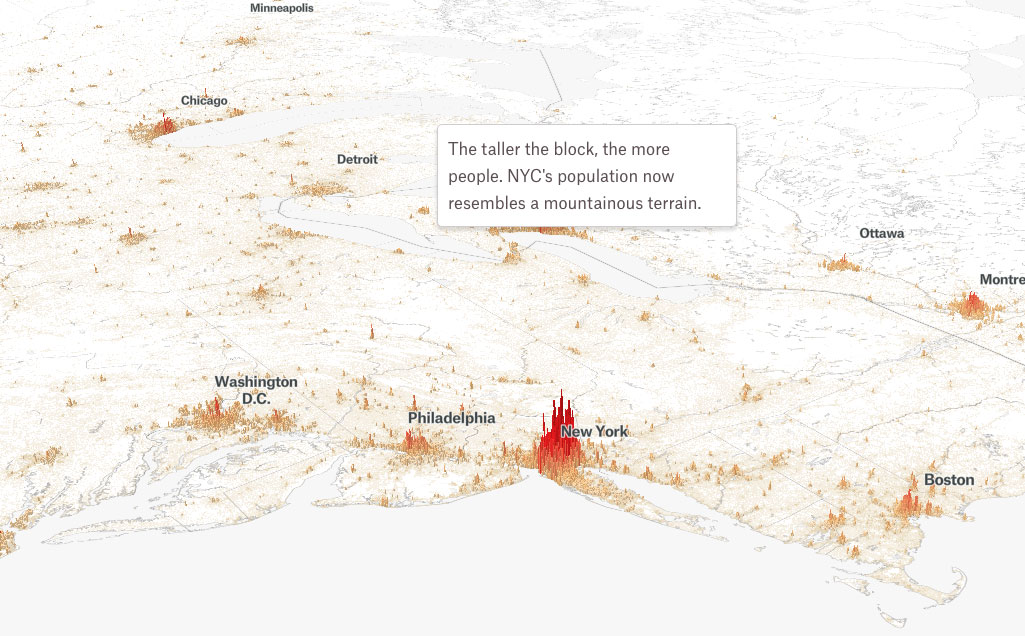
Areas of dense population show up as virtual mountains on the map
It can be hard to grasp just how populations are spread out around the world, but The Pudding's Population Mountains project presents this data in a way that enables you to immediately identify the world's population hotspots. Using data from the Global Human Settlement Layer – which uses a mix of satellite imagery, census data and geographic information to create population density maps – the project creates a detailed 3D height map, where the most heavily populated areas appear as virtual mountains.
Looking at a zoomed-out map of the the world in this view, you can instantly identify the major cities as vivid spikes on an otherwise flat plane; zoom in closer and you can see how some cities feature a lot of people crammed into a relatively small space that looks like a thick needle, while other cities with sprawling suburban areas appear as more gentle inclines.
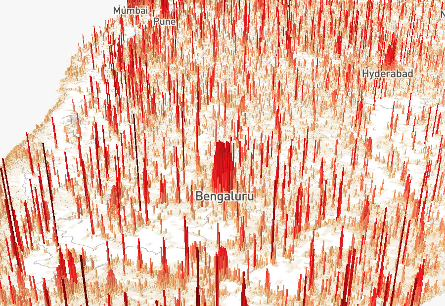
Here a big city is surrounded by lots of smaller, densely populated areas
In The Pudding's post about the project you'll find some fascinating studies of how population density can vary across the world; in some places, you'll find a huge proportion of the population packed into major cities, with the surrounding areas appearing as almost flat spaces by comparison, while in others, such as Bengalaru in India, you can see that the vast city is surrounded by loads of amazingly dense urban settlements.
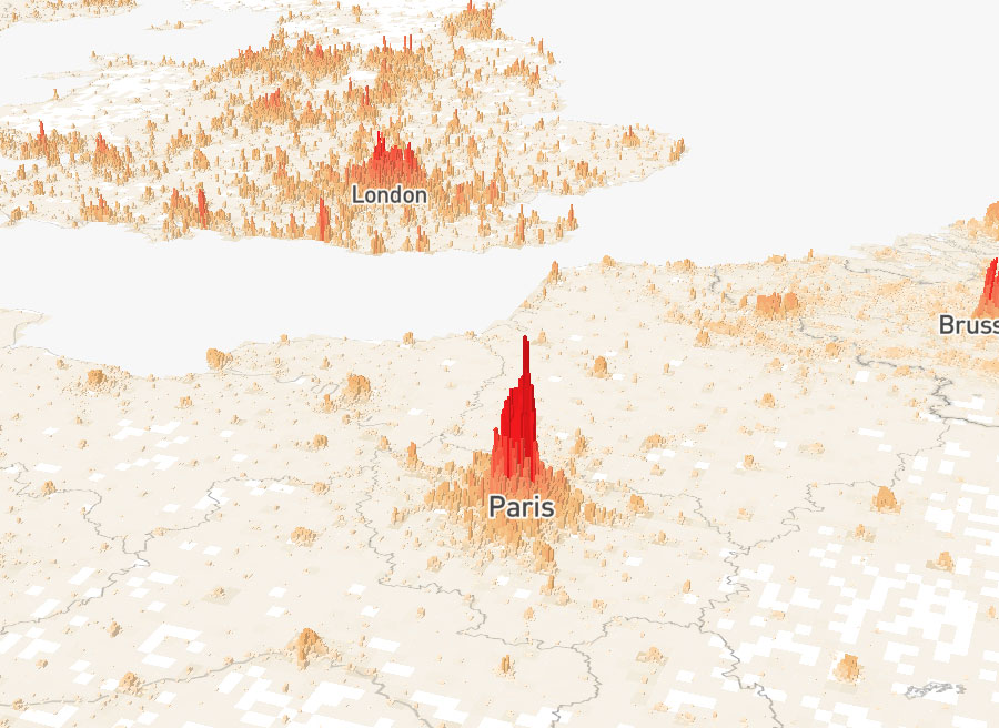
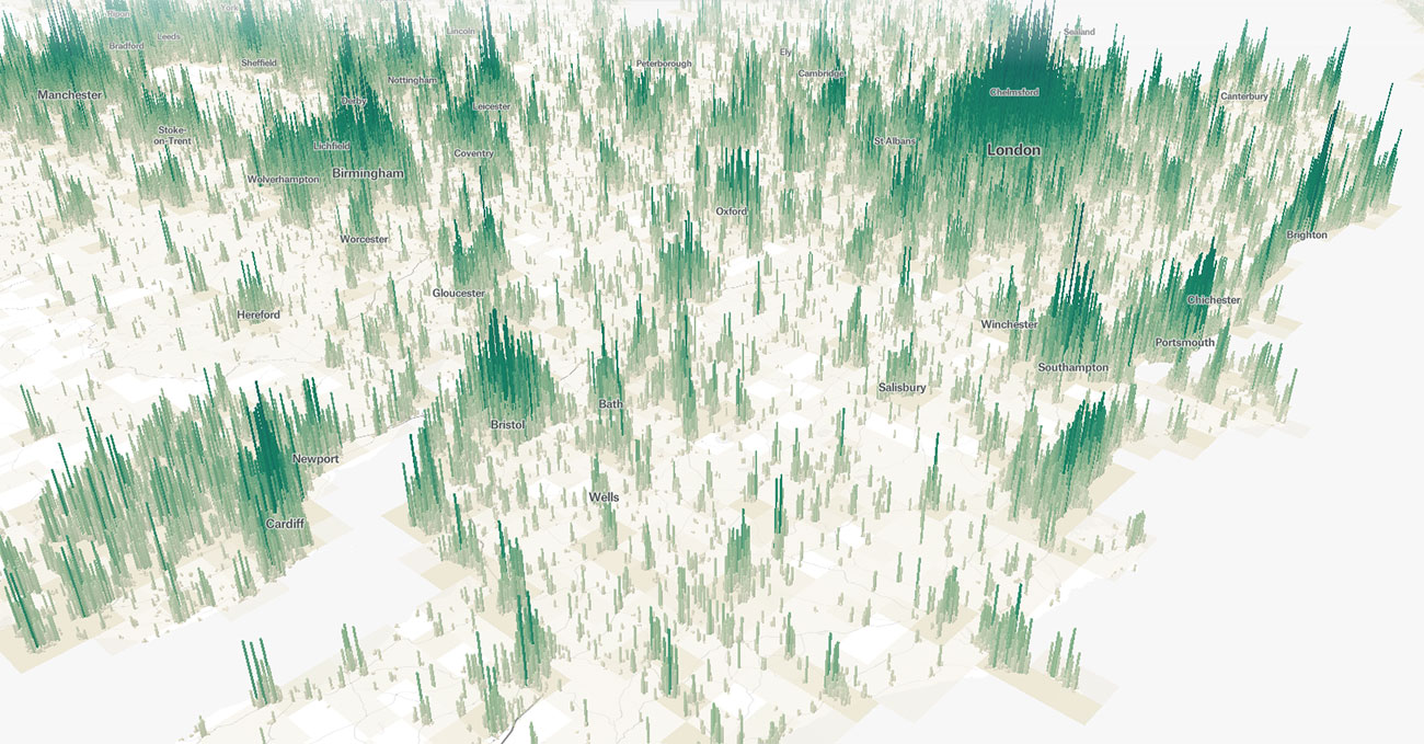
See the difference between the north of France and the south of England
Another interesting comparison is between London and Paris; London is a chunky peak among a load of the sizeable population hills that make up the Home Counties, while Paris is a vast spike, with nothing but the occasional foothill making up the rest of the north of France.
It’s easy to explore the data for yourself
You can read the Population Mountains post over at The Pudding for some great curated views and accompanying insight; alternatively you can head straight for the interactive map and see the data for yourself. There are two datasets to play with; the most recent population data from 2015, and an older set from 1990, and there's even an option to compare the two datasets to see how populations have shifted over the last quarter of a century.
Related articles:
The 62 best infographicsHow to create amazing infographicsThe data trend set to revolutionise app design


Leave a Reply
Want to join the discussion?Feel free to contribute!