Scroll Snap in CSS: Controlling Scroll Action
Original Source: https://www.sitepoint.com/scroll-snap-in-css/
The following is a short extract from Tiffany’s upcoming book, CSS Master, 2nd Edition, which will be available shortly.
As the web platform grows, it has also gained features that mimic native applications. One such feature is the CSS Scroll Snap Module. Scroll snap lets developers define the distance an interface should travel during a scroll action. You might use it to build slide shows or paged interfaces―features that currently require JavaScript and expensive DOM operations.
Scroll snap as a feature has undergone a good deal of change. An earlier, 2013 version of the specification — called Scroll Snap Points at the time — defined a coordinates-and-pixels-based approach to specifying scroll distance. This version of the specification was implemented in Microsoft Edge, Internet Explorer 11, and Firefox.
Chrome 69+ and Safari 11+ implement the latest version of the specification, which uses a box alignment model. That's what we'll focus on in this section.
Warning:
Many of the scroll snap tutorials currently floating around the web are based on the earlier CSS Scroll Snap Points specification. The presence of the word “points” in the title is one sign that the tutorial may rely on the old specification. A more reliable indicator, however, is the presence of the scroll-snap-points-x or scroll-snap-points-y properties.
Since scroll snap is really well-suited to slide show layouts, that's what we'll build. Here's our markup.
<div class="slideshow">
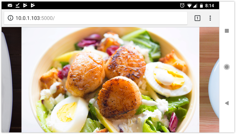
<img src="avocado-and-bacon-salad.jpg" alt="avocado and bacon salad">
<img src="salad-eggs-and-scallops.jpg" alt="salad topped with hard boiled eggs and seared scallops">
<img src="seafood-and-noodles.jpg" alt="seafood stew over noodles">
<img src="grilled-salmon-and-side-salad.jpg" alt="grilled salmon steak with avocado and side salad">
<img src="avocado-toast-with-egg.jpg" alt="avocado toast with egg">
</div>
That's all we need. We don't need to have an outer wrapping element with and an inner sliding container. We also don't need any JavaScript.
Now for our CSS:
* {
box-sizing: border-box;
}
html, body {
padding: 0;
margin: 0;
}
.slideshow {
scroll-snap-type: x mandatory; /* Indicates scroll axis and behavior */
overflow-x: auto; /* Should be either `scroll` or `auto` */
display: flex;
height: 100vh;
}
.slideshow img {
width: 100vw;
height: 100vh;
scroll-snap-align: center;
}
Adding scroll-snap-type to .slideshow creates a scroll container. The value for this property, x mandatory describes the direction in which we'd like to scroll, and the scroll snap strictness. In this case, the mandatory value tells the browser that it must snap to a snap position when there is no active scroll operation. Using display: flex just ensures that all of our images stack horizontally.
Now the other property we need is scroll-snap-align. This property indicates how to align each image's scroll snap area within the scroll container's snap port. It accepts three values: start, end, and center. In this case, we've used the center which means that each image will be centered within the viewport as shown below.
For a more comprehensive look at Scroll Snap, read Well-Controlled Scrolling with CSS Scroll Snap from Google Web Fundamentals guide.
The post Scroll Snap in CSS: Controlling Scroll Action appeared first on SitePoint.


Leave a Reply
Want to join the discussion?Feel free to contribute!