Removing Panic From E-Commerce Shipping And Inventory Alerts
Original Source: https://www.smashingmagazine.com/2020/07/ecommerce-shipping-inventory-alerts/
Removing Panic From E-Commerce Shipping And Inventory Alerts
Removing Panic From E-Commerce Shipping And Inventory Alerts
Suzanne Scacca
2020-07-09T11:00:00+00:00
2020-07-09T16:34:18+00:00
When it comes to displaying shipping and inventory alerts on an e-commerce website, you have to be very careful about inciting panic in your shoppers.
“Item is out of stock.”
“Expect shipping delays.”
“Page does not exist.”
These words alone are enough to turn a pleasant shopping experience into a panicked and frustrating one.
You have to be very careful about how you design these notices on your site, too. You obviously want to inform visitors of changes that impact their shopping experience, but you don’t want panic to be the resulting emotion when your alert is seen.
Better Search UX
For large-scale and e-commerce sites, the search experience is an increasingly critical tool. You can vastly improve the experience for users with thoughtful microcopy and the right contextualization. Read a related article →
When people panic, the natural response is to find a way to regain some control over the situation. The problem is, that regained control usually comes at the expense of the business’s profits, trust, and customer loyalty.
Unfortunately, some of the design choices we make in terms of alerts can cause undue panic.
“
If you want to better control your shoppers’ responses and keep them on the path to conversion, keep reading.
Note: Because the following post was written during the coronavirus pandemic, many of the alerts you’re going to see are related to it. However, that doesn’t mean these tips aren’t valid for other panic-inducing situations — like when a storm destroys an area and it’s impossible to order anything in-store or online or like during the November shopping frenzy when out-of-stock inventory is commonplace.
1. Avoid Out-Of-Stock Notices When Possible
Colleen Kirk is a professor of marketing at the New York Institute of Technology and an expert on territorial shopping.
She has a great analogy to help us understand why this happens:
Have you ever felt as if another driver stole your parking spot or were upset when someone else nabbed the last sweater that you had your eye on? If so, you experienced psychological ownership. You can feel psychological ownership over pretty much anything that doesn’t belong to you, from the last chocolate truffle in a display case to the dream home you found on Zillow and even intangible things like ideas.
When it comes to shopping in person, people exhibit territorial shopping traits by placing their items in a shopping cart. Or when they put a separator bar between their items on a conveyor belt and the person’s behind them.
We don’t really have that luxury on a website. The best we can do is enable shoppers to save their items to their cart or a wishlist, but that doesn’t keep the items from selling out before they have a chance to buy them.
This can lead to huge problems, especially when a shopper has gotten excited about that toy or shirt they “put aside”, only to discover a few hours later that the item is gone or no longer available.
The worst thing you could do is to remove out-of-stock product pages. You don’t want shoppers running into a 404 page and experiencing not just panic but also confusion and frustration.
While not as bad, I’d also recommend against displaying an inactive “Sold Out” or “Out of Stock” notice or button to shoppers as Olivela has done here:
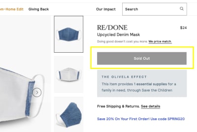
The Olivela website displays an inactive ‘Sold Out’ button for its denim mask product. (Source: Olivela) (Large preview)
Seeing this kind of feels like Google Maps directing you to your destination, only for you to end up at the edge of a lake where there’s supposed to be a road.
“Why the heck did you even send me here?”, is what your shoppers are going to wonder. And then they’re going to have to turn around and try to find something comparable to buy instead.
There are better ways to handle this that will also reduce the chances of your shoppers panic-buying a second-rate substitute for the item they really wanted. And this plays into the idea of territorial shopping (but in a healthy way).
This is what Target does when an item is “temporarily out of stock”:
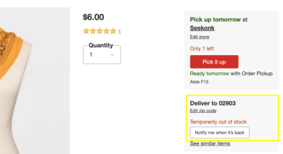
Target provides shoppers with the option to get notified when out-of-stock items become available. (Source: Target) (Large preview)
Rather than display an unclickable button and just completely shut down shoppers’ hopes of getting the item, a “Notify me when it’s back” button is presented. This is a more positive approach to handling out-of-stock inventory and, if customers really want the item, they’re more likely to use it rather than settle for something else or try another site altogether. (I’ll talk about the “Pick it up” option down below.)
Another way you can handle this is to do what Summersalt does and turn your “Sold Out” button into a “Pre-order” one:
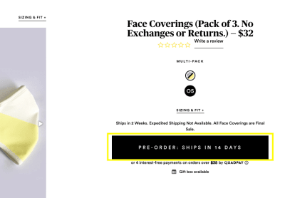
Summersalt provides shoppers with ‘Pre-order’ button for out-of-stock items. (Source: Summersalt) (Large preview)
What’s nice about this button is that it not only empowers shoppers to secure the currently unavailable item they have their eyes on, but it tells them exactly when they will get it.
So, if you know when inventory will be restored, this is a better option than the “Notify” button as there’s more transparency about availability.
2. Don’t Over-Promise Or Give Your Shoppers False Hope
It’s a good idea to keep your shoppers informed about how external situations may impact their online shopping experience. And you can use key areas like the website’s sticky banner or a promotional banner on the homepage to do that.
That said, be very careful what you promote.
Special notices aren’t the kinds of things that get ignored the way that cookie consent notices or lead generation pop-ups do.
“
Consumers know to look at these areas for things like promo codes and sales event details.
If you put anything else in there, you better make sure the notice is positive, useful and truthful.
Let’s take a look at what’s going on with the Gap website:
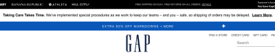
Gap’s ‘Taking Care Takes Time’ notice addresses shipping delays due to COVID-19. (Source: Gap) (Large preview)
Gap has three notices that appear in the header of its site:
In black: “Free shipping on $25+, free returns on all orders.”
In white: “Taking Care Takes Time. We’ve implemented special procedures as we work to keep our teams — and you — safe, so shipping of orders may be delayed.”
In blue: “Extra 50% off markdowns + more.”
It’s overwhelming. And it’s almost as if they wanted the alert in the middle to be ignored (or missed altogether) as it’s sandwiched between two very sharp-looking banners that promote attractive deals.
If your alert is related to something that’s going to affect the shoppers’ experience, don’t bury it and don’t try to massage it with overly optimistic messaging. Also, don’t contradict it with another alert that suggests the first one isn’t one to worry about.
Here’s why I say that:
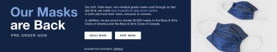
Gap promotes ‘Our Masks are Back’ on the homepage of its website. (Source: Gap) (Large preview)
This message is problematic for a couple of reasons. For one, Gap’s masks aren’t really “back” if they’re only available for pre-order. Second, it runs contrary to the top banner’s message about shipping delays.
Unsurprisingly, shoppers did not react well to this hyped-up announcement:
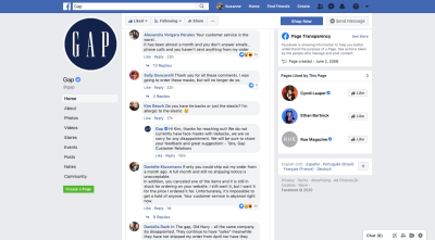
Gap receives an extraordinary amount of backlash on Facebook over mismanagement of shipping and promotions. (Source: Gap) (Large preview)
When Facebook ran a promotion on Facebook about the masks, it received a huge amount of backlash from customers. Many customers didn’t want to hear about the masks because they’d been waiting over a month for existing orders to ship and couldn’t get a customer service rep to talk to them. There were also complaints about items being canceled from their orders, only for them to magically become “available” again in the store.
A website that’s handling similar circumstances well right now is Urban Outfitters:
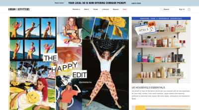
Urban Outfitters is focusing on the positive of a bad situation. (Source: Urban Outfitters) (Large preview)
Urban Outfitters, like a lot of non-essential retailers right now, has had to make some adjustments in order to stay alive. But rather than displaying a notice alerting online shoppers to shipping delays like many of its counterparts, Urban Outfitters has turned it into a positive.
The banner reads: “Your local UO is now offering curbside pickup!”
There’s no hidden message here that tries to explain away the brand’s bad behavior. There’s no greedy cash-grab, promising deep discounts for people who shop with them despite likely delays in shipping. There’s no overhyping of a promise they can’t possibly keep.
This is an actionable offer.
What I’d suggest for e-commerce businesses that want to keep customers on their side — even during a tumultuous time — is to keep their alerts simple, honest and useful. And if you’re going to promote multiple ones, make sure they tell the same story.
3. Soften The Blow By Promoting Multichannel Options
I recently signed a new lease on an apartment but was dismayed to discover that my move-in date and furniture delivery date wouldn’t line up because of shipping delays. I was well-aware of this when I made the purchase, but I wasn’t as prepared as I wanted to be. And because we were in the middle of a city-wide lockdown, I was unable to crash with friends who live over the state border.
I thought, “I’ll sleep on an air mattress. No biggie.” But then remembered I left mine behind in Delaware. So, I had to figure out a way to buy a cheap air mattress.
All of my go-to e-commerce websites had shipping delay alerts. And as I perused their available products (which there were very few), my panic only worsened. Until I discovered a website that offered BOPIS.
Buy-online-pickup-in-store is a shopping trend that’s proven very popular with consumers. According to data from Doddle and a report from Business Insider:
68% of U.S. shoppers have used BOPIS on numerous occasions.
50% have chosen where to shop based on BOPIS availability.
Shipping costs (avoiding them), speed and convenience are the primary reasons why customers prefer to buy online and shop in-store. It’s the best of both worlds.
If you’re building an e-commerce site for a company with retail locations that do this, then make sure you get customers thinking about it right away.
Barnes and Noble, for instance, enables shoppers to set their preferred local store:
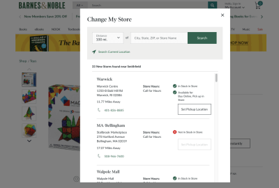
Barnes & Noble allows shoppers to set their preferred retail store location. (Source: Barnes and Noble) (Large preview)
This is a great feature to have. The only thing I’d do differently is to place a button in the header of the site that immediately takes them to the “Change My Store” or “Find Store” pop-up or page. That way, shoppers don’t have to wait until they’ve found a product they like to discover whether or not it’s available at their store for pickup.
Once a user has set their store location, though, Barnes & Noble remembers it and uses it to enhance the remainder of the shopping experience:
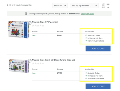
Barnes & Noble uses shopper location information to enhance search listings. (Source: Barnes and Noble) (Large preview)
This is what search listings look like for “Magna Tiles” on the Barnes & Noble site when the user sets their search to “List” view. Pretty neat, right? While “Grid” view is standard, only showing the featured image, product name and price, this view provides extra detail about availability.
This can provide a ton of relief for shoppers who too-often encounter “out-of-stock” or “not available in store” notices on individual product pages. This way, they can spend their time looking at the items they can get the most quickly and conveniently. There are no surprises.
If cross-channel options are available — between website and mobile app, website and retail store, website and third-party delivery service — make sure you call attention to them early on so customers can take advantage of the streamlined shopping experience.
Wrapping Up
Panicked shopping can lead to serious issues for your e-commerce site. Rather than put your shoppers in a situation where they grow impatient, dissatisfied, and frustrated by the site that seems to put up barriers at every turn, design your alerts so that they turn a bad experience into a positive one.
![]()
(ra, yk, il)


Leave a Reply
Want to join the discussion?Feel free to contribute!