Logo design: everything you need to know
Original Source: http://feedproxy.google.com/~r/CreativeBloq/~3/eS4DFZgDR64/pro-guide-logo-design-21221
If your company needs a new logo design, you'll probably be exploring your options. Do you go for a completely different logo or tweak the logo design you already have? Either way, you might be questioning: what makes a great logo design? And how do you design a logo that captures the essence of a product, person or brand?
We're here to answer all of your burning questions about logo design, and we've even collated the best logo design tools around to help you even further. Use the links opposite to jump to the section you're interested in.
And if you're looking to design amazing logos across a range of devices, you should also check out our countdown of the 5 best logo design apps.
Why is logo design important?
Your logo is you or your business' first point of contact with the outside world. If people connect with your branding, the likelihood is they'll be more open to whatever it is offering them. Great logo design requires a complex mixture of design skills, creative theory and skilful application.
Any designer worth their salt can create a fit-for-purpose logo, but truly mastering all aspects of the craft takes time. Of course, logo design is just one small subset of branding, but the logo or brand mark remains the centrepiece of most branding schemes. And we all know that it's often the part of a new identity that is most picked apart by the public.
If you want to see how it's done, why not head over to our pick of the best logo designs ever?
The best logo makers
A logo design app is not going to create a branding masterpiece – but you know this. Some people are simply looking for a quick, cheap logo that reflects their start-up brand until it has expanded enough to merit a full brand identity created by a professional designer or agency. Here are five logo design makers that are fast, sophisticated and good value.
Alternatively, if you've got Illustrator, here's how to design a logo in Illustrator. Or if you have Photoshop only, here's how to make a logo in Photoshop (note that Illustrator is usually preferred for logo creation).
01. Canva
Canva is a multi-talented application
Canva is a full, browser-based graphic design suite that just so happens to contain a great logo design tool. Okay, it doesn't offer the design capabilities of Adobe Creative Cloud, but Canva's simplicity, variety of useful tools, and inspirational learning assets make it a great way to design your branding. If you use your own image and design elements in Canva, then creating a logo is free. If not, design elements cost from $1.
02. TailorBrands
TailorBrands costs a little more but that means more options
TailorBrands promises not only a logo design but a full branding package with its browser-based software. The tool is simple to use and has no pre-made logos – instead, the platform is powered by AI to design a unique logo for every user. There is a cost involved here, but it is paltry compared to hiring an agency, starting at $3.99/month for its Dynamic Logo package and rising to $15.99/month for the full Premium package.
03. Hatchful
Hatchful is a logo design generator
Hatchful is a simple browser-based logo generator which allows you to customise your logo from hundreds of templates, icon, and colour combinations. You can test out logo variations and create a one-of-a-kind logo that’s perfect for whatever business you have, and the logo generator is so simple to use that you become an expert in minutes. The logo generated comes sized for all major social media platforms, you get a favicon design thrown in, and all it will cost you is your email address (although premium logos are available).
04. Logoshi
Logoshi charges nothing unless you are happy with your logo
Logoshi is a super-simple tool that looks a bit Web 1.0 but provides neat, simple designs at a very reasonable price (prices start at $5). It provides square, transparent, and cropped versions of your logo once it has been signed off, and you get bitmap and vector version of your logos all bundled into one cost.
05. Ucraft
Ucraft is probably best known as a website builder, but amongst its browser-based web tools you'll find an excellent logo maker. It is also completely free. The designs are compatible with all major social accounts: Instagram, Facebook, Pinterest, LinkedIn or even Twitch, and you can download it as a PNG or an SVG file (although the latter will cost you $7).
Now discover everything you need to know about logo design, starting on the next page with brand identity expert David Airey's 10 golden rules of logo design.
Next page: 10 golden rules of logo design from David Airey
David Airey's 10 golden rules of logo design
When you think of a person who’s impacted your life, it’s almost certain that you can picture what he or she looks like. And so it is with the brands from which we often buy. We can easily picture the logo just by thinking about our experiences with the product, company or service.
Where there was once just a handful of companies operating within a particular market or niche, there might now be hundreds, maybe thousands, all competing for attention, all wanting us to look at them first. That creates increasing need for brands to visually differentiate themselves so they’re not confused with competitors.
That differentiation is achieved through brand identity design – a range of elements that all work together to form a distinctive picture in our minds. Depending on the company, the identity can include uniforms, vehicle graphics, business cards, product packaging, photographic style, coffee mugs, billboard advertising, and a raft of other items, right down to the font choice on the website.
When we look at something, we don’t read first. Before anything else we see shape, we see colour, and if that’s enough to hold our attention, then we’ll read
David Airey
It’s important to remember that when we look at something, we don’t read first. Before anything else we see shape, we see colour, and if that’s enough to hold our attention, then we’ll read. So in every instance, regardless of company, the small but essential element in the brand picture is the logo.
Our job as designers is to distill the essence of a brand into the shape and colour that’s most likely to endure, because visual appearance plays a critical part in forming a connection in our brains between what we experience and who we experience it with (the brand). In many respects, a company’s logo is akin to our loved ones’ faces.
When the right logo is aligned with an excellent product, and when it’s in place for a significant amount of time, it can eventually become a priceless asset for any company. The Nike swoosh, McDonald’s golden arches, the Michelin man, Mercedes’ three-pointed star, the Woolmark symbol – these are just a few of the more high-profile examples. But besides their ubiquitous nature, how do you give a logo the best possible chance of reaching a similar status? There are universal traits within every successful logo project, and I’ve outlined some here to help improve the quality of the marks you create.
01. Lay the groundwork
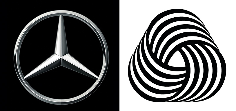
Logos such as Mercedes and Woolmark have become priceless assets for their respective companies
One of the most interesting parts of being a designer is that you get to learn new things with each new project. Every client is different, and even in the same profession, people do their jobs in many different ways.
To make it easier for consensus to be reached on your design idea, you need to ask your client the right questions from the outset: Why are you here? What do you do, and how do you do it? What makes you different? Who are you here for? What do you value the most?
Those questions might seem quite straightforward, but they can be challenging to answer, and they’ll lead to further questions about your clients’ businesses. What you discover in this phase of a project will help to determine the strongest possible design direction.
02. Treasure your sketchpad
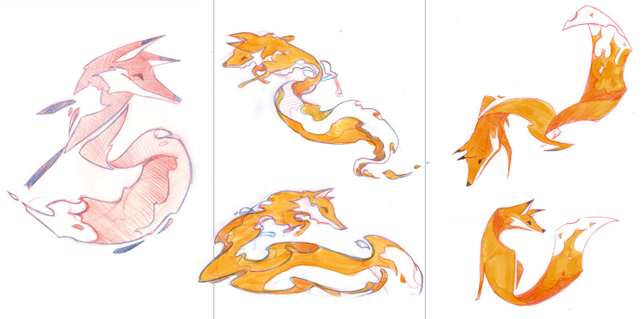
Sketches of Firefox mascots by Martijn Rijven, who was commissioned by Wolff Olins
Using a sketchpad is a chance to rest our eyes from the glare of brightly lit pixels that tend to dominate our lives. But more importantly, recording different design ideas can be much quicker when there isn’t a digital device between our hands and our brains. So if you wake in the night with an idea you don’t want to lose, the pen and paper by your bed is the ideal way to remember. Sketching also makes it easier to put shapes exactly where you want them – there’ll always be time to digitise your marks later (see our sketching tips for further sketching advice).
When you’re describing design ideas to clients, prior to digitising a mark, it can be helpful to share a sketch or two, making it easier for them to visualise the outcome without distraction from typefaces and colours. Don’t share too much, though – only the best ideas.
03. Work in black and white
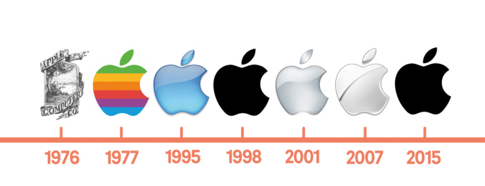
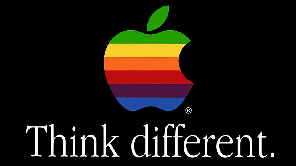
The inner detail of the Apple logo has changed over the years, but the silhouette remains
Leaving colour until near the end helps you focus your attention on the basics of the idea rather than something that’s much easier to change. A poor idea can’t be rescued by an interesting palette, whereas a good idea will still be good regardless of colour. Picture a well-known symbol. Think of it now. It’s the form we remember before the palette. It’s the lines, the shapes, the idea, whether that’s the bite from an apple, three parallel stripes, four linked circles in a horizontal line, or something else.
04. Keep it appropriate
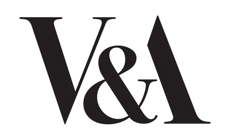
Pentagram founder Alan Fletcher created the V&A logo in 1989
A mark must be relevant for the ideas and activities it represents. An elegant typeface will suit a high-end restaurant more than it will a children’s nursery. A palette of fluorescent pink and yellow isn’t going to help your message engage with male pensioners.
Crafting a mark that bears some resemblance to a swastika, regardless of industry, isn’t going to work. You know these things. They’re obvious. But it goes a little deeper. The more appropriate your rationale behind a particular design, the easier it becomes to sell the idea to a client. And that can often be the most challenging part of a project. Designers don’t just design. They sell, too.
05. Aim for easy recall
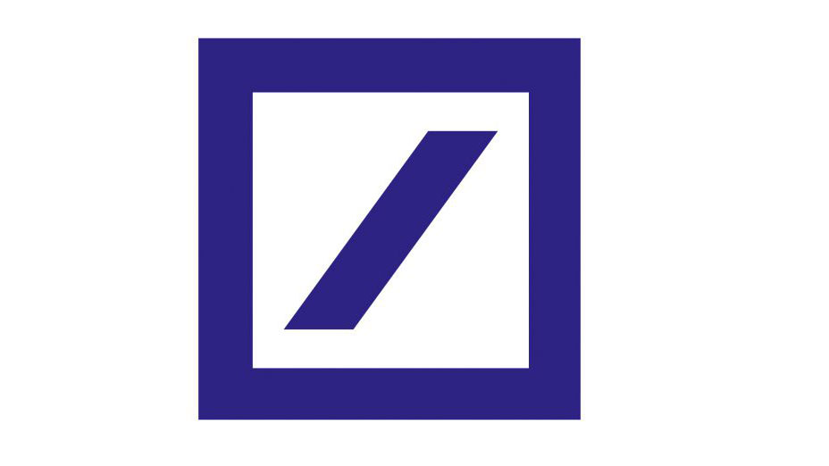
The 1974 Deutsche bank logo by Anton Stankowski
Simplicity aids recognition, especially when so many brands are competing for our attention. You want to give onlookers the opportunity to recall a mark after just a quick glance, and that’s not possible with an overly detailed design. A trademark has to be focused in concept – have a single ‘story’ – and in most cases must be uncomplicated in form. This is because it needs to work at a variety of sizes and in a range of applications, from a website icon in a browser bar to signage on a building.
06. Strive for difference
The 1999 Tate logo by Wolff Olins united the Tate’s four galleries across the UK
When your clients’ competitors are all using a particular typographic style, or the same kind of palette, or a symbol placed on the left of the brand name, do something different. It gives you the perfect opportunity to set your clients apart rather than have them blend in.
But so much similarity in the marketplace doesn’t necessarily mean your job has become easier, because it takes a brave client to buck the trend. By showing imagination in your portfolio, you’re on your way to attracting the kind of client you want.
07. Consider the broader identity
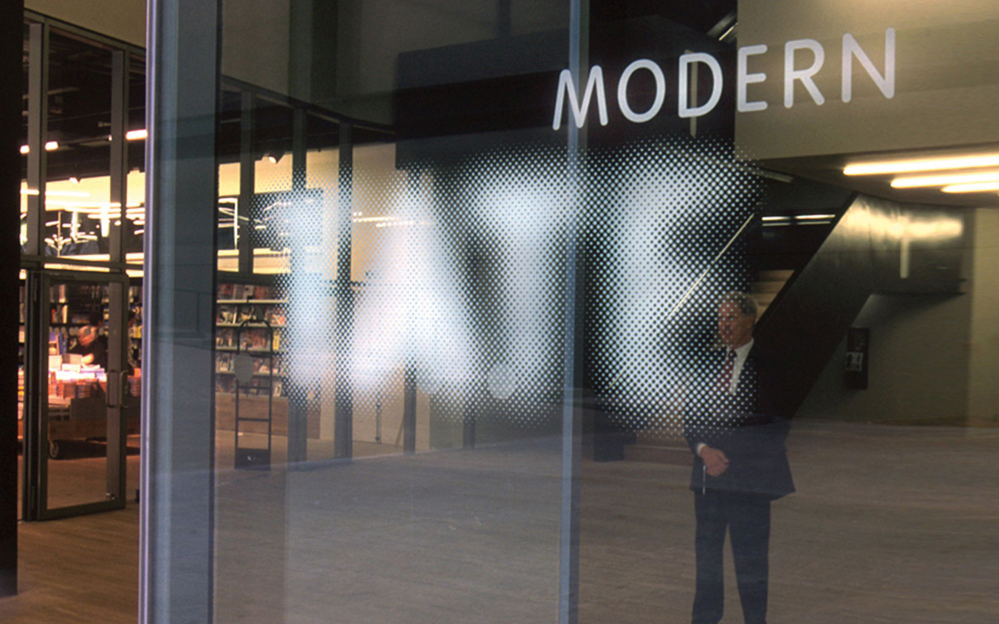
Wolff Olins created a new typeface for Macmillan cancer support in 2006; part of a wider repositioning
It’s rare when you see a logo in isolation, on its own without the context of a website or business card or drinks menu or app icon. That’s why a client presentation needs to encompass a variety of relevant touchpoints to show how a logo appears when seen by potential customers. It’s a little like when you’re stuck in a rut – it can help to step back, to look at the bigger picture, to see where you are, what you’re surrounded by.
In design terms, the bigger picture is every potential item on which a client logo might appear. But always consider how the identity works when the logo isn’t shown, because while important, a symbol will only take an identity so far. One way to achieve cohesive visuals is to craft a bespoke typeface that’s not only used in the logo, but that’s also seen in marketing headlines.
08. Don’t be too literal
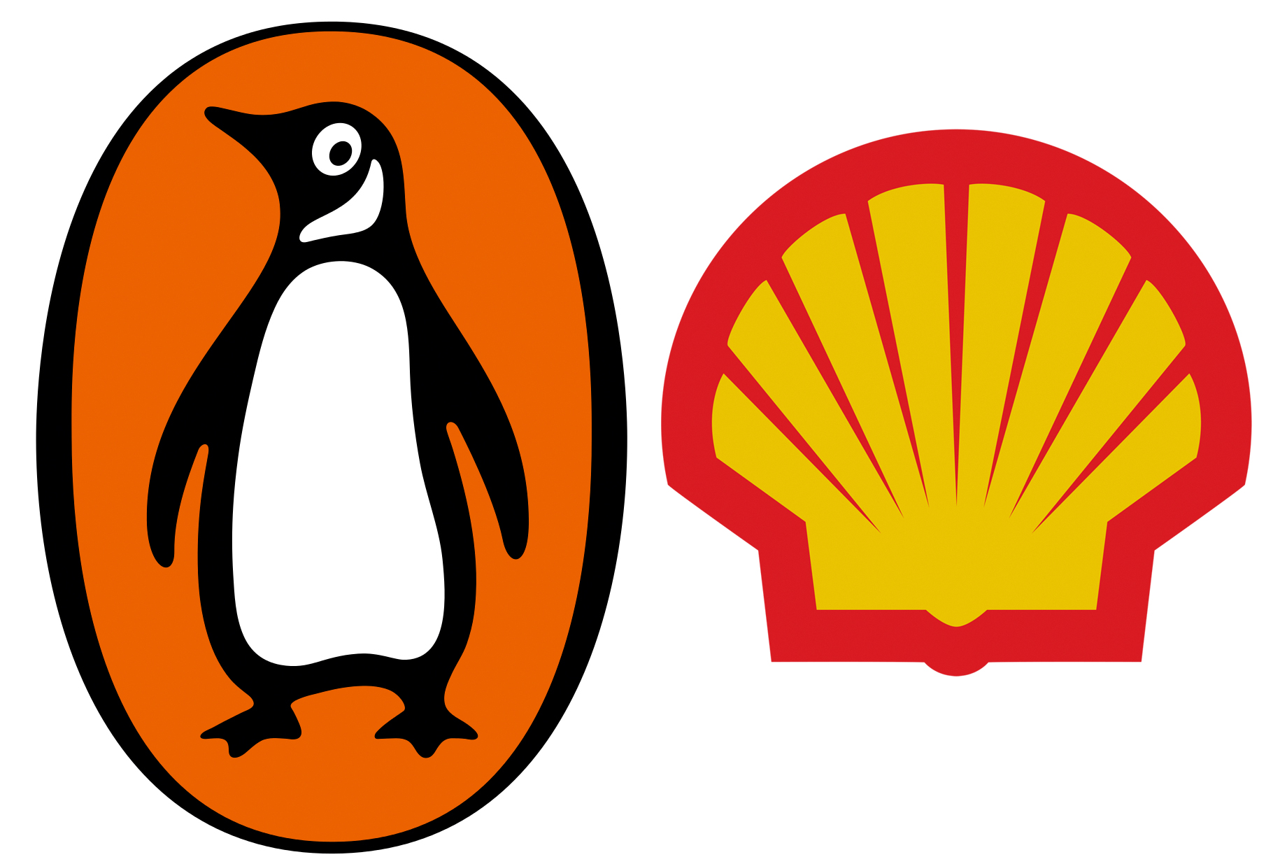
The logos for Penguin and Shell don’t give any clues as to the types of company they represent
A logo doesn’t have to show what the company does, in fact, it’s better if it doesn’t, because the more abstract the mark, the more enduring it can become. Historically you’d show your factory, or maybe a heraldic crest if it was a family-run business, but symbols don’t show what you do. Instead, they make it clear who you are. The meaning in the eyes of the public gets added afterwards, when associations can be formed between what the company does and the shape and colour of its mark.
09. Remember symbols aren’t essential
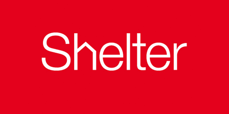
Johnson Banks’ 2004 wordmark for shelter – with its pitched roof ‘h’ – helped reposition the housing charity
Often a bespoke wordmark will do the job, especially when the company name is unique, such as Google, Mobil, or Pirelli. But a version of the logo that works in small confines will always help. That might be as simple as lifting a letter from the name and using the same colour, or it might incorporate a symbol that can be used as a secondary design element (wordmark first, symbol second) instead of as a logo lockup where both pieces are shown alongside one another.
Don’t be tempted to overdo the design flair just because the focus is on the letters. Legibility is key with any wordmark, and your presentations should demonstrate how your designs work at all sizes, large and small.
10. Make people smile
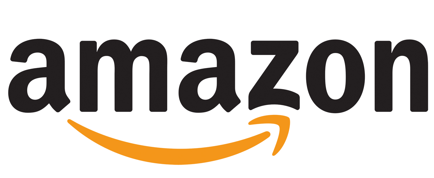
Designed in 2000, turner Duckworth’s wordmark for Amazon adds wit with a hidden smile that goes from A-Z
Injecting some wit into the work will not only make your job more fun, but it can help your client to become more successful, too. It won’t be appropriate for every profession, such as weapons manufacturers and tobacco firms, but whether you choose to work with those companies is another thing. The somewhat less contentious law and financial sectors are filled with companies identified by stuffy and sterile branding, putting some humour into the identity for such clients is one way to set them apart.
There’s a balance, though. Take it too far and you risk alienating potential customers. But regardless of the company, people do business with people, so a human, emotional side to your work will always have a level of relevance.
Next page: Logo design research and strategy
Before pen hits paper on any new logo design project, thorough research is essential. Here are five logo design tips for nailing this crucial first stage of the process.
01. Understand your competition
Apple cut through the traditional computing sector like a hot knife through butter in the ’80s, and has since evolved into one of the world’s most valuable brands
Before you even start working up a logo design concept, ensure you research your target market thoroughly. Your client should be able to provide some information about their competitors to get you started.
Compare all the logos in their competitive set. This research may well reveal some entrenched branding conventions in that market sector, and that can sometimes help your process by playing on familiar visual associations.
But bear in mind that many of the world’s most recognisable logo designs stand out specifically because they eschew trends and think differently.
02. Ask the right questions
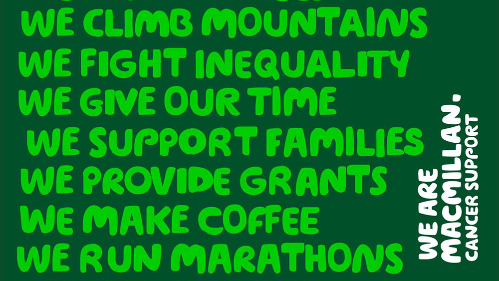
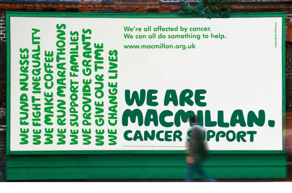
Wolff Olins’ copywriting-led branding for Macmillan Cancer Support, referenced in Johnson’s book, is built around a series of ‘we…’ statements that help answer some of the key brand questions
Strategy is becoming an increasingly important part of the branding process. What this means in practice will often depend on the scale of the project, but it all starts with asking the right questions.
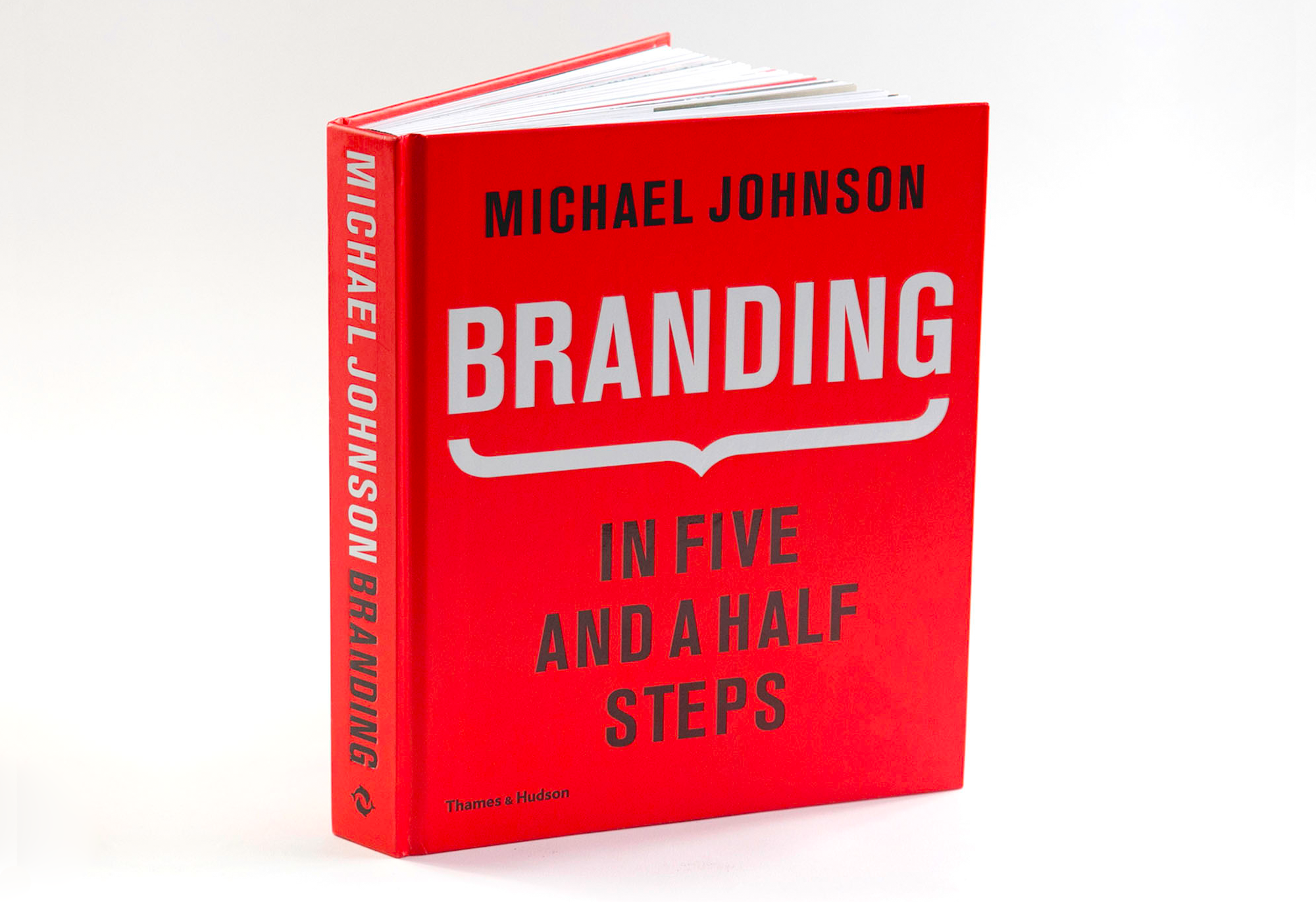
Michael Johnson’s book Branding: In Five and a Half Steps is dedicated to Johnson Banks’ creative process, and covers complex challenges such as formulating brand strategy in far more detail than we could ever hope to here.
In it, Johnson advocates asking the following six things of the brand you’re working on as a starting point:
Why are we here?What do we do, and how do we do it?What makes us different?Who are we here for?What do we value the most?What’s our personality?
03. Stay flexible during the process
Branding: In Five and a Half Steps is highly recommended reading to help you get to grips with all the key stages of the branding process, and the grey areas between them
Once you’ve formulated a strategy, you don’t have to set it in stone. There’s a reason that Johnson Banks’ creative process has that extra half step: that 'and how do we do it' part of the question represents the grey area between strategy and design.
According to Johnson, it can be a two-way street. Some conceptual, strategic ideas that work in theory may fall apart in practice when visualised; conversely, a compelling visual solution that emerges from left-field during the design stage can feed back into stage two and help evolve the strategy retrospectively.
04. Respect a brand’s heritage
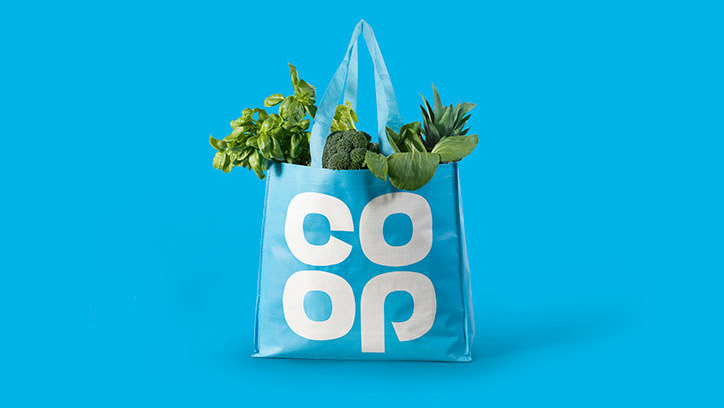
North’s Brand Impact Award-winning rebrand of Co-op reawakened the affection that many consumers felt for the organisation
The so-called ’retro branding’ movement was kicked off by North’s much-lauded rebrand of Co-op, which reinvigorated its original 1960s mark and won one of Computer Arts magazine’s coveted Brand Impact Awards in 2016 in the process.
NatWest and Kodak followed within a few months, and we've seen countless examples since. Brands need to be wary of jumping on the bandwagon for the sake of it, but where genuine heritage and untapped potential exists in a mark, avoid throwing the baby out with the bath water and consider bringing it to the fore – see our advice on how to reawaken a brand's heritage.
“It's vital to put your ego to one side and not dismiss designs created by others – and in doing so consider evolution as well as revolution,” argued North co-founder Stephen Gilmore in an essay in Computer Arts.
05. Remember: a logo is just one ingredient
As Brand Impact Awards judges Bruce Duckworth and Mark Bonner discuss in this video filmed during 2016’s judging day, logo design is just one small part of the modern branding process.
As Bonner puts it, the pyramid has inverted: people now engage with a brand through a huge variety of different touchpoints, and the logo is not always their first point of contact with a brand.
Keep this in mind as you develop your logo design: stay versatile and flexible, and consider how the logo interacts with the rest of the brand experience, from packaging to tone of voice.
Next page: Typography in logo design
Choosing the right typeface is a critical part of the logo design process – indeed, many of the world’s most recognisable brands are wordmarks, relying entirely on typography to convey their message.
Here are our logo design tips to get more from your typography.
01. Choose your typeface carefully
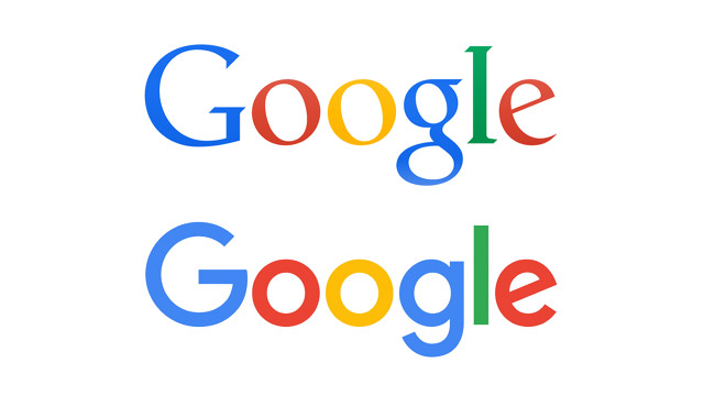
As part of a major identity overhaul, Google abandoned its distinctive serif logotype after 16 years in favour of a clean, modern sans serif
Sans serif fonts have dominated logo design in recent years, often going hand-in-hand with the minimalist movement – examples include Pentagram’s high-profile rebrands for Windows, MasterCard and the University of the Arts London.
In 2015, Google famously exchanged its longstanding serif logotype for a much friendlier, more contemporary sans serif. But don’t let trends cloud your own judgement: a serif font could still be the right choice for your latest project, particularly if you need a stylish and luxurious or traditional and professional feel, so take the time to research your options.
02. Tweak and refine to add personality
Company Folders’ design uses a tweaked typeface to form a chopper chassis
If you use an existing typeface in a logotype, particularly a near-ubiquitous one such as Helvetica, there is often more pressure on other touchpoints, such as imagery, colour palette, tone of voice and so on, to develop and enhance the brand’s personality.
Skilful tracking and kerning is essential when setting a simple logotype in an existing typeface. Wide-tracked type can feel sophisticated and authoritative, while tight, meticulous kerning can help lock individual letterforms together as self-contained unit.
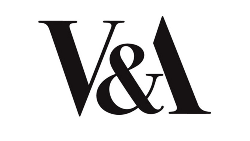
Testament to how simplicity can lead to longevity, Alan Fletcher’s effortlessly stylish V&A logotype relies on the interplay between the ampersand and the A
Once in logotype form, tweaking and modifying the typeface can also smooth links between letterforms, or add a unique twist to fit the tone of the brand – one example would be shearing off letter terminals at matching angles to give a sharp, progressive feel.
03. Consider illustrated, fully-bespoke type
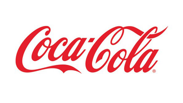
With only relatively subtle tweaks over more than a century, Coca-Cola is proof that illustrated type can stand the test of time in logo design
Sometimes an existing typeface just won’t cut it, and a hand-drawn typographical treatment feels much much more appropriate for the brand. Perhaps the most iconic example, which has evolved gradually over more than a century, is Coca-Cola.
Compared with its fierce rival Pepsi, which has been through at least seven major iterations, the market leader sports much the same logo as it did in the late 1800s. If Coca-Cola had ditched that familiar scrawling script for a sans serif, like Pepsi did in the 1960s, there would have been uproar.
The point is simple: get a truly unique, custom bit of illustrated type spot-on and you’ve bought yourself some powerful brand recognition with genuine longevity. (Although if all else fails, these free handwriting fonts are pretty great options).
04. Explore serendipitous letter combinations
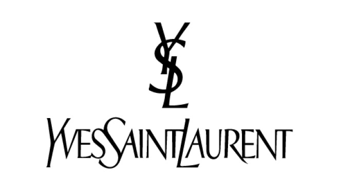
Yves St Laurent’s dollar-sign-esque lockup is a simple but effective emblem
Monograms don’t have to be restricted to dressing gowns and wedding invitations, and when given the right treatment, company initials formed into a typographic lockup can make for a simple but effective emblem for a brand.
This is notably true in the fashion sector – Coco Chanel’s interlocking Cs and Yves St Laurent’s dollar sign-esque lockup being standout examples. Also see our best 3-letter logos for other marks that combine characters in effective ways.
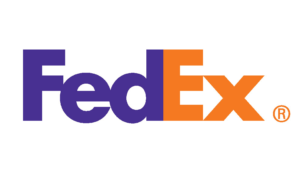
Landor’s simple but effective FedEx wordmark regularly tops lists of the best logos of all time, all thanks to its hidden arrow
Sometimes even the simplest typesetting can reveal serendipitous ‘accidents’ that, developed properly, can lead to twists of genius. One classic example is Landor’s FedEx mark, the hidden arrow between the ‘e’ and the ‘x’ making an otherwise plain sans-serif logotype the toast of logo design critics the world over.
Try typing out the brand name in different typefaces and perhaps a similar happy accident could occur in your own work. See our post on logo Easter eggs you might have missed for more examples of hidden messages in logos.
05. Take ownership of an entire typeface
Fontsmith’s award-winning logotype for ITV was expanded into a brand-wide typeface, to ensure a consistent tone of voice across all channels and applications
If your client can afford it, working with a specialist bespoke type design agency such as Dalton Maag or Fontsmith to develop a fully branded typeface family can put typography front and centre of a brand’s personality, transcending the logotype and permeating all brand communications.
Between them, these two agencies have worked for an array of brands including Nokia, Lush, Rio 2016, Sainsbury’s, ITV and Lloyds. “Type defines the tone of voice of a brand by its emotional qualities,” Dalton Maag founder Bruno Maag told Computer Arts in the video interview below.
“A grotesque typeface such as Univers, Arial or Helvetica feels more masculine, mechanical and engineered – colder – than, say, a Frutiger, which is a humanist sans serif with more open, warm, friendly, approachable tones. Whereas a serif typeface may appear old-fashioned, or bookish.”
Next page: Shape and symbolism in logo design
Some of the world’s most iconic brands are recognisable when the company name is removed. An even more exclusive club has achieved ownership of a particular shape so that it doesn’t even need to be fully realised into a logo form to be associated subconsciously with its brand.
Here are five logo design tips to help you master shape and symbolism.
01. Strip it back to basics
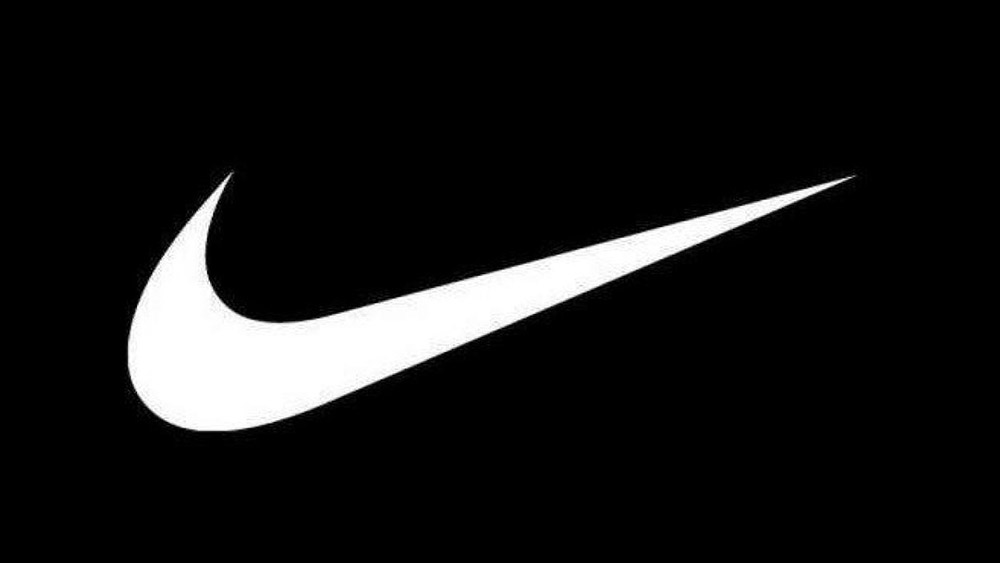
A student at the time, Carole Davidson was originally paid just $35 to design the Nike swoosh: a wonderfully simple shape that can be sketched with a couple of quick strokes of a pen
There are a few golden rules to which all the best examples of logo design adhere. Firstly, and perhaps most importantly: simplicity.
Put thought into your concept, but don’t overwork the execution, or adorn a mark purely for the sake of it. You want ease of recognition, as well as versatility of scale and application. Think: will it work as well when used tiny in the footer of a website, as it will emblazoned on the front of a building?
A great way to test the simplicity of your concept is to keep subtracting elements until you reach its most basic form. Be brutal here. Is it still recognisable if you sketch it quickly with a few rough strokes? What are its most unique, defining features? Generally speaking, the simpler a logo design, the more memorable it will be.
02. Understand shape psychology
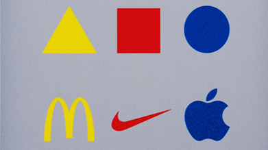
The yellow triangle, red square and blue circle have become a visual symbol of the Bauhaus School of Design – and embody a principle that can be applied to logo design, as expressed by this print by Marco Ugolini, entitled Bauhaus Revisited
There are certain ‘clip art’ style visual cliches guaranteed to make any logo design expert gnash their teeth. Avoid common offenders such as lightbulbs to represent ’ideas’ or globes as shorthand for 'international’ at all costs.
But shape psychology goes far beyond the obvious. Often used as a symbol of the hugely influential Bauhaus School of Design are the yellow triangle, red square and blue circle – the product of research by Wassily Kandinsky, who argued that shape and colour can transcend cultural and language barriers.
Kandinsky argued that bright, zingy yellow complements the angular sharpness of a triangle; cool, spiritual blue is a perfect match for a circle; while an earthy, visceral red partners nicely with a square. We’ll explore colour theory in a bit more detail later on.
03. Master grids and structure
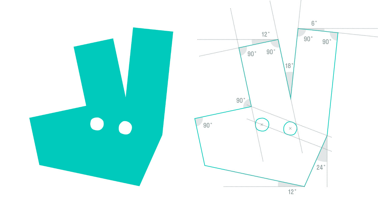
Revealing specific details of the geometric construction of a logo mark to the public is increasingly common, and DesignStudio’s rebrand of Deliveroo is no exception
It’s becoming increasingly common for design agencies to air their sketchbooks in public, whether on online platforms such as Behance or Dribble, or as part of project case studies on their own websites, or released to the design press.
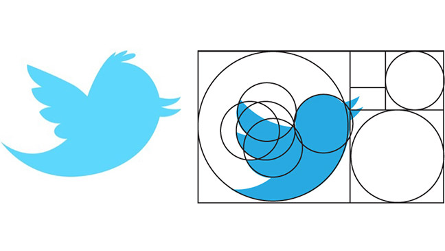
Twitter’s most recent icon is built around a series of interlocking circles that, according to this diagram, conform to the ‘golden ratio’ of 1:1.618
Often these workings include the technical side of a design’s composition, revealing and discussing the grid that underlies its construction and the specific curves and angles that define the shape.
Such projects can be invaluable reference points to inform your own work, and can help make abstract design principles such as the golden ratio come alive in application.
04. Employ negative space
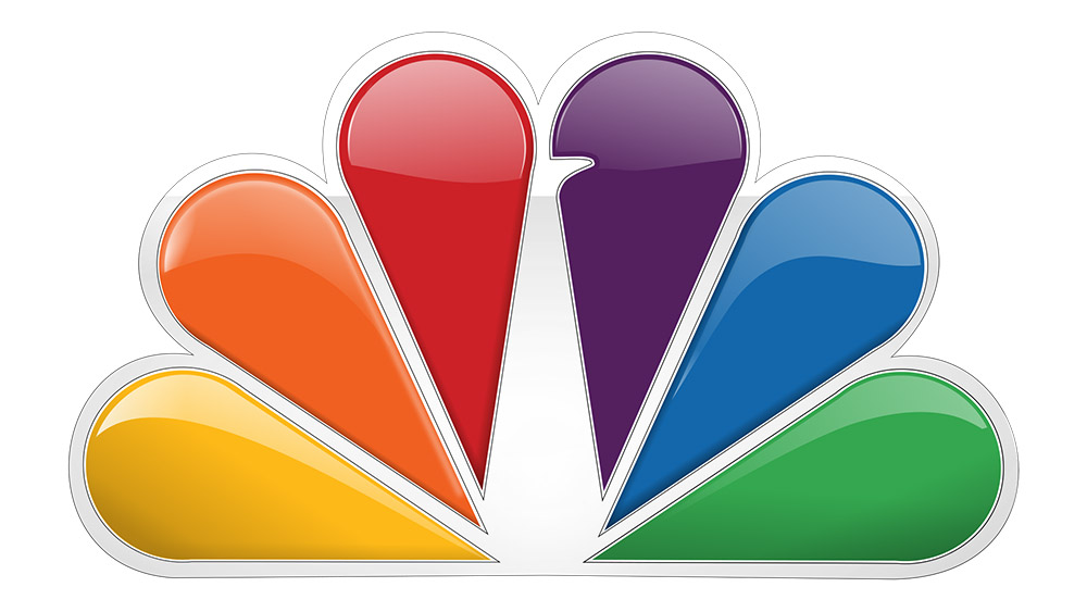
Even the most subtle use of negative space can be incredibly effective. For NBC, it only takes a little notch to transform six rainbow-coloured droplets into a peacock
Smart use of negative space in a mark can raise a smile, using wit to aid brand recognition. As discussed, FedEx is an oft-cited example of smart negative space used in a purely typographic mark, but there are plenty of stand-out examples of symbols employing it too.
Used cleverly and appropriately, negative space can also pack extra meaning into a logo design, reinforcing the theory that simplification through subtraction can lead to a more memorable brand mark.
05. Make use of wit and humour
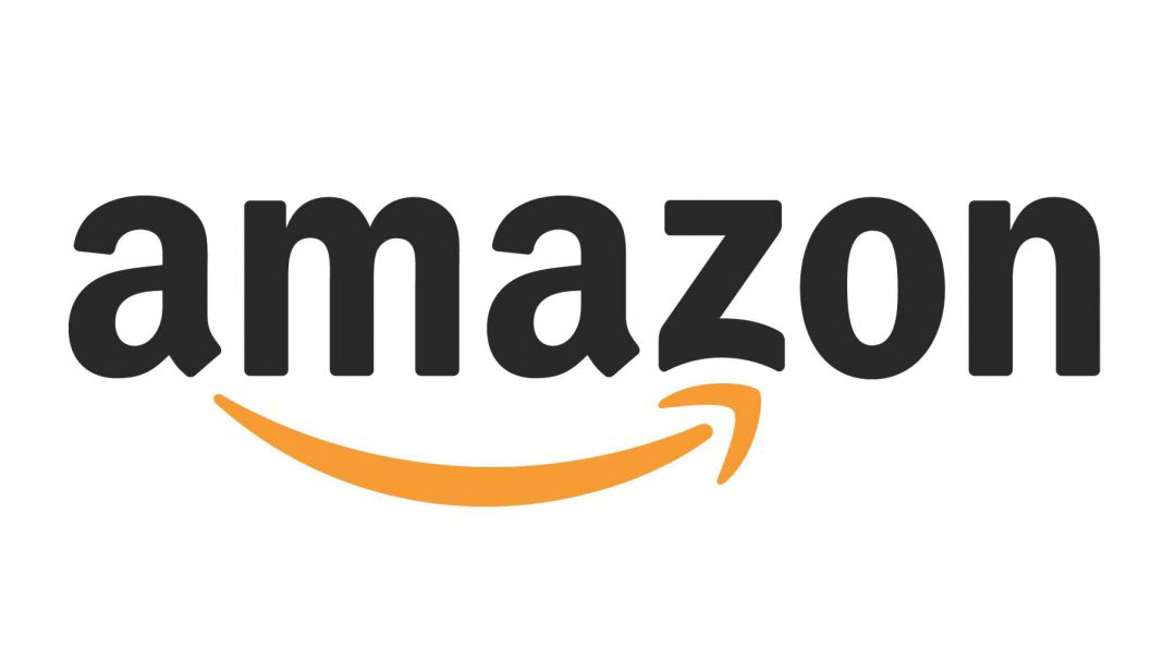
Turner Duckworth’s Amazon logo is an oft-cited example of cheeky wit in branding
Negative space is just one way to raise a knowing smile. The late, great Alan Fletcher, founding partner of Pentagram, was one of the leading pioneers in employing simple wit in graphic design, a practice that lends itself beautifully to logo design in particular.
Originally written by Beryl McAlhone and David Stuart and revised and updated by Nick Asbury and Greg Quinton at The Partners (now Superunion), seminal design book A Smile In The Mind: Witty Thinking in Graphic Design is an ideal reference if you’re keen to introduce wit and charm in your work, packed with inspirational examples from the world’s leading exponents, including Fletcher.
As Quinton and Asbury say in their introduction to the 2016 version: “Wit is big business, integral to the success of giants such as Google, Apple and Coca-Cola… wit is the alchemy that turns suitcases into adventure vehicles, vacuum cleaners into household friends.”
Next page: Colour theory in logo design
The psychology of colour is fascinating, and plays a pivotal role in building a brand association, whether you’re crafting a symbol-based logo or a wordmark.
Here are five logo design tips to help you employ colour theory in your work.
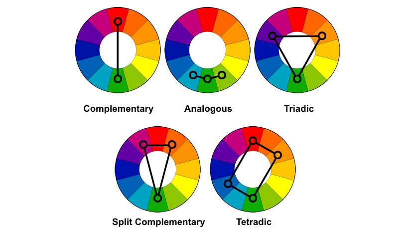
01. Understand the colour wheel
At the core of colour theory is the colour wheel, an essential tool for combining colours in different ways that was originally sketched by Sir Isaac Newton in 1666. The most common version features 12 colours, based on the ‘RYB’ colour model.
Here, the primary colours are red, yellow and blue, with the three secondary colours (green, orange and purple) created by mixing two primary colours. Finally, six tertiary colours are created by mixing primary and secondary colours.
The colour wheel basics explained
There are six main techniques for creating pleasing colour harmonies using a colour wheel. Complementary colours are opposite each other on the wheel (such as red and green, eg. Heineken, or blue and yellow, eg. IKEA, which tweaked its logo design very slightly in 2019); analogous colours sit next to each other on the wheel; and triadic colours involve three evenly spaced colours around the wheel.
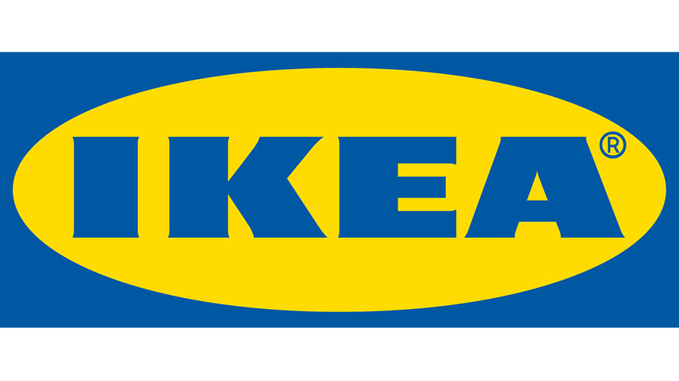
IKEA’s complementary colour scheme is instantly recognisable, and makes for a punchy, high-contrast logo design
Other schemes include split-complementary (which uses two colours adjacent to the main base colour’s complement); rectangular, a four-colour scheme based around two complementary pairs; and finally square, another four-colour scheme where, unlike rectangular, the colours are evenly spaced.
02. Manage colour schemes carefully
Many of the colour harmonies above require careful management in order to be successful in a logo design, and colours often shouldn’t be used in equal quantities.
Complementary colours can be too intense if used excessively, for instance, while analogous schemes have the opposite problem: they are gentle and pleasing to the eye, but lacking in contrast – and you should select a dominant colour, using the others as support and accent colours only.
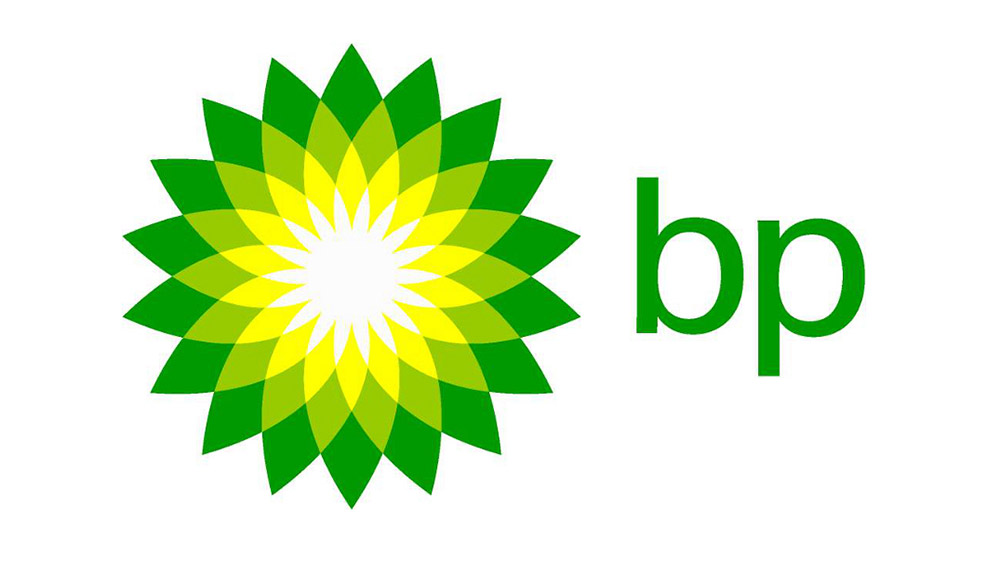
Landor’s rebrand of BP attracted its fair share of controversy for ‘greenwashing’ the oil giant, but one thing’s for sure: it’s a great example of an analogous colour scheme
Triadic schemes are much more vibrant, but again pick one dominant colour of the three. For beginners, it’s often safest to opt for a split-complementary scheme as there’s a good natural balance of contrast and harmony.
Rectangular and square schemes are both relatively versatile given the extra colour to play with, but again one should always be dominant – and you should pay particular attention to the balance between warm and cool colours.
03. Use colour to control mood
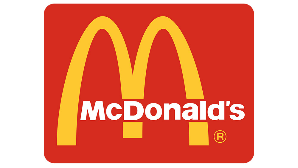
Like BP, McDonald’s is an example of an analogous colour scheme – but on the warm side of the spectrum, to invoke feelings of happiness and fun
Your choice of colour palette can make or break a logo design, partly for simple aesthetic reasons, but also because of the psychological associations of colours – which we touched on briefly as part of the Bauhaus theory on the previous page.
On a simple level, colours on the warm side of the spectrum – such as red and yellow – are bold, uplifting and energetic, while their cooler counterparts, blue and green, exude calmness and feel more reserved.
This is particularly relevant when it comes to branding: on an emotional level, in terms of how consumers feel when they look at it; but also on a practical level, in terms of market standout.
Read our designer’s guide to using colour in branding for more on this.
04. Research sector-specific colour trends
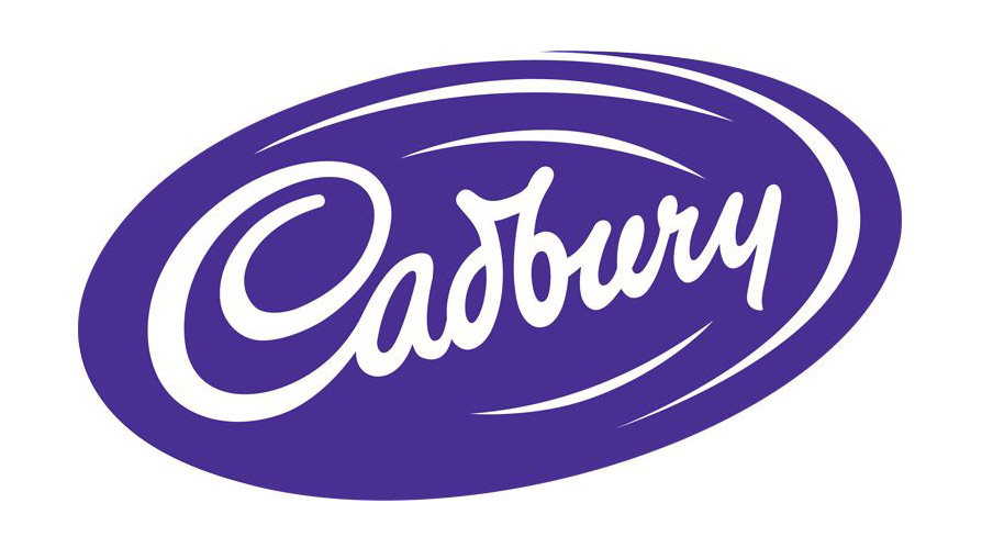
Sometimes ownership of a colour becomes a legal matter, as in Cadbury’s battles with Nestle to protect the use of its distinctive shade of purple
A brand 'owning' a colour in its sector can provide an enormous competitive advantage, achieving instant recognition – in some cases even without a logo, or even a mention of its name.
Of course, owning an entire colour isn't easy, and it goes way beyond the logo design: skilful planning and execution is needed across all elements of the brand and its advertising.
Depending on the popularity and market saturation of a particular colour, we could be talking as specific as an officially registered Pantone shade (such as Cadbury 2685C), or as general as being the only brand in competitive set to use that colour.
In order to achieve colour-based standout in any given market sector, the first step is to understand what the prevailing trends are – blue, for instance, is commonly used in the financial sector, while green is frequently found in branding for environmental organisations. Sometimes it pays to avoid the obvious.
05. Don’t forget black and white
Designed by Italian graphic artist Francesco Saroglia, the Woolmark logo is a triumph of monochromatic design, and is lauded as one of the greatest logos of all time
After all this talk of colour, it’s easy to forget that some of the world’s most iconic logo designs are purely monochrome, and make powerful use of the stark contrast that this palette affords.
Of course, even if your primary logo design is in glorious technicolour, it still needs to work effectively in black-and-white for different applications.
If your logo design uses colour to convey meaning, think about how you can reflect that meaning when the colour is removed. Sometimes this may mean changing the contrast between different elements of your design so that they still convey meaning when reproduced in monotone.
Next page: Putting your logo design into practice
Logos don’t exist in isolation: they need to be applied. Once you’ve perfected your logo design, the final stage is to bring it to life as part of a wider branding scheme.
Here are five logo design tips to get this important final stage spot-on.
01. Always get a second opinion
Logo for the Brazilian Institute of Oriental Studies. Presented without comment
Don’t underestimate the value of a second (or third) pair of eyes to identify things that you might have missed during the design stage. Once you’ve worked up your logo design concept, always make the time to sense-check it for unforeseen cultural misunderstandings, innuendos, unfortunate shapes and hidden words and meanings (see our logo design fails for more examples).
Many design studios advocate pinning work-in-progress up on the walls to enable constant peer review, but if you’re a lone freelancer then try to find some trusted peers to cast an eye over your work – and return the favour, of course.
02. Develop the rest of the brand world
A logo design is just one small component of a branding scheme – and should be developed in tandem with other activation points as part of a wider ‘brand world’.
This term is integral to the branding process at London agency SomeOne. And as co-founder Simon Manchipp sets out in the video interview with Computer Arts above, it’s much better to achieve coherence between different elements than simply consistency.
“Consistency is solitary confinement – the same thing every day,” he laments. “Cohesive is different: a more flexible, smarter way of doing things.”
03. Consider how to bring it alive
In the modern branding marketplace, a static logo that sits quietly in the corner of a finished piece of design work is often not enough. Consider how your logo design could come alive in motion for digital applications, and collaborate with animation or motion graphics specialists if necessary to explore its potential.
Here are a couple of examples of logos brought to life through animation: firstly, Function Engineering by Sagmeister & Walsh, which adds a playful, Meccano-like twist to the mark. Note that Sagmeister & Walsh is no more, see our story on new studio &Walsh.
And secondly, the University of the Arts Helsinki by Bond, which bends, twists and distorts to enhance the dynamic, modern feel of the type-led logo.
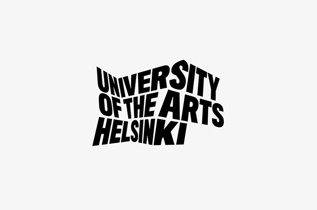
University of the Arts Helsinki’s animated logo twists and jumps
As VR trends continue to evolve, more advanced immersive brand experiences are becoming increasingly accessible, and in recent years branding agencies have also explored the potential in generative design and user participation to introduce a much more dynamic, unpredictable component to logo design.
This is not always possible, of course, but keep an open mind and experiment with new techniques when you can.
04. Help your client roll it out
Thorough brand usage guides should cover everything from colour options, to minimum and maximum sizes at which logo designs should be used, positioning rules, spacing – including exclusion zones from other design elements – and any definite no-nos, such as stretching or distorting. See our favourite style guides to see how it's done.
Some agencies swear by them to ensure a smooth, consistent handover to a client’s in-house team; others feel they can be overly restrictive and prescriptive.
05. Deal with public criticism
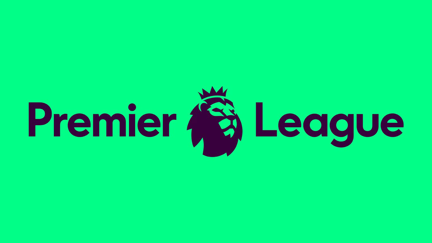
Like Airbnb the previous year, DesignStudio’s high-profile rebrand of Premier League attracted more than its fair share of criticism from traditionalist football fans
Over the last few years, social media has become more prevalent, and every man and his dog has developed an opinion about design. Accordingly, this final point has developed from an occasional annoyance into something that anyone working on a relatively high-profile rebranding exercise should bear in mind.
As we’ve set out above, a great branding scheme is about much more than just a logo design, but on platforms such as Twitter, when a newly released project is often encapsulated by a single image, this is often the first and only thing the public jumps upon.
London-based DesignStudio has experienced this backlash several times in the last couple of years, first with Airbnb and more recently Premier League – it explains how it deals with social media criticism in the video clip above.
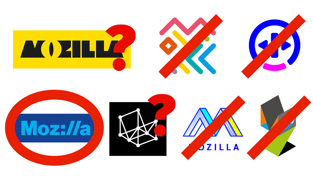
Johnson Banks’ open-source Mozilla rebrand whittled down various creative routes in the public eye, taking feedback on board
Johnson Banks embraced the growing interest in design, and harnessed it during the design process itself in a hugely ambitious, fully open-source rebrand of Mozilla – involving the public at key stages of the process and enabling them to steer the creative routes chosen. Firefox also took a similar route in 2018, and asked the public to help pick its new logo.
Be thick-skinned: take valuable feedback on board, and let the rest wash over you.
Related articles:
The best audio logos and why they workWhere to find logo design inspiration5 logo redesigns that got it right


Leave a Reply
Want to join the discussion?Feel free to contribute!