Learn How to Create Flip Cards using CSS
Original Source: http://feedproxy.google.com/~r/1stwebdesigner/~3/FBnASHTr8BI/
In this tutorial you will learn how to create blog post cards that flip on hover revealing the post excerpt on the back of the card. We will achieve this effect using CSS. The end result is responsive, making the card flip on click, on mobile devices. This GIF shows what you will be able to create by the end of this tutorial.
You need to have basic knowledge of HTML and CSS to begin with. We will explore a few advanced CSS topics such as perspective and transform towards the end. Let’s dive in.
Setting up
Create a blank HTML document and name it index.html. Add the basic HTML skeleton. If you use Visual Studio Code, all you need to do is type “!” and hit enter. You will end up with this.
<!DOCTYPE html>
<html lang="en">
<head>
<meta charset="UTF-8">
<meta name="viewport" content="width=device-width, initial-scale=1.0">
<title>Document</title>
</head>
<body>
</body>
</html>
I have used the font ‘Lato’ – with font weights 300 and 700. So add the following line below the title tag to embed this font using Google fonts.
<link href="https://fonts.googleapis.com/css2?family=Lato:wght@400;700&display=swap" rel="stylesheet">
Create your stylesheet and name it style.css. Link the stylesheet to your HTML document below the Google fonts CDN link using
<link rel="stylesheet" href="style.css">
I have used these three blog post images from Pexels – post1.jpg, post2.jpg and post3.jpg. You can download the same or choose to include your own. But don’t forget to name them post1.jpg, post2.jpg and post3.jpg.
A single flip card
Once the setup is done, let’s first create a single card that flips – with a front face and a back face. The card flip effect shown in the above GIF happens when the element is rotated 180 degrees along the Y-axis. To create the 3D effect, we need a 3D space for that element by adding perspective to its parent. Look at the difference between 2D effect and 3D effect.

2D Effect
3D Effect
Do you see that the card actually moves out of its space to give you depth effect in 3D? The CSS property perspective helps us do just that. Let’s say we add perspective:20px to the parent. This gives a depth of 20px to that element. This means, a 3D space is created – so the child elements can be moved near or far or can be rotated to give the 3D effect. Let’s create the markup first.
HTML
We need a parent div to add perspective. And then a child element that contains both the front face and back face absolutely positioned. So add this markup in your index.html within the body tag.
<div class="post-wrap"> <!– The parent element –>
<div class="post"> <!– Child element that flips –>
<div class="post-front">
Front face
</div>
<div class="post-back">
Back face
</div>
</div>
</div>
CSS
In style.css, begin with some common styles for all elements:
* {
margin: 0;
padding: 0;
box-sizing: border-box;
}
Add the following styles to html and body:
html, body {
width: 100%;
height: 100%;
}
body{
background-color: #f7fafc;
font-family: ‘Lato’,sans-serif;
font-size: 1rem;
color: #444444;
}
To the post-wrap element, add width, height and perspective.
.post-wrap {
width: 320px;
height: 420px;
perspective: 1000px;
}
Imagine this as a box where perspective is the depth of that box. Next, style the .post div to occupy the full space of its parent.
.post {
position: relative; /* Required to absolutely position the child faces */
width: 100%;
height: 100%;
}
Let’s add styles to the two faces.
.post-front, .post-back {
position: absolute;
width: 100%;
height: 100%;
background-color: white;
}
You will see both of them placed one on top of the other. (You cannot actually see them both. Only the back face is visible. On using the browser inspector tool, you can see that they are positioned on top of each other). But we need the back face to be facing backwards – which means, it needs to be rotated 180 degrees on the Y axis. So add this:
.post-back {
transform: rotateY(180deg);
}
This is what you will see in your browser now.
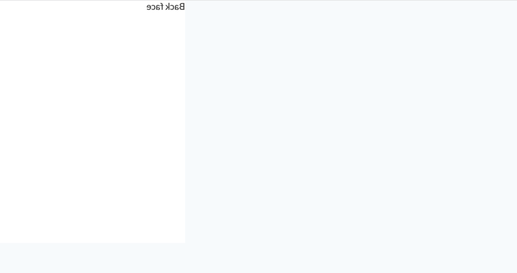
So the element has turned backwards but the text still appears – as if it’s a glass. We don’t want the back of the element to appear. For that, we use backface-visibility: hidden;. In Safari browser, this works with a -webkit- prefix. Add these now:
.post-front, .post-back {
/* Existing styles here */
-webkit-backface-visibility: hidden;
backface-visibility: hidden;
}
Now you can only see the front face – just the way we want. Next, we need to rotate the post div when the parent is hovered.
.post-wrap:hover .post {
transform: rotateY(180deg);
}
If you check your output now, you will see that the card does rotate but we don’t see any animation or 3D effect. That’s because we haven’t added the most important properties required for these – the transition and transform-style properties.
.post {
/* Existing styles here */
transition: transform 1s;
transform-style: preserve-3d;
}
It’s perfect. We have our flip card ready. It’s time to add our blog post’s content in the markup.
HTML
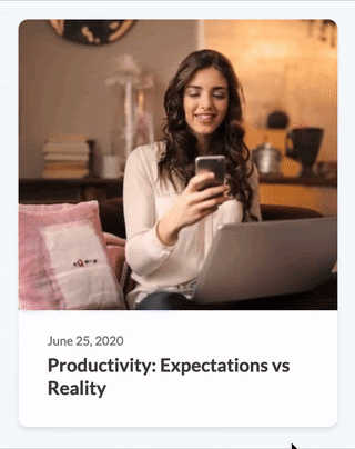
Add the background image, date and title in the front face.
<div class="post-front">
<div class="post-img" style="background-image: url(‘post1.jpg’);"></div>
<div class="post-info">
<span>June 25, 2020</span>
<h2>Productivity: Expectations vs Reality</h2>
</div>
</div>
The title, excerpt and “Read more” button on the back face.
<div class="post-back">
<div class="post-except">
<h2>Productivity: Expectations vs Reality</h2>
<p>
Et hinc magna voluptatum usu, cum veniam graece et. Ius ea scripserit temporibus, pri cu harum tacimates neglegentur. At adipisci incorrupte nam. Cu qui sumo appareat constituto, possit phaedrum inciderint ex usu, quis ignota cotidieque nam ea. Cum deserunt periculis ocurreret.
</p>
</div>
<a href="#">Read More</a>
</div>
Let’s style this single card.
CSS
Add rounded corners and shadow.
.post-front, .post-back {
/* Existing styles here */
border-radius: 10px;
box-shadow: 0 4px 6px -1px rgba(0, 0, 0, 0.1);
}
Front face styles.
.post-img {
background-size: cover;
background-position: center;
height: 300px;
border-top-left-radius: 10px;
border-top-right-radius: 10px;
}
.post-info {
padding: 20px 30px 30px;
}
.post-info span {
font-size: 0.8rem;
color: #808080;
}
.post-info h2{
font-weight: bold;
font-size: 1.2rem;
padding-top: 5px;
}
Back face styles.
.post-back {
background-color: #ffffff;
padding: 30px;
display: flex;
flex-direction: column;
justify-content: space-between; /* To push the read more button to bottom */
align-items: flex-start; /* To position the read more button at the left */
}
.post-back h2{
font-weight: bold;
font-size: 1.2rem;
padding-top: 5px;
}
.post-back p {
margin-top: 10px;
line-height: 1.6;
}
.post-back a{
text-decoration: none;
color: #ffffff;
background-color: #5678ba;
padding: 10px 14px;
text-transform: uppercase;
letter-spacing: 0.05em;
font-size: 0.8em;
font-weight: bold;
border-radius: 5px;
}
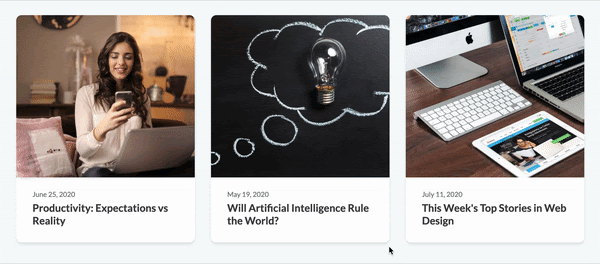
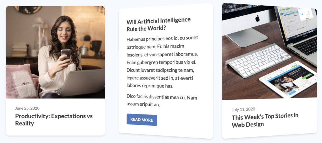
This does it. We have our single card perfected. Add two more cards in the markup, wrap all the cards within a flex container and add styles to center them. Below is the markup and CSS for the same.
HTML
<div class="container">
<div class="post-wrap"> <!– The parent element –>
<div class="post"> <!– Child element that flips –>
<div class="post-front">
<div class="post-img" style="background-image: url(‘post1.jpg’);"></div>
<div class="post-info">
<span>June 25, 2020</span>
<h2>Productivity: Expectations vs Reality</h2>
</div>
</div>
<div class="post-back">
<div class="post-except">
<h2>Productivity: Expectations vs Reality</h2>
<p>
Et hinc magna voluptatum usu, cum veniam graece et. Ius ea scripserit temporibus, pri cu harum tacimates neglegentur. At adipisci incorrupte nam. Cu qui sumo appareat constituto, possit phaedrum inciderint ex usu, quis ignota cotidieque nam ea. Cum deserunt periculis ocurreret.
</p>
</div>
<a href="#">Read More</a>
</div>
</div>
</div>
<div class="post-wrap">
<div class="post">
<div class="post-front">
<div class="post-img" style="background-image: url(‘post2.jpg’);"></div>
<div class="post-info">
<span>May 19, 2020</span>
<h2>Will Artificial Intelligence Rule the World?</h2>
</div>
</div>
<div class="post-back">
<div class="post-excerpt">
<h2>Will Artificial Intelligence Rule the World?</h2>
<p>
Habemus principes eos id, eu sonet patrioque nam. Eu his mazim insolens, et vim saperet laboramus. Enim gubergren temporibus vix ei. Dicunt iuvaret sadipscing te nam, legere assueverit sed in, at everti labores.
</p>
<p>
Dico facilis dissentias mea cu. Nam assum eripuit an.
</p>
</div>
<a href="#">Read More</a>
</div>
</div>
</div>
<div class="post-wrap">
<div class="post">
<div class="post-front">
<div class="post-img" style="background-image: url(‘post3.jpg’);"></div>
<div class="post-info">
<span>July 11, 2020</span>
<h2>This Week’s Top Stories in Web Design</h2>
</div>
</div>
<div class="post-back">
<div class="post-except">
<h2>This Week’s Top Stories in Web Design</h2>
<p>
Scaevola definitiones eum et. Assum postulant periculis per ei. Doming scribentur sea an. Eum verear docendi tincidunt in.
</p>
<p>
Ne duo posse deserunt, at eam euismod torquatos, est velit essent in. Et diam meliore cotidieque vim. Dicit ignota repudiandae ei pri.
</p>
</div>
<a href="#">Read More</a>
</div>
</div>
</div>
</div>
CSS
.container {
max-width: 1200px;
margin: auto;
padding: 60px;
display: flex;
justify-content: center;
flex-wrap: wrap; /* Required to position the posts one below the other on smaller devices */
}
.post-wrap {
/* Existing styles here */
flex: 1;
margin: 0 15px 30px;
}
Now the only pending part is to make this responsive. Just change the fixed width of .post-wrap to min-width and max-width instead.
.post-wrap {
/* Existing styles here */
min-width: 300px;
max-width: 380px;
}
And we did it! Resize your browser to see how the posts position themselves on different screen sizes.
In this tutorial, we used the flip card effect for blog posts. You can get creative and use this to display team profiles, portfolio items or anything really. Just in case you didn’t get the expected output, here is the complete source code for you.
DOWNLOAD SOURCE CODE


Leave a Reply
Want to join the discussion?Feel free to contribute!