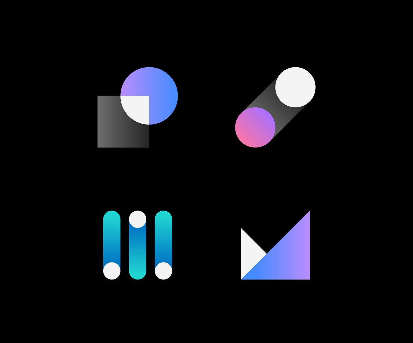
IBM App Icon Design & Visual Language
Original Source: http://feedproxy.google.com/~r/abduzeedo/~3/DEOUrdt1yJQ/ibm-app-icon-design-visual-language-0
IBM App Icon Design & Visual Language

AoiroStudio03.04.21
Peter Garvin is working as a designer at IBM from specifically from the Brand Experience and Design Team. He shared a series of very cool series of iconography from their IBM Design Language. Divided into four categories: Stroke app icons, Fill app icons, IBM Plex app icons, and Hero brands. The visual direction is a mixture of minimal approaches coming together with gradients and shades. I think it’s a very intriguing direction compared to the past years and it’s nice to see it applicable either on light or dark theme to accommodate all sorts of use cases. Definitely worth checking it out!
More about ibm.com/design/language/
Credits
IBM Brand Experience & Design


Leave a Reply
Want to join the discussion?Feel free to contribute!