How to master colour theory
Original Source: http://feedproxy.google.com/~r/CreativeBloq/~3/ag5mUpLgq3k/colour-theory-11121290
Colour is such a pervasive part of everything we visually encounter in the world, that for many designers it becomes an intuitive choice. If you think back to school though, you'll recall being told at a young age that there are three 'primary' colours – Red, Yellow, and Blue. We were all taught that any colour can be created by mixing these three colours in varying quantities.
It turns out that this isn't quite right (although it's still workable enough in practice to be taught the world over to five-year-olds).
Get Adobe Creative Cloud
How colour is formed
Colour theory stretches back to at least the 15th century
Understanding how colour is formed and, more importantly, the relationships between different colours, can help you to use colour more effectively in your designs.
The Bauhaus school understood this in the 1920s and 1930s, with staff and students going on to develop colour theories for evoking particular moods and emotions through choice of palette in design and architecture.
The theory of colour is a discipline that stretches back much further than that – at least to the 15th century – and encompasses physics, chemistry and mathematics to fully define and explain the concepts. However, much of this is unnecessary to being able to use colour effectively.
This quick primer will give you a handy overview of all the important aspects to help you start making informed decisions.
Colour systems
There are two primary colour systems – methods by which colour is reproduced: additive and subtractive (also known as reflective). We use both on a daily basis – the screen you’re reading this article on uses additive colour to generate all the colours you see, while the book you’re reading uses subtractive colour for its front cover.
In simple terms – anything that emits light (such as the sun, a screen, a projector, etc) uses additive, while everything else (which instead reflects light) uses subtractive colour.
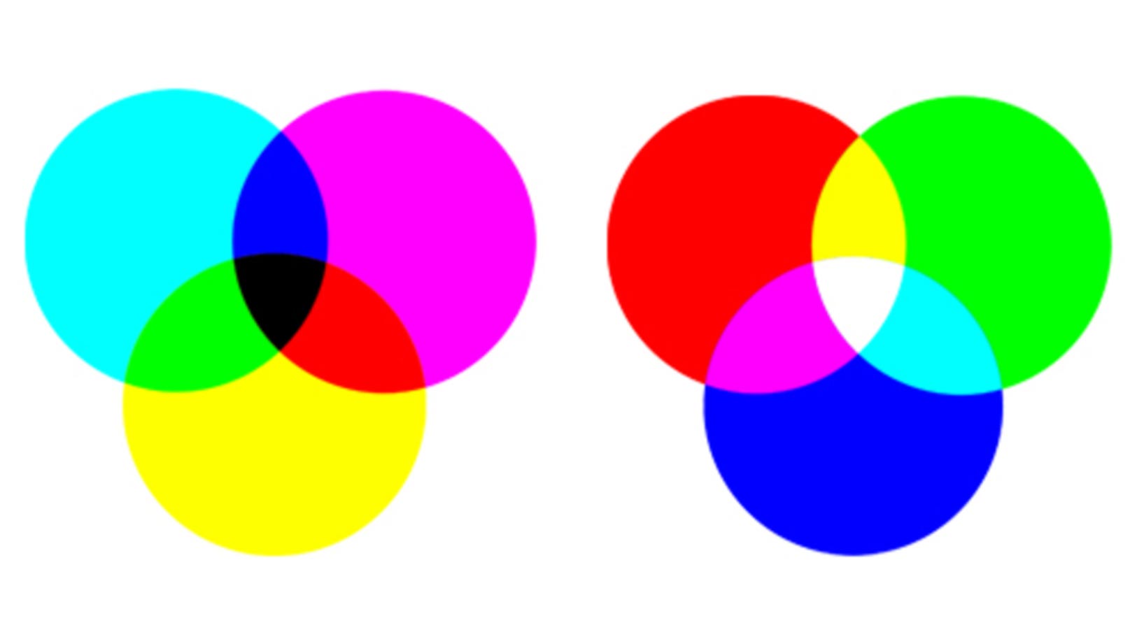
01. Additive
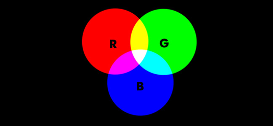
Additive colour is based on red, green, and blue – RGB for short
Additive colour works with anything that emits or radiates light. The mixture of different wavelengths of light creates different colours, and the more light you add, the brighter and lighter the colour becomes.
When using additive colour, we tend to consider the building block (primary) colours to be Red, Green, and Blue (RGB), and this is the basis for all colour you use on screen. In additive colour, white is the combination of colour, while black is the absence of colour.
02. Subtractive
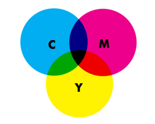
Subtractive colour is based on cyan, magenta, and yellow
Subtractive colour works on the basis of reflected light. Rather than pushing more light out, the way a particular pigment reflects different wavelengths of light determines its apparent colour to the human eye.
Subtractive colour, like additive, has three primary colours – Cyan, Magenta, and Yellow (CMY). In subtractive colour white is the absence of colour, while black is the combination of colour, but it’s an imperfect system.
The pigments we have available to use don’t fully absorb light (preventing reflected colour wavelengths), so we have to add a fourth compensating pigment to account for this limitation.
We call this “Key”, hence CMYK, but essentially it’s black. Without this additional pigment, the closest to black we’d be able to render in print would be a muddy brown.
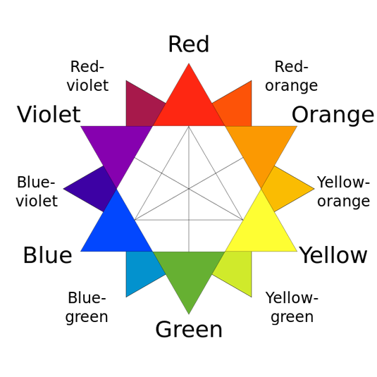
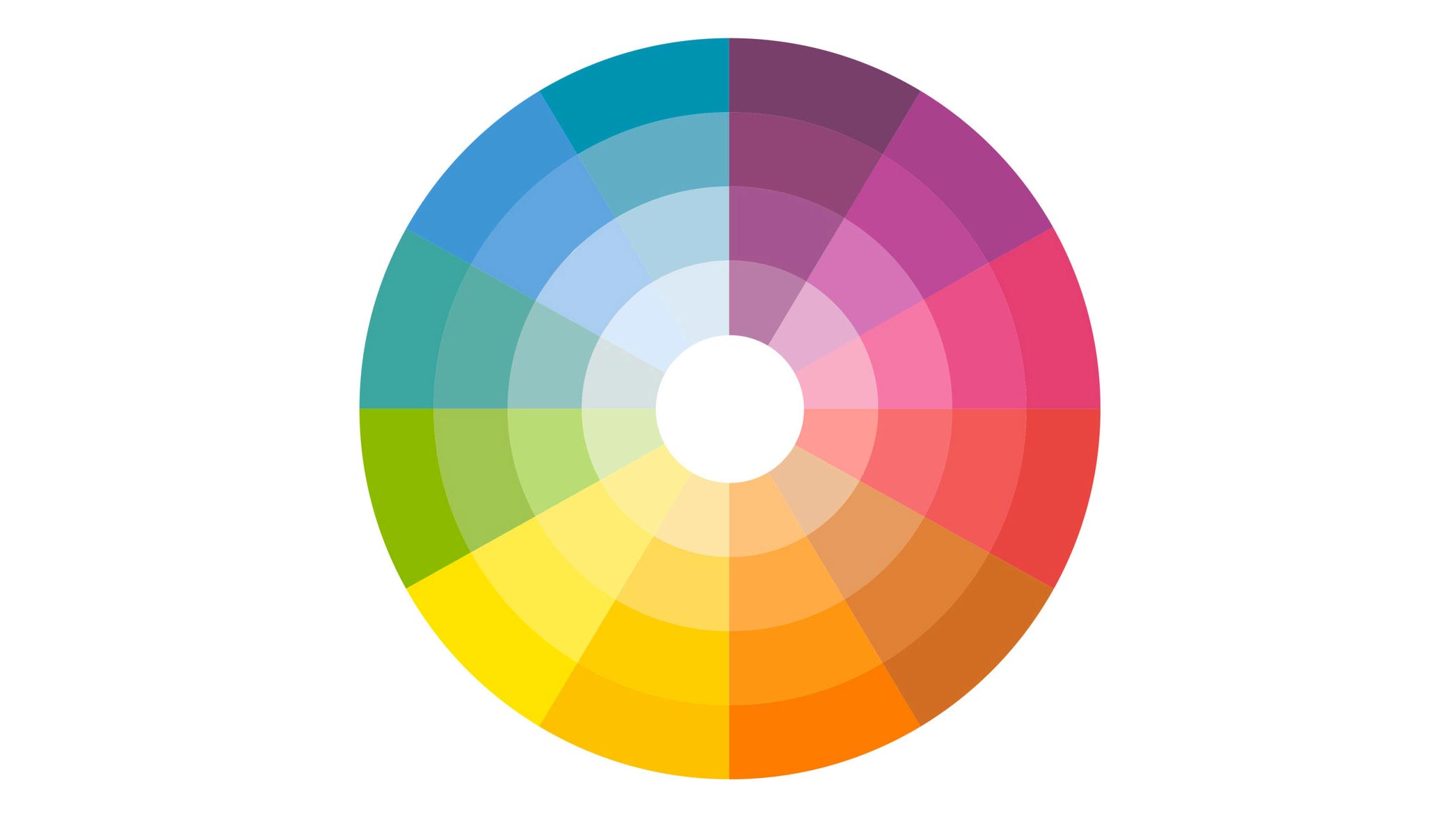
The colour wheel
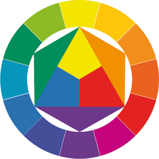
The modern colour wheel has been in use since the 18th century
In order to make it easier to see the relationship between different colours, the concept of the modern colour wheel was developed around the 18th century. These early wheels plotted the different primary colours around a circle, mixing different primary colours together in strict ratios to achieve secondary and tertiary colours.
The colour wheel allows us to see at a glance which colours are complementary (opposite each other on the wheel), analogous (adjacent to each other on the wheel), triadic (three colours positioned at 120 degrees on the wheel from each other) and so on.
Each of these relationships can produce pleasing colour combinations. There are many more pleasing relationships between colours based on their position on the wheel. There are free apps for picking a colour scheme, or you could use your designer's eye to pick your own. Click through to the next page for a little help on this.
Next page: the three components of colour, colour gamut, and more…
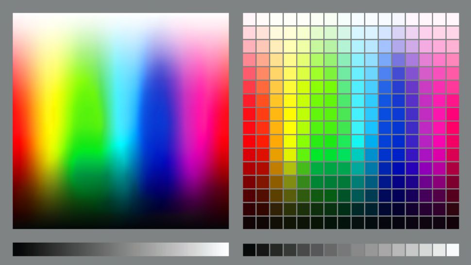
The three components of a colour
The three component parts that help us define a colour are hue, saturation and brightness
Yellow is yellow is yellow, right? Well, actually, no; there are many different colours we could refer to as yellow. Different shades or tints, saturations and hues are all possible while still being within the yellow part of the colour wheel. As a result, there are three primary component parts that help us define a colour:
01. Hue
This is the position on the colour wheel, and represents the base colour itself. This is typically referred to in degrees (around the colour wheel), so a yellow colour will appear between 50 and 60 degrees, with the perfect yellow appearing at 56 degrees. Green, meanwhile, appears at 120 degrees on the wheel at so on.
02. Saturation
This is a representation of how saturated (or rich) a colour is. Low saturation results in less overall colour, eventually becoming a shade of grey when fully desaturated. Saturation is normally referred to as a percentage between 0 and 100%.
03. Brightness
This is how bright a colour is, typically expressed as a percentage between 0 and 100%. A yellow at 0% brightness will be black, while the same yellow hue and saturation at 100% brightness will be the full yellow colour.
Colour gamut
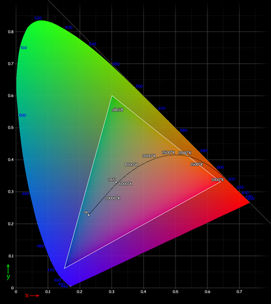
Colour gamut describes the range of potential colours a system can reproduce
Colour gamut is a way of describing the full range of potential colours a system can reproduce. It may surprise you to learn that the range of colours achievable in CMYK is different to that you can achieve with RGB.
This is partially because of the nature of the two different systems, but also (in the real world at least) as a consequence of limitations in our technology – screens aren’t always capable of producing the same range of colours as each other, and pigments reflect light at a non-uniform rate as you reduce their saturation.
Colour perception
Finally, it’s worth looking at how different colours can affect the way we perceive other colours. A typical illustration of this features a mid-grey tone placed over a light grey background, and the same mid-grey tone shown over a dark grey background.
The apparent brightness of the mid-grey is altered according to the context in which you see it – a trick of the eye, working to make sense of its surroundings. Hues works in the same way as tones when placed adjacent to other colours, allowing you to create different effects using the same palette of colours.
Further reading
There's more to explore in the world of colour, which is why we've got a tag for all of our articles on the subject of colour. Visit creativebloq.com/tag/colour to explore our latest colour articles, or read some of these highlights below.
01. The designer’s guide to using colour in branding
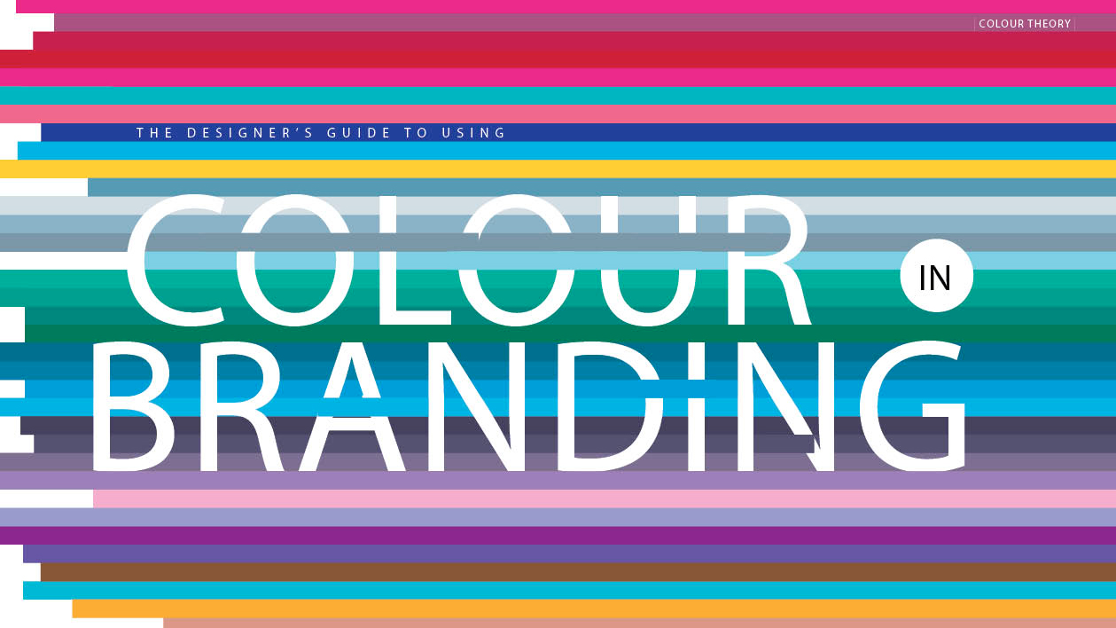
Colour sells. Whether you’re working with a product, service or space, the ‘right’ combinations of colours can influence how someone feels, thinks and behaves – with powerful results.
What are the ‘right’ combinations, and how can designers sidestep subjective debates to harness the power of colour more effectively in branding projects? Computer Arts magazine takes a look in this guide, speaking to experts in colour branding and looking at tools to help you make the right choices.
02. How to pick the perfect colour palette every time

In the 1980s, colour psychologist Angela Wright identified links between patterns of colour and patterns of human behaviour. She went on to develop the Colour Affects System, which identifies links between four colour groups and four basic personality types, based on original research involving Aristotle, Newton and German writer Johann Wolfgang von Goethe.
If harnessed correctly, designers can use the Colour Affects System to control the message of their colour palettes and, crucially, kill subjective debate around colour in client meetings with evidence to back up their decisions. This guide from Computer Arts magazine's colour issue explains how it works…
03. How to manage colours in Photoshop
This article provides a great overview for users who are new to colour management, with practical advice for managing colours in Photoshop.
It explores how to convert your images from RGB to CMYK mode, and the effect this will have on the colours within your image; how to customise your colour settings to suit your particular needs; and how to sync your colour profile across all of your Adobe CC apps, add a particular colour profile provided by your printer, and preview a CMYK version of your design without losing any RGB information.
Get Adobe Creative Cloud
04. 10 colour management terms designers need to know
Getting your colours right means getting your head around some tricky terms. There are a number of jargon terms that might baffle you – so we've put together this handy guide.
Have a read, and you'll soon be able to sort your spectrophotometer from your tristimulus colorimeter…
05. 4 ways to master colour in logo design
Colour is a universal language in design. It can help convey a brand’s personality, create market standout, and evoke an emotional response. This article reveals four ways to work with colour more effectively in your logo design work…
06. Outstanding uses of colour in branding

Successfully 'owning' a colour is a big deal. With this in mind, we've explored how different brands around the world have staked their respective claims to 10 colours – in some cases with considerable success.
07. The best colour tools for web designers
For web designers, one of the most important choices to make is over colour selections. Choose the wrong ones, and you might just lose out on an opportunity.
But how do you know which colours work well together? To help with the important task of colour selection, this article points you in the direction of some of the best free colour tools on the web (plus one special bonus at the end for Mac users).


Leave a Reply
Want to join the discussion?Feel free to contribute!