How to create animations using only CSS and @keyframes
Original Source: https://1stwebdesigner.com/how-to-create-animations-using-only-css-and-keyframes/
This article was originally posted at https://christinatruong.medium.com/how-to-create-animations-using-only-css-and-keyframes-9b282289e70 and was kindly shared by Christina Truong. Check out more of her work at https://christinatruong.com.
Adding dynamic elements to your website usually requires JavaScript. But the animation property and the @keyframes rule can be used to add animation effects using only CSS!
Prefer to watch a video? This article is a companion piece to my Decoded by Christina series on YouTube.
Your Web Designer Toolbox
Unlimited Downloads: 500,000+ Web Templates, Icon Sets, Themes & Design Assets

DOWNLOAD NOW
What is @keyframes?
Before we get too deep into the animation properties, let’s take a step back and talk about how to create the actual animation itself. CSS properties are used to define styles. CSS at-rules are statements used to provide CSS instructions.
For animations, the @keyframes rule is used to define the sequence of the animation and which styles are to be animated.
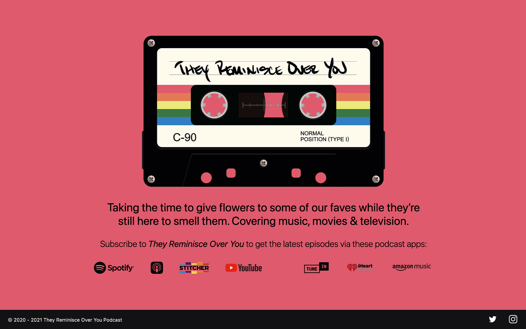
Let’s look at an example. Below is a website I created for my podcast. It’s a pretty basic page so I wanted to add a little something to it. I used the same five colors, seen in the cassette tape in the logo, as the page’s background colors. With @keyframes I was able to cycle through the colors and make them fade between each change, on a continuous loop.
Previously, I’ve talked about using the transition property to animate style changes. But transition only allows you to have a start and end point. So in this example, I would have only been able to transition between two colors: one at the start and one at the end.
With @keyframes, more complex effects can be created by setting multiple points for your animations, which in this case, allows me to use as many colors as I want.
How to use @keyframes
To create this effect, start with the @keyframes keyword.
@keyframes
Then, name the animation with a unique identifier. I recommend choosing something descriptive. Instead using a generic name like “myAnimation” choose a name that describes what you’re creating. This can help you clearly see what the animation is being used for, just by looking at the name.
In my example, my animation effect was used to change the background color. So I could name that animation “colorChange” or “bgColorChange” to make it more specific.
@keyframes bgColorChange
Just like CSS class and ID names, the animation name cannot contain spaces. It can be written as one word or use a dash, underscore or camel casing to separate the words.
@keyframes bgcolorchange
@keyframes bg-color-change
@keyframes bg_color_change
@keyframes bgColorChange
These identifiers are case sensitive so each of these example names would be rendered as different names. So pick a style and be consistent. For me personally, I like to use dashes for my CSS class names and camel casing for @keyframes animation names.
Next, add the left and right curly brackets to contain the animation sequence and style rules.
@keyframes bgColorChange {
}
Then, define the sequence for the animation by using percentages or keywords. Since I have five colors to cycle through, I will need five animation points in my sequence. The start and end points are defined as 0% and 100%. Each will also be followed by a pair of curly brackets.
@keyframes bgColorChange {
0% {}
100 % {}
}
This step not only defines the interval points, it is also where the style rules will be added.
The keywords from and to can also be used instead of 0% and 100%.
@keyframes bgColorChange {
from {}
to {}
}
But I’ll stick with percentages for this example since I’ll need more keyframes to animate between all five colors. The remaining percentages can be set at 25%, 50% and 75%. Now I have 5 even animation intervals for each color change in my sequence.
@keyframes bgColorChange {
0% {}
25% {}
50% {}
75% {}
100 % {}
}
Since I only want the background color to change, I’ll use the background-color property. Just to make it easier to read for this example, instead of using the hex code values for my podcast brand colors, I’ll use similar color keywords for the demo: red, orange, yellow, green and blue. The style declarations added to each interval will be add using the same syntax that you would normally use to declare any other CSS styles.
@keyframes bgColorChange {
0% { background-color: red; }
25% { background-color: orange; }
50% { background-color: yellow; }
75% { background-color: green; }
100% { background-color: blue; }
}
It’s usually convention to put the curly brackets on their own line and the style rules in between. But when I’m only using one property, I like to leave it on one line. This is just a personal preference. It’s totally up to you.
selector {
property: value;
property: value;
}
selector { property: value; }
At this point, you won’t actually see any animations just yet because this part only creates the sequence. It still has to be initiated and defined using the animation property.
The animation property
animation is actually shorthand for eight sub-properties. Let’s take a closer look at each one.
animation-name
In the example, I want to apply the background-color changes to the whole page, so the style rule can be added to the body selector. The value of the animation-name property is the name of the @keyframes sequence created in the previous step. This is how the animation will be initiated.
body {
animation-name: bgColorChange;
}
@keyframes bgColorChange {
0% { background-color: red;}
25% { background-color: orange; }
50% { background-color: yellow; }
75% { background-color: green; }
100% { background-color: blue; }
}
animation-duration
One more property is still needed to be able to actually see the animation in action: animation-duration. This property is used to set the length of time it will take for the animation to complete one cycle. The value is set using the s unit for seconds or ms for milliseconds. It can be define with whole numbers or decimals.
animation-duration: 2s;
animation-duration: 2000ms;
animation-duration: 0.5s;
animation-duration: 500ms;
If the animation-duration for the background color change example is set to 10s, it will take 10 seconds (2 seconds for each color) to complete one cycle.
body {
animation-name: bgColorChange;
animation-duration: 10s;
}
@keyframes bgColorChange {
0% { background-color: red;}
25% { background-color: orange; }
50% { background-color: yellow; }
75% { background-color: green; }
100% { background-color: blue; }
}
Only animation-name and animation-duration are required to initiate and run the animation. But you may find that you will need to add some additional style rules.
If you want to follow along with the remainder of the examples, you can follow along with my CodePen example here.
animation-fill-mode
At the end of the example animation, the background color shows the default white background color. That’s because the animation only runs once. So when it’s done, there are no more colors to transition into.
The animation-fill-mode property can be used to control how a CSS animation is applied before and after its execution.
If I wanted the animation to hold onto the last color (blue), I can define this property using the keyword forwards to instruct the animation to retain the last keyframe value. Now, when the animation finishes, the browser will show the blue background color instead of the default white.
body {
animation-name: bgColorChange;
animation-duration: 10s;
animation-fill-mode: forwards;
}
@keyframes bgColorChange {
0% { background-color: red; }
25% { background-color: orange; }
50% { background-color: yellow; }
75% { background-color: green; }
100% { background-color: blue; }
}
To see all the available keyword values, refer to the MDN documentation.
animation-iteration-count
What if you want the animation to run more than once? You can do that with animation-iteration-count. This property is used to set the number of times an animation sequence will be played. Number values can be used to define the amount of times the sequence should run, or use the keyword infinite to set the animation to repeat forever.
/* <number> values */
animation-iteration-count: 4;
animation-iteration-count: 1.5;
/* Keyword value */
animation-iteration-count: infinite;
For the background color change, if the animation is set on an infinite loop, then we’ll no longer need the animation-fill-mode property because the animation now runs more than once.
animation-delay
Animations also start right away, as soon as you load the page. So if you want it to start later, use the animation-delay property to specify the amount of time to wait before beginning the animation. This property can also be defined using seconds or milliseconds. You can also use a negative number to start the animation partway through.
animation-delay: 3s;
animation-delay: 250ms;
animation-delay: -2s;
If you set the animation-iteration-count to infinite, any value declared with animation-delay will only be applied to the first iteration of the animation. When the animation loops, there will be no delay.
animation-direction
The animation-direction property is used to set the direction of the sequence.
normal is the default, which shows the animation playing in a forward cycle.
reverse will play it backwards.
alternate will play it forwards first, then play it backwards and alternate.
alternate-reverse will play it backwards first and then alternate.
If this property is applied to the background color example, it will change the direction of the color changes. For example, instead of cycling from red to blue and starting again at red, alternate will play it from red to blue then back to red and so on.
Try adding this property to the CodePen with the different values and see how it changes.
animation-play-state
The animation-play-state will allow you to pause or run the animation. This property is probably most useful when creating some kind of animation that requires user interaction.
animation-play-state: paused;
animation-play-state: running;
animation-timing-function
And the last one, animation-timing-function determines how the animation will progress through the cycle. Different values can be declared to vary the speed over the duration of the change from one style to the other. The keyword values are based on Bézier curves, specifically cubic Bézier curves, which uses four points to define the acceleration pattern.
For example, the linear keyword will animate at an even speed. ease-in-out will animate the property slowly at the beginning, speed up, then slow down at the end.
animation-timing-function: linear;
animation-timing-function: ease-in-out;
animation-timing-function can be used with many more keyword or function values, to create your own acceleration patterns. These values is very similar to the transition-timing-function property that I covered in a previous post about animation with the transition property. You can check out that video or post to see more about how these values work or view the examples in the MDN documentation.
Using animation and @keyframes with multiple styles
In the example I’ve been using so far, I’ve only created an animation with one CSS property, the background-color. But you can also animate multiple CSS properties at the same time. Let’s take a look at another example. This animation will create a bounce effect.
Right now, the setup is similar to the previous example, the background color is changing between keyframes: lightblue at the beginning and lightgreen at the end.
.circle {
width: 150px;
height: 150px;
background-color: lightblue;
border-radius: 50%;
position: absolute;
animation: bounce 1.5s ease-out 1s 10;
}
@keyframes bounce {
0% {
background-color: lightblue;
/* top: 0px; */
}
50% {
/* top: 250px; */
}
100% {
background-color: lightgreen;
/* top: 0px; */
}
}
To create a bounce effect and make it look like the circle in bouncing up and down, in addition to the color change, move the the circle up and down.
The position property is set to absolute in the .circle class declaration block, since that style won’t change. But in the @keyframes declaration, the top property will be used to change the position of the circle.
Though we can use multiple properties, the animation itself can only be applied to the same property. So if I want to move this circle down the page, I can’t start with top: 0; and move it to bottom: 0; because top and bottom are different properties. But, the element can be moved down by declaring a new top value. Here’s how:
Start with a value of 0px, so it can display at the top of its container.
At the 50% keyframe, set the value to 250px (or whatever number you want to reposition the circle to where you want it to be displayed).
At 100%, set the value back to 0px to move it back to the top of the container.
.circle {
width: 150px;
height: 150px;
background-color: lightblue;
border-radius: 50%;
position: absolute;
animation: bounce 1.5s ease-out 1s 10;
}
@keyframes bounce {
0% {
background-color: lightblue;
top: 0px;
}
50% {
top: 250px;
}
100% {
background-color: lightgreen;
top: 0px;
}
}
This will give the appearance of a bounce effect because it starts at the top of the container, moves 250px down halfway through and then ends back up at the top. Now the position and the background color of the circle is being animated at the same time.
See the Pen
animation with multiple properties by Christina Truong (@christinatruong)
on CodePen.0
Using the animation shorthand property
In the bounce effect example, I used the shorthand animation property.
animation: bounce 1.5s ease-out 1s 10;
Here’s how it would look using the longhand properties:
animation-name: bounce;
animation-duration: 1.5s;
animation-timing-function: ease-out;
animation-delay: 1s;
animation-iteration-count: 10;
When using the shorthand animation property, order matters when defining the animation-duration and animation-delay values.
Both use the same type of number values, so the first value will always be assigned to the animation-duration. If there is a second value, then it will be assigned to the animation-delay property.
I generally recommend using shorthand whenever possible, to make your CSS more efficient. The less you write, the better. But if it makes more sense to use the longhand properties, especially if you’re still getting used to writing CSS, then use the longhand syntax. You can always re-write it later.
Or, what I like to do is use the shorthand property, but add a comment.
Since all these properties begin with animation, I just use the second part of the property name to make the comment shorter. I also separate the values with the pipe character, which is this vertical line. This comment is just a note for yourself so you can format however you like.
/* name | duration | timing-function | delay | interation-count */
animation: bounce 1.5s ease-out 1s 10;
In case you missed it, the links to the Codepen examples used in this tutorial can be found here and here. To see a more detailed breakdown of the techniques mentioned in the article, check out the corresponding video.


Leave a Reply
Want to join the discussion?Feel free to contribute!