How To Create a Responsive Timeline with Image Thumbnails
Original Source: http://feedproxy.google.com/~r/1stwebdesigner/~3/hky9PFuhQro/
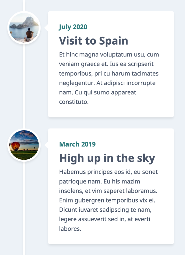
In this tutorial you will learn how to create a responsive timeline for a set of related events you wish to display in a chronological (or reverse chronological) sequence. This can be used to display significant company milestones, news or personal events. I have used personal travel events as an example in this post. Here’s what you will be able to create by the end of this tutorial.
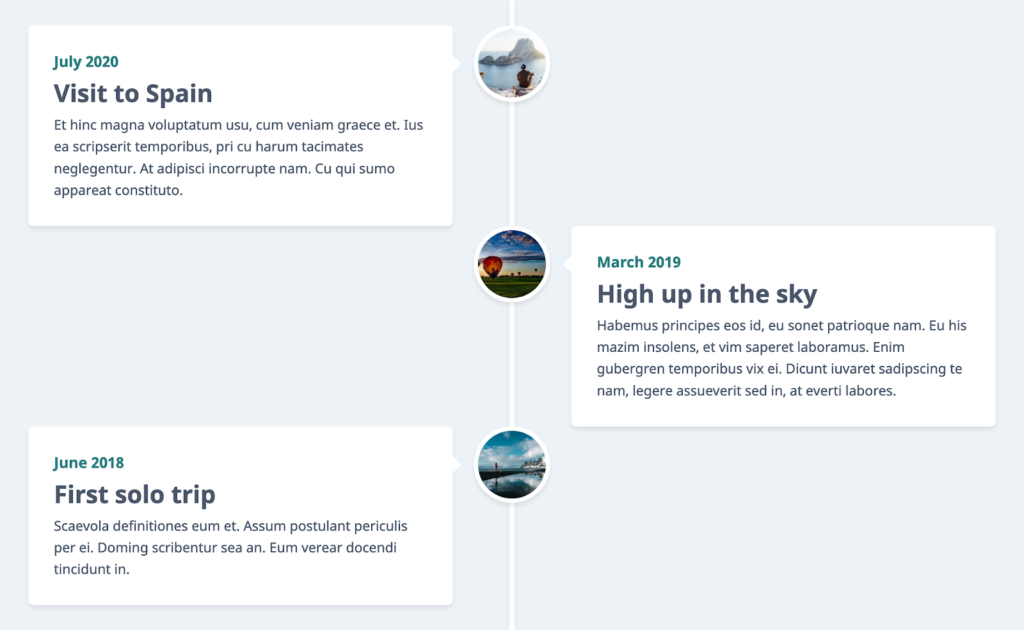
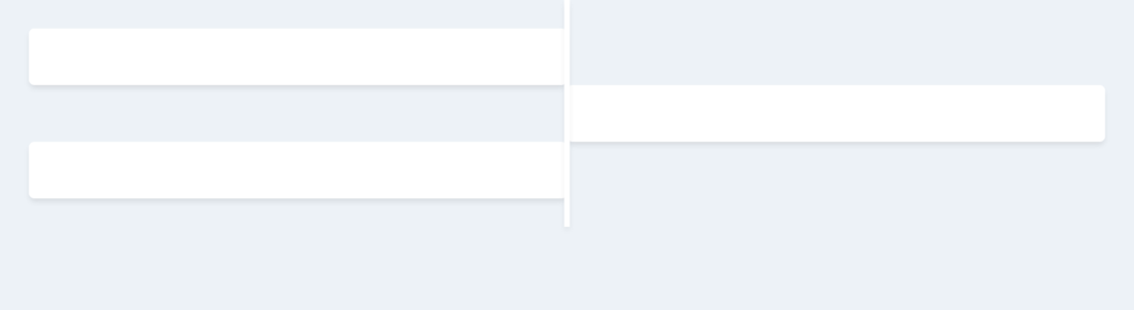
Desktop View
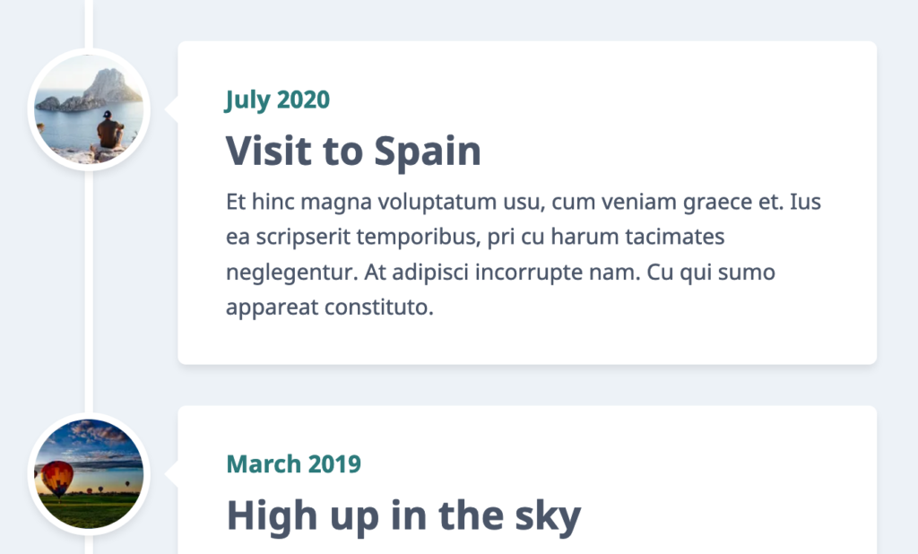
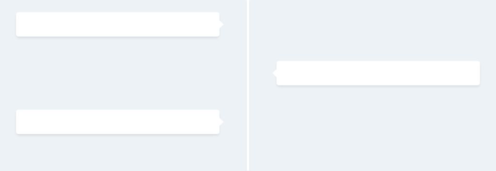
Small Tablets / Mobile Landscape View
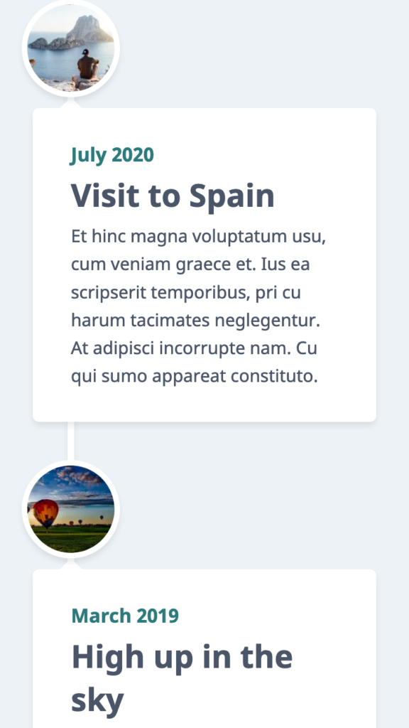
Mobile Portrait View
You need to have some basic knowledge of HTML and CSS to follow along. Let’s get started.
Millions of Fonts, Themes, Graphics: Starting at ONLY $16.50 per Month
Web Fonts
8,000+ Fonts

WordPress Themes
1,200+ Themes

Graphic Assets
32,000+ Graphics
DOWNLOAD NOW
Setting up
Create a blank HTML document and name it index.html. Add the basic HTML skeleton. If you use Visual Studio Code, all you need to do is type “!” and hit enter. You will end up with this.
<!DOCTYPE html>
<html lang="en">
<head>
<meta charset="UTF-8">
<meta name="viewport" content="width=device-width, initial-scale=1.0">
<title>Document</title>
</head>
<body>
</body>
</html>
I have used the font ‘Noto Sans’ – with font weights 300 and 700. So add the following line below the title tag to embed this font using Google fonts.
<link href="https://fonts.googleapis.com/css2?family=Noto+Sans:wght@400;700&display=swap" rel="stylesheet">
Create your stylesheet and name it style.css. Link the stylesheet to your HTML document below the Google fonts CDN link using:
<link rel="stylesheet" href="style.css">
The bare bones structure
Let’s first create the timeline structure, and in the next part we will add and style the content.
HTML
Add this to your markup:
<div class="timeline">
<div class="container container-left">
<div class="content"></div>
</div>
<div class="container container-right">
<div class="content"></div>
</div>
<div class="container container-left">
<div class="content"></div>
</div>
</div>
CSS
In style.css, begin with some common styles for all elements:
* {
margin: 0;
padding: 0;
box-sizing: border-box;
}
Add these styles to the body element:
body {
background-color: #EDF2F7;
font-family: ‘Noto Sans’, sans-serif;
font-size: 1em;
color: #4A5568;
}
To the timeline, add the following styles. Let’s restrict the maximum width to 1200px and center the content using margin.
.timeline {
position: relative;
max-width: 1200px; /* Restrict the width on large screens */
margin: 0 auto; /* Center the content */
padding: 30px;
}
Now, we can use the ::after pseudo element to create that actual line in the center for timeline. Add these styles:
.timeline::after {
content: ”;
position: absolute;
width: 6px;
background-color: white;
top: 0;
bottom: 0;
left: 50%;
margin-left: -3px;
box-shadow: 0 4px 6px -1px rgba(0, 0, 0, 0.1);
}
Width of the line is 6px. Hence, we have used left:50% and margin-left: -3px to position the line at the exact center. Read more about centering an element using absolute position.
You will now see a very tiny line at the top of your webpage, vertically centered. As we add some content, this line lengthens.
Let’s style the left and right containers that hold the timeline elements.
.container {
position: relative;
width: 50%;
}
.container-left {
left: 0;
}
.container-right {
left: 50%;
}
You will still not see anything on the web page until we style the .content element within.
.content {
padding: 30px;
background-color: white;
position: relative;
border-radius: 6px;
box-shadow: 0 4px 6px -1px rgba(0, 0, 0, 0.1);
}
You should be able to see this now.
Our timeline is taking shape. Let’s add those tiny arrow marks pointing to the line using a ::before pseudo element.
.container .content::before {
content: " ";
height: 0;
position: absolute;
top: 40px;
width: 0;
z-index: 1;
border: medium solid white;
right: -10px;
border-width: 10px 0 10px 10px;
border-color: transparent transparent transparent white;
}
This will add all arrow marks pointing to the right, positioned to the right edge of the box. But for the boxes on the right, we need an arrow pointing to the left and positioned to the left. So, change of all this to:
.container .content::before {
content: " ";
height: 0;
position: absolute;
top: 20px;
width: 0;
z-index: 1;
border: medium solid white;
}
.container-left .content::before {
right: -10px;
border-width: 10px 0 10px 10px;
border-color: transparent transparent transparent white;
}
.container-right .content::before {
left: -10px;
border-width: 10px 10px 10px 0;
border-color: transparent white transparent transparent;
}
Read more about how to create these CSS triangles using borders. Of course the output now looks a little odd because the boxes are sticking to the line. Add some padding to the container to space them out.
.container-left {
/* Existing styles here */
padding-right: 70px;
}
.container-right {
/* Existing styles here */
padding-left: 70px;
}
This is perfect.
Adding and styling content
Let us first add the images and position them on the “line”.
HTML
Change your markup to this, by adding 3 div elements with background images.
<div class="timeline">
<div class="container container-left">
<div class="image" style="background-image:url(‘https://images.pexels.com/photos/307008/pexels-photo-307008.jpeg?auto=compress&cs=tinysrgb&dpr=2&w=100’)"></div>
<div class="content"></div>
</div>
<div class="container container-right">
<div class="image" style="background-image:url(‘https://images.pexels.com/photos/210012/pexels-photo-210012.jpeg?auto=compress&cs=tinysrgb&dpr=2&w=100’)"></div>
<div class="content"></div>
</div>
<div class="container container-left">
<div class="image" style="background-image:url(‘https://images.pexels.com/photos/2104152/pexels-photo-2104152.jpeg?auto=compress&cs=tinysrgb&dpr=2&w=100’)"></div>
<div class="content"></div>
</div>
</div>
As you can see, I have directly linked 3 images from Pexels. You can choose to include your own.
CSS
Let’s add some size and shape to this image div.
.image {
width:90px;
height:90px;
background-size:cover;
background-position:center;
border:solid 5px #ffffff;
border-radius:50px;
box-shadow: 0 4px 6px -1px rgba(0, 0, 0, 0.1);
}
Now position them centered on the line, appearing next to boxes.
.image {
position: absolute;
}
.container-left .image {
right: 0;
margin-right: -45px;
}
.container-right .image {
left: 0;
margin-left: -45px;
}
But the images appear behind the line! This is easily fixed with some z-index.
.timeline::after {
/* Existing styles here */
z-index: 1;
}
.image {
/* Existing styles here */
z-index: 2;
}
Don’t mind the images overlapping each other right now. It will be fixed when we add some content within the boxes. But if your content is going to be very little, add a minimum height to the container.
.container {
/* Existing styles here */
min-height: 120px;
}
Next, add the actual content.
HTML
Add this markup within each .content block. Change the text as you wish.
<span>July 2020</span>
<h2>Visit to Spain</h2>
<p>
Et hinc magna voluptatum usu, cum veniam graece et. Ius ea scripserit temporibus, pri cu harum tacimates neglegentur. At adipisci incorrupte nam. Cu qui sumo appareat constituto.
</p>
CSS
We need to position the arrow marks such that they align with the center of the image.
.container .content::before {
/* Existing styles here */
top: 35px;
}
Align the text on left side boxes to the right and right side boxes to the left.
.container-left {
/* Existing styles here */
text-align: right;
}
.container-right {
/* Existing styles here */
text-align: left;
}
Now some styles for the actual content.
.content span {
color: #2C7A7B;
font-size: 1.1em;
font-weight: bold;
}
.content h2 {
font-size: 1.8em;
padding-top: 5px;
}
.content p {
line-height: 1.6;
padding-top: 5px;
}
Isn’t this neat? Great! Now resize your browser window to make it smaller, and things start to look messy when the screen size is too small.
Make it responsive
In smaller screens, when there are boxes on both sides of the line, the boxes become too narrow. Time to add some media queries. Let’s add a breakpoint at 767px width and position both the boxes on one side when the screen width is smaller than this width.
@media screen and (max-width: 767px) {
/* Add styles to change the behaviour for screens smaller than 767px width */
}
First, position the line to the left of the page. Add the below styles within the media query:
.timeline::after {
left: 65px;
}
Make the containers full width and position them correctly by overriding the previous styles.
.container {
width: 100%;
padding-left: 100px;
padding-right: 0px;
}
.container-right {
left: 0%;
}
.container-left {
text-align: left;
}
Add some top margin to all the containers, except the first.
.container {
/* Existing styles here */
margin-top: 30px;
}
.container:first-of-type {
margin-top: 0px;
}
Override image styles to position them on the line.
.container .image {
left:-10px;
top: 0px;
margin-left: 0;
margin-right: 0;
}
The arrows on the “left” boxes need to change position and direction.
.container-left .content::before {
left: -10px;
right: auto;
border-width: 10px 10px 10px 0;
border-color: transparent white transparent transparent;
}
This is what we have now:
Further reduce the screen size and you will notice that on really small screens (less than 400px width), the boxes again get narrow. Which is why, below 480px, let’s push the containers below the image giving them full screen’s width to occupy.
@media screen and (max-width: 480px) {
.container {
padding-left: 0px;
padding-top: 105px;
}
}
To prevent the line from appearing on top of the boxes instead of below, just add a z-index to the container and give a higher value than the “line”.
.container {
/* Existing styles here */
z-index: 3;
}
The only pending thing right now is to position the arrows on top and make them point upwards.
.container .content::before {
left: 25px;
top: -10px;
border: medium solid white;
border-width: 0 10px 10px 10px;
border-color: transparent transparent white transparent;
}
You got it! Resize your browser making it smaller and larger to see how responsive your timeline is. Go ahead and customize it to suit your needs. Just in case you didn’t get this working as expected, download the full source code and feel free to make changes as you wish.
Download Source Code


Leave a Reply
Want to join the discussion?Feel free to contribute!