How Accessibility Standards Can Empower Better Chart Visual Design
Original Source: https://smashingmagazine.com/2024/02/accessibility-standards-empower-better-chart-visual-design/
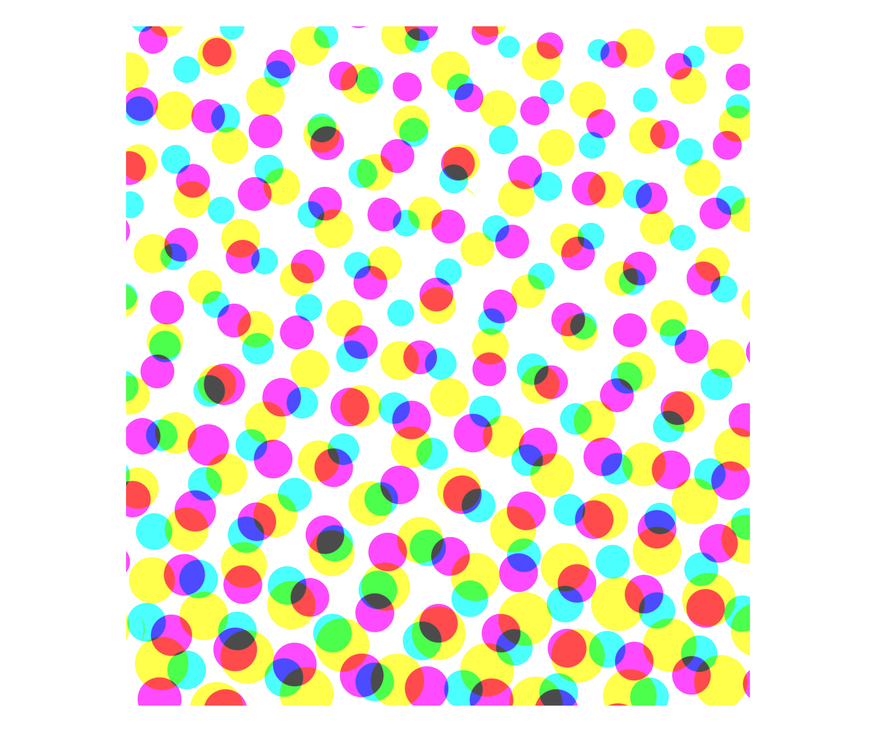
Data visualizations are graphics that leverage our visual system and innate capabilities to gather, accumulate, and process information in our environment, as shown in the animation in Figure 1.0.
 Figure 1.0. An animation demonstrating our preattentive processing capability. Based on a lecture by Dr. Stephen Franconeri. (Large preview)
As a result, we’re able to quickly spot trends, patterns, and outliers in all the images we see. Can you spot the visual patterns in Figure 1.1?
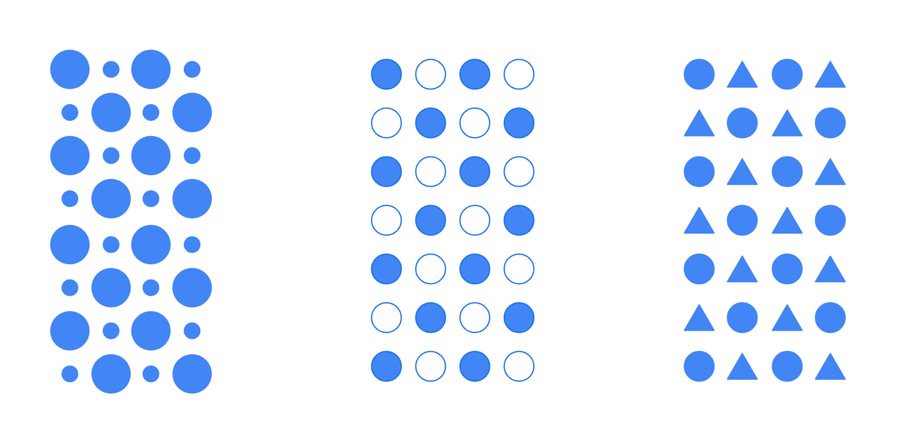
In this example, there are patterns defined by the size of the shapes, the use of fills and borders, and the use of different types of shapes. These characteristics, or visual encodings, are the building blocks of visualizations. Good visualizations provide a glanceable view of a large data set we otherwise wouldn’t be able to comprehend.
Accessibility Challenges With Data Visualizations
Visualizations typically serve a wide array of use cases and can be quite complex. A lot of care goes into choosing the right encodings to represent each metric. Designers and engineers will use colors to draw attention to more important metrics or information and highlight outliers. Oftentimes, as these design decisions are made, considerations for people with vision disabilities are missed.
Vision disabilities affect hundreds of millions of people worldwide. For example, about 300 million people have color-deficient vision, and it’s a condition that affects 1 in 12 men.1
1 Colour Blind Awareness (2023)

Most people with these conditions don’t use assistive technology when viewing the data. Because of this, the visual design of the chart needs to meet them where they are.
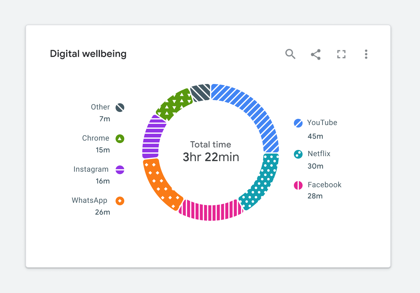
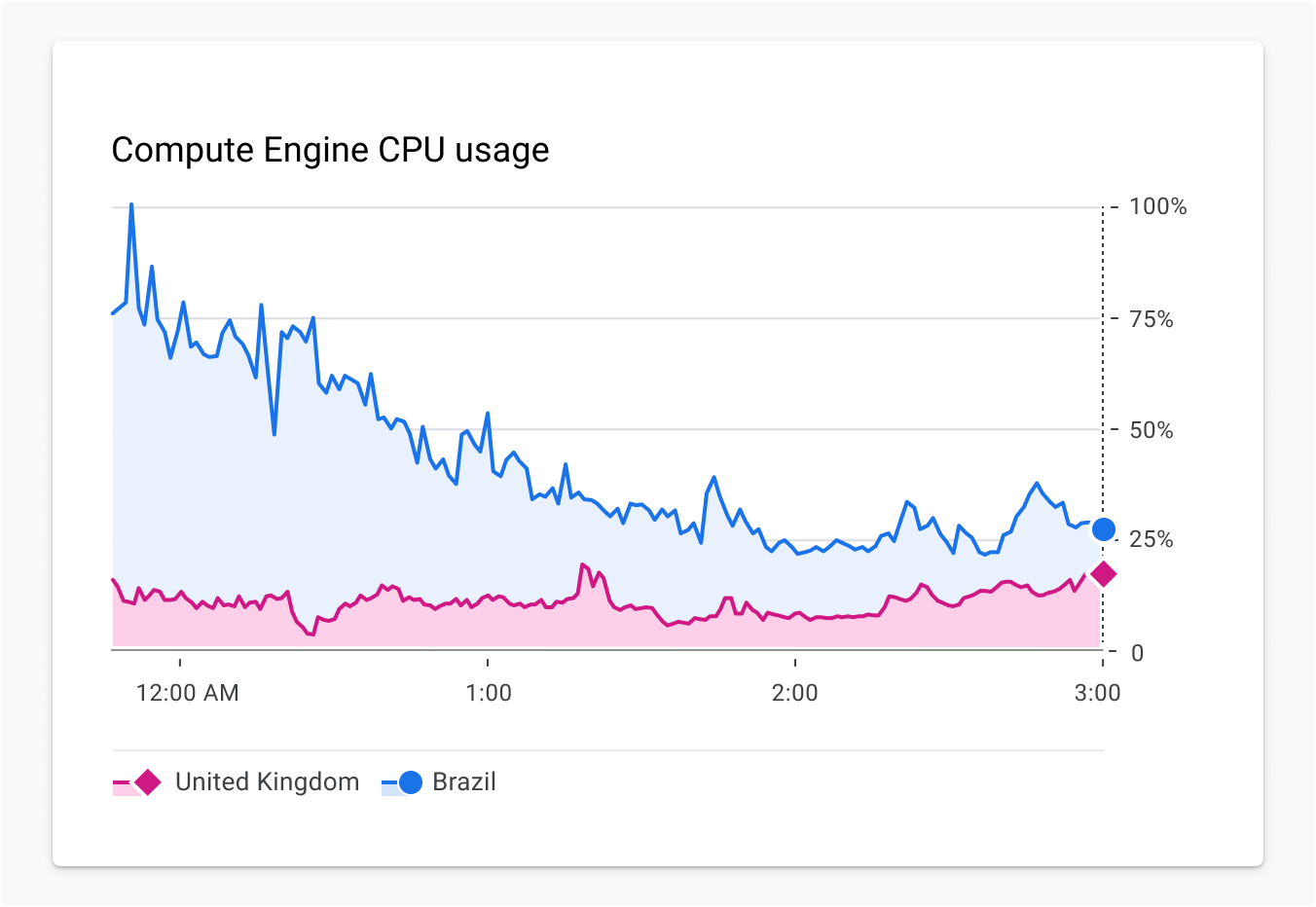
Figure 1.2 is an example of a donut chart. At first glance, it might seem like the categorical color palette matches the theme of digital wellbeing. It’s calm, it’s cool, and it may even invoke a feeling of wellbeing.
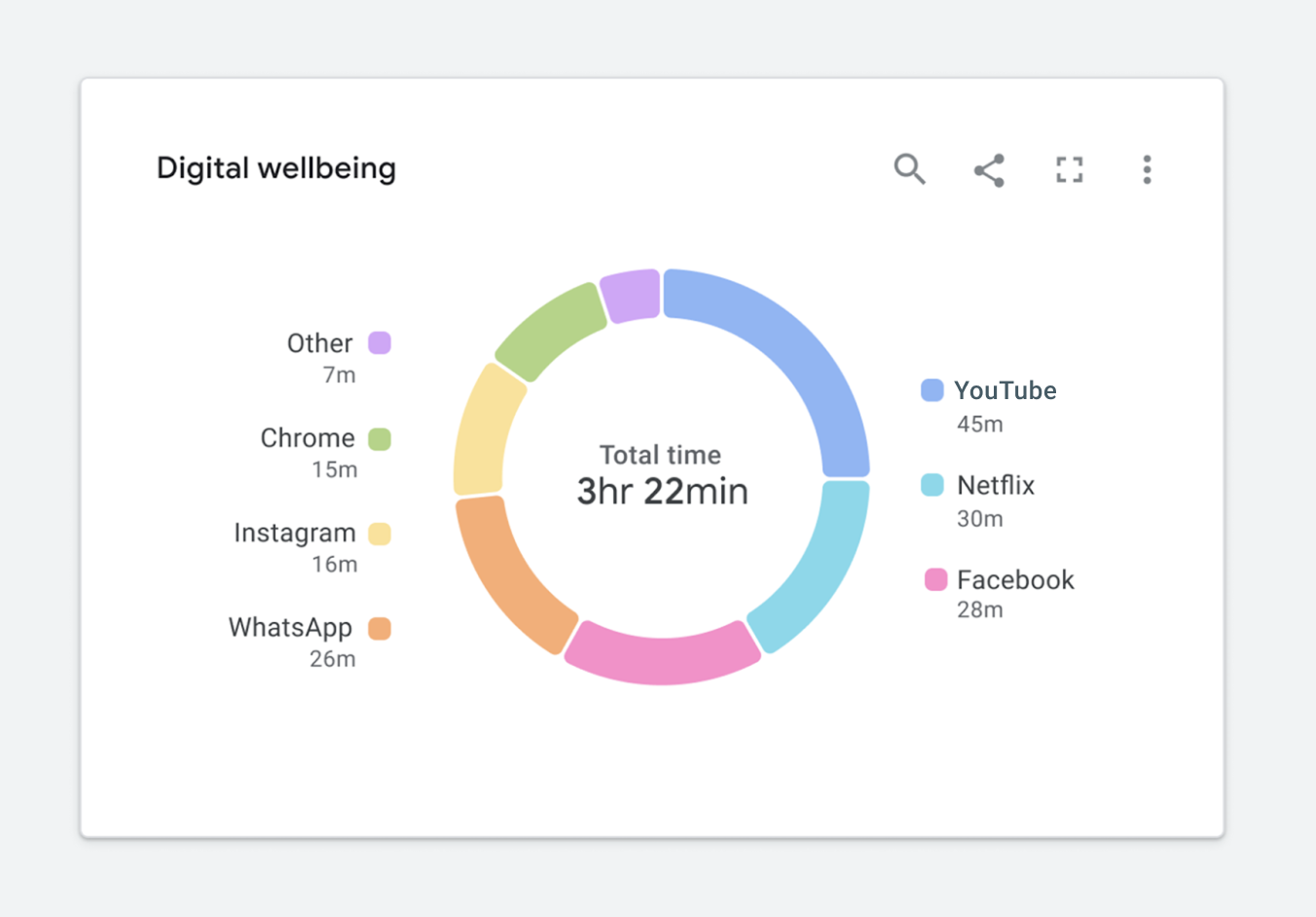
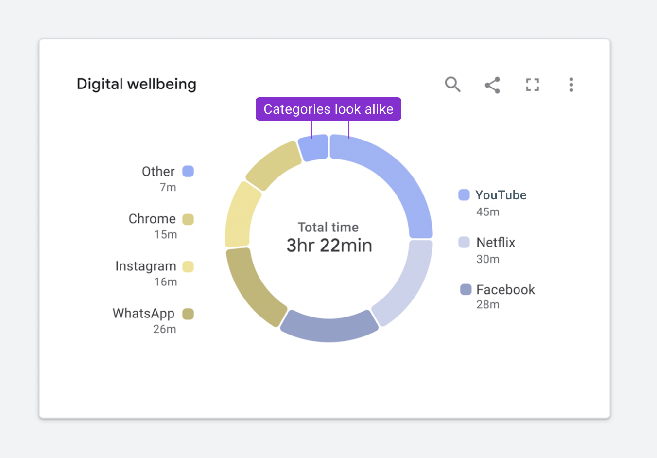
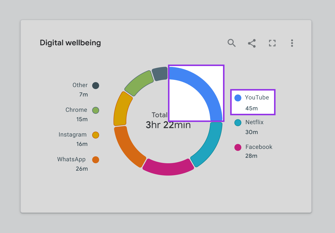
Figure 1.3 highlights how this same chart will appear to someone with a protanopia condition. You’ll notice that it is slightly less readable because the Other and YouTube categories appearing at the top of the donut are indistinguishable from one another.
For someone with achromatopsia, the chart will appear as it does in Figure 1.4
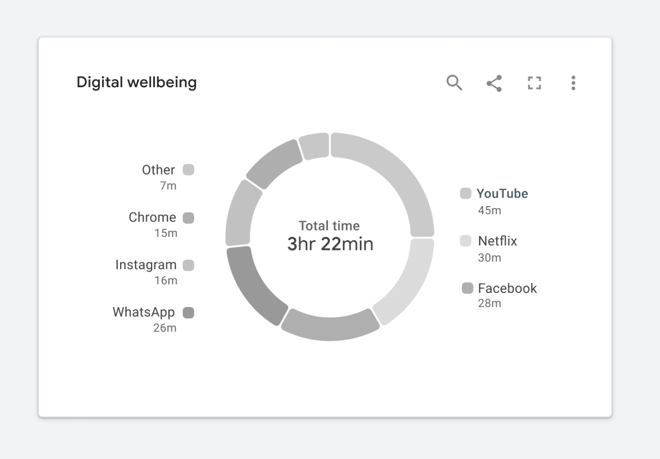
In this case, I’d argue that the chart isn’t really telling us anything. It’s nearly impossible to read, and swapping it out for a data table would be arguably more useful. At this point, you might be wondering how to fix this. Where should you start?
Start With Web Standards
Web standards can help us improve our design. In this case, Web Content Accessibility Guidelines (WCAG) will provide the most comprehensive set of requirements to start with. Guidelines call for two considerations. First, all colors must achieve the proper contrast ratio with their neighboring elements. Second, visualizations need to use something other than color to convey meaning. This can be accomplished by including a second encoding or adding text, images, icons, or patterns. While this article focuses on achieving WCAG 2.1 standards, the same concepts can be used to achieve WCAG 2.2 standards.
Web Standards Challenges
Meeting the web standards is trickier than it might first seem. Let’s dive into a few examples showing how difficult it is to ensure data will be understood at a glance while meeting the standards.
Challenge 1: Color Contrast
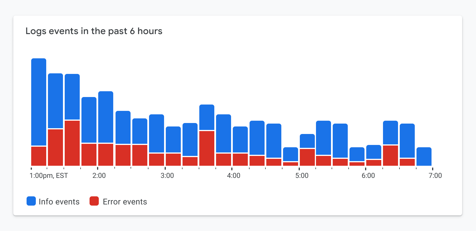
According to the WCAG 2.1 (level AA) standards, graphics such as chart elements (lines, bars, areas, nodes, edges, links, and so on) should all achieve a minimum 3:1 contrast ratio with their neighboring elements. Neighboring elements may include other chart elements, interaction states, and the chart’s background. Incidentally, if you’re not sure your colors are achieving the correct minimum ratio, you can check your palette here. Additionally, all text elements should achieve a minimum 4.5:1 contrast ratio with their background. Figure 1.5 depicts a sample categorical color palette that follows the recommended standards.

This is quite a bold palette. When applying a compliant palette to a chart, it might look like the example in Figure 1.6.

While this example meets the color contrast requirements, there’s a tradeoff. The chart’s focal point is now lost. The red segments at the bottom of each stacked bar represent the most important metrics illustrated in this chart. They represent errors or a count of items that need your attention. Since the chart features bold colors, all of which are equally competing for our attention, it’s now more difficult to see the items that matter most.
Challenge 2: Dual Encodings, Or Conveying Meaning Without Color
To minimize reliance on color to convey meaning, WCAG 2.1 (level A) standards also call for the use of something other than color to convey meaning. This may be a pattern, texture, icon, text overlay, or an entirely different visual encoding.
It’s easy to throw a pattern on top of a categorical fill color and call it a day, as illustrated in Figure 1.7. But is the chart still readable? Is it glanceable? In this case, the segments appear to run into one another. In his book, The Visual Display of Quantitative Information, Edward Tufte describes the importance of minimizing chartjunk or unnecessary visual design elements that limit one’s ability to read the chart. This begs the question, do the WCAG standards encourage us to add unnecessary chartjunk to the visualization?
Following the standards verbatim can lead us down the path of creating a really noisy visualization.
Let The Standards Empower vs Constrain Design
Over the past several years, my working group at Google has learned that it’s easier to meet the WCAG visual design requirements when they’re considered at the beginning of the design process instead of trying to update existing charts to meet the standard. The latter approach leads to charts with unnecessary chart junk, just like the one previously depicted in Figure 1.7, and minimized usability. Considering accessibility first will enable you to create a visualization that’s not only accessible but useful. We’re calling this our accessibility-first approach to chart design. Now, let’s see some examples.
Solving For Color Contrast
Let’s revisit the color contrast requirement via the example in Figure 1.8. In this case, the most important metric is represented by the red segments appearing at the bottom of each bar in the series. The red color represents a count of items in a failing state. Since both colors in this palette compete for our attention, it’s difficult to focus on the metric that matters most. The chart is no longer glanceable.
Focus On Essential Elements Only
By stretching the standards a bit, we can balance a11y and glanceability a lot better. Only the visual elements essential for interpreting the visualization need to achieve the color contrast requirement. In the case of Figure 1.8, we can use borders that achieve the required contrast ratio while using lighter fills to the point of focus. In Figure 1.9, you’ll notice your attention now shifts down to the metrics that matter most.
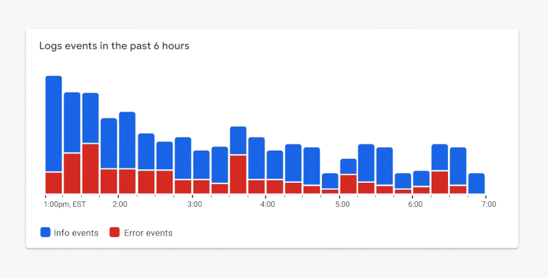 Figure 1.9. ✅ DO: Consider using a combination of outlines and fills to meet contrast requirements while maintaining a focal point. (Large preview)
Dark Themes For The Win
Most designers I know love a good dark theme like the one used in Figure 2.0. It looks nice, and dark themes often result in visually stunning charts.
More importantly, a dark theme offers an accessibility advantage. When building on top of a dark background, we can use a wider array of color shades that will still achieve the minimum required contrast ratio.
According to an audit conducted by Google’s Data Accessibility Working Group, the 61 shades of the Google Material palette from 2018 achieved the minimum 3:1 contrast ratio when placed on a dark background. This is depicted in Figure 2.1. Only 40 shades of Google Material colors achieved the same contrast ratio when placed on a white background. The 50% increase in available shades when moving from a light background to a dark background makes a huge difference. Having access to more shades enables us to draw focus to items that matter most.
With this in mind, let’s revisit the earlier donut chart example in Figure 2.2. For now, let’s keep the white background, as it’s a core part of Google’s brand.
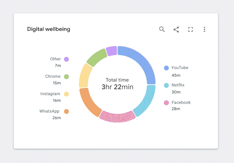 Figure 2.2. ✅ DO: Use a combination of fills and borders that achieve the minimum contrast ratios to improve the readability of your chart. (Large preview)
While this is a great first step, there’s still more work to do. Let’s take a closer look.
Solving For Dual Encodings And Minimizing Chartjunk
As shown in Figure 2.3, color is our only way of connecting segments in the donut to the corresponding categories in the legend. Despite our best efforts to follow color contrast standards, the chart can still be difficult to read for people with certain vision disabilities. We need a dual encoding, or something other than color, to convey meaning.
How might we do this without adding noise or reducing the chart’s readability or glanceability? Let’s start with the text.
Integrating Text And Icons
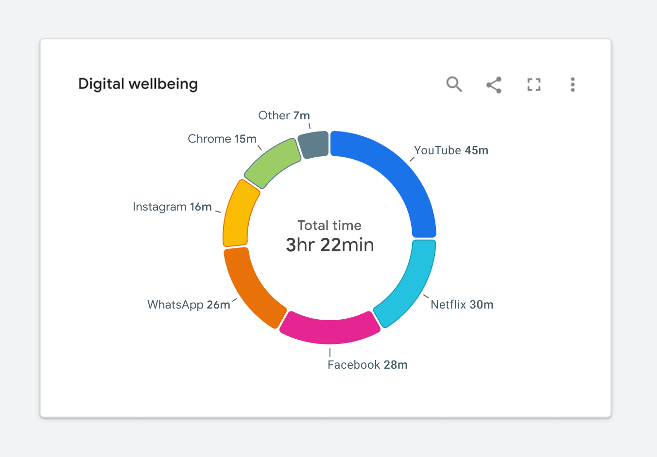
Adding text to a visualization is a great way to solve the dual encoding problem. Let’s use our donut chart as an example. If we move the legend labels into the graph, as illustrated in Figure 2.4, we can visually connect them to their corresponding segments. As a result, there is no longer a need for a legend, and the labels become the second encoding.
Let’s look at a few other ways to provide a dual encoding while maximizing readability. This will prevent us from running in the direction of applying unnecessary chart junk like the example previously highlighted in Figure 1.7.
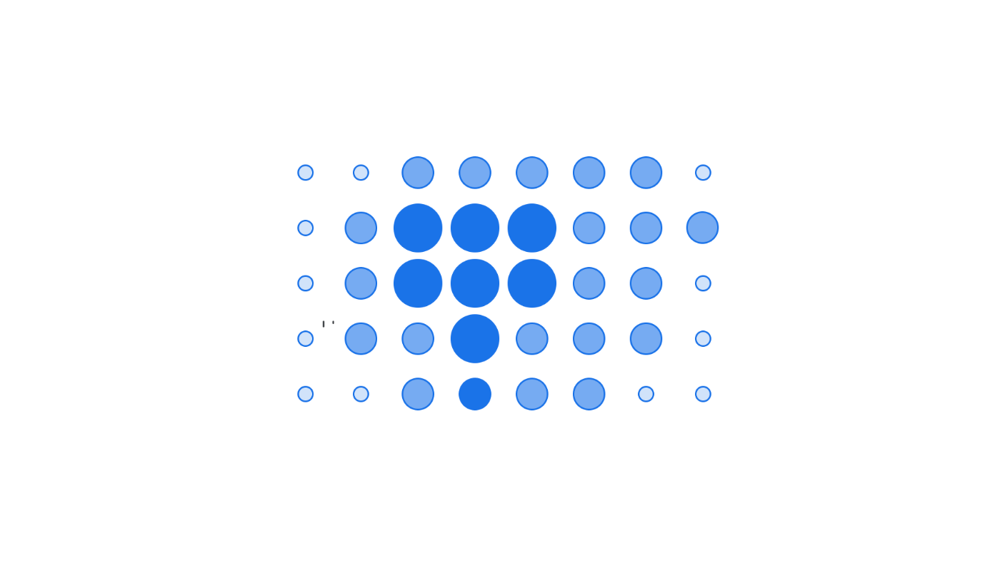
Depending on the situation, shape of the data, or the available screen real estate, we may not have the luxury of overlaying text on top of a visualization. In cases like in Figure 2.5, it’s still okay to use iconography. For example, if we’re dealing with a very limited number of categories, the added iconography can still act as a dual encoding.
Some charts can have upwards of hundreds of categories, which makes it difficult to add iconography or text. In these cases, we must revisit the purpose of the chart and decide if we need to differentiate categories. Perhaps color, along with a dual encoding, can be used to highlight other aspects of the data. The example in Figure 2.6 shows a line chart with hundreds of categories.
We did a few things with color to convey meaning here:
Bright colors are used to depict outliers within the data set.
A neutral gray color is applied to all nominal categories.
In this scenario, we can once again use a very limited set of shapes for differentiating specific categories.
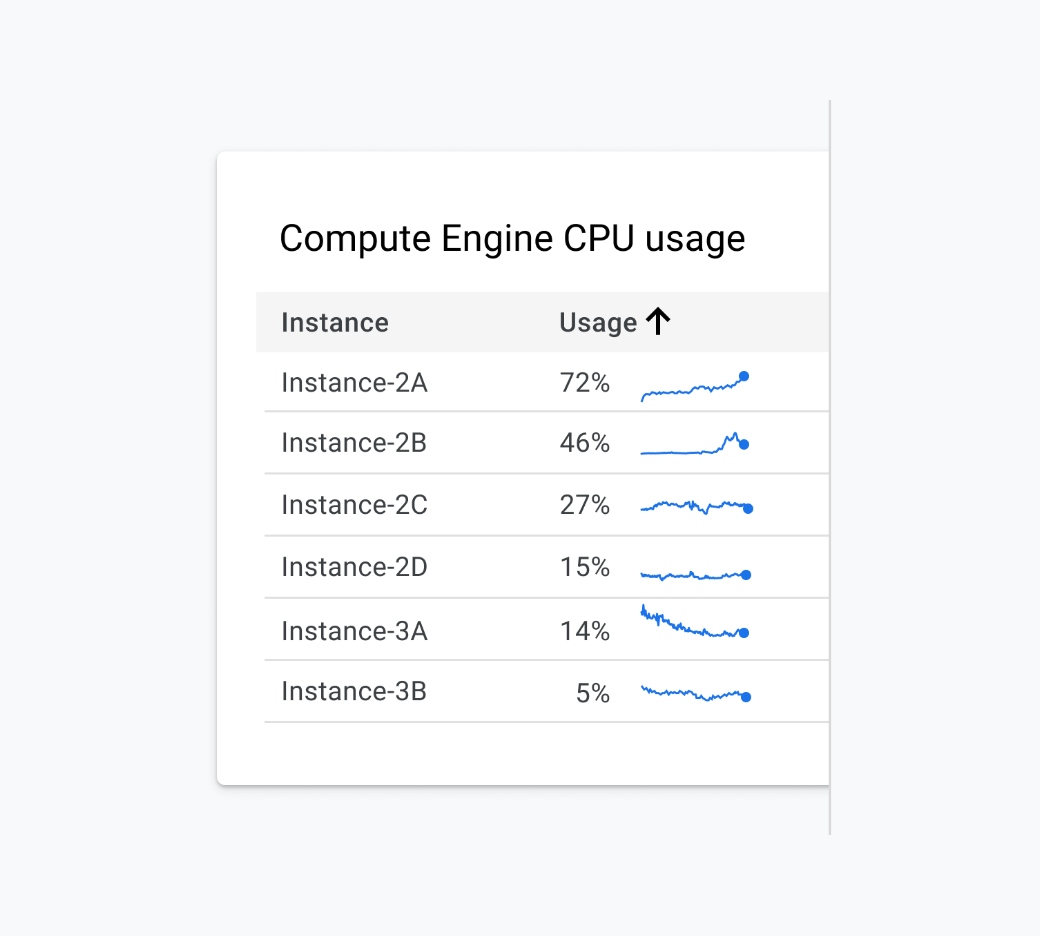
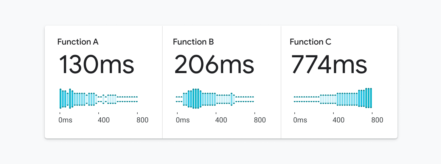
The Benefits Of Small Multiples And Sparklines
There are still times when it’s important to differentiate between all categories depicted in a visualization. For example, the tangled mess of a chart is depicted in Figure 2.7.
In this case, a more accessible solution would include breaking the charts into their own mini charts or sparklines, as depicted in Figure 2.8. This solution is arguably better for everyone because it makes it easier to see the individual trend for each category. It’s more accessible because we’ve completely removed the reliance on color and appended text to each of the mincharts, which is better for the screen reader experience.
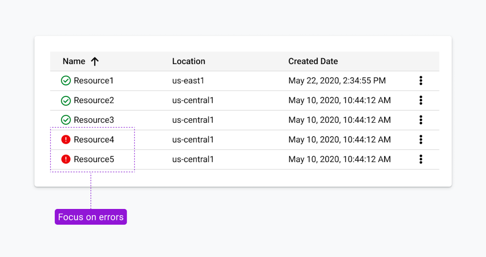
Reserve Fills For Items That Need Your Attention
Earlier, we examined using a combination of fills and outlines to achieve color contrast requirements. Red and green are commonly used to convey status. For someone who is red/green colorblind, this can be very problematic. As an alternative, the status icons in Figure 2.9 reserve fills for the items that need your attention. We co-designed this solution with some help from customers who are colorblind. It’s arguably more scannable for people who are fully sighted, too.
Embracing Relevant Metaphors
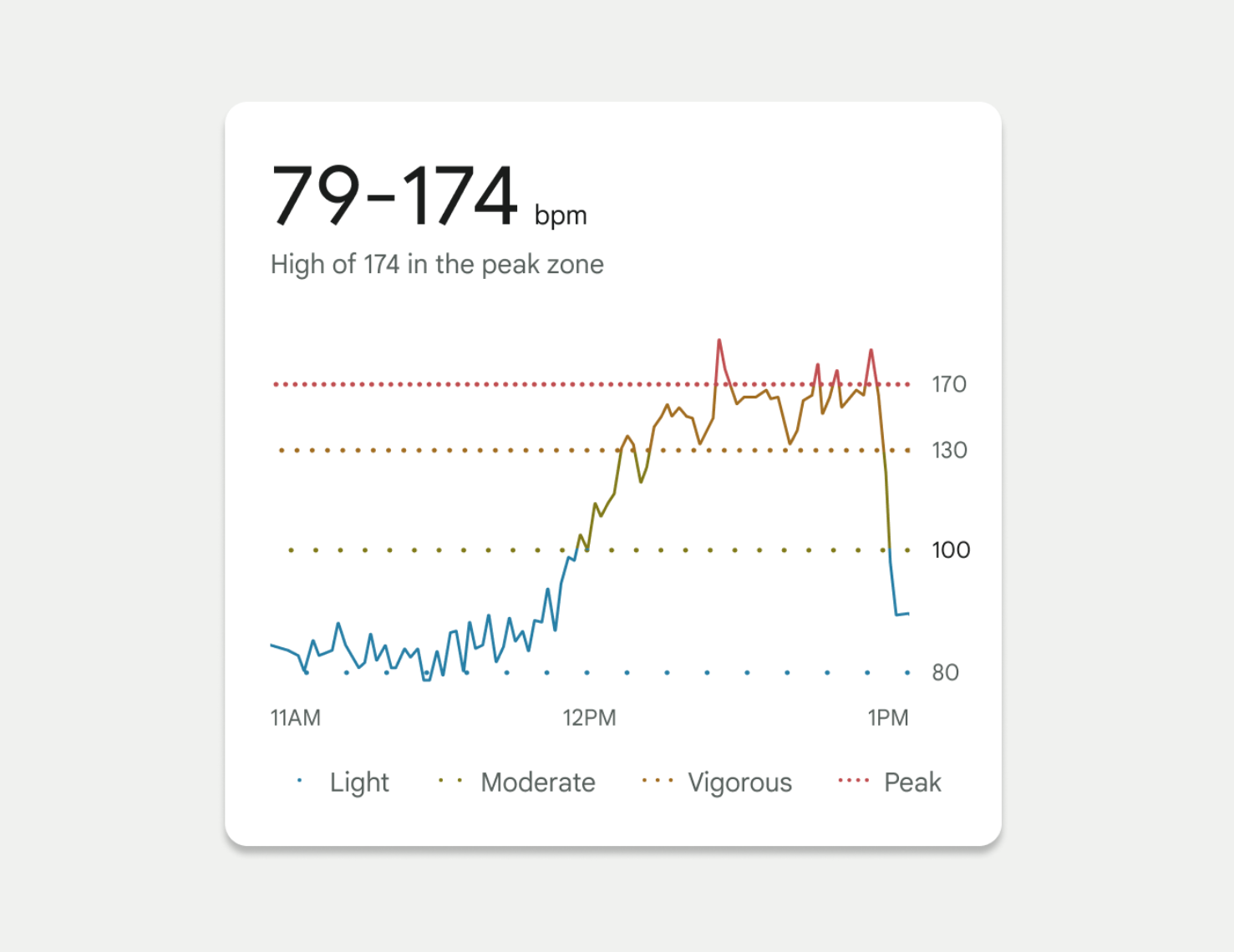
In 2022, we launched a redesigned Fitbit mobile app for the masses. One of my favorite visualizations from this launch is a chart showing your heart rate throughout the day. As depicted in Figure 3.0, this chart shows when your heart rate crosses into different zones. Dotted lines were used to depict each of these zone thresholds. We used the spacing between the dots as our dual encoding, which invokes a feeling of a “visual” heartbeat. Threshold lines with closely spaced dots imply a higher heart rate.
Continuing the theme of using fun, relevant metaphors, we even based our threshold spacing on the Fibonacci Sequence. This enabled us to represent each threshold with a noticeably different visual treatment. For this example, we knew we were on the right track as these accessibility considerations tested well with people who have color-deficient vision.
Accessible Interaction States
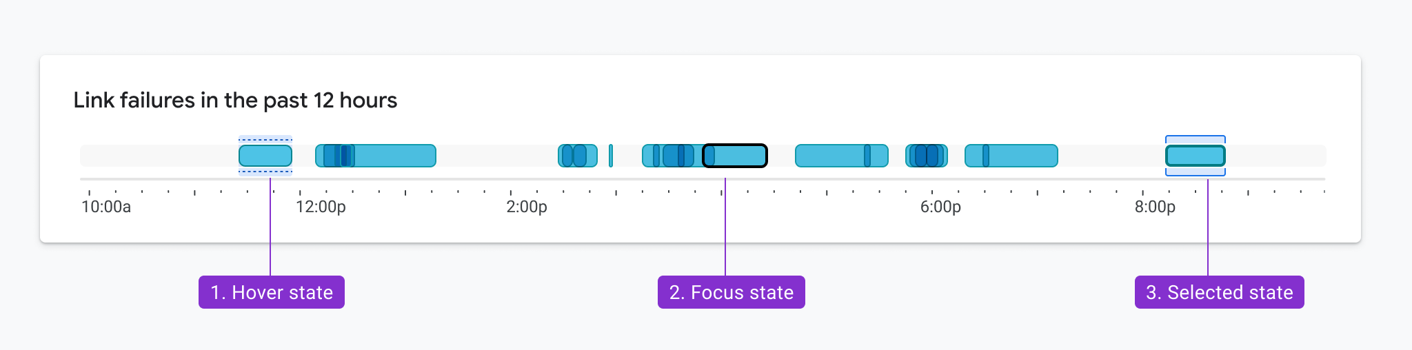
Color contrast and encodings also need to be considered when showing interactions like mouse hover, selection, and keyboard focus, like the examples in Figure 3.1. The same rules apply here. In this example, the hover, focus, and clicked state of each bar is delineated by elements that appear above and below the bar. As a result, these elements only need to achieve a 3:1 contrast ratio with the white background and not the bars themselves. Not only did this pattern test well in multiple usability studies, but it was also designed so that the states could overlap. For example, the hover state and selected state can appear simultaneously and still meet accessibility requirements.
Finding Your Inspiration
For some more challenging projects, we’ve taken inspiration from unexpected areas.
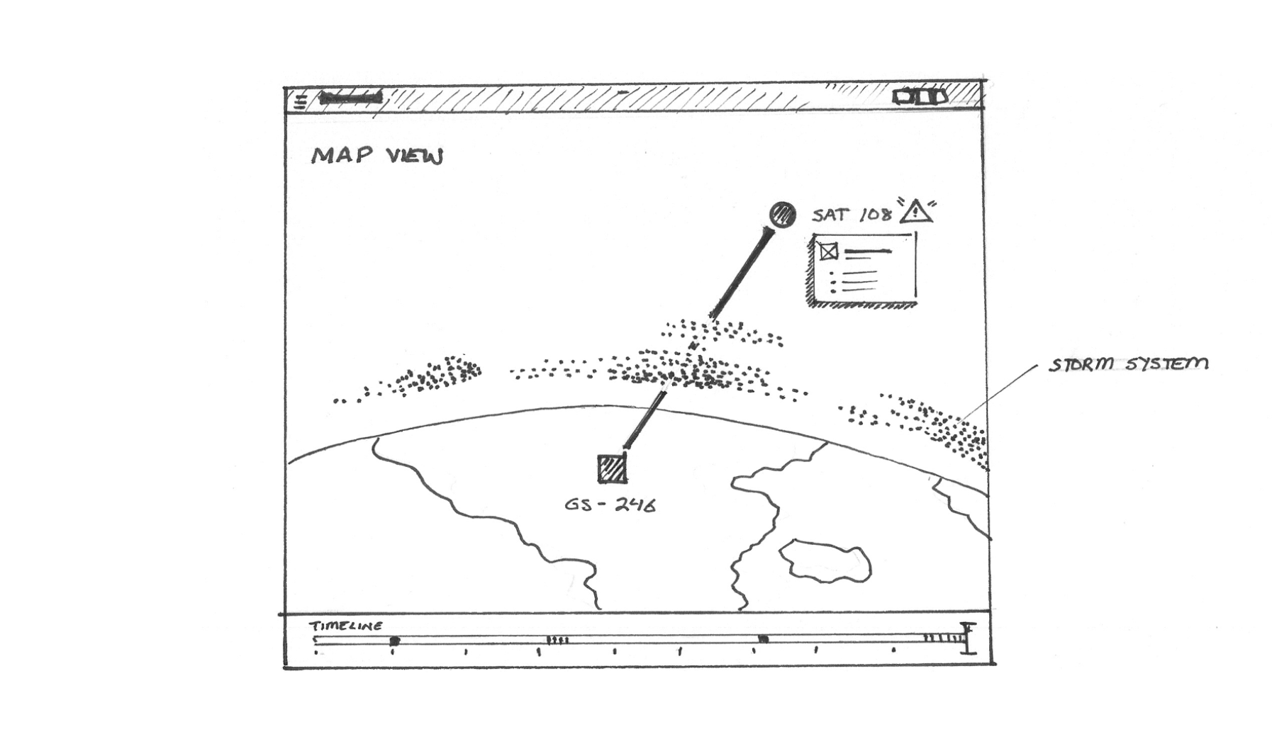
For example, we looked to nature (Figure 3.2) to help us consider methods for visualizing the effects of cloud moisture on an LTE network, as sketched in Figure 3.3.

We’ve taken inspiration from halftone printing processes (Figure 3.4) to think about how we might reimagine a heatmap with a dual encoding, as depicted in Figure 3.5.
We’ve also taken inspiration from architecture and how people move through buildings (Figure 3.6) to consider methods for showing the scope and flow of data into a donut chart as depicted in Figure 3.7.

 Figure 3.7. Applying inspiration from architecture and a building’s flow. (Large preview)
In this case, the animated inner ring highlights the scope of the donut chart when it’s empty and indicates that it will fill up to 100%. Animation is a great technique, but it presents other accessibility challenges and should either time out or have a stop control.
In some cases, we were even inspired to explore new versions of existing visualization types, like the one depicted in Figure 3.8. This case study highlights a step-by-step guide to how we landed on this example.
Getting People On Board With Accessibility
One key lesson is that it’s important to get colleagues on board with accessibility as soon as possible. Your compliant designs may not look quite as pretty as your non-compliant designs and may be open to criticism.
So, how can you get your colleagues on board? For starters, evangelism is key. Provide examples like the ones included here, which can help your colleagues build empathy for people with vision disabilities. Find moments to share the work with your company’s leadership team, spreading awareness. Team meetings, design critiques, AMA sessions, organization forums, and all-hands are a good start. Oftentimes, colleagues may not fully understand how accessibility requirements apply to charting or how their visualizations are used by people with disabilities.
While share-outs are a great start, communication is one way. We found that it’s easier to build momentum when you invite others to participate in the design process. Invite them into brainstorming meetings, design reviews, codesign sessions, and the problem space to help them appreciate how difficult these challenges are. Enlist their help, too.
By engaging with colleagues, we were able to pinpoint our champions within the group or those people who were so passionate about the topic they were willing to spend extra time building demos, prototypes, design specs, and research repositories. For example, at Google, we were able to publish our Top Tips for Data Accessibility on the Material Design blog.
Aside from good citizenship and building a grassroots start, there are ways to get the business on board. Pointing to regulations like Section 508 in America and the European Accessibility Act are other good ways to encourage your business to dive deeper into your product’s accessibility. It’s also an effective mechanism for getting funding and ensuring accessibility is on your product’s roadmap. Once you’ve made the business case and you’ve identified the accessibility champions on your team, it’s time to start designing.
Conclusion
Accessibility is more than compliance. Accessibility considerations can and will benefit everyone, so it’s important not to shove them into a special menu or mode or forget about them until the end of the design process. When you consider accessibility from the start, the WCAG standards also suddenly seem a lot less constraining than when you try to retrofit existing charts for accessibility.
The examples here were built over the course of 3 years, and they’re based on valuable lessons learned along the way. My hope is that you can use the tested designs in this article to get a head start. And by taking an accessibility-first approach, you’ll end up with overall better data visualizations — ones that fully take into account how all people gather, accumulate, and process information.
Resources
To get started thinking about data accessibility, check out some of these resources:
Getting started
Google’s Top Tips for Data Accessibility
Color and contrast
A comprehensive guide for exploring and learning about the theory, science, and perception of color and contrast.
Introduction to accessible contrast and color for data visualization
A series of Observable notebooks on using contrast and patterns to distinguish marks in accessible data visualizations.
ACM
Color blind accessibility manifesto
Contrast checking tool
Contrast-Ratio.com
WCAG requirements
Guidelines for text contrast contrast
Guidelines for graphic color contrast
Material design best practices and specs
Accessibility with Material 3
“Google’s Six Principles for Designing Any Chart,” Manuel Lima
Data Visualization in Material Design
We’re incredibly proud of our colleagues who contributed to the research and examples featured in this article. This includes Andrew Carter, Ben Wong, Chris Calo, Gerard Rocha, Ian Hill, Jenifer Kozenski Devins, Jennifer Reilly, Kai Chang, Lisa Kaggen, Mags Sosa, Nicholas Cottrell, Rebecca Plotnick, Roshini Kumar, Sierra Seeborn, and Tyler Williamson. Without everyone’s contributions, we wouldn’t have been able to advance our knowledge of accessible chart visual design.


Leave a Reply
Want to join the discussion?Feel free to contribute!