Global vs. Local Styling In Next.js
Original Source: https://smashingmagazine.com/2021/07/global-local-styling-nextjs/
I have had a great experience using Next.js to manage complex front-end projects. Next.js is opinionated about how to organize JavaScript code, but it doesn’t have built-in opinions about how to organize CSS.
After working within the framework, I have found a series of organizational patterns that I believe both conform to the guiding philosophies of Next.js and exercise best CSS practices. In this article, we’ll build a website (a tea shop!) together to demonstrate these patterns.
Note: You probably will not need prior Next.js experience, although it would be good to have a basic understanding of React and to be open to learning some new CSS techniques.
Writing “Old-Fashioned” CSS
When first looking into Next.js, we may be tempted to consider using some kind of CSS-in-JS library. Though there may be benefits depending on the project, CSS-in-JS introduces many technical considerations. It requires using a new external library, which adds to the bundle size. CSS-in-JS can also have a performance impact by causing additional renders and dependencies on the global state.
Recommended reading: “The Unseen Performance Costs Of Modern CSS-in-JS Libraries In React Apps)” by Aggelos Arvanitakis
Furthermore, the whole point of using a library like Next.js is to statically render assets whenever possible, so it doesn’t make so much sense to write JS that needs to be run in the browser to generate CSS.
There are a couple of questions we have to consider when organizing style within Next.js:
How can we fit within the conventions/best practices of the framework?
How can we balance “global” styling concerns (fonts, colors, main layouts, and so on) with “local” ones (styles regarding individual components)?
The answer I have come up with for the first question is to simply write good ol’ fashioned CSS. Not only does Next.js support doing so with no additional setup; it also yields results that are performant and static.
To solve the second problem, I take an approach that can be summarized in four pieces:
Design tokens
Global styles
Utility classes
Component styles
I’m indebted to Andy Bell’s idea of CUBE CSS (“Composition, Utility, Block, Exception”) here. If you haven’t heard of this organizational principle before, I recommended checking out its official site or feature on the Smashing Podcast. One of the principles we will take from CUBE CSS is the idea that we should embrace rather than fear the CSS cascade. Let’s learn these techniques by applying them to a website project.
Getting Started
We’ll be building a tea store because, well, tea is tasty. We’ll start by running yarn create next-app to make a new Next.js project. Then, we’ll remove everything in the styles/ directory (it’s all sample code).
Note: If you want to follow along with the finished project, you can check it out here.
Design Tokens
In pretty much any CSS setup, there’s a clear benefit to storing all globally shared values in variables. If a client asks for a color to change, implementing the change is a one-liner rather than a massive find-and-replace mess. Consequently, a key part of our Next.js CSS setup will be storing all site-wide values as design tokens.
We’ll use inbuilt CSS Custom Properties to store these tokens. (If you’re not familiar with this syntax, you can check out “A Strategy Guide To CSS Custom Properties”.) I should mention that (in some projects) I’ve opted to use SASS/SCSS variables for this purpose. I haven’t found any real advantage, so I usually only include SASS in a project if I find I need other SASS features (mix-ins, iteration, importing files, and so on). CSS custom properties, by contrast, also work with the cascade and can be changed over time rather than statically compiling. So, for today, let’s stick with plain CSS.
In our styles/ directory, let’s make a new design_tokens.css file:
:root {
–green: #3FE79E;
–dark: #0F0235;
–off-white: #F5F5F3;
–space-sm: 0.5rem;
–space-md: 1rem;
–space-lg: 1.5rem;
–font-size-sm: 0.5rem;
–font-size-md: 1rem;
–font-size-lg: 2rem;
}
Of course, this list can and will grow over time. Once we add this file, we need to hop over to our pages/_app.jsx file, which is the main layout for all our pages, and add:
import ‘../styles/design_tokens.css’
I like to think of design tokens as the glue that maintains consistency across the project. We will reference these variables on a global scale, as well as within individual components, ensuring a unified design language.
Global Styles
Next up, let’s add a page to our website! Let’s hop into the pages/index.jsx file (this is our homepage). We’ll delete all the boilerplate and add something like:
export default function Home() {
return <main>
<h1>Soothing Teas</h1>
<p>Welcome to our wonderful tea shop.</p>
<p>We have been open since 1987 and serve customers with hand-picked oolong teas.</p>
</main>
}
Unfortunately, it will look quite plain, so let’s set some global styles for basic elements, e.g. <h1> tags. (I like to think of these styles as “reasonable global defaults”.) We may override them in specific cases, but they’re a good guess as to what we will want if we don’t.
I’ll put this in the styles/globals.css file (which comes by default from Next.js):
*,
*::before,
*::after {
box-sizing: border-box;
}
body {
color: var(–off-white);
background-color: var(–dark);
}
h1 {
color: var(–green);
font-size: var(–font-size-lg);
}
p {
font-size: var(–font-size-md);
}
p, article, section {
line-height: 1.5;
}
:focus {
outline: 0.15rem dashed var(–off-white);
outline-offset: 0.25rem;
}
main:focus {
outline: none;
}
img {
max-width: 100%;
}
Of course, this version is fairly basic, but my globals.css file doesn’t usually end up actually needing to get too large. Here, I style basic HTML elements (headings, body, links, and so on). There is no need to wrap these elements in React components or to constantly add classes just to provide basic style.
I also include any resets of default browser styles. Occasionally, I will have some site-wide layout style to provide a “sticky footer”, for example, but they only belong here if all pages share the same layout. Otherwise, it will need to be scoped inside individual components.
I always include some kind of :focus styling to clearly indicate interactive elements for keyboard users when focused. It’s best to make it an integral part of the site’s design DNA!
Now, our website is starting to shape up:

Utility Classes
One area where our homepage could certainly improve is that the text currently always extends to the sides of the screen, so let’s limit its width. We need this layout on this page, but I imagine that we might need it on other pages, too. This is a great use case for a utility class!
I try to use utility classes sparingly rather than as a replacement for just writing CSS. My personal criteria for when it makes sense to add one to a project are:
I need it repeatedly;
It does one thing well;
It applies across a range of different components or pages.
I think this case meets all three criteria, so let’s make a new CSS file styles/utilities.css and add:
.lockup {
max-width: 90ch;
margin: 0 auto;
}
Then let’s add import ‘../styles/utilities.css’ to our pages/_app.jsx. Finally, let’s change the <main> tag in our pages/index.jsx to <main className=”lockup”>.
Now, our page is coming together even more. Because we used the max-width property, we don’t need any media queries to make our layout mobile responsive. And, because we used the ch measurement unit — which equates to about the width of one character — our sizing is dynamic to the user’s browser font size.

As our website grows, we can continue adding more utility classes. I take a fairly utilitarian approach here: If I’m working and find I need another class for a color or something, I add it. I don’t add every possible class under the sun — it would bloat the CSS file size and make my code confusing. Sometimes, in larger projects, I like to break things up into a styles/utilities/ directory with a few different files; it’s up to the needs of the project.
We can think of utility classes as our toolkit of common, repeated styling commands that are shared globally. They help prevent us from constantly rewriting the same CSS between different components.
Component Styles
We’ve finished our homepage for the moment, but we still need to build a piece of our website: the online store. Our goal here will be to display a card grid of all the teas we want to sell, so we’ll need to add some components to our site.
Let’s start off by adding a new page at pages/shop.jsx:
export default function Shop() {
return <main>
<div className=”lockup”>
<h1>Shop Our Teas</h1>
</div>
</main>
}
Then, we’ll need some teas to display. We’ll include a name, description, and image (in the public/ directory) for each tea:
const teas = [
{ name: “Oolong”, description: “A partially fermented tea.”, image: “/oolong.jpg” },
// …
]
Note: This isn’t an article about data fetching, so we took the easy route and defined an array at the beginning of the file.
Next, we’ll need to define a component to display our teas. Let’s start by making a components/ directory (Next.js doesn’t make this by default). Then, let’s add a components/TeaList directory. For any component that ends up needing more than one file, I usually put all the related files inside a folder. Doing so prevents our components/ folder from getting unnavigable.
Now, let’s add our components/TeaList/TeaList.jsx file:
import TeaListItem from ‘./TeaListItem’
const TeaList = (props) => {
const { teas } = props
return <ul role=”list”>
{teas.map(tea =>
<TeaListItem tea={tea} key={tea.name} />)}
</ul>
}
export default TeaList
The purpose of this component is to iterate over our teas and to show a list item for each one, so now let’s define our components/TeaList/TeaListItem.jsx component:
import Image from ‘next/image’
const TeaListItem = (props) => {
const { tea } = props
return <li>
<div>
<Image src={tea.image} alt=”” objectFit=”cover” objectPosition=”center” layout=”fill” />
</div>
<div>
<h2>{tea.name}</h2>
<p>{tea.description}</p>
</div>
</li>
}
export default TeaListItem
Note that we’re using Next.js’s built-in image component. I set the alt attribute to an empty string because the images are purely decorative in this case; we want to avoid bogging screen reader users down with long image descriptions here.
Finally, let’s make a components/TeaList/index.js file, so that our components are easy to import externally:
import TeaList from ‘./TeaList’
import TeaListItem from ‘./TeaListItem’
export { TeaListItem }
export default TeaList
And then, let’s plug it all together by adding import TeaList from ../components/TeaList and a <TeaList teas={teas} /> element to our Shop page. Now, our teas will show up in a list, but it won’t be so pretty.
Colocating Style With Components Through CSS Modules
Let’s start off by styling our cards (the TeaListLitem component). Now, for the first time in our project, we’re going to want to add style that is specific to just one component. Let’s create a new file components/TeaList/TeaListItem.module.css.
You may be wondering about the module in the file extension. This is a CSS Module. Next.js supports CSS modules and includes some good documentation on them. When we write a class name from a CSS module such as .TeaListItem, it will automatically get transformed into something more like . TeaListItem_TeaListItem__TFOk_ with a bunch of extra characters tacked on. Consequently, we can use any class name we want without being concerned that it will conflict with other class names elsewhere in our site.
Another advantage to CSS modules is performance. Next.js includes a dynamic import feature. next/dynamic lets us lazy load components so that their code only gets loaded when needed, rather than adding to the whole bundle size. If we import the necessary local styles into individual components, then users can also lazy load the CSS for dynamically imported components. For large projects, we may choose to lazy load significant chunks of our code and only to load the most necessary JS/CSS upfront. As a result, I usually end up making a new CSS Module file for every new component that needs local styling.
Let’s start by adding some initial styles to our file:
.TeaListItem {
display: flex;
flex-direction: column;
gap: var(–space-sm);
background-color: var(–color, var(–off-white));
color: var(–dark);
border-radius: 3px;
box-shadow: 1px 1px 1px rgba(0, 0, 0, 0.1);
}
Then, we can import style from ./TeaListItem.module.css in our TeaListitem component. The style variable comes in like a JavaScript object, so we can access this class-like style.TeaListItem.
Note: Our class name doesn’t need to be capitalized. I’ve found that a convention of capitalized class names inside of modules (and lowercase ones outside) differentiates local vs. global class names visually.
So, let’s take our new local class and assign it to the <li> in our TeaListItem component:
<li className={style.TeaListComponent}>
You may be wondering about the background color line (i.e. var(–color, var(–off-white));). What this snippet means is that by default the background will be our –off-white value. But, if we set a –color custom property on a card, it will override and choose that value instead.
At first, we’ll want all our cards to be –off-white, but we may want to change the value for individual cards later. This works very similarly to props in React. We can set a default value but create a slot where we can choose other values in specific circumstances. So, I encourage us to think of CSS custom properties like CSS’s version of props.
The style still won’t look great because we want to make sure that the images stay within their containers. Next.js’s Image component with the layout=”fill” prop gets position: absolute; from the framework, so we can limit the size by putting in a container with position: relative;.
Let’s add a new class to our TeaListItem.module.css:
.ImageContainer {
position: relative;
width: 100%;
height: 10em;
overflow: hidden;
}
And then let’s add className={styles.ImageContainer} on the <div> that contains our <Image>. I use relatively “simple” names such as ImageContainer because we’re inside a CSS module, so we don’t have to worry about conflicting with the outside style.
Finally, we want to add a bit of padding on the sides of the text, so let’s add one last class and rely on the spacing variables we set up as design tokens:
.Title {
padding-left: var(–space-sm);
padding-right: var(–space-sm);
}
We can add this class to the <div> that contains our name and description. Now, our cards don’t look so bad:

Combining Global And Local Style
Next, we want to have our cards show in a grid layout. In this case, we’re just at the border between local and global styles. We could certainly code our layout directly on the TeaList component. But, I could also imagine that having a utility class that turns a list into a grid layout could be useful in several other places.
Let’s take the global approach here and add a new utility class in our styles/utilities.css:
.grid {
list-style: none;
display: grid;
grid-template-columns: repeat(auto-fill, minmax(var(–min-item-width, 30ch), 1fr));
gap: var(–space-md);
}
Now, we can add the .grid class on any list, and we’ll get an automatically responsive grid layout. We can also change the –min-item-width custom property (by default 30ch) to change the minimum width of each element.
Note: Remember to think of custom properties like props! If this syntax looks unfamiliar, you can check out “Intrinsically Responsive CSS Grid With minmax() And min()” by Chris Coyier.
As we’ve written this style globally, it doesn’t require any fanciness to add className=”grid” onto our TeaList component. But, let’s say we want to couple this global style with some additional local store. For example, we want to bring a bit more of the “tea aesthetic” in and to make every other card have a green background. All we’d need to do is make a new components/TeaList/TeaList.module.css file:
.TeaList > :nth-child(even) {
–color: var(–green);
}
Remember how we made a –color custom property on our TeaListItem component? Well, now we can set it under specific circumstances. Note that we can still use child selectors within CSS modules, and it doesn’t matter that we’re selecting an element that is styled inside a different module. So, we can also use our local component styles to affect child components. This is a feature rather than a bug, as it allows us to take advantage of the CSS cascade! If we tried to replicate this effect some other way, we’d likely end up with some kind of JavaScript soup rather than three lines of CSS.
Then, how can we keep the global .grid class on our TeaList component while also adding the local .TeaList class? This is where the syntax can get a bit funky because we have to access our .TeaList class out of the CSS module by doing something like style.TeaList.
One option would be to use string interpolation to get something like:
<ul role=”list” className={`${style.TeaList} grid`}>
In this small case, this might be good enough. If we’re mixing-and-matching more classes, I find that this syntax makes my brain explode a bit, so I will sometimes opt to use the classnames library. In this case, we end up with a more sensible-looking list:
<ul role=”list” className={classnames(style.TeaList, “grid”)}>
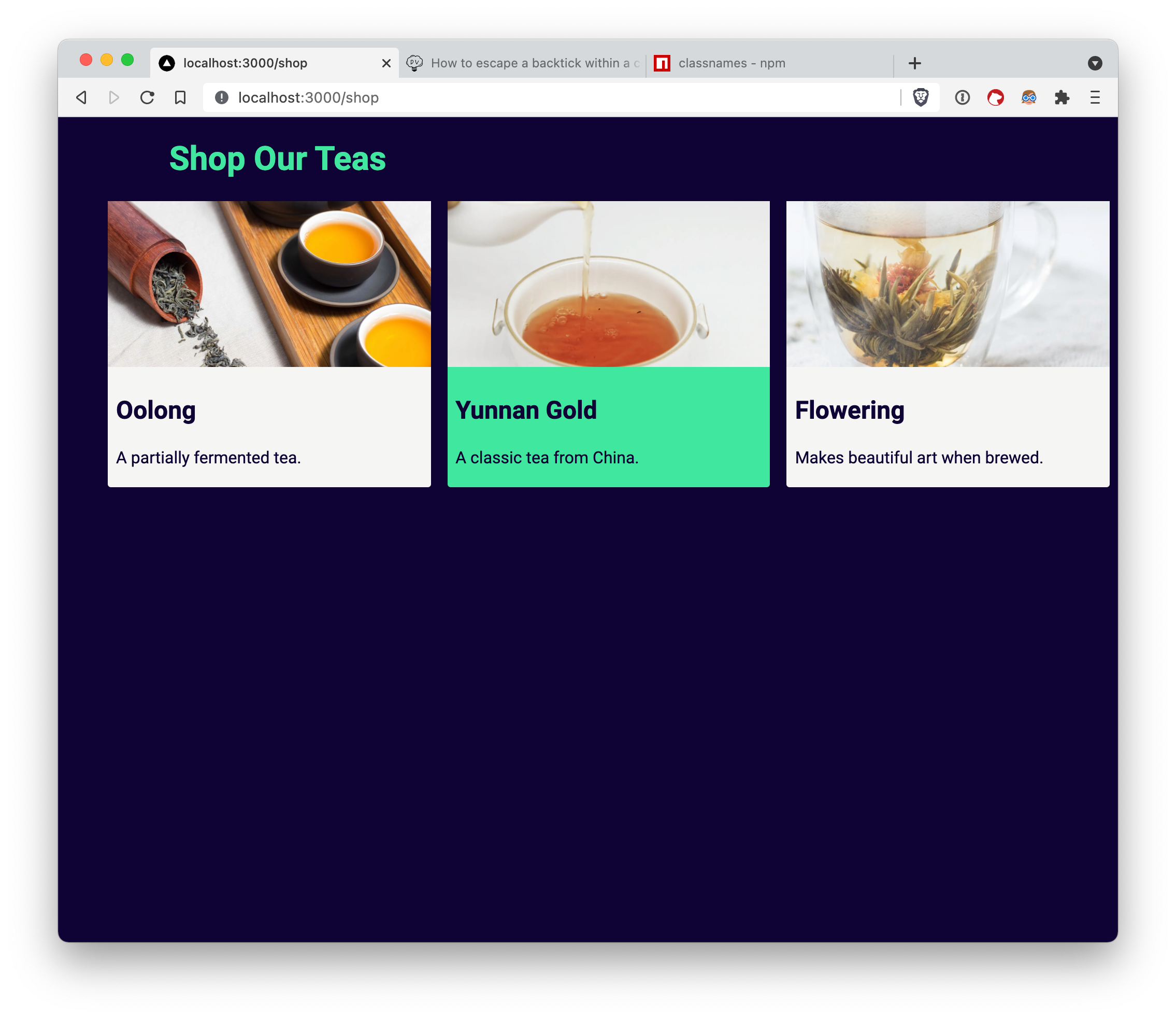
Now, we’ve finished up our Shop page, and we’ve made our TeaList component take advantage of both global and local styles.
A Balancing Act
We’ve now built our tea shop using only plain CSS to handle the styling. You may have noticed that we did not have to spend ages dealing with custom Webpack setups, installing external libraries, and so on. That’s because of the patterns that we’ve used work with Next.js out of the box. Furthermore, they encourage best CSS practices and fit naturally into the Next.js framework architecture.
Our CSS organization consisted of four key pieces:
Design tokens,
Global styles,
Utility classes,
Component styles.
As we continue building our site, our list of design tokens and utility classes will grow. Any styling that doesn’t make sense to add as a utility class, we can add into component styles using CSS modules. As a result, we can find a continuous balance between local and global styling concerns. We can also generate performant, intuitive CSS code that grows naturally alongside our Next.js site.


Leave a Reply
Want to join the discussion?Feel free to contribute!