Examples of Unorthodox Mobile App Designs
Original Source: http://feedproxy.google.com/~r/1stwebdesigner/~3/moKaz85vJmc/
Mobile apps should generally follow the same format and guidelines. Whether it’s Material Design or iOS Human Interface Guidelines, pushing designers to follow a design system ensures consistency across an entire operating system. This makes it easier for the end user to switch between apps with familiarity and ease. However, some mobile app designs break free of these constraints for the sake of experimenting with new styles and layouts. It enables us to envision new solutions to issues like navigation structures and work on general user experience design improvements.
In this article we are going to look at a selection of the most interesting and unorthodox mobile app designs. They each reconsider almost every aspect of a typical design.
Messages
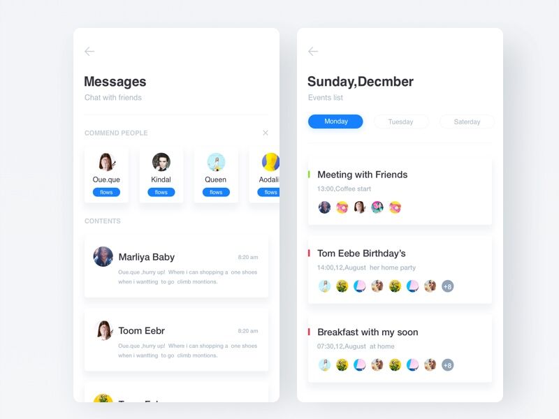
This messaging app moves away from the traditional header and tab bar associated with iOS. Instead it focuses on using simple navigation items, in-line tabs and depth to provide visual separation of elements.
iOS 11 Activity App
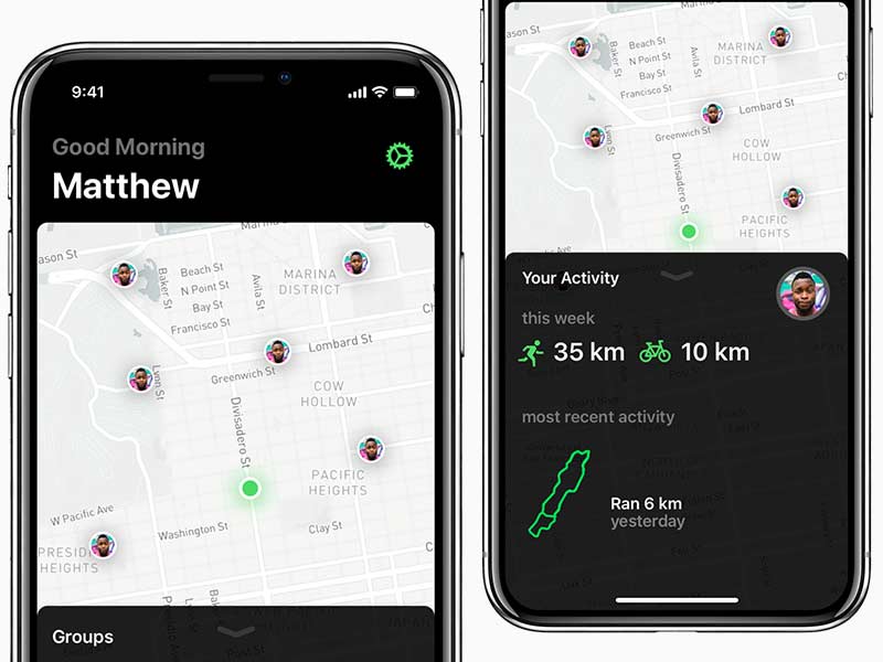
This activity app for iOS 11 goes against Apple’s advice to embrace the iPhone X notch. However, the result of using a black background is both visually impressive and less harsh on battery life. The bright green iconography contrasts beautifully against this background.
Pay App
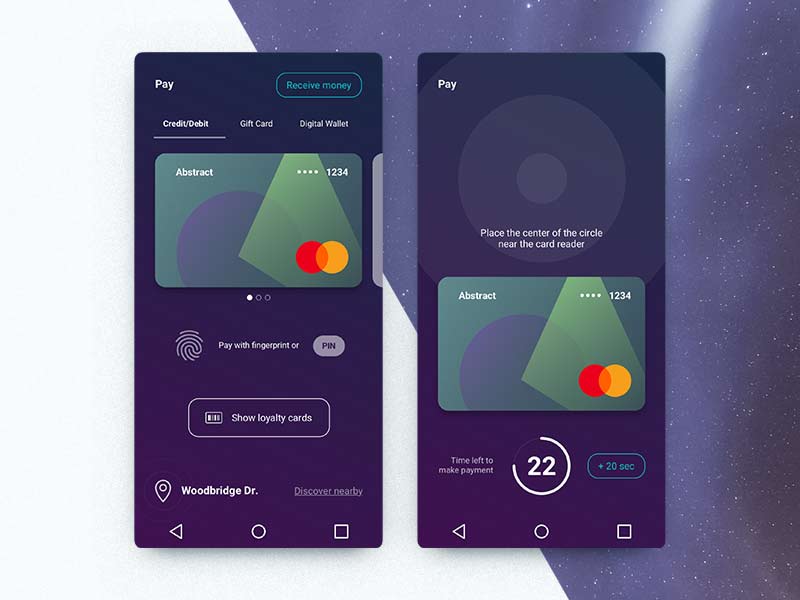
This Android app design offers a new take on primary action buttons, positioning the ‘Receive Money’ button on the top right. The tab bar has also been tweaked and the overall design looks cohesive with its singular background color.
Crypto Trading
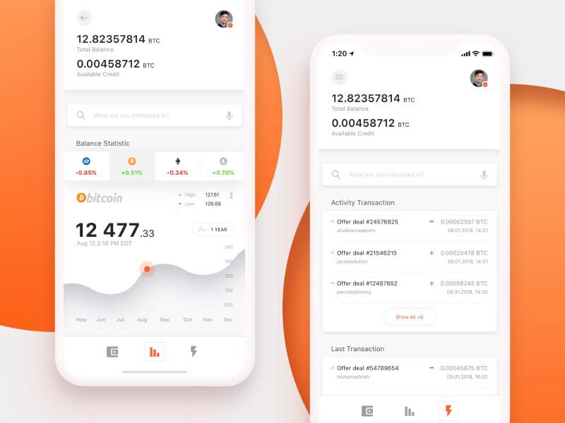
Using an abundance of depth, this iOS design takes visual cues from Material Design and implements them for iPhone. The design language is not associated with iOS styles but is wonderfully simple and offers a rethink of how added contrast and separation can enhance a design.
Events App
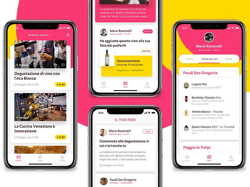
This events app is unique in the way it uses a colorful title bar background. It brings the edge-to-edge display to life and adds a great deal of design merit and feeling to the product.
Urban Timetable
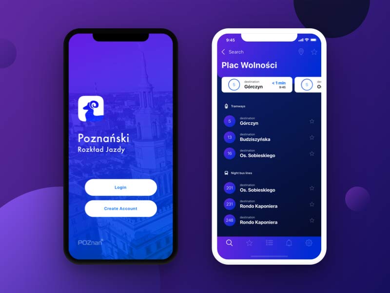
Using bright purples and blues, this timetable app moves away from the minimalist white that has become so popular across iOS. The result is visually stunning and ties into the brand perfectly.
Settings Interface
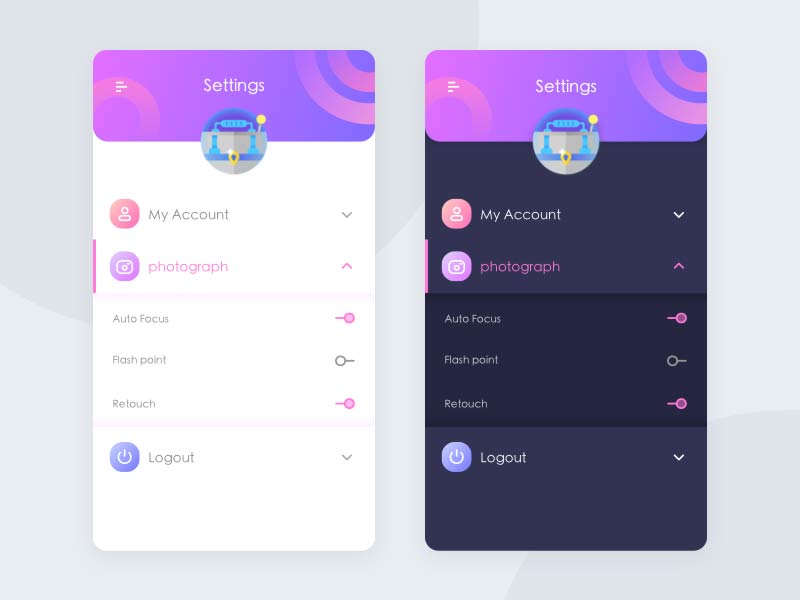
This settings interface takes on a more radical rethink of how a mobile app could look. From the colorful, graphic-intensive title bar, to the minimal switches, it’s a visually impressive design which looks easy to use and understand.
Kilpi Interactive
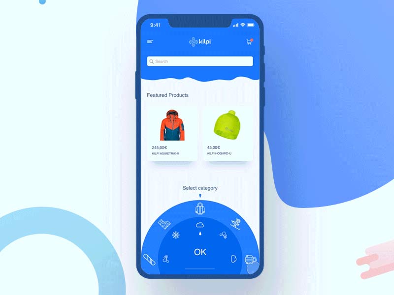
Not only does Kilpi use a completely redesigned title bar and header section, it also introduces an entirely new type of navigation system. It relies on rotating a wheel as opposed to using dropdowns, tabs and other traditional components. It looks visually impressive and easy to use with one hand.


Leave a Reply
Want to join the discussion?Feel free to contribute!