Designing An Attractive And Usable Data Importer For Your App
Original Source: https://smashingmagazine.com/2020/12/designing-attractive-usable-data-importer-app/
If you’ve ever tried to import data into an app before, you know, as a user, how varied the experience can be. In some cases, the user is overwhelmed with instructions on how to use the importer. In others, there’s no direction at all. And while that might look nicer than an importer overrun with directions and links to documentation on how to use it, a completely useless UI will also cause users frustration once the inevitable errors start getting thrown.
So, when you’re designing an app or software that needs a data importer, how do you ensure this doesn’t happen to your end users? Do you try to custom build or find a Goldilocks solution that strikes the right balance between minimal and informative? And what should that even look like?
Today, I want to look at four ways to ensure that the user interface design of your data importer doesn’t get in the way of a positive user experience.
Quick note before I start: I’ll be using live data importer examples to demonstrate how to design this on your own. However, if you’d rather just use a ready-made data importer, but don’t have time to review the existing options against these good design practices, Flatfile Concierge is what you’re looking for. I’ll show some examples of it as we go along and tell you a bit more about it at the end of this post.
UI Design Tips For Your Software’s Data Importer
There are many challenges in data onboarding for apps and software. But if you can get the UI right — in other words, provide your end users with an attractive and usable importer — you can effectively minimize those challenges.
Here’s what your data importer should look like if you want to make that a reality for your users:
1. Format The Instructions For Readability
It doesn’t matter how straightforward the data import process is. You can never assume that your end users will automatically know how to format their file(s), which file types are allowed and what sort of file size limitations there may be.
So, the main importer page must have instructions for them. Just be careful about going overboard.
If you leave them with a wall of text explaining what the importer is for, they’ll get annoyed with the redundant information holding them up from getting started. And if you spell out each possible step in minute detail, their eyes are going to glaze over. Worst-case scenario, they’ll start the experience feeling as though they’re being talked down to. None of these outcomes is ideal.
To find the sweet spot, aim for the following:
Simplify the instructions into 100 words or less.
PayPal’s invoice importer is a good example of this:
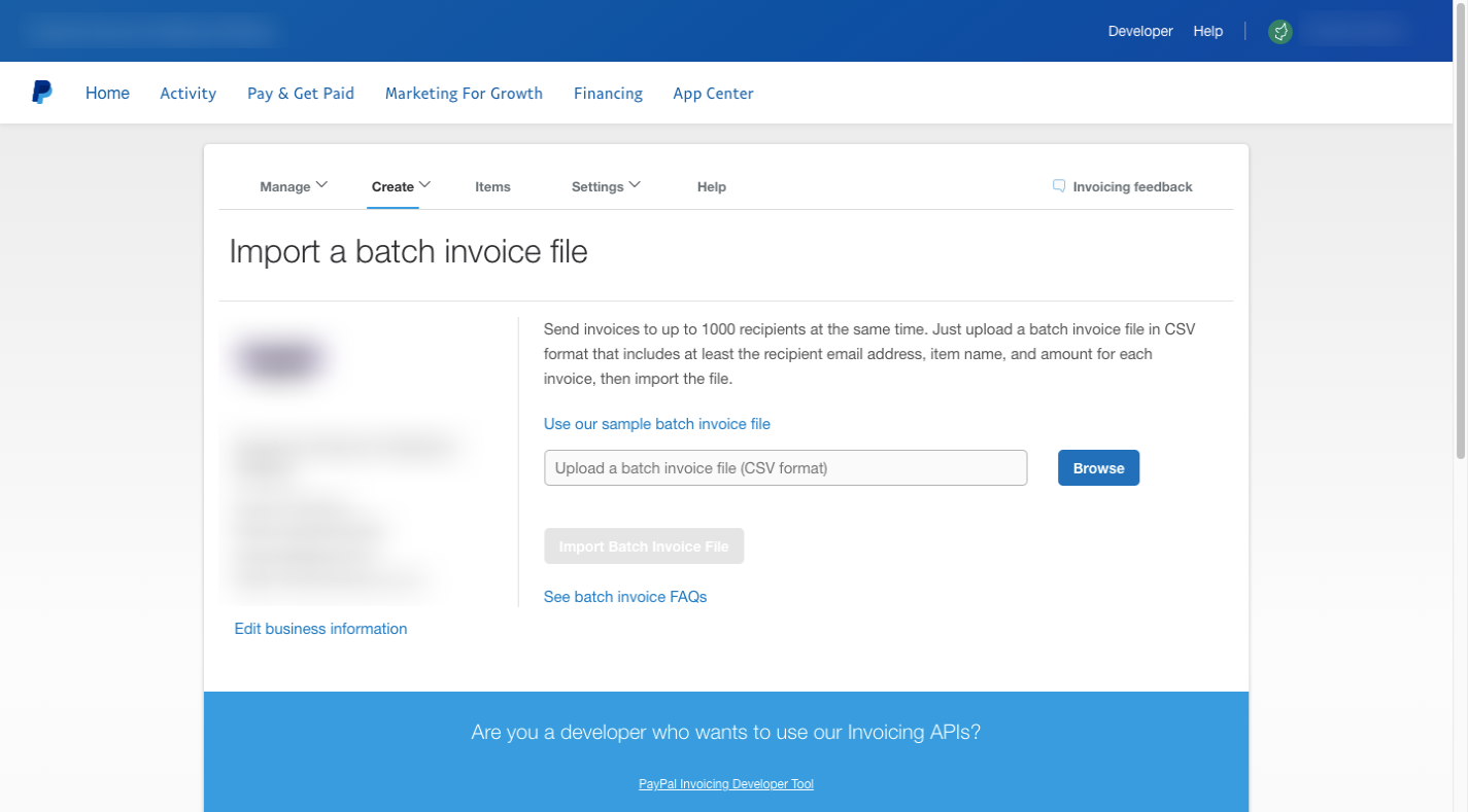
There’s a single paragraph on this page that tells users that files need to:
Be in CSV format;
Include fields for the email address, item name, and invoice amount;
Include no more than 1000 invoices.
For anyone that misses the bit about the file format, they’ll get a reminder of it in the upload field.
The rest of the information (the link to the file template and FAQs on how to batch invoice) is linked out to other pages, which keeps this importer page nice and short.
When possible, I’d recommend formatting the instructions using paragraphs, bulletpoints, bolded headers or white space. This would be similar to how you’d structure text for readability on a web or app page.
QuickBooks Self-Employed shows us how this might work:
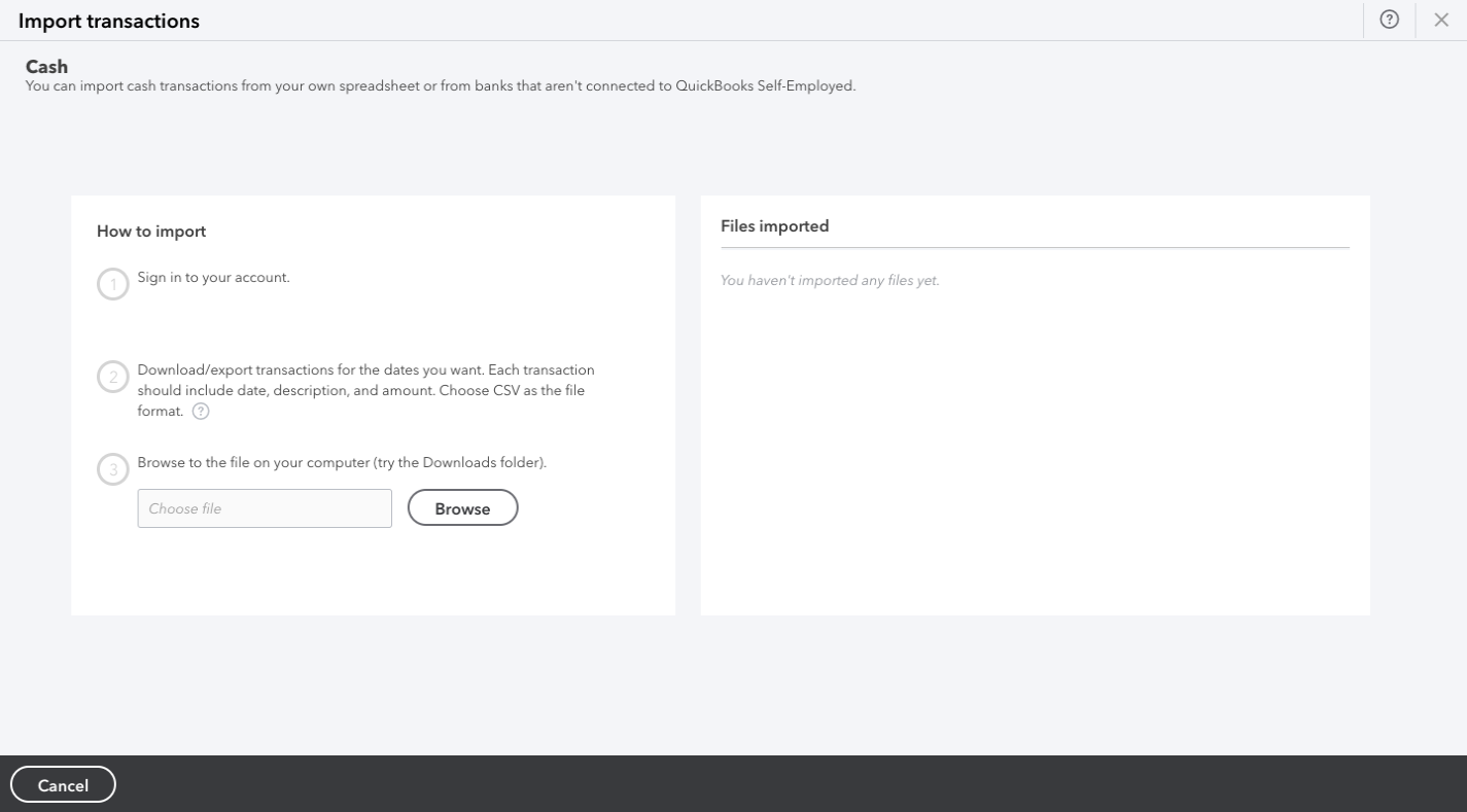
There are three steps presented and each is kept short and to the point. By adding extra space between and around them, reading the export/import instructions will seem less daunting.
One last thing you can do is to make the “Import” button stand out so that users that use the importer more than once can quickly skip past the instructions on subsequent uses.
Here’s how this might look if you use Flatfile as your data importer:
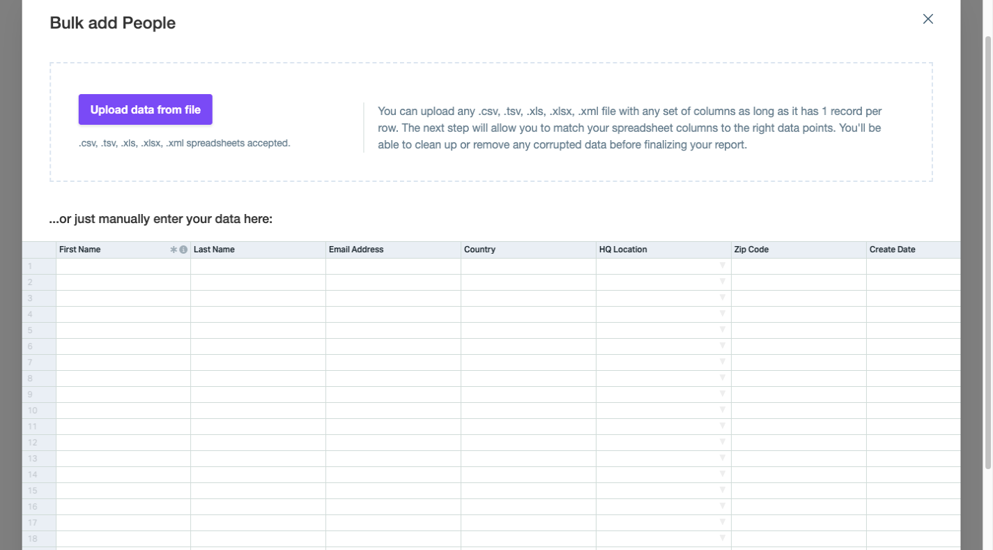
The button stands out clear as day on this page. And for those who have used this importer before, they won’t need to read through the instructions on the right for a reminder of what kinds of file types are allowed. There’s a note right beneath the button that clarifies this.
What’s more, the button is in the top-left corner, which is where most users’ eyes initially focus on a new page. So, the strong color of the button coupled with the priority placement will help users quickly get the import process started.
2. Show Them All The Import Options That Are Available
Consumers often expect companies to provide them with options. This is something we’ve seen a lot lately in e-commerce, with shoppers wanting various purchase options available (e.g. pick up in-store, curbside pickup, two-day delivery, etc.)
If it makes sense to do so for your app, consider giving your users the same kind of flexibility and control over how they import their data. And when you do, design each option so that it’s clear — just by looking at it — what action comes next.
For instance, this is the expense and income importer for AND.CO:
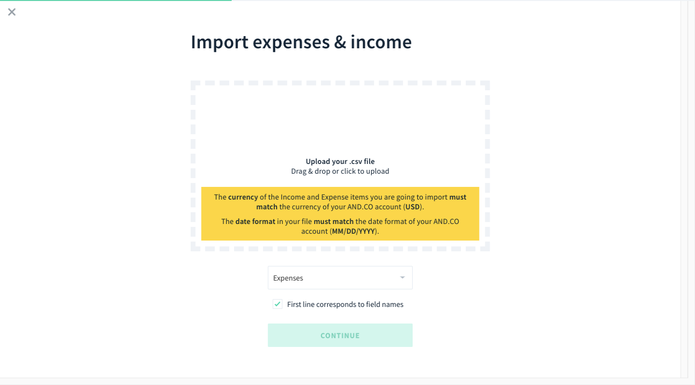
The block with the dashed border tells users that they have at least one option: Drag-and-drop their CSV file into the widget to upload. While an importer design like this doesn’t always allow for click-to-upload, this one does (per the instructions).
Flatfile uses a similar design at the top of the import page:

The difference between these two examples is that Flatfile includes an upload button inside the dashed-border box so that it’s clear that both import options are available.
There’s also a third option beneath this block:
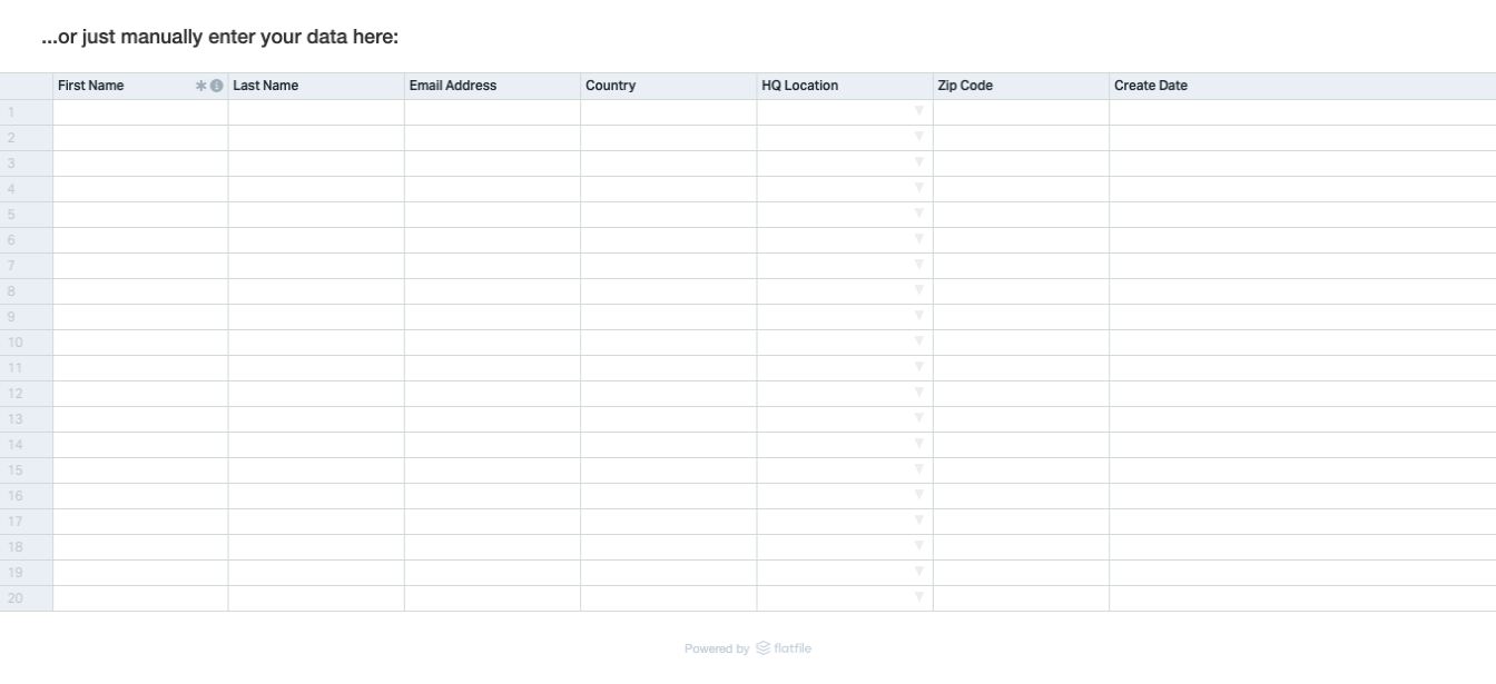
It’s a good idea to include a manual import option if your end users will return to the importer to add small handfuls of data and don’t want to prepare a file every time.
One last way to present import options is through the use of third-party software logos as Asana does:
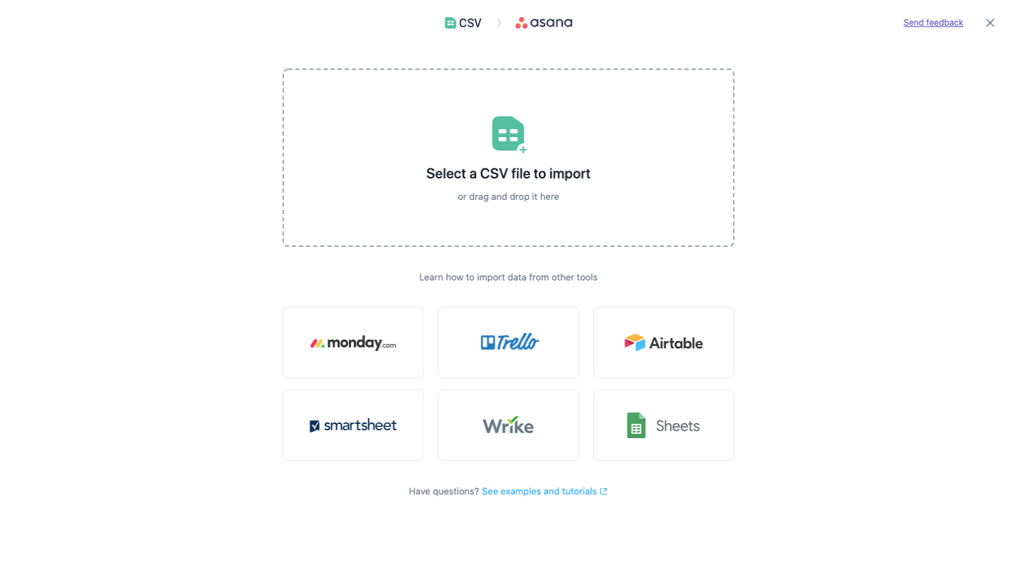
The standard CSV file import option is available at the top of the page. Beneath that, though, are apps that their users are most likely to have stored their project data in.
As you can see, the visual presentation of the import options is just as important as the instructions provided. So, rather than try to get creative here, just use a tried-and-true design that your end users will be familiar with and will help them instantly identify the import option they prefer.
3. Make Complex Imports Look Easy
At this stage of the data import process, things can get a little hairy. Even if you have a flawless import process on the backend, the way it’s presented to your end users can be a problem if the complexities of the process start to show through.
There are two things you can do with the UI to keep that from happening. This point will cover what you can do if the import process itself is complex.
HubSpot is a robust marketing and sales software, so it’s no surprise the data import process would take a while. Regardless, it starts simply enough, asking users if they’re going to import their data or pull it in from another platform:
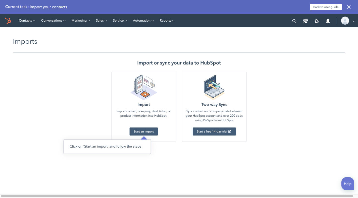
Now, this design goes against what I just talked about in the last point about designing the first page. However, there’s a reason why this was a good choice.
Let’s say this HubSpot user decides to import their data from a CSV file. They’d select “Import” and then go to this page:
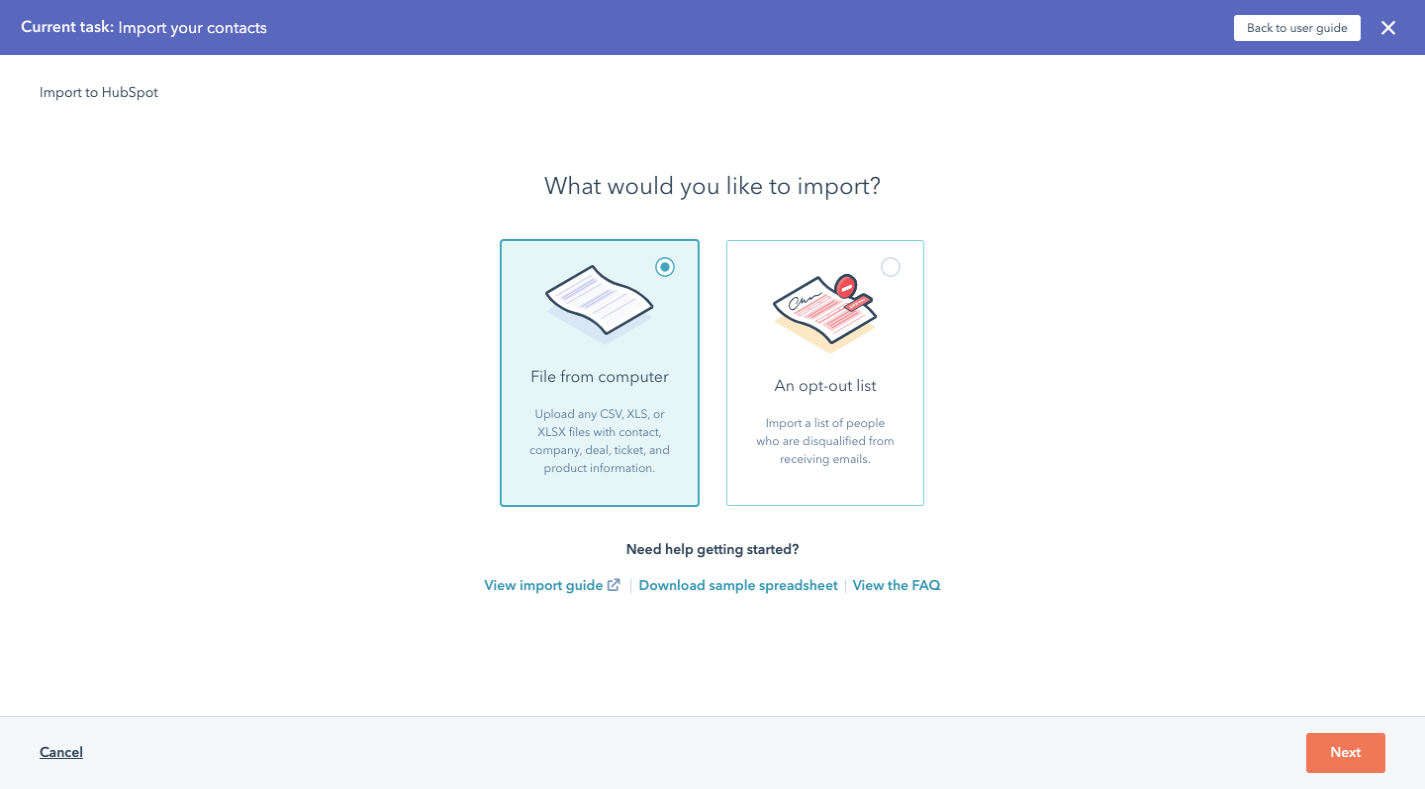
If HubSpot used the typical import page design, this page would require users to pause and then get acquainted with the new interface before moving on.
So, this is something to consider if you have a complex data onboarding process that needs to be broken up into multiple steps before the actual import begins.
Assuming the user just wants to import a CSV, XLS or XLSX, they’ll find themselves here next:
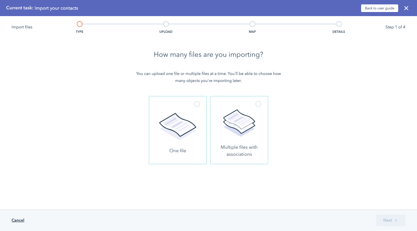
What’s nice about this approach is that it prevents users from having to go through the importer once for every file they have to upload. If there’s related data, they can select ‘Multiple files with associations’ and the importer will help them make those connections:
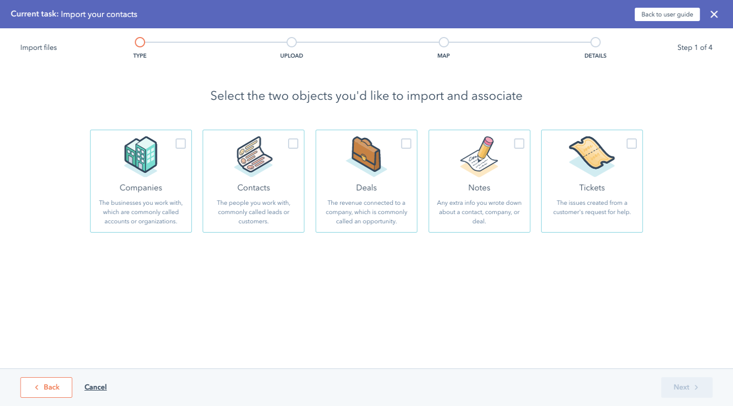
This way, it’s not the users’ responsibility to merge the data in their files. Nor do they have to spend hours going through their imported records to merge related records. This importer helps them do it.
The next screen is similar to the “How many files are you importing?” screen. This one appears, however, when the user selects “One file”:
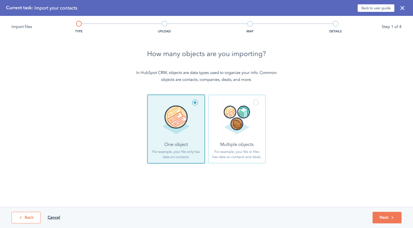
This again is aimed at keeping users from importing data and then spending excessive amounts of time cleaning it up.
Next, we have the part of the process where the user finally sees the importer. While it’s not exactly like the designs we looked at before, it’s still intuitive enough where users will know how to upload their files into it:
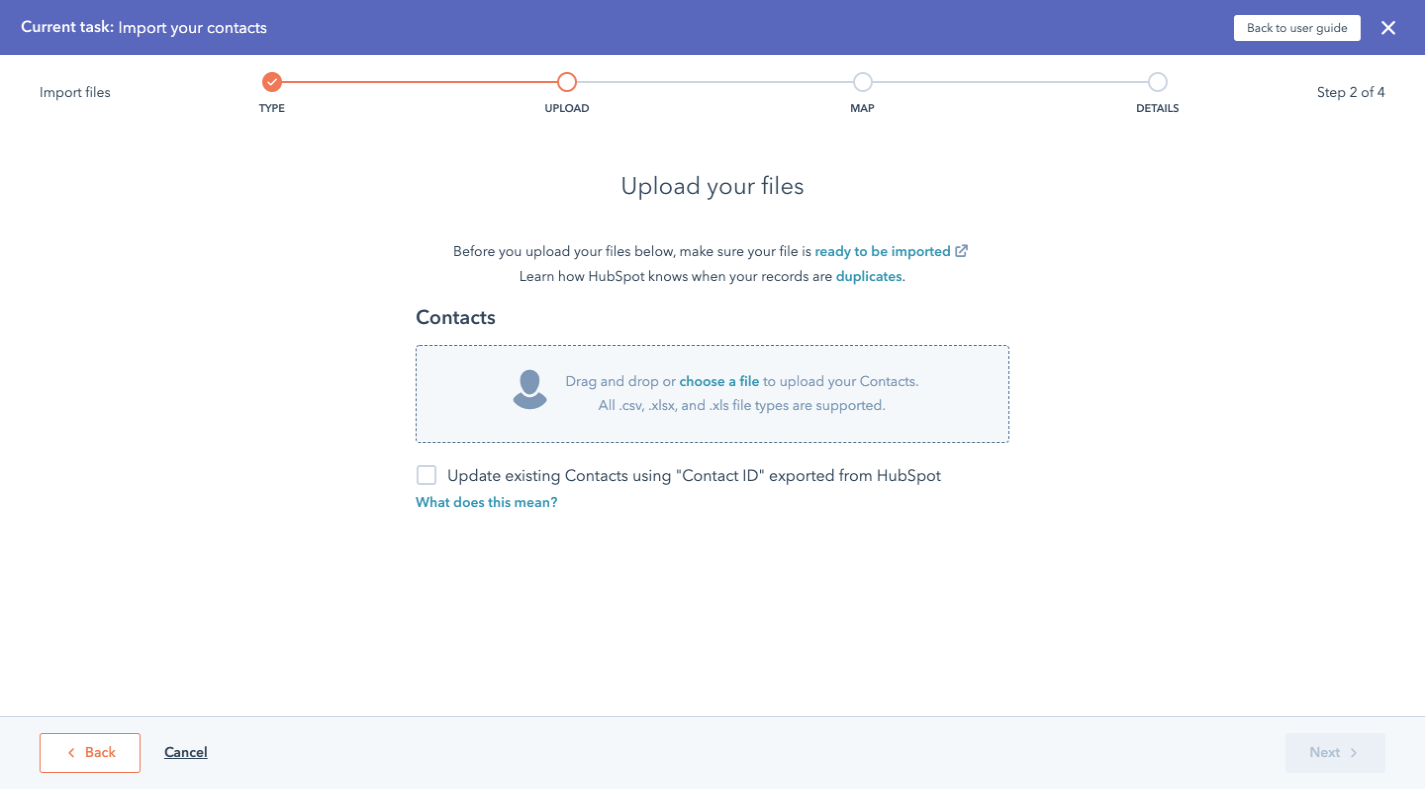
While I realize this is a lot of steps to get to a page that other software would show first, think about how much quicker these users are able to get inside HubSpot and to start working.
If you have a complex upload process (i.e. multiple files, object associations, etc.), consider using a similar design with each question on its own page as well as consistently presented options.
4. Use Color To Make Data Cleanup Speedy
The other way to simplify an otherwise complex import process is applicable to all data importers. In particular, this tip pertains to the final steps in the data onboarding process:
Data validation
Data sanitization
Now, having a data importer that can actually do some of this work is going to be a huge help. However, it’s ultimately up to your end users to review what they’ve imported and to approve it before they allow it inside the software.
To help them not be so overwhelmed by all the data and everything they need to address, use color to guide them through it.
For this example, we’re going to look at ClickUp. And if it looks familiar to you, that’s because it should. It was built using Flatfile’s data importer.
Let’s start with the first part of the data validation process:
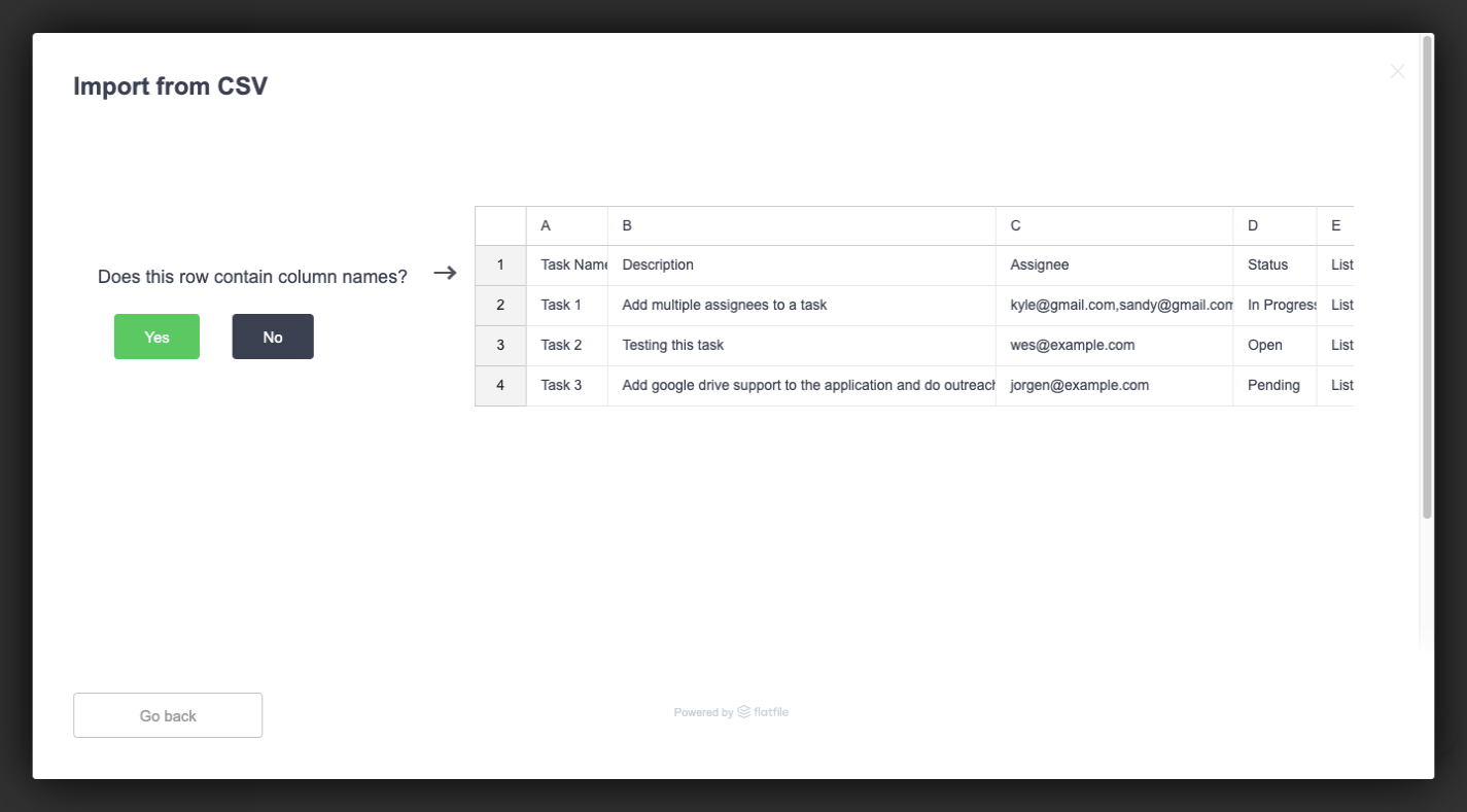
This page is straightforward enough. It shows the user a snippet from their imported data and asks them if the row pointed to contains column names.
But look at the green “Yes” button. While this is a design tactic we use for web and app interfaces (i.e. make the desired call-to-action a positive and eye-catching color), there’s another reason this is here.
Assuming the column names are there and ClickUp can easily interpret the data, this is what the user sees next:
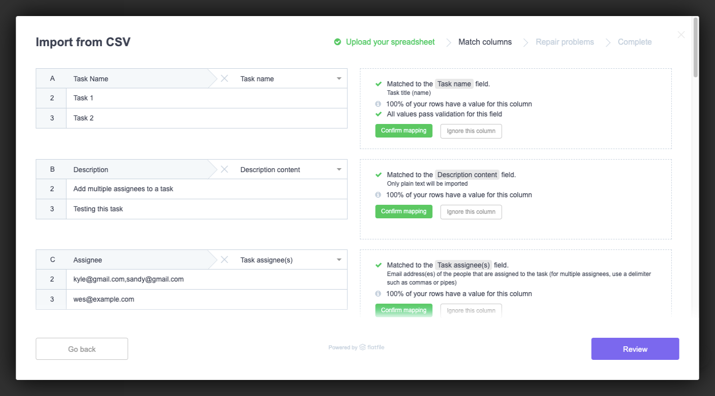
This is the data importer’s attempt at making light work of data validation. On the left are all the identified columns from the file.
On the right is information about how the columns were matched to ClickUp’s fields. There are also three possible data validation options:
Confirm mapping (in green);
Ignore this column (in a grey ghost button);
Include as a custom field (in another ghost button).
The green button here matches what we saw on the last screen. So, users have already been conditioned to view this green button as an affirmative, which will help them quickly go through all the results and confirm the fields that were correctly matched.
Green and grey aren’t the only colors that should appear in your data importer.
If errors should arise (which isn’t a bad thing), your users should have a chance to fix them before the data gets uploaded. Depending on where in the app the errors appear, you might want to design them differently.
For instance, ClickUp uses an orange warning symbol to call out issues with values during validation:
![]()
This allows ClickUp to tell users, “Yes, the column names match, but your values don’t line up with what we use.”
ClickUp then uses a red highlighter during data sanitization to point out errors with fields:
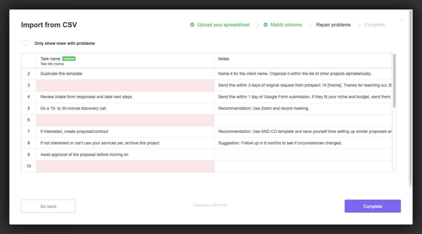
This is the final step before upload, so this is ClickUp’s last attempt at getting its users to perfect their data import. In this case, ClickUp highlights a field in red if it’s marked as required but contains no data.
The color alone should call attention to the fields. However, what if the user had imported a file with hundreds or thousands of rows and doesn’t see the red at first glance? Giving them a way to zero in on these red lines would be super valuable.
And ClickUp’s “Only show rows with problems” toggle does this:
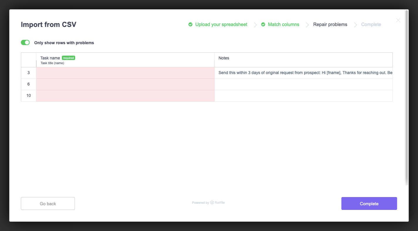
Let’s face it: Unless your data importer tells your users when and where there’s a problem with their data, they’re probably not going to give it a second glance. That is, not until they’re in the software and wondering why their records are all messed up.
Of course, they’ll blame it on the importer and the software; not on their own negligence. So, providing these colorful markers throughout the process will be a huge help.
Wrapping Up
As I mentioned before, if you’re not confident that you can pull off the tricky balancing act between building a friction- and error-free data importer while designing it to be attractive, intuitive and helpful, then why bother?
As we’ve already seen, Flatfile Concierge is a ready-made data importer solution that’s not only built to handle a wide range of data import scenarios, but it looks great, too. By letting it power your data import process, you can devote more time to building products and your clients can dedicate more time to providing their users with better customer service and support.

Leave a Reply
Want to join the discussion?Feel free to contribute!