Creating Flexible Layouts with Flexbox
Original Source: https://www.sitepoint.com/creating-flexible-layouts-with-flexbox/
The following introduction to Flexbox is an extract from Tiffany’s upcoming book, CSS Master, 2nd Edition, which will be available shortly.
Before CSS Grid came along, there was Flexbox (which is officially known as the CSS Flexible Box Layout Module). Flexbox was designed to manage layout in one direction—a row (flex-direction: row or row-reverse) or a column (flex-direction: column or column-reverse). That’s in contrast to Grid, which accounts for rows and columns.
A basic flexible box layout is simple to create: add display: flex or display: inline-flex to the containing element. These values for display will trigger a flex formatting context for that containing element’s children. As with Grid, both flex and inline-flex are inside display modes. We set these values on the container, which behaves like a block-level or inline-level box, respectively. The children of that container are then arranged according to the rules of flex layout.
Note: Older versions of Blink-based browsers such as Chrome (≤ 28), and WebKit-based browsers like Safari (≤ 8), require a vendor prefix. If your project still supports those browsers, you’ll need to use display: -webkit-flex or display: -webkit-inline-flex. Older versions of Firefox (≤ 21) also require a prefix. Use -moz-flex and -moz-inline-flex to support those browsers.
By adding display: flex or display: inline-flex to a containing element, its immediate children become flex items, as shown in the image below. Flex items may be element children or non-empty text nodes. For instance, the markup below generates three flex item boxes that each behave according to the rules of flex layout:
<div style=”display: flex”>
<span>This text is contained by a SPAN element.</span>
<b>This text is contained by a B element.</b>
This text node is still a flex item.
</div>
If no other properties are set, each flex item will have the same height as its tallest element (as determined by content). It will also stack horizontally (or vertically when the document has a vertical writing mode) without wrapping, and with no space between the edges of each box. Flex items may overflow the container.
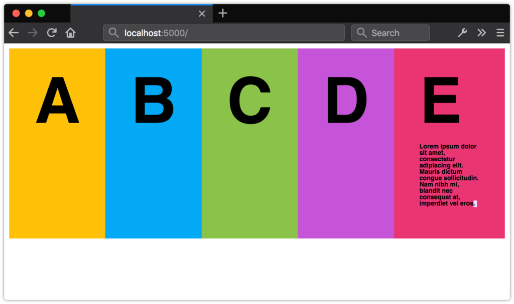 A list with display: flex applied to the ul containing element
This may not seem like such a big deal, but it simplifies the code necessary for a range of user interface patterns. Let’s look at a couple of examples.
A New Media Object Component
Take the following media object code:
<div class=”media__object”>
<img src=”video-thumb1.jpg”>
<div class=”media__object__text”>Lorem ipsum dolor sit amet, consectetur adipiscing elit, sed do eiusmod tempor incididunt ut labore et dolore magna aliqua.</div>
</div>
Before Flexbox, we might have paired the preceding markup with the following CSS:
.media__object img {
float: left;
height: auto;
width: 150px;
}
.media__object__text {
padding-left: 170px;
}
/* Let’s use the clearfix hack! */
.media__object::after{
content: ‘ ‘;
display: block;
clear: both;
}
This layout works, but it has one major drawback: it requires us to constrain the width of our images so that we know how much padding to use. That limits our ability to use this same component in multiple contexts. You may want an image 150px wide when this component is used for a “Related Stories” widget, and one that’s only 75px wide for comments.
Let’s try this using Flexbox. Here’s our updated CSS:
.media__object {
display: flex;
}
.media_object img {
margin-right: 20px;
}
That’s a lot less CSS. An added bonus is that we don’t have to worry about how wide or tall our image is. Nor do we have to concern ourselves with clearing floats. Whether the image is 200px wide or 20px wide, .media__object__text will abut the margin box of our img element.
The post Creating Flexible Layouts with Flexbox appeared first on SitePoint.


Leave a Reply
Want to join the discussion?Feel free to contribute!