Create perfect user flows
Original Source: http://feedproxy.google.com/~r/CreativeBloq/~3/o4K3CZxkUDc/create-perfect-user-flows
What exactly is a user flow? Visually, it's a bit like a dance mat. Right foot here. Left foot over there. Now bring them together, turn and repeat. Without knowing how to dance, you're still able to stand on this mat and move along with your feet stepping in the right places in the right order. A user flow is just that. A loose but coordinated dance with your website. It's important that you know where a user will step and in what order for that dance to go well.
Working through the expectations of users and crafting an overall positive user experience can be a complicated mixture of data points, use cases, wireframes and prototypes to connect the dots before the project is fully built out. With so many moving parts, it's easy to get tripped up or have a stakeholder misunderstand the vision.
The 20 best wireframe tools
Unlike a design showcasing what a user will interact with after development, the role of a user flow is to set the ground rules for what the subsequent wireframes and designs will represent. It's the strategy document to design how the user flows from point to point.
What you need for a user flow
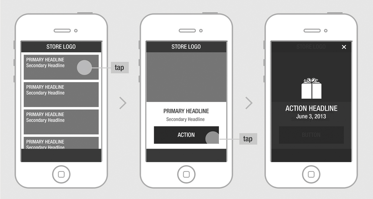
Apply user flows to work out how navigation will work in apps, as well as websites
Whether you work for an agency or directly with a client as a freelancer, you're probably no stranger to the confusion that comes with sharing early designs with a client. In your head, you understand the intricacies of how each block of content fits into the overall experience and it's glorious. Then you show someone else or, even worse, the client and they don't get it. They get hung up on the wrong details, often because they don't have the full vision in front of them yet. Which is where strategy documents that outline purpose – like a user flow – come in handy to keep things moving forward.
To do that, you'll need the following:
Business goals
Why do you want someone to visit your website? You can typically get these from your point of contact with a brief conversation. Are they launching a new service, product or trying to generate traffic for a specific area of the site? The more granular you can get the better. Goals lead to accountability from all sides and will benefit the users.
User goals
Why is someone actually visiting your website? Be hesitant to take these directly from the client unless they have done user testing or some kind of data-driven research to support it. Otherwise you'll end up with the same business goals with a different twist.
Entry points and user types
Based on the data, where are users landing right now? Do users typically land on a blog post? On a portfolio piece or a featured product? More importantly, how are they getting there? If organic traffic is driving mostly to the blog, those users may flow between secondary or tertiary pages differently than someone coming in from a referring website, social media or an email campaign. You may need to map them out differently to properly showcase the flow.
Yellow Brick Roads (YBRs)
What is the ideal path for users to travel between pages to meet both the business and user goals? To get them from the entry point to the results-driven destination? As users flow in non-linear ways, what are the edge cases that users may flow into? For example, if your YBR is a blog post landing page that clicks through to a service page and then the contact page, where might some users get lost? Do some users end up on the about page? Where do they go from there? Map out those edge cases and how they branch off from your ideal scenarios.
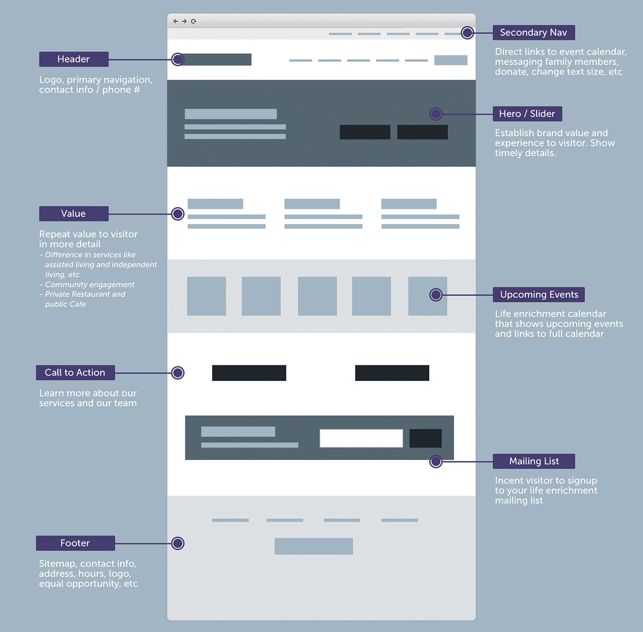
A lo-fi wireframe is useful for getting a rough idea of how a page works
You can extract the last two points with Google Analytics and the User Explorer feature for individual user flow paths or the Users Flow section to see a 10,000 foot view of trending paths for all users on the site. Both are worth getting familiar with (see our top tools in Google Analytics post).
Think of the dance mat. Where do users place their feet first (landing page)? Where does each foot go next (page two, three, four, etc)? Show that in a flow chart for each user type or goal.
There are plenty of plugins, frameworks or software solutions that can be used to create diagrams; let's look at what the deliverable should be in a user flow.
Easily shared and printed. This may seem like a no-brainer but you'd be surprised how often people bring printouts for diagrams that are unreadable. If there are too many steps or too much text to fit clearly on an 8.5 x 11-inch printout, you're overcomplicating things.Bridge the communication gap between clients, stakeholders, designers and developers. Flows show how a user will navigate and interact with the site jumping between pages. This is important to give a framework for everyone to unify their understanding moving forward.Showcase the path(s) toward each priority business and customer goal, common entry point pathways and a streamlined YBR pathway that offers up missed opportunities for key content. For clarity, this does not happen in a single flow. This will be multiple stand-alone flows.
With buy-in from stakeholders, you can take these user flow documents and use them to inform the designers creating wireframes to ensure they follow the core user experience strategies. They can be treated like a check list to validate the project is meeting the goals at each step.

Learn more about UX and more at generate New York 2019. Click the image to book your ticket
Expand user flows into wireframes
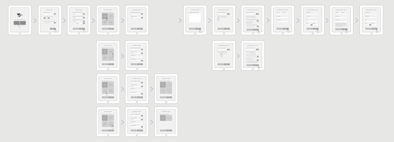
Map out edge cases and consider how they branch off from your ideal scenarios
Most of us have experience with wireframes in some form. Wireframes are used to represent the strategy behind a website layout. Sometimes they will be handed off to developers to begin building the bones of the infrastructure. They're the blueprint to the home. They help stakeholders understand the 'why' of the strategy without getting roped into details like fonts, colours or content.
Many times someone responsible for the user experience or design of a project will jump directly into the wireframe because they construct their own mental model of a user flow. The problem with that is they run the risk of internalising strategy, applying unforeseen bias, repurposing old ideas and may become a bottleneck between the design and the communication of the design. Clear communication is paramount.
User flows will help mitigate those risks because they pass down structured communication. It adds a layer of checkpoints.
There are various levels of visual fidelities when it comes to wireframing. Some prefer low-fidelity templated wireframes they can drop into place to represent the general information architecture of a given page. Others prefer high-fidelity wireframes that are very much designs but without the proper font, copy, colours and imagery in place. It's important to know your audience and what to use when. Realistically, if you are working from user flows you should move into a higher-fidelity wireframe that then grows into a prototype more easily.
It’s a good idea to start on paper, whiteboard or some tablet sketching tool
It's a good idea to start on paper, whiteboard or some tablet sketching tool. This enables you to focus on the quick ideation of potential solutions to problem areas and keeping the user on the ideal pathway.
To get started, you will need a list of each page to design and build into the website: home, about, service listing, etc. That acts as your checklist to ensure you don't miss anything. Start with rough sketches for each of those based on the goals you've uncovered previously.
Where does the navigation go? How are you going to convey the business goals on the home page? Are you following a 12-column grid for speed of understanding the structure with a certain demographic or is it a more progressive interactive site that can exude a bit more expressive freedom? This is where you determine the best way to achieve the goals and build on top of a strong base.
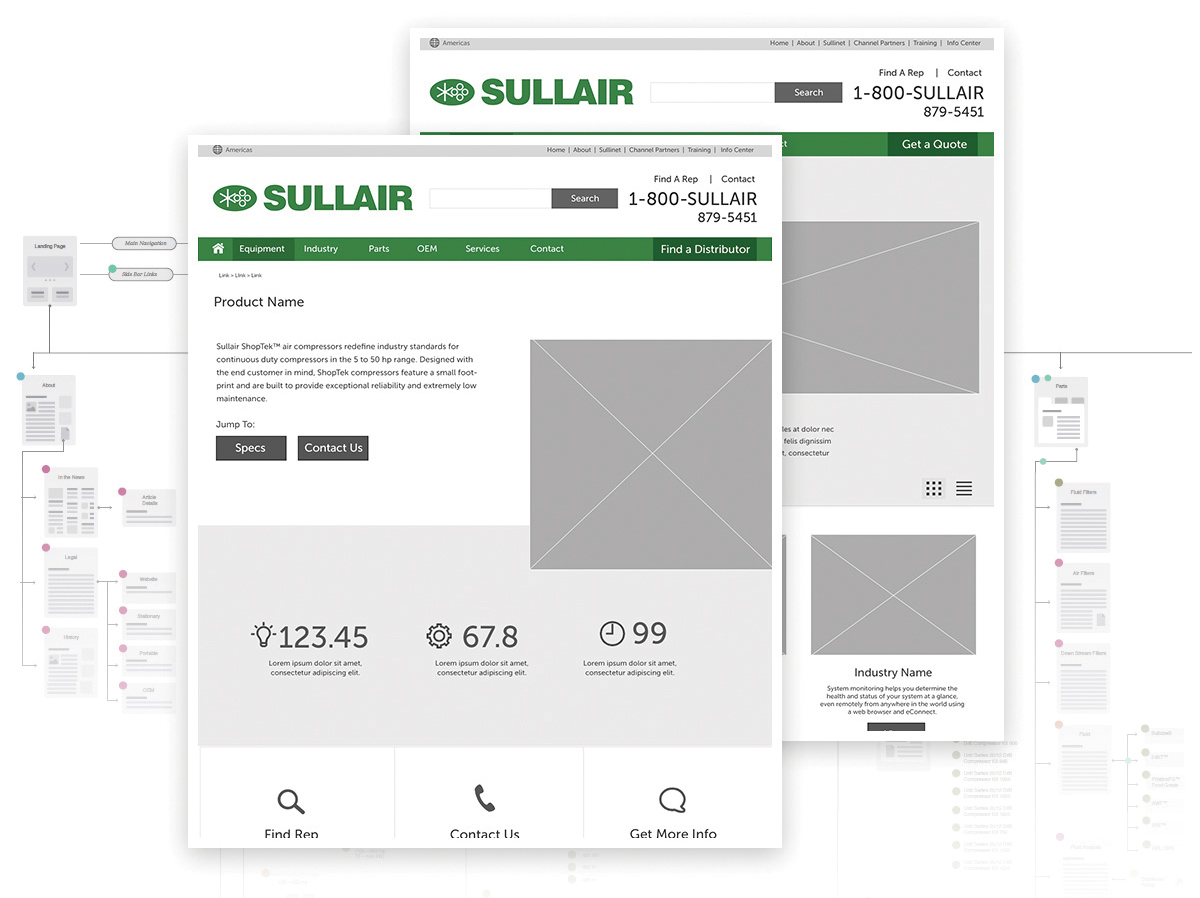
User flow documents can inform the creation of wireframes , as in this example for Sullair
Once those rough sketches are complete, select one of your user flows. For example, if the ideal pathway is a blog post landing page that the user clicks through to a service page and then the contact page, test that out with your wireframes. Look at your blog post landing page: how would a user find the service page based on your structure? Is it clear? Is it truly a priority on that page's layout or is it just another link tucked away on the sidebar, footer or navigation?
The user flow becomes an auditor to your work, the unbiased fact checker to your wireframes. Even better, when you can show a client you've connected all of the dots they deemed a priority, they become very satisfied with the work at each step. It reminds them of why they hired you to do this in the first place. It's a relief and they will likely begin to settle into your full process.
If you don't show you've provided a solution for those goals or a way to alleviate the existing pain points, each phase of your project will rely heavily on trust. Even with the best of us, that can only take you so far until comments like 'why didn't we catch that?' sneak into your conversations. The later those pop up, the more expensive they are to fix. The more often they pop up, the more that trust erodes. That's why following a process like this and supporting decisions with data and focus is so crucial.
Interactive prototypes
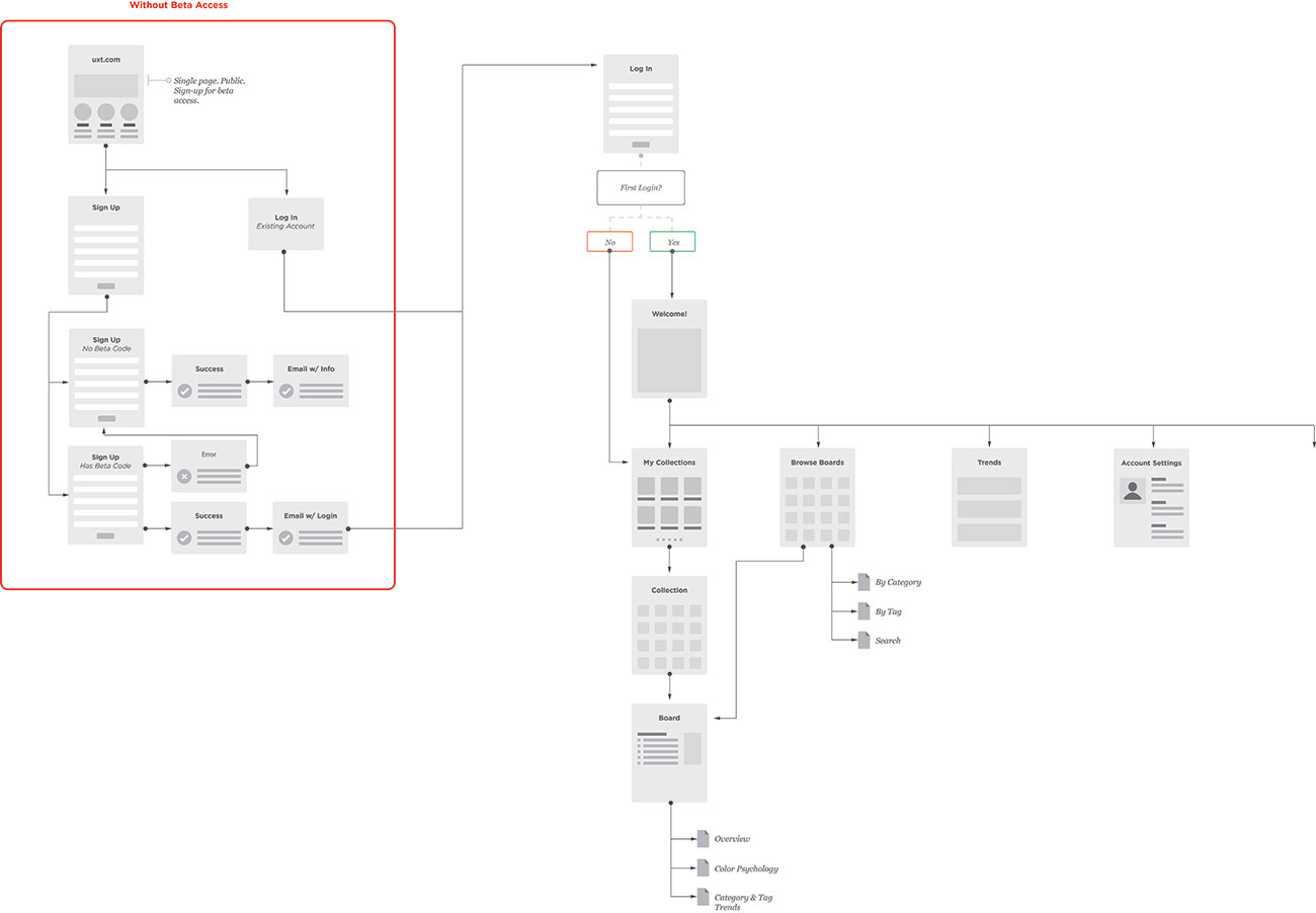
Showcase the path(s) toward each priority business and customer goal
Now you've validated the wireframe implementation with user flows, it's time to turn them into interactive prototypes. These are basically clickable static image files that enable you to jump to another image file to give the impression of navigating a website. Not only are these great for clients to experience, it's also very important to ensure your developers and designers are on the same page. That great layout idea may actually add 100 hours of development time and be out of scope. This kick-starts those conversations before time is wasted.
You or your design team may have a very clear vision for what this set of wireframes will evolve into in the weeks ahead. Maybe you're even taking the wireframes into a full design and prototyping that. That's not uncommon. But one problem persists. Those subtle hover states and microinteractions that support an intuitive user experience are hidden away inside of someone's mind. A stakeholder doesn't see that vision yet but prototypes can help.
Much like wireframing, prototypes can come in various fidelities. At Candorem we have used InVision for years because of the simplicity of creating sharable prototypes that focus on the user pathways between pages and key interactions or overlays. Drop in existing images and draw hot spots over links. Creating low-fidelity interactions then enables you to share a prototype within an hour, depending on complexity.
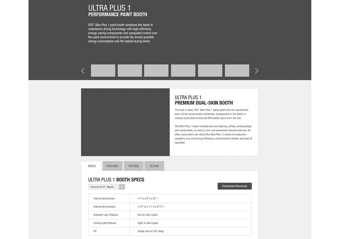
Bring out the hi-fidelity wireframes when you want to drill down into content in detail
Others may suggest using Adobe XD, which is far more robust in showcasing interactive elements of a design beyond page transitions. It's like if you combined Adobe's Creative Suite (get Adobe Creative Cloud here) with InVision as a single product. You could create your wireframes, full design concepts and prototypes in one fell swoop if you're organised enough. The important part is connecting the pages to craft an experience someone can click through and understand the vision.
It’s important to set expectations
Again, know your audience. Even with basic click-throughs in InVision, some clients confuse it with a built-out website. It's important to set expectations. Communicate exactly what it is you're showing a client with the prototype and, more importantly, what kind of feedback you are looking for at this stage. Are you looking for feedback on flow between those key pages in the user flow? Are you looking for feedback on the page transition animations in the prototype? The content that fits into the spaces and where it will come from? Communicate that. It will help you grow as a professional very quickly and the quality of your work will increase exponentially.
You can judge the success of this process by beginning the prototype review on a key landing page like the blog from earlier. Ask someone in the review from the stakeholder team to click through to a specific page on the prototype and see what paths they take. Even in edge cases where the user travels down another path, as users travel in non-linear fashion, they should be able to locate the key pages that reflect a business goal. Your work must be accountable to that.
Your ability to showcase the critical thinking and implementation behind key decisions, as well as how you or your team have adapted your goals into an intuitive experience, is crucial. That's what enables you to reframe perspectives, move away from short-term trends and obtain support from the otherwise loudest people in the room. Strategy at every step.
This article was originally published in issue 315 of net, the world's best-selling magazine for web designers and developers. Buy issue 315 here or subscribe here.
Related articles:
10 rules for making user-friendly web formsPerformance UX: A primer10 steps to an engaging user experience


Leave a Reply
Want to join the discussion?Feel free to contribute!