Fresh Resources for Web Designers and Developers (August 2025)
Original Source: https://www.hongkiat.com/blog/designers-developers-monthly-08-2025/
We are back with our monthly roundup of fresh resources for web developers.
This month, we have a collection of tools, libraries, and frameworks that can help you in your web development projects. This month’s list includes many tools focusing on AI-based development, automation, and productivity.
As always, we encourage you to explore these resources and see how they can fit into your workflow. So without further ado, here is the full list:
Click Here for More Resources
.no-js #ref-block-tax-74165-1 .ref-block__thumbnail {
background-image: url( “https://assets.hongkiat.com/uploads/thumbs/related/tag-fresh-resources-developers.jpg” );
}
Click Here for More Resources
Check out our complete collection of hand-picked tools for designers and developers.
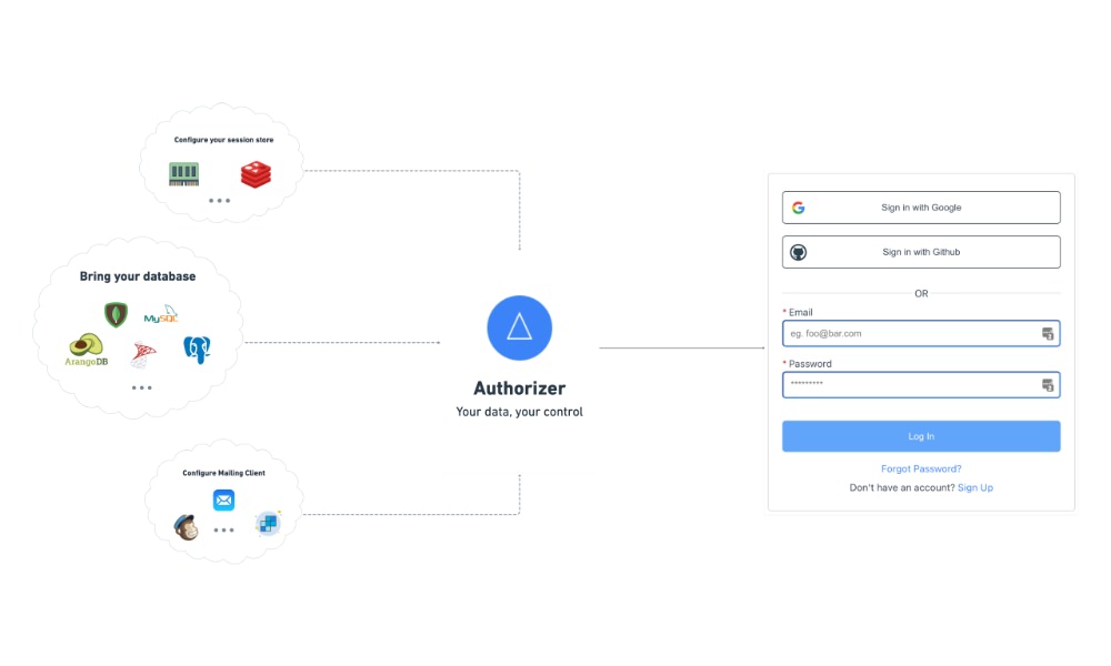
Authorizer
Authorizer.dev is an open-source tool that allows you to add login and user access control to your app without relying on third-party services. It supports email, social logins, magic links, and works with databases like PostgreSQL and MySQL. You can host it yourself, keep full control of user data, and integrate it easily with frontend apps using GraphQL or the JavaScript SDKs.
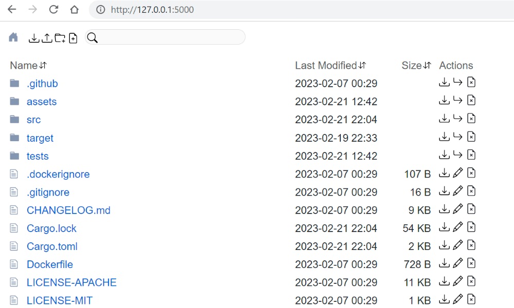
Dufs
Dufs is a fast and easy-to-use file server written in Rust. It lets you share files through a web browser or the command line, with features like drag-and-drop uploads, folder downloads as zip, file search, partial downloads, HTTPS, authentication, and WebDAV support. It works on macOS, Linux, and Windows, and can be installed via Cargo, Docker, or prebuilt binaries.
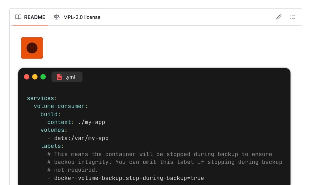
Docker Volume Backup
Docker Volume Backup, as the name implies, is a tool that can help you back up Docker volumes on a schedule. It supports saving backups to local folders or cloud storage like S3, Dropbox, or SSH servers. It works with both named volumes and bind mounts, and is easy to add to your docker compose setup.
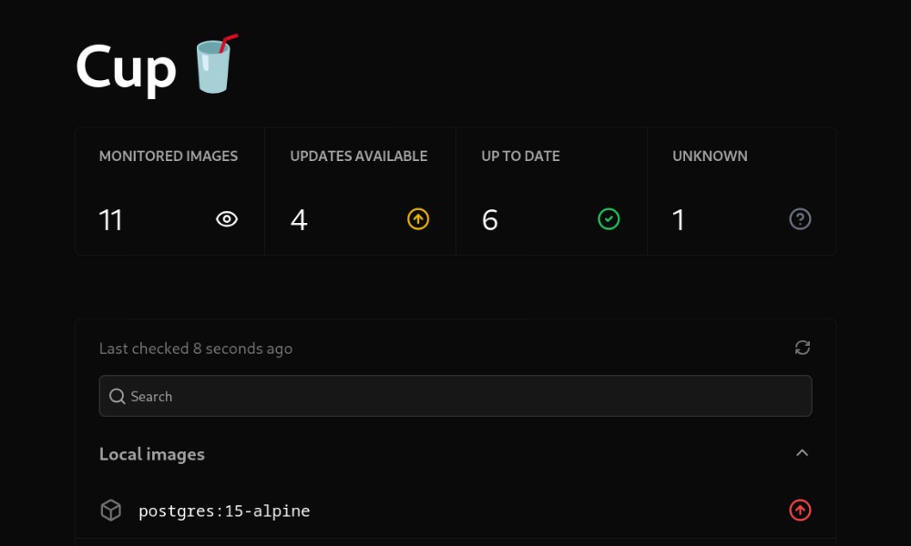
Cup
Cup is a fast, lightweight tool that helps you check for and manage Docker container image updates with ease. It supports many registries including Docker Hub, GitHub Container Registry, and Quay, and runs even on low-powered devices like a Raspberry Pi. A handy tool to keep your Docker images up-to-date.
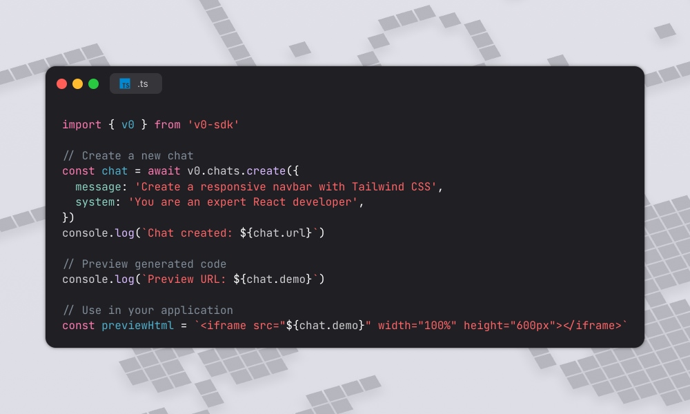
v0 SDK
v0 SDK is a TypeScript library for working with Vercel’s v0 Platform API. It supports code generation, project management, and deployments, with features like prompt-to-code, context injection, and seamless integration with frameworks like React and Next.js. Super useful if you’re using Vercel’s platform to build and deploy applications.
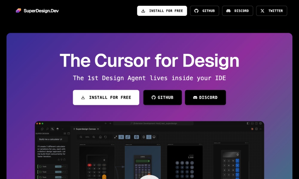
Superdesign
SuperDesign is an open-source AI design agent that runs in your IDE, like VS Code or Cursor, that allows you to generate UI mockups, wireframes, and components from text prompts all without leaving your code editor. A great tool for designers and developers who want to quickly prototype and iterate on UI designs.
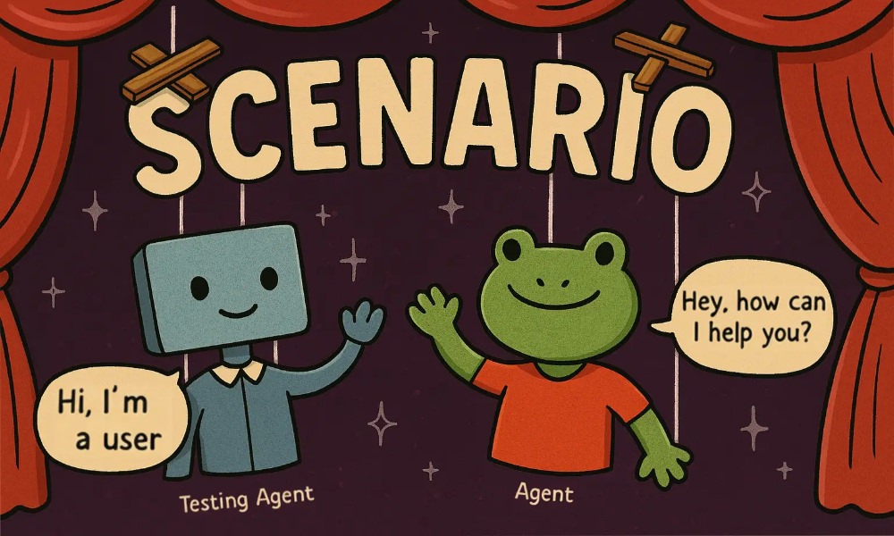
Scenario
Langwatch Scenario is a tool that helps you test AI agents by simulating real conversations with users. Instead of checking things by hand, you can set up full chat scenarios, define what should or shouldn’t happen, and run tests automatically. It works with any AI model and helps you catch mistakes before they reach users. A great way to ensure your AI agents are working as expected and providing a good user experience.
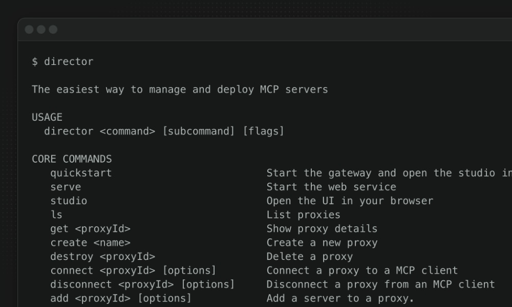
Director
Director is a free and open tool that makes it much easier to connect your MCP servers to AI tools like Claude, Cursor, or VSCode. It’s specifically designed to handle multiple MCP servers, so you don’t need to deal with complex JSON files. A useful tool for developers who want to streamline their workflow and connect their MCP servers to AI tools.
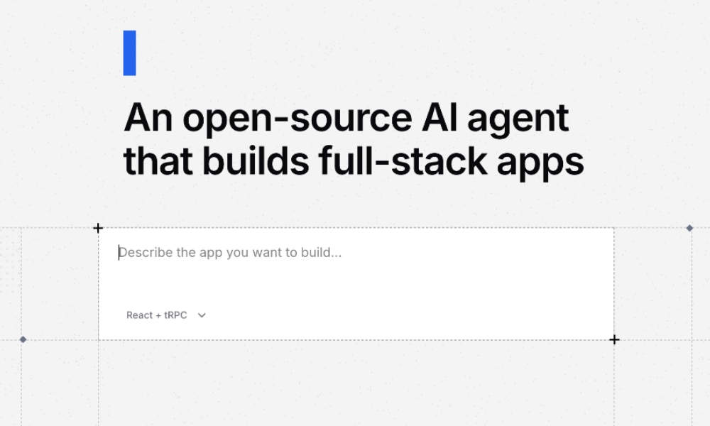
App.build
App.build is an AI tool that helps you create full apps, from frontend to backend, including the database, with just a simple prompt.
It supports modern stacks like tRPC applications with Bun and React, Laravel with Inertia, and Python apps. It handles validation, testing, deployment, and even writes models, controllers, and UI code for you.
A great way to quickly prototype and build applications without having to write all the code yourself.
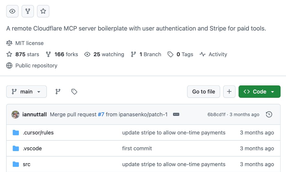
MCP Boilerplate
MCP Boilerplate is a free, open-source starter kit for building remote MCP servers on Cloudflare. It includes built-in Google/GitHub login, Stripe integration for selling paid tools, and uses Cloudflare KV for storage. A great way to quickly set up a new MCP server without having to start from scratch, and especially useful if you’re looking to monetize your MCP server with paid tools.
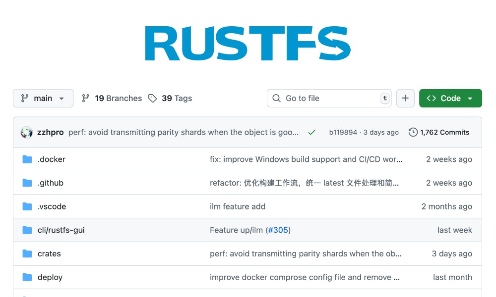
RustFS
RustFS is a fast, distributed object storage system written in Rust, designed for modern cloud and big data needs. It supports S3-compatible storage, strong access control, and is capable of handling large-scale data storage and retrieval efficiently. A great choice if you’re looking for a robust and high-performance storage solution for your applications.
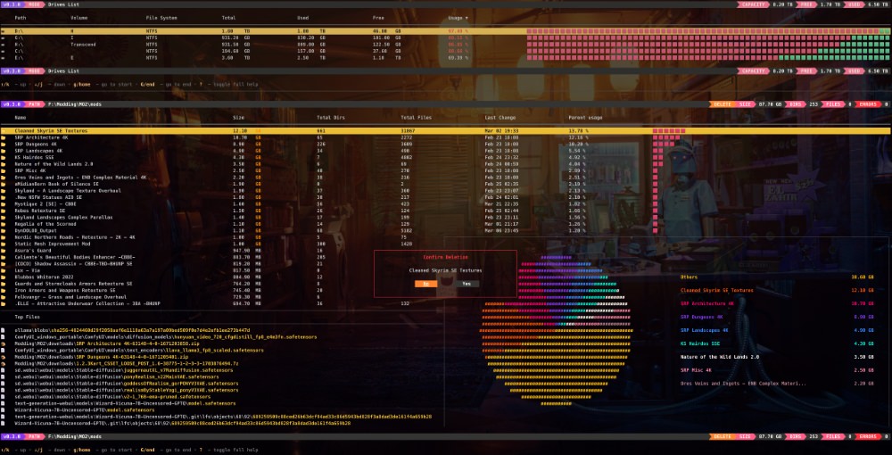
Noxdir
NoxDir is a fast, cross-platform terminal tool that can help you explore and manage disk space on Windows, macOS, and Linux. It shows real-time disk usage such as the used, free, total, and percentage in an interactive, keyboard-driven interface. A great tool if you need to quickly analyze disk space usage and manage files efficiently.
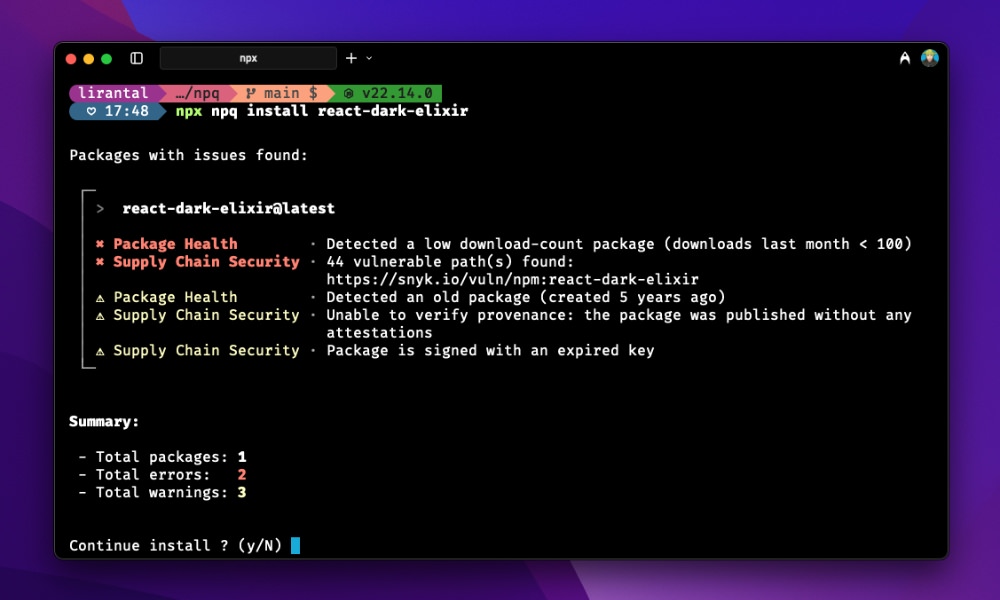
NPQ
NPQ is a command-line tool that checks NPM packages for security issues before you install them. It looks for known vulnerabilities, suspicious install scripts, missing metadata, deprecated or risky packages, and signs of typosquatting. This tool helps you stay safe when adding new dependencies.
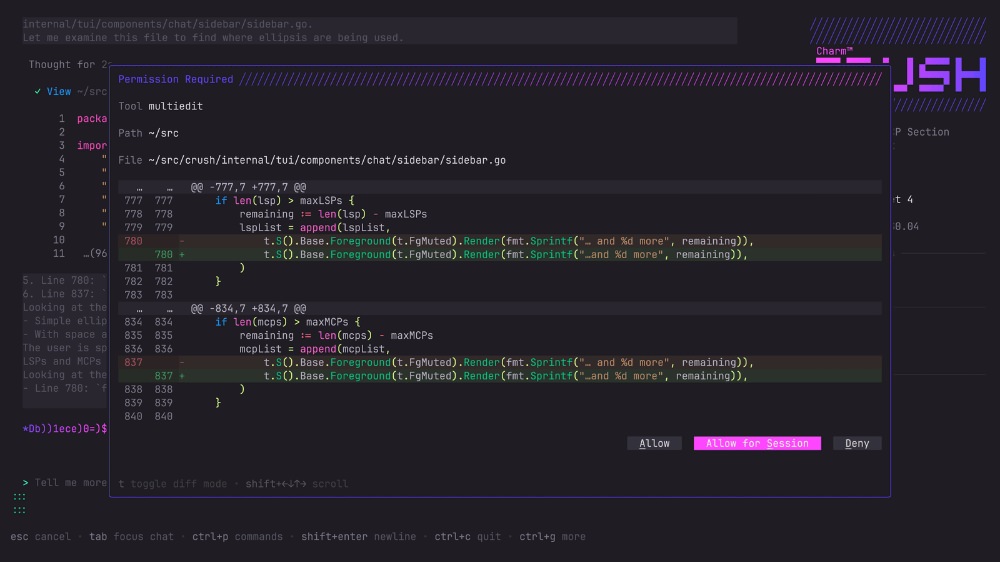
Crush
Crush is a stylish, open-source AI coding agent that runs in your terminal and connects your tools, code, and workflows to LLMs like OpenAI and Claude.
It supports Language Server Protocol (LSP), session management, and extensions via MCP, and works on macOS, Linux, Windows, BSDs, and more, with easy installation across platforms.
A great tool if you want to enhance their coding experience with AI-powered features right in your terminal.
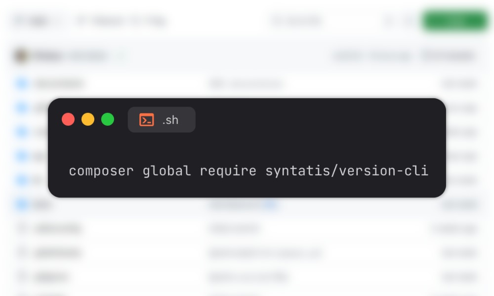
Version CLI
Version CLI is a simple PHP tool for the command line that allows you to check, compare, and manage Semantic Versioning strings. A useful tool if you need to, for example, bump version, check if a version is valid, and compare versions easily.
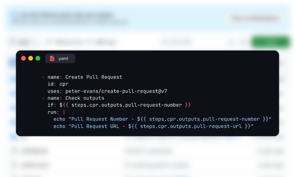
Create Pull Request
Create Pull Request is a popular GitHub Action that helps you automatically make pull requests when files are changed during a workflow.
It can create or update a branch, commit the changes, and open a pull request to the main branch. You can customize things like the commit message, pull request title, labels, and more.
It’s useful for automating tasks like code formatting, syncing files, or updating data on a schedule.
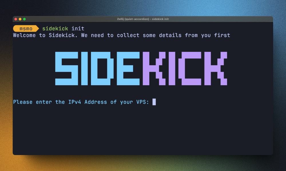
Sidekick
Sidekick is a tool designed to make deploying and managing apps on your own VPS easier. With just one command, it sets up Docker, Traefik, SSL, and secrets management. You can deploy any app using a Dockerfile, zero downtime, and connect your own domain. A great choice if you want to self-host your applications without the hassle of managing all the infrastructure yourself.
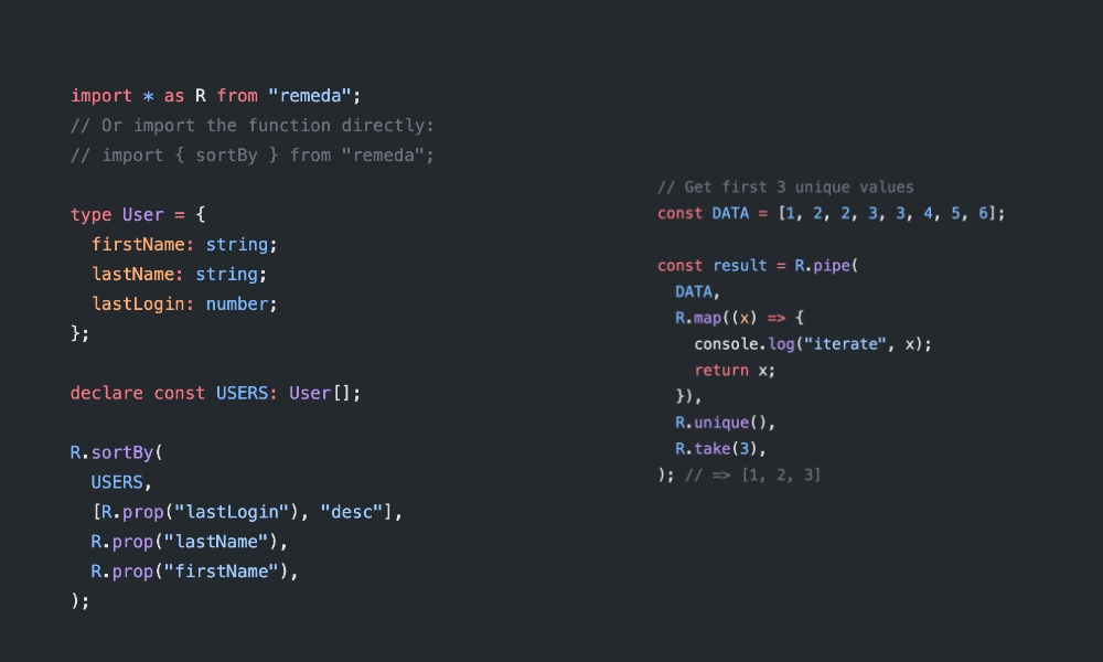
Remeda
Remeda is a modern utility library for JavaScript and TypeScript, built entirely in TypeScript for better type safety and IDE support. It offers both data-first and data-last functional styles, and supports lazy evaluation for efficient data processing. A great choice if you’re looking for a lightweight and type-safe utility library to use in your JavaScript or TypeScript projects.
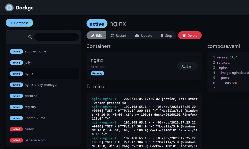
Dockge
Dockge is a self-hosted Docker stack manager focused on docker-compose.yaml files. Instead of managing individual containers, it allows you manage entire stacks with a clean and reactive web UI. Features include progress display, terminal access, and full directory-based stack management. A simpler alternative to tools like Portainer.
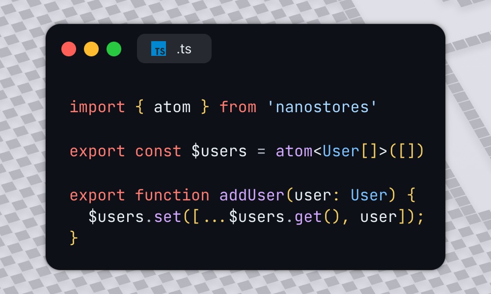
Nanostores
Nanostores is a small and fast state management library for JavaScript. It works with any framework like React, Vue, or Svelte, and is just under 1 KB.
It supports reactive state, TypeScript, and even has built-in tools for saving state to localStorage.
A simple and efficient way to manage state in your web applications without the overhead of larger libraries.
The post Fresh Resources for Web Designers and Developers (August 2025) appeared first on Hongkiat.


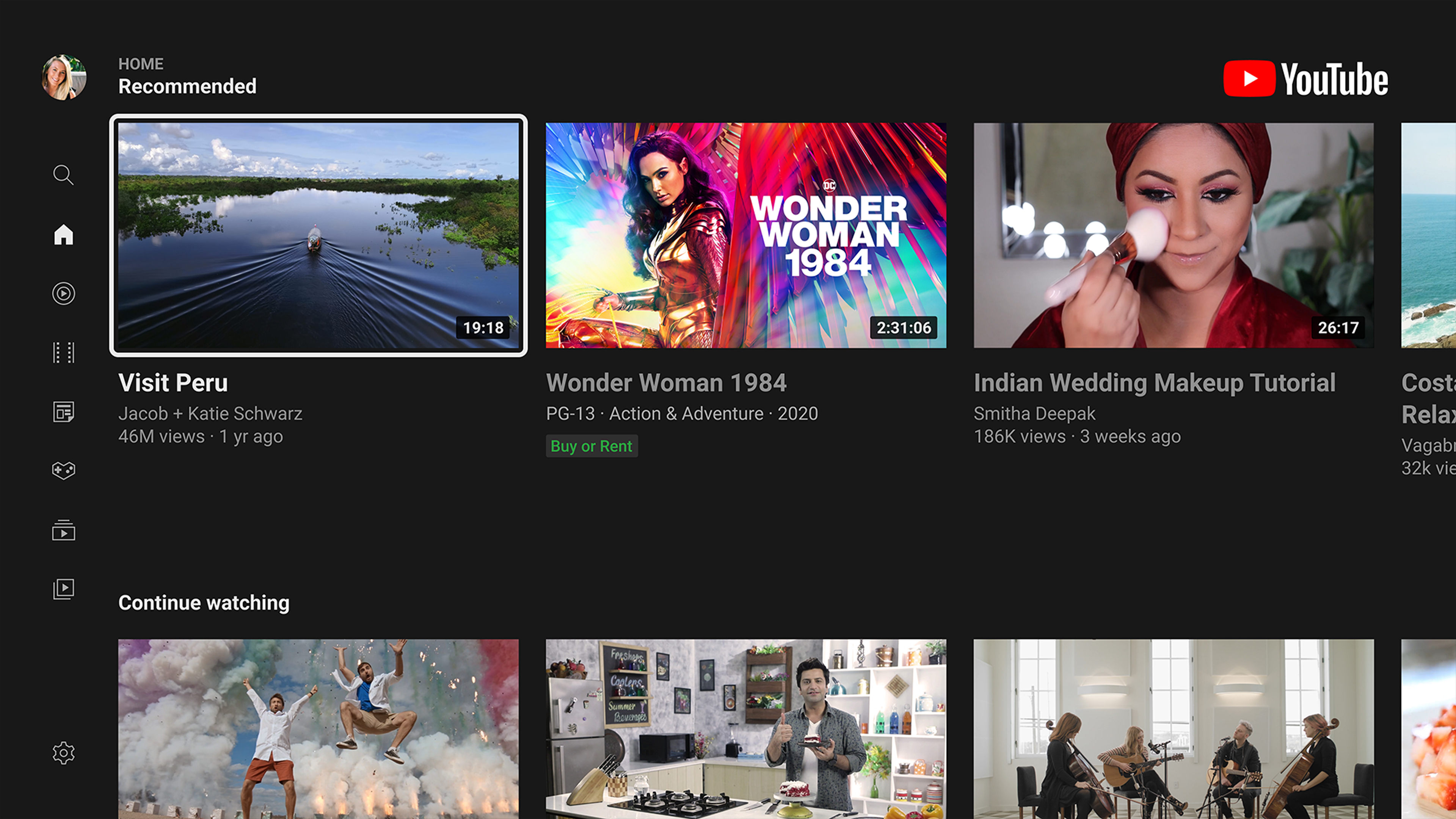
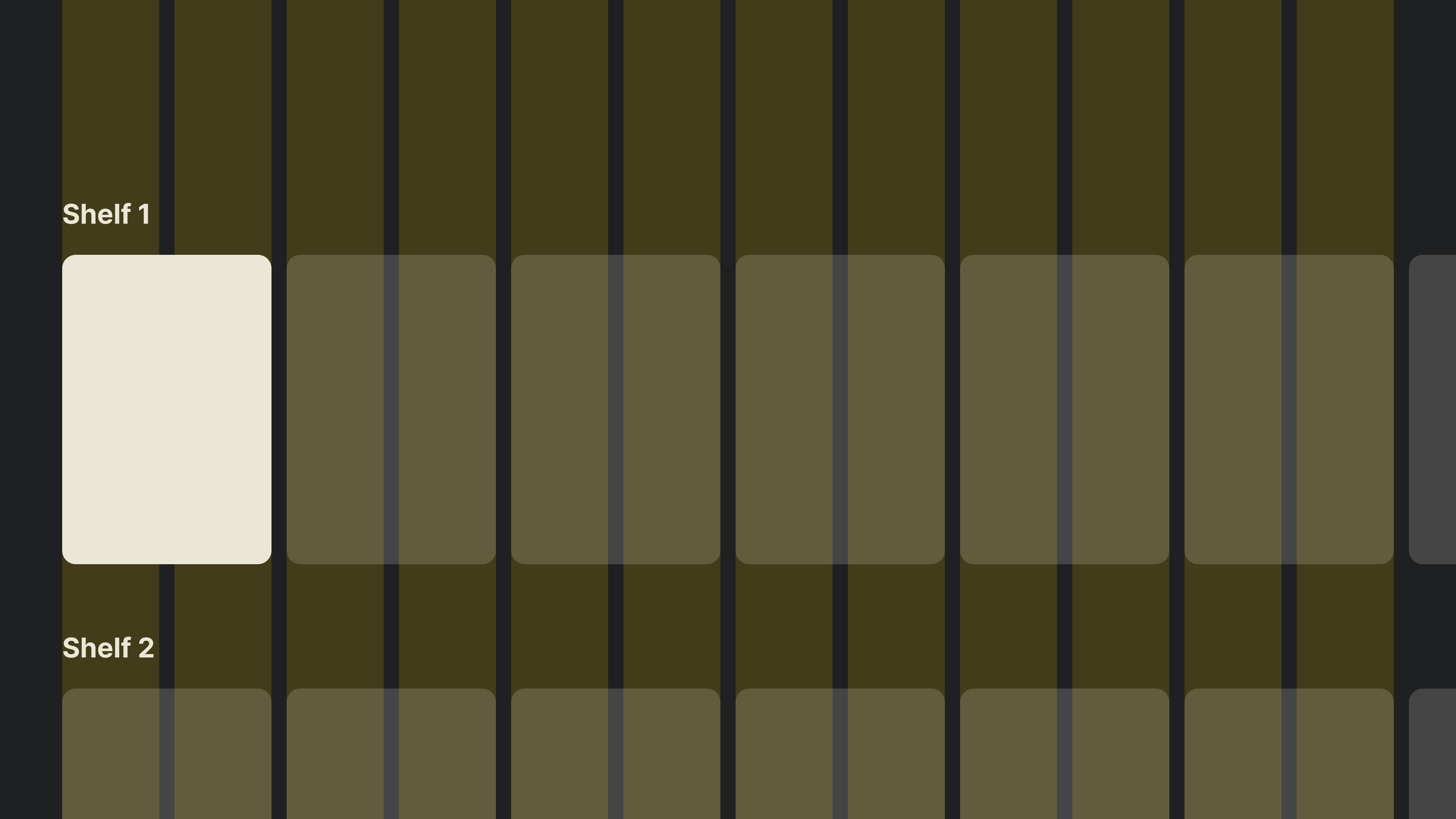
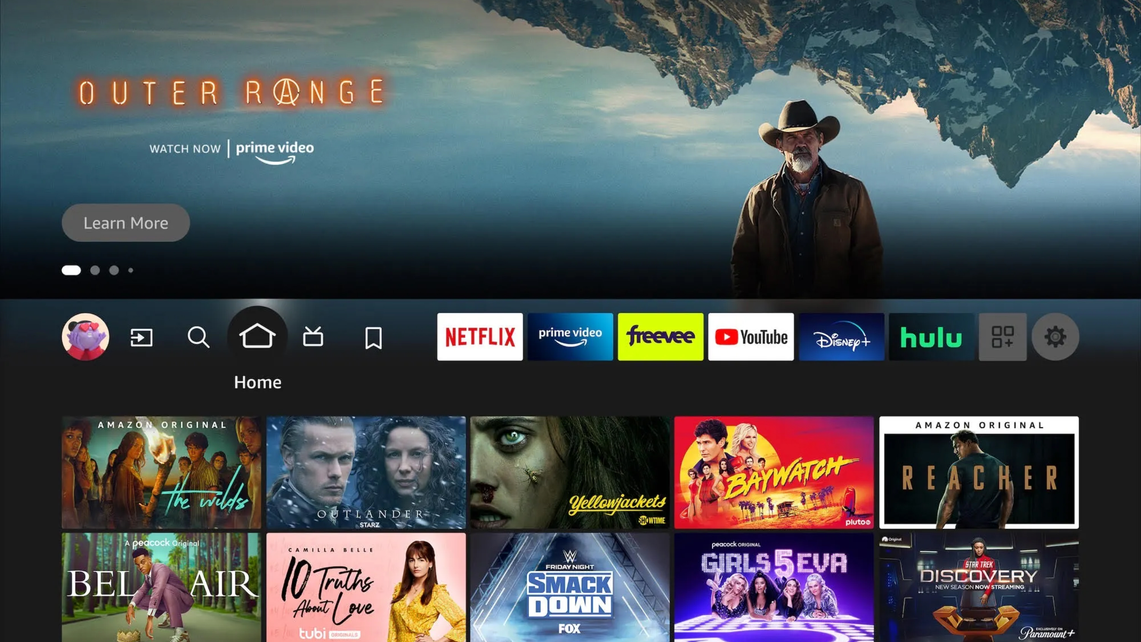
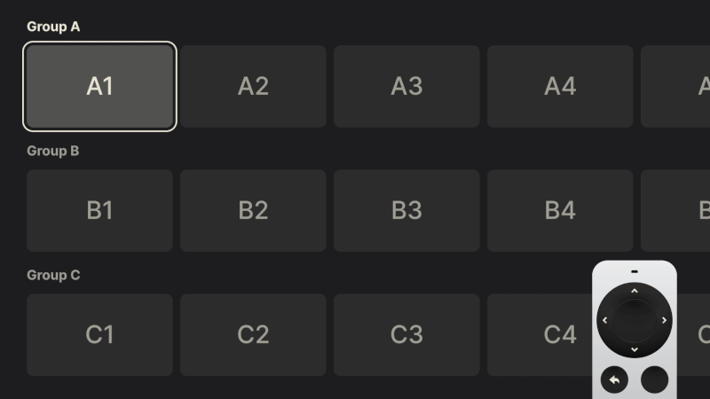
 Simplified TV UI demonstrating a focus state along with sequential movement from item to item within a column.
 Simplified TV UI demonstrating a focus state along with sequential movement from item to item within a row.
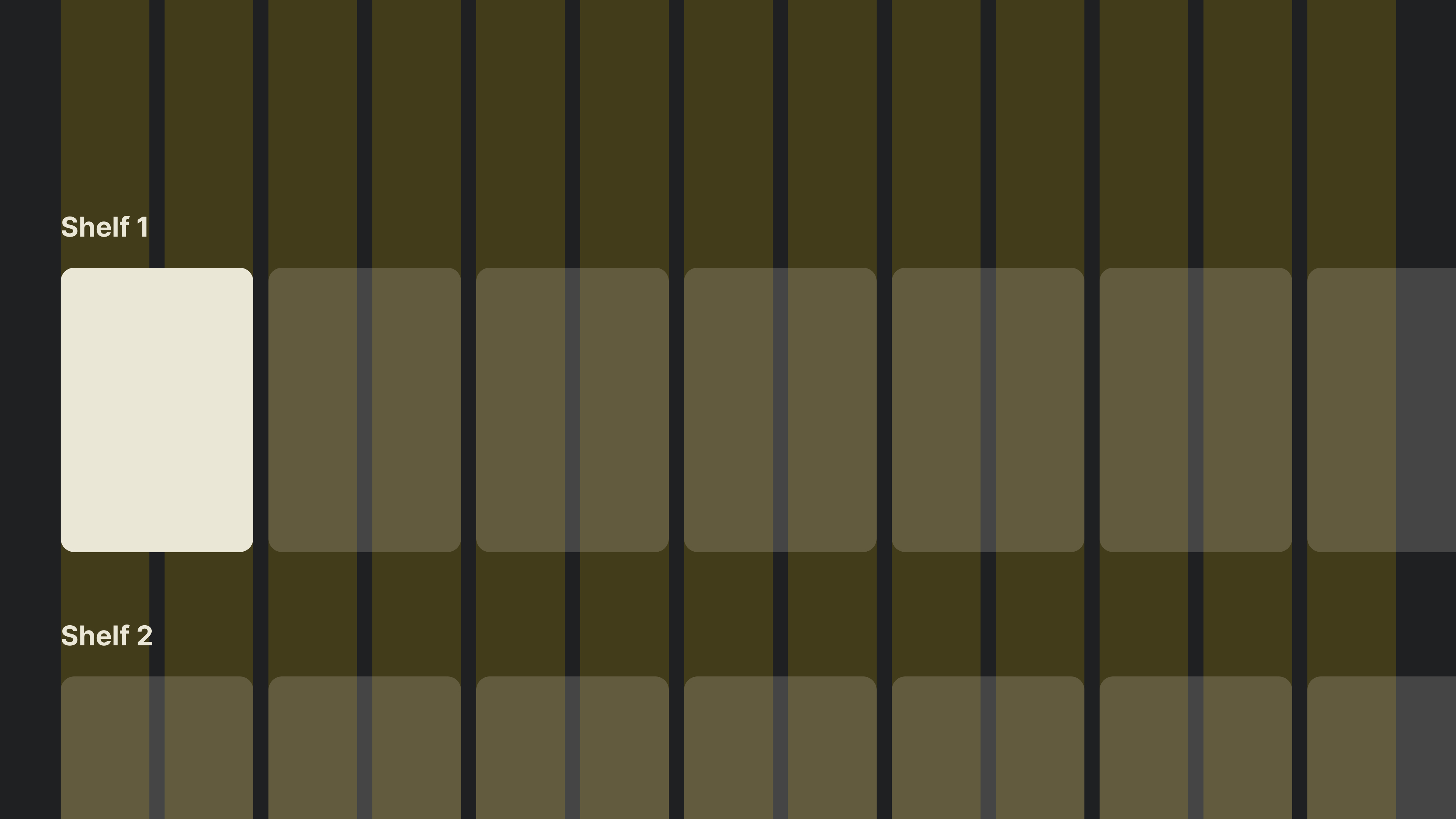
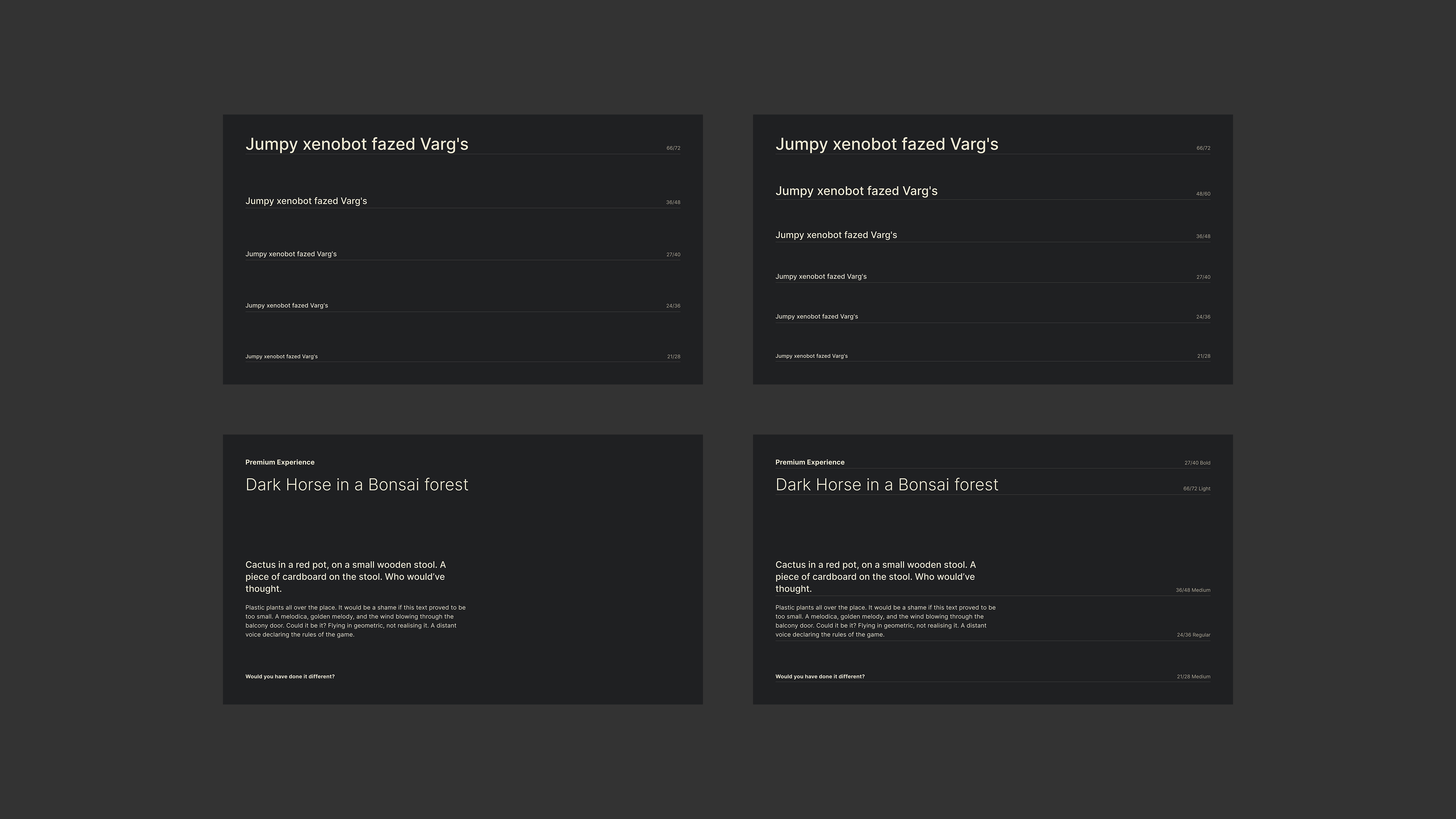
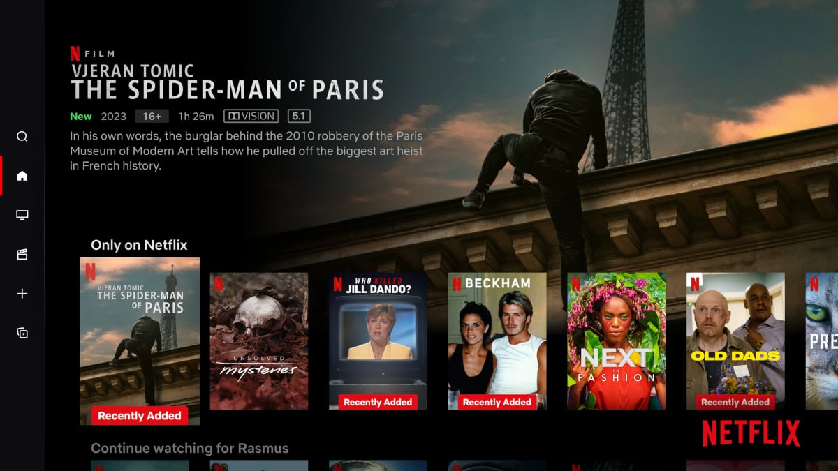
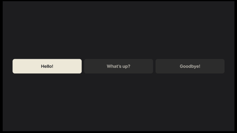 A focus state is the underlying principle of TV navigation. Most commonly, it relies on creating high contrast between the focused and unfocused elements. (Large preview)
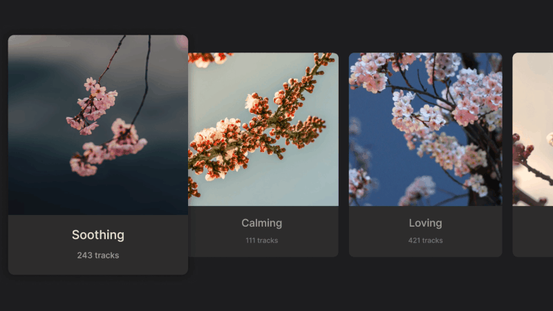 Example of scaling elements on focus. This is especially common in cases where only images are used for focusable elements. (Large preview)
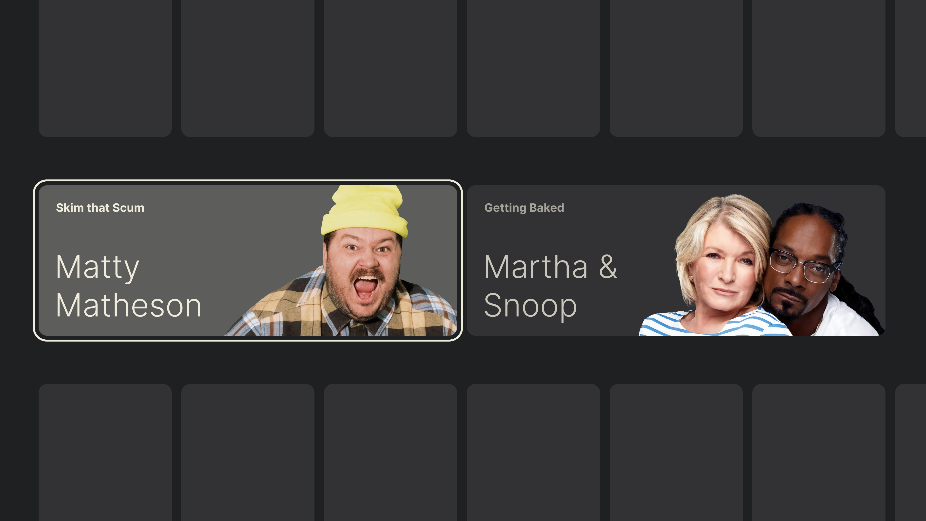
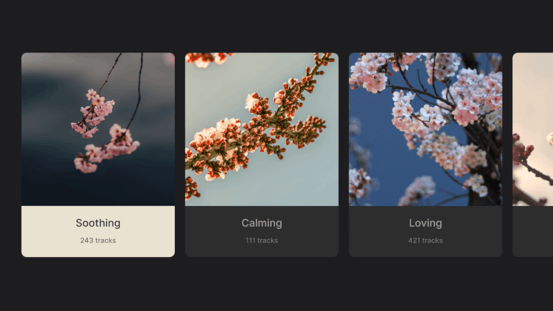 Color inversion on focus, common for highlighting cards. (Large preview)
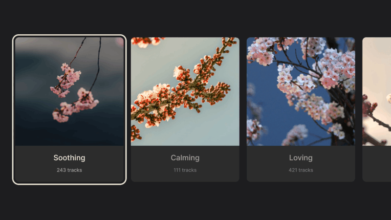 Example of border highlights on focus. (Large preview)
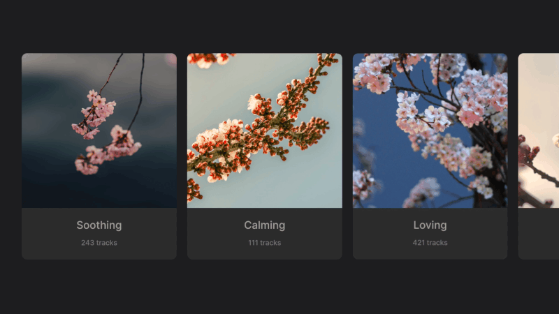 The three basic styles can be combined to produce more focus state variants. (Large preview)
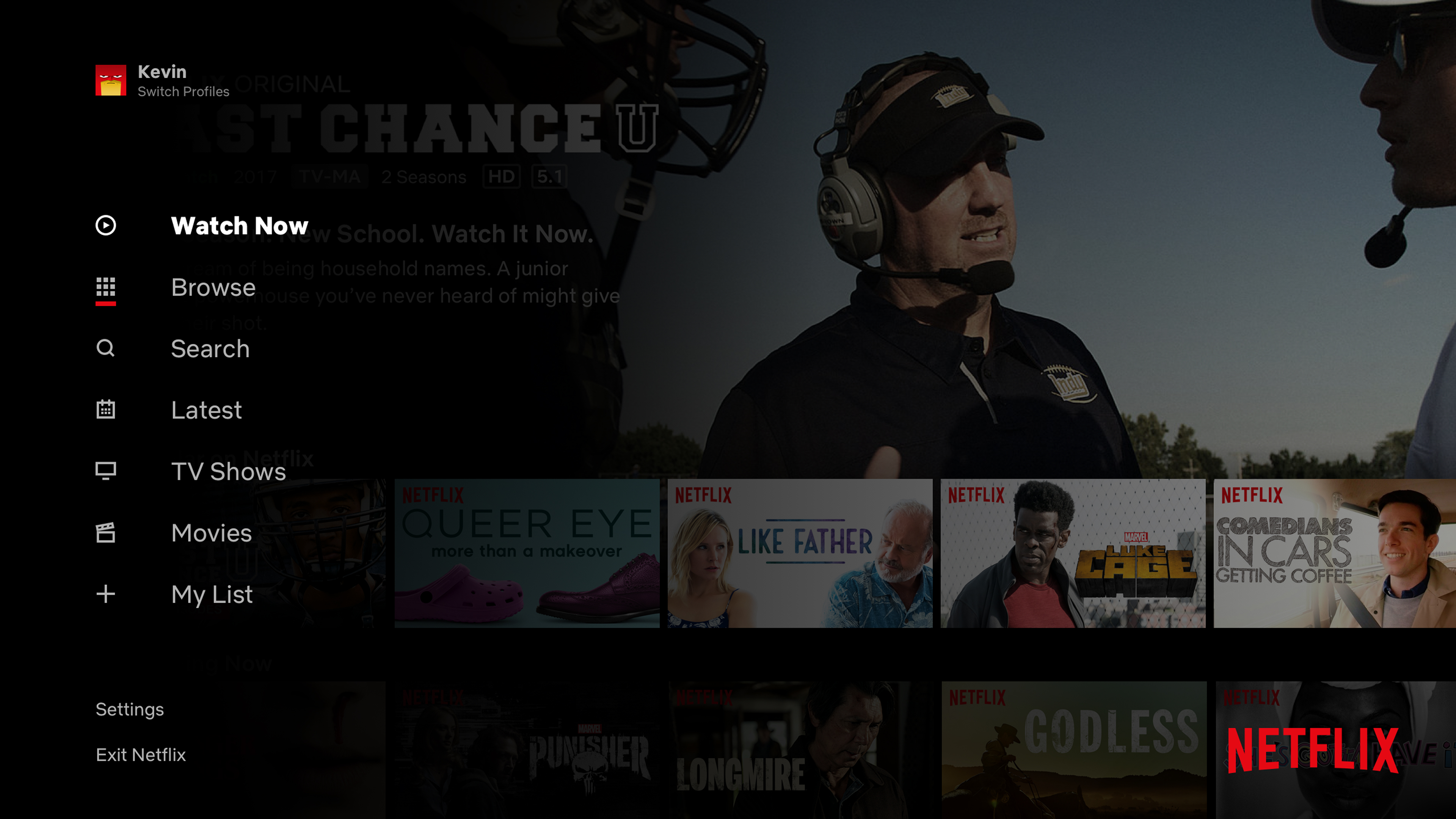

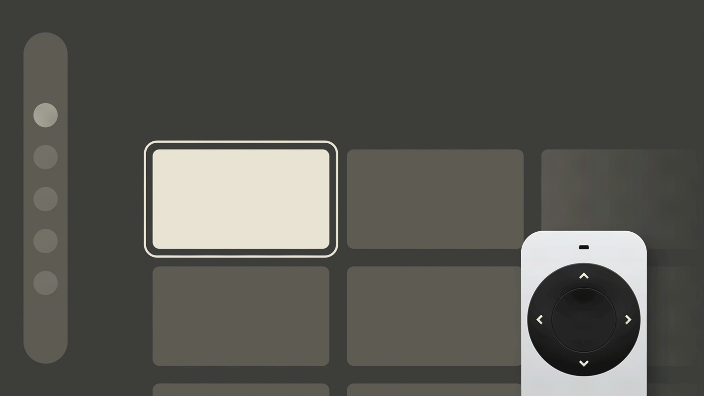
 Every step on TV “costs” an action, so we might as well optimize movement. (Large preview)
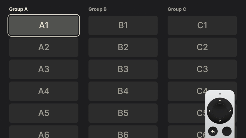 Properly applied in a vertical layout, the principles of optimal movement remain the same. (Large preview)
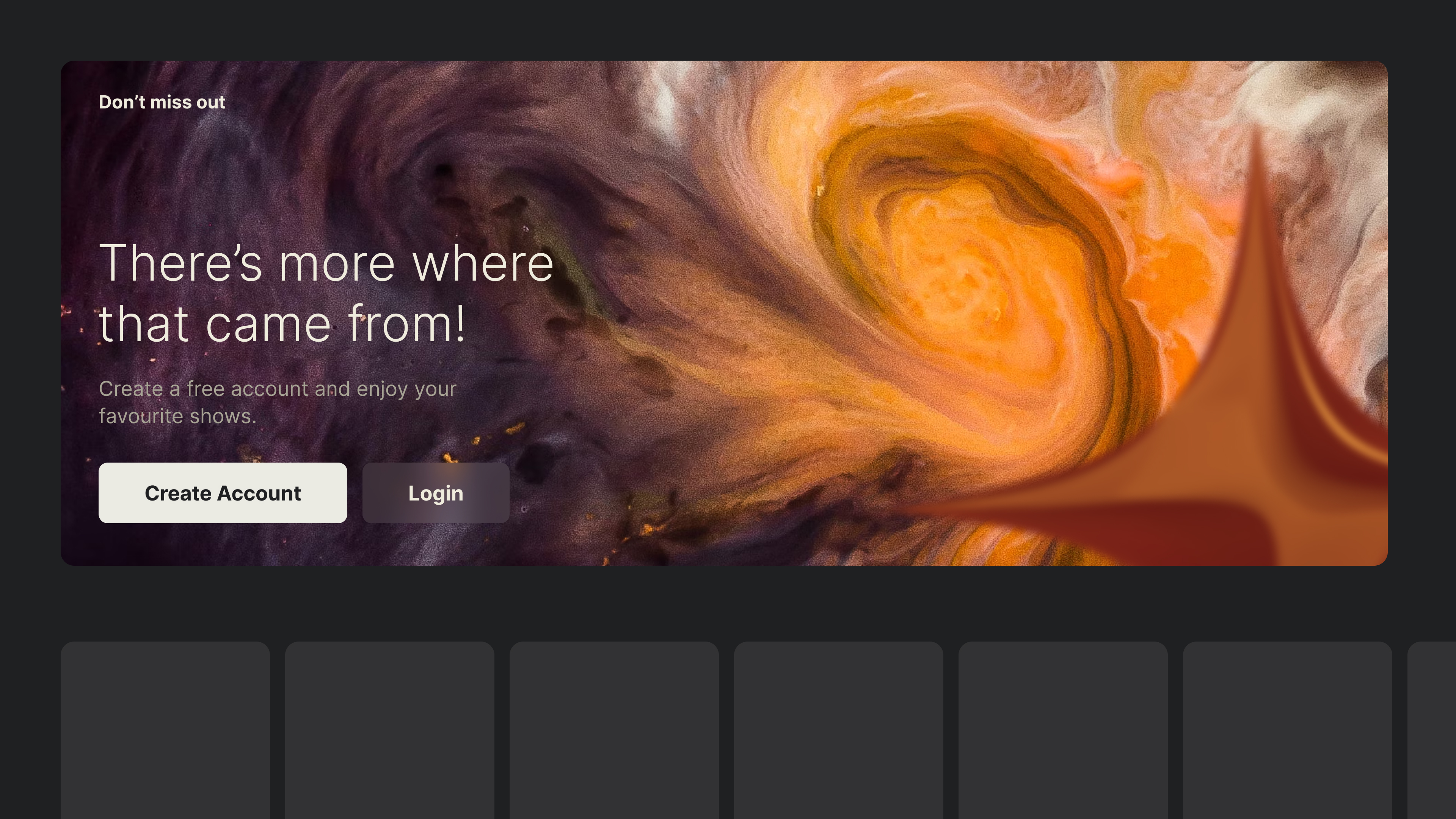
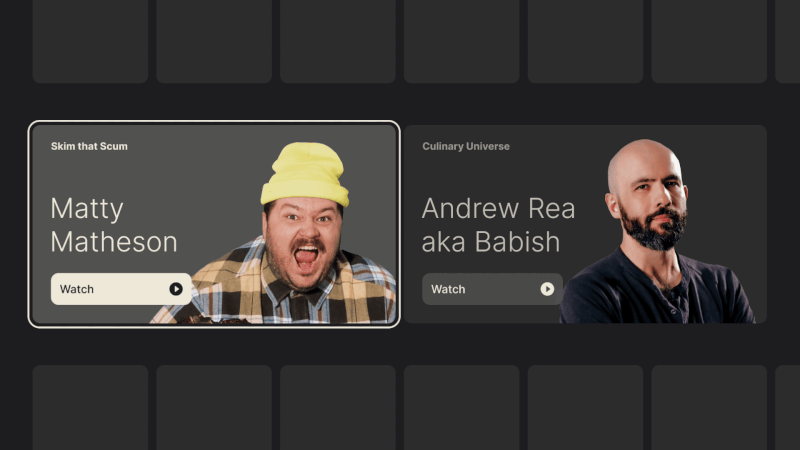 Having a transparent background blends well with surface color changes common in TV interfaces. (Large preview)
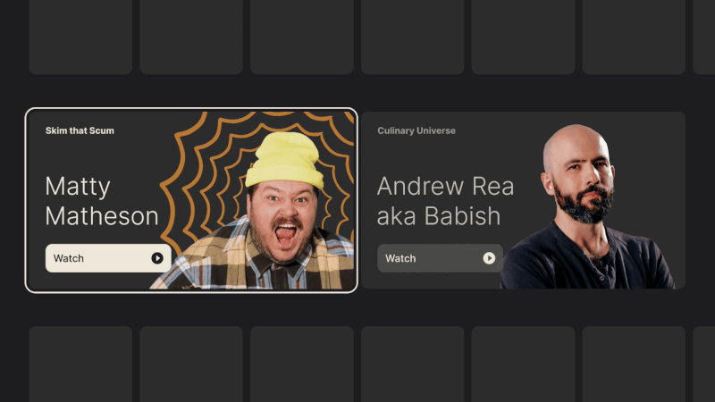 And don’t forget, transparency doesn’t have to mean that there shouldn’t be any background at all. (Large preview)
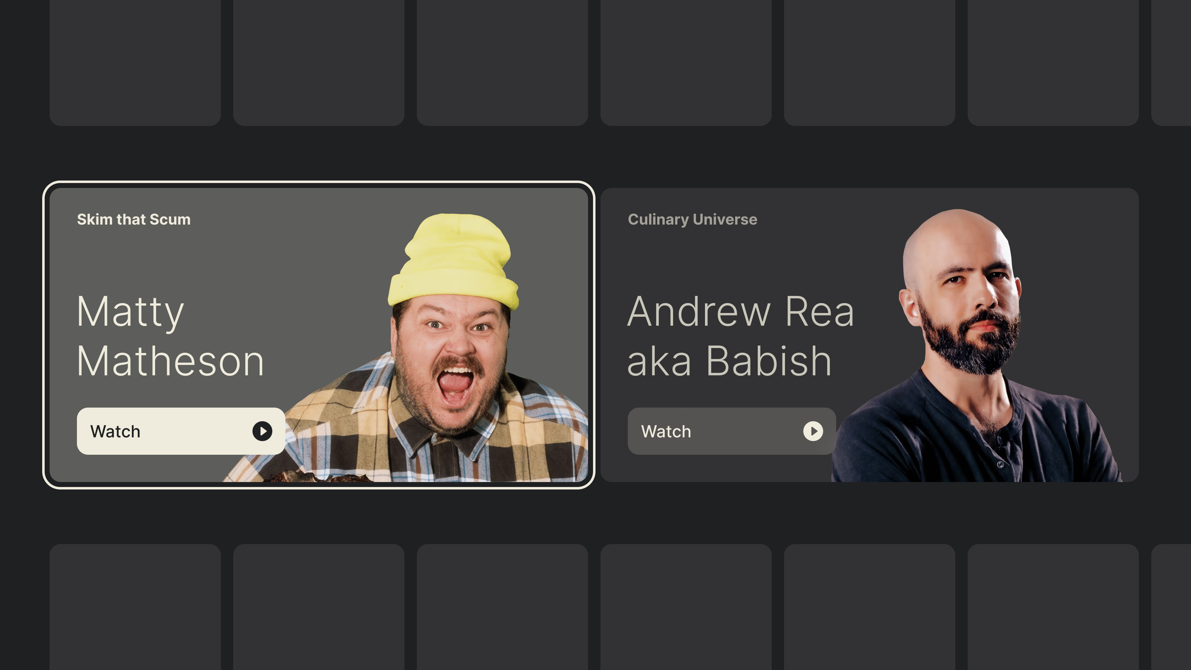
 Combining multiple images along with a background color change can liven up certain sections. (Large preview)