Original Source: https://www.sitepoint.com/how-to-take-your-idea-from-concept-to-creation-with-moqups/
This article was created in partnership with Moqups. Thank you for supporting the partners who make SitePoint possible.
So, you have a great idea.
You’ve already told your family, friends, and colleagues, and the feedback has been great. Everyone loves the concept, and can see its potential. They think you should just go for it!
But, you know it’s not quite that simple.
Before committing time and money – both yours and other people’s – you need to get real, and work out the details.
As you move your concept from ideation to realization, you’ll need to assemble your team and put together your financing. That means pitching to a wide range of industry professionals: product managers, developers, designers, business analysts, marketers, and investors.
To show them that your vision is both viable and executable, your pitch needs to be abstract enough to capture their imagination, but specific enough to be clear and credible.
You need to build out your concept, assess its technical complexity, and map out its full scale. In other words, you need to get real.
And that’s where Moqups can help.
We designed Moqups as an online, all-in-one creative platform, so that it could take you from your first brainstorming session – capturing and connecting ideas – all the way to fully-realized, interactive, hi-fi prototypes.
Our goal was to create the perfect “low effort – high impact” app.
We think Moqups’ real strength is that it’s UI is both intuitive and easy to master. So, without switching apps, you can produce a wide range of materials that outline the requirements of your project, including workflow diagrams, sitemaps, wireframes, mockups, and interactive prototypes.
Sure, there are a number of more complicated and detailed tools out there for each of these specific artifacts (i.e diagramming apps that just do diagrams, or apps that focus exclusively on wireframing or prototyping).
But when you’re frantically building out your concept, every hour spent struggling with a new and unfamiliar interface is an hour NOT spent on your own product’s future.
So, let’s take a look at three artifacts that you’ll probably want to have as part of your eventual pitch package:
Wireframes and prototypes
Flow diagrams
Sitemaps
Begin Anywhere
During the incubation process, you may be the only one who can make sense of your vision. But even with all that information in your head – or maybe because of it – your ability to explain its intricacies may still be fuzzy, and chaotic.
The best thing you can do is give shape to those scattered ideas by getting them out of your brain and onto the page. That way, you can turn them into something tangible and organized.
But where to begin?
Bruce Mau, in his Incomplete Manifesto for Growth, has a great prompt:
Begin anywhere. John Cage tells us that not knowing where to begin is a common form of paralysis. His advice: begin anywhere.
So don’t worry about prescriptive methodology. Just rely on your intuition. No matter where you start, each artifact will inform the others – and develop in parallel – as your vision comes into focus and becomes more concrete.
A real advantage of an all-in-one tool like Moqups is that it frees you to jump back and forth seamlessly between assets as they develop.
So, let’s get going!
If you want to play along, just head to moqups.com and click on "Try it now for free".
Wireframes & Prototypes
Software helps users accomplish certain goals by leading them through a series of steps towards those objectives – and your concept is no different. Building a wireframe will help you empathize with your users by putting you in their shoes, and helping you visualize each step they take.
Creating a wireframe is also the most immediate way of getting your vision out of your head, and onto the page, because it lets you experiment with different options and layouts – without worrying about details like colours, fonts, logos, exact sizing, etc.
Chances are, you’ve probably already identified some primary use cases, and imagined the sequence of steps the users should follow. Wireframes give you the chance to figure out what essential elements are required by those screens – content, input fields, buttons, menus – and which ones you may have overlooked.
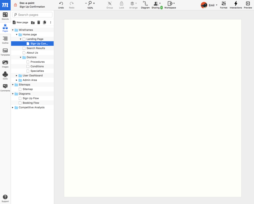
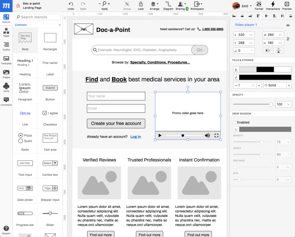
So, choose a single objective. In this case, I’ve chosen ‘Create an Account’ as my objective. I’ve decided to embed the sign-up fields directly into the home page – in the hope of capturing more leads.
Now, identify the steps required to achieve that goal:
Visit the landing page and enter personal credentials in the sign-up fields
Get confirmation
In this Moqups project, I want every objective – in this case, ‘Create an Account’ – to have its own page. Further, that page will contain a series of nested pages that detail the steps/screens required to achieve that objective.
In the Moqups app, your assets (stencils, pages, icons, images, etc.) are accessed from the left sidebar. Formatting and interactivity is controlled via the right sidebar.
From the left sidebar, click on the Pages tab. From the Pages panel you can create, name, and nest both folders and pages.
If you want to change your page dimensions to suit the device you’re designing for, the Workspace dropdown in the top toolbar (the little gear icon) will give you access to page settings, as well as snapping, guides and grids.
(Moqups UI is intuitive, so I won’t go into too much detail here… but if you need more granular instructions, just visit the Help Center which is pretty comprehensive and user-friendly.)
Now, it’s time to start mocking up your screens.
Click on the Stencil tab in the left sidebar. From the open panel, you can search for relevant stencils to add to your screen; for example, an account registration form is composed of text inputs, checkboxes, radios, and buttons.
Simply drag and drop these stencils onto the page. Then move them around, resize them, or style them by using the Format tab in the right sidebar.
Add as many details as you want, but don’t sweat them too much. At this point, aesthetics aren’t really important. You can always come back and polish your work. It’s more important that you discover whatever input is required from your users – and how the basic navigation will work for them.
Watching your amorphous vision take concrete shape can be wonderfully energizing… so you may want to add a bit of color and tweak the fonts, just to get your blood pumping, and to give you an inspiring sense of your future brand. The important thing is to keep moving, building, and making progress. You can always change, edit, and iterate later.
You may want to go even further, turning your wireframe into a preliminary prototype by adding interactivity. This can provide your stakeholders with a visceral sense of the user experience (UX) and navigation.
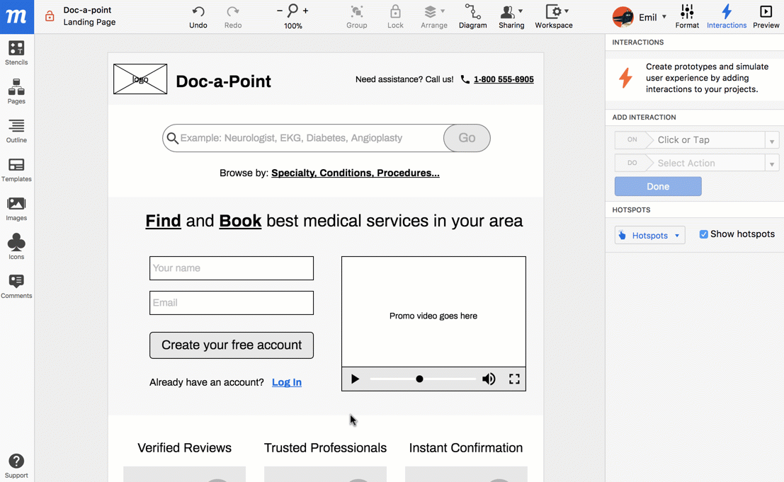
A well constructed wireframe/prototype not only helps you communicate your vision in a comprehensive and comprehensible way, but it’s also the kind of document that your designers and developers will need in order to get right down to work.
Flow Diagram
Now that you’ve used the wireframe/prototype to explore the user interface, and you’ve got a feeling for the navigation, it’s time to go explore the business aspects of your project by creating a flow diagram.
Continue reading %How to Take Your Idea from Concept to Creation with Moqups%