10 Beautifully Designed Free Bootstrap Dashboard Admin Templates

Original Source: http://feedproxy.google.com/~r/1stwebdesigner/~3/0UZO-ek0L5E/

The goal of any admin area (a.k.a. “Dashboard”;) should be to provide all the functions a user needs and doing so with their ease-of-use in mind. Using the popular Bootstrap framework, you can create an administration area that excels in both form and function.

Here are 10 free Bootstrap-based themes that will help to turn your custom admin area into a user-friendly powerhouse.

All the Admin Templates You Could Ask For

Bootstrap Admin Templates
2M+ items from the worlds largest marketplace for Admin Templates, Themes & Design Assets. All of it can be found at Envato Market.

DOWNLOAD NOW

AdminLTE

AdminLTE is a lightweight theme that prides itself on being both beautiful and useful. It’s fully responsive, includes a selection of six skins and is even optimized for printing.

AdminLTE

Material Dashboard

Built with Google’s Material Design in mind, Material Dashboard is clean and colorful. The UI is inspired a bit by layered sheets of paper and uses light, surface and movement to create an easy-to-use dashboard.

Material Dashboard

AdminBSB – Material Design

Those looking for a very Google-like interface will love AdminBSB – Material Design. It follows the principles of Material Design while providing users with a familiar-looking GUI.

AdminBSB - Material Design

BootFlat Admin

BootFlat Admin features an attractive and easy-to-navigate dashboard area. As its name indicates, it uses the BootFlat flat UI kit.

BootFlat Admin

Klorofil

Klorofil features lots of useful elements such as charts, timelines, notifications and ready-to-use page templates. It provides you with all the basics you’ll need to build a perfect backend to your site or web-based app.

Klorofil

Shoppy E commerce Admin Panel

Using vibrant colors and a flat UI, Shoppy is a great choice for a custom eCommerce dashboard. It’s fully responsive and includes lots of goodies like buttons, icons and animated charts.

Shoppy E commerce Admin Panel

Paper Dashboard

Unlike a lot of admin themes out there, Paper Dashboard is quite subtle in its use of color. That leads to a beautiful UI that may have a bit more of a calming effect than other, more cluttered choices.

Paper Dashboard

Bluebox

There’s something to be said for simplicity in color scheme. Bluebox does it to near perfection in that the consistent use of blue makes it easy to find what you’re looking for. It comes with lots of UI elements while supporting Google Fonts and Fontawesome Icons.

Bluebox

Blocks – Single Page Admin

Blocks takes a different approach to the admin screen by utilizing a fully-widgetized UI. Also gone is the ubiquitous left-side navigation in favor of a much more subtle menu across the top. This just goes to show that there is more than one way to create an appealing admin layout.

Blocks – Single Page Admin

Free Responsive Horizontal Admin

Free Responsive Horizontal Admin also eschews the standard left menu. The theme also makes nice use of white space and sports a muted color scheme. This could be a solid choice for those who need a more simple and minimal type of dashboard.

Free Responsive Horizontal Admin

Admin Themes That Help You Take Control

Admin areas have, to some degree, gotten a bit stale – especially when you look at what some popular CMS are doing. Part of their problem is that you don’t necessarily want to make radical changes to a UI that millions are comfortable with.

So the real innovations are coming in the form of the roll-your-own dashboards, like the ones featured above. Building your own admin can free you up to take a few more chances than the bigger players out there. These Bootstrap-based themes are proof that there is still a lot of room for both improvement and different ideas.


The best 4K monitors for designers 2018

Original Source: http://feedproxy.google.com/~r/CreativeBloq/~3/lvE42f_tulQ/best-monitor

Choosing the best 4K monitor for creative work when you're a designer can be difficult and time consuming. You'll want to make sure that you get a 4K monitor that does your artwork justice.

You also need one that can keep up with the rest of your hardware. After all, you might be armed with a great laptop for graphic design or a brilliant video editing computer – not to mention a top-class Creative Cloud subscription, but if you're not seeing the right colours on your screen, don't have enough inputs or simply have the wrong size monitor, it doesn't matter how good you are: your work will suffer.

This guide will help you choose the best monitor for you, no matter what creative discipline you work in. (Make sure you pick up a quality monitor calibrator as well.)

As you'd expect, all the monitors here are 4K or above, making them an excellent choice for creative professionals and serious hobbyists alike. 

Also read: The best cheap 4K monitor deals of 2018
What is 4K resolution?

4K, also known as Ultra HD, refers to the high-definition resolution 3840 x 2160 pixels, which is four times the 1920 x 1080 pixels found in a full HD TV. 

Read on for our pick of the very best 4K monitors out there for designers, artists and creative professionals. 

The best and most accurate picture quality carries a high price tag. Eizo displays are a familiar sight in professional photography and video production studios. The 31-inch ColorEdge CG318-4K continues this tradition, with not just full sRGB coverage, but 99% of the Adobe RGB spectrum and 98% DCI-P3. It fully supports 10-bit colour, taken from a 16-bit look-up table.

Unlike other 4K monitors, the CG318-4K has a 4096 x 2160 resolution. This reflects the different, slightly taller 4K standard used in digital video production, compared with the 3840 x 2160 resolution used in most computer displays. 

All of these features come together to produce a jaw-dropping image, making your creative work shine. Oh, and there's a built-in calibration tool to constantly keep the colours as accurate as possible, which pops across the screen every time it's powered on, along with a bundled monitor hood.

Dell's top-end 31.5-inch 4K display packs in a lot of professional-grade features for superb colour accuracy. But while it costs a lot less than Eizo's offering, it's still a pricey prospect, as expected of a large high-end 4K monitor.

Dell's top-end 4K display now covers the DCI-P3 colour spectrum. It has a specification that almost rivals Eizo's monster CG318-4K, as it hits 99% Adobe RGB coverage and 87% DCI-P3, delivering great picture quality.

This is an incredible display – but do you really want a 40-inch panel? Based on VA-IPS panel technology, it offers extremely good contrast, with 300 cd/m2 brightness.

Its menu is controlled with a small joystick at the back and it also offers a four-way picture-in-picture (PIP) mode, allowing you to allocate a quarter of the screen to each video input.

On such a large 4K screen, each connected device will have its own 1920 x 1080 screen area – perfect for seeing your designs in Illustrator or working on your 3D art on one machine while looking up reference images on another device on the same screen, for example.

Acer S277HK

If you're after a mid-range 4K monitor that ups the image quality and provides plenty of features, without costing an exorbitant amount, then the Acer’s S277HK is the best mid-range 4K monitor out there. With a 1,000,000,000:1 contrast ratio, a colour gamut of 1.07 billion and a resolution of 3,840 x 2,160, the Acer S277HK excels at image quality. And while the minimalist design might not have a lot to shout about, some will appreciate its pared-down looks. 

The BenQ PD3200U's screen size and resolution makes it a great choice for designers and creators. The screen is a hefty 32-inches, which makes working with 4K images and videos much more comfortable. 3D designers will be grateful for the inclusion of a CAD/CAM mode, and everyone else will appreciate the factory-calibrated colour accuracy and Rec. 709 adherence. It's a pricey monitor, but for many designers, this will be well worth the money.

Asus' Pro Art line competes with professional colour-accurate screens. It's got loads of inputs, with three HDMI ports – including one HDMI 2.0 port capable of the full 60Hz needed for smooth 4K –  and two DisplayPort inputs.

The Asus PA329Q is the upgraded version of of the company's flagship 4K professional display, with a 10-bit IPS panel that now supports a 16-bit colour look-up table and quoted 100% Adobe RGB coverage, with support for the DCI-P3 colour spectrum as well.

Iiyama's 28-inch B2888UHSU is a lot more reasonably priced than many of the options we've presented in this buying guide. It uses a TN panel with a 1ms response time, and although the viewing angles aren't quite as wide as you'll find with an IPS display, there are plenty of small extras that make the B2888UHSU a really good buy.

It has plenty of inputs, too, plus a fully adjustable stand, and a picture-in-picture mode, so you can use two devices simultaneously with this monitor.

The U28E590D is a slick 28-inch 4K monitor with a beautiful design and a whopping 8.3 billion pixels. DisplayPort 1.2 gives you fluid 60Hz 4K, while everything is detailed and clear thanks to a brightness of 370cd/m. Picture settings can be tweaked using the on-screen menu, or you can sit back and enable its Dynamic Contrast mode to do the heavy lifting.

There's also very smart port placement, so you won't have to bend around the back to connect any cables or peripherals.

Related articles:

The best laptops for video editing 2018Typography 55 best free fonts for designersThe best cheap laptop deals for creatives

Fresh New Brand Identity for Sweet Films

Original Source: http://feedproxy.google.com/~r/abduzeedo/~3/iDjb__0FbhY/fresh-new-brand-identity-sweet-films

Fresh New Brand Identity for Sweet Films

Fresh New Brand Identity for Sweet Films

abduzeedo
Jun 26, 2018


Elvis Benício and Diego Bolgioni were invited to create a new brand identity for Sweet Films. The goal of this rebranding was to adapt to the new strategic position and vision of the studio and communicate the message to the market. Sweet Films is a Brazilian boutique studio specialized in video production for advertisements. The design solution that they created included dynamic visual elements made up of fresh components and a new typeface.

The final deliverables included a visual identity guideline book, website (UI/UX), stationery and animated signature.

Credits
Motion graphic: Rafael Fernandes /
Graphic Design: Elvis Benicio, Diego Bolgioni
Brand identity

Concept.

After going through many possible ideas about shapes and graphic concept Diego and Elvis realized that it could be interesting to build a metaphorical connection with a fly (as a client) and something that looks yummy (sweet). From this starting point, everything pumped up in their minds and the process began to be playful, upbeat and consistent. The project was approved with success by the client without any changes. (all in!)

Stationery.

Social kit

Visual elements

Website

Signature

Before / after

branding


15 Essential Twitch Tips & Tricks You Should Know

Original Source: https://www.hongkiat.com/blog/essential-twitch-tips-tricks/

Helpful tips and features that help you make the most of Twitch’s game-streaming service.

The post 15 Essential Twitch Tips & Tricks You Should Know appeared first on Hongkiat.

Visit hongkiat.com for full content.

Visual Design Inspiration for your Monday Morning

Original Source: http://feedproxy.google.com/~r/abduzeedo/~3/9lGDvEOeV1o/visual-design-inspiration-your-monday-morning

Visual Design Inspiration for your Monday Morning

Monday Visual Design Inspiration

abduzeedo
Jul 02, 2018

Monday is always the perfect day to spend some time to collect some visual design inspiration and set some goals for the week. With that in mind, there’s nothing better than getting tons of references. In the past, I used to go through books and magazines, but with the web now things are way easier. So for this post, I would like to share some of the UI design inspiration I have been collecting during the weekend for the upcoming redesign of Abduzeedo, which I will have more to share very soon. 

So for this post, I would like to share some references in web design, app design or simply put, pure design inspiration.

Visual Design Inspiration

03 architecture website3dflipFurnitureStoriesuiAuto landing page dribbbleMaster&DynamicOchcinci landing page nike design ui ux product web dribbble full 5Anicornxorder  yalessandri 3ShopHome 1.0

visual design


How to Run a Heuristic UX Evaluation

Original Source: http://feedproxy.google.com/~r/1stwebdesigner/~3/z1N9WV8rgV4/

User experience development and optimization is a broad field. There are many facets of web design to consider in the development of a website. The factors affecting user experience, or UX, span from content production and page layout to website interactions.

Being able to identify usability issues with a user interface is called heuristics. It encompasses broad, qualitative rules that help determine the usability of your website and the overall experience your visitors are having.

The UX Designer Toolbox
Unlimited Downloads: 500,000+ Wireframe & UX Templates, UI Kits & Design Assets


DOWNLOAD NOW

To ensure better performance, designers use a heuristic evaluation, which is a way to test the overall UX of your site and if the site has usability issues. Your website’s UX is important and can have a big impact on your business and the success of your website.

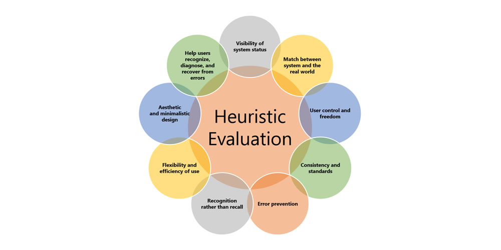
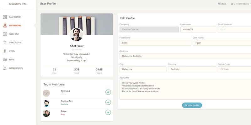
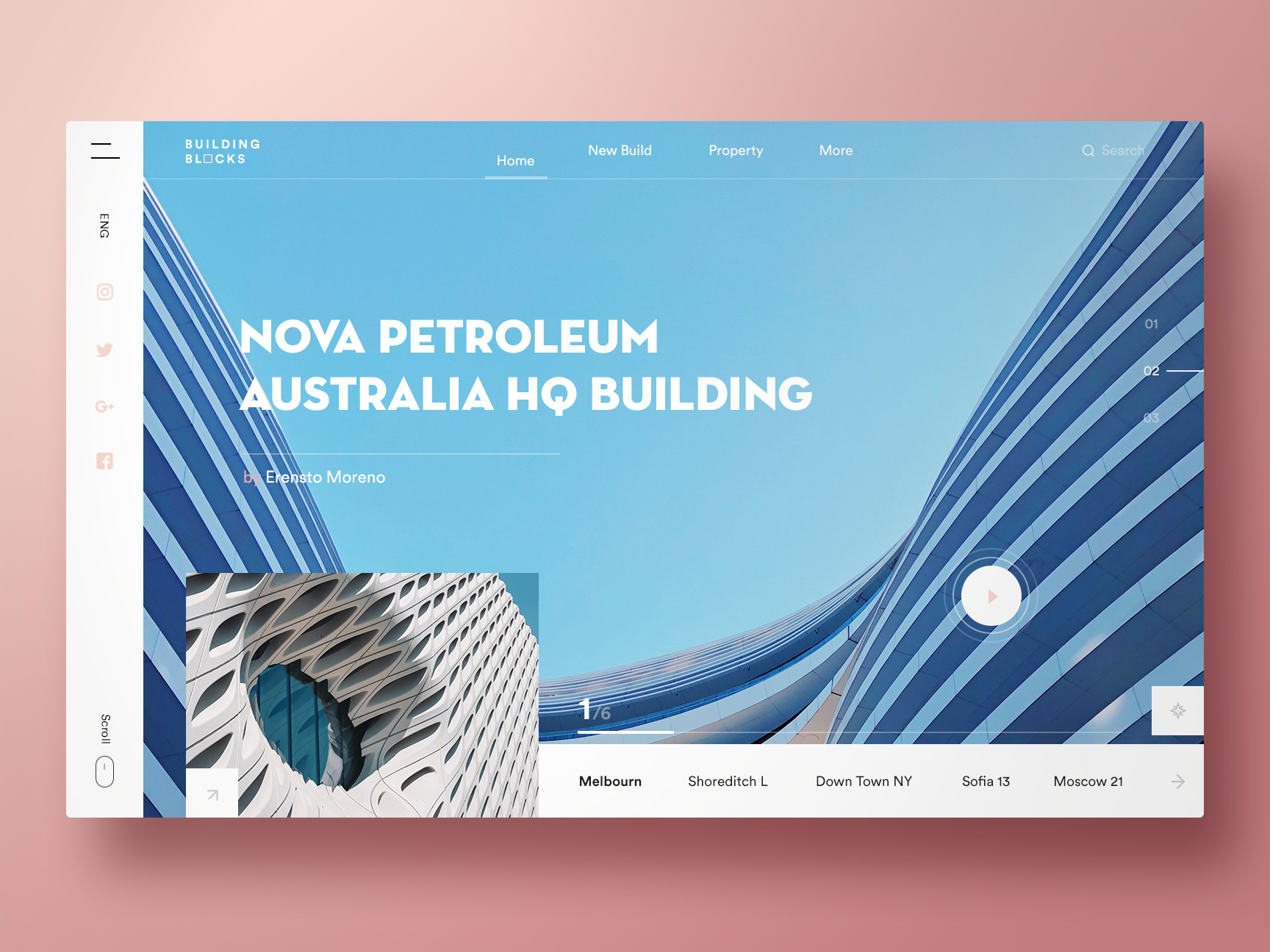
Image via UsabilityGeek.com

A heuristic evaluation is different than user-testing because you are utilizing usability professionals instead of users. Sometimes, this approach is referred to as an expert review since you are getting professional feedback about your UX.

There are over 200 criteria that can be used when a site is being evaluated. Most businesses will determine the specific probes they want to be included in the evaluation. Many experts base their questions and responses on Jacob Neilson’s 10 Heuristics for User Interface Design.

Here is a closer look at those 10 heuristics:

1. Visibility of System Status

The system or website should always keep users in the loop about what is going on. This information is given to users through feedback in a reasonable time.

2. Match Between System and the Real World

The website should cater to a specific audience. The language used through phrases, words, and concepts should be relatable to that specific audience and fit into their worldview.

3. User Control and Freedom

Users will inevitably click on something by mistake, leading them to a page they don’t want to be on. An exit or return option should be available to them for a quick return.

4. Consistency and Standards

Platform conventions have been put in place, so your users do not have to wonder what your website means. Most users are familiar with these conventions. If your site is consistent, it should be easy for users to navigate and know what steps to take to reach a goal.

5. Error Prevention

Evaluators check for situations that could lead to an error page for your user. A good error message will send readers back to where they belong. An even better solution is removing any error-prone conditions on your website.

6. Recognizing Rather than Recalling

Your website should not require its users to remember information. Objects, actions, and options should always be visible, allowing them to keep up with your website’s dialogue without missing a beat.

7. Flexibility and Efficiency of Use

Accelerators are often used to speed up the process and interaction between experienced users and your website. This means that no matter the level of expertise of your user, your site will function at the same speed.

8. Aesthetic and Minimal Design

There should be no fluff or irrelevant information on your website. The design should be aesthetically pleasing and seamlessly incorporate relevant content and information for your users.

9. Helps Users Recognize, Diagnose, and Recover from Errors

Error messages should never include code and should simply explain the problem to users. It should suggest a quick solution that is easy for the user to follow.

10. Help and Documentation

It is most effective to have a system or website that does not require any help or documentation. If your system does require it, it should be easy to find, read, and carry out.

How to Run Your Evaluation

Planning and running your heuristic evaluation can be a long process.

Companies with expansive resources should hire at least three usability experts to perform the evaluation. Your team will decide upon the guidelines to be used during the evaluation, and then each expert will evaluate the site separately. Someone who is comfortable with the site should be available to the experts to answer any questions and record the process.

Before You Start

It is important to have a clear focus of who your users are before you begin the evaluation process. Develop personas or story maps for your users and make sure your website design caters to those individuals.

Consider the different tasks your users do when they are visiting your website. Most businesses prefer to rank these activities in order of importance. Take these tasks and relate them to the guidelines that will be given to the evaluators.

Develop a Method

After you have determined your guidelines and tasks the experts should be evaluating for, develop a method. Your evaluation method will include a system of severity codes the evaluators will be basing their responses on. Once the guidelines and methods are in place and your experts have been trained on them, it is time to run the evaluation.

Write a Report

When the heuristic evaluation is over, it is time to study the responses and write a report on the findings. Just like data, here’s where you gather the intel and analyze it. At this point, you can show developers the problems your users may have and come up with solutions for them.

Though you offer a written report, present your findings in person, if possible. This evaluation was done to test the functionality and UX of your website, and those who are involved in the process need to fully understand the findings – some of that may mean face-to-face interaction.

You will be reporting to the team of developers and key stakeholders in the business, so present the information tactfully and make it clear the recommendations for changes are for the betterment of the business.

Your report should include a list of the specific heuristics that were used in the evaluation. This will show the starting point that gave you your results. Explain who the experts are and their backgrounds to the group.

List the issues you discovered with the most important first. Then, give the audience solutions to how these problems can be fixed efficiently.

Your findings and report may mean some extra work for the developers, so give them as much information as possible about the findings so they understand how the UX is being affected and what they can do to fix it.

Can You Run a Heuristic Evaluation Without Experts?

Small start-ups or freelance web developers may not be able to afford a team of experts to evaluate their web design. In these situations, a more informal method called the heuristic markup can be helpful. This method does not provide professional results but can still be beneficial when testing your usability and UX.

Using this process, you set aside a few hours to walk through the website. Try to separate yourself from the development and act as a member of your target audience.

Keep in mind one of the personas developed for the business and perform the tasks as you imagine they would. Keep notes of your experiences as you move your way through the website, keeping track of areas where you got stumped or see a potential problem.

Insight Into UX Can Boost Your Website’s Traffic

Sometimes, why a website works well for a demographic can be a mystery, and these heuristic evaluations take some of the guesswork out of the process. Regardless of the size of your business, a heuristic evaluation of your website allows you to gain knowledge and experience about what your users are seeing.

Their experience on your website determines how long they stay, if they buy your product or service, and whether they return. Conducting an evaluation is the best way to discover potential problems and develop the best UX for your visitors.


10 Open Source 3D Animated Sliders Built On CSS & JavaScript

Original Source: http://feedproxy.google.com/~r/1stwebdesigner/~3/CI9_9MXM-Lc/

You can add some pretty crazy image sliders into your project with basic jQuery or even with free WordPress plugins.

They all have their own unique animations, custom interfaces and features. But if you can’t find what you want in a plugin, then you may be forced to build it yourself.

That’s what many of the developers featured below did when they built these incredible 3D-animated sliders. Here are 10 of my favorites from CodePen.

Slicebox

See the Pen Slicebox – 3D Image Slider by codefactory (@codefactory) on CodePen.

You’ve probably seen or heard of Slicebox before. This is a popular 3D slideshow plugin and it’s by far one of the most detailed.

This pen offers a live demo of the animated slider in action with most of the features still intact. It all runs on jQuery, while this specific demo works with just 50 lines of JavaScript.

But you can find an even more detailed example on the Codrops site. I’m a huge fan of this slider. If you’re looking for something with crazy 3D effects – this is your best bet.

Rotating Page Slider

See the Pen Rotating 3D Slider by Nikolay Talanov (@suez) on CodePen.

Developer Nikolay Talanov created this rotating slider with some very detailed JavaScript and even more complex HTML/CSS classes.

His code actually follows the BEM naming conventions for CSS, which use a double underline to separate blocks from containers. This makes it a lot easier to skim the code once you understand what you’re looking at.

But this slider may not work for everyone because it rotates the entire page rather than just a part of the page.

Still, it’s a really cool effect that would work very well on specific projects.

Smooth Perspective Slider

See the Pen Smooth 3d perspective slider by Alex Nozdriukhin (@alexnoz) on CodePen.

If you love parallax design on the web, then have a look at this slider created by Alex Nozdriukhin.

As you move your cursor around the page you’ll notice the slideshow element responds in kind. As you rotate your way through the elements, notice the custom animation effects.

This really is pretty smooth and it’s a darn creative use of web animation. However, you may have trouble finding a project that is a good fit for this type of slideshow.

3D Effects with jQuery

See the Pen jQuery 3D Effect Slider by victor (@vkanet) on CodePen.

This basic slider is proof that you can build something great with just a little bit of jQuery. It works on a timer interval, but can also be controlled with the included navigation arrows or dots.

It’s all pretty easy to customize if you’re looking to restyle the animation, as well. Just make sure that you’re up-to-date on the latest jQuery techniques before diving into this code.

3D Flipping Image

See the Pen 3D Flip Image Slideshow by Nik Lanús (@niklanus) on CodePen.

One interesting aspect of this pen is that it doesn’t work exactly like a slideshow. It’s built more to showcase the animation rather than a typical slider UI.

Still, I’d say that developer Nik Lanús has created an amazing design with a very attractive flipping animation.

You can force the images to flip by scrolling up or down on the page (this can all be controlled in jQuery). But it’ll take some work to move this animation effect into a full-blown image slider.

3D Cube Slider

See the Pen 3D Cube slider. Pure CSS. by Ilya K. (@fornyhucker) on CodePen.

I’ve never seen anything quite like this on the web – it has to be one of a kind.

With this 3D cube, you may be surprised how accurate and smooth the animations feel. Note that this script is a bit heavy, so you may have to give the pen a minute to load in.

But here’s the great part: this entire 3D cube animation works on pure CSS. No JavaScript required. How great is that?

Carousel Using TweenMax.js & jQuery

See the Pen 3D Carousel Using TweenMax.js & jQuery by John Blazek (@johnblazek) on CodePen.

You can build some incredible things with custom libraries like TweenMax.

One such example is this carousel, which works just like a typical 3D rotating album you’d expect to find in iTunes. The whole thing is controlled via JavaScript and it works with one of the many TweenMax animations.

Granted, this demo just uses placeholder text for each block – so it’s not all that pretty to look at. But you can easily swap out the text and create one heck of a custom carousel.

3D Slider in Pure CSS

See the Pen PURE CSS 3D SLIDER by Dmitriy Panfilov (@panfilov) on CodePen.

Here’s another radical slider with a super unique interface. This CSS3 slider is built on just HTML and CSS – making it even more impressive.

Creator Dmitriy Panfilov built this like an album stack where you click any of the lower elements to bring it into the foreground. It’s not your typical slideshow interface but it can work very well on websites with enough space.

But this really feels more like a practice project just to prove how much you can do with a little CSS ingenuity.

3D Image Gallery

See the Pen 3D images gallery by Bobby (@ImBobby) on CodePen.

If you’re looking for a rotating carousel with a smaller frame, check out this code snippet.

It works via CSS3 transforms and really does feel like it’s embedded into the page in 3D space. Note that the images may also take a few seconds to load, so it may require some patience on your part.

But what I like most about this snippet its portability. You can reformat the container element to whatever size you’d like – making this flexible and easy to add into any layout.

10. Carousel Cubed

See the Pen 3D Cube Carousel by Derek Wheelden (@frxnz) on CodePen.

Yup, another crazy cube carousel with some pretty whacky code.

This design created by Derek Wheelden relies on Sass and Bourbon mixins to simplify the animations. But all of the jQuery code is built from scratch, so you can easily reuse it without any preprocessing.

Again, this may not prove incredibly useful for every project you build. But the design is flashy enough to grab attention and certainly usable in the majority of modern web browsers.

This is just the tip of the iceberg with 3D effects on the web. If you’d like to see more, have a peek in CodePen for plenty of awesome 3D snippets that you can work with.


Most Promising Web Design Trends To Follow In 2018

Original Source: http://feedproxy.google.com/~r/Designrfix/~3/N3n7oJqmtbw/most-promising-web-design-trends-to-follow-in-2018

Technology is advancing fast, and most people have forgotten the days when time had to be set aside for shopping and running errands. Most businesses now have an online presence because people no longer have the time for time-consuming activities like shopping. Apart from completing their shopping from the comfort of their home, people are […]

The post Most Promising Web Design Trends To Follow In 2018 appeared first on designrfix.com.

Should Freelancers Join a Professional Network?

Original Source: https://www.webdesignerdepot.com/2018/07/should-freelancers-join-a-professional-network/

One of the biggest concerns that freelancers have is that they can be isolated from others in similar fields. So can a professional network offer the additional resources you need to succeed?

The answer is yes if you find the right group. Here are reasons why you should join a professional network and how to find one that’s right for you.

You’ll Build Relationships

The No. 1 reason to join a professional organization is to develop personal and business relationships. This can be vitally important to freelance web designers and developers because you most often work in isolation.

A professional group can help you stay fresh in the design community as well as work with people who have different skills and strengths. You might find someone that you can refer work to when you are busy or a person that will serve as a mentor to you. Professional groups often include members from all different career levels and that have varying experience. There’s a lot to learn from each other.

Professional groups of a more general nature—not field specific—can also come with benefits. These groups are also good for cultivating relationships, but rather than staying on top of design trends and changes, you might actually develop new clients with these connections.

Get Access to Development and Training

Affiliation with a professional group often comes with perks such as free or discounted training opportunities. From live training sessions and speakers to webinars and online training, this is often a major benefit of a professional group.

Professional organizations at a local level are often part of a larger, national organization, which provides many of these opportunities to members. Many groups also include large national directories and access to discounts – from health insurance to web hosting – for members, depending on the organization. These opportunities can often make training and tools that might seem expensive more accessible and affordable (even free in some instances).

Development and training can also extend to national events. Most bigger organizations have local, regional and national gatherings. These conferences are a breeding ground for training and large-scale networking. Often the most active members of an organization at the local level have easy access to these events (and the parent organization often will help foot the bill for participants).

“Free” Promotion for Your Brand

Think of professional networking as “free” promotion for your brand or freelance design or web development business. The more people you meet and talk with about work, the more opportunities you have to generate new business.

Whenever meeting with members of a professional organization, you should always be networking. Engaging in projects with the group will also show others how well you collaborate and what you are good at. (This can result in more freelance work and referrals from group members.)

Make sure to take advantage of opportunities to show off as well. Most professional organizations have some type of honors or awards each year. Make sure to enter your work. Whether you win or not, it puts your name and projects in front of your full organization and a panel of judges. (There’s no better opportunity to show the work you do to a wide – and industry connected – audience.)

Get Involved in the Community Locally and Nationally

A linkage to a professional organization is an easy way to get involved in the design community locally and nationally. You’ve got an immediate network and connection to an established group with events, public service projects and common goals. While not all groups are part of larger organizations, many are. Look for local or affiliated chapters of organizations such as these:

AIGA, the professional organization for design
Freelancers Union
International Web Association
International Council of Design
Graphic Artists Guild
Association of Registered Graphic Designers
The HTML Writers Guild
Interaction Design Association

How to Find a Professional Group That Fits You

Finding the right professional group can take a little time.

Start by looking for organizations that are rooted in things you believe in. What is the mission of the organization? What do they support or promote and is that in line with your goals?
Then look at the meeting and event schedule. Does it work with your calendar? There’s no point in joining an organization if you know you’ll never make any of the meetings.
Attend with a friend. Do you know someone already involved with a specific group? Most organizations allow potential members to visit an event or meeting without a financial commitment; ask a friend if you can tag along.
Think about the budget. Can you afford dues or costs associated with the organization? Costs to join professional networks range from free to hundreds of dollars annually.
Look at the big picture. Does the group have ties to a bigger national organization? It’s almost like interviewing for a job; do you see the potential for personal/professional growth?

When Not to Join a Professional Group

Professional networking groups are not one size fits all. Don’t feel like you have to be a member of a group just because it relates to your field. Professional networking groups and associations only help your resume if you are active and involved. Don’t join a group if:

You don’t connect with current members. Just like workplaces, professional groups have a culture of their own. Find people who feel like part of your tribe.
You don’t believe in the mission or projects the group takes on.
The organization has a bad reputation in your community.
You don’t plan on actually participating.
You don’t get value from membership. (This can happen with the best professional groups over time and sometimes you need to “phase out” of a current role and move on to something else.)

Conclusion

When making a choice to join a professional networking group, look for an organization with ties or a chapter where you live. You’ll almost always get more out of an organization where you get actual face time with other members than an organization that’s all online.

While there are benefits to both kinds of groups, make sure to pick a group that you actually benefit from personally or professionally and that you want to be a part of. You should want to go to meetings and events and spend time working with other members. That’s the true test as to whether a professional networking group is right for you.

Add Realistic Chalk and Sketch Lettering Effects with Sketch’it – only $5!

Source

p img {display:inline-block; margin-right:10px;}
.alignleft {float:left;}
p.showcase {clear:both;}
body#browserfriendly p, body#podcast p, div#emailbody p{margin:0;}

6 Considerations before Choosing a Web Design Company for Your eCommerce Website

Original Source: http://feedproxy.google.com/~r/Designrfix/~3/tWjkSYMFTYQ/6-considerations-before-choosing-a-web-design-company-for-your-ecommerce-website

If you are not a seasoned eCommerce professional, finding a perfect web design company for website development is more of like Forrest Gump’s box of chocolate: “you never know what you are going to get.” The benefits of having an eCommerce website for your traditional brick-and-mortar store is no secret. Most of the conventional merchants […]

The post 6 Considerations before Choosing a Web Design Company for Your eCommerce Website appeared first on designrfix.com.