Collective #391

Original Source: http://feedproxy.google.com/~r/tympanus/~3/Qn-CA6ayUeQ/

C391_parallax

basicScroll

BasicScroll updates CSS variables depending on the scroll position, which allows you to use them to animate anything.

Check it out

C391_pro

Our Sponsor
Create prototypes that feel real. Without coding.

Turn your static designs into beautiful interactive prototypes. Import directly from Sketch/Photoshop or design directly in Proto.io. Add interactions, gestures, and animations in no time and get valuable feedback.

Try Proto.io for free

C391_Blotterjs

Blotter.js

A JavaScript API for creating interesting text effects. Powered by Three.js and Underscore.js.

Check it out

C391_ordering

Variable Order

A brilliant table ordering experiment powered by CSS custom properties and flexbox. By Roman Komarov.

Read it

C391_ProtonNative

Proton Native

With Proton Native you can create native desktop applications in React syntax for all platforms.

Check it out

C391_Kuttit

Kutt.it

A tool with many features for creating and monitoring shortened links. Even custom domains can be used.

Check it out

C391_gradient

GradPad

A great tool for creating CSS gradients intuitively.

Check it out

C391_webmaker3

Web Maker 3.0 is here!

Read about the 3.0 release of Web Maker, the web playground for your browser.

Check it out

C391_cssvariables

Everything you need to know about CSS Variables

Ohans Emmanuel’s complete guide on CSS variables.

Check it out

C391_vuejs

Replacing jQuery With Vue.js: No Build Step Necessary

Sarah Drasner shows how to easily replace jQuery with Vue.js and use it the same way, directly in the HTML.

Read it

C391_waves

Waveforms

Josh Comeau’s fantastic interactive guide on waveforms.

Read it

C391_sketchiso

Sketch Isometric Plugin

Automatically generate isometric views from artboards and rectangles in Sketch with this useful plugin.

Check it out

C391_moleskine

Pure CSS Moleskine Notebooks

Some beautiful CSS Moleskine notebooks.

Check it out

C391_handlebars

Handlebars in UI Design

An article that studies the nature of interaction of ‘handlebars’, a new kind of element which has risen in UI design. especially on touch based operating systems.

Read it

C391_githubfonts

Shipping system fonts to GitHub.com

Mark Otto writes about GitHub’s font upgrade process.

Check it out

C391_classy

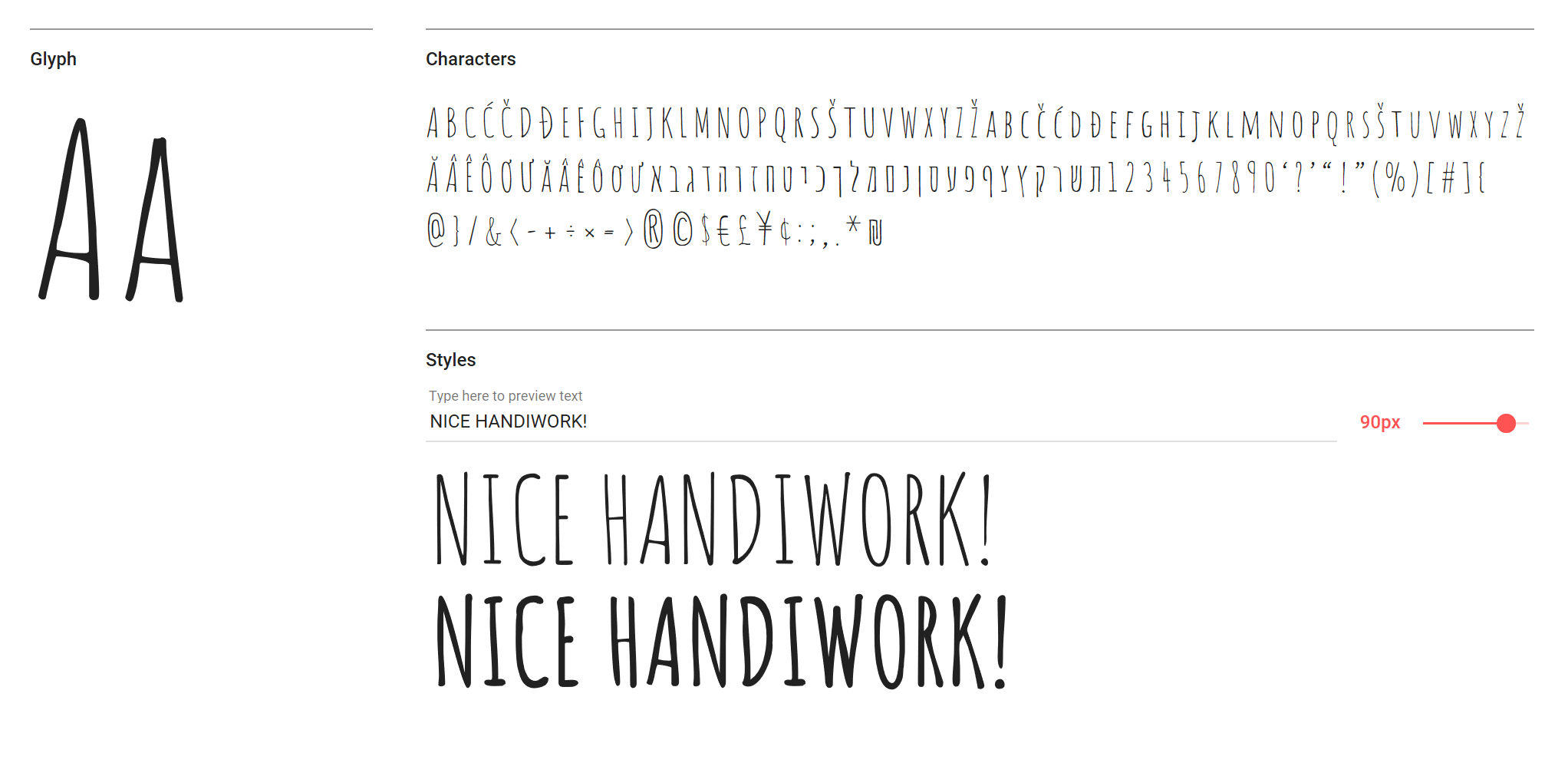
Free Font: Stay Classy

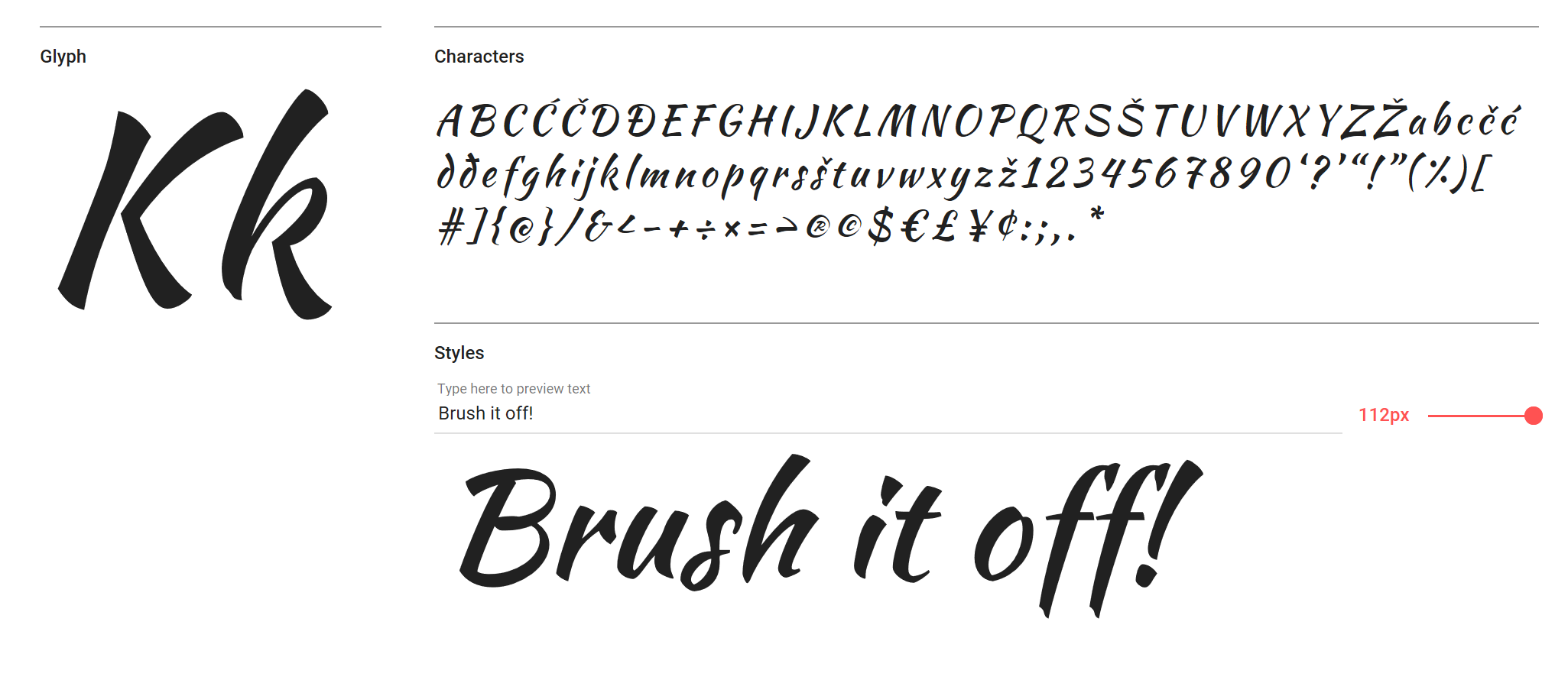
An elegant handwritten font designed by Solid Type.

Get it

C391_ssl

SSL Certificate Expiration Alerts

Get notified when the SSL certificate of a website expires.

Check it out

C391_Memphis

8-bit Memphis Patterns Pack (EPS, AI, JPG)

A set of 15 trendy Memphis vector patterns by Softulka for Pixel Buddha.

Check it out

C391_Polacode

Polacode

Take screenshots in Visual Studio Code with this smart plugin.

Check it out

C391_grid

CSS Grid for UI Layouts

Josh Marinacci shows how to use CSS Grid for practical UI layouts.

Check it out

C391_gradientpara

Gradient for EVERY line of a para

An interesting technique for adding a gradient to every line of a paragraph.

Check it out

C391_react

Minimal React.js Without A Build Step (Updated)

In case you missed it: an updated tutorial on using React.js without a build step.

Read it

C391_Descartes

Descartes

A small plotting library as a JavaScript alternative to matplotlib, made for TheoremJS.

Check it out

Collective #391 was written by Pedro Botelho and published on Codrops.

12 professional fonts for designers

Original Source: http://feedproxy.google.com/~r/CreativeBloq/~3/vRnc3r-Dn_A/professional-fonts-31619557

There's no shortage of paid-for and free fonts available for designers to choose from these days. But what if you want a typeface that's really special and stands out? 

Whatever the project, these professional fonts are certain to give your designs an air of sophistication.

01. FF Din

FF Din serif font sample

FF Din is a popular choice among designers

Price: From $65/£51.99 per fontFormat: OTF

Added to MOMA's digital typefaces for its Architecture and Design collection back in 2011, FF Din is a popular choice among designers. Created by Dutch type designer Albert-Jan Pool between 1995 and 2009, this sans serif is ideally suited to advertising and packaging, logos and branding.

02. Oswald

Oswald serif font sample

We’re big fans of professional font Oswald here at Creative Bloq
Price: FreeFormat: Google web font

Oswald has become a popular choice of font for designers, especially for those working in the world of of the web. A reworking of the classic style historically represented by the 'Alternate Gothic' sans serif typefaces, this professional font has been re-drawn and reformed to better fit the pixel grid of standard digital screens. 

03. Brandon Grotesque

Brandon Grotesque sans serif font sample

Brandon Grotesque won the Type Directors Club Award in 2011
Price: $40/£27.99 per fontFormat: OTF

Designed by Hannes von Dohren in 2009, Brandon Grotesque was influenced by the popular geometric-style, sans serif typefaces of the 1920s and 30s. Equipped for complex, professional photography, Brandon Grotesque won the Type Directors Club Award in 2011.

04. Aviano

Aviano serif font sample in gold

Aviano typeface is inspired by the power and timeless beauty of classic letterforms
Price: $24.99/£15.99 per fontFormat: OTF

Named after a small town at the base of the Alps in Northern Italy, Aviano typeface is inspired by the power and timeless beauty of classic letterforms. A gorgeous design, Aviano was created by type designer Jeremy Dooley, owner of one-man foundry Insigne.

05. Proxima Nova

Proxima Nova sans serif font sample

Proxima Nova is used by over 25,000 websites, including Buzzfeed, Wired and Mashable
Price: $29/£19.99 per fontFormat: OTF/TTF

Used by over 25,000 websites, including Buzzfeed, Wired and Mashable, Mark Simonson's professional font Proxima Nova is an extremely popular choice amongst designers. The extensive family is available in seven weights (thin, light, regular, semi-bold, bold, extra-bold and black), with matching italics, small caps and condensed and extra-condensed widths. 

06. Rockwell

Rockwell serif font sample says 'Most useful face for jobbing'

An updated Rockwell was published in 1934 by Monotype
Price: $35/£22.99 per fontFormat: OTF/TTF

Geometric slab serif Rockwell was inspired by a 1910 font titled Litho Antique. Designer Morris Fuller Benton revived Rockwell in the 1920s before it was redesigned and published in 1934 by Monotype, in a project headed by Frank Hinman Pierpont.

07. Trojan

Trojan serif font sample

Trojan’s design is based on classic Roman structures
Price: $25.80/£20 for 1 fontFormat: OTF

Trojan is one of many stand-out designs by creative genius Alex Trochut. Created back in 2012, professional font Trojan was used extensively throughout Wallpaper after its initial release. Based on classic Roman structures, Trojan has a very sophisticated set of glyphs, which, in turn, gives this font a classic contemporary appearance.

08. Le Havre

Le Havre sans serif font sample

Le Havre lends itself to all manner of creative projects
Price: $24.99/£15.99 per fontFormat: OTF

Art deco-inspired typeface Le Havre was named after the port where many a famous luxury cruise liner was launched in the 1930s. Compressed capitals, a low x-height and geometric construction give this beautiful typeface a retro look and feel, with the new contemporary update in 2009 lending itself to all manner of creative projects.

09. Mallory

Mallory display font sample

Mallory is the work of s type designer and teacher Tobias Frere-Jones
Price: $50 per fontFormat: OTF

The product of type designer and teacher Tobias Frere-Jones, Mallory is a beautiful professional font, which began as an experiment in mixing typographic traditions, building a new design with British and American traits.

Frere-Jones has a number of best-selling type designs under his belt, but Mallory was the first font he created after splitting with long-time creative partner Jonathan Hoefler.

He comments on his website: "Mallory was built to be a reliable tool, readily pairing with other typefaces to organise complex data and fine-tune visual identities. Each style contains over 1250 glyphs, to anticipate a wide range of content: small caps and old-style figures for running text, lining figures and uppercase punctuation for headlines, tabular figures and over a dozen currency symbols for financial data."

10. FF Meta

FF Meta sans serif font sample

FF Meta was designed by Erik Spiekermann

Price: $59/£45 per fontFormat: OTF

Created by outspoken type designer Erik Spiekermann, FF Meta was first called PT55, a typeface made for easy reading at small sizes for West German Post Office in 1985. Spiekermann continued work on his design to include more weights and styles, later releasing it as FF Meta, one of the first and truly foundational members of the early FontFont library.

With a clean, cheery and distinctive aesthetic, professional font FF Meta flourished in the early 1990s and has been a firm favourite ever since. In 2011, the Museum of Modern Art in New York added FF Meta to its permanent collection, one of only 23 fonts selected to represent typography of the digital era.

11. Soho

Soho is a beefy slab-serif by Seb Lester
Price: $65 per fontFormat: OTF

Beefy slab serif Soho is the product of renowned type designer Seb Lester. The super-family has over 40,000 glyphs and represents three years' worth of work. 

"As a type designer I'm preoccupied with finding ways in which I can address modern problems like good legibility in modern media, and create fonts that work precisely and efficiently in the most technically demanding of corporate and publishing environments," he comments on the Monotype website.

12. Davison Spencerian

Professional fonts: Davison Spencerian

Davison Spencerian is a remains a benchmark of the ornamental script genre
Price: $75Format: OTF/web font

American letter designer Meyer 'Dave' Davison was arguably one of the most distinguished lettering artists of the 20th century. With a library of Spencerian designs, Davison Spencerian typeface made its first appearance in Photo-Lettering’s 1946 catalogue and remains a benchmark of the ornamental script genre.

Tireless hours have been spent by Mitja Miklavčič and House Industries designers Ben Barber and Ken Kiel to preserve the poise and precision of Davison’s masterwork in this faithfully-rendered digital incarnation.

The House Industries website states: 'From automotive exhaust accessories and pirate-themed wedding invites to New Orleans sissy bounce hip-hop CD covers and upmarket bivalve ambrosia packaging, Davison Spencerian offers sober sophistication and unparalleled flexibility'.

Related articles:

20 perfect font pairingsWhat is DPI? The ultimate guide to image resolution30 books every graphic designer should read

Making It Pop — 5 Ways to Combat Subjective Design Feedback

Original Source: https://www.webdesignerdepot.com/2018/02/making-it-pop-5-ways-to-combat-subjective-design-feedback/

“It looks great, but can you make it ‘pop’ more?”

We’ve all been there, the dreaded subjective design feedback, no use to anyone; let’s stop a moment and look at what led to this subjective nonsense, what chain of events instigated this horror show of unusable feedback? Actually, how clients receive your work and how you frame the feedback request is often just as much to blame as the person asking you to make your designs ‘pop’.

Ask yourself how often have you simply sent over an email to a client with a .jpg attached and the seemingly innocent request “let me know what you think”.

recognising how your own process often invites completely unhelpful feedback can help you change

The truth is there’s never a 100% right answer when it comes to web design, so everyone is likely to have a different personal opinion. If you really think about it every design is the result of hundreds of tiny decisions that could have gone any one of a thousand different ways (light blue buttons instead of dark blue, 10px padding instead of 14px etc etc).

Design is, by its very nature, is perceived as a subjective exercise. So the truth is we don’t actually want to know if a client or stakeholder ‘likes’ our design or not, we want to know if it meets their business needs. We don’t want to know if the Legal Department gets a warm fuzzy feeling when they see our work, we want to know if they’re able to sign it off.

It’s also important to bare in mind that some subjectivity will always make it’s way through into the feedback you receive and that’s not always such a bad thing. Often at the heart of it is some really well meaning and useful insight but recognising how your own process often invites completely unhelpful feedback can help you change and weed it out.

1. Ask the Right Questions

The easiest way to start preventing subjective feedback on your project is to be clear on what you’re asking for. Instead of flinging over a completed design with a cheery “let me know what you think” email, try and steer the feedback conversation towards what you actually need.

Now this can take a little more effort and sometimes after finishing a super difficult project at 2AM the only thing you want to do it get a design sent off and never look at it again, but believe me in the long run it’s worth it.

if you’re sending your design to a client you should be pleased with it, so don’t be afraid to sound positive

Take some time to think about who you’re sending your designs to and why. Is it a business owner reviewing a design for their new website? If so, be positive, tell them that you’re really pleased with how the design represents their brand and you’re ready to move onto to the next phase of the project, do they agree? If not, which specific elements would they like you to focus on changing. Don’t forget if you’re sending your design to a client you should be pleased with it, so don’t be afraid to sound positive and ready to move on.

Essentially what you’re doing here is trying to frame what you want from people in an objective way. Think ‘yes or no’ questions rather than ‘what do you think’.

This approach can be especially useful if your intended recipient is reviewing your design for a very specific single reason, for example if you need the legal team to sign off you should be asking if there are: “Any reasons the design would not be acceptable from a legal perspective,” rather than: “What do you think? Is this ok for you?”

…you’re actually helping people when you ask for this simple yes or no type feedback.

A lot of the time you’re actually helping people when you ask for this simple yes or no type feedback. You are, for a lot of people, removing the subconscious pressure for them to contribute something if asked. When presented with a blank canvas request for ‘their feedback’ most people will force themselves to think of something even if it’s just a random point that in reality they don’t care about—simply because the alternative feels like they’re saying “nope sorry—I can’t think of anything I’d change—I’m not required—I don’t need to be involved—I’m useless really”. Inviting a simpler yes or no answer is often enough to lift the pressure and gain a positive response.

2. Let Less Cooks Near the Broth

Another great way to avoid subjective feedback hell is to work hard on limiting the number of people you invite to feedback. Design feedback has a nasty habit of snowballing as more and more people are CC’d into an ever growing email chain of contradicting opinions. Instead, don’t be afraid to limit your feedback loop, you can even separate stakeholders off into groups if needed. For example if two stakeholders are brand and two are legal, why not reach out to the legal sign off team separately for specific legal feedback and vice versa for brand (it can save you the legal person’s often unwelcome brand feedback).

Now it’s not always that easy and there is the risk you can create even more problems for yourself if you exclude people (especially in large organisations). What you can do to combat this is to share design output with a wider group but be specific that it’s purely for their awareness and that feedback is not need at this stage, thank you very much.

3. Position Your Design

Don’t just leave your design to stand on its own, this opens it up to misinterpretation—instead share it with context, easy to understand explanations around why certain decisions have been made. There’s plenty of ways you can do this, the simplest being to provide a version of the designs with easy to follow annotations, but ideally you want to actually talk people through it step by step in a design walk through.

A walk through of your designs moves away from the rather old school concept of sending designs over to clients or stakeholders for feedback like an exam paper being sent off to be marked. The actual best way to share designs and squash unwelcome subjective feedback is to present in person, walk your stakeholders through your design step by step answering any questions as you go. Obviously there’s a number of issues with this, logistically it can be difficult, it can be costly to find the time but not least of all… it can be quite frightening.

But if you’re up for the challenge there are definite rewards. Getting your clients or stakeholders together to walk them through your designs will give you the opportunity to remove even more subjectivity from feedback as you explain not only how the proposed design would work but also the reasoning behind your design decisions. Right off the bat this cuts out any questions in amongst your feedback about “How do you see component X working?” or “Why have you opted to use color Y here?”.

Getting everyone to attend a walk-through can feel like herding cats

Obviously design walk-throughs no longer need to be done face to face either, there are plenty of amazing tools out there to help you walk a client through design remotely. But the most useful tool in this scenario is you as the designer explaining your design decisions and answering questions—sharing your enthusiasm.

Getting everyone to attend a walk-through can feel like herding cats sometimes, getting all your stakeholders in one place at one time is certainly tricky but it’s worth persevering because it helps you out in another key area where subjective feedback often creeps in.

4. The Curse of Contradictory Feedback

This occurs when stakeholder no.1 loves the new header image but stakeholder no.2 hates it. Before you know it you’re playing stakeholder top trumps deciding who is more important and who you should to listen to. If you do find yourself in this situation is can be useful to ask your client or internal stakeholders for a single point of contact through whom any and all feedback is filtered (leaving it to them to have to battle to decide who’s top dog).

Another great way to keep people away from contradictory feedback is to be very upfront and honest around the number of amends that are available or the time impact of unnecessary feedback. This may feel uncomfortable to some but believe me its infinitely better in the long run to be honest and direct early on rather than let people down later after you’ve received 8 rounds of subjective feedback that’s delayed your project and pushed you way way over budget.

5. Too Late it’s Happened…

If after all this you still find yourself on the receiving end of some subjective feedback that you just don’t know how to proceed with with (maybe such classics as “Can you make it pop?”, “Can this page look more exciting please?”, “I’m just not sure about these colors”) don’t despair. A great way to bring your client back on track at this point is to politely ask them to send you some links to sites they’ve seen that do ‘pop’ or do look ‘exciting’. You’ll be surprised how often this works and a client will send you a couple of links to similar sites and you can decipher their meaning and implement something that… ‘pops’ 🙂

Some Key Things to Try

Be specific not general in what you ask for in feedback
Limit the number of people you ask for feedback
Walk through your design with stakeholders to give it context
Limit the number of rounds of feedback available
Ask for feedback to come through a single point of contact
Make it pop

DLEX UI Kit with 1,000+ Elements & 400 Components – only $24!

Source

p img {display:inline-block; margin-right:10px;}
.alignleft {float:left;}
p.showcase {clear:both;}
body#browserfriendly p, body#podcast p, div#emailbody p{margin:0;}

How to Consume Less Time on Social Media

Original Source: http://feedproxy.google.com/~r/Designrfix/~3/7aREFXdcf7Y/consume-time-social-media

The most important drawback in working with social media is that it seems to take up a great deal time. Due to time constraints, businesses are usually not utilizing the benefits that social media can provide. You will discover three factors concerning why social media takes up so much time on the part of the designers:  There are so many […]

The post How to Consume Less Time on Social Media appeared first on designrfix.com.

Exclusive Freebie: Creative Process Icon Set

Original Source: https://inspiredm.com/exclusive-freebie-creative-process-icon-set/

Inspired Magazine
Inspired Magazine – creativity & inspiration daily

Perhaps you’re a future Einstein in the making or you have just started an exciting new hobby. Either way, The Creative Process Pack provided exclusively by Flaticon and Freepik is the perfect fit for your next project. Each icon revolves around the theme of imagination while celebrating the processes needed for creating. So if you need a splash of motivation and colour, look no further!

Free for personal and commercial use!

Download this awesome pack as SVG from here.

For the PNG files check here: part 1,  part 2 and part 3.

This post Exclusive Freebie: Creative Process Icon Set was written by Catalin Zorzini and first appearedon Inspired Magazine.
20 Best New Portfolio Sites, February 2018

Original Source: https://www.webdesignerdepot.com/2018/02/20-best-new-portfolio-sites-february-2018/

Hey everyone! It’s February, and you know what that means: Hallmark executives get bonuses! Also, people make a special effort to show love and affection to those they care about, which is cool too.

The theme this month is minimalism and motion designer portfolios, pretty much. Enjoy.

Note: I’m judging these sites by how good they look to me. If they’re creative and original, or classic but really well-done, it’s all good to me. Sometimes, UX and accessibility suffer. For example, many of these sites depend on JavaScript to display their content at all; this is a Bad Idea (TM), kids. If you find an idea you like and want to adapt to your own site, remember to implement it responsibly.

Christopher Kirk-Nielsen

Christopher Kirk-Nielsen is a WDD reader who sent in his own site for review, and oh my God I think he’s been listening! You see, he is a front-end dev / motion designer. Typically, sites built by motion designers tend to suffer in the usability and accessibility department.

In this case, however, the site looks good. It looks original. It appeals to the love of the ’80s aesthetic. And so far, I can’t get the thing to break without going back to much older browsers. Even without JavaScript, everything has a fallback.

Less+More

Next up, Less+More is perhaps the very embodiment of the “white space and thick heading type” school of design. It has big type. It has big images. It has… a lightly-animated Venn diagram? Okay, I like that.

No prizes for originality, but it looks good.

Marina Rachello

Every time I see a site so brazenly colorful as Marina Rachello’s portfolio, I always wonder if my tendency toward monochromatic palettes is wrong somehow. While some of the bolder tones don’t contrast too well with the black text, it must feel freeing to just go nuts with the colors and shapes.

The only change I’d make (besides fixing the potential contrast issue) would be to make the background an SVG rather than a PNG.

Antoni

Antoni brings us another videographer’s portfolio that goes all in on the motion design. It’s got a visually pleasing combination of background video, and simple, solid minimalism that would just scream “professional” if it weren’t so darned professional.

Nikos Pandazaras

Nikos Pandazaras’ portfolio is as artsy as his photography, which is par for photographers’ websites these days. You have the minimalism, the somewhat unconventional layout, and even rather artsy animation. The whole thing really fits the theme.

Dow Smith

Dow Smith adheres to the trend of ever-more-minimalist sites, with the big, thin text, and the love of literal white space. Tons of it.

There’s also a fair bit of distracting animation, but I actually rather like the way it’s been used. Each portfolio piece is presented as a short video (embedded with HTML5) that shows how a user is expected to interact with the site. It shows how they work, not just how they look.

Prollective

Prollective’s website is minimalist and professional, but isn’t afraid to preen a bit. Gradients and bright colors haven’t looked this good since people kept mistaking Web 2.0 for an aesthetic trend. Despite relying far more on type than it does on imagery, this site still feels vibrant.

Blue Productions

Blue Productions properly commits to their theme by, well, using a whole lot of blue. Video is what they’re all about, so expect a fair bit of background video, and stills from their work. I particularly appreciate the cinematic presentation for all of their work.

galgo.studio

galgo.studio’s style of minimalism is bound to remind you at least a little bit of Google. They’ve worked with Google on at least one project, so that sounds about right. It’s clean, it’s smooth, it has that thin text you see on pretty much every Google site now. Some small usability issues on the home page aside, it’s a pleasure to browse.

Julie Bonnemoy

Julie Bonnemoy’s portfolio hits you with some rather chaotic lava lamp effects before revealing a classy layout that revels in its asymmetry and imagery in equal measure. I feel like this is one of those sites that is perhaps a bit over-animated. Even so, when it calms down a bit, it’s just plain beautiful to look at.

Dinner for Five

Mitsugu Takahashi’s portfolio is elegant. I don’t mean that it uses fancy type (well, it does), or that it uses imagery to project a high-class brand (it does that, too). Those are just surface level indications of a deeper understanding of the way something elegant is supposed to feel.

Page loader aside, the site feels graceful, pleasant, and stylish as you could wish for. It’s almost a miracle that only one of the featured projects has anything to do with fancy weddings. It just hits all of the right notes.

Jermaine Craig

Jermaine Craig makes a bold and risky move by hitting users right in the eye-sockets with a wall of text. The site as a whole seems to be a bit of a work in progress, but it’s already eye-catching enough for this list.

Paper Tiger

Paper Tiger is your classic minimalism that’s had few paint-filled balloons thrown at it. The people at Paper Tiger are apparently good at throwing things, though, as the use of color doesn’t overwhelm the rest of the design at all. It just takes an already-solid design and makes it stand out a bit more.

James Merrell Architects

I’m not sure why architects love the PowerPoint-style site so much, but James Merrell Architects is a fine example of the form. Even their blog is part presentation, and part print publication. The cool thing is that CSS (and JS) has come far enough to make sites like this reasonably usable, and even pretty.

Even though building sites this way goes against my personal preferences — and even though there’s no point in hiding the navigation behind a hamburger menu on the desktop — I have to admit that it just looks good.

Kickpush

It’s one heck of a power move for a company that makes mobile apps (and occasionally websites) to state that they don’t even like the Internet. And yet, Kickpush has done just that. Of course, they also call London “sunny” which is exactly how you know they’re kidding. That brashness permeates the site’s entire aesthetic and experience.

MoreSleep

MoreSleep is not just a good idea, it’s also a design studio. This one has gone for that holy grail of alternative aesthetics: the horizontal layout. Well, on their home page anyway.

Nathan Young

Nathan Young has brought us a multiple-slideshow portfolio for our enjoyment. This sort of portfolio is actually growing on me a bit, though I’d personally try for pure CSS slideshows.

Jack Davidson

Jack Davidson’s portfolio makes absolutely sure that you will read the title of every project by replacing your cursor with said title. Don’t worry, it goes back to the regular pointer as soon as you mouse over the navigation, so it remains useful.

The site is interesting, but I want to dock it a few points for using a “screen saver”. I’m getting a bit annoyed with those. At least this one is a slideshow of his work, so it’s still kind of useful.

Amateur.rocks

Okay, a thousand websites have done the “it’s all text until you hover on a project name” thing. I’d just like to point at amateur.rocks to say, “They did it right.”

See how the images are kept from overlapping the title of the project you’re previewing? See how they don’t have to worry about text contrast like that? That’s the right way to do it.

Giovanna Silva

Giovanna Silva has taken the unconventional route of allowing people to make their own collages (sort of) with her portfolio. Click on a country/location, then start clicking away to see every picture in the project.

After you’ve exhausted the stack of photos, you can see them all again in a more conventional layout. The rest of the site is a bit more conventional, too, but looks good.

Art Text App for Mac Turns Text into a Masterpiece – only $17!

Source

p img {display:inline-block; margin-right:10px;}
.alignleft {float:left;}
p.showcase {clear:both;}
body#browserfriendly p, body#podcast p, div#emailbody p{margin:0;}

Collective #388

Original Source: http://feedproxy.google.com/~r/tympanus/~3/t2BR0m76pfM/

C388_themeco

Our Sponsor
Get every single detail right

There’s plenty of “good enough” web design work. And designers who almost never pay attention to details. But you’re different. You always give 110%, right?

Get X

C388_svgreact

Making SVG icon libraries for React apps

An article by Nicolas Gallagher that describes how to make a package of React components from a library of SVG icons.

Read it

C388_dinosaur

Modern CSS Explained For Dinosaurs

Peter Jang explains modern CSS in a nutshell and shows why it is considered both one of the easiest and one of the hardest languages to learn as a web developer.

Read it

C388_loader

CSS “Coding” animation

A loading animation that looks like schematic “coding”. By Chris Dermody.

Check it out

C388_Grid

CSS Grid layout – crossed sections

An introduction to CSS Grid and its potential with a practical example. By Rafaela Ferro.

Read it

C388_easing

Writing an easing function; a slightly interesting story

David Gilbertson shares his experience on creating a tiny library for smoothly moving elements.

Read it

C388_font

Free Font: Highlander

A beautiful marker script font by Kavoon.

Get it

C388_svgbackground

SVG Backgrounds

Some nice customizable SVG patterns and background designs for your websites

Check it out

C388_yo

Yo!

A new weekly YouTube show about design and development. By Rob Hope.

Watch it

C388_witeboard

Witeboard

A real-time, cross-platform drawing app for collaborating with others.

Check it out

C388_global

Maybe don’t globally-install that Node.js package

Jake Wilson encourages everybody to consider the downsides of globally installing random Node.js packages and takes a look at some alternatives.

Read it

C388_webpack

Keep webpack Fast: A Field Guide for Better Build Performance

In case you missed it: Rowan Oulton’s guide for keeping webpack fast.

Read it

C388_shader

Converting Shaders from Shadertoy to ThreeJS

Dirk Krause shows how to transfer Shaders from Shadertoy to ThreeJS.

Read it

C388_18

ESNext Proposal: The Pipeline Operator

A proposal for adding the simple-but-useful pipeline operator to JavaScript

Check it out

C388_fontsilent

Free Font: Silent Scream

Andreas Leonidou designed this great display font.

Get it

C388_Stairs

Only CSS: Infinite Steps

Yusuke Nakaya created this mesmerizing demo of an infinite staircase.

Check it out

C388_cone

Using Conic Gradients and CSS Variables to Create a Doughnut Chart Output for a Range Input

A great technique for creating doughnut shaped charts. By Ana Tudor.

Read it

C388_Python

Web Programming with Python and JavaScript

Learn about the design and implementation of web apps with Python, JavaScript, and SQL using frameworks like Flask, Django, and Bootstrap.

Check it out

C388_basin

Basin

Basin takes the hassle out of creating form backends.

Check it out

C388_button

Build a Download Button Full of Micro Interactions

A tutorial by Luis Manuel where you will learn how to pull off some interesting micro interactions on a button.

Read it

C388_alterworld

This alter world

Gerard Ferrandez created this magical demo.

Check it out

C388_review

Awesome Code Review

An “Awesome” list of code review resources including articles, papers, tools, and so on.

Check it out

C388_chromeadblock

Here’s how Google Chrome’s new ad blocker works

Learn about how Google Chrome will block every ad on websites that are not compliant with the Better Ads Standards by default. By Daniel Aleksandersen.

Read it

C388_imageprocessing

An Intuitive Explanation of using Poisson Blending for Seamless Copy-and-Paste of Images

Learn about the image processing technique called “Poisson Blending” in this article. By Eric Arnebäck.

Read it

C388_deepfake

Family fun with deepfakes. Or how I got my wife onto the Tonight Show

Sven Charleer explains how the deepfakes app algorithm works in a nutshell.

Read it

C388_outdoors

From Our Blog
Outdoors Template

An implementation of Gil Huybrecht’s “Outdoors” design project powered by layered CSS grids.

Check it out

Collective #388 was written by Pedro Botelho and published on Codrops.

50 Handpicked Beautiful Tumblr Themes

Original Source: https://www.hongkiat.com/blog/tumblr-themes/

Tumblr is one of the most interesting social media platforms and home to creative individuals who like to share their thoughts and ideas with people of same interest. However, to attract more…

Visit hongkiat.com for full content.

Monthly Web Development Update 2/2018: The Grown-Up Web, Branding Details, And Browser Fast Forward

Original Source: https://www.smashingmagazine.com/2018/02/monthly-web-development-update-2-2018/

Every profession is a wide field where many people find their very own, custom niches. So are design and web development today. I started building my first website with framesets and HTML4.0, images and a super limited set of CSS, and — oh so fancy — GIFs and inline JavaScript (remember the onclick=”” attribute?) about one and a half decades ago. It took me four days to learn the initial, necessary skills for that.

Get perfect sound with StockUnlimited

Original Source: http://feedproxy.google.com/~r/CreativeBloq/~3/jKfQA1fzD1w/get-perfect-sound-with-stockunlimiteds-audio-library

The right song can set the mood for a video. Unfortunately, good music doesn't always come easy. You can make sure you always have the perfect tune ready for use for your project with the StockUnlimited Audio Library. You can get three-year access on sale for just $49.99 (approx. £36)!

Music assets aren't cheap and they often aren't easy to find, either. StockUnlimited's massive Audio Library can fix that problem for you. This massive library provides you with tons of premium audio tracks and sound effects that you can use for any project. For three years, you'll have unlimited downloads to all of the royalty-free music you could want. These tracks are perfect for setting the mood with tons of genres, instruments and sound effects to choose from.

You can get a three-year subscription to StockUnlimited Audio Library on sale for just $49.99 (approx. £36). That's a savings of 91% off the retail price for a can't-miss deal for any creator, so grab this offer today!

About Creative Bloq deals

This great deal comes courtesy of the Creative Bloq Deals store – a creative marketplace that's dedicated to ensuring you save money on the items that improve your design life.

We all like a special offer or two, particularly with creative tools and design assets often being eye-wateringly expensive. That's why the Creative Bloq Deals store is committed to bringing you useful deals, freebies and giveaways on design assets (logos, templates, icons, fonts, vectors and more), tutorials, e-learning, inspirational items, hardware and more.

Every day of the working week we feature a new offer, freebie or contest – if you miss one, you can easily find past deals posts on the Deals Staff author page or Offer tag page. Plus, you can get in touch with any feedback at:deals@creativebloq.com.

Related articles:

The best video editing software 2018Apple Music's new branding hits all the right notesBuild a simple music player with React