Learn How to Build a Chatbot with IBM Watson APIs

Original Source: http://blog.teamtreehouse.com/build-a-chatbot-with-ibm-watson-apis

ibm_watson_logotype_reg_pos_rgb

We’re excited to announce that Treehouse has partnered with IBM on a new course called Build a Chatbot with Watson APIs. Watson is the AI platform for business from IBM (made famous by its appearance on Jeopardy! in 2011), and it’s a collection of AI services designed to work together. If you’re new to AI, you might be wondering why it matters or how you can use it yourself. Below is my own explanation, and the course can help take you even further.

Start learning to code today with your free trial on Treehouse.

From protein folding, to Twitter, to stock markets, the amount of data in the world is growing at an unprecedented pace; there’s no way for humans to sift through it all. This is a problem, because our ability to turn raw data into useful information and knowledge is a limiting factor on the pace of technology and innovation.  If the world is generating more data than we can interpret, then we’re not getting the full value from the data or reaching our full potential. In many cases there are low consequences to slower data processing, but as someone that lives in Florida where we get hurricanes annually, I depend on computer models and human experts to predict the path and severity of each storm in real-time. If more sophisticated models and better predictions are available, there would be less guesswork when making preparations, and hopefully a less severe aftermath.

Even when we apply clever algorithms, it’s extremely difficult to create the perfect set of rules for interpreting and understanding a given data set. For example, let’s say we want to create an algorithm that’s capable of identifying a piece of fruit from a photograph. Maybe we could create rules to identify a fruit based on its shape. But then, what if the photo is taken at a strange angle (for example, the silhouette of a pear is similar to other spherical fruit from a top-down perspective)? Then, maybe we could add rules to identify the fruit based on color. However, what if a banana is transitioning from yellow to brown, or what if there are green apples instead of red apples, or what if the photo is in black and white?

Sure, it’s probably possible to come up with a rule set that will work, but it could be hundreds of rules and branching decision trees, and that’s just for identifying one type of thing. This is the type of problem that can be addressed by machine learning. Rather than telling a computer to check a set of rules created by a human, we instead “train” the computer on a set of a data and it writes the rules itself. In most cases this still involves a human to build an initial data set and work with an artificial intelligence to guide it to the initial correct answers, but after viewing enough different photos of fruit, the AI will start to gain more confidence in its own predictions.

Image recognition and computer vision is just one application of AI. Similar principles of machine learning can be applied to problems like speech recognition, natural language processing, and much more. In the Treehouse course Build a Chatbot with Watson APIs, you’ll create an AI that you can talk to in the same way you might chat with someone over an instant messaging service. This type of “chatbot” can assist businesses that need help with customer service, but may not have the capacity to answer a high volume of customers, or want to offer assistance outside of normal business hours; a chatbot never has to sleep. Just like AI, chatbots also have broad applications – for example, perhaps someday we might interact with domain-specific chatbots rather than using so many different phone apps.

If you want to browse some of IBM Watson services before getting started, head over to ibm.com/watson. Then when you’re ready to start creating, check out the Build a ChatBot course!

The post Learn How to Build a Chatbot with IBM Watson APIs appeared first on Treehouse Blog.

Desktop Wallpaper Calendars: April 2012

Original Source: http://feedproxy.google.com/~r/visualswirl/~3/QBoB-rcRBmw/

No April Fools joke today. Instead let me present a roundup of Desktop Wallpaper Calendars for April 2012. With spring in full swing, I’ve gathered several beautiful desktop wallpapers featuring April 2012 calendars. Freshen up your desktop and check back next month for a brand new calendar update.  Feel free to share these with your friends and email me if you ever would like your calendar featured in a similar roundup.

6 Beautiful Desktop Wallpaper Calendars for March 2012
Wallpaper by Ibrandstudio

Wallpaper by Paper Leaf

Wallpaper by MonkeyMan504

Wallpaper by Shrimp Salad Circus

Wallpaper by Webgranth

Wallpaper by Studio of Mae

Wallpaper by Kriegs

The post Desktop Wallpaper Calendars: April 2012 appeared first on Visual Swirl Design Resources.

6 Must-Have Tools in a PHP Developer’s Toolkit

Original Source: http://blog.teamtreehouse.com/6-must-have-tools-in-a-php-developers-toolkit

PHP is a popular back-end programming language that allows you to quickly and effortlessly create simple, dynamic websites. It’s so popular, in fact, that around 80% of all websites now use it! Once you’ve decided to learn PHP and join the awesome community of developers, you may be wondering, what are some essential tools I’ll need? We asked expert PHP teacher, Alena Holligan to share her top picks!

Start learning to code today with your free trial on Treehouse.

Reference PHP.net documentation

The first and most fundamental tool you should have at your disposal as a PHP developer is the PHP.net documentation manual bookmarked in your browser or downloaded to your desktop. This go-to resource will cover everything PHP from installation and configuration to a full list of language references and features. As a developer, don’t expect to be able to remember everything (no one can!), but keeping this manual handy is a great way to look something up quickly.

Access or download the PHP.net manual here.

Be part of the collaborative GitHub community

Octocat via GitHub

GitHub is a collaborative development platform built on top of a distributed version control system called Git. As a PHP developer – and any developers for that matter – GitHub can be the most valuable place for you to share & collaborate with other developers. If you’re new to GitHub, we also recommend checking out the GitHub Basics course on Treehouse to learn how to navigate the GitHub site, explore open source software, and best practices.

Sign up for GitHub here.

Rely on Xdebug to exterminate bugs

Xdebug is a great debugger and profiler tool for PHP. Use it to test your code and assist with debugging and development. Trust us, it’ll save you valuable time and avoid unnecessary frustrations!

Install Xdebug here.

Master management with Composer

php developer's toolkit

Composer is a dependency manager for PHP that allows you to manage both dependencies of PHP software and required libraries in one place, saving you time and effort. Since the software’s initial released in 2012, it has literally changed how PHP is developed and is a popular choice among the PHP community, from beginners to pros.

Download Composer here.

Testing, testing with PHPUnit

If you’re going to write unit tests in PHP, look no further. PHPUnit is a programmer-oriented unit testing framework for PHP and is a favorite tool with our teachers for writing unit tests in PHP. It’s flexible, powerful and easy to use. The great news is that we teach a course on PHP Testing with guest teacher, Chris Hartjes and there’s even a section specifically about using PHPUnit!

Get started with PHPUnit here.

Tap into the power of PHPStorm

php developer's toolkit

PHPStorm is an awesome super tool. It’s a PHP IDE from JetBrains that can also integrate with the other tools we’ve mentioned above. PhpStorm works with frameworks like Drupal, WordPress, Laravel, Magento, CakePHP, and the list goes on… With built-in developer tools, you can also carry out routine tasks right from the IDE. With so many capabilities, the editor is also able to truly understands your code and offers valuable code completion, error prevention, and more to help you code efficiently and productively.

Learn more and buy PHPStorm here to start coding.

BONUS: Join Local User Groups

Another top tip from Alena is to make an effort to connect with local PHP user groups. The PHP community is awesome, welcoming and supportive, and always happy to welcome new members. So how do you find your local group? Easy, just head on over to php.ug to access every PHP-Usergroup worldwide, find your local group and sign up for their next event!

These are only a few of the PHP tools out there, we’d love to hear what you would add to the list in the comments below!

8 Must-Have Tools in a Beginner Developer’s Toolkit

The post 6 Must-Have Tools in a PHP Developer’s Toolkit appeared first on Treehouse Blog.

Animating Border

Original Source: https://css-tricks.com/animating-border/

Transitioning border for a hover state. Simple, right? You might be unpleasantly surprised.

The Challenge

The challenge is simple: building a button with an expanding border on hover.

This article will focus on genuine CSS tricks that would be easy to drop into any project without having to touch the DOM or use JavaScript. The methods covered here will follow these rules

Single element (no helper divs, but psuedo-elements are allowed)
CSS only (no JavaScript)
Works for any size (not restricted to a specific width, height, or aspect ratio)
Supports transparent backgrounds
Smooth and performant transition

I proposed this challenge in the Animation at Work Slack and again on Twitter. Though there was no consensus on the best approach, I did receive some really clever ideas by some phenomenal developers.

Method 1: Animating border

The most straightforward way to animate a border is… well, by animating border.

.border-button {
border: solid 5px #FC5185;
transition: border-width 0.6s linear;
}

.border-button:hover { border-width: 10px; }

See the Pen CSS writing-mode experiment by Shaw (@shshaw) on CodePen.

Nice and simple, but there are some big performance issues.

Since border takes up space in the document’s layout, changing the border-width will trigger layout. Nearby elements will shift around because of the new border size, making browser reposition those elements every frame of the animation unless you set an explicit size on the button.

As if triggering layout wasn’t bad enough, the transition itself feels “stepped”. I’ll show why in the next example.

Method 2: Better border with outline

How can we change the border without triggering layout? By using outline instead! You’re probably most familiar with outline from removing it on :focus styles (though you shouldn’t), but outline is an outer line that doesn’t change an element’s size or position in the layout.

.border-button {
outline: solid 5px #FC5185;
transition: outline 0.6s linear;
margin: 0.5em; /* Increased margin since the outline expands outside the element */
}

.border-button:hover { outline-width: 10px; }

A quick check in Dev Tools’ Performance tab shows the outline transition does not trigger layout. Regardless, the movement still seems stepped because browsers are rounding the border-width and outline-width values so you don’t get sub-pixel rendering between 5 and 6 or smooth transitions from 5.4 to 5.5.

Strangely, Safari often doesn’t render the outline transition and occasionally leaves crazy artifacts.

border artifact in safari
Method 3: Cut it with clip-path

First implemented by Steve Gardner, this method uses clip-path with calc to trim the border down so on hover we can transition to reveal the full border.

.border-button {
/* Full width border and a clip-path visually cutting it down to the starting size */
border: solid 10px #FC5185;
clip-path: polygon(
calc(0% + 5px) calc(0% + 5px), /* top left */
calc(100% – 5px) calc(0% + 5px), /* top right */
calc(100% – 5px) calc(100% – 5px), /* bottom right */
calc(0% + 5px) calc(100% – 5px) /* bottom left */
);
transition: clip-path 0.6s linear;
}

.border-button:hover {
/* Clip-path spanning the entire box so it’s no longer hiding the full-width border. */
clip-path: polygon(0 0, 100% 0, 100% 100%, 0 100%);
}

clip-path technique is the smoothest and most performant method so far, but does come with a few caveats. Rounding errors may cause a little unevenness, depending on the exact size. The border also has to be full size from the start, which may make exact positioning tricky.

Unfortunately there’s no IE/Edge support yet, though it seems to be in development. You can and should encourage Microsoft’s team to implement those features by voting for masks/clip-path to be added.

Method 4: linear-gradient background

We can simulate a border using a clever combination of multiple linear-gradient backgrounds properly sized. In total we have four separate gradients, one for each side. The background-position and background-size properties get each gradient in the right spot and the right size, which can then be transitioned to make the border expand.

.border-button {
background-repeat: no-repeat;

/* background-size values will repeat so we only need to declare them once */
background-size:
calc(100% – 10px) 5px, /* top & bottom */
5px calc(100% – 10px); /* right & left */

background-position:
5px 5px, /* top */
calc(100% – 5px) 5px, /* right */
5px calc(100% – 5px), /* bottom */
5px 5px; /* left */

/* Since we’re sizing and positioning with the above properties, we only need to set up a simple solid-color gradients for each side */
background-image:
linear-gradient(0deg, #FC5185, #FC5185),
linear-gradient(0deg, #FC5185, #FC5185);

transition: all 0.6s linear;
transition-property: background-size, background-position;
}

.border-button:hover {
background-position: 0 0, 100% 0, 0 100%, 0 0;
background-size: 100% 10px, 10px 100%, 100% 10px, 10px 100%;
}

This method is quite difficult to set up and has quite a few cross-browser differences. Firefox and Safari animate the faux-border smoothly, exactly the effect we’re looking for. Chrome’s animation is jerky and even more stepped than the outline and border transitions. IE and Edge refuse to animate the background at all, but they do give the proper border expansion effect.

Method 5: Fake it with box-shadow

Hidden within box-shadow’s spec is a fourth value for spread-radius. Set all the other length values to 0px and use the spread-radius to build your border alternative that, like outline, won’t affect layout.

.border-button {
box-shadow: 0px 0px 0px 5px #FC5185;
transition: box-shadow 0.6s linear;
margin: 0.5em; /* Increased margin since the box-shado expands outside the element, like outline */
}

.border-button:hover { box-shadow: 0px 0px 0px 10px #FC5185; }

The transition with box-shadow is adequately performant and feels much smoother, except in Safari where it’s snapping to whole-values during the transition like border and outline.

Pseudo-Elements

Several of these techniques can be modified to use a pseudo-element instead, but pseudo-elements ended up causing some additional performance issues in my tests.

For the box-shadow method, the transition occasionally triggered paint in a much larger area than necessary. Reinier Kaper pointed out that a pseudo-element can help isolate the paint to a more specific area. As I ran further tests, box-shadow was no longer causing paint in large areas of the document and the complication of the pseudo-element ended up being less performant. The change in paint and performance may have been due to a Chrome update, so feel free to test for yourself.

I also could not find a way to utilize pseudo-elements in a way that would allow for transform based animation.

Why not transform: scale?

You may be firing up Twitter to helpfully suggest using transform: scale for this. Since transform and opacity are the best style properties to animate for performance, why not use a pseudo-element and have the border scale up & down?

.border-button {
position: relative;
margin: 0.5em;
border: solid 5px transparent;
background: #3E4377;
}

.border-button:after {
content: ”;
display: block;
position: absolute;
top: 0; right: 0; bottom: 0; left: 0;
border: solid 10px #FC5185;
margin: -15px;
z-index: -1;
transition: transform 0.6s linear;
transform: scale(0.97, 0.93);
}

.border-button:hover::after { transform: scale(1,1); }

There are a few issues:

The border will show through a transparent button. I forced a background on the button to show how the border is hiding behind the button. If your design calls for buttons with a full background, then this could work.
You can’t scale the border to specific sizes. Since the button’s dimensions vary with the text, there’s no way to animate the border from exactly 5px to 10px using only CSS. In this example I’ve done some magic-numbers on the scale to get it to appear right, but that won’t be universal.
The border animates unevenly because the button’s aspect ratio isn’t 1:1. This usually means the left/right will appear larger than the top/bottom until the animation completes. This may not be an issue depending on how fast your transition is, the button’s aspect ratio, and how big your border is.

If your button has set dimensions, Cher pointed out a clever way to calculate the exact scales needed, though it may be subject to some rounding errors.

Beyond CSS

If we loosen our rules a bit, there are many interesting ways you can animate borders. Codrops consistently does outstanding work in this area, usually utilizing SVGs and JavaScript. The end results are very satisfying, though they can be a bit complex to implement. Here are a few worth checking out:

Creative Buttons
Button Styles Inspiration
Animated Checkboxes
Distorted Button Effects
Progress Button Styles

Conclusion

There’s more to borders than simply border, but if you want to animate a border you may have some trouble. The methods covered here will help, though none of them are a perfect solution. Which you choose will depend on your project’s requirements, so I’ve laid out a comparison table to help you decide.

My recommendation would be to use box-shadow, which has the best overall balance of ease-of-implementation, animation effect, performance and browser support.

Do you have another way of creating an animated border? Perhaps a clever way to utilize transforms for moving a border? Comment below or reach me on Twitter to share your solution to the challenge.

Special thanks to Martin Pitt, Steve Gardner, Cher, Reinier Kaper, Joseph Rex, David Khourshid, and the Animation at Work community.

Animating Border is a post from CSS-Tricks

Logo Wave Awards International: Open for Entries

Original Source: http://justcreative.com/2017/10/10/logo-wave-awards-international/

Want more logo design & branding gigs?

Need to attract more qualified design clients so you can land those $2k, $5k, $20k logo identity and branding projects?

If you’re anything like me, I’m always finding ways to up my value to potential clients.

But to add value, you need to establish credibility and trust.

And the way to do this, is by gaining recognition.

So if you want to add “Award-Winning” to your title and win more design projects, I’ve got the answer…

» Logo Wave Awards International

Did I mention you can win $1000 + a crystal trophy?

Awards Reinvented

How does Logo Wave work?

With Logo Wave, you simply upload your best logos into the latest “wave” consisting of 25-50 other designers. Then the judges pick the winners!

I’m part of the judges panel, along with David Airey, Bill Gardner (LogoLounge), Kyle Courtright, Nadir Balcikli and Ian Paget.

LogoWave Judges

What do you win?

The 1st place winner from each wave receives $1,000.00 cash, a crystal engraved trophy, official certificate, digital badge set and recognition on the site & social media. The top 5 winners will receive all of the above, minus the $1k and trophy.

Crystal Award

Enter Logo Wave Awards Today

Entries are just $49 (one of the cheapest in the industry), but unlike traditional design awards sites, there aren’t specific entry dates. Once they hit that 50 designer (max) threshold, then a new wave begins right away–just like waves in the ocean, it’s continuous in nature.

» Enter your logos today before this wave washes to shore!

Good luck!

A Big List of Typography Books

Original Source: http://mediatemple.net/blog/tips/big-list-typography-books/

For your holiday gift shopping needs! These my picks for some of the most popular books out there on typography, with a tilt toward web typography. Plus a couple of bonus picks by our own Robin Rendle.

Direct Link to Article — Permalink

A Big List of Typography Books is a post from CSS-Tricks

Common WordPress Errors & How to Fix Them

Original Source: http://webdesignerwall.com/tutorials/common-wordpress-errors-fix

WordPress is an amazingly stable platform thanks to the dedication and talent of the hundreds of professionals contributing to it, and the strict code standards they follow. Even so, the huge variety of themes, plugins and server environments out there make it difficult to guarantee nothing will ever go wrong. This guide will help you […]

The post Common WordPress Errors & How to Fix Them appeared first on Web Designer Wall – Design Trends and Tutorials.

The Three Developers and the Insightful User Tester

Original Source: https://www.24a11y.com/2017/three-developers-and-the-insightful-user-tester/

A story by Scott O’Hara:

The first of the developers, why he thought he knew best.
“I’ll get this done ever so quick!” he said, puffing out his chest.

“While the others review wikis, knowledge bases, and specifications,
I’ll lean on my deep knowledge of CSS to circumvent such onerous proclamations.

Specificity will be lax, and BEM classes will be king!
Everyone will marvel at the CSS of this thing.

Direct Link to Article — Permalink

The Three Developers and the Insightful User Tester is a post from CSS-Tricks

How to Win at Email Design

Original Source: http://justcreative.com/2017/12/04/how-to-win-at-email-design/

Below is an interview with Mike Smith, the art director for Aweber (the email marketing service I use for JUST Creative) and he has answered a few common questions on email design.

On a side note, if you’ve designed a great email newsletter, enter it into EmailMonks’ free newsletter competition and win your share of $10k in prizes.

1. How can using a consistent template build brand trust?

Templates are beneficial for many reasons, but specific to your customers, a consistent template design helps to establish expectations. A consistent template makes the cognitive load on subscribers lighter because they see a recognizable structure and aesthetic. This minor mental trigger builds a subconscious trust with readers which goes a long way to making your brand stronger.

2. What are the best colors and placements for CTAs in emails?

The best way to know how subscribers will respond is through testing, but here are some tips we’ve learned with our own testing. If you can place a link or button just under a header image or headline we’ve seen marked increases in the click through.

When it comes to color, matching your brand is important but so is contrast. The higher the contrast between a button and the background it sits on the more actionable it will appear.

3. How much do I really need to change on the template to make it unique?

Aweber Email Template

The templates in your email provider have been designed to make your life easier. If you only change the colors and logo that is sufficient enough to make a well designed email. No need to go crazy with changing all the elements just to “make it your own”.

The templates are also created to be flexible so adding additional images and content should be easy to make work within the constraints the email designer created for that specific template.

4. Should my template match my website?

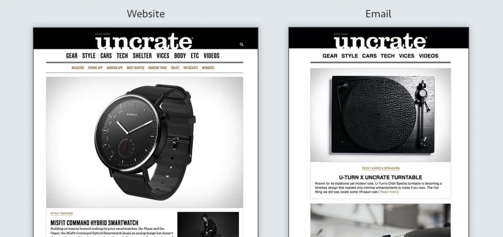
Aweber Website vs Email

It’s a big challenge to match an email and web experience 1 to 1. The use cases for each are quite different so there isn’t a point in beating yourself up to make it perfectly match. The important elements of your site–fonts, colors, logos, image styles– are enough to make the two coexist.

Think about your email in the way that old school correspondence kits were designed. Your business card and letterhead don’t look identical, because they have different purposes. But they did obviously live as part of the same brand. That is the same logic that applies to a website and email template, similar but designed with the medium’s intent in mind.

5. Should design or content come first when thinking about creating an email newsletter?

A flexible email template design should allow for all types of content.

6. What are fun and unique ways to make your email stand out from other brands?

Let your personality shine! This doesn’t have to be through witty copy or flashy GIFs but it could be. Whatever you do make it true to you. Every person and brand are a unique mix of their history, their convictions, and their personality. Allow that to come through in your design decision making, don’t focus on “being different”.

7. What’s the number one mistake you see marketers make in email designs?

Don't be fancy

Trying to be fancy. Clip art images, crazy fonts or font colors, or whacky layouts aren’t necessary. Drive home the value every time you send an email and subscribers will want to hear from you. Don’t put a bunch of silly distractions in the way of getting to the value!

Win at Email Design: Video Series

Mike Smith has been working on a series of videos about email design. Below is the first video which teaches you how to design an awesome welcome email, focusing on the principles of brand aesthetics, setting expectations and showing humanity.

Enjoy!

A Front End Developer’s Guide to GraphQL

Original Source: https://css-tricks.com/front-end-developers-guide-graphql/

No matter how large or small your application is, you’ll have to deal with fetching data from a remote server at some point. On the front end, this usually involves hitting a REST endpoint, transforming the response, caching it, and updating your UI. For years, REST has been the status quo for APIs, but over the past year, a new API technology called GraphQL has exploded in popularity due to its excellent developer experience and declarative approach to data fetching.

In this post, we’ll walk through a couple of hands-on examples to show you how integrating GraphQL into your application will solve many pain points working with remote data. If you’re new to GraphQL, don’t panic! I’ll also highlight some resources to help you learn GraphQL using the Apollo stack, so you can start off 2018 ahead of the curve.

GraphQL 101

Before we dive into how GraphQL makes your life as a front end developer easier, we should first clarify what it is. When we talk about GraphQL, we’re either referring to the language itself or its rich ecosystem of tools. At its core, GraphQL is a typed query language developed by Facebook that allows you to describe your data requirements in a declarative way. The shape of your result matches the shape of your query: in the example below, we can expect to receive back an object with a currency property and a rates property containing an array of objects with both currency and rate keys.

{
rates(currency: “USD”) {
currency
rates {
currency
rate
}
}
}

When we talk about GraphQL in a broader sense, we’re often referring to the ecosystem of tools that help you implement GraphQL in your application. On the backend, you’ll use Apollo Server to create a GraphQL server, which is a single endpoint that parses a GraphQL request and returns data. How does the server know which data to return? You’ll use GraphQL Tools to build a schema (like a blueprint for your data) and a resolver map (just a series of functions that retrieve your data from a REST endpoint, database, or wherever else you choose).

This all sounds more complicated than it actually is — with Apollo Launchpad, a GraphQL server playground, you can create a working GraphQL server in your browser in less than 60 lines of code! 😮 We’ll reference this Launchpad I created that wraps the Coinbase API throughout this post.

You’ll connect your GraphQL server to your application with Apollo Client, a fast and flexible client that fetches, caches, and updates your data for you. Since Apollo Client isn’t coupled to your view layer, you can use it with React, Angular, Vue, or plain JavaScript. Not only is Apollo cross-framework, it’s also cross-platform, with React Native & Ionic supported out of the box.

Let’s give it a try! 🚀

Now that you’re well-versed in what GraphQL is, let’s get our hands dirty with a couple of practical examples that illustrate what it’s like to develop your front end with Apollo. By the end, I think you’ll be convinced that a GraphQL-based architecture with Apollo can help you ship features faster than before.

1. Add new data requirements without adding a new endpoint

We’ve all been here before: You spend hours building a perfect UI component when suddenly, product requirements change. You quickly realize that the data you need to fulfill these new requirements would either require a complicated waterfall of API requests or worse, a new REST endpoint. Now blocked on your work, you ask the backend team to build you a new endpoint just to satisfy the data needs for one component.

This common frustration no longer exists with GraphQL because the data you consume on the client is no longer coupled to an endpoint’s resource. Instead, you always hit the same endpoint for your GraphQL server. Your server specifies all of the resources it has available via your schema and lets your query determine the shape of the result. Let’s illustrate these concepts using our Launchpad from before:

In our schema, look at lines 22–26 where we define our ExchangeRate type. These fields list out all the available resources we can query in our application.

type ExchangeRate {
currency: String
rate: String
name: String
}

With REST, you’re limited to the data your resource provides. If your /exchange-rates endpoint doesn’t include name, then you’ll need to either hit a different endpoint like /currency for the data or create it if it doesn’t exist.

With GraphQL, we know that name is already available to us by inspecting our schema, so we can query for it in our application. Try running this example in Launchpad by adding the name field on the right side panel!

{
rates(currency: “USD”) {
currency
rates {
currency
rate
name
}
}
}

Now, remove the name field and run the same query. See how the shape of our result changes?

the data changes as you describe your query differently

Your GraphQL server always gives you back exactly the data you ask for. Nothing more. This differs significantly from REST, where you often have to filter and transform the data you get back from the server into the shape your UI components need. Not only does this save you time, it also results in smaller network payloads and CPU savings from loading and parsing the response.

2. Reduce your state management boilerplate

Fetching data almost always involves updating your application’s state. Typically, you’ll write code to track at least three actions: one for when the data is loading, one if the data successfully arrives, and one if the data errors out. Once the data arrives, you have to transform it into the shape your UI components expect, normalize it, cache it, and update your UI. This process can be repetitive, requiring countless lines of boilerplate to execute one request.

Let’s see how Apollo Client eliminates this tiresome process altogether by looking at an example React app in CodeSandbox. Navigate to `list.js` and scroll to the bottom.

export default graphql(ExchangeRateQuery, {
props: ({ data }) => {
if (data.loading) {
return { loading: data.loading };
}
if (data.error) {
return { error: data.error };
}
return {
loading: false,
rates: data.rates.rates
};
}
})(ExchangeRateList);

In this example, React Apollo, Apollo Client’s React integration, is binding our exchange rate query to our ExchangeRateList component. Once Apollo Client executes that query, it tracks loading and error state automatically and adds it to the data prop. When Apollo Client receives the result, it will update the data prop with the result of the query, which will update your UI with the rates it needs to render.

Under the hood, Apollo Client normalizes and caches your data for you. Try clicking some of the currencies in the panel on the right to watch the data refresh. Now, select a currency a second time. Notice how the data appears instantaneously? That’s the Apollo cache at work! You get all of this for free just by setting up Apollo Client with no additional configuration. 😍 To see the code where we initialize Apollo Client, check out `index.js`.

3. Debug quickly & painlessly with Apollo DevTools & GraphiQL

It looks like Apollo Client does a lot for you! How do we peek inside to understand what’s going on? With features like store inspection and full visibility into your queries & mutations, Apollo DevTools not only answers that question, but also makes debugging painless and, dare I say it, fun! 🎉 It’s available as an extension for both Chrome and Firefox, with React Native coming soon.

If you want to follow along, install Apollo DevTools for your preferred browser and navigate to our CodeSandbox from the previous example. You’ll need to run the example locally by clicking Download in the top nav bar, unzipping the file, running npm install, and finally npm start. Once you open up your browser’s dev tools panel, you should see a tab that says Apollo.

First, let’s check out our store inspector. This tab mirrors what’s currently in your Apollo Client cache, making it easy to confirm your data is stored on the client properly.

store inspector

Apollo DevTools also enables you to test your queries & mutations in GraphiQL, an interactive query editor and documentation explorer. In fact, you already used GraphiQL in the first example where we experimented with adding fields to our query. To recap, GraphiQL features auto-complete as you type your query into the editor and automatically generated documentation based on GraphQL’s type system. It’s extremely useful for exploring your schema, with zero maintenance burden for developers.

Apollo Devtools

Try executing queries with GraphiQL in the right side panel of our Launchpad. To show the documentation explorer, you can hover over fields in the query editor and click on the tooltip. If your query runs successfully in GraphiQL, you can be 100% positive that the same query will run successfully in your application.

Level up your GraphQL skills

If you made it to this point, awesome job! 👏 I hope you enjoyed the exercises and got a taste of what it would be like to work with GraphQL on the front end.

Hungry for more? 🌮 Make it your 2018 New Year’s resolution to learn more about GraphQL, as I expect its popularity to grow even more in the upcoming year. Here’s an example app to get you started featuring the concepts we learned today:

React: https://codesandbox.io/s/jvlrl98xw3
Angular (Ionic): https://github.com/aaronksaunders/ionicLaunchpadApp
Vue: https://codesandbox.io/s/3vm8vq6kwq

Go forth and GraphQL (and be sure to tag us on Twitter @apollographql along the way)! 🚀

A Front End Developer’s Guide to GraphQL is a post from CSS-Tricks