Original Source: https://www.smashingmagazine.com/2018/08/ux-lifecycle-attracting-user/
Attracting Users To Evaluate Your Product
Attracting Users To Evaluate Your Product
Joe Leech
2018-08-05T23:30:38+01:00
2018-08-07T12:41:07+00:00
(This is a sponsored article.) The entire ecosystem in which we are designing and researching the user experience is shifting and changing constantly. Traditional UX skills need to be expanded to meet the reality of the modern digital ecosystem. Understanding the user is essential to the job, but you also need to understand the wider user context. How do they discover they have a need? How do they find and evaluate a product to meet that need?
This three-part series outlines the three phases of the product life cycle, the future of UX, and the skills and approach you’ll need to design modern digital products.
Part 1: Attraction
Going out there to get users to evaluate your product.
Part 2: Activation
Signing up, onboarding users, asking for payment.
Part 3: Retention
Encouraging users to come back and keep using and paying for your product.
Due to their technical skills, creativity and deep understanding of user needs, UXers are in a perfect position to apply marketing, SEO and growth-hacking tools and processes to their work.
For focused UX efforts, it’s all about knowing user outcomes at each stage of their journey.
1. Attraction

Large preview
Getting Started
The days of changing the text on one button and having a dramatic effect on the user experience are behind us. Luckily, we have the processes and skills in our UX toolbox to meet this changing world.
More often than not, there are many small usability and experience issues throughout a user journey that cumulatively create a poor experience.
Mapping out the full user life cycle will help us discover and fix these problems. It’s often the case that a problem at the very beginning of the user journey only surfaces when a user drops out further along in the product life cycle.
We need data to help us understand how UX professional can improve performance. We’ll need user research data, business metrics, data to frame decisions made when improving UX, and metrics to help us understand the business values.

Marketing metrics tracked by team employing growth hacking. (Source). (Large preview)
Plotting Out the Journey
When we talk about the attraction phase, we’re talking about users discovering they have a need, discovering our product and visiting our website to see if our product meets their needs.
Within the life cycle, we can split the larger three phases into smaller phases to help us plan our approach. In this case, we can use Philip Kotler’s model (expanded to six steps by Bryony Thomas):
Awareness: realizing they have a need;
Interest: looking for something to help with that need;
Evaluation: looking at products that help with their need;
Trial: trying the product to see if it meets their need;
Adoption: choosing a product and using it for a while;
Loyalty: deciding to continue using the product or switching to a different one.
We’re interested in the first three parts, which fall under the attraction phase.

Large preview
We’ll look into trial, adoption and loyalty in future parts of this series.
We’ll use the customer life cycle to align user needs and expectations — what they want and when they need it — to business metrics. We’ll also look at a tool and UX process to use at each step on the journey.
As we move through the process we’ll use the example of a money management app that helps people understand what they are spending and save money.
1. Awareness: They Understand That They Have A Need
The first battle isn’t fought on the ground but in the mind of the customer.
It isn’t fought with your built out solution but instead with an offer.
— The Science of How Customers Buy Anything
This is most challenging phase because there is very little that is concrete in terms of user need.
Users can’t articulate what they want, but by looking at how they complete a task or the context of their life, we can identify the problems they face, how they address (or don’t!) the problems now, and potential product features to address the problems.
The goal here is to identify unmet, hidden user needs. This is something Amazon, for example, is very good at.

The secret to Amazon’s success? Be the first to uncover hidden needs. Jeff Bezos, founder of amazon.com. (Large preview)
How To Identify A Need And A Solution Using Fro-Tos
A good technique to use here is to plot the current problem as articulated by the user and then the result of that problem being solved.
Al Ramadan, in his book Play Bigger, named this overarching science category design.
Category design takes people on a journey. We refer to it as creating a from/to. Actually, we use a shorthand term: frotos. Remember, a great new category is one that solves a problem people didn’t know they had, or solves an obvious problem no one thought could be solved.
You have to help them move from the way they used to think, to a new frame of reference. This is what it means to condition the market. You have to first define and market the problem — and only then can you help people understand that you can solve the problem better than anyone else.
The “from” is the problem the user is facing. The “to” is the solution your product offers. The solution described here are the words the user uses to solve the problem.
If we take the example of our money management tool, in user research, we would identify the from as:
I don’t have much money left at the end of the month. Why?
The user then identifies the to as:
I need to something to help me analyze what I spend.
Put the two together and you have frotos: a definition of the problem and an articulation of the solution.
There is a slidedeck that has a good overview of Play Bigger and its techniques.
Bonus: You can also use the jobs-to-be-done timeline as a great tool to map the intent phase.
User research helps us uncover the hidden needs and identify the frotos.
User Research To Uncover Frotos And Other Useful Details
Traditionally, user research has been focused on the experience of the product. We need to expand user research to include all parts of the user acquisition phase.
It’s not easy to research with users who aren’t yet interacting with you. We can turn to the same tools that we are using to raise awareness to also find users to research with.
Recruit and conduct research with users who might respond to your product’s messaging by using Facebook ads or Google demographic targeting. You can then use a tool like Ethn.io to ask them a few questions to aid with recruitment.
The value in researching users who are in the user acquisition phase is that they don’t bring any preconceptions of your product. In fact, when you are reaching out to users for them to give you feedback, don’t talk much about who you are researching for.
Ethnographic and contextual research is the most useful tool here. Going out and observing users in their homes and offices is a great technique. Watching a user go through a typical task will help you identify their needs. You can’t simply ask users what their unmet needs are because they won’t know. The only true way to get to unmet need is to observe behavior.
With our money management app, we might observe that some potential users under 30 years of age don’t have much money left at the end of the month to save or are curious about how much they spend on coffee.
The user research can also uncover any common identifiable traits (and patterns of behavior) that your users show, such as age-related (for example, they are under 30) or interests they share (love of coffee). We can use these traits to target them in our messaging.
The goal from the user research is to uncover unmet needs and identify the frotos: the from state and the to state.
An example of a froto might be:
FROM
I love coffee, but it can get expensive. I wonder how much I spend a month on coffee?
TO
I need to know how much I spend on expensive luxuries like coffee, so that I can reduce my spend.
We can also use the jobs-to-be-done interview framework to help identify unmet needs.
Journey Maps To Understand The Details
Taking the frotos and other learnings, you can add more detail to the journey by mapping out the steps and behaviors at a granular level.
Niall O’Connor has a great overview of how to build a journey and experience map.
Below is a high-level journey map for our money management app, showing needs mapped against each phase of the life cycle.

In the awareness phase, we can see how the need is quite abstract, but we can clearly see a need for our product. Our money management app can help people understand their current spending. (Large preview)
Personas To Target
Personas are a divisive issue in the UX world. For the purpose of targeting users in the intent stage, we need to know demographic traits and interests.
We can then use tools such as Facebook ads to target the users who will respond to our frotos.
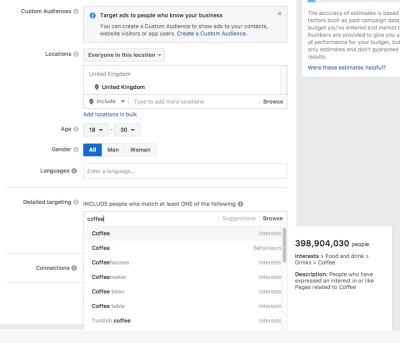
Facebook ad targeting: We can see how easy it is to find the users we are looking for based on their interests and age group. (Large preview)
In Facebook ads, we can target a specific age group who are coffee lovers. We can use this to target users who might be in the market for our product because they might spend a lot on coffee. Let’s roll up our sleeves and start designing the interactive elements to support this behavior.
Prototyping Attraction
Prototyping and wireframing have traditionally been limited to designing just the product. A modern UXer needs to take prototyping into the wider context and design interactions from the very beginning of the user journey. Rapid prototyping interactions at each step of the product life cycle to gather user feedback and validate ideas can save a lot of time, money and effort later.
For our money management app, we’ll design a Facebook ad to target potential users. We know what copy to include in the ad from our frotos.

An example showing how easy it is to create a Facebook ad prototype interaction. (Large preview)
When we get our target users and run user testing on the prototype, we’re testing the entire user experience — from awareness onwards — receiving high-quality UX insights from all parts of the user journey.
The attraction phase is really important for the user experience because it’s where expectations are set. As shown below, we need to use the tools and UX activities at our disposal to design the interactions with our user as we would design the interactions within the product.
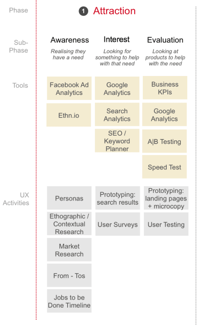
An overview of tools and activities to use to improve the UX during the attraction phase. (Large preview)
2. Interest
The interest phase is characterized by the user looking for a product to help with the frotos we identified during the awareness phase.
Here, we’ll be working with our SEO colleagues, which means we UXers need to know the tools and processes that SEO practitioners use to help design the search and discovery journey.
Back To The Experience Map To Review The Interest Phase
We used user research to identify the frotos and the questions and information at each step of the journey.
Large preview
If we take the interest phase, we can see that the user has come to the conclusion they need something to:
Analyze what I spend, and
Manage my money.
We can take these interest statements and look to search and keyword-planning tools to refine the language used.
Using Google’s Keyword Planner:

Google’s Keyword Planner shows the suggested terms to target. (Large preview)
We are offered the following:

After selecting a keyword, we are shown alternatives we might not have considered. (Large preview)
Google’s documentation has some more useful help with the search terms report.
We can see from the related search terms what other words our target audience might type in when looking for our product. These words will help us design and improve the search user experience.
You can also use the free Google keyword research tool from SERPS.com to help define the terms used by your users to describe the problem. The higher the volume, the more likely a person is to search for that term.

A list of related search terms based on our initial query. Also shown is the relative popularity of each term. (Large preview)
We can use these search terms to refine the language we use when building the next part of our prototype.
Design The Ad In Your Prototype Tool
We can use Google’s Keyword Planner to design the interest phase of our prototype. You can update the text and the design will change in real time. This is the best approach because Google is constantly changing the format of paid and organic search listings, and any design templates will be quickly out of date.

Creating the ad in Google’s tool shows a live preview of how it will look. (Large preview)
You can also live prototype the ad in using Google’s tools on desktop and mobile.

You can preview the ad on desktop and mobile. (Large preview)
Our prototype now contains details for the first two subphases of the attraction part of the user life cycle.
Now that we have generated interest in the product, we need to start looking at how our user will evaluate our product to see if it is something they would want to invest time in.
3. Evaluation
The evaluation phase is all about the first visit to our website and that all-important first impression.
We need to look at where users are landing from, be it Facebook ads, Google search results or indeed other routes to our product, such as YouTube, Instagram or Pinterest.
Google Analytics can tell us the most common landing pages and where people come from. A report named “Network Referrals” can help.

We can see here that Facebook is major source of inbound traffic. (Large preview)
SiteTuners’ custom Google Analytics report identifies landing pages with a high bounce rate. We can interpret these as pages users are interested in, but users can’t find what they need or the messaging might not resonate with them. This report is fantastic for UXers to find pages that are causing problems and need to be improved.

Google Analytics shows pages with high-traffic and high-bounce rates (i.e. problematic pages). (Large preview)
Quick Sprout’s tool is great for evaluating landing pages to give you some clues as to why the page we identified from the custom report is failing.
Prototype The Landing Page
User research has helped us define what our users need at each step, and we’ve mapped out those needs. If it’s an existing product, then we know which landing pages are causing us problems.
The journey map can help us determine the type of copy to include on the landing page — what the user is expecting to see, what questions they need answering and what concerns they may have.

The three parts of the attraction phase and user questions and information needs. (Large preview)
We can then directly translate the user needs into the design for the landing page.

A quick mockup of the landing page meeting the user questions and information needs. (Large preview)
Understanding and mapping the problems users have, the solutions they need, as well as the questions they have when evaluating will make designing this page a straightforward task. If we have an existing but underperforming landing page, we’ll know what content the user is expecting and can evaluate and recommend what needs to change.
Previously, when prototyping we may have used lorem ipsum text. Now, we don’t need to because we have the copy we need. We can design the calls to action to reflect the problems our users are facing, increasing the likelihood of them using our product. No more need for lorem ipsum!
This landing page is just the start. In the next UX life cycle article, we’ll look at further enhancements.
Here’s more great guidance on How To Design An Effective Mobile Landing Page.
User Research The Journey, Including The Landing Page
We can now use the prototype to user test the whole attraction journey, from initial awareness to evaluation. Another Smashing Magazine article has some great suggestions to help with your user research.
Just Scratching The Surface
We’ve looked at how UXers can learn from other disciplines, such as marketing and SEO, to better understand, research, design and improve the attraction phase of the product life cycle.
If you’d like to learn more, I suggest these great books:
Watertight Marketing
Play Bigger (frotos!)
Researching UX: Analytics
In the next part of the series, we’ll look at the next phase, activation: helping users to sign up, onboard and pay for your product.
This article is part of the UX design series sponsored by Adobe. Adobe XD tool is made for a fast and fluid UX design process, as it lets you go from idea to prototype faster. Design, prototype and share — all in one app. You can check out more inspiring projects created with Adobe XD on Behance, and also sign up for the Adobe experience design newsletter to stay updated and informed on the latest trends and insights for UX/UI design.

(ra, yk, il)


 Web designers are some of the hardest working people I know. Which is why I don’t envy them having to design websites and other content for clients while managing their freelance design business and continually being on the lookout for new clients.


