CSS Border-Radius Can Do That?
Original Source: https://www.webdesignerdepot.com/2018/10/css-border-radius-can-do-that/
 TL/DR: When you use eight values specifying border-radius in CSS, you can create organic looking shapes. WOW. No time to read it all ? — we made a visual tool for you. Find it here.
During this year’s Frontend Conference Zurich Rachel Andrew talked about Unlocking the Power of CSS Grid Layout. At the end of her talk, she mentioned something about an old CSS property that got stuck in my head:
The Image is set round just by using the well-supported border-radius. Don’t forget that old CSS still exists and is useful. You don’t need to use something fancy for every effect.
— Rachel Andrew
Shortly after I heard this talk, I thought that you certainly could create more than just circles and started to dig deeper into what can be done using border-radius.
Mastering Border-Radius
Single Value
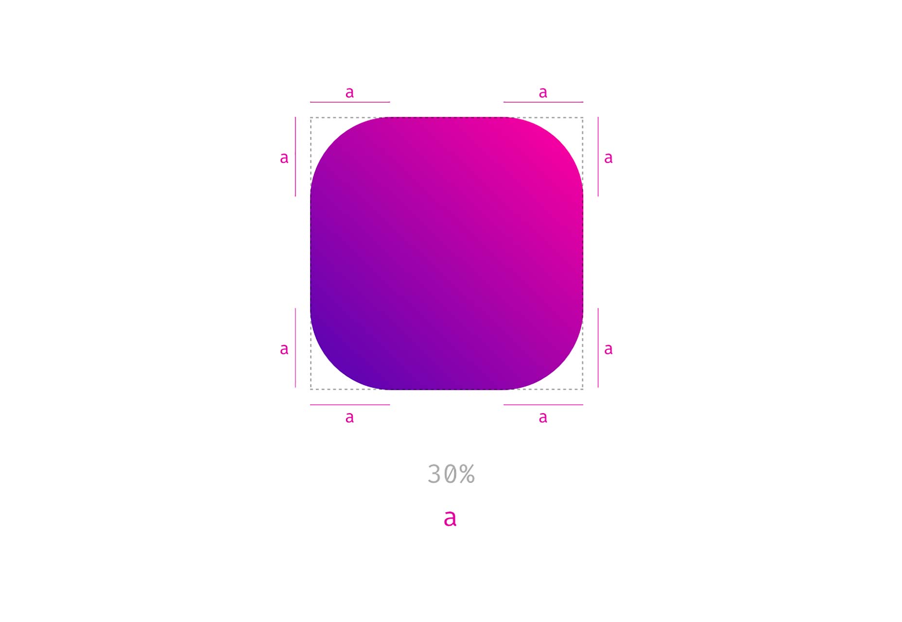
Let’s start with the basics. Hopefully this will not bore you. You are probably familiar with CSS, and you also know border-radius. It has been around for some years now, mostly used with a single value like this: border-radius: 1em and was maybe one of the most discussed/loved CSS3 features back in 2010 when css3please.com was your best friend.
Whenever you only use a single value, all corners are rounded by this value:
As you can see in the example above, next to fixed length values like px, rem or em you can also use percentages. Those are mostly used to create a circle by setting border-radius to 50%. The percentage value is based on the width and height of the given element. So when you use it on a rectangle, you will no longer have symmetrical corners. Here’s an example showing the difference between border-radius: 110px and border-radius: 30% applied to a rectangle.
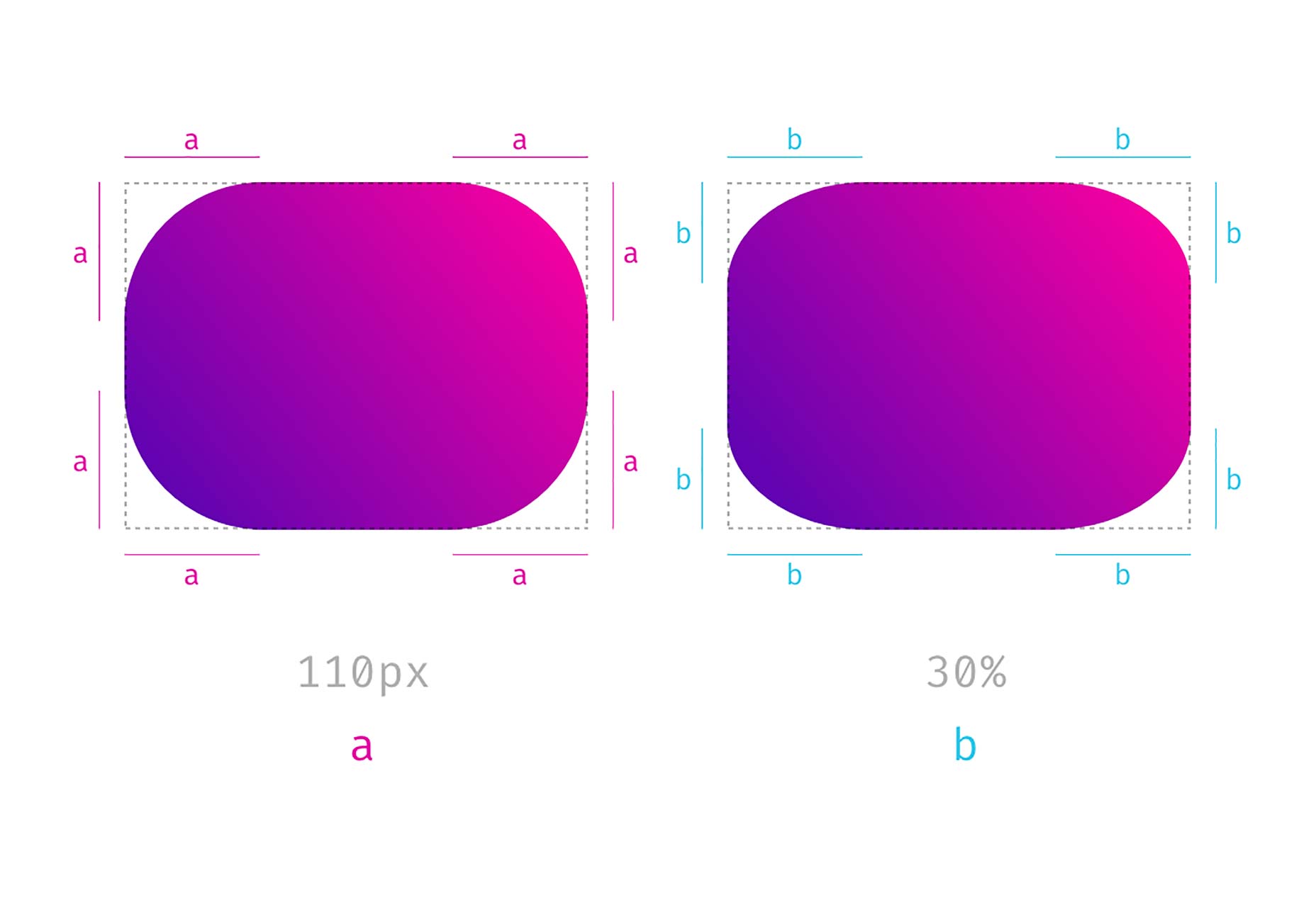
Notice that the corners on the right side are not symmetrical and keep that in mind. We’ll come back to this later.
Four Different Values
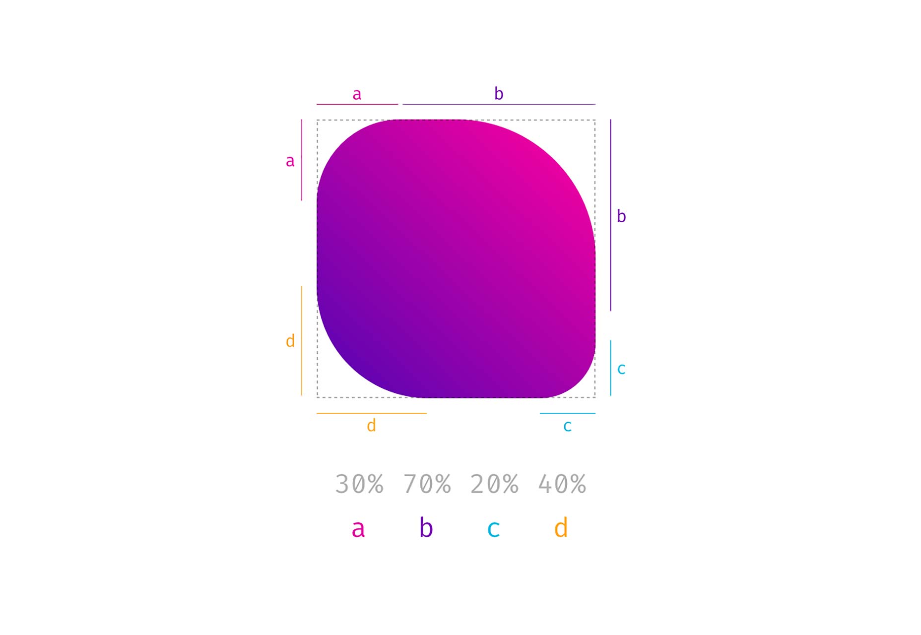
When you use more than one value, you start setting values for each corner, beginning in the top left corner and then moving clockwise. Again you can also use percentages, and you could also mix percentages with fixed-length values.
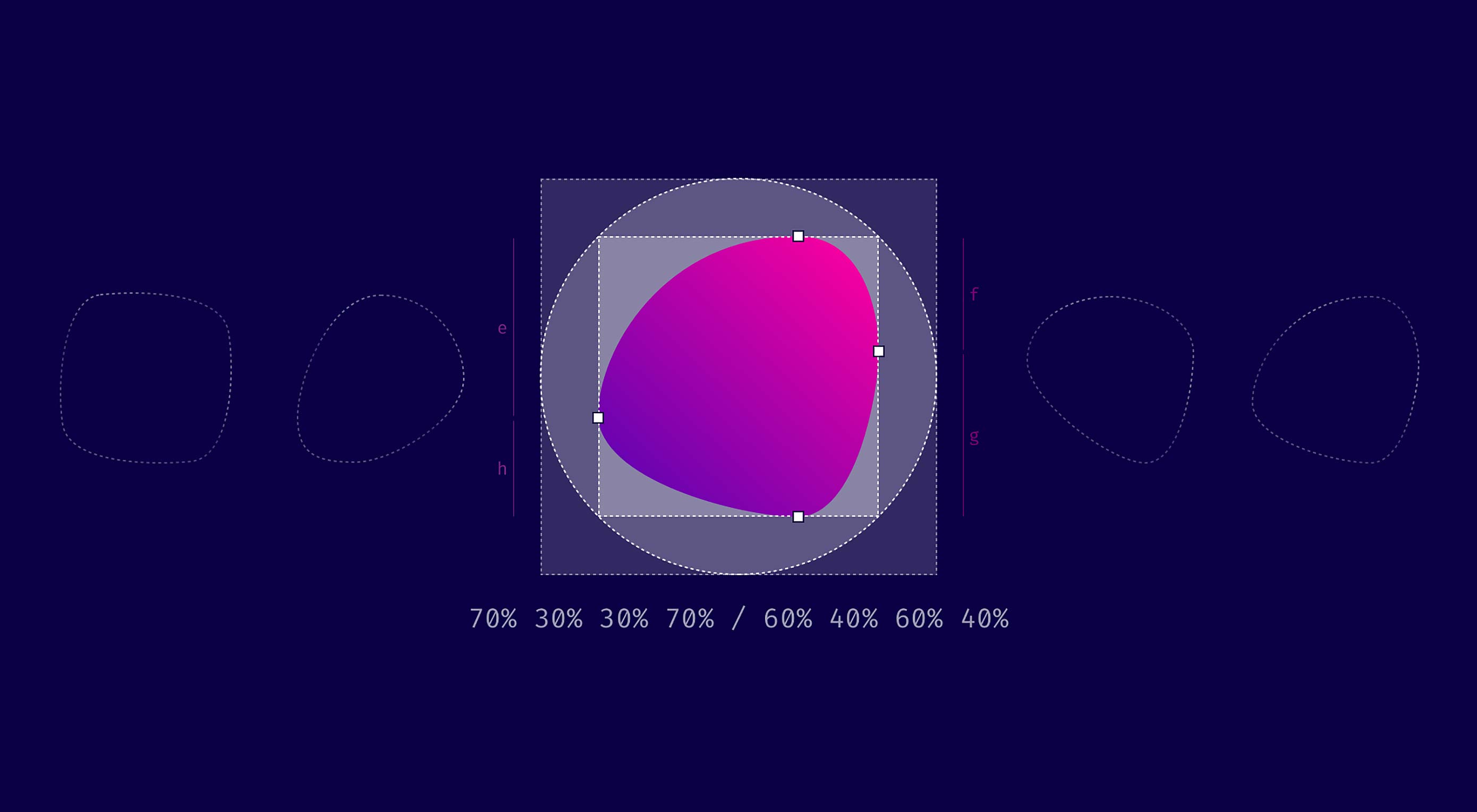
Eight Values Separated by a Slash (This is Where it Gets Interesting)
I think most of you have already done everything I explained above. Now we get to the exciting part. What happens, if you separate values with a slash and specify up to eight values? Let’s see, what the spec says about that:
If values are given before and after the slash, then the values before the slash set the horizontal radius and the values after the slash set the vertical radius. If there is no slash, then the values set both radii equally.
— W3C
So, values before the slash are responsible for horizontal distances whereas values after the slash define the vertical lengths. But what does that mean? Remember percentage values on rectangular shapes? We had different absolute values for vertical and horizontal distances and asymmetrically rounded corners, and that is precisely what you get when you use the slash syntax.
So when you compare border-radius: 4em 8em to border-radius: 4em / 8em the results are quite different.
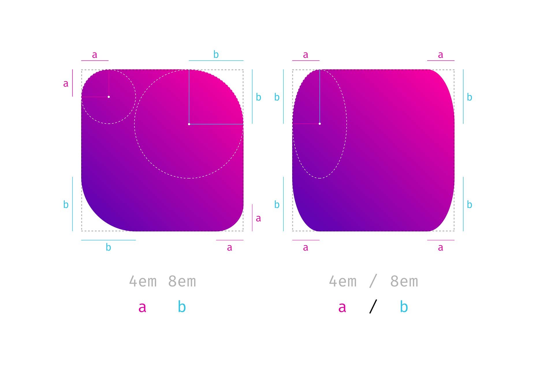
The symmetrical corners on the left form quarter of a circle, whereas the asymmetrical corners on the right are part of an ellipsis.
The shapes that you get with this look a little odd, to be honest. But remember the circles you create with border-radius: 50%. You get a circle because both values defining one side add up to 100% (50% + 50% = 100%) and there is no straight line left, that reminds you of the original square. If you apply the same logic to the full eight value border-radius syntax, you can create a shape that looks a little like a plectrum or an organic cell:
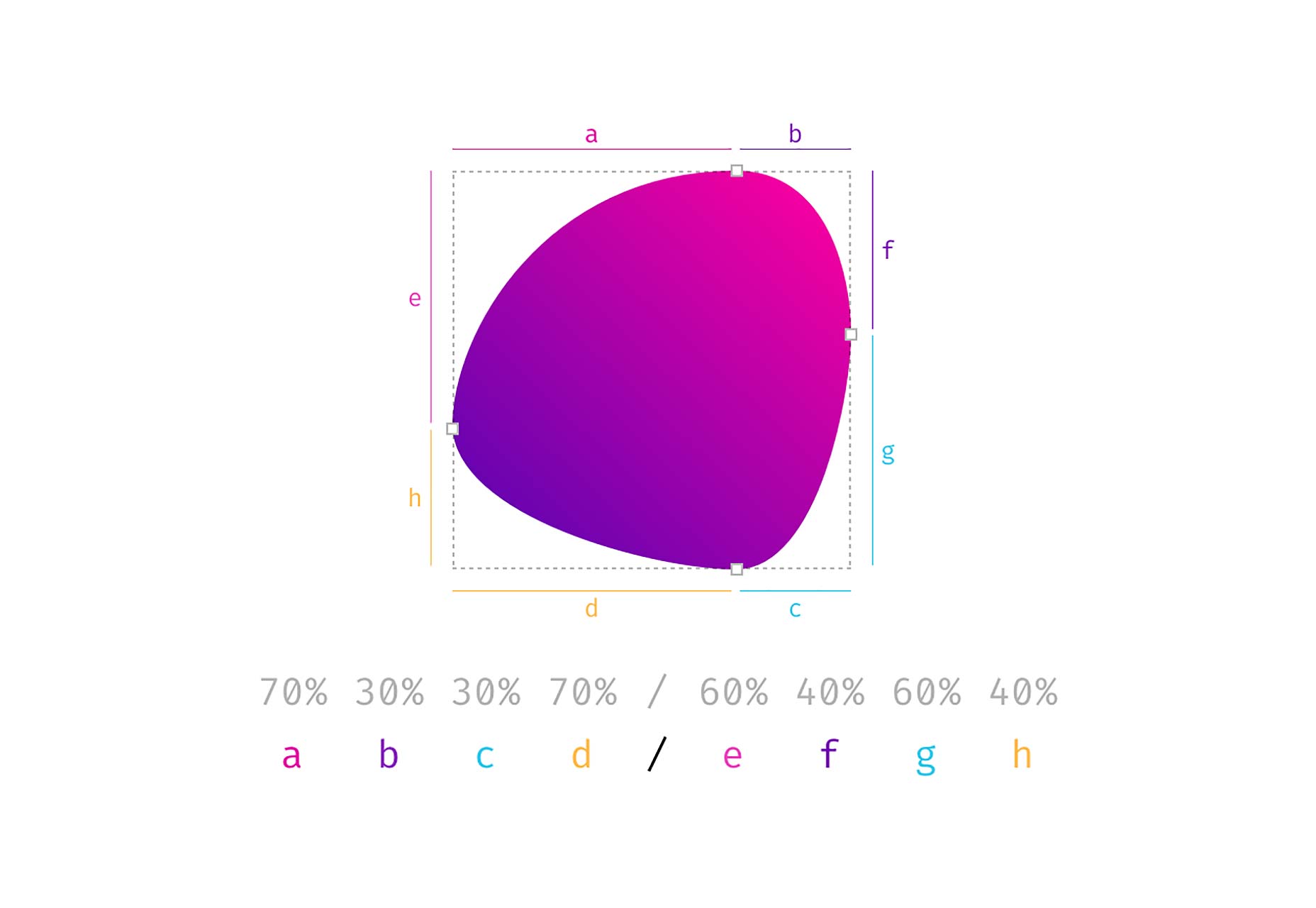
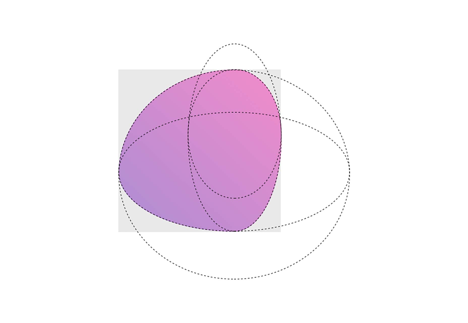
In the end it is four overlapping ellipses that build the final shape. Easy ha!
Don’t Panic…We Made a Visual Generator for You
It took me some time to get used to this syntax. Somehow it is not that intuitive. To make things a little easier for you, we built a little tool, that helps you create your very own organic shape.
Do(n’t) Cross The Streams
Now that you know about the 8 values in total, you might feel a little sad, because our border-radius-tool doesn’t give you the option to set each value separately…Sit tight, here is the 8-POINT-FULL-CONTROL version.
If you’re old enough, you might remember this quote from the 1984 Ghostbusters movie:
“Don’t Cross The Streams.” — “Why?” — “It would be bad.”
There is something similar going on here: If you cross the handles on one side, the shape behaves…let’s say unpredictably. But see for yourself, after all, it’s not going to end up in total protonic reversal or something, but don’t say, that I didn’t warn you.
PS. Many Thanks to simurai. Back in 2010, he created some CSS3 BonBon Buttons. Even though they look a little outdated, it is the only place I ever encountered and learned about the slash syntax.
See This Cool Feature in Action

Photos by gratisography.com
See the Pen border-radius by Nils (@enbee81) on CodePen.
This article was originally published on Medium, reposted with the author’s permission.
Add Realistic Chalk and Sketch Lettering Effects with Sketch’it – only $5!
Source
p img {display:inline-block; margin-right:10px;}
.alignleft {float:left;}
p.showcase {clear:both;}
body#browserfriendly p, body#podcast p, div#emailbody p{margin:0;}

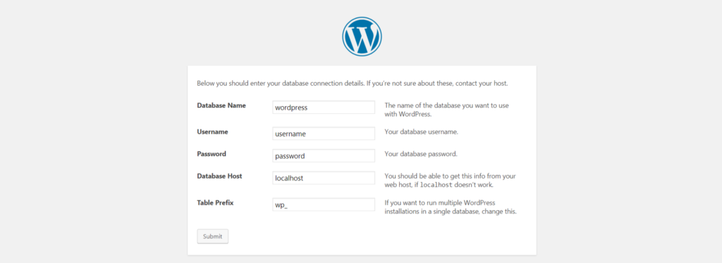 WordPress database defined during installation
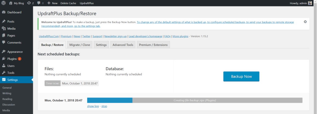 Udraft Plus creating a backup