Popular Design News of the Week: August 6, 2018 – August 12, 2018

Original Source: https://www.webdesignerdepot.com/2018/08/popular-design-news-of-the-week-august-6-2018-august-12-2018/

Every week users submit a lot of interesting stuff on our sister site Webdesigner News, highlighting great content from around the web that can be of interest to web designers. 

The best way to keep track of all the great stories and news being posted is simply to check out the Webdesigner News site, however, in case you missed some here’s a quick and useful compilation of the most popular designer news that we curated from the past week.

Note that this is only a very small selection of the links that were posted, so don’t miss out and subscribe to our newsletter and follow the site daily for all the news.

20 Must-Have Wireframe Templates and UI Kits for your Design Library


Common Webpage Design Mistakes


5 Extensions that Transform Google Chrome into a Modern Browser


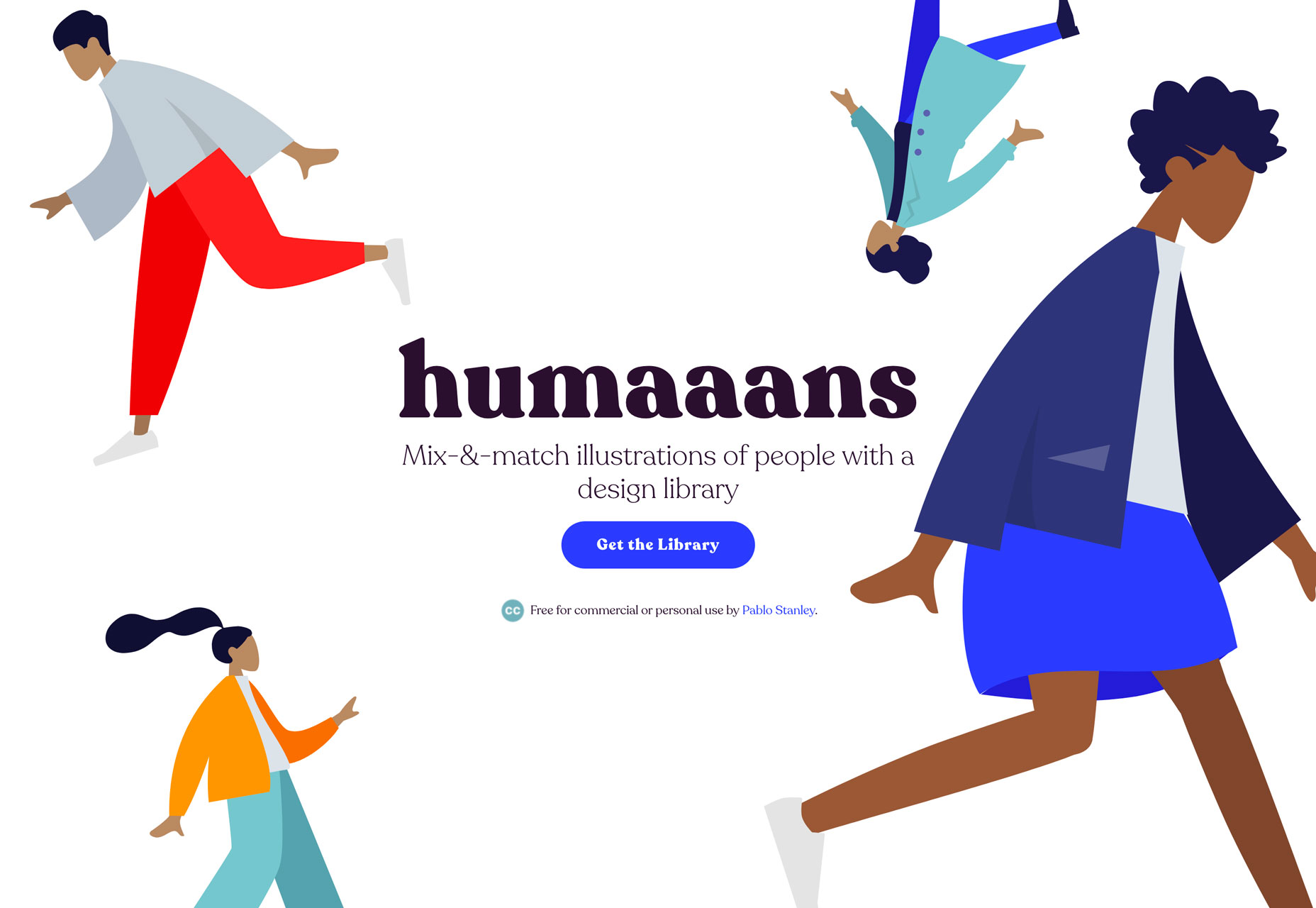
SimpleBar – Custom Scrollbars Made Simple


Clockify for Mac – The Only Truly Free Time Tracker & Timesheet for Teams


Everything Bad About Facebook is Bad for the Same Reason


Site Design: Bill Hinderman


Framer X Preview


Asora Clickbait Detector – Detects Clickbait Posts on Social Media


Acct.Watch – Monitors Accounts so You Can Have the @username You Want


Oilist 2.0 – Ground-breaking Generational Art App


Racism in Design, Who’s To Blame?


Turn Designs to Native Mobile Apps


UX Case Study: Google Maps Vs. Waze Mobile Apps


Take Another Look at Tumblr


The Doomed Toys “R” Us Rebrand that Never Came to Be


Drawser – Free Browser-based Vector Graphics Editor and Design Sharing


Be Better: Process


How to Design an Effective Welcome Email


Design Trends for Fixed Navigation Menus in Web Design


Designing Charts – Principles Every Designer Should Know


Adobe has Added 665 New Monotype Fonts to Creative Cloud


Linked: Space Force Logo Vote


Building Fluid Interfaces


How to Land a Remote Freelance Web Development Job in 21 Days Without a Fleshed Out Portfolio


Want more? No problem! Keep track of top design news from around the web with Webdesigner News.
Add Realistic Chalk and Sketch Lettering Effects with Sketch’it – only $5!

Source

p img {display:inline-block; margin-right:10px;}
.alignleft {float:left;}
p.showcase {clear:both;}
body#browserfriendly p, body#podcast p, div#emailbody p{margin:0;}

“there’s good inside” – Method’s Inspiring New Brand Campaign

Original Source: http://feedproxy.google.com/~r/abduzeedo/~3/8y6QdxCBUI0/theres-good-inside-methods-inspiring-new-brand-campaign

“there’s good inside” – Method’s Inspiring New Brand Campaign

“there’s good inside” - Method’s Inspiring New Campaign

abduzeedo
Aug 13, 2018

Today, Method Products, pbc – a pioneer in design-driven, people and planet-friendly home and personal care products – launches a new integrated brand campaign, “There’s Good Inside.” It spotlights the good inside its products, its people and its state-of-the-art, sustainable soap factory in Chicago. Brought to life with an uplifting, clean-centric cover anthem of the popular ‘90s earworm “I’m Gonna’ Be (500 Miles),” by The Proclaimers, the whimsical, smile-inducing campaign centers around the notion that most people don’t believe cleaning can be fun, creative or connected to their values. True to the brand’s disruptive nature, method® playfully disagree.

“When people think of method®, they often think of our beautiful designs and wonderful fragrances, but there’s so much more depth to the brand,” said Doug Piwinski, method®’s Global Chief Marketing Officer. “This campaign is meant to draw attention to the beauty of what’s inside our bottles–not only how our products are made and who makes them–but ultimately how we are connected to the homes and people who use and love method. We’re reminding everyone we can all be planet, people, and pet-friendly, and look good doing so.”

“There’s Good Inside” 2-minute video


Playing a starring role in the campaign and commercial are a handful of actual method employees, aka the Movers and Makers. The spot takes place inside method®’s factory  which is the first-ever LEED Platinum Certified manufacturing plant—affectionately known as the South Side Soapbox—and located on the south side of Chicago in the historic community of Pullman. The boldly colorful, delightfully sustainable factory provided the perfect setting to spotlight the brand’s iconic design, color and whimsy alongside industry-leading practices that exemplify what manufacturing and urban revitalization look like in the 21st century.

The method® brand’s two-minute anthem video features a harried father of twins thankful that method® is both stylish and sustainable; a chef who swoons over plant-derived ingredients and sweet-smelling soap; and a cat lady who appreciates putting the hurt on dirt without harming her furry friend. The spot culminates with some of method’s very own Chicago factory Movers and Makers dancing and singing a rousing chorus of “Scrub a dub, yeah!”

method® partnered with independent creative agency Mekanism and Mekanism’s in-house Social Media Agency Epic Signal to conceptualize and produce the content which includes the two-minute anthem video, a mix of connected TV and digital ads, social, influencer and experiential media. Directed by Chicago native Greg Brunkalla, the spot is designed to introduce method® to a larger audience than ever before. Social media activations will compel people to join the fun and creativity online using #mymethod.

“We built an idea that’s about doing good together. To show that “clean” doesn’t have to be all about elbow grease and sparkly white floor —it’s individual personalities, bold colors, vibrant factory workers, and a ‘90s track we all know and love,” said Mekanism Creative Director Laura Wimer. “Method’s “there’s good inside” campaign showcases how we clean isn’t just a reaction to a mess. There’s a way to it—whether we’re cleaning for loved ones, pets, a passion, or ourselves, we all aim to make the world a little bit better.”  

The campaign, while integrated across multiple channels, is method’s latest significant campaign driven to reach the people who love method®where they live and shop online. The ads will run from August 13th – through October in top US markets including Chicago, Washington D.C. and Denver. To view the campaign ads and learn more, visit www.methodhome.com/mymethod.

advertising


“Coming Soon” Pages: Be Successful or Die Trying

Original Source: https://www.hongkiat.com/blog/coming-soon-pages/

Some useful tips for creating effective ‘Coming Soon’ page for your upcoming website along with live examples.

The post “Coming Soon” Pages: Be Successful or Die Trying appeared first on…

Visit hongkiat.com for full content.

What’s New for Designers, August 2018

Original Source: https://www.webdesignerdepot.com/2018/08/whats-new-for-designers-august-2018/

What’s old is new again; that’s the theme this month with new tools for designers with a few new tools that are rooted in the “old” concepts of design theory. From working with typefaces, to a color wheel, this roundup is packed with goodies. And then there are some new “new” tools as well, including a couple of cool 3D elements.

If we’ve missed something that you think should have been on the list, let us know in the comments. And if you know of a new app or resource that should be featured next month, tweet it to @carriecousins to be considered!

Font Playground

Font Playground is a tool to help you experiment with variable fonts and even export front-end code. Variable fonts, which are single font files that behave like multiple fonts, are gaining popularity, making this something you should probably experiment with.

Color Wheel Generator

Color Wheel Generator provides color-perfect matches for all hues around the color wheel in HEX format. Adjust settings such as hue, angle, saturation and lightness to see perfect matches from every location on the wheel.

Scale

Scale is a tool to help you see a color scale for actual use. See tints of a color in steps so you know exactly what colors will look like.

Rockstar

Rockstar is a dynamically typed Turing-complete programming language. It is designed for creating computer programs that are also song lyrics, and is heavily influenced by the lyrical conventions of 1980s hard rock and power ballads. (So, it is a super-fun programming language to experiment with.)

Fondu

Fondu is a smart contract building tool. The open-source contract is designed for launching an initial coin offering or crowdfunding campaign. Fill out the questionnaire and download your contracts.

Font Memory Game

The Font Memory Game can help you train your eyes to notice details in typography and better identify different typefaces. (It’s harder than you think!)

Fusion.js

Fusion.js is now available for public use. The Uber project is described as “is a good choice for someone looking for an open source boilerplate to build a modern, non-trivial web app.” It is a MIT-licensed JavaScript framework that supports popular libraries like React and Redux, and comes with modern features like hot module reloading, data-aware server-side rendering, and bundle splitting support. It provides a flexible plugin based architecture.

StyleURL

StyleURL lets you export and share CSS changes directly from Chrome DevTools so you can use it with an existing workflow. It generates a link which loads CSS changes into existing webpages automatically so that you can share tweaks visually.

Keyframes

Keyframes is a new online hangout for animators. You can chat about and share projects, ask questions and use the community as a learning tool to up your animation game.

Brandcast Team Edition

Brandcast Team Edition makes it easy for teams to work on code-free website design projects together. The tool allows marketing teams to create completely custom websites and interactive sales and marketing collateral without a single line of code. The release allows everyone – from designers to copywriters – to work on projects together within the interface.

Pair & Compare

Pair & Compare lets you find and preview font pairs. Test Google fonts (and more) right on the screen and change settings to match your project needs — background, text width, font size, line height and more.

Emoji Tweeter

Emoji Tweeter lets you create tweets from a desktop computer complete with emojis. It’s basically an emoji keyboard.

3D Cube Form

3D Cube Form makes you say “that’s cool.” The form tool is interactive and starts with a color picker — engaging, right? Then the user enters details based on form fields. It’s fun and different; it might not work for every project, but is definitely worth your time.

3D Toggle

3D Toggle is a cool animation that changes how you think about toggle actions. You’ll want to click it into action.

Malvid

Malvid is a tool to help you develop components with an interactive user interface so that you can preview and document web components as you create them. The tool analyzes your folder structure to turn files into a visual UI and it works using an API or CLI tool.

Podmap

Podmap is a cool data visualization tool that maps the world’s podcasts so you can find something new to listen to near you. Search by geolocation, podcast name or filter by country.

CoolHue

CoolHue is a JSON-rendered gradients palette. It includes 60 gradient options so you can add a trendy color effects to projects with ease. You can also grab CoolHue palettes for Photoshop or Sketch.

Tutorial: Animated SVG Neon Light Effect

The Animated SVG Neon Light Effect tutorial allows you to take a cool custom effect that you create in Adobe Illustrator and then move it to Sketch and export a sleek SVG image that is lightning fast for websites and apps. The step-by-step guide shows you how to do everything from creating the nifty effect to applying it for use (no more heavy gifs!). Plus, the tutorial includes downloadable project files to get you moving through the project with ease.

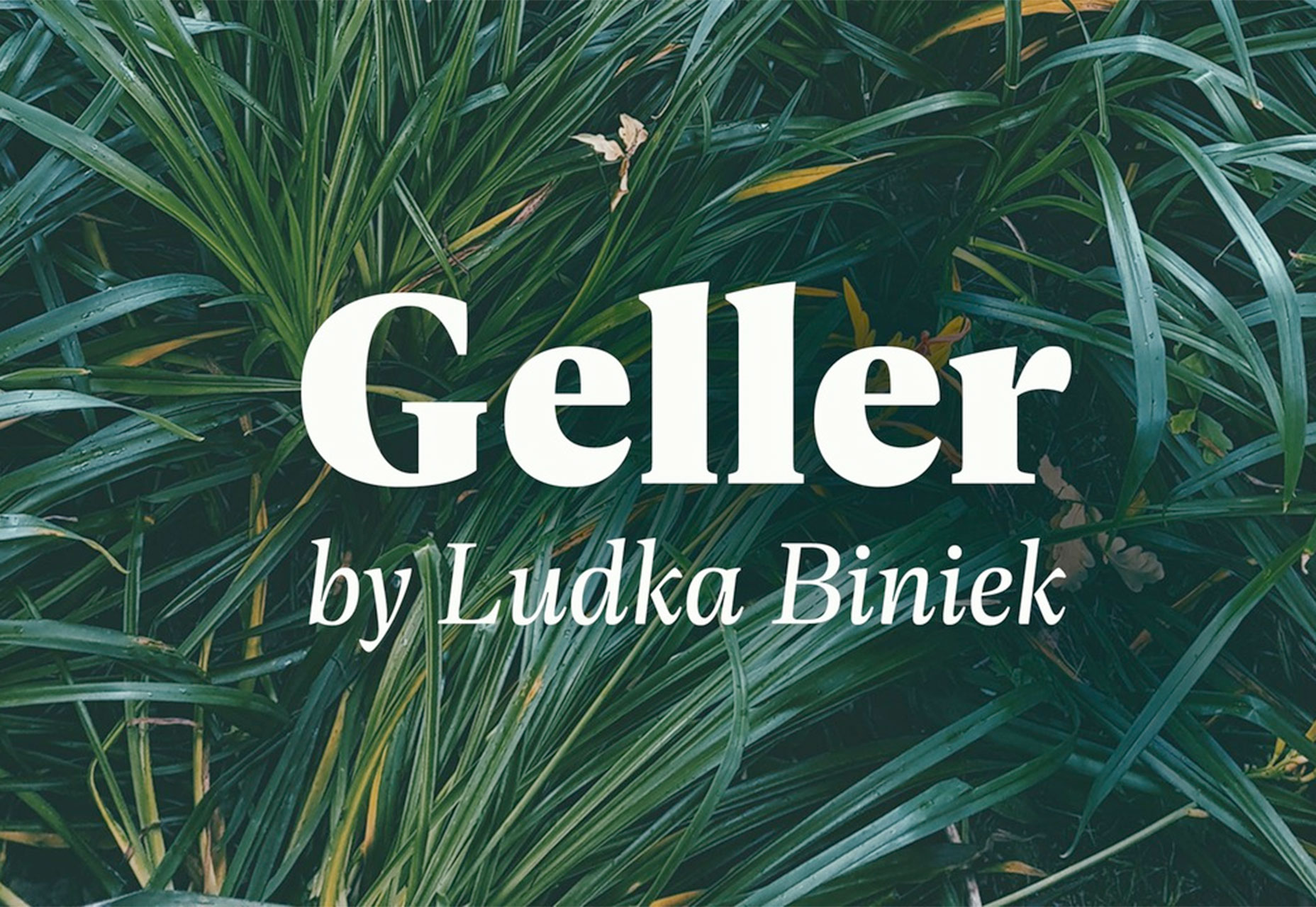
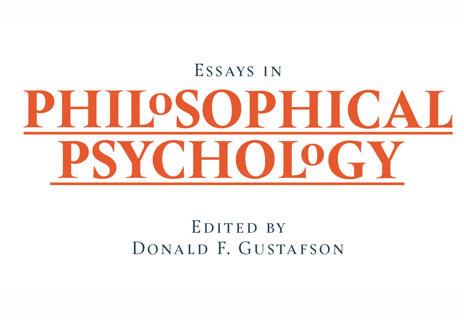
Aunofa Serif

Aunofa Serif is a tall and distinct serif typeface for display. The free version includes only uppercase characters. The paid version includes a script option as well.

Calibre

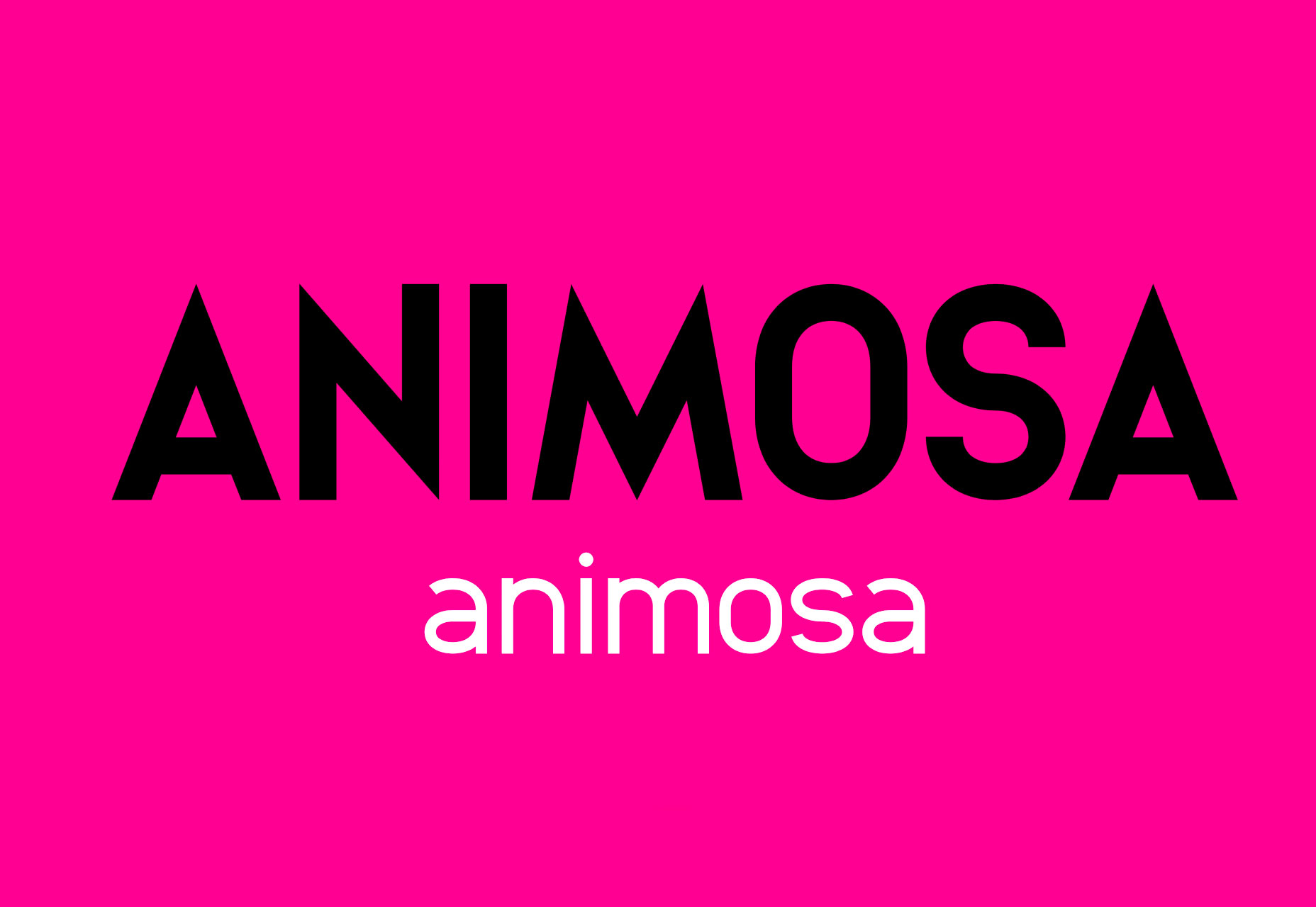
Calibre is a super-condense font that’s a fun choice for display with just a few words. The x-height is incredibly high in this uppercase font. It also includes numbers and a few glyphs.

Cleon

Cleon is a round sans serif appropriate for a variety of uses. It includes upper- and lowercase letters, numerals and some punctuation.

Deansgate Condensed

Deansgate Condensed is a clear and distinctive typeface that resembles the type used on street name signs in Manchester. Distinct characters include a point Z and points on the M and W.

Facon

Facon is a trendy display font in a ragged style. The letterforms include distinctive cutouts. It is an uppercase font with numbers and some special characters.

Mercy

Mercy is a highly readable sans serif with interesting curves for some of the letters – note the “M” in the image. It comes with a limited character set – just 69 elements – but does include italics of each.

Add Realistic Chalk and Sketch Lettering Effects with Sketch’it – only $5!

Source

p img {display:inline-block; margin-right:10px;}
.alignleft {float:left;}
p.showcase {clear:both;}
body#browserfriendly p, body#podcast p, div#emailbody p{margin:0;}

Web Performance For Third Party Scripts: SmashingConf Videos

Original Source: https://www.smashingmagazine.com/2018/08/smashingconf-scripts-videos/

Web Performance For Third Party Scripts: SmashingConf Videos

Web Performance For Third Party Scripts: SmashingConf Videos

The Smashing Editorial

2018-08-08T13:30:35+02:00
2018-08-10T21:02:53+00:00

We are continuing our exploration of video from Smashing Conferences this year with two videos that explore the impact of third party scripts. These scripts can add functionality, and give us valuable information, but what do they cost?

These two talks will help you to assess the third party scripts you might be considering adding to a site, and to be able to advise your clients or team members when the request comes in to add yet another script to a global include file!

Name That Script!

Recorded at the SmashingConf in San Francisco earlier this year, Trent Walton asks how can we objectively measure the value of third party scripts for advertising, A/B testing, or analytics? We need to consider their impact on web performance, user experience, as well as understand if they really help our business goals.

A/B Testing, Ads and Other Third Party Tags

At the SmashingConf in London, Andy Davies approached the same subject from a technical angle, showing us the impact that “just a snippet of JavaScript” can have.

Enjoyed watching these talks? There are many more SmashingConf videos on Vimeo. We’re also getting ready for the upcoming SmashingConf in New York — see you there? 😉

With so much happening on the web, what should we really pay attention to? At SmashingConf New York 2018 ?? we’ll explore everything from PWAs, font loading best practices, web performance and eCommerce UX optimization, to refactoring CSS, design workflows and convincing your clients. With Sarah Drasner, Dan Mall, Sara Soueidan, Jason Grigsby, and many other speakers. Oct 23–24.

Check the speakers →

SmashingConf New York 2018, with Dan Mall, Sara Soueidan, Sarah Drasner and many others.

Smashing Editorial
(ra)

Build a complex 3D sci-fi scene in Blender

Original Source: http://feedproxy.google.com/~r/CreativeBloq/~3/Y7zOuYEl0pY/build-a-complex-3d-sci-fi-scene

Creating an apocalyptic sci-fi city scene in 3D art is something artists might shy away from doing because of the vast complexity of the subject, 3D models and textures needed. But with smart ways to tackle it, it is certainly doable.

There are many different paths you can choose to achieve the final visualised image you have in mind. In this tutorial, I‘ll shed some light on the process I used to make this night-time scene. I try not to limit myself too much with a strict and predetermined workflow, or the software I use. My workflow may differ minimally to vastly depending on the project I’m working on. Software packages are just different tools that help you to get things done.

31 brilliant Blender tutorials

Most of my projects start with a concept sketching stage in 2D, but this time I started in 3D. If you’re interested in 3D concepting, I strongly recommend Jama Jurabaev‘s Intro to 3D Concept  Design course on Learn Squared.

Procedurally generating a city can vastly speed up the initial stage of finding a good concept, camera position and composition. You don‘t need to worry about getting the perspective of your 2D buildings right; in 3D you can simply reposition your camera and instantly have a completely different picture.

01. Look for references

Look beyond Google for reference images

As I already have a pretty good picture in mind of what I wanted to do – an apocalyptic, Independence Day-inspired scene – I start with hunting for reference. If all you want is reference pictures, Google is a good place to start, but if you intend to use those references in some way or another in your picture (textures, and so on), you should look for royalty-free images. Pixabay and Textures.com are a big help there.

02. Create the assets

Photoshop brushes allow for the buildings to be painted quickly

I use a procedural approach to model the buildings. The lower buildings are all displaced planes. I hand-paint a few displacement maps of single buildings with Photoshop and convert them into brushes. This method allows me to quickly ‘paint’ displacement maps for entire city blocks. These blocks can then be instanced to give the illusion of a highly detailed city. The higher buildings are roughly modelled with no attention to topology. We will add details later.

03. Add textures and shading

Blender randomly allocates the textures

The texturing and shading is done (partially) procedurally. I compile several pictures of cities to texture atlases. I then map, shade, alter and randomly distribute those textures with Blender’s powerful node system. For every diffuse map I plug in, the shader network automatically generates a specular- and bump-map. Not a single building is manually UV-unwrapped – all are box-mapped with some random shifting of the coordinates.

04. Streamline your lighting

Lighting is mapped in a similar way to the textures

I compile light texture atlases the same way I did the diffuse textures of the buildings. The mapping is also done the same way except blocking the textures on faces, which point upwards to avoid having lights on the roof. Distributing them randomly means they often don‘t match up perfectly to the diffuse textures. There is definitely a trade-off between being fast and flexible, and probably having to fix some things in post-production.

05. Shift and scale UVs

Displacement maps are modelled in real time

The base of the ship is a really simple model, which I then UV-unwrap, subdivide and displace with a displacement map I find in a Blender forum thread. The UVs are all rectangular and not rotated so the displacement follows the round form of the ship. With such a set up you can shift and scale the UVs to model the ship with displacement maps in real time. This is an extremely fast and intuitive way of doing greeble-like surfaces.

06. Experiment with building layouts

Different building layouts can be played with quickly

Now the fun part begins. This is where all the work comes together. First, bundle all the buildings into separate groups that feed particle systems. By doing this, you can change the random seed of a particle system and shuffle through randomly generated cities to find an arrangement that you like. This is the power of 3D concepting – you can generate several layouts in a really short amount of time.

07. Create lighting with HDR

HDRs produce true to life lighting quickly

The scene is lit entirely with a HDR image. There are numerous places on the internet that provide high-resolution HDRs these days. HDRs have two major advantages for 3D concepting; they render extremely fast and give you realistic lighting with a click of a button. I pick a few that I then import into Blender to quickly test out a few lighting scenarios. Cycles, Blender’s modern built-in viewport renderer, makes this a breeze.

08. Do render passes

Allow plenty of time for a beauty render

Beside doing a beauty render, I also render out several passes for compositing. These include, ID passes so I can quickly select individual buildings; Z-depth passes to simulate the atmosphere; Normal passes for eventual relighting; and, of course, several light passes. The beauty render needs around 20 minutes in 4K to be reasonably noise free. The additional passes are ready in a fraction of that time.

09. Create atmosphere 

Build the image up from the background to the foreground

With the already prepared and rendered passes, the compositing is really straight forward. I usually work from the background to the foreground. The sky sets the mood. With the Z-depth pass I‘m able to give the image a nice atmosphere. The light passes are then added on top and blended between them, depending on which light pass looks best on the buildings.

10. Add details

cityscape image

Fixing is easier than adding every single detail

Now comes the payback for not doing things properly before rendering. But most of the time fixing things in post is far less work than having to model every little detail and care about every pixel in the render. In this stage, I blend the spaceship with the clouds, add red lights on the roofs, add cranes, chimneys, antennas, the electric lightning below  the ship and the smoke between the buildings. And generally fix everything that wasn‘t perfect!

11. Finalise the scene

cityscape image

Recreate a camera lens to finish off the image

The final step is to replicate the effects of a real camera’s lens and film; to make the scene look as it would have looked if it had been shot in the real world. So, I slightly blur the scene, add bloom, lens distortion, a slight chromatic aberration, vignetting, film grain, and finally give it a cinema-like colour grading. I love this part. This is when everything you worked on blends together to form something real. It‘s like magic.

This article was originally published in 3D World magazine. Subscribe here.

Read more:

How to create a photorealistic room sceneMaster procedural modellingCreate a tiles material in Substance Designer

The Intersection of Food + Design: A Thought Provoking Look

Original Source: http://feedproxy.google.com/~r/abduzeedo/~3/CZ7NnOqYnOA/intersection-food-design-thought-provoking-look

The Intersection of Food + Design: A Thought Provoking Look

The Intersection of Food + Design: A Thought Provoking Look

GisMullr
Aug 09, 2018

How empowering would it be to cause social impact with your design? Have you ever thought about mixing design, technology and food to transform the way we eat? I honestly haven’t thought about this before. At least not in this impactful fashion. I didn’t realize that food & design could be so interesting and important together. What comes to mind when you hear “food & design”? To me, I envision fancy, curated dishes perfectly shot on Instagram. You know, the ones that look too good to be true? Or how about those super exclusive and fancy restaurants you see on TV shows but can only dream about actually going? So it was a happy surprise to read that The Dutch Institute of Food and Design is a platform for designers working with food and its impacts on society. They instigate designers creativity to collaborate with specialists and develop alternative approaches to the food industry.

When Design meets Food to Change the way we see the Food System

We all eat. It doesn’t matter what you eat, when or how much. But that is something all of us have in common. Eating. Some see food as fuel for our body. Other see food as a ritual, as a reward. It doesn’t matter how you see the food industry, you do participate in it. So why not use your point of view and ability as a designer to disrupt the food sector? And don’t think about that beautiful dish that keeps popping into your head while you think about this. Think about the whole food industry, the whole process behind that food you are eating. Think about how important it is. From farming to transportation, healthcare to waste, there are a ton of steps involved in the process of creating our beloved food. Have you ever stopped to think about the societal and environmental challenges that surround food? Yes? No? Maybe? So this may be a good opportunity for an exercise. Next time you eat something, take a few minutes to think about it. Think about the process behind that particular morsel you are eating. Where was it produced? How was it transported to where you are? Did it cause any impact during its journey to your plate? And most importantly, do you have any ideas that could change one of those answers you asked yourself? I bet, at least once, it crossed your mind that a certain package could have been designed better. That this certain material would have made a much better to go box than the one in front of you. Or that we should be able to have a better use for some of the food waste we see. Maybe it crossed your mind that when we eat a banana and discard the peel, someone, somewhere, could have a brilliant idea for what to do with that peel. What about that little sucker peanut shell? Can we smash it and turn them into beautiful furniture? Maybe we can blend corn cobs and turn them into a natural dishware line? How about food transportation? If we could have some sort of Lyft service for trucks where rides could be shared to make transportation more cost effective and accessible? I don’t know. Is any of this possible? But this kind of exercise certainly provokes a lot of thinking and how great ideas come to life.

When Design meets Food to Change the way we see the Food System


Design is the creation of a plan or convention for the construction of an object, system or measurable human interaction. Design has different connotations in different fields. In some cases, the direct construction of an object (as in pottery, engineering, management, coding, and graphic design) is also considered to use design thinking.

Wikipedia


So you see, you don’t need to be a chef or a farmer or anyone directly working inside the food industry to change things. It all starts with an idea.

In case you have something related to food design in mind you can check out The Dutch Institute of Food and Design Future Food Design Awards. They are still accepting projects for the 2018 Awards. The deadline is August 12. They are looking for ideas that will change the way we see the food system. Take a look of last year’s winning project.

Winner 2017 – Fernando Laposse

We were delighted to post about last year’s winner Fernando Laposse and his awe-inspiring project dubbed Totomoxtle. Totomoxtle is a project inspired by the relationship of Mexico with its maize by creating a surfacing material from naturally coloured, native corn husks. The process is simple, the husks are flattened and glued onto veneer or MDF which can be sawed and lasercut to create tiles or marquetry for interiors and furniture. Apart from creating a sustainable material, the project also aims to raise awareness about the uncertain future of heirloom maize and the people that harvest it using traditional methods in an increasingly globalised world. Read more about Totomoxtle.


When Design meets Food to Change the way we see the Food System

When Design meets Food to Change the way we see the Food System

food


Game Design for the Colorful Word Galaxy

Original Source: http://feedproxy.google.com/~r/abduzeedo/~3/LUsnlfowdQY/game-design-colorful-word-galaxy

Game Design for the Colorful Word Galaxy

Game Design for the Colorful Word Galaxy

abduzeedo
Aug 10, 2018

NestStrix Studio shared a beautiful game design project on their Behance profile. It is for three iOS games, Word Puzzle, Quiz, Sudoku. They were really nice to share a bit of the behind the scenes. You can see the evolution from the interaction design point of view, including wireframes, to the visual design with the style up to the iconography. I love the friendly look they achieved with a 3Dish cartoon look. Everything feels very inviting to touch and interact, and that’s one of the reasons I am a fan of this project and game design in general.

NestStrix studio is a team of illustrators with a lot of experience. They love to create game stuff especially game characters and game backgrounds. Their portfolio showcase work they’ve done with companies and organizations all over the world. For more information make sure to check out their website.

Game design

You can also follow them on:

Dribbble
Artstation
Instagram
Facebook


game design


Collective #440

Original Source: http://feedproxy.google.com/~r/tympanus/~3/CcOmj0pnvWA/

C440_WOTW

Inspirational Website of the Week: The Bewegen Bike Share System

A celebration of smoothness and subtle design details with wonderful transitions. Our pick this week.

Get inspired

C440_bugherd

This content is sponsored via Syndicate Ads
BugHerd makes client feedback visual, easy and pain free.

??Like sticky notes for your website, BugHerd turns client feedback into clear actionable tasks with all the data needed to resolve the issue.

Try for free

C440_mauerwerk

Mauerwerk

An animated masonry-like React grid with enter/exit transitions and maximizable cells.

Check it out

C440_regex

A Practical Guide to Regular Expressions (RegEx) In JavaScript

Sukhjinder Arora explains some useful regex JavaScript recipes.

Read it

C440_nav

Sticky, Smooth, Active Nav

Chris Coyier shares a very useful sticky navigation template.

Read it

C440_menu

Dot Menu Animations

Tamino Martinius created these four menu button animations.

Check it out

C440_logoanim

20+ Famous Animated Logos

A great collection of animated logos for your inspiration.

Check it out

C440_flexanima

Flexbox – The Animated Tutorial

Greg Sidelnikov’s fantastic visual animated guide to some flexbox properties.

Check it out

C440_spaceletter

Line-height Crop

Read about how you can use a simple CSS formula to remove top space from your text in this article by Claudia Romano.

Check it out

C440_dev

Dev.to is now Open Source

Read all about the release of dev.to to the community in this article by Ben Halpern.

Check it out

C440_https

Securing Web Sites Made Them Less Accessible

A very interesting article by Eric Meyer on the downsides of HTTPS.

Read it

C440_slider

Build An Image Slider With React & ES6

An easy to follow tutorial by Daniel Zuzevich on how to create a React image slider.

Read it

C440_fluid

Building Fluid Interfaces

Nathan Gitter provides the working code examples of every major topic in the WWDC 2018 “Designing Fluid Interfaces” presentation by Apple designers.

Read it

C440_dumper

Dumper.js

Dumper.js aims to be a better variable inspector for your Node.js applications.

Check it out

C440_slack

Sclack

A CLI client for Slack made by Marcelo Camargo.

Check it out

C440_sliderwest

Westworld Slider

A Westworld inspired slider made by Chris Gannon.

Check it out

C440_midi

BitMidi

BitMidi serves over a hundred thousand MIDI files curated by volunteers around the world.

Check it out

C440_Pts

Pts

A new version and a new homepage for the great Pts project by William Ngan.

Check it out

C440_vector

Drawser

A free vector graphics editor where you can share your ideas and create design.

Check it out

C440_font

Free Font: Sangha Kali

A special edition font for Google Fonts designed by Anna Seslavinskaya.

Check it out

C440_sketch

Flight App Freebie (Sketch)

A great Sketch freebie by Pixelz Studio.

Get it

Collective #440 was written by Pedro Botelho and published on Codrops.

YOOtheme Pro Review: Strong Theme and Page Builder for WordPress and Joomla

Original Source: https://inspiredm.com/yootheme-pro-review-powerful-theme-and-page-builder-for-wordpress-and-joomla/

Meta: This YOOtheme review focuses on YOOtheme Pro features, functionalities and the corresponding pricing, plus overall efficacy.

For now, forget about all the fancy sales language you know. Or your products’ amazing and exceptional features. There’s only one thing that will make your traffic stay immediately they land on your site.

Yes, you’re dead right. It all comes down to your web design.

And the numbers are astonishing. Basically, 94% of your traffic would not trust a site with poor design. Chances are, they’ll just leave to engage other businesses with better-designed sites.

That’s why I’ve always been extremely keen about the themes and templates I adopt for my sites, especially if they come from third-party providers.

Speaking of which, WordPress users have always been lucky when it comes to this. We have a wide range of options to choose from, including dedicated theme providers, and page-builders that also come with their own set of professionally-designed themes.

And you know what? The providers are not having it easy. Each additional tool means increased competition. So, of course, they have to keep reinventing themselves to provide better, well-optimized themes, layouts, and templates to survive.

Now, I’ve followed a couple of promising services through this journey, and I have to admit that YOOtheme has outstandingly improved its themes quite substantially over the years.

While I knew that the solution was in for the long haul, I never, not even once, predicted that they would ultimately go for the long ball.

Let’s face it. YOOtheme Pro caught many of us by surprise. Because although they are closely tied, themes and page building are two utterly different ballgames.

But guess what? That’s exactly what makes this move exceptionally intriguing. According to their team, YOOtheme Pro is the most powerful theme and page builder for WordPress and Joomla. They are not playing around here. They mean business.

So, let’s see how much of that they can actually deliver. This YOOtheme review focuses on YOOtheme Pro features, functionalities and the corresponding pricing, plus overall efficacy.

How good is it, really?

But first, let’s see what YOOtheme is all about.

YOOtheme Reviews: Overview

YOOtheme Pro might be new. But the company has been around for quite some time. For longer than a decade, to be precise.

Joomla and WordPress themes plus plugins might have been their principal focus all along. But you’d be mistaken to assume that that’s pretty much all they’ve been doing.

That said, have you ever heard of Ulkit?  It’s basically an open source front-end framework for web interface development.

If not, what about Pagekit? That’s another open source solution, which is essentially a modern intuitive CMS.

Well, YOOtheme is also the brains behind these two projects. Both of them created from their Hamburg, Germany headquarters. Quite a number of remarkable solutions to their name, to say the least.

In retrospect, the first move was made back in 2007 by Steffan and Sascha, in one of their basements. YOOtheme has since grown exponentially, to host more than 150,000 customers. Ulkit has also managed to attract an admirably extensive fan-base, going by the half a million sites it has helped build.

The experts and creatives at YOOtheme continue striving to develop what they call “most cutting-edge web software”. Hence the introduction of YOOtheme Pro to further empower users on WordPress and Joomla.

So, how about assessing just how powerful it actually is?

Well, let’s dive in.

YOOtheme Pro Reviews: Features
Page Builder

Let’s start off at the top. With what is considered the core offering on YOOtheme Pro.

To keep everything simple and intuitive, the page builder is built around the well-known drag-and-drop functionality. This makes the whole design interface clean and pleasantly ideal for both developers and inexperienced builders.

The subsequent editing process is equally straightforward. You can systematically structure your pages into grids, rows, and columns to create an attractive layout that visitors can easily follow through.

I’m particularly fond of the masonry effect option, which allows users to establish neat layouts with multiple columns. The resultant gap-free system even looks great on pages with varying grid cell lengths.

If you find this a bit too monotonous, you can throw in the parallax effect to come up with an extensively dynamic page outlook.

When you’re done with the general structure, you can shift to edit the finer details that ultimately determine a page’s functions and features. For this, thankfully, YOOtheme Pro provides not just the basic element options like “Image” and “Heading”, but also advanced ones like “Slideshow”.

YOOTheme Pro elements

The slideshow element, for instance, offers five different systems of animations, optimized for both PC and mobile. Plus, you can embed both videos and images to achieve a distinctively refreshing and modern website.

And guess what? Using all these tools doesn’t require any coding experience. You can have a website in just minutes without hiring a developer.

But, don’t get me wrong. While it’s possible to create a page in a couple of minutes, you should be extremely careful with the whole process. A perfect, well-optimized page is best created when you put your mind to it, thinking through all the possible options.

In the layout library, for example, it’s advisable to analyze all the premium layouts to select the most suitable one. Well, of course, this is easier said than done since YOOtheme has engaged a team of professional to churn out attractive and trendy templates. You’ll possibly be spoilt for choice here since most of them look like they can fit perfectly on any website.

YOOTheme Pro layouts

To help you sort through the entire heap, YOOtheme Pro allows you to filter by topic. Consequently, you’ll be able to conveniently select a layout that suits your preferences and business needs. And changing the general outlook of your WordPress site is as simple as a single click.

Now, even with a wide array of professionally designed layouts and templates, it’s impossible to address all possible user preferences. So, to work around this, YOOtheme pro also supports extensive customization. You can adjust pretty much anything- from colors, typography, element sizes, fonts, spacing, and position, to global settings for PC and mobile.

Local Google Fonts

And speaking of font customization, YOOtheme handles Google fonts locally. If you choose to proceed with any of the Google font styles, the corresponding files are automatically downloaded to your site’s server and embedded into the CSS.

YOOTheme Pro styles

But, why is this even a big deal?

Normally, introducing an extra font, admittedly, would be a good thing. And although this would be welcome, admit it.  It wouldn’t be exciting enough for a bottle of champagne.

But Google Fonts are different in every sense of the word. Storing them locally, for starters, drastically improves your Google page loading speed. The browser doesn’t have to make a roundtrip to the Google servers because everything is available locally.

Secondly, it sorts out the whole issue of GDPR-compliance. Your traffic’s privacy is adequately assured as a result.

Integrated Unsplash Library

It might seem like a small and negligible problem at first. But, when you come to think of it, finding ideal stock images has got to be one of the biggest challenges for website owners.

We’d all probably be walking around with digital cameras, looking for picturesque shots for our sites. Or maybe steal a couple of copyrighted ones, which would, of course, invite Google’s penalty whips. But then sites like Unsplash came to the rescue with an extensive array of stock images.

Now, sourcing for images from Unsplash, for most site owners, requires you to first download to your PC before uploading to the site. Not much of a problem for small sites. But it comes quite a hassle when you’re dealing with multiple pages.

Thankfully, YOOtheme Pro has made things much easier by bringing the library to you. Unsplash is now seamlessly integrated into the service’s media manager, allowing you to search and lift images directly. You can also filter the images and scan through the various collections.

YOOTheme Pro unsplash

Finally, instead of downloading the images to your PC, they are simply added to your site’s media folder when you save your layout. It really is that simple.

Developer Support

YOOtheme is simple, with a solid list of elements, and is universally customizable. Plus, of course, the drag-and-drop functionality is intuitive, and should go well with the range of layouts available.

Now, that pretty much covers everything standard users need to comfortably build a site without any coding experience. User-friendliness and flexibility.

But that’s not all that YOOtheme provides. One interesting fact about it is that it doesn’t lock out experienced coders.

Well, you could use the standard page building functionalities like regular users. Or alternatively, capitalize YOOtheme Pro’s expandable and modular framework to code your way to a well-customized site.

This provision essentially allows you to override all elements, and introduce your own custom themes and layouts.

And since it’s not always a smooth process, YOOtheme Pro provides comprehensive documentation with precise details on all the customization options. It should come in handy before you finally learn the ropes.

Overall Features

YOOtheme Pro also provides:

One-click updates
WooCommerce integration for ecommerce
Numerous blog options
Customized footers
Three mobile header layouts
16 header layout options
User-friendly color picker
More than 125 icons
Global user interface components
WebP image format
Automatically generated scrsets
Lazy-loading images
Max width breakpoint
Mobile optimization
Extensive style customizer
Modernized layouts
Thumbnail navigation

YOOtheme Pro Reviews: Pricing

Sadly, there is no free option here. You have to pay to use YOOtheme Pro.

And that brings us to another downside. For a service that doesn’t come with a free package, we expect at least a limited free-trial period. But YOOtheme is having none of that either.

The only thing you get is a 30 day money-back guarantee period. If you don’t like its offerings, you can request for a full refund.

That said, there are three standard packages:

Basic- € 49

Risk-free guarantee
Technical support
Regular updates
Access to all themes
Subscription for 3 months
Updates for 1 site

Standard- € 99

All Basic features
Subscription for 12 months
Updates for 3 sites

Developer- € 299

All Standard features
Unsplash integration
For WordPress and Joomla
Subscription for 12 months
Updates for unlimited sites

YOOTheme Pro pricing

Who Should Consider Using YOOtheme Pro

To recap, let’s first review the key takeaways:

Basically, 94% of your traffic would not trust a site with poor design.
YOOtheme has outstandingly improved its themes quite substantially over the years.
According to their team, YOOtheme Pro is the most powerful theme and page builder for WordPress and Joomla.
To keep everything simple and intuitive, the page builder is built around the well-known drag-and-drop functionality. This makes the whole design interface clean and pleasantly ideal for both developers and inexperienced builders.
YOOtheme Pro provides not just the basic element options like “Image” and “Heading”, but also advanced ones like “Slideshow”.
If you choose to proceed with any of the Google font styles, the corresponding files are automatically downloaded to your site’s server and embedded into the CSS.
Unsplash is now seamlessly integrated into YOOtheme Pro media manager, allowing you to search and lift images directly.
You could also capitalize YOOtheme Pro’s expandable and modular framework to code your way to a well-customized site. This provision essentially allows you to override all elements, and introduce your own custom themes and layouts.
YOOtheme Pro comes with a 30 day money-back guarantee period. If you don’t like its offerings, you can request for a full refund.

Evidently, YOOtheme Pro attempts to cater to both standard users and developers. It combines simplicity for non-coders with modular flexibility for experienced coders. Quite a tricky balance there, but so far so good for this solution.

At the moment, YOOtheme Pro is ideal for standard websites and blogs. Ecommerce blogs, on the other hand, are better off with services that come with specialized tools for building and managing stores.

All in all, I have to admit that YOOtheme is doing very well for a relatively new page builder, although it still has a couple of features to catch up on. But going by the frequency of new feature rollouts, I predict that YOOtheme could possibly be the next big thing in the WordPress page building space. For now, let’s wait and see.

The post YOOtheme Pro Review: Strong Theme and Page Builder for WordPress and Joomla appeared first on Inspired Magazine.