Original Source: https://www.smashingmagazine.com/2018/05/building-serverless-contact-form-static-website/
Building A Serverless Contact Form For Your Static Site
Building A Serverless Contact Form For Your Static Site
Brian Holt
2018-05-02T18:30:17+02:00
2018-05-02T17:49:19+00:00
Static site generators provide a fast and simple alternative to Content Management Systems (CMS) like WordPress. There’s no server or database setup, just a build process and simple HTML, CSS, and JavaScript. Unfortunately, without a server, it’s easy to hit their limits quickly. For instance, in adding a contact form.
With the rise of serverless architecture adding a contact form to your static site doesn’t need to be the reason to switch to a CMS anymore. It’s possible to get the best of both worlds: a static site with a serverless back-end for the contact form (that you don’t need to maintain). Maybe best of all, in low-traffic sites, like portfolios, the high limits of many serverless providers make these services completely free!
In this article, you’ll learn the basics of Amazon Web Services (AWS) Lambda and Simple Email Service (SES) APIs to build your own static site mailer on the Serverless Framework. The full service will take form data submitted from an AJAX request, hit the Lambda endpoint, parse the data to build the SES parameters, send the email address, and return a response for our users. I’ll guide you through getting Serverless set up for the first time through deployment. It should take under an hour to complete, so let’s get started!
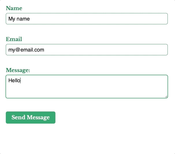 The static site form, sending the message to the Lambda endpoint and returning a response to the user.
Nope, we can’t do any magic tricks, but we have articles, books and webinars featuring techniques we all can use to improve our work. Smashing Members get a seasoned selection of magic front-end tricks — e.g. live designing sessions and perf audits, too. Just sayin’! 😉
Explore Smashing Wizardry →

Setting Up
There are minimal prerequisites in getting started with Serverless technology. For our purposes, it’s simply a Node Environment with Yarn, the Serverless Framework, and an AWS account.
Setting Up The Project
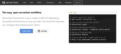
The Serverless Framework web site. Useful for installation and documentation.
We use Yarn to install the Serverless Framework to a local directory.
Create a new directory to host the project.
Navigate to the directory in your command line interface.
Run yarn init to create a package.json file for this project.
Run yarn add serverless to install the framework locally.
Run yarn serverless create –template aws-nodejs –name static-site-mailer to create a Node service template and name it static-site-mailer.
Our project is setup but we won’t be able to do anything until we set up our AWS services.
Setting Up An Amazon Web Services Account, Credentials, And Simple Email Service

The Amazon Web Services sign up page, which includes a generous free tier, enabling our project to be entirely free.
The Serverless Framework has recorded a video walk-through for setting up AWS credentials, but I’ve listed the steps here as well.
Sign Up for an AWS account or log in if you already have one.
In the AWS search bar, search for “IAM”.
On the IAM page, click on “Users” on the sidebar, then the “Add user” button.
On the Add user page, give the user a name – something like “serverless” is appropriate. Check “Programmatic access” under Access type then click next.
On the permissions screen, click on the “Attach existing policies directly” tab, search for “AdministratorAccess” in the list, check it, and click next.
On the review screen you should see your user name, with “Programmatic access”, and “AdministratorAccess”, then create the user.
The confirmation screen shows the user “Access key ID” and “Secret access key”, you’ll need these to provide the Serverless Framework with access. In your CLI, type yarn sls config credentials –provider aws –key YOUR_ACCESS_KEY_ID –secret YOUR_SECRET_ACCESS_KEY, replacing YOUR_ACCESS_KEY_ID and YOUR_SECRET_ACCESS_KEY with the keys on the confirmation screen.
Your credentials are configured now, but while we’re in the AWS console let’s set up Simple Email Service.
Click Console Home in the top left corner to go home.
On the home page, in the AWS search bar, search for “Simple Email Service”.
On the SES Home page, click on “Email Addresses” in the sidebar.
On the Email Addresses listing page, click the “Verify a New Email Address” button.
In the dialog window, type your email address then click “Verify This Email Address”.
You’ll receive an email in moments containing a link to verify the address. Click on the link to complete the process.
Now that our accounts are made, let’s take a peek at the Serverless template files.
Setting Up The Serverless Framework
Running serverless create creates two files: handler.js which contains the Lambda function, and serverless.yml which is the configuration file for the entire Serverless Architecture. Within the configuration file, you can specify as many handlers as you’d like, and each one will map to a new function that can interact with other functions. In this project, we’ll only create a single handler, but in a full Serverless Architecture, you’d have several of the various functions of the service.
The default file structure generated from the Serverless Framework containing handler.js and serverless.yml.
In handler.js, you’ll see a single exported function named hello. This is currently the main (and only) function. It, along with all Node handlers, take three parameters:
event
This can be thought of as the input data for the function.
context object
This contains the runtime information of the Lambda function.
callback
An optional parameter to return information to the caller.
// handler.js
‘use strict’;
module.exports.hello = (event, context, callback) => {
const response = {
statusCode: 200,
body: JSON.stringify({
message: ‘Go Serverless v1.0! Your function executed successfully!’,
input: event,
}),
};
callback(null, response);
};
At the bottom of hello, there’s a callback. It’s an optional argument to return a response, but if it’s not explicitly called, it will implicitly return with null. The callback takes two parameters:
Error error
For providing error information for when the Lambda itself fails. When the Lambda succeeds, null should be passed into this parameter.
Object result
For providing a response object. It must be JSON.stringify compatible. If there’s a parameter in the error field, this field is ignored.
Our static site will send our form data in the event body and the callback will return a response for our user to see.
In serverless.yml you’ll see the name of the service, provider information, and the functions.
# serverless.yml
service: static-site-mailer
provider:
name: aws
runtime: nodejs6.10
functions:
hello:
handler: handler.hello

How the function names in serverless.yml map to handler.js.
Notice the mapping between the hello function and the handler? We can name our file and function anything and as long as it maps to the configuration it will work. Let’s rename our function to staticSiteMailer.
# serverless.yml
functions:
staticSiteMailer:
handler: handler.staticSiteMailer
// handler.js
module.exports.staticSiteMailer = (event, context, callback) => {
…
};
Lambda functions need permission to interact with other AWS infrastructure. Before we can send an email, we need to allow SES to do so. In serverless.yml, under provider.iamRoleStatements add the permission.
# serverless.yml
provider:
name: aws
runtime: nodejs6.10
iamRoleStatements:
– Effect: “Allow”
Action:
– “ses:SendEmail”
Resource: [“*”]
Since we need a URL for our form action, we need to add HTTP events to our function. In serverless.yml we create a path, specify the method as post, and set CORS to true for security.
functions:
staticSiteMailer:
handler: handler.staticSiteMailer
events:
– http:
method: post
path: static-site-mailer
cors: true
Our updated serverless.yml and handler.js files should look like:
# serverless.yml
service: static-site-mailer
provider:
name: aws
runtime: nodejs6.10
functions:
staticSiteMailer:
handler: handler.staticSiteMailer
events:
– http:
method: post
path: static-site-mailer
cors: true
provider:
name: aws
runtime: nodejs6.10
iamRoleStatements:
– Effect: “Allow”
Action:
– “ses:SendEmail”
Resource: [“*”]
// handler.js
‘use strict’;
module.exports.staticSiteMailer = (event, context, callback) => {
const response = {
statusCode: 200,
body: JSON.stringify({
message: ‘Go Serverless v1.0! Your function executed successfully!’,
input: event,
}),
};
callback(null, response);
};
Our Serverless Architecture is setup, so let’s deploy it and test it. You’ll get a simple JSON response.
yarn sls deploy –verbose
yarn sls invoke –function staticSiteMailer
{
“statusCode”: 200,
“body”: “{“message”:”Go Serverless v1.0! Your function executed successfully!”,”input”:{}}”
}

The return response from invoking our brand new serverless function.
Creating The HTML Form
Our Lambda function input and form output need to match, so before we build the function we’ll build the form and capture its output. We keep it simple with name, email, and message fields. We’ll add the form action once we’ve deployed our serverless architecture and got our URL, but we know it will be a POST request so we can add that in. At the end of the form, we add a paragraph tag for displaying response messages to the user which we’ll update on the submission callback.
<form action=”{{ SERVICE URL }}” method=”POST”>
<label>
Name
<input type=”text” name=”name” required>
</label>
<label>
Email
<input type=”email” name=”reply_to” required>
</label>
<label>
Message:
<textarea name=”message” required></textarea>
</label>
<button type=”submit”>Send Message</button>
</form>
<p id=”js-form-response”></p>
To capture the output we add a submit handler to the form, turn our form parameters into an object, and send stringified JSON to our Lambda function. In the Lambda function we use JSON.parse() to read our data. Alternatively, you could use jQuery’s Serialize or query-string to send and parse the form parameters as a query string but JSON.stringify() and JSON.parse() are native.
(() => {
const form = document.querySelector(‘form’);
const formResponse = document.querySelector(‘js-form-response’);
form.onsubmit = e => {
e.preventDefault();
// Prepare data to send
const data = {};
const formElements = Array.from(form);
formElements.map(input => (data[input.name] = input.value));
// Log what our lambda function will receive
console.log(JSON.stringify(data));
};
})();
Go ahead and submit your form then capture the console output. We’ll use it in our Lambda function next.
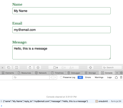
Capturing the form data in a console log.
Invoking Lambda Functions
Especially during development, we need to test our function does what we expect. The Serverless Framework provides the invoke and invoke local command to trigger your function from live and development environments respectively. Both commands require the function name passed through, in our case staticSiteMailer.
yarn sls invoke local –function staticSiteMailer
To pass mock data into our function, create a new file named data.json with the captured console output under a body key within a JSON object. It should look something like:
// data.json
{
“body”: “{“name”: “Sender Name”,”reply_to”: “sender@email.com”,”message”: “Sender message”}”
}
To invoke the function with the local data, pass the –path argument along with the path to the file.
yarn sls invoke local –function staticSiteMailer –path data.json
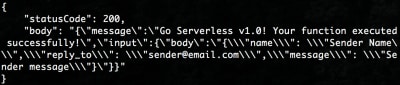
An updated return response from our serverless function when we pass it JSON data.
You’ll see a similar response to before, but the input key will contain the event we mocked. Let’s use our mock data to send an email using Simple Email Service!
Sending An Email With Simple Email Service
We’re going to replace the staticSiteMailer function with a call to a private sendEmail function. For now you can comment out or remove the template code and replace it with:
// hander.js
function sendEmail(formData, callback) {
// Build the SES parameters
// Send the email
}
module.exports.staticSiteMailer = (event, context, callback) => {
const formData = JSON.parse(event.body);
sendEmail(formData, function(err, data) {
if (err) {
console.log(err, err.stack);
} else {
console.log(data);
}
});
};
First, we parse the event.body to capture the form data, then we pass it to a private sendEmail function. sendEmail is responsible for sending the email, and the callback function will return a failure or success response with err or data. In our case, we can simply log the error or data since we’ll be replacing this with the Lambda callback in a moment.
Amazon provides a convenient SDK, aws-sdk, for connecting their services with Lambda functions. Many of their services, including SES, are part of it. We add it to the project with yarn add aws-sdk and import it into the top the handler file.
// handler.js
const AWS = require(‘aws-sdk’);
const SES = new AWS.SES();
In our private sendEmail function, we build the SES.sendEmail parameters from the parsed form data and use the callback to return a response to the caller. The parameters require the following as an object:
Source
The email address SES is sending from.
ReplyToAddresses
An array of email addresses added to the reply to the field in the email.
Destination
An object that must contain at least one ToAddresses, CcAddresses, or BccAddresses. Each field takes an array of email addresses that correspond to the to, cc, and bcc fields respectively.
Message
An object which contains the Body and Subject.
Is your pattern library up to date today? Alla Kholmatova has just finished a fully fledged book on Design Systems and how to get them right. With common traps, gotchas and the lessons she learned. Hardcover, eBook. Just sayin’.
Table of Contents →

Since formData is an object we can call our form fields directly like formData.message, build our parameters, and send it. We pass your SES-verified email to Source and Destination.ToAddresses. As long as the email is verified you can pass anything here, including different email addresses. We pluck our reply_to, message, and name off our formData object to fill in the ReplyToAddresses and Message.Body.Text.Data fields.
// handler.js
function sendEmail(formData, callback) {
const emailParams = {
Source: ‘your_email@example.com’, // SES SENDING EMAIL
ReplyToAddresses: [formData.reply_to],
Destination: {
ToAddresses: [‘your_email@example.com’], // SES RECEIVING EMAIL
},
Message: {
Body: {
Text: {
Charset: ‘UTF-8’,
Data: `${formData.message}nnName: ${formData.name}nEmail: ${formData.reply_to}`,
},
},
Subject: {
Charset: ‘UTF-8’,
Data: ‘New message from your_site.com’,
},
},
};
SES.sendEmail(emailParams, callback);
}
SES.sendEmail will send the email and our callback will return a response. Invoking the local function will send an email to your verified address.
yarn sls invoke local –function testMailer –path data.json

The return response from SES.sendEmail when it succeeds.
Returning A Response From The Handler
Our function sends an email using the command line, but that’s not how our users will interact with it. We need to return a response to our AJAX form submission. If it fails, we should return an appropriate statusCode as well as the err.message. When it succeeds, the 200 statusCode is sufficient, but we’ll return the mailer response in the body as well. In staticSiteMailer we build our response data and replace our sendEmail callback function with the Lambda callback.
// handler.js
module.exports.staticSiteMailer = (event, context, callback) => {
const formData = JSON.parse(event.body);
sendEmail(formData, function(err, data) {
const response = {
statusCode: err ? 500 : 200,
headers: {
‘Content-Type’: ‘application/json’,
‘Access-Control-Allow-Origin’: ‘https://your-domain.com’,
},
body: JSON.stringify({
message: err ? err.message : data,
}),
};
callback(null, response);
});
};
Our Lambda callback now returns both success and failure messages from SES.sendEmail. We build the response with checks if err is present so our response is consistent. The Lambda callback function itself passes null in the error argument field and the response as the second. We want to pass errors onwards, but if the Lambda itself fails, its callback will be implicitly called with the error response.
In the headers, you’ll need to replace Access-Control-Allow-Origin with your own domain. This will prevent any other domains from using your service and potentially racking up an AWS bill in your name! And I don’t cover it in this article, but it’s possible to set-up Lambda to use your own domain. You’ll need to have an SSL/TLS certificate uploaded to Amazon. The Serverless Framework team wrote a fantastic tutorial on how to do so.
Invoking the local function will now send an email and return the appropriate response.
yarn sls invoke local –function testMailer –path data.json

The return response from our serverless function, containing the SES.sendEmail return response in the body.
Calling The Lambda Function From The Form
Our service is complete! To deploy it run yarn sls deploy -v. Once it’s deployed you’ll get a URL that looks something like https://r4nd0mh45h.execute-api.us-east-1.amazonaws.com/dev/static-site-mailer which you can add to the form action. Next, we create the AJAX request and return the response to the user.
(() => {
const form = document.querySelector(‘form’);
const formResponse = document.querySelector(‘js-form-response’);
form.onsubmit = e => {
e.preventDefault();
// Prepare data to send
const data = {};
const formElements = Array.from(form);
formElements.map(input => (data[input.name] = input.value));
// Log what our lambda function will receive
console.log(JSON.stringify(data));
// Construct an HTTP request
var xhr = new XMLHttpRequest();
xhr.open(form.method, form.action, true);
xhr.setRequestHeader(‘Accept’, ‘application/json; charset=utf-8’);
xhr.setRequestHeader(‘Content-Type’, ‘application/json; charset=UTF-8’);
// Send the collected data as JSON
xhr.send(JSON.stringify(data));
// Callback function
xhr.onloadend = response => {
if (response.target.status === 200) {
// The form submission was successful
form.reset();
formResponse.innerHTML = ‘Thanks for the message. I’ll be in touch shortly.’;
} else {
// The form submission failed
formResponse.innerHTML = ‘Something went wrong’;
console.error(JSON.parse(response.target.response).message);
}
};
};
})();
In the AJAX callback, we check the status code with response.target.status. If it’s anything other than 200 we can show an error message to the user, otherwise let them know the message was sent. Since our Lambda returns stringified JSON we can parse the body message with JSON.parse(response.target.response).message. It’s especially useful to log the error.
You should be able to submit your form entirely from your static site!
The static site form, sending the message to the Lambda endpoint and returning a response to the user.
Next Steps
Adding a contact form to your static is easy with the Serverless Framework and AWS. There’s room for improvement in our code, like adding form validation with a honeypot, preventing AJAX calls for invalid forms and improving the UX if the response, but this is enough to get started. You can see some of these improvements within the static site mailer repo I’ve created. I hope I’ve inspired you to try out Serverless yourself!

(lf, ra, il)


 The following options are available: