Is The Tor Browser Illegal?: What You Need to Know

Original Source: http://feedproxy.google.com/~r/Designrfix/~3/6FXF-P7m1oU/is-the-tor-browser-illegal-what-you-need-to-know

The Tor Browser has been in the news for the past few weeks with people looking for reassurance that Tor Browser lets them browse anonymously and safely. The biggest question on everyone’s mind right now – is Tor illegal? Could we be in trouble if we use Tor Browser to access the dark web links? […]

The post Is The Tor Browser Illegal?: What You Need to Know appeared first on designrfix.com.

How Does Free Graphic Design Software Stack Up?

Original Source: https://inspiredm.com/how-does-free-graphic-design-software-stack-up/

Graphic design is an easy kind of business to manage, but a difficult one to get started in. Until you have built up a decent number of regular clients, you may find you must watch every penny closely. If you are in this situation, the prices of popular graphic design software will be quite a shock.

One of the true luxuries of running your own graphic design studio, however, is that you’re not locked in to using any particular software as you would probably be if you were an employee of somebody else. That means you’re at liberty to use whatever helps you get the job done efficiently.

The idea of free graphic design software may sound exciting, but is it really up to the task? Will it allow you to create professional quality work without the high cost? Let’s find out.

1. PhotoShop vs GIMP

 GIMP default interface

GIMP is often touted as a replacement for PhotoShop, but this isn’t strictly true. GIMP does not come with everything PhotoShop has, because the GIMP developers wanted to create a lean application that does not have bloat. In consequence, most of those “missing” features are still available, but have to be added in after you have installed GIMP.

You can do almost anything in GIMP that you can do in PhotoShop, but some things (like creating primitives) require additional steps. Previously GIMP didn’t have as many features as PhotoShop, but it is gradually drawing level, and may one day overtake it.

 GIMP in Single Window mode

GIMP advantages:

Free. You’ll save at least $600 compared to buying PhotoShop, and significantly more over the long term because there’s no upgrading or subscription fees.
Open source. This is good for many reasons too complex to tackle in this article, however you can read Advantages of Open Source Software if you want a quick summary of the primary advantages.
Cross-Platform. GIMP works on just about every major operating system, plus a few minor ones. PhotoShop definitely does not do that.
No licensing worries. Because it’s free, GIMP can be installed on as many computers as you want, and it can be shared freely.
Easier to use. A bit of a controversial point because people who have a lot of experience in PhotoShop don’t relish the idea of learning a new system, but GIMP actually is a lot easier to use.
Dockable detached tool bars. Most people who are migrating from PhotoShop will initially prefer GimpShop or GimpPhoto instead of authentic GIMP, but actually the detached toolbars of GIMP are a strength, not a weakness. If you’re not aware of their power, it’s because you’re not working in a multi-screen environment (and you definitely should be).  You can throw all your tool bars onto one screen and work on the image in the other, which means you can see more of your image at a higher zoom level, with no pesky toolbars getting in the way.
One-way PhotoShop compatibility. This means you can open PhotoShop images in GIMP, use most PhotoShop filters and brushes in GIMP, and export GIMP files to PhotoShop format. However the reverse is not true. PhotoShop can’t open GIMP files, save to GIMP format, or use brushes and filters that were designed exclusively for GIMP.
Uses less resources. PhotoShop is a hungry beast in comparison to GIMP. The entire core GIMP package installs in under 20MB of space, while PhotoShop requires about a gigabyte. PhotoShop also typically uses more CPU and RAM resources while running.

PhotoShop default interface

Advantages of PhotoShop:

Higher level of industry recognition. PhotoShop has for many years been so far at the top of image editing tools, it has almost achieved the same status in that field as Google has achieved in online searches.
Adjustment levels. You may need these, but not everyone does. GIMP only uses physical image layers.
Supports CMYK effortlessly. In fact PhotoShop was mainly designed for editing CMYK images. To get the same CMYK functionality in GIMP, you need to install it separately.
Supports RAW images. GIMP can only do this if you open it using UFRaw.
Single interface window. This is, in some ways, a disadvantage on multiple monitor set ups. Novice users, however, find it easier to deal with a single interface window. GIMP can support this in two ways. The obvious one is to use GimpShop or GimpPhoto. The built-in way is to choose “Windows → Single Window Mode”.

Final verdict: GIMP doesn’t replace all of PhotoShop’s functionality, but it replaces enough of it to make this software a serious contender. The difference in price, especially considering this is not the only software you’re going to need, is a major factor in favor of GIMP.

The best way may be to start with GIMP, customize it to work like PhotoShop (which is very easy) and then transition to PhotoShop once you find you truly have a need for the additional features.

2. Inkscape vs Illustrator

Adobe illustrator is the market leader in vector graphics, and indeed it has so many powerful features for the professional designer, it probably deserves to be so popular.

Inkscape is very capable too, however. Basically the situation is if you can’t draw something well in Inkscape, you won’t be able to draw it well in Illustrator either.

 Inkscape default interface

Advantages of Inkscape:

Free. You’ll save a lot of money by using Inkscape instead of Illustrator.
Open source. You can inspect the source code, modify it, recompile it, etc. You could even create your own entirely new vector graphics application based on Inkscape’s source code.
Cross-platform. Works on all major operating systems.
Easy to learn and use. Inkscape is a bit simpler than Illustrator, so it is easier to learn.
Imports more image types. This is self-explanatory.
Saves directly to SVG. Illustrator can do this too, but doesn’t do it as well, and you need to select it when you save, or your file will be stored in proprietary AI format. Inkscape defaults to SVG.
Easy object cloning. It’s amazingly easy to clone anything in Inkscape. Not only that, but the latest versions of Inkscape allow you to create tiled clones, so you can quickly create interesting patterns without all the work of manually positioning each tile.
Easy object duplication. What’s the difference between a clone and a duplicate? If you make a change to a cloned object, all of it’s clones will change as well. If you make a change to a duplicated object, only the active copy is changed.

 Adobe Illustrator default interface

Advantages of Illustrator:

Industry standard. Looks good when listed as a skill on your CV.
Supports gradient meshes. It’s not every day you’d be likely to need to make use of a gradient mesh, so whether this point is a deal-breaker depends on the kind of work you do. This advantage is being stripped away as you’re reading this, because the next release of Inkscape is going to include gradient meshes.
Allows more than one stroke color and fill color per object. When you draw a shape in Inkscape, every line of the shape border or path border is continuous and only one color can be used. Illustrator allows you to mix and match.

Final verdict: If you’re any good at drawing, there’s nothing you can create in Illustrator that you can’t create in Inkscape, but Illustrator offers a few extra tools that make the work a bit lighter. You can easily overcome Inkscape’s few limitations, however, so the decision to spend a lot of money on Illustrator needs to be considered carefully.

Before we sign off on Inkscape, there’s just one more myth to bust. Many people declare that Illustrator is better because Inkscape doesn’t do CMYK color. This simply isn’t true. Using a simple plug-in, you can create CMYK output.

3. Scribus vs InDesign

Scribus and InDesign share a common purpose, but that’s about all they share. Both are quite competent at DTP, but InDesign is a far more mature product.

 Scribus interface (image by Nicolas Vérité, CC2.0-SA)

Advantages of Scribus:

Free. You’ll save money using Scribus instead of InDesign.
Open source. Scribus could use some improvement. It’s open source nature allows for that.
Cross-platform. Scribus works on all major operating systems, plus a few more obscure ones.

InDesign interface (image by Mike, CC2.0-ND)

Advantages of InDesign:

More intuitive interface. Most users who have used both find it easier to learn InDesign.
Better text handling. Scribus still has some room for improvement when it comes to editing text. InDesign works perfectly.
Better documentation. If you need help with Scribus, you’ll spend a lot of time on Google and browsing forums. InDesign has mature documentation and plenty of additional support to call upon.

Final verdict: If you need to do a lot of DTP work, InDesign may give you better workflow, so it may be worth the investment. If you only occasionally dabble in DTP, Scribus can do virtually everything InDesign can do, and does it for free.

4. Blender vs Maya

Most graphic designers rarely need to delve into the cruel and punishing world of 3D images, but Blender (free) and Maya (proprietary) are the leading tools in 3D graphics creation and 3D animation.

 Blender interface (image by Dany123, CC3.0-SA)

Advantages of Blender:

Free. Which is amazing, considering how good it is.
Open source. If you want to change something, you don’t have to wait for somebody else to fix it. You can fix it yourself.
Cross-platform. Works on Windows, Mac, Linux.
Built-in game engine. This can be used for any kind of animation, plus simulated physics reactions.
Built in cloth simulator. If you need a flag to flutter in the wind, Blender makes that easy. There’s also a fluid simulator, but that’s not an advantage because Maya has it too.
Many add-ons available free or cheap. There are add-ons to let you easily generate trees, rocks, weeds, debris, roads, cities, people, and so on. Most of these are free or cost little compared to Maya add-ons.
More intuitive modeling system. It may depend slightly on your personal style, but many people who have worked with both find Blender’s modeling system more intuitive.

 Maya interface (image by Mr Ben, CC-3.0SA)

Advantages of Maya:

None.

Final verdict: Blender wins this one really easily, because Maya costs so much and doesn’t deliver anything really special. On the other hand, Blender is free and does deliver a lot. You can do really incredible things with both items of software. Maya is really great, but so is Blender, and the latter just happens to be free.

Something else to think about: on average it might take up to two years to make a feature-length animated film, and if you’re using Maya, you’ll probably spend quite a lot of money just keeping your software and expensive paid add-ons up to date.

So does free graphic design software really stack up?

The answer is a solid maybe. So much depends on what you want to do and what you need to do. What we can say with some certainty is that most of the popular free graphic design software, with the exception of Scribus, is good enough to get you off to a decent start.

The software you use is not what makes you a great designer. It’s how you use the software, your talent, and your attitude to getting the job done that makes all the difference to the quality you can provide to clients.

header image courtesy of tubik

The post How Does Free Graphic Design Software Stack Up? appeared first on Inspired Magazine.

Popular Website Interfaces Reimagined on CodePen

Original Source: http://feedproxy.google.com/~r/1stwebdesigner/~3/ky5d7dICcK4/

Redesigning a popular interface is a great way to improve your skills.

Whether you want to hone your mockup design skills or craft your frontend prowess, a fancy redesign is a solid practice project.

It’s easy to search Dribbble and find tons of website redesigns as static images. But it’s not so easy to find similar redesigns in code.

That’s why I took a dive into CodePen’s archives to find these 11 custom interfaces that reimagine popular sites. You’ll find designs for Twitter, IMDb and even a few other notable websites you might recognize.

Google Search Redesign

See the Pen Google Search (Custom) Redesign #2 by max (@vm187) on CodePen.

The infamous Google search page gets billions of impressions per day. Actually 3.5b per day, to be exact.

So that page needs a design that’s on-point. If you’re redesigning something, there is a bit of room to have fun with it and that’s the idea behind this pen.

It’s a simple Google page redesign focusing just on the search input field. It features a bright, colorful button with drop shadow effects that you’d never see from Google’s design team.

The result is a fun way to reimagine search.

Gmail Application

See the Pen Gmail Application by Kenny (@ispykenny) on CodePen.

Google fans will probably enjoy this reimangined Gmail in a similar vein as the last pen.

But this one features a full Gmail interface – so it’s a little more detailed.

Clicking through the sidebar animations, you’ll notice that they really do animate smoothly. Not to mention the sleek material design color scheme.

If you’re a frequent Gmail user, you may even prefer this redesign over the current style.

Google Branded Redesign

See the Pen Google Redesign by MohamadReza Deylami (@imohamad) on CodePen.

Here’s another Google redesign I wanted to throw in. This one’s a little more detailed with links for Google’s entire set of tools.

This pen by Mohamad Reza Deylami features a redesigned Google logo, altered color scheme and links to all of their different search features.

I think it’s a bit more complex than the current page – so I wouldn’t take it over Google’s design.

What I do like about this redesign is that it’s unique and it stays true to the Google style. Oh and all the code is open source, too.

Twitter UX

See the Pen Twitter UX by Calin (@CalinM) on CodePen.

Twitter has a bunch of UX features spanning their desktop and mobile interfaces. One popular design style is the card interface, which you can see in this pen.

It’s a reimagining of Twitter’s UX with a smaller card design.

This includes a scroll bar along with buttons for editing your profile. And when you scroll down, there are even placeholders for the tweets. How cool!

Modern Twitter Redesign

See the Pen Modern Twitter Redesign by Gibbu (@Gibbu) on CodePen.

Now for something a little more technical, have a peek at this Twitter redesign.

This thing is monstrous and it really does flip the Twitter interface on its head. I actually recommend studying the design in full view to see how it looks in your browser.

I love the menu, love the timeline and really love the simple hover/focus effects. The only thing missing? This isn’t a responsive page.

But in all fairness, Twitter does have a mobile-specific layout aside from the main desktop design. So they handle mobile users differently, too.

FreeCodeCamp Homepage

See the Pen FreeCodeCamp homepage redesign by Giana (@giana) on CodePen.

Developers love FreeCodeCamp for its endless support of new developers and for its friendly approach to charity.

CodePen user Giana must really love the site since they created a full redesign of the FreeCodeCamp homepage.

I can’t really say if it’s a better or worse design. It’s awesome in many ways and also very different. It’s worth a glance if you’re familiar with the original layout.

Spotify Artist Page UI

See the Pen Spotify Artist Page UI by Adam Lowenthal (@alowenthal) on CodePen.

The Spotify web layout is another widely-known interface and Adam Lowenthal took it upon himself to recreate the Spotify artist page.

Most of the features don’t fully work – so you can’t stream music. But the actual page elements are real, so you could copy/paste this code to mix up your own HTML audio player.

Plus, the whole thing is mobile responsive. So that’s nice.

Unsplash Redesign Stuff

See the Pen Unsplash Redesign Stuff by Kyle Shanks (@mavrK) on CodePen.

I can’t say that this redesign of Unsplash is better than the current homepage. But I do think it’s a creative reimagining of how the layout could look focusing on a different structure.

This pen still has the same grid system but developer Kyle Shanks also places a focus on the email capture box and the dropdown navigation menu.

It’s super clean and super easy to rework if you’d like to edit this for your own site.

IMDb Concept

See the Pen Redesign concept IMDB series page by Joanez Andrades (@JoanezAndrades) on CodePen.

Not everything in this IMDb redesign is functional. That’s the downside here.

But the upside is this design really looks spectacular. It’s absolutely phenomenal and would probably work well as a web-app for touchscreens.

Take a peek at the full view to really see how it all comes together on the page.

LinkedIn Redesign

See the Pen LinkedIn Redesign by Nahom Ebssa (@enahom99) on CodePen.

Over the years, LinkedIn has cluttered their layout with so many extra features. I’m really a fan of minimalism and that’s what I see in this redesign by Nahom Ebssa.

Simple colors with an easy-to-use interface. Many elements even borrow ideas from the material design language.

Granted, the layout doesn’t seem 100% finished – but I think it’s a really nice template.

If you want some HTML/CSS/JS practice, maybe fork this one and try adding your own features.

YouTube Redesign

See the Pen YouTube redesign concept by Dino (@dinocam) on CodePen.

For another design that’s not totally done (but still looks amazing), I have to recommend this YouTube redesign.

It really does look a lot cleaner than the modern YouTube homepage. Granted, some of the images won’t load but you still get the gist of the layout. It’s also 100% free of JavaScript, which is pretty awesome.

None of the links or buttons work – so it’s not usable. Still, this is a brilliant attempt to bring YouTube’s design forward with a much more focused UI.


How to Improve Your Data Privacy on Facebook

Original Source: https://www.hongkiat.com/blog/how-to-improve-privacy-on-facebook/

This guide will tell you how to make necessary changes in your Facebook privacy settings to protect your data on this social network.

The post How to Improve Your Data Privacy on Facebook appeared…

Visit hongkiat.com for full content.

20 Responsive Image Galleries and Slideshows (2018)

Original Source: https://www.hongkiat.com/blog/free-responsive-image-gallery/

If your website is image-heavy i.e. a portfolio or photography website etc., then there are two things that you’ll be needing the most – photo gallery plugins to help you better manage…

Visit hongkiat.com for full content.

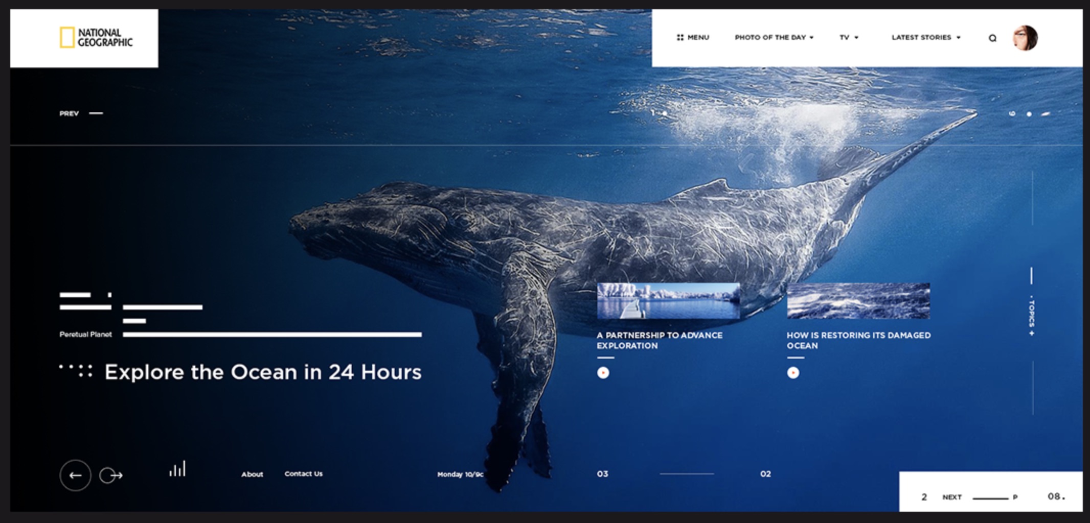
Web Design Concept for National Geographic

Original Source: http://feedproxy.google.com/~r/abduzeedo/~3/WA-MUeAUKs4/84688

Web Design Concept for National Geographic

Web Design Concept for National Geographic

abduzeedo
May 04, 2018

Andriy Bata shared a very stylish web design concept for the National Geographic web site. It features pretty trendy style, with a clear grid system and very minimal. The imagery provided by the topics that National Geographic covers makes things a bit easier. Overall it’s a nice study of web design, but in my opinion it fails on very important aspects, especially accessibility. Some texts feel just too small and with very little contrast from the background. I think any web designer out there should have the duty to create experiences for all and if you take in consideration that the tools and technology allow us to do that, we should not sacrifice function for the form.

Web design concept


web design


10 Free Icon Sets for Ecommerce UI Design

Original Source: http://feedproxy.google.com/~r/1stwebdesigner/~3/iC2TElFqUGg/

Designing an ecommerce site is not like any other web project. You have to think about branding along with user experience and marketing based on the design. It can be quite difficult to say the least.

But there are lots of free resources you can use to make your job easier. Icon sets, for one, are a lot of work to design. You can save hours (even days) worth of time by using a free icon pack instead.

The sets below are all totally free and come in a variety of styles. If you’re looking for ecommerce-related icons, you’ll find plenty to dig through in this list.

All the Icons, Fonts, Web Templates & Design Assets You Could Ask For


DOWNLOAD NOW

54 Ecommerce Icon Pack

54 Ecommerce Icon Pack

First up is a massive 54-set icon pack featuring simple line icons that will work well for typical ecommerce features.

This set was created by designer Virgil Pana and released for free on Dribbble. The entire pack comes as a PSD file and it really is one of the better ecommerce sets out there.

I like this particular style because I think it can easily blend in with any website.

The minimalist line style is very common and so it’s worth trying – regardless of what project you’re building.

Simple Green Icon Set

Simple Green Iconset

Here’s one more freebie pack hosted on Dribbble with a focus on beautiful green icons. Although, technically the color scheme can be altered with a few clicks in Illustrator.

Designer Pavel Kozlov created this pack of 40 free ecommerce icons and released it to the world a few years ago. Yet, the icons are just as relevant today as ever before.

To download a copy you’ll need to visit the Gumroad page. Typically items on Gumroad cost money, but this pack is actually 100% free.

If you want to give Pavel a tip for all his efforts, you certainly can. But it’s not a requirement to gain access to these lush green icons.

Flat Vector Shopping Icons

Flat Vector Shopping Icons

Another really popular trend is flat design. This has been applied to everything from mobile apps to websites and yes, even icons.

Take a look at this vector icon set featuring 80 different shopping icons. Some are colored, some are just plain line icons, but they’re all super easy to use and customize.

You can nab the pack as static PNGs or as vectors in AI/EPS format. And they’re free to use on commercial projects. Just note that the license requires a simple link back to the original website.

Shipping and Ecommerce Icons

Shipping and Ecommerce Icons

The online marketplace EpicPxls includes some really high-quality resources. It’s a great place for designers to release premium and free assets to the world – all while building a following for their work.

Take a look at this icon set created by EpicCoders. It’s been downloaded well over 2,000 times and it’s really quite unique.

One glance at the style and you’ll see what I mean. It feels vibrant, almost cartoony, yet not over-the-top.

This pack should work great for minimalist sites, along with any ecommerce shops that match the color scheme.

Hand-Drawn Icons Set

Hand-Drawn Icons Set

It can be tough designing a page with hand-drawn elements. But they do add a certain creativity into any website and that goes double for these free icons.

The entire ecommerce icon pack is focused on hand-drawn elements. From gift box icons to little shopping baskets and checkout features, all the graphics you’ll need can be found in this set.

I would recommend using this set for a landing page design rather than a checkout UI. You may have difficulty getting these icons to blend naturally for a checkout interface, but they would grab attention on a web shop’s homepage.

Credit Cards Pack

Credit Cards Pack

No ecommerce website is complete without credit card icons.

If you are designing a shop that accepts credit cards then have a look at these free CC icons released on Dribbble.

Designer Guy Levin created 9 different credit card icons – all in one Adobe Illustrator file.

They’re super clean, easy to customize and will blend anywhere on your page.

Linear Ecommerce Icons

Linear Ecommerce Icons

I do love my line icons, so they make plenty of appearances on this list.

The Pixlov website released their own pack of free linear ecommerce icons following this exact style. And the pack is just phenomenal.

You wouldn’t think 33 icons would amount to a whole lot but this set has plenty of designs to pick from. I just wouldn’t recommend them for a checkout screen, as it seems more suited for a landing page or a “features” page about the store.

These could also work well in your own newsletter to push your products even further.

Noun Project Ecommerce

Noun Project Ecommerce

If you aren’t familiar with The Noun Project, you should definitely check it out. The website curates a ton of free icon packs from around the web and from many designers worldwide. There’s a lot to go through, but for this post I would like to suggest the ecommerce collection, made by Anton Scherbik.

They are the simplest of simple line icons. The pack includes several great choices, like checkout bags and cart icons in a variety in styles.

Checkout and Delivery Icons

Checkout and Delivery Icons

The Codrops blog is simply amazing. They regularly publish high-quality tutorials with freebies you can use for your own projects.

One example is this checkout icon set created by EpicPxls.

It comes with 35 unique icons that have a fill effect that you just won’t find elsewhere. The fill colors ever-so-slightly hang outside of the line work, which is probably the first thing you’ll notice.

This set definitely provides a unique twist.

Customized Icon Set

Customized Iconset

Last but certainly not least is this awesome icon set by Graphicboat.

These icons won’t necessarily fit in everywhere. But they can draw attention fast and get people curious to learn more about your shop.

I’d say these icons would fit best in a header background, in a “features” page, or maybe somewhere near your CTA button.

That’s the list! If you still haven’t found what you’re looking for, feel free to search Google for more. New freebies come out every month, so you never know what you’ll find.


15 Inspirational Examples of Minimal Web Design

Original Source: http://feedproxy.google.com/~r/1stwebdesigner/~3/uhBoQDKCBTs/

Considering that the current philosophy of UI design is “less is more,” the expected rise in popularity of minimalism has reached an all-time high amongst web designers, especially in the last couple of years. But, perhaps unknowingly, its appeal to users has also grown.

The principles of minimalism in web design are that a website (and other mediums as well) should be stripped down to their bare bones, while carefully making use of whitespace and improving readability with clearer typography. When implemented correctly, the result will allow users to focus on what’s truly important without being distracted by non-essential elements.

While this may sound easy, it can be difficult deciding what the truly important elements are and what’s little more than decoration. It can also be risky. Accidentally removing a seemingly innocuous element could be deemed critical by the user and could result in the wrong message (or worse, no message at all) being delivered to your target audience.

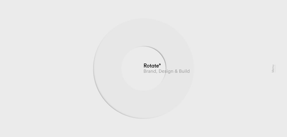
minimal web design Rotate

Source: Rotate°

If you think about the logistics, it makes sense that minimalism appeals to users: the less fluff on the site, the less you have to think about. When there are just a few links or blocks of text, and the point of interest is directly in front of you, you can let your mind rest for a bit – relax, and the website will spoon feed you just what you need.

This collection features fifteen websites that have been designed using the minimalistic principles mentioned above. Some of the sites have also been influenced by many of the popular web design trends we have seen over that past year or so, like flat design, yet still retain a look and feel that can only be described as minimal. Here are the beautifully designed sites:

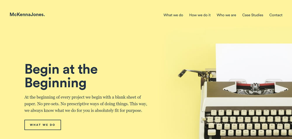
minimal web design McKennaJones.co.uk

Source: McKennaJones.co.uk

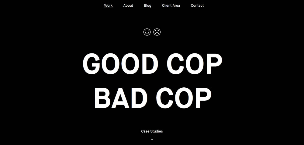
minimal web design Good Cop Bad Cop

Source: Good Cop Bad Cop

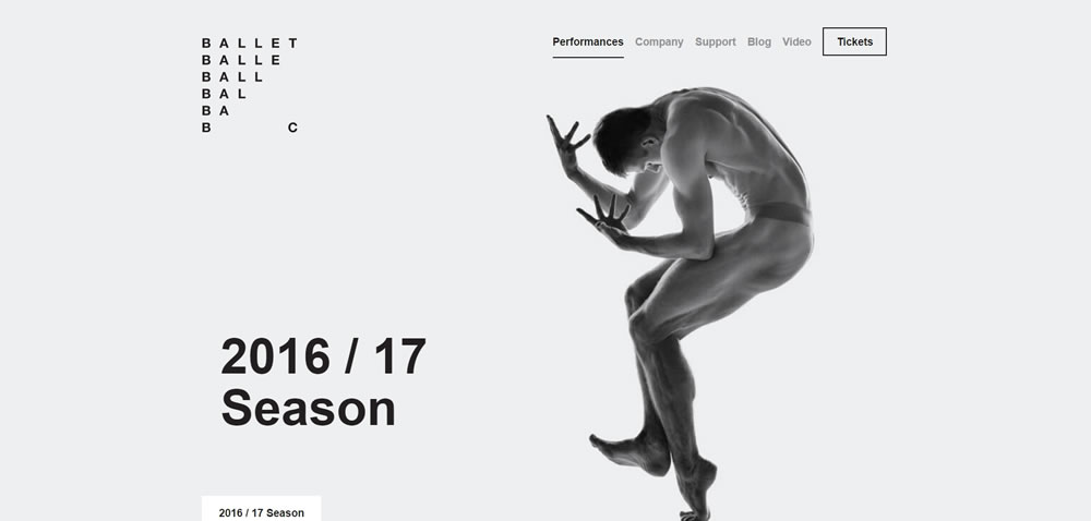
minimal web design Ballet BC

Source: Ballet BC

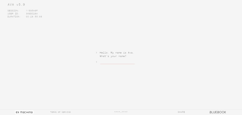
minimal web design Ava Sessions

Source: Ava Sessions

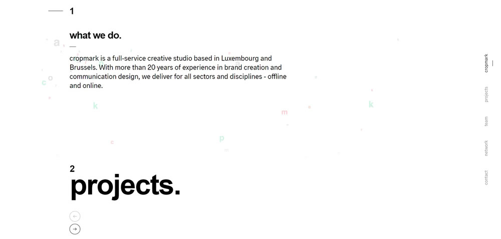
minimal web design Cropmark

Source: Cropmark

minimal web design Mike Guss

Source: Mike Guss

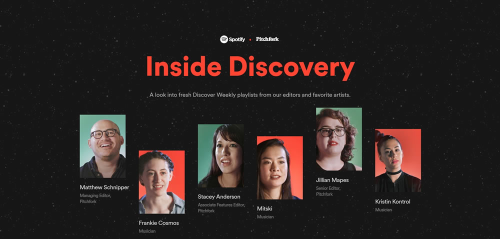
minimal web design Inside Discovery

Source: Inside Discovery

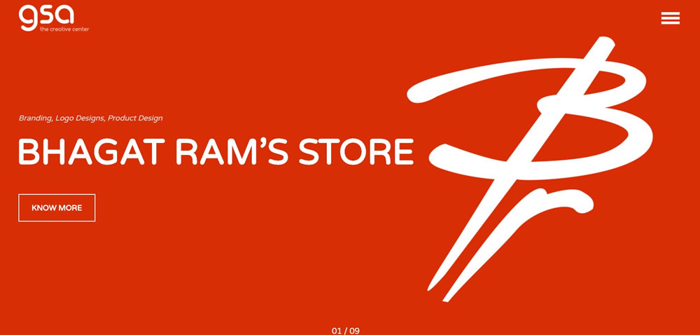
minimal web design GSArora

Source: GSArora

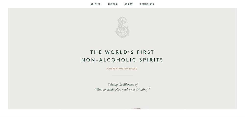
minimal web design Seedlip

Source: Seedlip

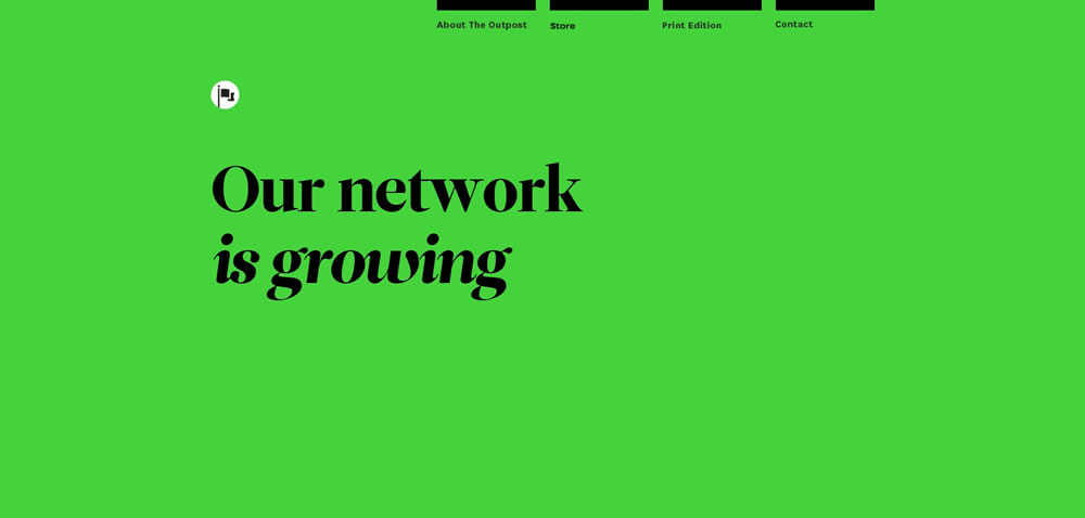
minimal web design The Outpost

Source: The Outpost

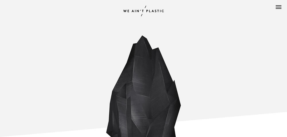
minimal web design We Ain't Plastic

Source: We Ain't Plastic

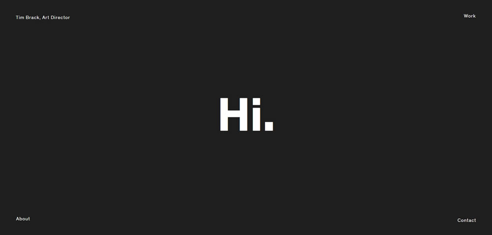
minimal web design Tim Brack

Source: Tim Brack

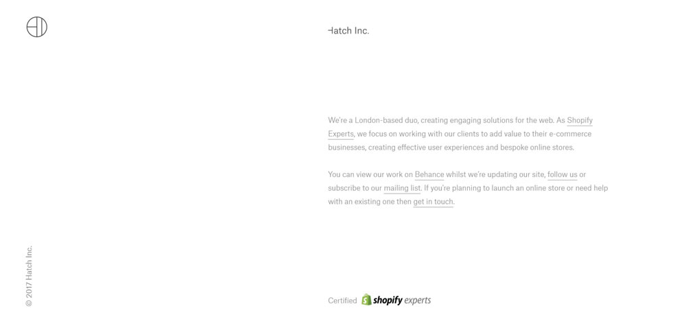
minimal web design Hatch Inc

Source: Hatch Inc.

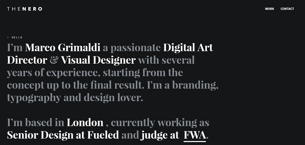
minimal web design The Nero Design

Source: The Nero Design

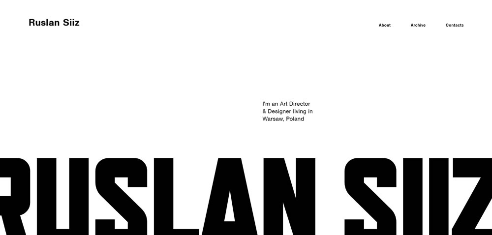
minimal web design Ruslan Siiz

Source: Ruslan Siiz

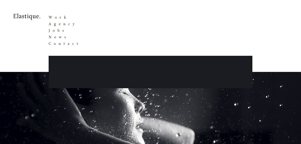
minimal web design Elastique

Source: Elastique

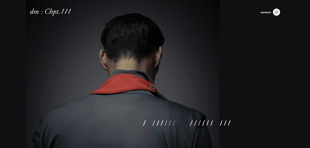
minimal web design Chapter 3

Source: Chapter 3

Finshed

Minimalism isn’t the miracle solution that you can slap on every single project. There’s a time and place for everything; the time is now, but you need to carefully decide the place.


Why Passion Is a Key Ingredient to Freelance Success

Original Source: http://feedproxy.google.com/~r/1stwebdesigner/~3/KBj_JBR5GhI/

Have you ever thought about why you became a web designer?  It’s one of those questions that may not have entered your mind because, it’s just who you are.

Recently, I’ve given some thought to my own path to where I am now. As a high school senior in 1995, my family subscribed to an unlimited dialup internet service. Previously, internet service had been metered by the likes of AOL and so I had been extremely limited in how much time I could spend online. But with the arrival of unlimited access, it literally opened up the world.

I mention this because, without that slow-as-a-snail dialup account, I may never have started to play around with HTML. And I probably wouldn’t have taken the time to learn Photoshop or any other graphics program.

Those items helped to spark a creative passion that I didn’t know I had. Thankfully, even through some ups and downs, it’s something that I still have over 20 years later.

Passion Led Us Here

Where Passion Begins and Ends

Creative fields like web design require a certain amount of talent. But to really succeed, I’d argue that passion is just as important.

Anyone who’s read a Dilbert comic or watched The Office knows that these fictional employees have a dearth of passion for what they do. While the stories are made up, the almost-robotic way the characters go about their jobs is something very real and relatable.

If you’re a designer who acts similarly in your daily grind, it’s hard to imagine that you’d be very creative. No, design requires a real passion to do things the right way. Without it, your work is going to suffer.

However, those who decide to take on the challenge of becoming a freelance designer often face a stark reality: There are days where it’s really hard to conjure up any passion for what you’re doing. And it’s not very surprising.

When you consider the amount of added responsibility you take on while running a business, it can weigh on you. Finances, client relations and all the stress that goes along with the gig is enough to drain anyone of excitement.

And, just like in the more creative parts of your job, facing each task with dread or ambivalence is a recipe for failure.

Where Passion Begins and Ends

Finding Passion and Purpose in Your Business

How, then, can we become passionate about the day-to-day challenges of freelance life? Let’s take a look at some fairly simple things you can do:

Embrace Reality
As it turns out, neither life nor work is 100% fun all of the time. So it makes sense to set realistic expectations when it comes to running a business. There are going to be days that, simply put, are going to stink like a closet full of rotten eggs. But, each day is an opportunity to get those creative juices flowing again.

Find a New Muse
Being creative in and of itself can stir some passion. In my own career, I’m happiest when doing design work or writing. But we can’t spend every moment on those tasks. So it’s up to us to find other things that create some mojo. It might be finding a new niche or service to offer. Or, spend some time on a different aspect of your business that brings out your best. Feeling as though you’ve done a great job can be enough to keep you going.

Learn Something
Another possibility here is to learn a new skill. Study up on that new JavaScript framework you’ve wanted to use or find a new tool to increase productivity. Just the act of learning can make things more fun. You might even find that you just can’t wait to apply this new knowledge to a project and show off your skills.

Challenge Yourself
Creating goals and challenging yourself to top them is a great way to stay in the right frame of mind. Set a goal for how many new clients you want to book in a month or even how many blog posts you want to write. Whatever it is, you’ll have something positive to focus on. Just remember to keep your goals realistic!

Don’t Overdo It
Working yourself too hard is one of the biggest soul-crushing activities for a freelancer. This is especially tough when you’re extremely busy and have deadlines to meet. But there are also times when you simply need a break. Take some time away from your desk and your phone. It can give you a more positive perspective on life.

Finding Passion and Purpose in Your Business

Make Your Work Mean Something

Finding passion in what you do will put you on the right path towards a successful freelance web design career.  The key to developing it is in finding purpose in each day – even the bad ones. How you find it is really up to you.

For instance, if you don’t have enough clients, maybe your purpose can be in making contact with a new prospect. If you’re buried under a mountain of work, you might find purpose in reaching little milestones each day.

That purpose leads to passion, which will shine through to everyone you work with. And when others can see how deeply connected you are to your work, it not only makes them want to work with you but also sing your praises to others.

The result is that your business starts to build momentum. Keep it up and you’ll find yourself in the middle of a successful career.


The New Gmail – Material Design and 8 New Features

Original Source: https://www.hongkiat.com/blog/new-gmail-material-design-and-features/

Gmail has received a major update recently, which brings the beautiful material design interface to our favorite email provider. That is not all, it introduces many requested features to help…

Visit hongkiat.com for full content.