SitePoint Premium New Releases: Node, Android, React Native & More

Original Source: https://www.sitepoint.com/sitepoint-premium-new-releases-node-android-react-native-more/

We’re working hard to keep you on the cutting edge of your field with SitePoint Premium. We’ve got plenty of new books and mini-books to check out in the library — let us introduce you to them.

Mastering the Faster Web with PHP, MySQL, JavaScript

Make data-driven web apps run faster with advanced PHP, SQL and JS techniques. Ensure seamless implementation of a JS-, HTML 5- and CSS-based front end and PHP-based back end. Learn about problem identification, best strategies, and UI design patterns as well to build a clean, fast web app.

Read Mastering The Faster Web with PHP, MySQL, JavaScript.

Learning Java by Building Android Games Second Edition

Develop engaging games for the Android platform with Java. Learn Java, Android, and object-oriented programming from scratch. Build games including Sub Hunter, Retro Pong, and Bullet Hell. Create and design your own games, such as an open-world platform game.

Read Learning Java by Building Android Games Second Edition.

Internet of Things Programming Projects

This book is a practical, project-based guide to help you build and control your IoT projects. Leverage the full potential of IoT with the combination of Raspberry Pi 3 and Python. Build complex, Python-based apps with IoT. Work on various IoT projects and understand the basics of electronics.

Read Internet of Things Programming Projects.

Real-Time 3D Graphics with WebGL 2 – Second Edition

Create interactive, visually stunning, high-performance 3D applications for the web with JavaScript and WebGL 2. This complete course on 3D computer graphics covers rendering, 3D math, lighting, cameras, and more, unlocking a variety of new and advanced WebGL 2 features.

Read Real-Time 3D Graphics with WebGL 2 – Second Edition.

Android Programming for Beginners – Second Edition

Through this first-principles introduction to Java, via Android, you’ll learn all the Java and Android skills you need to start making powerful mobile apps with practical and actionable steps, and how to publish apps to the Google Play marketplace.

Read Android Programming for Beginners Second Edition.

Mastering React Native

Get up to speed with all the React Native building blocks necessary for creating expert, cutting-edge apps. Learn how to apply Flexbox, build rich animations, integrate third-party libraries, develop customized components, combine React Native with Redux, Redux middleware, a remote API, and more.

Read Mastering React Native.

Vue.js: Tools & Skills

In this book, we’ll examine some of the most popular Vue,js tools, and look at some related skills that will help you on your journey to becoming an expert Vue developer.

Read Vue.js: Tools & Skills.

CSS Animation 101

We’re going to learn about CSS transitions and animations. By the end of the book, you’ll have a good understanding of CSS animations as well as the tools to create and experiment with our own.

Read CSS Animation 101.

How to Build a Game with Vue.js

In this tutorial, we’ll explore one of the less obvious uses for Vue: game development,. We’ll build an electronic variant of the popular Match Pairs game.

Read How to Build a Game with Vue.js.

Node.js Web Development Fourth Edition

Create real-time apps with Node.js, Docker, MySQL, MongoDB, and Socket.IO. Learn about live deployment, including HTTPS and hardened security, the latest JS features and ES modules, and walk through different stages of developing robust apps using Node.js 10.

Read Node.js Web Development Fourth Edition.

And More to Come…

We’re releasing new content on SitePoint Premium almost every day, so we’ll be back next week with the latest updates. And don’t forget: if you haven’t checked out our offering yet, take our 7 day free trial for a spin.

The post SitePoint Premium New Releases: Node, Android, React Native & More appeared first on SitePoint.

How We Used WebAssembly To Speed Up Our Web App By 20X (Case Study)

Original Source: https://www.smashingmagazine.com/2019/04/webassembly-speed-web-app/

How We Used WebAssembly To Speed Up Our Web App By 20X (Case Study)

How We Used WebAssembly To Speed Up Our Web App By 20X (Case Study)

Robert Aboukhalil

2019-04-05T12:00:29+02:00
2019-04-05T19:06:22+00:00

If you haven’t heard, here’s the TL;DR: WebAssembly is a new language that runs in the browser alongside JavaScript. Yes, that’s right. JavaScript is no longer the only language that runs in the browser!

But beyond just being “not JavaScript”, its distinguishing factor is that you can compile code from languages such as C/C++/Rust (and more!) to WebAssembly and run them in the browser. Because WebAssembly is statically typed, uses a linear memory, and is stored in a compact binary format, it is also very fast, and could eventually allow us to run code at “near-native” speeds, i.e. at speeds close to what you’d get by running the binary on the command line. The ability to leverage existing tools and libraries for use in the browser and the associated potential for speedup, are two reasons that make WebAssembly so compelling for the web.

So far, WebAssembly has been used for all sorts of applications, ranging from gaming (e.g. Doom 3), to porting desktop applications to the web (e.g. Autocad and Figma). It is even used outside the browser, for example as an efficient and flexible language for serverless computing.

This article is a case study on using WebAssembly to speed up a data analysis web tool. To that end, we’ll take an existing tool written in C that performs the same computations, compile it to WebAssembly, and use it to replace slow JavaScript calculations.

Note: This article delves into some advanced topics such as compiling C code, but don’t worry if you don’t have experience with that; you will still be able to follow along and get a sense for what is possible with WebAssembly.

Background

The web app we will work with is fastq.bio, an interactive web tool that provides scientists with a quick preview of the quality of their DNA sequencing data; sequencing is the process by which we read the “letters” (i.e. nucleotides) in a DNA sample.

Here’s a screenshot of the application in action:

Interactive plots showing the user metrics for assessing the quality of their data

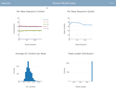
A screenshot of fastq.bio in action (Large preview)

We won’t go into the details of the calculations, but in a nutshell, the plots above provide scientists a sense for how well the sequencing went and are used to identify data quality issues at a glance.

Although there are dozens of command line tools available to generate such quality control reports, the goal of fastq.bio is to give an interactive preview of data quality without leaving the browser. This is especially useful for scientists who are not comfortable with the command line.

The input to the app is a plain-text file that is output by the sequencing instrument and contains a list of DNA sequences and a quality score for each nucleotide in the DNA sequences. The format of that file is known as “FASTQ”, hence the name fastq.bio.

If you’re curious about the FASTQ format (not necessary to understand this article), check out the Wikipedia page for FASTQ. (Warning: The FASTQ file format is known in the field to induce facepalms.)

fastq.bio: The JavaScript Implementation

In the original version of fastq.bio, the user starts by selecting a FASTQ file from their computer. With the File object, the app reads a small chunk of data starting at a random byte position (using the FileReader API). In that chunk of data, we use JavaScript to perform basic string manipulations and calculate relevant metrics. One such metric helps us track how many A’s, C’s, G’s and T’s we typically see at each position along a DNA fragment.

Once the metrics are calculated for that chunk of data, we plot the results interactively with Plotly.js, and move on to the next chunk in the file. The reason for processing the file in small chunks is simply to improve the user experience: processing the whole file at once would take too long, because FASTQ files are generally in the hundreds of gigabytes. We found that a chunk size between 0.5 MB and 1 MB would make the application more seamless and would return information to the user more quickly, but this number will vary depending on the details of your application and how heavy the computations are.

The architecture of our original JavaScript implementation was fairly straightforward:

Randomly sample from the input file, calculate metrics using JavaScript, plot the results, and loop around

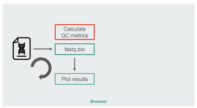
The architecture of the JavaScript implementation of fastq.bio (Large preview)

The box in red is where we do the string manipulations to generate the metrics. That box is the more compute-intensive part of the application, which naturally made it a good candidate for runtime optimization with WebAssembly.

fastq.bio: The WebAssembly Implementation

To explore whether we could leverage WebAssembly to speed up our web app, we searched for an off-the-shelf tool that calculates QC metrics on FASTQ files. Specifically, we sought a tool written in C/C++/Rust so that it was amenable to porting to WebAssembly, and one that was already validated and trusted by the scientific community.

After some research, we decided to go with seqtk, a commonly-used, open-source tool written in C that can help us evaluate the quality of sequencing data (and is more generally used to manipulate those data files).

Before we compile to WebAssembly, let’s first consider how we would normally compile seqtk to binary to run it on the command line. According to the Makefile, this is the gcc incantation you need:

# Compile to binary
$ gcc seqtk.c
-o seqtk
-O2
-lm
-lz

On the other hand, to compile seqtk to WebAssembly, we can use the Emscripten toolchain, which provides drop-in replacements for existing build tools to make working in WebAssembly easier. If you don’t have Emscripten installed, you can download a docker image we prepared on Dockerhub that has the tools you’ll need (you can also install it from scratch, but that usually takes a while):

$ docker pull robertaboukhalil/emsdk:1.38.26
$ docker run -dt –name wasm-seqtk robertaboukhalil/emsdk:1.38.26

Inside the container, we can use the emcc compiler as a replacement for gcc:

# Compile to WebAssembly
$ emcc seqtk.c
-o seqtk.js
-O2
-lm
-s USE_ZLIB=1
-s FORCE_FILESYSTEM=1

As you can see, the differences between compiling to binary and WebAssembly are minimal:

Instead of the output being the binary file seqtk, we ask Emscripten to generate a .wasm and a .js that handles instantiation of our WebAssembly module
To support the zlib library, we use the flag USE_ZLIB; zlib is so common that it’s already been ported to WebAssembly, and Emscripten will include it for us in our project
We enable Emscripten’s virtual file system, which is a POSIX-like file system (source code here), except it runs in RAM within the browser and disappears when you refresh the page (unless you save its state in the browser using IndexedDB, but that’s for another article).

Why a virtual file system? To answer that, let’s compare how we would call seqtk on the command line vs. using JavaScript to call the compiled WebAssembly module:

# On the command line
$ ./seqtk fqchk data.fastq

# In the browser console
> Module.callMain([“fqchk”, “data.fastq”])

Having access to a virtual file system is powerful because it means we don’t have to rewrite seqtk to handle string inputs instead of file paths. We can mount a chunk of data as the file data.fastq on the virtual file system and simply call seqtk’s main() function on it.

With seqtk compiled to WebAssembly, here’s the new fastq.bio architecture:

Randomly sample from the input file, calculate metrics within a WebWorker using WebAssembly, plot the results, and loop around

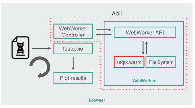
Architecture of the WebAssembly + WebWorkers implementation of fastq.bio (Large preview)

As shown in the diagram, instead of running the calculations in the browser’s main thread, we make use of WebWorkers, which allow us to run our calculations in a background thread, and avoid negatively affecting the responsiveness of the browser. Specifically, the WebWorker controller launches the Worker and manages communication with the main thread. On the Worker’s side, an API executes the requests it receives.

We can then ask the Worker to run a seqtk command on the file we just mounted. When seqtk finishes running, the Worker sends the result back to the main thread via a Promise. Once it receives the message, the main thread uses the resulting output to update the charts. Similar to the JavaScript version, we process the files in chunks and update the visualizations at each iteration.

Performance Optimization

To evaluate whether using WebAssembly did any good, we compare the JavaScript and WebAssembly implementations using the metric of how many reads we can process per second. We ignore the time it takes for generating interactive graphs, since both implementations use JavaScript for that purpose.

Out of the box, we already see a ~9X speedup:

Bar chart showing that we can process 9X more lines per second

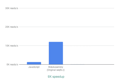
Using WebAssembly, we see a 9X speedup compared to our original JavaScript implementation. (Large preview)

This is already very good, given that it was relatively easy to achieve (that is once you understand WebAssembly!).

Next, we noticed that although seqtk outputs a lot of generally useful QC metrics, many of these metrics are not actually used or graphed by our app. By removing some of the output for the metrics we didn’t need, we were able to see an even greater speedup of 13X:

Bar chart showing that we can process 13X more lines per second

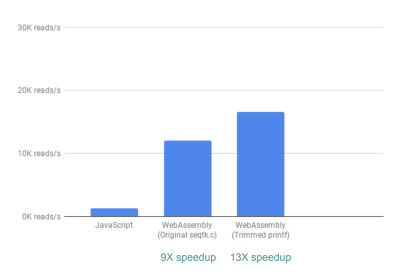
Removing unnecessary outputs gives us further performance improvement. (Large preview)

This again is a great improvement given how easy it was to achieve—by literally commenting out printf statements that were not needed.

Finally, there is one more improvement we looked into. So far, the way fastq.bio obtains the metrics of interest is by calling two different C functions, each of which calculates a different set of metrics. Specifically, one function returns information in the form of a histogram (i.e. a list of values that we bin into ranges), whereas the other function returns information as a function of DNA sequence position. Unfortunately, this means that the same chunk of file is read twice, which is unnecessary.

So we merged the code for the two functions into one—albeit messy—function (without even having to brush up on my C!). Since the two outputs have different numbers of columns, we did some wrangling on the JavaScript side to disentangle the two. But it was worth it: doing so allowed us to achieve a >20X speedup!

Bar chart showing that we can process 21X more lines per second

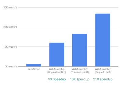
Finally, wrangling the code such that we only read through each file chunk once gives us >20X performance improvement. (Large preview)

A Word Of Caution

Now would be a good time for a caveat. Don’t expect to always get a 20X speedup when you use WebAssembly. You might only get a 2X speedup or a 20% speedup. Or you may get a slow down if you load very large files in memory, or require a lot of communication between the WebAssembly and the JavaScript.

Conclusion

In short, we’ve seen that replacing slow JavaScript computations with calls to compiled WebAssembly can lead to significant speedups. Since the code needed for those computations already existed in C, we got the added benefit of reusing a trusted tool. As we also touched upon, WebAssembly won’t always be the right tool for the job (gasp!), so use it wisely.

Further Reading

“Level Up With WebAssembly,” Robert Aboukhalil
A practical guide to building WebAssembly applications.
Aioli (on GitHub)
A framework for building fast genomics web tools.
fastq.bio source code (on GitHub)
An interactive web tool for quality control of DNA sequencing data.
“An Abridged Cartoon Introduction To WebAssembly,” Lin Clark

Smashing Editorial
(rb, ra, il)

Collective #505

Original Source: http://feedproxy.google.com/~r/tympanus/~3/Bxenxt_Awkk/

C505_WOTW

Inspirational Website of the Week: Dogstudio

A perfect symphony of exciting WebGL, modern typography and great layout. Our pick this week.

Get inspired

C489_NW

This content is sponsored via Syndicate Ads
Northwestern’s Online MS in Information Design and Strategy

Build the in-demand skills, such as UX, UI, and HCI, needed to drive user interactions. Choose a specialization in content strategy, analytics, or learning design.

Apply now

C505_yetanother

Yet Another JavaScript Framework

A wonderful article by Jason Hoffman on the history of JavaScript frameworks and the legacy they left behind.

Read it

C505_CSSBattle

CSSBattle

Use your CSS skills to replicate targets with smallest possible code.

Play it

C505_vertigo

Accessibility for Vestibular Disorders: How My Temporary Disability Changed My Perspective

Facundo Corradini shares his experience with temporary vertigo and how it changed his mindset on accessibility for good.

Read it

C505_zindex

Managing Z-Index In A Component-Based Web Application

Pavel Pomerantsev describes an approach for successfully managing stacking in a web app.

Read it

C505_Dogstudio

Some dogstudio.co insights

Kevin Chapelier provides some valuable insight into the initial implementation of the WebGL/three.js dog scene on dogstudio.co.

Check it out

C505_component

A progressive disclosure component

Andy Bell discusses some key elements of a progressive and accessible disclosure component.

Read it

C505_editor

Editor.js

The next generation block styled editor got a major update.

Check it out

C505_grass

Grass

A stunning grass shader with three.js by Al Ro.

Check it out

C505_hip

You probably don’t need that hip web framework

Owen Williams explains why obsession with finding better frameworks is killing ideas before they reach the world.

Read it

C505_api

Upcoming WebHID API – access Bluetooth/USB HID devices in web applications

Robat Williams takes a look at the exciting, yet to be released WebHID API and shows what you might be able to do with it.

Read it

C505_onlick

How I failed the <a>

Remy Sharp shares how and why you should be extra careful when adding onClick to a component.

Read it

C505_gimli

Gimli

A promising looking Visual Studio Code extension enabling smart visual tools for front-end developers. You can back it on Kickstarter.

Check it out

C505_pagination

combine-pagination

A JavaScript library for paginating across multiple data sources at once, whilst retaining the sort order.

Check it out

C505_danhooks

Dan Abramov teaches me React Hooks

Watch Mattias Petter Johansson get a React Hooks master class by Dan Abramov in this Fun Fun Function live stream recording.

Watch it

C505_xray

x-ray

In case you didn’t know it: A simple HTML debugger, executable by bookmark, that let’s you visualize the HTML structure of a website.

Check it out

C505_icons

Remix Icon

A great set of open source neutral style system symbols.

Get it

C505_Font

Free Font: Explorer

A playful uppercase typeface by Kristaps Zelmenis.

Get it

C505_colortheory

Color theory for designers – a crash course

An infographic that will teach you some important aspects of color theory applied to web design. By Micah Bowers.

Check it out

C505_shoperr

shoperr

With shoperr you can create your own custom shop in minutes, and stock up on referral links to your favorite products.

Check it out

C505_slideshow

From Our Blog
Crossroads Slideshow

An experimental slideshow with an inclined look, three slide previews and a content view on click.

Check it out

Collective #505 was written by Pedro Botelho and published on Codrops.

How to Build a News App with Ionic 4 & Angular

Original Source: https://www.sitepoint.com/ionic-4-angular-build-app/

In this tutorial we’ll be using Ionic 4 to build a news application that makes use of a third-party news API.

Ionic 4 is the latest version of Ionic, a mobile framework originally built on top of Cordova and Angular. Ionic allows users to create hybrid mobile apps with HTML, CSS and JavaScript and their related web technologies.

What makes Ionic 4 the best version yet is that it’s now framework agnostic. This means it’s not dependent on Angular anymore, and you you’ll be able to use it with any framework or library you are familiar with, or with plain JavaScript.

But at the time of this writing, Ionic CLI only supports generating Ionic projects based on Angular, so we’ll be using an Angular/Ionic project to build our news application.

See a hosted version of the application we’ll be building and grab the source code from this GitHub repository.

Prerequisites

Let’s get started with the prerequisites you need to be able to follow this tutorial comfortably.

The post How to Build a News App with Ionic 4 & Angular appeared first on SitePoint.

The best iPad stylus in 2019: top iPad styluses for drawing and note-taking

Original Source: http://feedproxy.google.com/~r/CreativeBloq/~3/2tklqxlfueg/best-ipad-stylus

If you want to use one of the many fantastic iPads available now as a tool for drawing, you're going to need a stylus. Your impulse may well be to simply pick up the Apple Pencil, and while this is a great buy and you won't go wrong with it, we'd recommend taking a moment to consider some of the alternative options out there. 

There are many iPad-compatible styluses available from other manufacturers, and many of them are extra-attractive by virtue of the fact that they cost considerably less than Apple's version. We've picked out the best of the best styluses available right now, for all iPad users and all budgets, so you can find which one is right for you and get to drawing.

The best tablets with a stylus for drawing and note-taking

In the following guide, we'll walk you through the best iPad styluses with integrated buttons that you can customise for different functions, and we'll help you decide whether an iPad stylus with a hard nib or soft nib is likely to be better for your requirements. Read on to find out exactly what stylus for your iPad you should buy – and where to buy it for the best price.

Apple Pencil next to two iPads showing artwork

The new Apple Pencil (2018) works with the third-generation 12.9-inch iPad Pro or the 11-inch iPad Pro. The original Apple Pencil works with iPad Pro 12.9-inch (second and first generation), iPad Pro 10.5-inch, iPad Pro 9.7-inch and iPad (6th generation).

The Apple Pencil is, of course, the natural choice of stylus for iPad – but only if you own one of the two iPad models that are compatible with it: an iPad Pro or sixth-generation iPad (2018). If you do, there isn't a better stylus to write and draw with on the market. Not only is it exceptionally comfortable to use, Apple has eliminated many of the issues that can dog other styluses – such as inadequate palm rejection and clear lag that instantly makes you feel disconnected to what you're producing on the screen. The astonishing pressure levels mean that the Apple Pencil reproduces your movements perfectly, at even the most acute angles, and it enhances all your favourite creative iOS apps. The bottom line is that if you've forked out the cash for an iPad Pro, you'd be daft not to swallow the extra expense and go straight for an Apple Pencil.

Also read: Apple Pencil review

Wacom boasts an industry-leading reputation thanks to its fabulous range of dedicated drawing tablets. So it's only natural that the company produces an attractive line of styluses as well. As well as being our favourite iPad stylus for artists, the Wacom Bamboo Sketch also takes the plaudits for general use on the iPad Air and iPad Mini series thanks to its compatibility with iOS devices. Rather than trying to exactly mimic a traditional rounded pen, the Bamboo Sketch favours an ergonomic triangular design for better grip. It's an excellent all-rounder, but its fine tip and pressure-sensitive nibs make it just about as close an experience to sketching on paper as you can get. With an epic battery life (recharged via USB) it uses Bluetooth to connect to your iPad, which brings the integrated shortcut buttons into play, too, enabling you to set up handy shortcuts within your chosen iOS apps.

Despite the fact that you can snag one for less than £30, the Hahakee iPad stylus does a good job of feeling like a premium product, thanks to an aluminium alloy build with a polished finish. It's pleasant to hold and use, and thanks to the healthy forty-hour battery life, you'll find yourself easily getting lost in your projects before it needs a charge. Charging is accomplished via the micro-USB port concealed in the top. With a fine tip, the Hahakee stylus is pleasingly precise, and spare nibs in the box ensure it'll keep on being usable for a long time (indeed, probably considerably longer than the iPad you're drawing on). It's no Apple Pencil, but for the money, it's a great buy.

Adonit has been refining its stylii for more than eight years now, and the Pixel is still one of its best for drawing on iPad. Bluetooth enabled and compatible with many of the sorts of apps creatives will likely be using on their tablets, the Pixel boasts 2048 levels of pressure sensitivity and a range of function buttons on its body that can be assigned to the user's preferred tools (though be warned these can be easy to knock accidentally if you're not paying attention). The battery should last for about 15 hours of use, allowing you to get really stuck into your projects, and the sleek design makes the Pixel stylus genuinely enjoyable to use.

If you're not sold on the idea of spending upwards of $20/£20 on a simple pointing device, and don't need the specialised functioning of the iPad styluses above, then Adonit's budget option – the Adonit Mark – is worth considering. Despite its cheap price tag, this stylus has been designed to feel as comfortable as possible in your hand, with its triangular anti-roll design. It retains the precision you'd expect from the sole-purpose stylus manufacturer, largely thanks to its smudge-free mesh tip. The Adonit Mark won't win any innovation awards, but if you just want a stylus for navigating around your iPad, you won't find a better cheaper iPad stylus than this. 

Related articles:

The best tablets with styluses10 top new best tools for traditional artists Best cheap Wacom tablets you can buy

9 Time Tracking Apps for Freelancers

Original Source: http://feedproxy.google.com/~r/1stwebdesigner/~3/Bdbz1qkfd8s/

When you’re not working on the typical schedule of a nine-to-five job, it’s easy to lose track of all those hours. Where is all that time going? If you’re struggling to stay on task, or just want to make the most of your hours, one of these time tracking apps is just the thing. It’s time to reclaim your work life!

Toggl

Toggl

How does free/cheap time tracking software sound? Toggl is flexible and designed for teams of any size. One-click timers turn into valuable insight and business statistics, so you can reclaim those lost hours. Super affordable per-user billing means you don’t need to pay more than the app is worth, and teams up to five can use Toggl for free!

Harvest

Harvest

Harvest is a business-oriented time tracking app, rich with features and loaded with everything you need to keep you and your team on target. The program works by letting you set timers or fill out a timesheet yourself – super simple. Manage projects, see how your team is doing and bill clients from your phone, desktop or browser.

Clockify

Clockify

A simple time tracker, 100% free with no strings attached. Clockify was created because every team and freelancer should have an easy way to track their time. It may not have the flashy features of other apps, but it does exactly what you need. Individual, team and project tracking, hassle-free.

DropTask

DropTask

Made for visual thinkers, DropTask is the free management software for those looking for something a little more flexible. If other software is too restrictive, you’ll be pleased with this app. Work alone or together in real time with two teammates, or try the business version if you need even more control.

RescueTime

RescueTime

Time to create a balanced work-life schedule! RescueTime runs in the background and creates a report on what apps and websites you’ve spent your time on, letting you accurately identify distractors.

The software is free, but the premium version lets you block websites or set up alerts. RescueTime for organizations offers insight into your employees’ habits while allowing them to keep their privacy with generalized reports.

Hubstaff

Hubstaff

Running a freelancing team? Hubstaff is made for businesses and freelancers who need a way to track employees’ time spent. You can also use it for free by yourself! This is an all-in-one program that includes time tracking features as well as payroll, invoicing, scheduling, and more.

Billings Pro

Billings Pro

The no-nonsense slogan sums it up pretty well: “Track, invoice, and get paid”. Send clients quotes, track your billable time while creating helpful reports and send an invoice when you’re done. Simple and to the point. The cross-platform app even has Apple Watch support!

Hours

Hours

Hours is easy to sign up for, easier to use, and lets you switch between timers with just a tap. The app’s timeline feature allows you to easily adjust your logged hours when there’s a mistake and get more accurate reports. You can use it on any device or right in the browser.

TimeCamp

TimeCamp

Need a free way to track what you’re doing on your computer? Try TimeCamp. For one user, the app is free forever. And its reports are super detailed, down to logging when you turn your PC on or off. With the paid versions, you get team support and access to dozens of helpful addons.

Eliminate Distractions

Time is money. How much is yours worth? When work isn’t getting done and you’re not sure why, it’s time to turn to one of these awesome time tracking apps. It can really be enlightening to learn how much time you spend on distractions throughout the day. And, armed with this knowledge, you’ll be able to cut out those wasteful hours and stay productive.


Managing Z-Index In A Component-Based Web Application

Original Source: https://www.smashingmagazine.com/2019/04/z-index-component-based-web-application/

Managing Z-Index In A Component-Based Web Application

Managing Z-Index In A Component-Based Web Application

Pavel Pomerantsev

2019-04-03T14:00:08+02:00
2019-04-03T16:05:46+00:00

If you’ve done any complex web UI development, you must have at least once furiously tried driving an element’s z-index up to thousands, only to see that it’s not helping position it on top of some other element, whose z-index is lower or even not defined at all.

Why does that happen? And more importantly, how to avoid such issues?

In this article, I’ll recap what z-index actually is and how you can stop guessing whether it might work in any specific case and start treating it just like any other convenient tool.

The Hierarchy Of Stacking Contexts

If you imagine the webpage as having three dimensions, then z-index is a property that defines the z coordinate of an element (also called its “stacking order”): the larger the value, the closer the element is to the observer. You can also think of it as a property affecting paint order, and this will in fact be more correct since the screen is a two-dimensional grid of pixels. So, the larger the z-index value, the later the element is painted on the page.

There is, however, one major complication. The z-index value space is not flat — it’s hierarchical. An element can create a stacking context which becomes the root for z-index values of its descendants. It would be best to explain the concept of stacking contexts by using an example.

The document body has five div descendants: div1, div2, div3, div1-1, and div2-1. They’re all absolutely positioned and overlap with each other. div1-1 is a child of div1, and div2-1 is a child of div2.

See the Pen stacking-contexts by Pavel Pomerantsev.

Let’s try to understand why we see what we see. There are quite elaborate rules to determine paint order, but here we only need to compare two things:

z-index Values
If an element has a higher z-index, it’s painted later.
Source Order
If z-index values are the same, then the later it’s in the source, the later it’s painted.

So if we don’t take stacking contexts into account, the order should be as follows:

div1
div2
div3
div1-1
div2-1

Note that div2-1 is in fact overlapped by div3. Why is that happening?

If an element is said to create a stacking context, it creates a basis for its children’s z-index values, so they’re never compared with anything outside the stacking context when determining paint order. To put it another way, when an element creating a stacking context is painted, all its children are painted right after it and before any of its siblings.

Going back to the example, the actual paint order of body’s descendant divs is:

div1
div2
div3
div1-1

Notice the absence of div2-1 in the list — it’s a child of div2 which creates a stacking context (because it’s an absolutely positioned element with a z-index other than the default value of auto), so it’s painted after div2, but before div3.

div1 doesn’t create a stacking context, because its implicit z-index value is auto, so div1-1 (its child) is painted after div2 and div3 (since its z-index, 10, is larger than that of div2 and div3).

Don’t worry if you didn’t fully grasp this on first reading. There’s a bunch of online resources that do a great job in explaining these concepts in more detail:

“The Stacking Context,” MDN web docs, Mozilla
“What No One Told You About Z-Index,” Philip Walton

Note: It’s also great to be familiar with general paint order rules (which are actually quite complex).

The main point of this piece, however, is how to deal with z-index when your page is composed of dozens and hundreds of components, each potentially having children with z-index defined.

One of the most popular articles on z-index proposes grouping all z-index values in one place, but comparing those values doesn’t make sense if they don’t belong to the same stacking context (which might not be easy to achieve in a large application).

Here’s an example. Let’s say we have a page with header and main sections. The main section for some reason has to have position: relative and z-index: 1.

See the Pen z-index-step1 by Pavel Pomerantsev.

We’re using a component architecture here, so CSS for the root component and every child component is defined in dedicated sections. In practice, components would live in separate files, and the markup would be generated using a JavaScript library of your choice, like React, but for demonstration purposes it’s fine to have everything together.

Now, imagine we’re tasked with creating a dropdown menu in the header. It has to be stacked on top of the main section, of course, so we’ll give it a z-index of 10:

See the Pen z-index-step2 by Pavel Pomerantsev.

Now, a few months later, in order to make something unrelated work better, we apply the translateZ hack to the header.

See the Pen z-index-step3 by Pavel Pomerantsev.

As you can see, the layout is now broken. An element with z-index: 1 sits on top of an element with z-index: 10, in the absence of any other z-index rules. The reason is that the header now creates a stacking context — it’s an element with a transform property whose value is anything other than none (see full rules) and its own z-index (0 by default) is lower than that of the main section (1).

The solution is straightforward: give the header a z-index value of 2, and it’ll be fixed.

See the Pen z-index-step4 by Pavel Pomerantsev.

The question is, how are we supposed to come to this solution if we have components within components within components, each having elements with different z-indices? How can we be sure that changing z-index of the header won’t break anything else?

The answer is a convention that eliminates the need for guesswork, and it’s the following: changing z-indices within a component should only affect that component, and nothing else. To put it differently, when dealing with z-index values in a certain CSS file, we should ideally only concern ourselves with other values in that same file.

Achieving it is easy. We should simply make sure that the root of every component creates a stacking context. The easiest way to do it is to give it position and z-index values other than the default ones (which are static and auto, respectively).

Here’s one of the ways to structure the application. It uses more elements than the previous one, but computation associated with extra DOM elements is cheap whereas developer’s time (a lot of which can sometimes be spent on debugging stacking issues) is definitely not.

See the Pen z-index-step5 by Pavel Pomerantsev.

header__container and main__container both have position: relative and z-index: 0;
header__overlay now has z-index: 1 (we don’t need a large value since it’s only going to compete for stacking order with other elements within the header);
root__header now has z-index: 2, whereas root__main keeps its z-index: 1, and this is what makes the two siblings stack correctly.

(Note also that both have position: relative since z-index doesn’t apply to statically positioned elements.)

If we look at the header code now, we’ll notice that we can remove the z-index property from both the container and the overlay altogether because the overlay is the only positioned element there. Likewise, the z-index is not required on the main container. This is the biggest benefit of the proposed approach: when looking at z-indices, it’s only the component itself that matters, not its context.

See the Pen z-index-step6 by Pavel Pomerantsev.

Such an architecture is not without its drawbacks. It makes the application more predictable at the expense of some flexibility. For example, you won’t be able to create such overlays inside both the header and the main section:

See the Pen z-index-step7 by Pavel Pomerantsev.

In my experience, however, this is rarely a problem. You could make the overlay in the main section go down instead of up, in order for it to not intersect with the header. Or, if you really needed it to go up, you could inject the overlay HTML at the end of the body and give it a large z-index (“large” being whatever’s larger than those of other sections at the top level). In any case, if you’re not in a competition to build the most complicated layout, you should be fine.

To recap:

Isolate components in terms of z-index values of elements by making the root of each component a stacking context;
You don’t have to do it if no element within a component needs a z-index value other than auto;
Within a component’s CSS file, maintain z-index values any way you like. It might be consecutive values, or you could give them a step of 10, or you can use variables — it all depends on your project’s conventions and the size of the component (although making components smaller is never a bad thing). Preferably, only assign z-index to sibling elements. Otherwise, you may inadvertently introduce more stacking contexts within a component, and you’re faced with the same issue again, luckily on a smaller scale;
Debugging becomes easy. Find the first ancestor component of the two elements that are not stacked correctly, and change z-indices within that component as necessary.

This approach will hopefully bring back some sanity to your development process.

Smashing Editorial
(dm, ra, il)

The best tablets with a stylus for drawing and note-taking in 2019

Original Source: http://feedproxy.google.com/~r/CreativeBloq/~3/4-zu1wyOKKM/the-best-tablets-with-a-stylus-for-drawing-and-note-taking

We're sure that as a creative you love notepads, pencils and everything else that's stationery-tastic. However, even if you're the biggest stationery nerd on the planet, a tablet with a stylus is a fantastic thing to buy and can be a real asset to your creative work. A tablet with a stylus is a hugely useful tool for getting your work done, and it's well worth looking into getting hold of one.

What's best of all is that you absolutely do not need to spend a fortune on a tablet with a stylus. Whether you're looking to work with an iOS, Android, Mac or Windows operating system, there are plenty of options available for knock-down prices. We've scoured the internet to suss out which are the best of the best, and present to you the best tablets with a stylus that money can buy right now, so that you can make the right decision for what you need. And if you're after a bargain, we've included some bargain options too.

Let's get started…

Apple iPad Pro 12.9 (2018)

The iPad Pro has received a big makeover for 2018, with a new edge-to-edge liquid retina LCD display, an A12X Bionic chip (which can outperform Intel-based laptops) and a new version of the Apple Pencil that attaches to the side of the iPad magnetically, with wireless charging. The result? Our pick for the best tablet with a stylus on the market right now. 

The iPad Pro has dropped Apple’s Lightning connector for USB-C, meaning it now works with a range of peripherals, including external displays.

With the 12.9-inch screen, this is one of the largest tablets on the market, and that means it’s a brilliant digital canvas for you to sketch out your ideas, using one of the brilliant drawing apps for the iPad in the App Store.

So what's the downside? Well, this laptop-like performance means laptop-like prices. You won’t see much change from £1000 for the smallest 64GB storage, and you’re certain to want more. Add on the additional expense of the Pencil and this is the most expensive iPad ever made by some margin.

Read more: iPad Pro review

Microsoft Surface Pro 6

The 2018 Surface Pro is a small update over the Pro 2017 model, with a slightly better screen and battery life, but it remains our top choice for a Windows tablet. Unlike Android or iOS devices, you’re getting a tablet that will run full-fat desktop software – so think Creative Cloud  apps such as Photoshop CC without any compromise on features or performance – and use it with Microsoft’s excellent Surface Pen stylus.

In fact the Surface Pro has an Intel quad-core chip, of the same variety that you might find in a laptop. So you can expect it to sail swiftly through tricky filters and have no problem loading complex designs.

And being a Windows PC at its core, it will have no problem connecting to any peripheral you could think of. That said, Microsoft hasn’t yet bestowed a faster USB 3.1 Gen 2 port on the Surface, a missed opportunity for 2018. 

Read more: Microsoft Surface Pro review

Samsung Galaxy Tab S4

If iOS leaves you cold, or you’re already heavily invested in Android software, then the Galaxy Tab S4 is a welcome update to Samsung’s tablet line, and brings in some great new features.

It has an upgraded 10.5-inch screen with a 2560 x 1600 resolution and thinner bezels. A new 2.1 lockable mode uses the DeX software to mimic a PC interface when connected to Samsung’s Book Keyboard Cover, complete with resizable windows and a task bar.

12 essential tools for graphic designers

Being free from Apple’s grasp, there are some advantages to going with Android over iOS. The Galaxy Tab S4 bundles a Samsung S Pen with the device, and it'll set you back around $660/£600, making it much better value for money. And thank the heavens, you can expand the internal storage with SD cards.

Wacom Cintiq 22HD touch pen display

If you're primarily looking for a tablet with a stylus for drawing, consider investing in a dedicated drawing tablet. Our favourite is the Wacom Cintiq 22HD: its large dimensions (it's not really one for shoving in your bag too often) mean that you get a total of 50cm x 30cm of total drawing area – perfect if you want a more detailed design than most normal tablets allow you to execute. The super sensitive stylus won't hurt to this end, either – we can't think of another drawing tablet out there that will give you more accurate results.

The integrated stand means that you can adjust the angle of the tablet to suit your preferred stance and the full HD display boasts over 16 million colours. If you can afford it, the Wacom Cintiq 22HD could have a major impact on the quality of your work.

Read more: The best drawing tablet

Lenovo Yoga Book

We eyed the Lenovo Yoga Book with a combination of intrigue and suspicion when it was first announced. It's a kind of tablet-laptop hybrid with a digital, capacitive keyboard that doubles up as a handwriting or drawing surface. But the result is a tablet with a stylus that's well worth owning. 

The traditional surface is 10.1-inch 1,920 x 1,200 resolution screen, which again hits that magic number of 16.7 million colours. The second surface is that capacitive Halo Keyboard, which – despite the lack of digital keys – is accurate enough to take quick notes straight to your chosen word-processing app. Prefer the old-fashioned method? Then you can utilise the included Real Pen stylus instead and use the Halo surface as a digital notebook, with the added bonus of seeing your scribblings saved immediately into your onboard storage.

We know the Yoga Book won't be for everyone (the 180-degree fold back screen means it's much chunkier than most other traditional tablets), but Lenovo's unique proposition means its well worth considering if you can't decide between a laptop and a tablet.

Huawei MediaPad M5 Pro

Huawei seems to have an army of tablets in its arsenal, ranging from the basic MediaPad M3 model, which is super-affordable and can do simple note taking, to this Pro model, with some real performance under the hood. This tablet still won't set you back anywhere nearly as much as the iOS or Windows tablets, and is a genuinely good option.

Despite the relatively low price point, you still get an excellent screen and sufficient power for most tasks. The sleek, light aluminium frame is practical and won't embarrass you if you pull it out at a coffee shop.

It's also worth noting that if you've got little ones, Huawei recently unveiled a 'Lite' version that's lower-specced, (slightly) lower-priced and designed for younger users. You can head over to TechRadar to read a hands-on review of the Lite tablet – while it's a nice addition to the range, the kid-friendly focus means the M5 Pro is very much still the better buy for creatives.

The best stylus to buy for your tablet

If you choose one of the tablets above that doesn't come with a stylus in the box, then we can help you pick out a pencil to purchase:

Related articles:

The best drawing tablets money can buy4 alternatives to traditional sketchbooksHow to draw: 100 tutorials

Create perfect user flows

Original Source: http://feedproxy.google.com/~r/CreativeBloq/~3/o4K3CZxkUDc/create-perfect-user-flows

What exactly is a user flow? Visually, it's a bit like a dance mat. Right foot here. Left foot over there. Now bring them together, turn and repeat. Without knowing how to dance, you're still able to stand on this mat and move along with your feet stepping in the right places in the right order. A user flow is just that. A loose but coordinated dance with your website. It's important that you know where a user will step and in what order for that dance to go well.

Working through the expectations of users and crafting an overall positive user experience can be a complicated mixture of data points, use cases, wireframes and prototypes to connect the dots before the project is fully built out. With so many moving parts, it's easy to get tripped up or have a stakeholder misunderstand the vision. 

The 20 best wireframe tools

Unlike a design showcasing what a user will interact with after development, the role of a user flow is to set the ground rules for what the subsequent wireframes and designs will represent. It's the strategy document to design how the user flows from point to point.

What you need for a user flow

Apply user flows to work out how navigation will work in apps, as well as websites

Whether you work for an agency or directly with a client as a freelancer, you're probably no stranger to the confusion that comes with sharing early designs with a client. In your head, you understand the intricacies of how each block of content fits into the overall experience and it's glorious. Then you show someone else or, even worse, the client and they don't get it. They get hung up on the wrong details, often because they don't have the full vision in front of them yet. Which is where strategy documents that outline purpose – like a user flow – come in handy to keep things moving forward.

To do that, you'll need the following:

Business goals
Why do you want someone to visit your website? You can typically get these from your point of contact with a brief conversation. Are they launching a new service, product or trying to generate traffic for a specific area of the site? The more granular you can get the better. Goals lead to accountability from all sides and will benefit the users.

User goals
Why is someone actually visiting your website? Be hesitant to take these directly from the client unless they have done user testing or some kind of data-driven research to support it. Otherwise you'll end up with the same business goals with a different twist. 

Entry points and user types
Based on the data, where are users landing right now? Do users typically land on a blog post? On a portfolio piece or a featured product? More importantly, how are they getting there? If organic traffic is driving mostly to the blog, those users may flow between secondary or tertiary pages differently than someone coming in from a referring website, social media or an email campaign. You may need to map them out differently to properly showcase the flow.

Yellow Brick Roads (YBRs)
What is the ideal path for users to travel between pages to meet both the business and user goals? To get them from the entry point to the results-driven destination? As users flow in non-linear ways, what are the edge cases that users may flow into? For example, if your YBR is a blog post landing page that clicks through to a service page and then the contact page, where might some users get lost? Do some users end up on the about page? Where do they go from there? Map out those edge cases and how they branch off from your ideal scenarios.

A lo-fi wireframe is useful for getting a rough idea of how a page works

You can extract the last two points with Google Analytics and the User Explorer feature for individual user flow paths or the Users Flow section to see a 10,000 foot view of trending paths for all users on the site. Both are worth getting familiar with (see our top tools in Google Analytics post). 

Think of the dance mat. Where do users place their feet first (landing page)? Where does each foot go next (page two, three, four, etc)? Show that in a flow chart for each user type or goal. 

There are plenty of plugins, frameworks or software solutions that can be used to create diagrams; let's look at what the deliverable should be in a user flow.

Easily shared and printed. This may seem like a no-brainer but you'd be surprised how often people bring printouts for diagrams that are unreadable. If there are too many steps or too much text to fit clearly on an 8.5 x 11-inch printout, you're overcomplicating things.Bridge the communication gap between clients, stakeholders, designers and developers. Flows show how a user will navigate and interact with the site jumping between pages. This is important to give a framework for everyone to unify their understanding moving forward.Showcase the path(s) toward each priority business and customer goal, common entry point pathways and a streamlined YBR pathway that offers up missed opportunities for key content. For clarity, this does not happen in a single flow. This will be multiple stand-alone flows.

With buy-in from stakeholders, you can take these user flow documents and use them to inform the designers creating wireframes to ensure they follow the core user experience strategies. They can be treated like a check list to validate the project is meeting the goals at each step.

 generate New York 2019

Learn more about UX and more at generate New York 2019. Click the image to book your ticket

Expand user flows into wireframes

Map out edge cases and consider how they branch off from your ideal scenarios

Most of us have experience with wireframes in some form. Wireframes are used to represent the strategy behind a website layout. Sometimes they will be handed off to developers to begin building the bones of the infrastructure. They're the blueprint to the home. They help stakeholders understand the 'why' of the strategy without getting roped into details like fonts, colours or content. 

Many times someone responsible for the user experience or design of a project will jump directly into the wireframe because they construct their own mental model of a user flow. The problem with that is they run the risk of internalising strategy, applying unforeseen bias, repurposing old ideas and may become a bottleneck between the design and the communication of the design. Clear communication is paramount.

User flows will help mitigate those risks because they pass down structured communication. It adds a layer of checkpoints.

There are various levels of visual fidelities when it comes to wireframing. Some prefer low-fidelity templated wireframes they can drop into place to represent the general information architecture of a given page. Others prefer high-fidelity wireframes that are very much designs but without the proper font, copy, colours and imagery in place. It's important to know your audience and what to use when. Realistically, if you are working from user flows you should move into a higher-fidelity wireframe that then grows into a prototype more easily. 

It’s a good idea to start on paper, whiteboard or some tablet sketching tool

It's a good idea to start on paper, whiteboard or some tablet sketching tool. This enables you to focus on the quick ideation of potential solutions to problem areas and keeping the user on the ideal pathway. 

To get started, you will need a list of each page to design and build into the website: home, about, service listing, etc. That acts as your checklist to ensure you don't miss anything. Start with rough sketches for each of those based on the goals you've uncovered previously. 

Where does the navigation go? How are you going to convey the business goals on the home page? Are you following a 12-column grid for speed of understanding the structure with a certain demographic or is it a more progressive interactive site that can exude a bit more expressive freedom? This is where you determine the best way to achieve the goals and build on top of a strong base.

User flow documents can inform the creation of wireframes , as in this example for Sullair

Once those rough sketches are complete, select one of your user flows. For example, if the ideal pathway is a blog post landing page that the user clicks through to a service page and then the contact page, test that out with your wireframes. Look at your blog post landing page: how would a user find the service page based on your structure? Is it clear? Is it truly a priority on that page's layout or is it just another link tucked away on the sidebar, footer or navigation?

The user flow becomes an auditor to your work, the unbiased fact checker to your wireframes. Even better, when you can show a client you've connected all of the dots they deemed a priority, they become very satisfied with the work at each step. It reminds them of why they hired you to do this in the first place. It's a relief and they will likely begin to settle into your full process. 

If you don't show you've provided a solution for those goals or a way to alleviate the existing pain points, each phase of your project will rely heavily on trust. Even with the best of us, that can only take you so far until comments like 'why didn't we catch that?' sneak into your conversations. The later those pop up, the more expensive they are to fix. The more often they pop up, the more that trust erodes. That's why following a process like this and supporting decisions with data and focus is so crucial.

Interactive prototypes

Showcase the path(s) toward each priority business and customer goal

Now you've validated the wireframe implementation with user flows, it's time to turn them into interactive prototypes. These are basically clickable static image files that enable you to jump to another image file to give the impression of navigating a website. Not only are these great for clients to experience, it's also very important to ensure your developers and designers are on the same page. That great layout idea may actually add 100 hours of development time and be out of scope. This kick-starts those conversations before time is wasted.

You or your design team may have a very clear vision for what this set of wireframes will evolve into in the weeks ahead. Maybe you're even taking the wireframes into a full design and prototyping that. That's not uncommon. But one problem persists. Those subtle hover states and microinteractions that support an intuitive user experience are hidden away inside of someone's mind. A stakeholder doesn't see that vision yet but prototypes can help.

Much like wireframing, prototypes can come in various fidelities. At Candorem we have used InVision for years because of the simplicity of creating sharable prototypes that focus on the user pathways between pages and key interactions or overlays. Drop in existing images and draw hot spots over links. Creating low-fidelity interactions then enables you to share a prototype within an hour, depending on complexity.

Bring out the hi-fidelity wireframes when you want to drill down into content in detail

Others may suggest using Adobe XD, which is far more robust in showcasing interactive elements of a design beyond page transitions. It's like if you combined Adobe's Creative Suite (get Adobe Creative Cloud here) with InVision as a single product. You could create your wireframes, full design concepts and prototypes in one fell swoop if you're organised enough. The important part is connecting the pages to craft an experience someone can click through and understand the vision.

It’s important to set expectations

Again, know your audience. Even with basic click-throughs in InVision, some clients confuse it with a built-out website. It's important to set expectations. Communicate exactly what it is you're showing a client with the prototype and, more importantly, what kind of feedback you are looking for at this stage. Are you looking for feedback on flow between those key pages in the user flow? Are you looking for feedback on the page transition animations in the prototype? The content that fits into the spaces and where it will come from? Communicate that. It will help you grow as a professional very quickly and the quality of your work will increase exponentially. 

You can judge the success of this process by beginning the prototype review on a key landing page like the blog from earlier. Ask someone in the review from the stakeholder team to click through to a specific page on the prototype and see what paths they take. Even in edge cases where the user travels down another path, as users travel in non-linear fashion, they should be able to locate the key pages that reflect a business goal. Your work must be accountable to that.

Your ability to showcase the critical thinking and implementation behind key decisions, as well as how you or your team have adapted your goals into an intuitive experience, is crucial. That's what enables you to reframe perspectives, move away from short-term trends and obtain support from the otherwise loudest people in the room. Strategy at every step.

This article was originally published in issue 315 of net, the world's best-selling magazine for web designers and developers. Buy issue 315 here or subscribe here.

Related articles:

10 rules for making user-friendly web formsPerformance UX: A primer10 steps to an engaging user experience

SitePoint Premium New Releases: DevOps Security, jQuery & Vue Projects

Original Source: https://www.sitepoint.com/sitepoint-premium-new-releases-devops-security-jquery-vue-projects/

We’re working hard to keep you on the cutting edge of your field with SitePoint Premium. We’ve got plenty of new books and mini-books to check out in the library — let us introduce you to them.

Learning jQuery 3 Fifth Edition

A step-by-step, practical tutorial on creating efficient and smart web apps and high-performance interactive pages with jQuery 3.0. Create a fully featured and responsive client-side app using jQuery. Explore jQuery 3.0 features and code examples updated to reflect modern JS environments.

Read Learning jQuery 3 Fifth Edition.

How to Develop and Test Vue Components with Storybook

Learn Storybook, an interactive environment for developing and testing UI components. It allows you to build components and play with them in isolation from the app that you’re building.

Read How to Develop and Test Vue Components with Storybook.

Build a Shopping List App with Vue, Vuex and Bootstrap Vue

Build a simple shopping list app using Vue, Vuex and Bootstrap. Along the way, you’ll discover how Vue’s official state management solution can help you manage state throughout your app as it grows.

Read Build a Shopping List App with Vue, Vuex and Bootstrap Vue.

Hands-On Security in DevOps

Protect your organization’s security at all levels with the latest strategies for securing DevOps at each layer of the pipeline. Discover security practices to protect your cloud services by detecting fraud and intrusion. Explore solutions to infrastructure security using DevOps principles.

Read Hands-On Security in DevOps.

Building a Vue Front End for a Headless CMS

Learn how to build a modern blog site using Vue.js and GraphCMS, a headless CMS platform that delivers content via GraphQL, for a faster and more customizable website than using WordPress.

Read Building a Vue Front End for a Headless CMS.

A New Library Interface

If you’re a Premium member, take our new library for a spin. We’ve launched a cleaner, faster library interface that makes tracking and resuming your current books much quicker.

And More to Come…

We’re releasing new content on SitePoint Premium almost every day, so we’ll be back next week with the latest updates. And don’t forget: if you haven’t checked out our offering yet, take our 7 day free trial for a spin.

The post SitePoint Premium New Releases: DevOps Security, jQuery & Vue Projects appeared first on SitePoint.