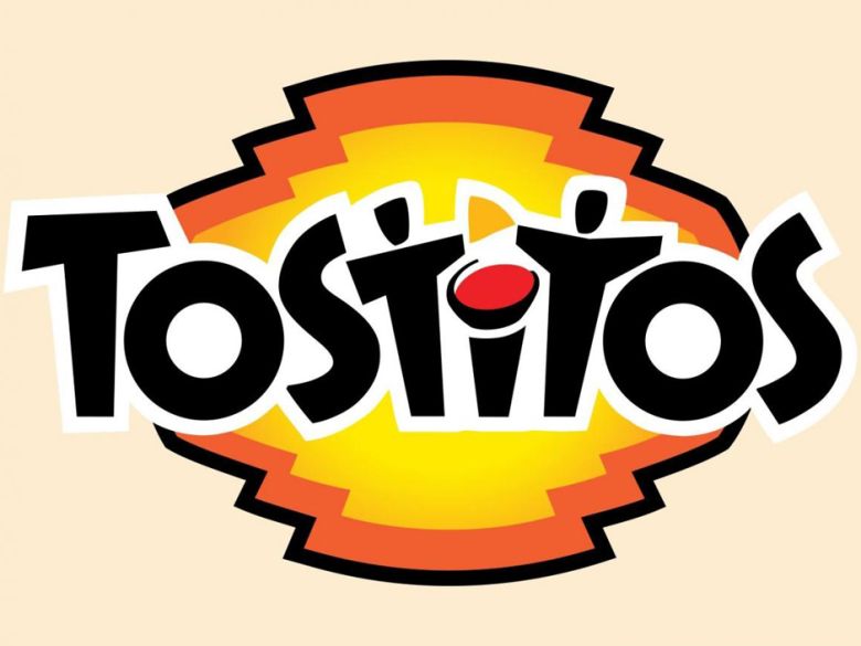
Can you spot the hidden image in the Tostitos logo?
Original Source: http://feedproxy.google.com/~r/CreativeBloq/~3/HAfgVBF1SX0/tostitos-logo
There are few things more satisfying than a well-made logo, and especially when that logo contains a clever surprise that conveys a brand's story. Coming to our attention most recently is the Tostitos logo, which contains a brilliant piece of chip-themed imagery.
Tostitos may be more well known in the US, while across the pond in the UK, the brand's sibling Doritos (which comes with its own clever logo) is more familiar. But we wonder how many chip-consumers in either country have noticed the hidden-in-plain-sight image in the Tostitos logo. It's a neat piece of design we can't believe we haven't yet noticed, and a contender for our pick of the best logos.
Take a second to have a good look (below) before we dive in.

What can you see?
The two capital Ts and the i nestled between tell the story – can you see it now? We clocked the chip and then the dip being used to dot the i almost immediately, but it took another few seconds to realise the Ts also double as people.
It's not only that the design plays with the wordmark to create a visually-witty image, but the brand message being delivered is smart too. The image conveys Tostitos as a party brand – sociable and warm in its two pals' chip-sharing nature.

The design sure brings the party
Tostitos is certainly in good company with its use of hidden imagery, symbolism and meaning in its logo, as this bumper infographic displaying a whopping 50 examples backs up. It's a smart tactic that enables a brand to use its logo to its full effect, and we love spotting them.
Read more:
This logo contains a delightful hidden surprise6 magnificently minimal logosWhere to find logo design inspiration

Leave a Reply
Want to join the discussion?Feel free to contribute!