Branding and Visual Identity for Eko Trädvård
Original Source: http://feedproxy.google.com/~r/abduzeedo/~3/ue7gQLlO6EA/branding-and-visual-identity-eko-tradvard
Branding and Visual Identity for Eko Trädvård

abduzeedo12.01.20
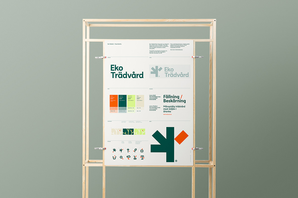
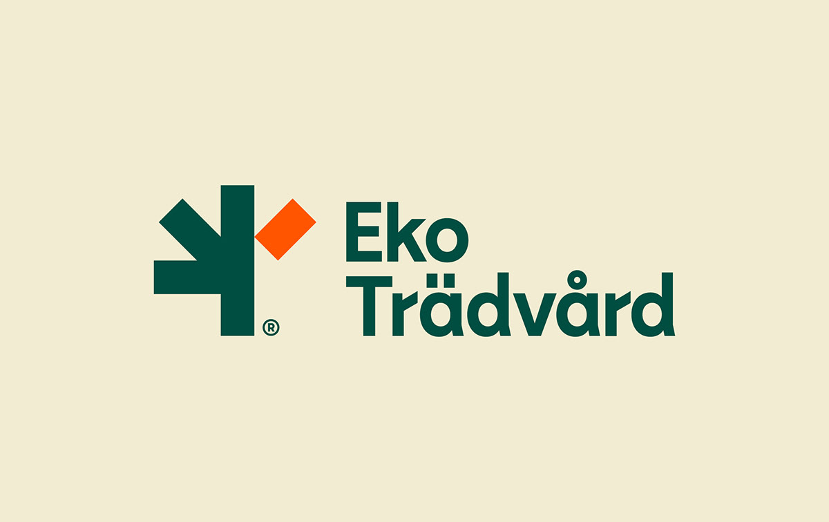
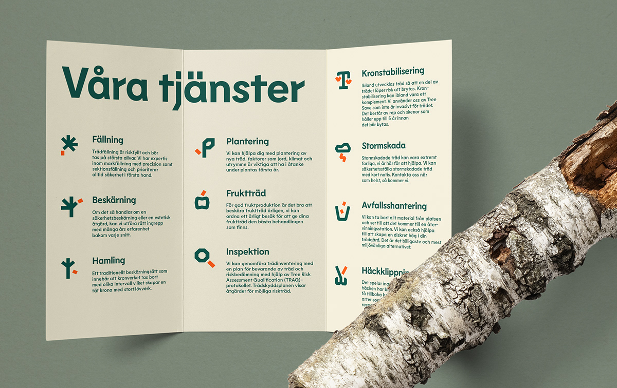
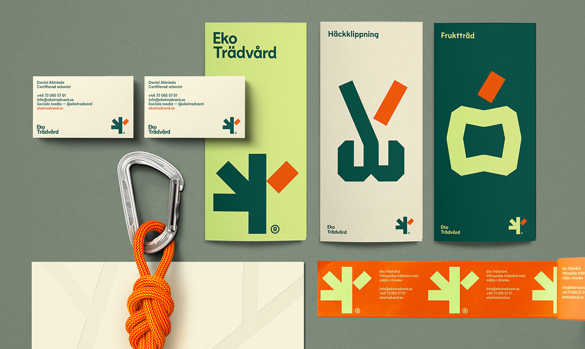
Ville Oké created the branding and visual identity for Eko Trädvård (Eco Treecare),an arborist in the southern parts of Sweden offering felling and pruning services in accordance with the highest standards of safety.
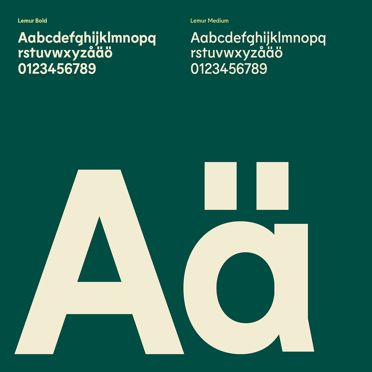
The identity was based on the idea of a medical cross that also resembles a tree with one branch cut off. The cut-off shape became a simple visual tool that is used in pictograms, patterns, typography and color.


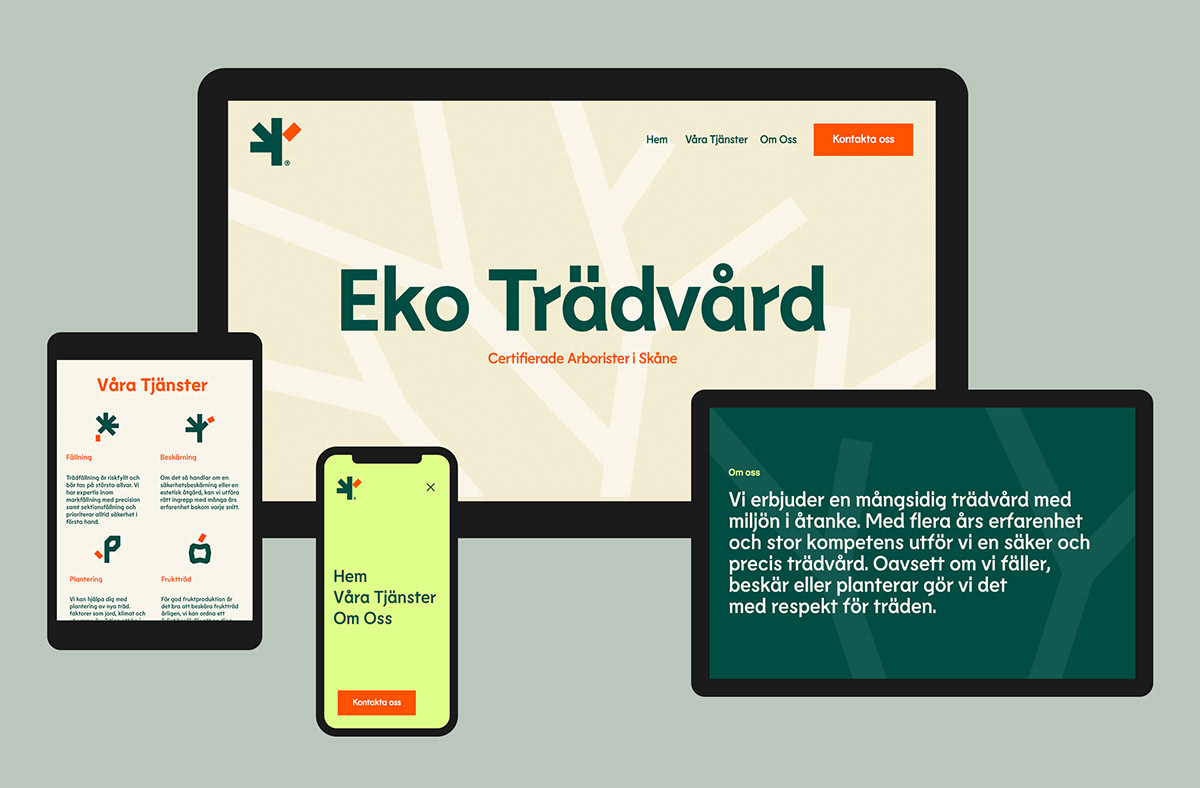


For more information make sure to check out ekotradvard.se


Leave a Reply
Want to join the discussion?Feel free to contribute!