Bootstrap Card Component: a Complete Introduction
Original Source: https://www.sitepoint.com/bootstrap-card-component-introduction/
In this article, I’m going to introduce you to the Bootstrap card component and walk you through its many features and uses. By the end of this tutorial, you’ll be able to incorporate Bootstrap cards in your web projects for great layouts and page content organization.
Bootstrap is the most popular HTML, CSS, and JavaScript framework for quickly creating responsive and mobile-first web layouts.
Using Bootstrap offers many advantages to developers, including the following:
you can easily and quickly build a responsive layout by having only some knowledge of HTML and CSS
the library was built to be mobile-first from the core
it’s compatible with all modern browsers etc.
it uses Flexbox for its grid system
it provides tons of features and components.
The latest release of Bootstrap offers many new, modern features — such as the support for Flexbox, and the new card component, which replaces panels, thumbnails and wells from earlier versions of the library.
What Is the Bootstrap Card Component?
Bootstrap introduces a new UI component for creating cards which provides a flexible and stylish container for showing content. Cards come with minimal styling, but you can easily extend them with extra styling options.
This component is built on top of Flexbox, and you can use the Bootstrap spacing utility classes for margins and padding.
Cards can conveniently accommodate different types of content like title, subtitle, body copy, and images etc., and optional header and footer sections. You can also include different sections (card blocks) to construct different types of cards depending on your use.
Including Bootstrap in Your Project
You can very easily start using Bootstrap in your website by either including it from a CDN or downloading it from getbootstrap.com.
For the sake of introducing the new Bootstrap card component, you’re going to create a simple HTML page with Bootstrap styling to demonstrate the basic elements of the card component. Go ahead and create the index.html file inside your project folder, then add the following content from the docs starter template:
<!doctype html>
<html lang=”en”>
<head>
<!– Required meta tags –>
<meta charset=”utf-8″>
<meta name=”viewport” content=”width=device-width, initial-scale=1, shrink-to-fit=no”>
<!– Bootstrap CSS –>
<link rel=”stylesheet” href=”https://maxcdn.bootstrapcdn.com/bootstrap/4.0.0/css/bootstrap.min.css” integrity=”sha384-Gn5384xqQ1aoWXA+058RXPxPg6fy4IWvTNh0E263XmFcJlSAwiGgFAW/dAiS6JXm” crossorigin=”anonymous”>
<title>Bootstrap Card Example</title>
</head>
<body>
<div class=”container”>
</div>
<!– Optional JavaScript –>
<!– jQuery first, then Popper.js, then Bootstrap JS –>
<script src=”https://code.jquery.com/jquery-3.2.1.slim.min.js” integrity=”sha384-KJ3o2DKtIkvYIK3UENzmM7KCkRr/rE9/Qpg6aAZGJwFDMVNA/GpGFF93hXpG5KkN” crossorigin=”anonymous”></script>
<script src=”https://cdnjs.cloudflare.com/ajax/libs/popper.js/1.12.9/umd/popper.min.js” integrity=”sha384-ApNbgh9B+Y1QKtv3Rn7W3mgPxhU9K/ScQsAP7hUibX39j7fakFPskvXusvfa0b4Q” crossorigin=”anonymous”></script>
<script src=”https://maxcdn.bootstrapcdn.com/bootstrap/4.0.0/js/bootstrap.min.js” integrity=”sha384-JZR6Spejh4U02d8jOt6vLEHfe/JQGiRRSQQxSfFWpi1MquVdAyjUar5+76PVCmYl” crossorigin=”anonymous”></script>
</body>
</html>
We’ve included Bootstrap files and their dependencies (jQuery and popper.js) from different CDNs, then created a container division.
Minimal Styling for Cards
In order to create a basic card, we need to —
use .card with a div tag to create the outer container
add the .card-body class to an inner div tag to create the card body
use .card-title and card-subtitle classes with heading tags for adding the title and the subtitle
use the card-text class with <p> tags to add textual content
use the card-img-top class with the <img> tag to add an image to the top of the card.
These are the basic elements that constitute a full but basic card layout, as we can see from the following example:
<div class=”card”>
<img class=”card-img-top” src=”https://source.unsplash.com/daily” alt=”Card image top”>
<div class=”card-body”>
<h3 class=”card-title”>Card title</h3>
<h4 class=”card-subtitle”>Card subtitle</h4>
<p class=”card-text”>This is a simple Card example</p>
</div>
</div>
This is a screenshot of the result:
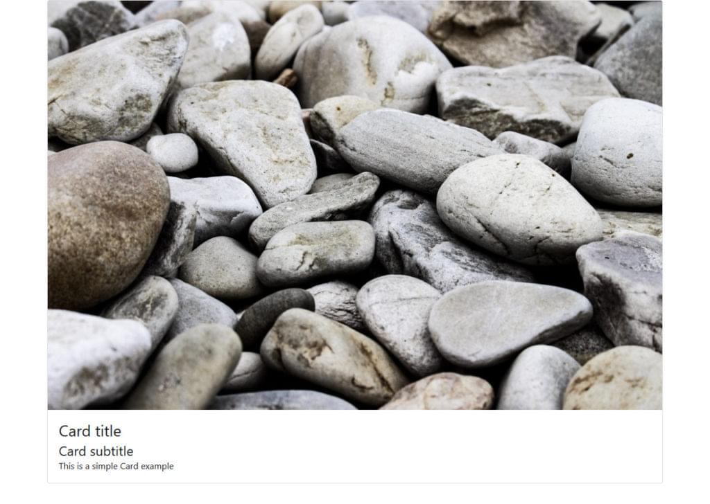
As can be seen, the card takes the full width of its container div.
By simply switching the card-body class with the card-img-overlay class, we can use the image as an overlay:

We can also use the class .card-img-bottom with the <img> tag to add the image at the bottom of the card:
<div class=”card”>
<div class=”card-header”>
This is a header
</div>
<img class=”card-img-top” src=”https://source.unsplash.com/daily” alt=”Card image top”>
<div class=”card-body”>
<p class=”card-text”>A Card with a top and bottom images</p>
</div>
<img class=”card-img-bottom” src=”https://source.unsplash.com/daily” alt=”Card image top”>
<div class=”card-footer”>
This is a footer
</div>
</div>
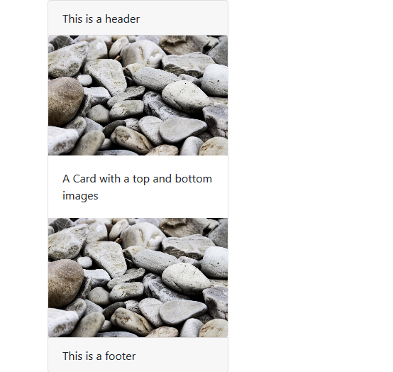
The card top and bottom images are called image caps.
Continue reading %Bootstrap Card Component: a Complete Introduction%


Leave a Reply
Want to join the discussion?Feel free to contribute!