Boots reveals biggest logo redesign in 170 years
Original Source: http://feedproxy.google.com/~r/CreativeBloq/~3/gBIo6ovfuAc/boots-rebrand
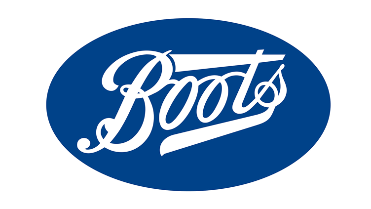
Health and beauty retailer Boots has recently launched a new logo (above) and a refreshed visual identity to help it keep up to date with the ever-changing world of wellbeing. The overhauled branding includes one of the most dramatic changes to the UK retailer's logotype in its 170-year history, as well as an energetic redesign of Boots' stores, apps, social platforms, campaigns and website.
For readers outside of the UK, the Boots logo might be something of an unknown quantity. But for plenty of shoppers, the pharmacist-cum-beauty shop is a familiar sight. Its previous logo, below, featured the Boots logotype encased in a distinctive blue lozenge. The essence of this design has been going strong since the '60s, while the overall letter shapes can be traced back to 1883.
So tweaking the logo now is a significant move. In our guide to logo design we cover how logos are the centrepiece of most branding schemes. By adjusting the shape of such a long-standing design, the designers at London-based agency Coley Porter Bell are sending out a clear message that Boots is moving forwards.
The lozenge shape first appeared in the ’60s, but changed from black to blue in the ’80s
Perhaps the most striking difference between the old logo and the new one is that the elongated cross bar on the letter 't' is no more. However, the large stroke trailing off from the letter 's' is still present. The latter is a good way of underlining the name and bringing the logotype together, while the old letter 't' now seems a bit clumsy in comparison.
If you're wondering why the cross bar was so long, it's because the original Boots logo (below) used to contain the word 'the', as the company used to be called The Boots Chemists.
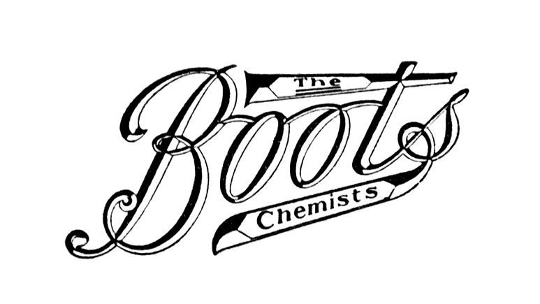
Back when Boots was the definite article
For Coley Porter Bell, the new logo design was just one item on a long shopping list of rebrand updates.
"We liberated and crafted the Boots logotype from the restriction of the 1960's lozenge, re-introduced the classically contrasting master-brand colours, created straightforward, simple type and typography, easy to read, modern in feel and symmetrical in design, built an imagery library that looks great and feels great, bringing to life people and their individual character," Coley Porter Bell explains on its project page.
"And finally, we created a flexible, energetic design system with a true sense of simplicity."
This design system is intended to stop Boots from feeling old-fashioned. "Being healthy is no longer about ‘the absence of illness’, it’s now a way of life," Coley Porter Bell adds. With this in mind, the studio evolved the Boots masterbrand identity from 'champion everyone's right to feel good' to a new projected idea that 'our confidence inspires your confidence'.
Take a look at how this identity takes shape in store and online by clicking left to right in the gallery below.
As far as rebrands go, it's a clean and refreshing look. So points to Coley Porter Bell for modernising Boots and avoiding a sterile approach that could've dulled a pharmaceutical brand.
We like the use of vibrant but not garish colours. Although if we were to criticise one aspect, it would be that the array of fonts look a little jarring. There are sans serifs in both roman and italic styles, not to mention handwriting fonts on the brochures, which is a bit of a mismatch in what is otherwise a uniform and consistent identity.
Nitpicks aside though, this redesign is just what the doctor ordered.
Related articles:
18 controversial moments in logo design and branding5 logo design terms you should know8 Insta feeds to follow for logo design inspiration


Leave a Reply
Want to join the discussion?Feel free to contribute!