How To Draw Fire (Easy Guide)

Original Source: https://designrfix.com/how-to-draw-fire-easy-guide/

Drawing fire can turn out to be a perplexing feat, but it could also be a fun, rewarding, and fascinating experience. As an aspiring artist, I vividly remember the first time I attempted to draw flames, using bold strokes and vibrant colors to create an image that was, at best, mediocre. But with practice and …

Read more

Wondershare Recoverit 11 File Recovery Tool Review

Original Source: https://www.hongkiat.com/blog/wondershare-recoverit-review/

Recoverit 11 is an amazing piece of technology developed by Wondershare that can help you recover those precious memories and important files that you thought were lost forever.

This data recovery software is perfect for those moments when you accidentally delete a file or your hard drive crashes, as well as for small businesses, media agencies, vloggers, and travel enthusiasts who keep a record of everything.

It can retrieve files from different storage devices like hard drives, memory cards, USB drives, and others – in fact, they support over 2000 types of storage devices.

One of the highlights for Recoverit 11 is that they have over 35 data recovery patents, which significantly boosts the chances that you’ll get your files. As a breakdown of this, at least partially, one of their patents is focused on a data recovery method for video clip files, and another one is focused on different computer equipment, device, and storage type.

I’m not exactly well-versed on this kind of thing, but if a method or invention is patented, it means it is worth protecting because it actually works.

Who’s behind Recoverit?
Wondershare Recoverit 11Wondershare Recoverit 11

Recoverit was developed by Wondershare, a software company that develops a wide range of multimedia software solutions like Filmora, a video editing software, PDFelement and PDF Reader, diagramming and mind mapping tools, and other fully-featured utility tools for data transfer, file recovery and repair, and parental control and monitoring, to name a few.

At one point, I am certain that you’ve encountered at least one of Wondershare’s software, and if you are reading this, it’s because you are looking for a file recovery tool. Wondershare Recoverit is trusted by billions of users to save them from the disaster of losing files!

Who is Recoverit 11 for?
Wondershare Recoverit 11 enhanced featuresWondershare Recoverit 11 enhanced features

I already mentioned this in the introduction, but this deserves a dedicated section.

Wondershare Recoverit 11 is for people who deal with heavy media, a heavy flow of files, and the like. Those who actively use and abuse their devices and file storage, because no matter how careful you are, the chances of something failing due to operational error or human error is bound to happen at one point.

Professional Photographers

Photographers often deal with large amounts of data, like high-resolution images and video files, and these files are valuable to their business. Any loss of a file due to accidental deletion, file corruption, or hardware failure could directly result in financial loss, as well as loss of reputation.

By having a tool like Wondershare Recoverit 11, the damage can be minimized, if not altogether removed.

Read our previous article on How to Prevent and Recover Permanently Deleted Photos with Recoverit.

Professional Videographers

Like photographers, videographers deal with hundreds of gigabytes to even terabytes of data every single day, and losing all or partial footage due to corruption or operational malfunction can be disastrous. But Recoverit 11 can minimize the problem, and with their latest update, entire video files can even be recovered and repaired.

Content Creators / Vloggers

Vloggers and other content creators typically don’t keep backups, or if they do, it’s not to a professional degree. And as we all know, many of these video clips could be a one-time thing.

Imagine living in Canada and going to Japan for 2 weeks and losing all of your footage because you accidentally deleted or formatted your device.

The same is true for travel enthusiasts who record a lot of footage using multiple devices like GoPros, DJI drones, mirrorless cameras, and the like.

Media Agencies

Photography agencies, web design and development firms, graphic design agencies, and the like also heavily rely on their file revisions, although often they use cloud storages, but there are cases when files are yet to sync and the devices fail – in which case, a data recovery tool like Wondershare Recoverit 11 could play a huge role.

That said…

What Makes Recoverit Unique…
Wondershare Recoverit 11 unique selling pointWondershare Recoverit 11 unique selling point

Aside from what’s mentioned above, when compared to other file recovery software, Recoverit 11 has three core advantages:

1. Full-scene Data Recovery

Simply put, all possible scenarios that made you lose your files are covered. Whether it’s by accident, device corruption, due to malware, or an unfortunate luck, Recoverit 11 has a high chance of recovering your files, as long as your device or storage medium is still not physically broken.

2. 3-Step Recovery: Scan, Preview, Recover

Recoverit works in 3 simple steps, basically, it will scan your storage medium first, then it will display all of the files that can still be recovered, and finally, you will be given the option to choose which files you’d like to recover. If it’s in the preview, it can be recovered.

3. One-stop Recover Solution

Unlike many file recovery software, Recoverit supports recovery of all files, whether it’s a video, photo, documents like MS office files, zip files, audio files, and 1000+ other file types and formats. Recoverit supports one-click recovery for video and photo file types!

Enhanced Features:
Wondershare Recoverit 11 NAS and Linux RecoveryWondershare Recoverit 11 NAS and Linux Recovery

Some of you may already know about Recoverit due to its popularity as the number 1 file recovery software, but just in case you didn’t know, the latest update was rolled out that boosted its performance even more.

Enhanced Recovery

While the recovery rate was already high, Wondershare still upgraded its recovery function, with focus on large video footage taken by professional cameras. Making Recoverit a must-have for professional videographers, vloggers, and travel enthusiasts.

NAS Data Recovery

Recoverit supports NAS data recovery without needing to unplug the affected disk from the NAS. This is a perfect Plan B solution for small businesses s or professional photographers and videographers, vloggers, media agencies, and other content creators that deal heavily with data and data sharing.

Linux Data Recovery

Supports Ext4 file system, which is used by the majority of Linux distributions. Unlike most software companies that just altogether skip support for Linux systems, Wondershare did a good job on this one.

As for the other new key features, Recoverit 11 supports in-depth scanning for Mac systems that run on T2 and M1 chips. This is a perfect update for creatives who work on Mac devices.

With the new update, Recoverit also now supports disk mirror or disk image recovery. This is particularly helpful for people who are active in creating mirror copies of their systems or drives.

That, along with other enhancements behind the scenes help improve the scanning quality, recovery rate, and user experience.

List of Features

Recover accidentally deleted files, even “permanently” deleted files from the Recycle Bin
Recover files from formatted media or drive
Recover files from factory reset devices
Recover files from corrupted SD cards due to improper handling of the device
Recover files from virus infection
File recovery from power outage-related issues
Supports file types and a thousand different formats for:

Photo
Audio
Video
Database
Documents
Email
Archive (zip)
Web files like HTML, PHP
And other files like ACM, ACP, POL, PPD, TTF, VB, DLL, sys, lib, and more

Corrupt files can be repaired
Search and filtering options
And many more

Pricing Model

Wondershare Recoverit 11’s pricing model is pretty straightforward and for the price, it is quite affordable, a true cost performance.

Essential

Windows: $59.99/month, $69.99/year, and $119.99 for a lifetime license
Mac: $75.99/month, $79.99/year, and $119.99 for lifetime

Essential includes:

Hard Drives and Locations Recovery
1000+ file formats supported
2000+ devices supported
Disk image recovery
Deep scan and file preview

Standard

Windows: $69.99/month, $79.99/year, and $139.99 for lifetime
Mac: $95.99/month, $99.99/year, and $139.99 perpetually

Standard includes:

Everything in Essential plus:
Crashed computer recovery
Bootable disk/USB creation

Premium

Windows: $79.99/month, $99.99/year, and $159.99 for your entire life
Mac: $109.99/month, $139.99/year, and $169.99 for lifetime subscription

Premium includes:

Everything in Essential and Standard plus:
Linux PC recovery
NAS server recovery
RAID corruption recovery
Enhanced photo and video recovery
Scan and merge video fragments
Repair corrupted videos

For individuals, see the detailed product information here.

For Businesses, refer to this page.

For Students and Educators, refer to this page.

Awards

In fact, Recoverit won multiple awards for its outstanding data recovery capabilities.

Recoverit – G2 Crowd Report 2022 Fall Leader “Leader of File Recovery”
Recoverit – G2 Crowd Report 2022 Summer Leader “Leader of File Recovery”
Recoverit – G2 Crowd Report 2022 Spring Leader “Leader of File Recovery”
Recoverit: High performer in Mid Market for File Recovery

For the unfamiliar, G2 Crowd, or now G2, is a non-biased company that reviews business software and services in a peer-to-peer manner. It was established in 2011 and has 575 employees worldwide.

Just with that in mind, you know that Wondershare really spent a lot of resources on research and development of this intricate product.

To End

In conclusion, Wondershare Recoverit 11 is a powerful and user-friendly data recovery software that can do it all to an extreme degree. You can recover lost files due to accidental deletion, formatting, device corruption, malware attacks, and because of just bad luck.

The high recovery rate that Recoverit 11 boasts is no joke, given that they won multiple awards for it and have 35 patents to flaunt.

The post Wondershare Recoverit 11 File Recovery Tool Review appeared first on Hongkiat.

10 Best Prebuilt Websites for Digital Agencies & Consultants

Original Source: https://www.sitepoint.com/prebuilt-websites-agencies-consultants/?utm_source=rss

BeTheme has 10 of the best prebuilt websites for digital agencies and consultants. If you’re building a new site or redesigning an existing one, start your search here.

Continue reading
10 Best Prebuilt Websites for Digital Agencies & Consultants
on SitePoint.

15 Podcast Channels for Web Developers

Original Source: https://www.hongkiat.com/blog/podcasts-web-developers/

Listening to podcasts is a great way to stay up-to-date in the web development field. Podcasts provide a convenient way for you to learn and get information since you don’t need to sit down at your desk for that.

Here, we’ve put together some of the best podcasts for developers, covering various topics such as software development, frontend development, JavaScript, CSS, and more. Whether you’re a seasoned developer or just starting out, I’m pretty sure you will find a podcast that fits your needs. So grab your headphones and get ready to learn!

1. ShopTalk Show
ShopTalk ShowShopTalk Show

One of the most popular web design podcasts, hosted by Chris Coyier of CSS-Tricks and Dave of Paravel, ShopTalk invites experts in the field of web design and programming to share their ideas and experiences.

They currently have more than 100 episodes already and counting, and podcast releases are weekly.

2. Boagworld
BoagworldBoagworld

Paul Boag is a well-respected name in the web design industry. He is an author who has released several bestselling books and is a founder of the UK-based design agency, Headscape.

His podcast, Boagworld, has been on air since 2011 with more than 100 episodes on website building and digital strategy, making it one of the longest-running podcast channels in the industry. You can subscribe to Boagworld through RSS or through iTunes.

3. Inside Marketing Design
Inside Marketing DesignInside Marketing Design

Inside Marketing Design is a podcast that can help you learn more about a different side of design in tech. The show is focused on marketing and brand design, which is not as much mentioned or discussed as product and UI/UX design.

Each episode features an interview with marketing design experts from large tech companies such as Stripe, Zendesk, Zapier, Shopify, etc. You’ll hear about how they design things like landing pages, brand illustrations, and campaigns.

By listening to these interviews, you’ll get a better understanding of how design teams work, how they tackle projects, and what challenges they face.

4. Beyond Coding
Beyond CodingBeyond Coding

Beyond Coding is a weekly podcast that covers a variety of topics related to software development and software engineering. But as the name implies, it goes beyond just coding.

It also includes discussions on leadership, communication, self-improvement, and happiness. The show is hosted in a friendly and informal format, with host Patrick Akil and his guests having relaxed conversations about their experiences and perspectives. There’s a new episodes every Wednesday.

5. Syntax FM
Syntax FMSyntax FM

A podcast hosted by two experienced web developers, Scott Tolinski and Wes Bos, and they cover a wide range of topics related to frontend development, back-end development, and design.

They’ll provide you with practical advice, tips, and insights to help you improve your skills and stay up-to-date with the latest trends and best practices in the industry. It’s one of the most popular podcasts in the web community for its in-depth conversations and insightful commentary.

6. CodePen Radio
CodePen RadioCodePen Radio

A podcast from codepen.io, a popular online code editor for frontend developers and designers. The podcast focuses on web development, design, and the intersection of code and creativity.

The show is hosted by Chris Coyier and Marie Mosley, and they explore a variety of topics related to the web, including design patterns, CSS, JavaScript, and more. It is a great resource for front-end developers and designers looking to stay up-to-date with the latest trends and best practices in their field.

7. CodeNewbie Podcast
odeNewbie PodcastodeNewbie Podcast

A podcast for people who are new to coding or who are thinking about starting a career in technology. The show is hosted by Saron Yitbarek and features conversations with developers and tech professionals from a variety of backgrounds.

It covers a wide range of topics from coding and the technology as well as how to get started with programming, tips for staying motivated, and stories about the ups and downs of learning to code.

The podcast is part of the CodeNewbie community, which is dedicated to helping people learn to code and find their place in the tech industry.

8. Frontend Happy Hour
Frontend Happy HourFrontend Happy Hour

Hosted by a group of experienced web developers from well-respected names in the tech industry such as Netflix, Twitch, Atlassian, Evernote, and LinkedIn. It features discussions on various topics related to frontend development, including the latest trends, best practices, and latest shiny tools.

It’s great podcast for frontend developers who want to stay up-to-date with the latest trends and best practices in their field, as well as for those who are looking for inspiration and advice on how to grow and succeed as a frontend developer.

9. Web Rush
Web RushWeb Rush

A weekly podcast for web developers hosted by John Papa, Ward Bell, Craig Shoemaker, and Dan Wahlin. It covers various topics from JavaScript to general web development. The show aims to provide practical insights and discussions about the challenges faced by developers today.

Each episode features expert guests who share their experience and knowledge. It is a great resource for learning with development in the fields, whether you’re a beginner or an experienced web developer.

10. JavaScript Jabber
JavaScript JabberJavaScript Jabber

Another weekly podcast covering a wide range of topics related to JavaScript, web development, and the web platform. It aims to provide insights, tips, and advice to help developers improve their skills and stay up-to-date.

A great resource for anyone interested in web development, especially those working with JavaScript, and is accessible to developers of all levels, from beginners to experts.

11. Views on Vue
Views on VueViews on Vue

A podcast about Vue.js, featuring conversations with developers and experts who are working with Vue.js. Each episode covers various topics around Vue.js, such as the best practices, emerging trends, and some real-world projects using Vue.js.

A perfect podcast for any developer looking to learn more about Vue.js or who is already using it in their work.

12. DeveloperTea
DeveloperTeaDeveloperTea

A podcast for web and software developers hosted by Jonathan Cutrell. This podcast is designed to be a quick and easy way for developers to stay informed about the latest in the development field.

Each episode is around 10-15 minutes long and covers various of topics, from technical skills and tools as well as non-technical areas for developers. A great podcast for developers at all levels or for anyone interested in web and software development.

13. Podrocket
PodrocketPodrocket

A weekly podcast that focuses on front-end web development. It is hosted by LogRocket co-founder Ben Edelstein and the LogRocket engineering team, along with other experienced developers.

The show provides in-depth knowledge and insights on libraries, frameworks, and current industry issues related in web development.

14. The Changelog
The ChangelogThe Changelog

A weekly podcast that covers topics related to open-source, software development, and technology in general. Hosted by Adam Stacoviak and Jerod Santo. The show features interviews with developers, engineers, and other experts in the software development industry.

The podcast covers a wide range of topics, including new and emerging technologies, tips, and the future of open-source software. If you’re into open-source, it’s a great resource for anyone interested in staying up-to-date with the latest developments in the open-source field.

15. The CSS Podcast
The CSS PodcastThe CSS Podcast

A podcast covering about all things CSS. It is hosted by Una Kravets and Adam Argyle, discussing a wide range of topics related to CSS, including the latest CSS features, design and development tips and tricks, and more.

They also interview experts in the field to provide insights and perspectives on the current state of CSS and its future direction. If you are interested in learning more about CSS and keeping up-to-date with the latest advancements in this field, stay tune to this podcast.

The post 15 Podcast Channels for Web Developers appeared first on Hongkiat.

The best Photoshop alternatives in 2023

Original Source: https://www.creativebloq.com/photoshop/alternatives-1131641

From Affinity to Procreate: The best Photoshop alternatives for Mac, Windows and more.

A Step-By-Step Guide To Building Accessible Carousels

Original Source: https://smashingmagazine.com/2023/02/guide-building-accessible-carousels/

You can spot them on every other homepage: carousel widgets with auto-rotating content. Those who use them want to show more content within a limited space. At the same time, they aim to present the most important messages as prominently as possible. However, if design and development do not receive proper attention, you will be at the highest risk of creating usability and accessibility issues.

This particularly affects people with cognitive, motor, or visual impairments, for whom using the complex design pattern is usually even more challenging. Whether you call it an “eye candy” or “devil’s spawn”, if you want to implement the carousel in a user-friendly and accessible way, a whole range of requirements is to be considered.

“Should I Use A Carousel?”

As widely used as they are, carousel widgets have a bad reputation among UX professionals. They are ignored by users (Nielsen Norman Group), only 1% interact with a carousel at all, and 89% of them only with the first slide (Eric Runyon). Jared Smith even responds to the question “Should I use A Carousel?” by saying, “Seriously, you really shouldn’t.” Others state that there isn’t one answer. You have to consider various factors, such as function, design, platform (desktop or mobile) and, most importantly, context. For whatever reason you include a carousel on a website, make sure it is user-friendly and accessible.

Accessible Implementation

For a carousel to be accessible, it is essential that all users can perceive the widget and its components and that they can easily navigate it using a mouse, touch gestures, a keyboard, a screen reader, and any other assistive technology. The rotation of the slides must not interfere with users’ ability to operate the carousel or use the website as a whole.

The W3C’s WAI-ARIA working group provides guidance on implementing an accessible carousel in its ARIA Authoring Practices Guide (APG). This article is based on those recommendations and wants to create a profound understanding of elements and ARIA attributes applied and their impact on users.

Auto-Rotating

I assume we have all been there at some point: Constantly changing content can be rather annoying. For some people, however, uncontrolled rotation can be absolutely critical:

People need different times to read content.
If the available time is not enough, auto-advancing carousels can become very frustrating. It’s not very satisfying to just be able to skim the text before new content appears without any request.
Some people, especially people with cognitive impairments such as attention deficit disorder, may experience moving content distracting.
The movement could prevent users from concentrating and interacting with the rest of the website. People within the autistic spectrum may even have to leave such a page entirely.
Screen reader users may not be aware of the rotation.
They might read a heading on “slide 1” and execute the keyboard command for “read next item.” Instead of hearing the next element on “slide 1”, the screen reader announces a text from “slide 2” — without the person knowing that the element just read out is from an entirely new context.

WCAG 2.1, therefore, requires the possibility to stop movement (2.2.2 Pause, Stop, Hide).

Add a “Pause” or “Stop” button if you cannot give up auto-rotation at all.
The “Pause” button is the minimum solution (if the movement does not end automatically after 5 seconds).
In addition, usability experts recommend the following:
Pause auto-rotation as long as a slide is being hovered.
There is usually a correlation between the mouse position and the user’s interest in a piece of content. Don’t risk a slide change a few milliseconds before a person activates a link and then ends up on the wrong page and, to make things worse, not realizing that this was not the intended one.
Stop the rotation permanently when users are setting focus on interactive elements using a keyboard or interacting with the carousel.
An action such as actively changing slides also indicates that the user might be interested in the content. People may temporarily explore other parts of the page but possibly want to come back. Furthermore, you make keyboard navigation easier if the carousel stops as soon as a control receives focus.

Visibility

For all of us, user interface elements are intuitively easier to use if we can perceive them well. For people with visual impairments, however, this aspect is crucial.

Ensure sufficient contrast.
Most often, icons are used to indicate the controls: simple arrows for advancing the slides as well as the widely used dots for selectively fading in. However, these icons often have poor contrast against the background, especially when placed on images. The easiest way to avoid contrast issues is to position the icons outside the slides.
Provide a visible focus indicator.
People navigating with a keyboard need to be able to see which interactive element they are currently focusing on. Often design merely (if at all) provides a slight and barely discernible change in color of the controls. If color is the only way to indicate focus, both colors (the one used for non-focused and focused state) must meet at least a contrast ratio of 3.0:1 with each other. This minimum contrast requirement also applies to the icon against its background and to other kinds of focus indicators (e.g., a border that indicates the focus state of a button).
The size of the controls affects their visibility as well.
Besides, with a reasonable target size combined with sufficient distance between interactive elements, you reduce the risk of accidentally activating a nearby button or a linked slide. This not only benefits people with limited dexterity but also minimizes errors when using mobile devices.
Indicate the current position within the set of slides.
It is not the only option, but often this is done by highlighting one of several progress dots. To ensure that people with color deficiencies can access visual information, you must not rely on color alone but use a color-independent indicator, for example, a filled and unfilled dot.

Activation With A Simple Pointer Input

Many people are used to moving slides on touch devices by swiping. But there are also users who cannot perform this gesture because of their impairment or because of the assistive technology they use. In addition to swiping, enable users with an alternative way of navigating (WCAG 2.5.1 Pointer Gestures).

Provide interaction with a simple pointer input (e.g., simple click or tap). That means if there are no slide picker controls to display content directly, you need to implement “Previous” and “Next” buttons.

Structure, Semantics And Labelling

The carousel widget is designed primarily for two-dimensional, visual use. For screen reader users who do not see the carousel as a whole, it is much harder to understand the composition of controls and content. These users have different perspectives when using a website. They explore content linearly, tab through interactive elements, and use shortcuts for navigation. The challenge is to provide a meaningful structure and semantics and inform users about controls and slides in a way that enables them to build a mental model of the widget. Use semantic markup for different sections, controls, and content and proper labeling to ensure good orientation.

Regions And Groups

Using the HTML element <section> (or role=”region”) with an accessible name, you can set a generic landmark and thus mark smaller regions of a page. Landmarks provide a way to identify the structure of a web page to screen reader users and help them with orientation. Using a screen reader, you can display these sections in a table of contents and use specific keyboard shortcuts for landmarks to move focus to the corresponding content.

When navigating to the landmark, the assistive technology announces the name and type of the section, for example: “[name] — region”. In browse mode (exploring content with arrow keys), the screen reader tells users when they enter or exit a region. They will hear something like “[name] — region” or “out of region”. (This output in browse mode is currently well-supported by the screen reader NVDA, but unfortunately, with JAWS, users have to set screen reader settings accordingly.)

role=”group” is intended to form a logical set of items as a group. Since it is not a landmark, the group is not included in a landmark listing displayed by the user. For that reason, use this role in contrast to role=”region” for less important sections of a page. You could use role=”group”, for example, to group (custom) form controls (compare <fieldset> and <legend> in HTML) but it is not limited to this.

With role=”group”, it is also necessary to use the role with an accessible name. The screen reader will convey the boundaries of the group by announcing something like “[name] — grouping” or “out of grouping,” and the assistive technology will inform users about the start and end of the group (in this case also JAWS in the default setting).

The following applies to role=”region” and role=”group”: When the first interactive element within the region or group receives focus, the screen reader will announce its name and role, plus the role and label of the focused control.

The Carousel Container

Currently, there is no specific HTML element or ARIA role to mark up a carousel. However, you can still convey semantic information to make the existence of the carousel, its sections, and the meaning of the controls clear and understandable to non-visual users. That will help them better adapt to the widget and its interaction patterns.

role=”region|group” + accessible name

An easy way to make non-visual users aware of the carousel is to use a landmark or a group role: To get there, use the <section> element (or role=”region”) or role=”group” for the container that encompasses all the carousel elements (including the carousel controls and slides). In addition, provide an accessible name that identifies the carousel as such.

Carousel container marked with a landmark:

<div role=”region” aria-label=”Carousel”>
<!– Slides and controls –>
</div>

Screen reader output when encountering the widget: „Carousel — region“

The W3C Authoring Practices go beyond this basic markup and recommend using the aria-roledescription attribute:

role=”region|group” + aria-roledescription + accessible name

With aria-roledescription, you create an even more specific output for screen reader users. You thus define the meaning of the container more precisely.

Code sample (HTML): Carousel container marked with a landmark with a specified meaning

<div role=”region” aria-roledescription=”carousel” aria-label=”Design patterns”>
<!– Slides and controls –>
</div>

Screen reader output: “Design patterns — carousel” instead of (without using aria-roledescription) “Design patterns — region.” In the previous example, we have seen a more generic accessible name (“Carousel”). With role=”region”, this has resulted in the output: “Carousel — region”.

aria-roledescription changes the way a screen reader announces the role of an element. This allows authors to define a localized and human-readable description for a role. The screen reader announces the value of aria-roledescription (a string provided by the author) instead of the original role. It overrides the role to which the attribute is applied. aria-roledescription should only be used on elements that have a valid implicit or explicit (ARIA) role.

Back to our carousel, this means instead of region or grouping (you can also use role=”group” instead of role=”region”), the value of aria-roledescription is read out by the assistive technology. Note: If the aria-roledescription property is set to “carousel”, you should not set the aria-label property to “carousel” because this would be redundant.

The ARIA specification recommends the attribute mainly for clarifying the purpose of non-interactive container roles such as group or region. Otherwise, use it with great caution:

“Do not use aria-roledescription to change the way a role is announced, if it will prevent the user from knowing what to do with it.”

— Léonie Watson

The Slide Container

Just as you communicate the boundaries of the carousel as a whole, you can do the same for the slides. Each slide represents simply a smaller entity within the “carousel” composite.

role=”group” + aria-roledescription + accessible name

Container for slides marked as “group” with a specified meaning:

<div role=”group” aria-roledescription=”slide” aria-labelledby=”carousel_item-1_heading”>
<h2 id=”carousel_item-1_heading”>Modal dialogs</h2>
<!– Some more content –>
</div>

Screen reader output: „Slide — heading level 2 — Modal dialogs“

In this example, the heading of the slide serves as the accessible name of the group. The aria-labelledby property is set to the id of the heading. You could also use the aria-label attribute to convey the position within the set of slides, for example, “1 of 3”. In particular, that makes sense if no unique name is available to identify the slide.

Again, if you set aria-roledescription to “slide”, the aria-label property should not be set to “slide” to avoid redundancy.

The Slides

Slides that are not visible should be hidden, not only visually but from all users (including users of assistive technology). You can either use CSS (display: none or visibility: hidden) or the HTML hidden attribute.

If you truly hide the slides that are not visible, you should not use list markup for the whole set of slides. Screen readers do announce the number of list items (which may seem helpful) but will ignore hidden ones. Concerning the carousel, list markup would not result in an output of the total number of list items but just the visible ones. If only one slide is visible, that wouldn’t be very helpful.

The Container For The Controls

What about the container for the controls? It also encompasses a set of items. Because of this, it is reasonable to apply role=”group” to it. And again, the group needs an appropriate group name.

role=”group” + accessible name

Container for controls marked as “group” with a specified meaning:

<div role=”group” aria-label=”Slide controls”>
<!– Slide controls –>
</div>

Screen reader output: „Slide controls — grouping“

In this context, the accessible name (the group name) reflects the purpose of the controls, for example, “Slide controls” or “Choose a slide”.

The ARIA Authoring Practices refer to this implementation as a “grouped carousel”. Another approach is described as “tabbed carousel”. Following the “tabbed” pattern, you would use role=”tablist”, role=”tab” for the controls and role=”tabpanel” (instead of role=”group”) for the slide container. Don’t use aria-roledescription in this case. The appropriate ARIA properties are specified in the tab pattern.

The Controls

Slide picker controls allow users to display a specific slide. They visually present the total number of slides and indicate the current position within the set. It is rather popular to use “dots” for that purpose.

Operable Keyboard Controls

All controls must be operable with the keyboard. Use the native button element for controls of the grouped carousel. That involves the “Previous” and “Next” buttons, the “Pause” button, and the slide picker controls.

If you cannot use native HTML, add semantic information by applying an explicit ARIA role (role=”button”) to the clickable div or span element. Use tabindex=”0″ to include the element in the tab sequence. Furthermore, you need to incorporate JavaScript that provides interactions expected for a button (activation with Space and Enter ). Be aware that ARIA roles do not cause browsers to provide keyboard behaviors.

Grouped controls

<div role=”group” aria-label=”Slide controls”>
<button aria-label=”Show slide 1 of 4″>
<!– SVG icon –>
</button>
<!– Some more controls –>
</div>

Screen reader output: „Slide controls — grouping — Show slide 1 of 4 — button“

The Accessible Name Of The Controls

Choose an appropriate accessible name (text alternative) in context with the group name. Regarding the above example, the screen reader would announce: “Slide controls — grouping — Show slide 1 of 4″ — button” when focusing on the first control in the group (or “Slide controls — grouping — Pause — button” if the first control is a “Pause” button).

Assuming the group name is “Choose a slide,” then the heading of the corresponding slide would also be a reasonable label for the button in this context. Instead of using the aria-label attribute, you could also specify the label using visually hidden text.

Along with the group name and the slide picker elements, the “Previous,” “Next,” and “Pause” buttons need an accessible name. That means do not forget about the text alternatives for these icons either.

Semantic Markup Of The Active Control

Do not just indicate visually but also semantically which control does represent the currently displayed slide. You can use aria-disabled=”true” for this purpose. In this case, aria-disabled is preferable to the HTML attribute disabled. Unlike disabled, a button with an aria-disabled attribute is still included in the tab sequence of the page. You may also use the aria-current property set to “true”.

Focus Order

For a webpage to be accessible using a keyboard or assistive technology, it is important to ensure a proper focus order. That is the order in which you tab through interactive elements. An appropriate order generally means that it follows the visual flow of the page. Users can navigate in a logical and predictable way without loss of orientation.

By default, the tab order is set by order of the elements in the source code (more precisely, in the DOM). That means that the order in which you write the HTML will affect the focus order when navigating with the keyboard. The DOM order also affects the reading order, that is, the order in which screen reader users in browse mode linearly explore content using the arrow keys (non-interactive content included).

The DOM and, with it, the focus sequence should match as closely as possible to the visual order of the page. In this way, sighted keyboard users can easily follow the sequence.

Content changes that precede the current focus cause issues with sequential navigation since screen reader users will not know about such changes (apart from dynamically displayed status messages implemented using live regions). Users need to navigate backwards to reach those interactive elements, which makes navigation more difficult.

A Proper And Understandable Focus Order For A Carousel

Many carousel implementations are intended to visually display the controls below the slides:

Previous
Slide
Next
Pause
Slide Controls

If this order matches the order of the elements in the DOM, both the activation of “Next” and the activation of the slide controls will cause a content change (display of a new slide) before the triggering control. That is, users need to navigate backwards if they want to explore the content of the slide with the screen reader or follow a link on the slide.

DOM Order

The focus order is easier to use, and the reading order is more meaningful if the controls (at least the “Pause” button and the slide controls) are positioned in the DOM before the changing slides. If you still want the controls to be visually positioned below the carousel, use CSS for this purpose. When in doubt, a good focus and reading order for the carousel is more important than the optimal conformity with the visual order:

Pause
Slide controls
Previous
Slide
Next

or

Pause
Slide controls
Previous
Next
Slide

Notice that people working with magnification software will locate the “Pause” button more quickly if it is also visually positioned at the beginning of the carousel. They do not see the carousel as one (depending on the magnification level) but might explore the content by moving the keyboard focus or the mouse pointer, which results in repositioning their viewport.

Pause And Previous/Next Buttons

When activating the Pause / Play and Previous / Next control, the focus has to remain on the button. That allows sighted keyboard users to repeatedly press the button and perceive the changing content at the same time.

The Keyboard Navigation For “Tabbed Carousels”

If you prefer following the “tabbed carousel” pattern, allow users to navigate with arrow keys within the set of controls. In addition, ARIA markup must correspond to the tab pattern (unlike the “grouped carousel”) to make screen reader users understand the expected operation based on the information announced by the screen reader.

Working Example

Complete carousel widget:

<div role=”region” aria-roledescription=”carousel” aria-label=”Tips & Techniques”>
<div role=”group” aria-label=”Slide controls”>
<button aria-label=”Stop auto-rotation”>
<!– SVG icon –>
</button>
<button aria-disabled=”true”>
<span class=”hide-element”>Show slide 1 of 3: Hiding Accessibly</span>
<!– SVG icon –>
</button>
<button aria-disabled=”false”>
<span class=”hide-element”>Show slide 2 von 3: Accessible Contrasts</span>
<!– SVG icon –>
</button>
<button aria-disabled=”false”>
<span class=”hide-element”>Show slide 3 von 3: Semantics, WAI-ARIA and Assistive Technologies</span>
<!– SVG icon –>
</button>
<button aria-label=”Previous slide”>
<!– SVG icon –>
</button>
<button aria-label=”Next slide”>
<!– SVG icon –>
</button>
</div>
<div role=”group” aria-roledescription=”Slide” aria-labelledby=”carousel-item-1__heading” id=”carousel-item-1″>
<h2 id=”carousel-item-1__heading”>Hiding accessibly</h2>
<!– Further slide contents –>
</div>
<div hidden role=”group” aria-roledescription=”Slide” aria-labelledby=”carousel-item-2__heading” id=”carousel-item-2″>
<h2 id=”carousel-item-2__heading”>Accessible Contrasts</h2>
<!– Further slide contents –>
</div>
<div hidden role=”group” aria-roledescription=”Slide” aria-labelledby=”carousel-item-3__heading” id=”carousel-item-3″>
<h2 id=”carousel-item-3__heading”>Semantics, WAI-ARIA and Assistive Technologies</h2>
<!– Further slide contents –>
</div>
</div>

Wrapping Up

Add a button to pause or stop all movement.
Ensure that controls have sufficient contrast (meet WCAG’s color contrast requirements).
Provide a visible focus indicator.
Don’t rely solely on swiping. In addition, provide interaction with a simple pointer input (e.g., simple click or tap).
Provide semantic markup and labeling to ensure that screen readers can identify the carousel as a whole, the slides, and the set of controls. For the “grouped carousel”, use role=”group” with an aria-label or aria-labelledby attribute. For the carousel container, you can also use a landmark (role=”region” with an accessible name) instead of role=”group”.
The aria-roledescription attribute allows you to specify the meaning of the container tagged with role=”region” or role=”group”.
If you go for the “tabbed carousel”, use the ARIA attributes specified in the tab pattern. Ensure keyboard navigation within the set of “tabs” can be operated with the arrow keys.
All controls must be keyboard operable and require meaningful text alternatives for icons.
Ensure a proper focus order. It is recommended to position at least “Pause” and slide controls in the DOM before the slides, even if this order may differ slightly from the visual tab order.

Conclusion

This article describes one way of implementing carousel widgets in an accessible way. Even W3C working groups provide different approaches in the ARIA Authoring Practices Guide (APG) and the W3C Accessibility Tutorial (see also a discussion on GitHub and the comment by Jason Web regarding user testing of “tabbed carousels” and focus management). The important thing is:

Be familiar with semantic markup options and their impact on users.
The objective is to provide a predictable and understandable way of operating the widget, also for non-visual users.
Test with a keyboard and a screen reader. This will show most clearly whether you have met your goal or not.
If you do not have the resources to implement a carousel in an accessible way or if it is just the wrong pattern, better explore alternatives, and you might notice the benefits they entail.

“Carousels are complex components, and making complex components accessible adds more complexity.”

— Léonie Watson

Note: This article was first published in German on tollwerk.de in April 2022.

Useful Resources

“ARIA Authoring Practices Guide (APG), Carousel,” W3C Web Accessibility Initiative
“How To Build A More Accessible Carousel Or Slider,” Jason Web
“The Unbearable Inaccessibility Of Slideshows,” Gian Wild
“W3C Accessibility Tutorial,” W3C Web Accessibility Initiative (WAI)
“Using The aria-roledescription Attribute,” Léonie Watson
“Designing A Better Carousel UX,” Vitaly Friedman
“Carousel/Slider Design Best Practices (with examples),” Vitaly Friedman (Video)
“5 Alternatives To Using A Carousel On Your Website Homepage,” Mightybytes
“More Alternatives To Using A Carousel On Your Website,” Mightybytes

20 Best New Websites, February 2023

Original Source: https://www.webdesignerdepot.com/2023/02/20-best-new-websites-february-2023/

The quality of websites in 2023 has moved up a gear, with designers cherry-picking trends as tools, embracing new ideas, and plenty of innovative UI details.

Every month we put together this roundup of the best new websites we’ve seen over the previous four weeks. In February’s edition, you’ll find warm colors to brighten grey days and lots of animation. Enjoy!

CTRL SHIFT!

CTRL SHIFT! is a podcast about people who changed the world by changing their perspectives. Its site features an excellent scrolling set of animations.

Earthfoam

Earthfoam is a new kind of mattress and pillow. It uses soft colors and subtle animation to create a sense of calm and well-being. There’s fantastic attention to detail on this site.

July 01

The microsite for July 01, a new typeface from Studio K95, is brilliantly engaging with retro art direction and some well-chosen gradients. This is how fonts should be sold.

The Checkout 2022

The Checkout 2022 is a look back at last year through the lens of purchases made via Klarna. The microsite features pixel-style animation and typography that is very 2023.

Water

Water is a collection of kitchen products by Falmec. The site is like a high-end brochure, with intelligent content design and an overarching aesthetic.

Summer Afternoon

Summer Afternoon is a beautiful Studio Ghibli-esque 3D experiment. Explore the environment and discover five different secrets. It’s delightful.

Maciej Zadykowicz

Maciej Zadykowicz’s portfolio is suitably dark mode for someone who specializes in Ethereum and web3, but it’s brought to life by the splashes of animated color.

Dot Pad

Dot Pad is an innovative tactile display for visual data. It allows you to feel the world you see. Its site has many clever details; we particularly like what happens with the menu when you scroll.

Cal.com

Cal.com is an event scheduler app. Its site features black-and-white typography that is elevated by subtle shadows and a clear hierarchy. Simple ordered, and appropriate.

Pure Sunfarms

Pure Sunfarms sells cannabis, and its retro vibes take us all back to long Summer days when the world seemed more innocent and chilled.

Madre Mezcal

The warm terracotta color of Madre Mezcal transports you to warmer climes. The illustrations and typography are on-brand, but what we really love is the variable scrolling on the content columns.

Fey

Fey is an app for investors, and its simple site is suitably restrained and high-quality. Some nice animations do a great job of highlighting the app’s features.

Carl Beaverson

Carl Beaverson’s portfolio is an exercise in restraint. It‘s just a series of tastefully presented thumbnails. Obvious accessibility issues aside, the pale text looks beautiful against the soft grey backgrounds.

Bakstad Construction

2022’s Brutalism trend has waned, and we’re seeing a lot less of the style. But in the case of Bakstad Construction, nothing could be more appropriate.

Nightworks

Nightworks creates stunning lighting products that would grace any home. Its site oozes luxury from every pixel. The type, colors, and layout all convey quality.

Village

We’re used to team scheduling apps, but Village is a team scheduling app for your family. The desaturated colors and modern look is perfectly pitched at young families.

Hotel 23

Hotel 23 is amazing-looking in Medellín, Columbia. Its site features shapes and colors that reflect the building’s decor, and the room slideshow is charming and original.

Flat Camp

Flat Camp is a retreat for up to 50 members of the Statamic community. Its site is clean and clear without being dull and minimal. And the hilltop illustration is highly appealing.

Aviv Katz

We love the playfulness of Aviv Katz’s portfolio. There’s lots to explore in the UI and some great work on display.

Samara

When you’re selling six-figure products, you better have a great site. Samara sells small houses that fit in a backyard, with everything you need included. It’s ideal for a home office or an Airbnb.

Source

p img {display:inline-block; margin-right:10px;}
.alignleft {float:left;}
p.showcase {clear:both;}
body#browserfriendly p, body#podcast p, div#emailbody p{margin:0;}

The post 20 Best New Websites, February 2023 first appeared on Webdesigner Depot.

Pagecloud vs Squarespace: Which is Right for You?

Original Source: https://ecommerce-platforms.com/articles/pagecloud-vs-squarespace

Pagecloud vs Squarespace: which tool should you be using to build your business website?

Both Pagecloud and Squarespace have a lot of benefits to offer potential entrepreneurs and store owners looking to claim their part of the online market. Each platform offers a simple and straightforward set of tools for creating, customizing, and optimizing your online presence.

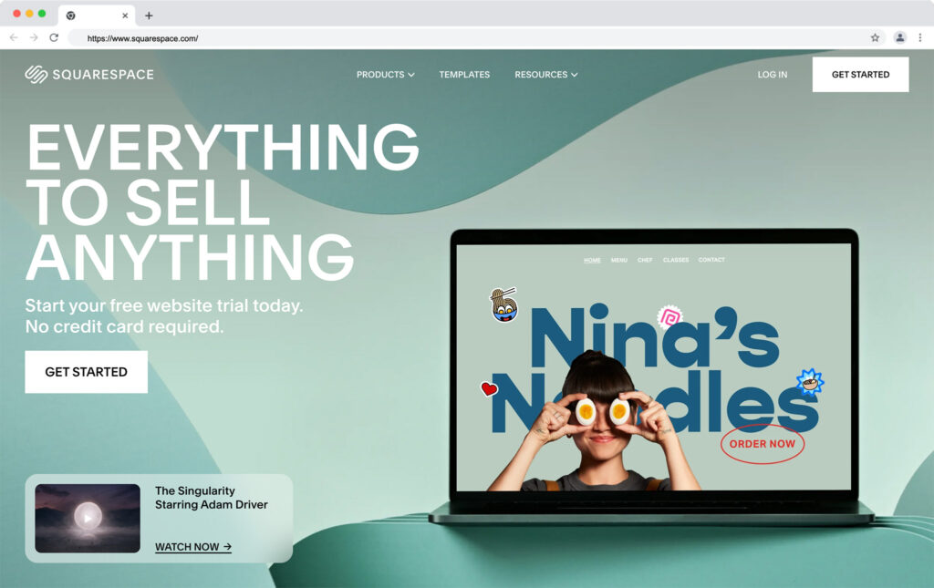
With Squarespace, you can design a stunning site in a matter of minutes, using some of the world’s most highly regarded themes and templates. There are templates for building everything from compelling online portfolios to SEO-optimized blogs and ecommerce stores.

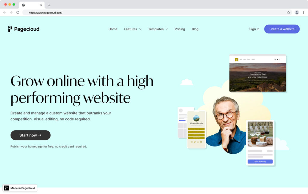
With Pagecloud, you can leverage an equally intuitive no-code website builder to launch, market, and grow your online business. There’s support for blogging, ecommerce sales, subscriptions, and service-based websites. Plus, you can even edit the source code for your site directly if you choose.

So, which solution is best?

Pagecloud vs Squarespace: Pros and Cons

All website builders have their own pros and cons. Some excel at helping content creators to stand out online, with SEO, marketing integrations, and promotional tools, but lack advanced ecommerce tools. Others are fantastic for making entrepreneurs looking to monetize their online presence, but may lack customization options, or scalability.

Both Pagecloud and Squarespace are fundamentally targeted at smaller companies, looking for a budget-friendly way to design a website with minimal coding or tech knowledge. They both allow users to build websites using intuitive templates and themes, and can both enable brands to take payments for services, products, and digital assets.

Squarespace is often the go-to solution for content creators and experts looking to build engaging, and professional-looking portfolios online. It has marketing tools and SEO functionality built-in, as well as dedicated templates for a range of industries.

Pagecloud is ideal for building one-page websites and online stores. It makes it easy to showcase social media links and bios, and helps entrepreneurs to grow their sales with inventory tracking and customizable storefronts.

Squarespace Pros and Cons

Pros 👍
Cons 👎

Pros 👍

Award-winning templates and themes
Built-in SEO and marketing capabilities
Online selling for products, downloads, and services
Included scheduling and booking tools
Options for building membership sites
Email marketing and social media integrations
Easy-to-use no-code builder
Website analytics and reporting
Creator tools (Video maker, logo maker, etc)

Cons 👎

Some limitations on inventory tracking
Limited scalability for bigger businesses
Fewer customization options than some alternatives

Pagecloud Pros and Cons

Pros 👍
Cons 👎

Pros 👍

Various beautiful templates
Source code access for customization
Transparent pricing structure
Easy-to-use drag-and-drop builder
Support for selling products, services, and digital items
Portfolio tools with social media integrations
Team member support for collaborative building
Marketing and SEO features
Forms for collecting lead data

Cons 👎

Limited scalability for larger sites
Add-ons required for analytics and reporting
Small selection of templates

Go to the top

illustration of a cat climbing a ladder

Squarespace vs Pagecloud: Background Info

There’s a lot of overlap between the features offered by Pagecloud and Squarespace. Both tools are ideal for building single-page professional portfolios, blogging sites, and ecommerce stores. They also both come with excellent SEO features, powerful monetization options, and the ability to integrate your site with multiple marketing tools.

Squarespace is a little better-known than Pagecloud, however. The solution first emerged online in 2004, with one of the first intuitive drag-and-drop builders around. Since then, Squarespace has become one of the go-to tools for website building, thanks in large part to its award-winning templates, user-friendliness, and constant commitment to innovation.

squarespace homepage

Squarespace now offers not just a comprehensive website builder, but also ecommerce tools for selling products, services, memberships, and digital assets. You can also access SEO tools, video makers, logo makers, and scheduling systems from Squarespace.

Pagecloud is a much newer addition to the low-code website building landscape, launching officially in 2015. This company supports business leaders in more than 130 countries, giving them all the tools, they need to create immersive portfolios, compelling ecommerce sites, and blogs.

pagecloud homepage

Pagecloud integrates with a range of existing apps and services, so you can align your website with your strategies for email and social media marketing. Companies can also request specialist services and support from Pagecloud developers, to help them build or manage their sites.

Go to the top

illustration of a cat climbing a ladder

Squarespace vs Pagecloud: Basic Features

With both Squarespace and Pagecloud, entrepreneurs can design one-page portfolios, blogs, ecommerce websites, membership sites, and more. Both tools promise stunning templates which look fantastic on any screen. They each also give business leaders a range of options for customizing their store, connecting with new customers, and boosting brand awareness.

Here are some of the features you’ll find included with both tools

Portfolio design: Both Squarespace and Pagecloud are great for building one-page websites and portfolios. There are dedicated templates available to help you showcase your work, as well as integrations with social media buttons so you can expand your reach online.

Ecommerce: Squarespace and Pagecloud both enable ecommerce selling. Pagecloud supports more than 40 payment gateways, including common options like PayPal. You can also choose whether you want to sell physical or digital products. Squarespace works with all of the leading payment systems, including Stripe, Apple Pay, AfterPay, and PayPal. It also has extra features available for membership sites and service websites, including scheduling tools.

Templates and customization: Squarespace is probably the industry leader for delivering phenomenal, high-quality templates. There are various theme options and frameworks to choose from to suit virtually every industry. Pagecloud also offers a wide range of templates, organized by industry and purpose. The templates are highly customizable, and responsive across all mobile devices and browsers.

Integrations: Pagecloud can integrate with a variety of tools for everything from analytics to donations, and podcast hosting. Squarespace has official integrations for a handful of marketing and sales tools. However, there aren’t as many extensions available from either tool as you’d get from competitors like WordPress, Shopify, or Wix.

Security and reliability: Both Pagecloud and Squarespace promise a strong security posture, with SSL certificates included for your website, encryption for your data, and access controls. You can also leverage PCI-compliant payment tools, and single sign-on with some plans on Squarespace. Both sites offer excellent reliability and uptime.

Omnichannel selling: Pagecloud allows users to connect their website to social media accounts, POS systems, and Amazon or eBay marketplaces. Alternatively, Squarespace can support everything from social media selling, to dropshipping with partners like Printful and Spocket. You can also link your Squarespace site to Amazon.

Analytics and Reporting: While both Squarespace and Pagecloud support business reporting features, Pagecloud doesn’t have its own built-in analytics system. You’ll need to connect your site to Google Analytics to track metrics. Squarespace has a dedicated environment where you can track things like page views, conversions, sales, and bounce rates.

Go to the top

illustration of a cat climbing a ladder

Pagecloud vs Squarespace: Pricing and Plans

Pricing is one of the most important factors you’ll need to consider when deciding which platform to build your website on. Fortunately, both Squarespace and Pagecloud offer a range of plans to suit different needs.

Squarespace Pricing

squarespace pricing

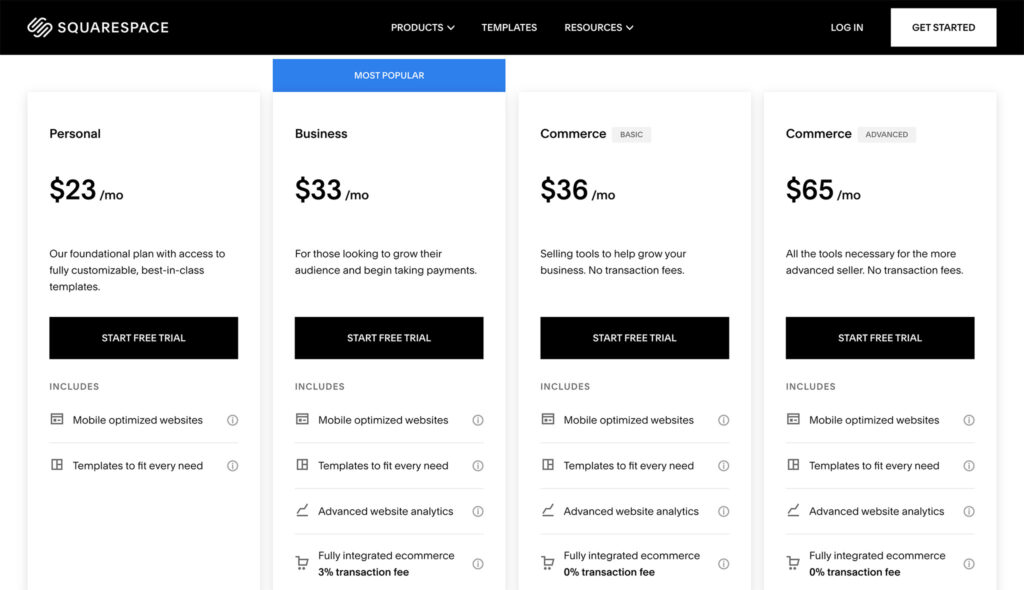
There are 5 pricing plans in total available from Squarespace, and you can save some money on paying for your subscription annually, instead of monthly.

Following a free trial, you can choose from the following plans:

Personal: $12 per month annually or $16 month-to-month for a free custom domain, mobile optimized website designs, templates to suit every need, SEO, unlimited bandwidth, 24/7 customer support, 30 minutes of video storage, up to 2 contributors, SSL security, a video maker, audience management tools and basic website metrics.

Business: $18 per month annually or $26 month-to-month for all the features of Personal, plus integrated ecommerce (with a 3% transaction fee), advanced website analytics, promotional pop-ups and banners, professional email from Google, unlimited contributors, customization with CSS and JavaScript, and more.

Commerce Basic: $26 per month annually or $30 month-to-month for all the features of Business, plus integrated ecommerce (without transaction fees), ecommerce analytics, point of sale integrations, product reviews, customer accounts, advanced merchandising, Instagram, and Facebook selling, limited availability labels, and custom checkouts.

Commerce Advanced: $40 per month annually or $46 month-to-month for all the features of Commerce Basic, plus advanced shipping and discounts, abandoned cart recovery, subscription selling, and commerce APIs.

Enterprise: Custom pricing for all the features you need, customized to suit your specific requirements. The enterprise plan includes SSO, permission controls, advanced collaboration features, custom site tags, scalable uptime, and enhanced security. You’ll also get unlimited storage, and premium customer support.

Pagecloud Pricing

pagecloud pricing

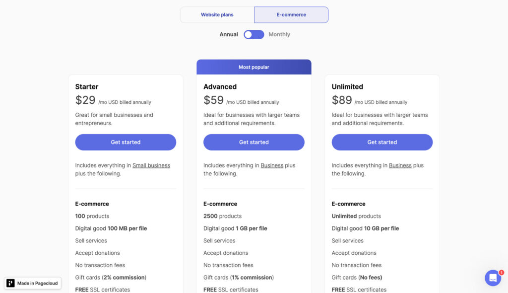
Pagecloud has a total of 7 plans to choose from, separated into “Business” and “Ecommerce” plans. The Business plans are intended for blogs, portfolios, and service websites, while the ecommerce options allow you to sell online. There’s a free plan for Pagecloud, which allows users to build a single one-page website for free. You won’t be able to work collaboratively, or add your own domain on this plan, and Pagecloud branding will be included on your site.

Paid plans include:

Small Business: $20 per month for 1 site with up to 100 pages, 1,000 form submissions per month, 2 team members, a free custom domain and free Google workspace.

Business: $36 per month for all the features of Small Business, plus up to 200 pages per site, 10 team members, 5,000 form submissions, and priority support.

Pro: $79 per month for all the features of Business for up to 5 sites, 1TB of bandwidth per month, site migration services, and expert chat support.

Starter: $29 per month for up to 100 products, 100MB per file (digital goods), service selling and donations, no transaction fees, free SSL, and gift cards.

Advanced: $59 per month for all the features of Starter, plus support for up to 2,500 products, 1GB per file (Digital goods), Amazon and eBay integration, email marketing, variations, and product filters, scheduled order pickups, multilingual catalogs, and volume discounts.

Unlimited: $89 per month for all the features of Advanced, plus unlimited product support, no fees for gift cards, 10GB per file (Digital goods), POS integrations, and expert support.

Go to the top

illustration of a cat climbing a ladder

Shopify vs Pagecloud: Customization and Ease of Use

If you’re looking for a straightforward and intuitive website builder, it’s hard to go wrong with either Pagecloud, or Squarespace. Both of these tools will allow you to design a stunning site with no coding knowledge. However, they also both allow you to dive into the code for your website or landing page content if you want to make more advanced changes.

One thing that makes Pagecloud particularly user-friendly, is that it allows multiple staff members to work on a site at the same time. Plus, there are various helpful videos and pop-ups included within the platform to assist beginners as they build. You can even use a convenient checklist to ensure you have everything you need set up before you launch your site.

Pagecloud offers customizable fonts, colors, and domain name options, with simple drag-and-drop components for bringing your vision to life. There’s also the option to copy and paste segments of HTML throughout your entire site when you want to maintain consistency.

Squarespace is also an extremely straightforward tool for business owners and freelancers. The site asks you a handful of questions when you’re getting started, to ensure you can find the right templates for your needs. There are also designers available to build your site for you if you get stuck, however the same is true for Pagecloud.

You can edit your Squarespace site with a drag-and-drop interface. However, it’s section-based so you can’t place your elements anywhere. You will need to follow a grid system. Overall, however, Squarespace does make it simple to build your website in no time. Plus, it’s simple to add plugins and extra features to connect your site to Amazon, OpenTable, and other channels.

From a web design perspective, Pagecloud does offer a little more freedom. The Pagecloud website builder can even allow you to upload Photoshop components with layers onto your site, and make changes alongside your team members in real-time. However, Squarespace has a slightly broader selection of templates to choose from.

Go to the top

illustration of a cat climbing a ladder

Squarespace vs Pagecloud: Ecommerce Functionality

Both Squarespace and Pagecloud support ecommerce functionality through a range of dedicated plans. You’ll need at least a Business plan on Squarespace to build an online store, while you’ll need to choose one of Pagecloud’s ecommerce plans if you want to sell online.

The WYSISWYG editors for both platforms come with templates specifically intended for ecommerce. Additionally, both tools can integrate with offline POS systems, for omnichannel selling, as well as marketplaces like Amazon and eBay. Both tools also integrate with social media platforms for social selling. However, Pagecloud doesn’t have any dedicated dropshipping tools yet, while Squarespace does have integrations for some popular platforms.

Both Squarespace and Pagecloud also support a range of sales options. You can sell digital products and physical products online with both systems. However, Squarespace is a little more advanced when it comes to supporting service based companies. There’s an Acuity Scheduling system for arranging appointments with customers, and you can create course and membership sites too.

Squarespace also has more advanced features for store management. While Pagecloud has inventory management tools, Squarespace has comprehensive tracking and analytics features, as well as an integration with “Tock” for hospitality industry management.

Go to the top

illustration of a cat climbing a ladder

Squarespace vs Pagecloud: Reporting and Analytics

Compared to other online site builders like Shopify and Weebly, both Squarespace and Pagecloud may appear to have slightly limited reporting capabilities. However, there are options to integrate additional SaaS tools if you need more in-depth insights.

Squarespace also has it’s own dedicated reporting page, where you can track impressions, page views, where your customers come from, and even how many sales you earn with each product. You’ll also be able to create reports with activity logs, traffic overviews, geography insights, traffic source insights, and engagement statistics.

There’s also a dedicated “Commerce analytics” section available on some plans, so you can track revenue, orders, units sold, and even abandoned carts. Unfortunately, Pagecloud doesn’t come close with its analytics and reporting options.

There’s no built-in solution for tracking important metrics on Pagecloud. Instead, you’ll need to integrate your store or website with Google Analytics, and track your information with these tools instead. This could make it harder to get a fully comprehensive view of your company’s growth.

Go to the top

illustration of a cat climbing a ladder

Pagecloud vs Squarespace: Customer Support

Both Pagecloud and Squarespace offer relatively decent levels of customer support. Both platforms even allow you to reach out and request the assistance of service experts and specialists if you need help building or managing your website.

However, if you need direct assistance with something from Pagecloud, you can only send emails to their customer service team. There’s no chat or phone support. Alternatively, you can try looking for solutions to your problems within the company’s FAQs and knowledgebase articles.

With Squarespace, your level of customer support will depend on which plan you choose. In most cases, however, you’ll be able to connect with the team either through live chat or email. There are also various knowledge base and help articles available to guide you in answering your own questions. Plus, Squarespace has some active social media channels too.

Go to the top

illustration of a cat climbing a ladder

Pagecloud vs Squarespace: Which is Best?

Ultimately, Squarespace and Pagecloud can both be fantastic tools for building a compelling online presence. Both solutions are excellent for ecommerce sales and portfolio building. They also make it easy to design phenomenal sites with minimal coding knowledge.

Squarespace is likely to be the ideal option for you if you’re looking for a tool to design a website for a services-based company, hospitality brand, or dropshipping company. It’s also a fantastic choice for professional portfolios and one-page websites.

Pagecloud, on the other hand, is intended more for traditional, yet small ecommerce companies, looking to get started rapidly online. It can integrate with your POS system, and your marketing tools. Pagecloud could also be ideal if you want to build a simple one-page portfolio for free.

Good luck choosing the right solution for your business needs.

The post Pagecloud vs Squarespace: Which is Right for You? appeared first on Ecommerce Platforms.
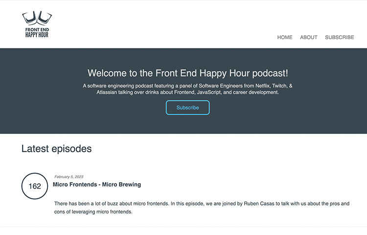
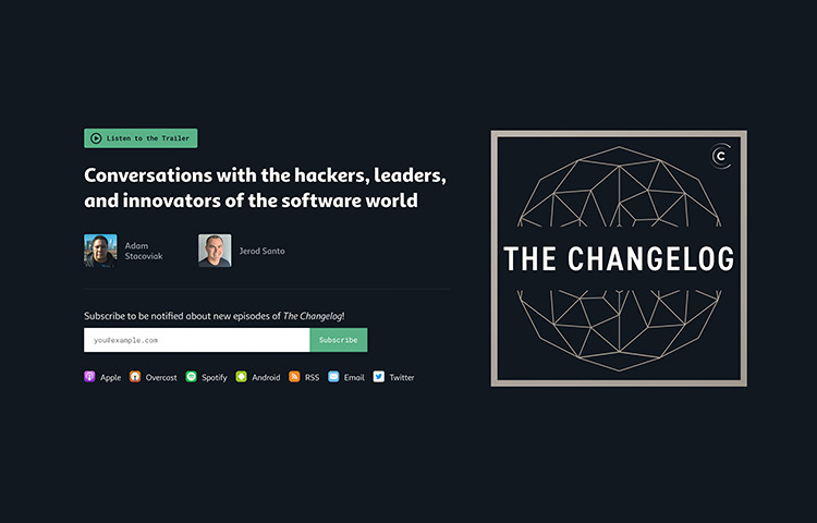
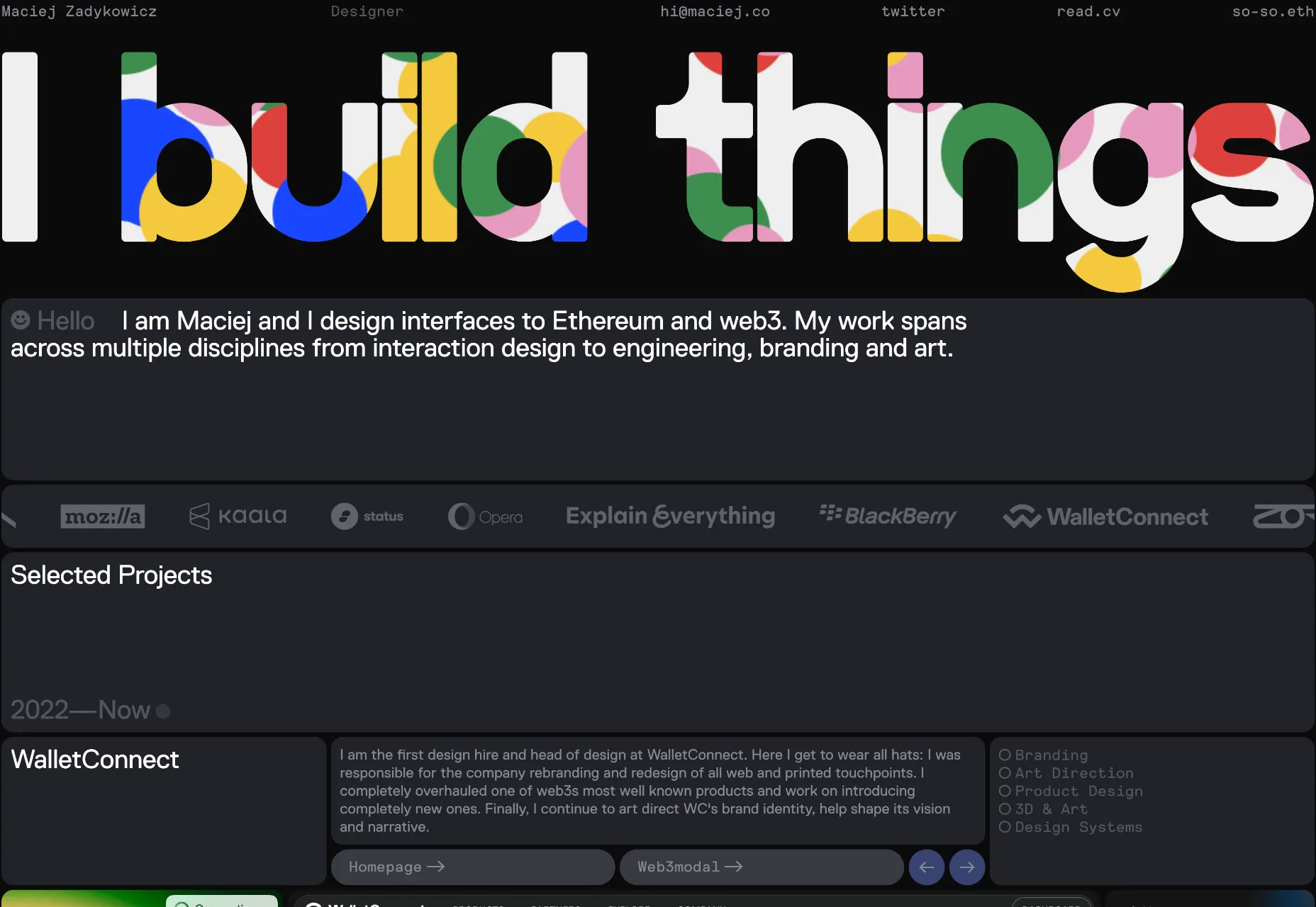
Putting Gears In Motion: Animating Cars With HTML And SVG

Original Source: https://smashingmagazine.com/2023/02/putting-gears-motion-animating-cars-with-html-svg/

Hello! And if you like HTML, you’ve come to the right place!

I love HTML. As an old-school front-end developer, I think it’s a hugely underrated skill. I’ve been writing HTML since ~2005, and today the browser alone can almost do all the things Flash could do nearly two decades ago!

One such trick HTML now has is called <animateMotion> — those familiar with Flash will remember this as The Motion Guide. I found this video from 14 years ago, but the method existed for a while before that:

The idea is, you create a path for elements to follow… and that’s it!

Here’s an example of what you can do with <animateMotion>:

🚀 Live Preview
⚙️ Repository

If you take a look at the MDN Docs, you’ll see a simple example of a red circle following a path on an infinite loop. The race cars in the live preview follow the same simple rules, and it works just like this!

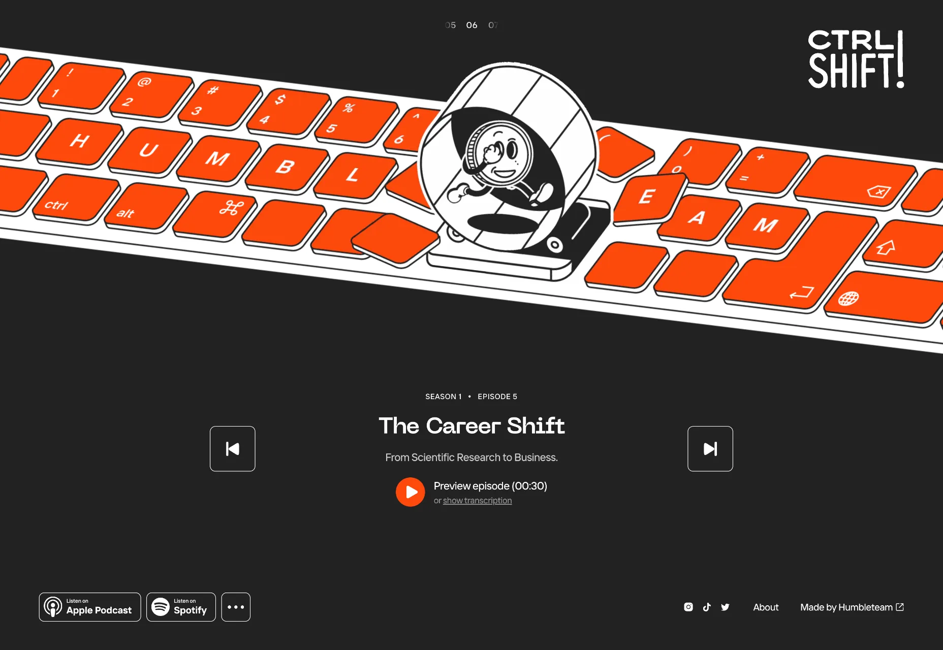
A simple example of what can be achieved using animateMotion. (See animation)

SVG Using animateMotion

Here’s a simplified version which I’ll use to explain some of the finer details.

Note: I’ve removed some of the path values for brevity, but you can see src for the below snippet at simple-version.html.)

<!DOCTYPE html>
<html>
<head>
<title>Simple Example</title>
</head>
<body>
<main>
<svg viewBox=”0 0 307 184″ xmlns=”http://www.w3.org/2000/svg”>
<g id=”track”>
<g id=”track-lines”>
<path fill=”none” stroke=”#facc15″ d=”M167.88,111.3…” />
</g>

<g id=”pink-car”>
<animateMotion dur=”4s” repeatCount=”indefinite” rotate=”auto” path=”M167.88,111.3…” />
<path fill=”#EC4899″ d=”M13.71,18.65c0.25-0.5…” />
</g>
</g>
</svg>
</main>
</body>
</html>

The first thing to look at is the <g> element with the id of track-lines. This is the yellow dashed line that represents the path the car will follow.

You’ll also see another <g> element with the id of pink-car. Within this group is the <animateMotion> element. It has an attribute of path. The numbers used to form this path are the same as the numbers that form the track-lines. An <animateMotion> element is invisible, and its only purpose is to provide a path for an element to follow.

Speaking of which, below the <animateMotion> element is another <path> element, this is the pink car, and it will follow the path of its nearest neighbor.

animateMotion Attributes

There’s some additional attributes that the <animateMotion> element accepts; these are as follows:

dur: The duration of the animation.
repeatCount: The number of times the animation should loop.
rotate: This can be considered as an orientation to the path. It will ensure the element that’s animating around the path always faces the direction of travel.
path: As explained, this is the actual path an element will follow.

The MDN Docs show the <animateMotion> element as a child of an Svg <circle> shape e.g:

<circle r=”5″ fill=”red”>
<animateMotion
dur=”10s”
repeatCount=”indefinite”
path=”M20,50 C20,-50 180,150 180,50 C180-50 20,150 20,50 z” />
</circle>

Whilst this approach works for shapes, it will only work if the element can accept a child. The SVG path element can’t, so wrapping everything in the <g> element allows HTML to work out where the coordinate system should start and which elements should follow the path. Sneaky ay!

And that’s it. I designed the track and the other elements seen on the preview link in Adobe Illustrator and exported the whole thing as an SVG. I then did a little bit of manual refactoring to ensure the cars were adjacent to an <animateMotion> element. Et voilà! A race track!

Accessibility

One small snag, the <animateMotion> element doesn’t natively observe prefers-reduce-motion. To work around this in the preview I’ve added a media query that sets any element with the class name of car to display: none;. Not ideal, but it is at least motion safe!

I hope you’ve enjoyed this post, and if you have any questions, please come and find me on Twitter. @PaulieScanlon, oh and if you’re a better illustrator than I am, please, feel free to re-design the race track and cars, and I’ll be happy to convert it into code!

See you around the internet!

Further Reading On SmashingMag

“How To Build A Real-Time Multi-User Game From Scratch,” Martin Grubinger
“Easy SVG Customization And Animation: A Practical Guide,” Adrian Bece
“Composable CSS Animation In Vue With AnimXYZ,” Ejiro Asiuwhu
“A Guide To Keyboard Accessibility: HTML And CSS (Part 1),” Cristian Díaz

How To Get a User’s IP Address With PHP

Original Source: https://1stwebdesigner.com/how-to-get-a-users-ip-address-with-php/

In PHP, there are several methods to retrieve a user’s IP address. We will explore two of those ways in this article.

UNLIMITED DOWNLOADS: 500,000+ WordPress & Design Assets
Sign up for Envato Elements and get unlimited downloads starting at only $16.50 per month!

DOWNLOAD NOW


The most reliable way to get a user’s IP address in PHP is to use the $_SERVER superglobal variable.

The $_SERVER superglobal variable contains information about the server environment, including the user’s IP address. Here’s an example:

<?php
$ip = $_SERVER[‘REMOTE_ADDR’];
echo $ip;
?>

The $_SERVER[‘REMOTE_ADDR’] element returns the IP address of the client (i.e., the user’s device) that is making the request to the server. This method works well for most cases, but there are a few situations where it may not return the correct IP address, such as when the user is behind a proxy server or using a VPN.

To handle these cases, it is recommended to use the following code to get the user’s IP address:

<?php
function get_client_ip() {
$ip = ”;
if (isset($_SERVER[‘HTTP_CLIENT_IP’])) {
$ip = $_SERVER[‘HTTP_CLIENT_IP’];
} elseif (isset($_SERVER[‘HTTP_X_FORWARDED_FOR’])) {
$ip = $_SERVER[‘HTTP_X_FORWARDED_FOR’];
} else {
$ip = $_SERVER[‘REMOTE_ADDR’];
}
return $ip;
}

$ip = get_client_ip();
echo $ip;
?>

In this code, we first check if the $_SERVER[‘HTTP_CLIENT_IP’] element is set. If it is, we use its value as the user’s IP address. If not, we then check if the $_SERVER[‘HTTP_X_FORWARDED_FOR’] element is set. If it is, we use its value as the user’s IP address. If neither of these elements is set, we use the $_SERVER[‘REMOTE_ADDR’] element as the user’s IP address.

This method provides a more robust solution for retrieving the user’s IP address, as it takes into account the possibility that the user may be behind a proxy server or using a VPN.

Learn more here.