10 stress relief gadgets
Original Source: http://feedproxy.google.com/~r/CreativeBloq/~3/xTPO3A43o3k/10-stress-relief-gadgets-for-designers
January can be a tough time; all that festive partying, darkened afternoons and chilly weather means that inspiration and motivation can often be more difficult to keep hold of than usual. This tends to lead to stress – and a lot of it – which, in turn, renders you unable to focus.
The best new tech for designers in 2018
But fear not creative folk – here we’ve pulled together some of the finest gadgets that aim to help you get back to your best self. From nature-inspired structures to electronic wizardry, explore the technology that could bring the calm back into your creative process.
01. Fidget Cube

Playing around with puzzles can often lead to a more efficient work ethic
$9.99/£7.61 from antsy labs
Funded through Kickstarter in 2016, this clever desk toy from designers Matthew and Mark McLachlan will remind you that playing around with puzzles can often lead to a more efficient work ethic.
Featuring six sides, each features something to fidget with, whether you like to click, flip, glide or roll. There’s even a side inspired by those age-old worry stones that aim to get you breathing and reduce anxiety.
02. BiOrbAIR terrarium
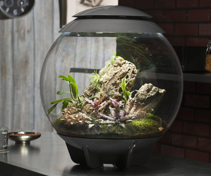
A little greenery can go a long way in establishing a calm and relaxing work environment
We all know that a little greenery can go a long way in establishing a calm and relaxing work environment. If you’re unable to stroll around the park on your lunch break or escape to the countryside at the weekend, a terrarium is pretty much the next best thing.
This one from biOrb is tech-heavy (and has a fairly hefty price tag) but that means it can take care of your plants so you don’t have to. Creating the perfect micro-climate for growing tropical plants, you can sit back and enjoy your personal slice of paradise.
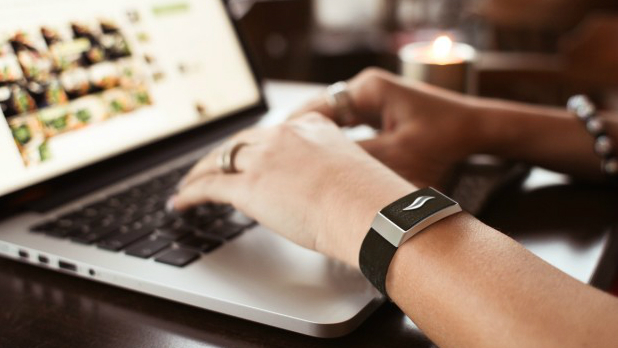
03. Sona
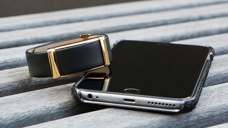
Sona keeps tabs on your heart rate and physical activity to measure your overall stress levels
Wearable technology offers new possibilities when it comes to wellbeing, both mental and physical. The Sona bracelet wants to “train your resilience to stress” and comes with five Resonance breathing meditation sessions for focus and calm.
It's perfect if you need a quick fix during small, intense bouts of stress-related anxiety. It also keeps tabs on your heart rate and physical activity to measure your overall stress levels.
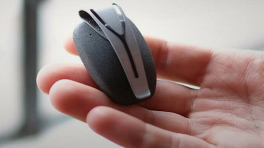
04. The Pip
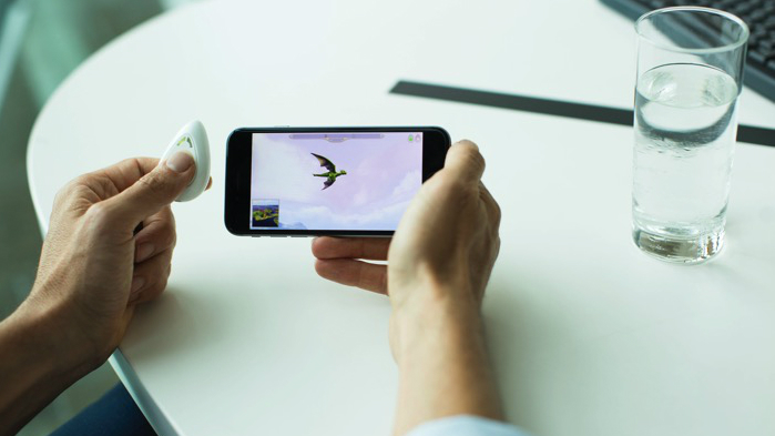
Who knew that your fingertips could lead to a happier and healthier mind?
Who knew that a stress-free life was at your fingertips? It turns out that the pores on your fingertips are extremely sensitive to stress. The Pip is an innovative gadget that reads these signals and turns them into a visualisation that enables you to keep track of your stress levels.
With a scientific board at the heart of the design, The Pip allows you to be self-aware and, in turn, establish some self-care.
05. Thync
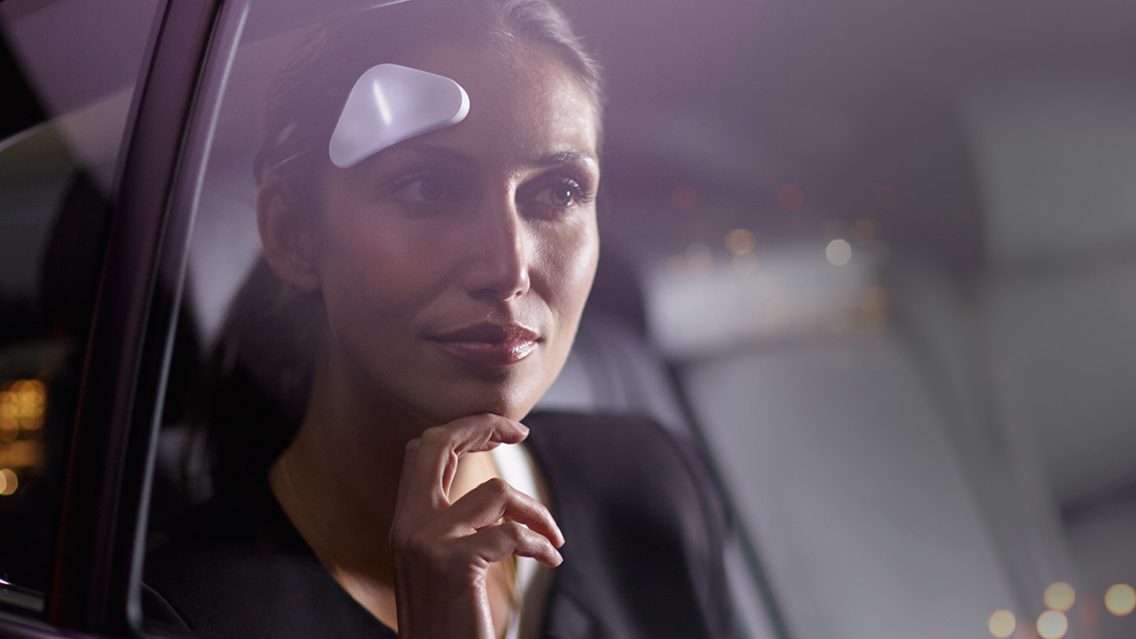
Thync uses electronic pulses to stimulate the brain
Claiming to be the first wearable technology that “actively elevates your mood and lowers stress,” Thync uses electronic pulses to stimulate the brain.
If that sounds worrying, it does come with some solid credentials: this stress relief gadget was developed by a team of neuroscientists from MIT, Harvard and Stanford and has been clinically tested over 5000 times. Plus, with such a sleek design, you’ll be combating stress in serious style.
06. Wellbe
Discover exactly what triggers your stress with Wellbe
Initially funded through IndieGoGo, the WellBe wearable provides insights into what exactly triggers your stress levels to rise. The bracelet monitors your heart rate and uses a sophisticated algorithm to determine your stress and calmness levels based on time, location and people you meet throughout your day.
Cut back on the negativity in your life.
07. Face Of The Moon stress ball
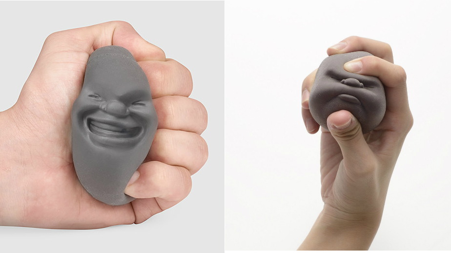
The ‘Faces of the Moon’ stress ball expressions change as you squeeze
Stress balls are a go-to toy for desk spaces, and while most of them do the job, this stress relief product from The Museum of Modern Art is truly one-of-a-kind.
Created by Japanese designer Makiko Yoshida, the ‘Faces of the Moon’ expressions change as you squeeze. Produced using a unique texture, its addictive tendencies will help relieve your anxiety. Who couldn’t love a face like that?
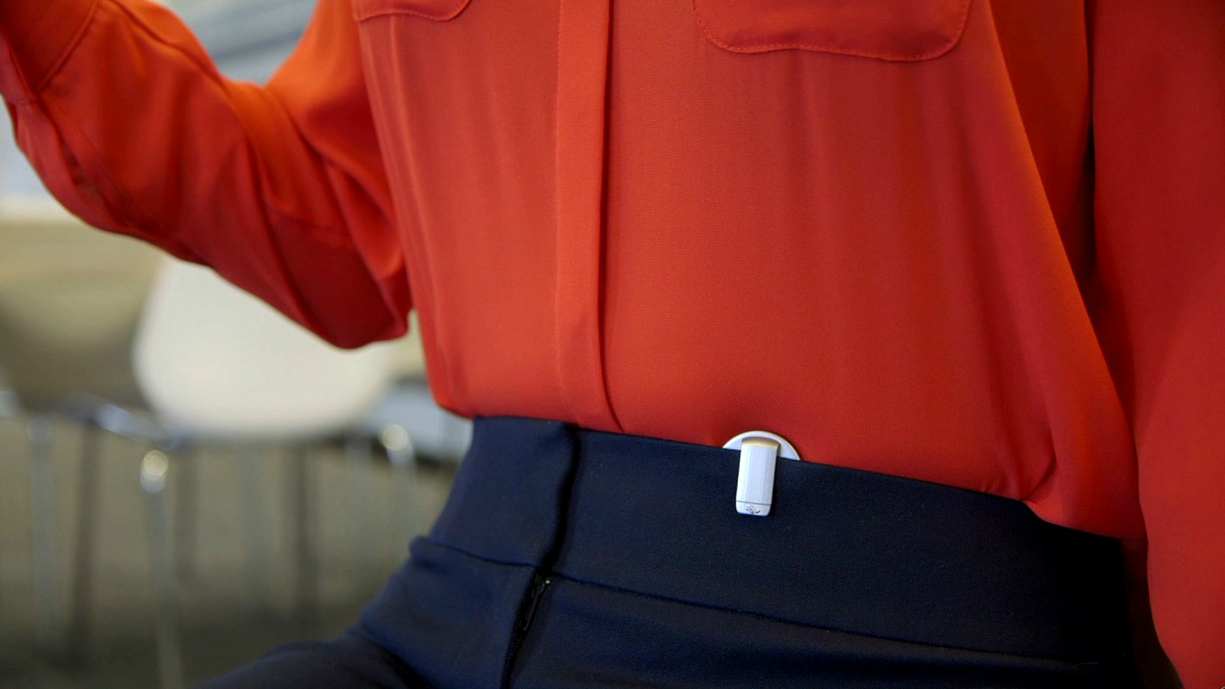
08. Spire
Spire measures your breathing, notifying you when your it reflects tension
When it comes to managing your stress levels, focusing on your breath is one of the most important exercises around. Spire helps to manage this by measuring your breathing, notifying you when it reflects your tension.
Through its use, you can discover what makes you calm and focused or stressed and agitated, allowing you to be more productive than ever. Designed to clip onto your belt, you can also program your Spire to let you know when you’ve been inactive and it’s time to get walking.
09. Prana
Prana tells you when you need to improve your posture
Bad posture is one of the most common problems for creatives who work at a desk. Thankfully, the team at Prana has created a stress relief wearable that not only tracks your breath but also tells you when you need to improve your posture.
Designed to rapidly activate your body’s relaxation response through proper diaphragmatic breathing and good posture, Prana could enable you to have a calm working day in no time.
10. Muse
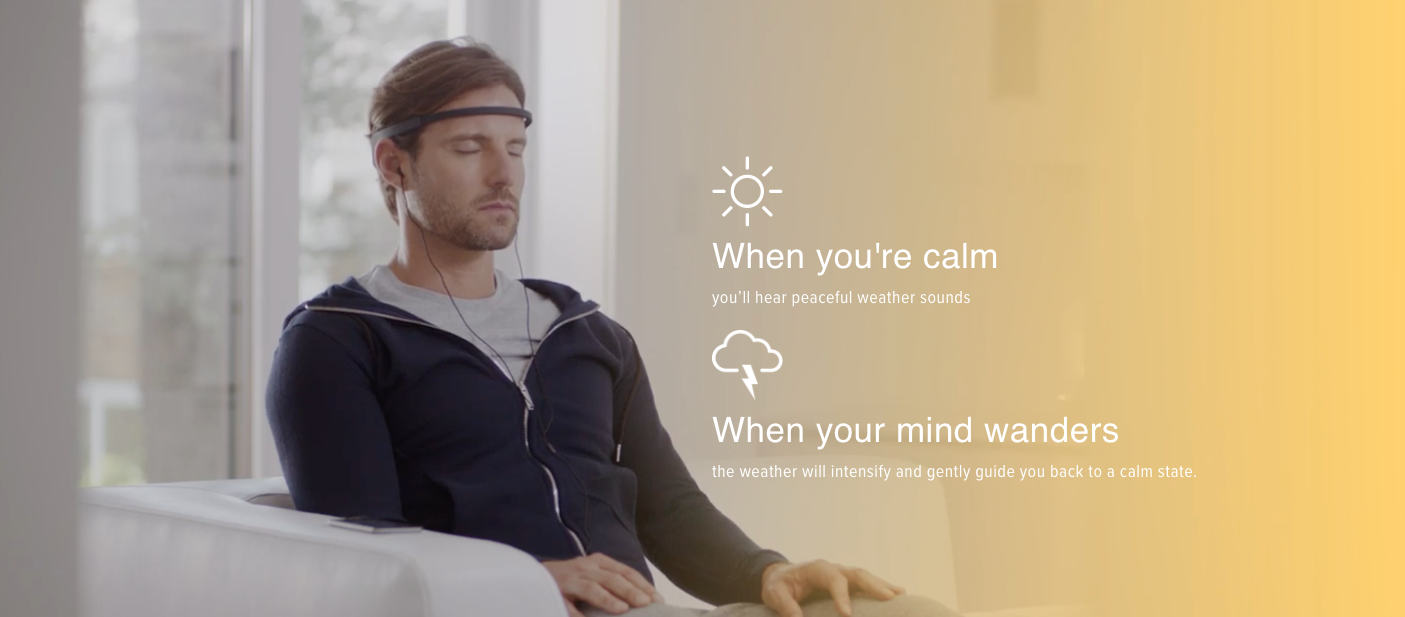
Designed like a headband, Muse uses brain-sensing technology to measure whether your mind is calm or active
You may already be well on your way to stress management through meditation and while this is proven to keep your mind healthy, you may have trouble sticking to a meditative routine or find yourself distracted during the process.
Designed like a headband, Muse uses brain-sensing technology to measure whether your mind is calm or active, and translates those signals into guiding sounds, so you can stay focused.
Related articles:
How to avoid creative burnout10 designers' New Year resolutions for 201821 ways to unlock your creative genius


