The 33 best photo apps
Original Source: http://feedproxy.google.com/~r/CreativeBloq/~3/10yH2nekAxc/best-photo-apps-513764
Here is the definitive guide to the best photo apps around, covering iOS (that's iPhone and iPad) and Android apps. Some you won't have heard of, others you'll be more familiar with.
None are going to replace a great DSLR, mirrorless or compact camera (see our guide to the best cameras for creatives) and a couple of hours with a photo editor such as Photoshop CC, but they're all great at what they do.
Get Adobe Creative Cloud
Let's start off with apps to transform your current photo collection: photo editing apps. You'll also find apps for taking photos and artistic photo apps on the other pages of this article, so click through to those if that's what you're after.
The 5 best laptops for photo editing
01. Photoshop Lightroom CC for mobile
Platform: iOS, AndroidDeveloper: Adobe Price: Free
Adobe makes a number of photo apps but if you’re serious about photo editing on your device, you only need one: Photoshop Lightroom CC for mobile. It's a free app that gives you a powerful yet simple solution for capturing, editing and sharing your photos.
You can shoot raw photos (on compatible phones), or transfer from your camera onto your device, and easily organise and tweak them, then automatically upload them to the cloud so they don’t take up space on your device. It has presets to keep your edits quick and simple, but you can also go deeper and fine-tune images to perfection.
Signing up to a Creative Cloud account – including the Lightroom CC plan, adds the ability to work across phone, tablet and desktop with instant synchronisation.
02. Photoshop Express
Photoshop Express offers the sort of professionalism you’d expect from Adobe
Platform: iOS, AndroidDeveloper: AdobePrice: Free
As you would expect from Adobe, the interface and user experience of the Photoshop Express photo app for Apple and Android devices is faultless. It fulfils all the functions you need for picture editing and will probably be the one you turn to for sheer convenience. 'Straighten' and 'Flip' are two useful functions not included in many other apps.
However, none of the filters really jump out, and some are surprisingly naff for an app that comes from the developer for designers. Ultimately, if you are looking for a more professional tool, look towards Lightroom CC for mobile, but the cut-down feel and familiarity of PS Express will suit some.
03. Photoshop Mix
Platform: iOS, AndroidDeveloper: Adobe Price: Free
Photoshop Mix is an app that caters more for those looking to make big statements than those making subtle adjustments, and it’s none the worse for it. PS Mix enables you to cut out and combine elements from different images, blend layers and make adjustments to your creations on your device, and it majors in ease-of-use.
Usefully, it live-syncs with Photoshop CC, meaning that when you make a change on your phone, it’ll show up instantly on your desktop – and you can take advantage of Creative Cloud benefits with an Adobe Photography Plan, which saves a fair bit of cash over a full subscription.
04. Photoshop Fix
Platform: iOS, AndroidDeveloper: AdobePrice: Free
With Photoshop Fix, you can make the most common image adjustments very easily, right on your smart device, without having to transfer your photos to a desktop computer and use expensive photo editing software. At your fingertips are the tools to liquify, heal, lighten, colour and adjust your images to perfection, plus you can experiment with painting tools and vignettes, control exposure, contrast, saturation and focus.
As with all Adobe mobile apps, having a Creative Cloud account opens up the ability to instantly share your work with other CC apps on desktop or mobile, but Photoshop Fix is probably best Adobe app for those just looking to make their smartphone photos better without requiring deep knowledge of editing tools.
05. Photo Editor by Aviary
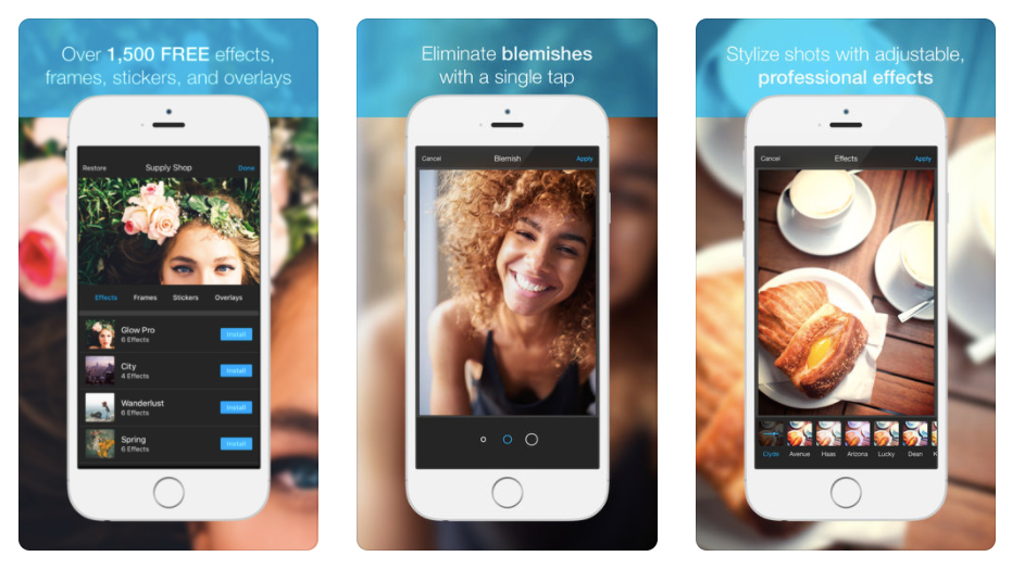
Aviary strikes a balance between serious and playful
Platform: iOS, AndroidDeveloper: AviaryPrice: Free
Aviary is a pleasantly designed app that strikes the perfect balance between serious photo editing and playful photo decoration functions, without looking bland or childish. Since it was first launched, the number of tools has exploded from 20 to 1500, giving you plenty of room to play.
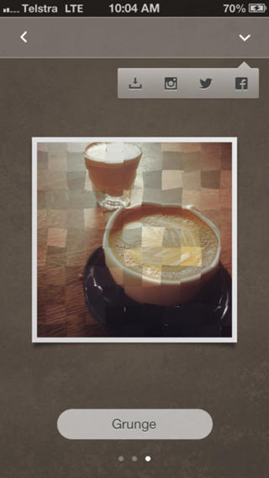
The 'Strato' filter creates one of the most convincing vintage effects from all the apps tested.
06. Google PhotoScan
Platform: iOS, AndroidDeveloper: GooglePrice: Free
It's all very well being able edit photos on your phone or computer, but what about those old pre-digital prints you have lying around? If putting them all through a scanner's too much for you, there's an app that makes digitising your ancient snaps much easier.
Google's PhotoScan enables you to scan photos with your phone in seconds, without unsightly glare and shadows; head this way for some great tips on how to get the best out of it.
07. Pixlr
Pixlr has such a huge array of effects and tools that you can get lost in it for hours
Platform: iOS, AndroidDeveloper: Autodesk IncPrice: Free
Boasting over two million combinations of effects, overlays and filters, Pixlr contains enough tools to keep you busy for hours. You can also layer your images, add text captions, and it is also an excellent collage maker. Plus you'll also find an eraser to auto fix the colour and automatically adjust contrast. Not bad for a free app.
08. Fotor
Platform: iOS, AndroidDeveloper: EverimaginingPrice: Free
Looking for a flexible photo editing app that's easy to pick up and produces quality results? Fotor delivers all of this, and best of all you can download it for free. This versatile app enables you to edit, collage and share images, plus you can discover masterpieces snapped by other users.
Fotor also offers a focus feature, enabling you to control depth of field and clarity to simulate DSLR effects. Simply select a focal point, adjust the emulator to your preference, and create a high definition finish.
09. Qwik
Qwik is crammed with filters, fonts and frames
Platform: iOS, AndroidDeveloper: Guillaume BabusiauxPrice: Free
Qwik describes itself as 'the fastest and easiest way to make pretty photos,' and with over 50 filters, plus tons of fonts and frames, it's hard to argue with it.
Edit your images in seconds with straightforward hands-on tools, and share them with Qwik's online community. With new filters and features being added every week, Qwik is constantly keeping itself fresh and exciting.
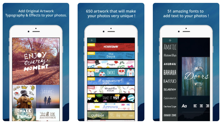
10. PicLab
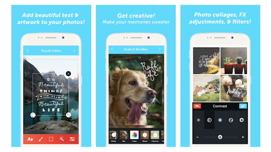
Use the photo editor to quickly create trendy infographic images with this photo app
Platform: iOS, AndroidDeveloper: MuseWorksPrice: Free
PicLab is a nifty app for creating those inspiring images that you get all over the internet these days. You know, the ones featuring a photo – probably with at least one retro filter applied – with a helpful aphorism layered over the top in an attractive, friendly typeface. Yeah, those – like the silly AI-generated ones we've featured, but better. PicLab HD makes them an absolute doddle to create, enabling you to either snap a photo or grab one from your photo library, then go to town on it.
As well as adding typography – lots of fonts and full control over size, positioning, opacity, rotation, and colour – you can also layer illustrations, ornamentation and other design elements on top of your image.
PicLab features full layer-based editing and also packs plenty of tools for making your original photo look its best, with loads of lighting and film effects to choose from as well as preset photo filters and adjustment tools for fine tuning the brightness, contrast, exposure, saturation, and the blur level of your photos.
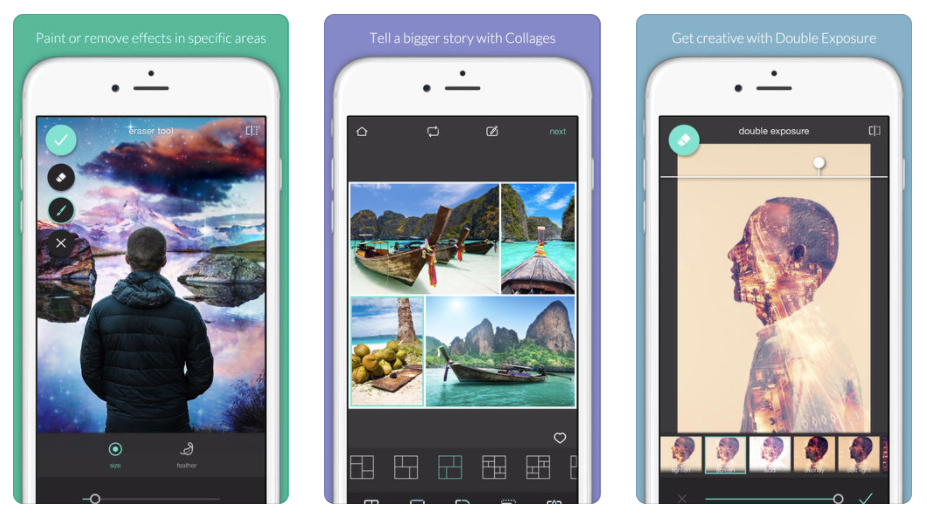
11. Handy Photo
Platform: iOS, AndroidDeveloper: ADVA SoftPrice: $2.99/£2.99 (iOS), $2.99/£2.89 (Android)
The selling point of photo editor Handy Photo is its interface, which uses the corners of the screen to cater for rotating menu options. It's all designed to keep the central area of the screen clear, allowing you to use swipe gestures to tone your effects up or down.
It's a powerful photo editor; the UI isn't for everyone, but this is an amazing price for the effects you get. The 'Move Me' tool enables you to clip out objects and move, resize or flip them.
12. Facetune
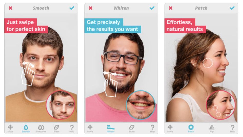
Hide your blemishes, wrinkles and more with Facetune’s photo editor
Platform: iPhone, iPad, AndroidDeveloper: LightricksPrice: $3.99/£3.99 (iPhone), $5.99/£5.99 (iPad), $5.99/£3.99 (Android)
Embarrassed about your laughter lines? Feeling blue about those blemishes? Fear not, Facetune is here! Grab a photo from your Camera Roll and start your makeover; you can remove unwanted freckles, blemished skin or hide bags under the eyes with Smooth; reshape that wonky nose or misshapen jawline with, er, Reshape; and make subtle tweaks of colour using Tone.
The results of this photo editor are truly impressive. You can share results over Facebook, Twitter and Tumblr – if you dare.
13. PhotoWonder
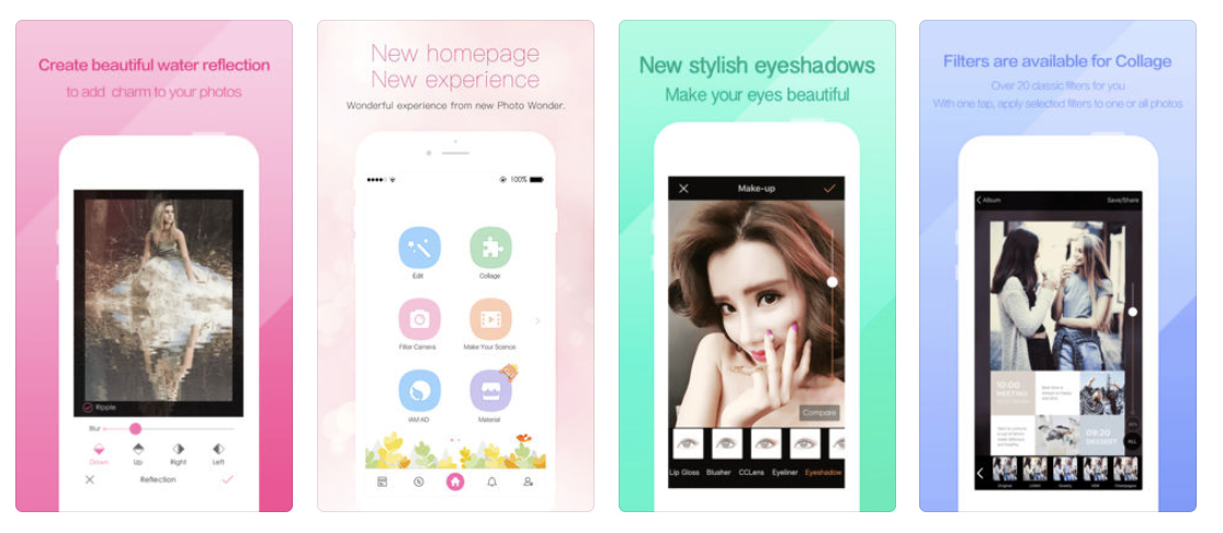
Photo Wonder has a good collage feature with multiple layouts and photo booth effects
Platform: iOS, AndroidDeveloper: Beijing Baidu NetcomPrice: Free
Excellent user interface makes Photo Wonder one of the speediest smartphone photo apps to use. It also has a good collage feature with multiple layouts and photo booth effects. The filter selection isn’t huge, but many are so well-designed that you’ll find them far more valuable than sheer quantity from a lesser app. The 'Vintage' filter works magic on photos of buildings or scenery. Combine with 'Sweety' for a dreamy retro effect.
14. Rakuga Cute
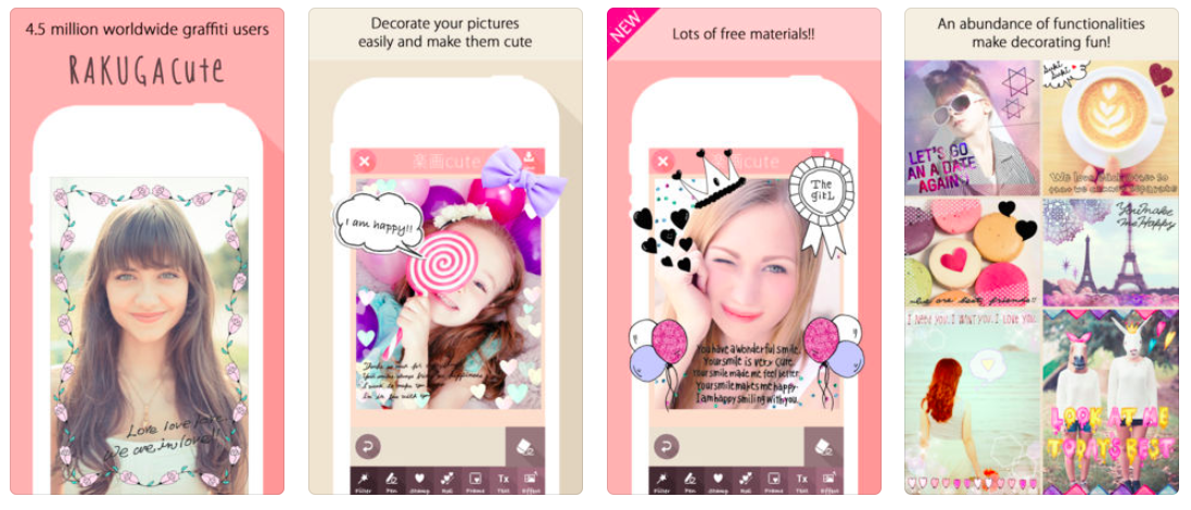
Look beyond the cuteness and Rakuga Cute has some interesting features
Platform: iOSDeveloper: Tatsumi ElectronicsPrice: Free
At first glance this iPhone photo app seems aimed at Japanese schoolgirls rather than discerning designers, but Rakuga Cute actually contains some unusual editing functions which makes it an interesting addition to your photo repertoire.
The 'Mosaic' option lets you selectively pixelate any part of a photo, quite useful for blurring out license-plates, identities or should you feel so inclined, body parts as well.
Next page: Camera apps
15. Halide
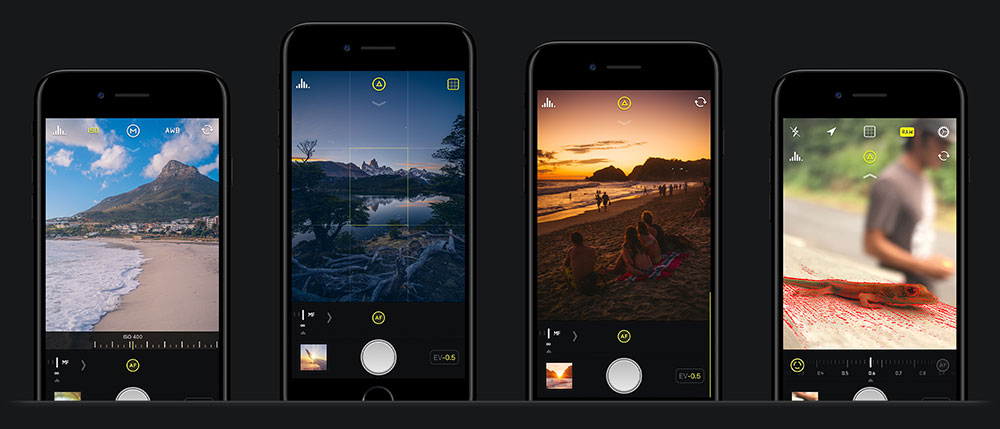
Halide puts pro camera controls at your fingertips
Platform: iOSDeveloper: Chroma NoirPrice: £4.99/$4.99
If you love the convenience of mobile photography but miss the control you get with a full-on SLR, Halide is well worth snapping up. It'll work as a simple point and shoot, but with a swipe you can open up a whole load of lovely manual options, giving you tactile control over focus, ISO and shutter speed, as well as a live histogram to help you get the right exposure.
You can review your photos Tinder-style, with a right swipe to add them to your favourites, and a left swipe to trash them, and Halide can even export as RAW to give you more flexibility when you edit your shots.
16. Camera MX
Platform: AndroidDeveloper: Appic Labs CorpPrice: Free
The Android exclusive photo app Camera MX combines powerful enhancement tools with a beautifully simple user interface. Thanks to intelligent image prcoessing you can take visibly sharper snaps, as well as cutting and trimming them to perfection in the edit.
In the latest version you can create dynamic photos with the ‘Live Shot’ feature. By saving the last seconds before you actually take the photo, this app lets users capture moving snaps that can be relived and shared.
17. Lensical
Platform: iOS (iPhone)Developer: Apptly, LLCPrice: Free
Lensical makes creating face effects as simple as adding photo filters. Lensical is designed for larger displays and utilises one-handed gesture-based controls making it the perfect complement to the iPhone 6 and iPhone 6S Plus’s cameras.
18. Camera+
Camera+ is adored by iPad users and has subsequently arrived on iPhone – hooray!
Platform: iOS (iPhone and iPad)Developer: tap tap tapPrice: $2.99/£2.99 (iPhone), $4.99/£4.99 (iPad)
The Camera app that comes on the iPhone by default is not brilliant: yes, you can use it to take some decent shots, but it doesn’t offer you much creative control. This is where Camera+ excels. The app has two parts: a camera and a photo editor, and it truly excels at the latter, with a huge range of advanced features.
Camera+ doesn’t just limit you to editing new pics – you can quickly import your existing photos into the Lightbox so that you can breathe new life into them.
19. Clone Camera Pro
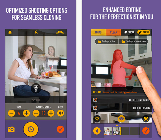
Double up your images with Clone Camera Pro
Platform: iOS (iPhone)Developer: Peta VisionPrice: $1.99/£1.99
A smart photo-compositing app that allows you to double up on your images. Clone Camera lets you produce a ‘photo’ of a scene with the same person in it multiple times. It’s simply a case of taking up to four photos of the same person in a different location, and then selecting the areas you want to stitch together into the final photo. The app works best if you have a tripod, or can otherwise keep your device still.
20. Camera360
Camera360 offers a huge range of functions and no ads
Platform: iOS (iPhone), AndroidDeveloper: PinGuoPrice: Free
Camera360 is a remarkable smartphone photo app. It’s perfectly self-contained with a huge range of functions, no ads and no insistence in promoting paid content.
Touching the photo after applying a filter produces a nifty quick comparison of the ‘before’ and ‘after’ versions. One drawback is that the process of importing photos is slightly tedious, with one too many clicks involved. Tip: go to Enhancement>Night for a great filter to correct slightly dark or underexposed photos.
21. LINE Camera
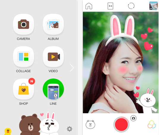
You can add text to your pictures in over 100 fonts and 20 colours
Platform: iOS (iPhone), AndroidDeveloper: Naver JapanPrice: Free
Sleek and easy-to-use, LINE Camera comes with a solid range of filters, borders, icons and stamps. You can also add text to your pictures in over 100 fonts and 20 colours, making this free smartphone photo app one of the best for typography. Check out Stamp>Heart Symbol>Shine for a nice selection of kitschy sparkle brushes.
22. Paper Camera
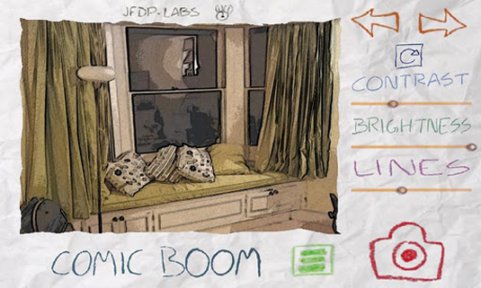
Paper Camera’s interface is quirky to say the least
Platform: iOS (iPhone and iPad)Developer: JFDP LabsPrice: $2.99/£2.99 (iOS), £2.39 (Android)
Filter effects aren't exactly a new thing, but Paper Camera takes a different approach to the post effects found in the likes of Instagram. What does it do? Well, it displays effects in real time on your camera as you're using it. There are some neat effects on offer – including cartoon, half tone and sketch.
23. Lifecake
Platform: iOS (iPhone and iPad), AndroidDeveloper: LifecakePrice: Free
Save and organise pictures of your children growing up with Lifecake. In a timeline free from the adverts and noise that clutter most social media channels, you can easily look back over fond memories and share them with family and friends.
Touted as ‘a time machine of your child’s life’, you can skip to select stages and compare different dates. You decide who can see your images, and because Lifecake is now a Canon company you can order a printed album of your precious photos.
24. VSCO Cam
Platform: iOS (iPhone and iPad), AndroidDeveloper: Visual Supply CompanyPrice: Free
Connect with amazing photographers from around the world, and create your own stunning photography with VSCO Cam. Create your own VSCO Journal to join in with the community and find inspiration form other users. Unlike other social platforms, your followers and clout are not displayed, giving everyone an equal creative playing field.
VSCO Cam comes packed with top performance features, including high resolution imports, and before and after comparisons to show how you built up your edit. Introduce yourself to the community by downloading it for free.
Next page: Artistic photo apps
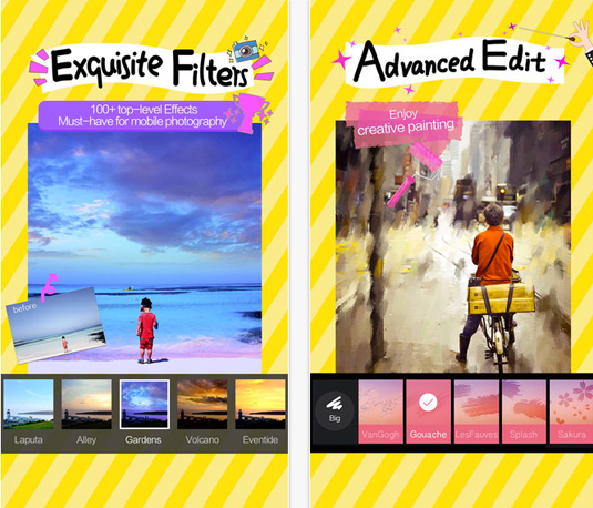
25. Prisma
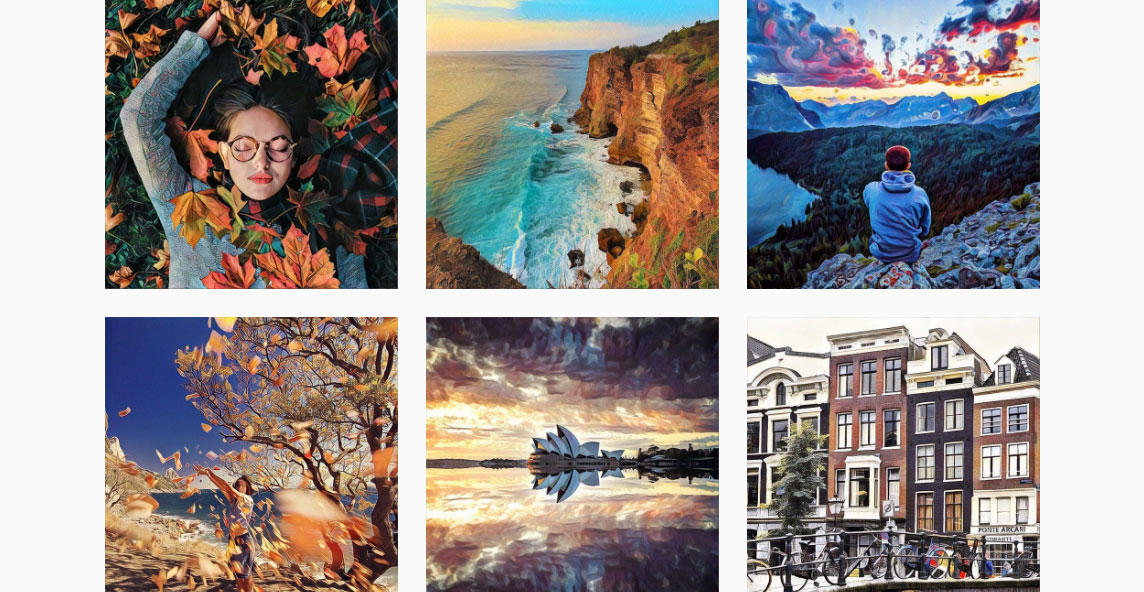
Prisma uses AI to turn your snaps into works of art
Platform: iOS/AndroidDeveloper: Prisma LabsPrice: Free
Better than any filter-based photo app, Prisma can transform your photos into masterpieces in the style of famous artists such as Van Gogh, Munch, Mondrian and Picasso. It uses an AI technique called style transfer to do its artistic magic, and it's no longer restricted to still images; it now works on video as well.
26. Instagram
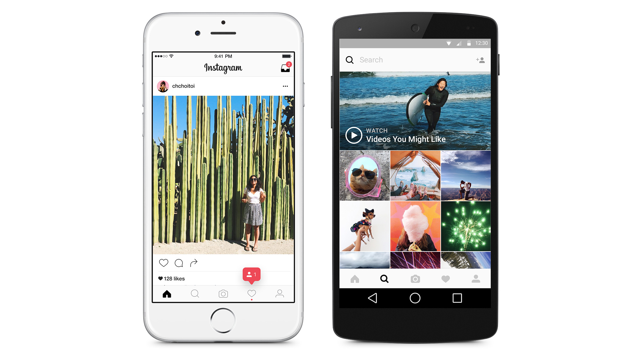
With a few simple edits, Instagram transforms photos into works of art
Platform: iOS, AndroidDeveloper: Instagram, IncPrice: Free
Even if you're new to the world of photo apps chances are you've heard of Instagram. Capable of turning the most everyday photo into something glamorous thanks to its range of custom-designed filters and editing tools, Instagram has won over a legion of fans and dedicated users.
Put simply, there is a reason Instagram is so popular. It's powerful, versatile, and best of all it's free. Thanks in part to its ownership by Facebook, Instagram has also become a social media platform in itself. Instagram Stories let you communicate a diary of images to your followers, and offshoot apps Boomerang, Hyperlapse and Layout help you create striking video and collages.
And – praise be! – Instagram has finally tweaked its feed to make newer posts more likely to appear near the top. But please just make it chronological again!
27. PixelWakker

PixelWakker transforms your pics into pointillist art
Platform: iOS (iPhone and iPad)Developer: PixelWakkerPrice: £2.99
If you're a fan of pointillism then this is the photo app for you. PixelWakker breaks down your images into their component pixels and that's where the fun begins. You can apply one of four great effects – pixel image, dots, line, or colour rain – to your pics and watch in wonder as dot art unfolds before your eyes.
28. Sktchy
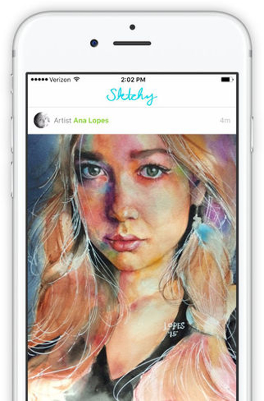
You’ll either love or hate sketch-based community photo editor app Sktchy
Platform: iOS (iPhone and iPad)Developer: Sktchy LLCPrice: Free
Connecting with people around the world in a new way, here you can choose from a selection of photographs, uploaded by the Sktchy community and create a portrait from that image.
Sktchy co-founder Jordan Melnick comments: “Our community of artists is growing every day because Sktchy is the perfect place for them to find inspiration and share their art with the world, in part because of the neat way we layer portraits over the photos that inspired them.”
29. Photochop
Photochop – Chop Up and Distort Your Photos does exactly what it says on the tin
Platform: iOS (iPhone and iPad)Developer: Big Bucket SoftwarePrice: $0.99/£0.99
We probably like this app for its name (in full: Photochop – Chop Up and Distort Your Photos) as much as for its function. It’s a cheap and cheerful little photo editor tool for mucking about with pictures. Simply pick a snap from your iPhone’s photo library, chop it up into a set of tiles and then go crazy.
You can either work directly with the tiles, dragging them around, rotating and resizing them to create a collage effect, or there’s a warp mode that works in the same way but results in a distorted image rather than a collage. Obviously it’s nothing you can’t easily do in any image editing app in a couple of minutes and you’ll be hard pushed to find a serious application for it, but it’s a fun graphical toy to have in your pocket.
30. Path On
Add images to your text with Path On
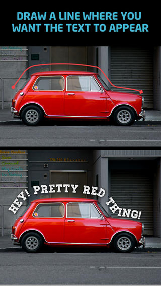
Platform: iOS (iPhone and iPad)Developer: Peta VisionPrice: $1.99/£1.99
Path On lets you add funky text to photos in unique ways. You draw the path you’d like the words to take, then type in your message – the text then flows along the path. The custom options are the real killer feature here, with you being able to adjust the font, the letter space, and the alignment. Although it’s a little fiddly, Path On is probably the best adding-text-to-photos tool around.
31. Geló
Persevere with Geló and the results will speak for themselves
Platform: iOS (iPhone)Developer: James MoorePrice: Free
A splash of colour can alter the look of an photo dramatically. Give your iPhone shots some extra oomph with this cool app for the iPhone. Gradients have become a lost art in iPhone photography, but Geló fills that gap in the market well. It needs a little more patience than your average photo app, but persevere and the results are excellent.
Once you’ve taken or imported an image, you see a carousel of ‘gels’. Cycle through to choose a colour, tap it, and then it’s applied to your shot. Using the sliders you can tweak how the filter affects your shot, and you can easily apply specific RGB values though, that might mimic your favourite tints in iPhoto or Photoshop, say.
32. Retromatic
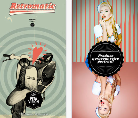
Retromatic can be frustrating at times but it portrays a great vintage feel
Platform: iOS (iPhone and iPad)Developer: Peta VisionPrice: $1.99/£1.99
1950s-inspired photo app Retromatic enables you to import your photos, cut them out using an instant alpha tool, and then apply vintage effects to them. It's quick and easy to use, and looks great, although expect frustration if you want to do anything more than the basics. The instant alpha tool works well, but you have to hold down on the screen to make it switch between a brush and pinching to zoom.
33. Tadaa
Tadaa is great for fine-tuning photos
Platform: iOS (iPhone)Developer: MenschmaschinePrice: Free
Tadaa lets you adjust the strength of all its filters, which is ideal for people who like fine-tuning their photos with subtle effects. This iPhone photo app tries to get you to use its own social network, but you can still use all features without a login.
Click on the frame icon to access a nice range of photo film borders. Unlike Instagram and Magic Hour, you’re not limited to a square and can apply the film border to a photo of any size.
Related articles:
40 sets of free iconsThe best new art apps of 2016HelloGiggles' elegant redesign focuses on community