Marketing Design Elements Every eCommerce Website Needs

Original Source: http://feedproxy.google.com/~r/1stwebdesigner/~3/iNdPCjv0g0E/

When you’re setting up your own online shop, in all your worrying over the site itself, you may forget one very crucial step: marketing. You don’t need a team for DIY marketing; get on social media, start blogging, and snatch up those free ad credits from hosting providers.

But even more important than advertising is its appearance. A distinguishable logo, visually appealing marketing content, and beautiful website will set you apart in the eCommerce world. Luckily, you don’t have to be a seasoned artist to create decent designs. Get a grasp on the basics, and you’re already on your way.

The Importance of Graphic Design

Graphic design is easy to pick up though difficult to master. But when marketing an eCommerce site, or any sort of website, good composition is key. Your website, advertisements, and even the pictures you post on social media must have an appealing and original appearance, or viewers will quickly click away.

Theme

The first thing to consider is what theme you’re after. Minimalistic? Retro? Modern? Artistic? What you’re selling can play a big role here. A store that sells games or computer parts may want a futuristic, dark, or shiny theme to complement the products.

If you already have a website with a solid theme, you can use the same or a similar design and color palette.
Chose a theme that’s linked to your products, your company, or your website’s look.

Strive for originality above all else. What makes your website, ad, or email different from everyone else’s?

The minimally designed Depot WooCommerce Theme

Placement

Graphic design is not so much about art and imagery as the way the picture is put together. Placing pieces correctly and using proper spacing is essential.

Sketch or use an image editing program to plot out each element’s placement. You don’t need to worry about alignment and symmetry yet. Just see how it looks on paper.
Look at how the pieces make up the whole. Squint your eyes to see if its looks appealing without all the details.
Use placeholder text and pictures until you have a good idea of what the final product will look like.
If you’re uncomfortable starting from scratch, don’t be ashamed to use a template.

At the very least, you should study what others have done, whether you’re tweaking a website, creating an advertisement, or writing a blog post. The single rule of art: always use reference images!

Perfectly positioned elements: Grana.cc

Lines and Shapes

Despite how simple they seem, basic lines and shapes can be put to great use in a picture. A straightforward design is often better than an overly complex one.

Lines can separate or link content, or surround and highlight important parts of the image.
Simple shapes draw the eye. Combining different types can make a dynamic and appealing picture.
The strong imagery provided by bold and distinguishable shapes sticks in potential customers’ minds.

Color

Color is one of the most essential aspects of design. Your choice of hues can create a treat for the eyes or a lurid mess. What makes a “good” color palette is debatable, but there are a few rules to remember.

Don’t use too many colors. 2-4 is ideal.
Contrast is eye-grabbing and great for adverts, but can be garish and displeasing.
Analogous colors are more harmonious, but can appear dull without contrast.
Consider the mood of the image. Are you trying to rouse excitement? A flaming red will surely draw attention. Or are you more of a chill sort of business? Gentle blues, greens, and whites are perfect. If you sell cute products like toys, pastel may be proper.
If you’re unsure, the safest bet is to borrow your website’s color scheme.

Typography

Arguably the most important in graphic design, typography is itself an art. Finding the right font, color, and placement is necessary if you want people to pay attention to what the words say.

Use different font sizes for different types of text (header, body text, buttons), but stay consistent between them.
Pick 1-3 fonts, and no more. Small images such as banners look best with one or two.
Don’t overuse stylistic or cursive fonts.
Make sure the text is legible. Use a contrasting color so that text pops and is easy to read.

Be mindful of the content as well. Get to the point quickly. Use short words and sentences. Include a call to action that encourages people to “click here” or “call now”.

Simplicity

In graphic design, it’s generally better to go for a more simple style. It’s easier and often looks better.

Don’t cram all free space with giant text, random stock images, and other clutter.
White space is a blessing; it draws attention towards the visual elements and causes less eyestrain.
Make use of basic shapes before complex images.

In general: Use as little fonts, colors, and graphics as you can. Pick a few fonts, a small palette, and a handful of images. It’s better your creation be called “plain” than “ugly”.

How to Use Design In Marketing

Now that you know the basics, how and when to apply them? Marketing isn’t all ads and email campaigns — it begins with your site, and everything you post online.

Logo and Site Design

If you haven’t begun your eCommerce website yet, these basics of design will serve you well. Usability and simplicity should be your main goal. If no one can find your shop in the clutter, you’re losing money. Instead, go with something that’s easy to navigate and isn’t an eyesore.

Using an eCommerce platform like BigCommerce may be the solution. Your website is the most significant part of your marketing strategy — what’s the use of advertising if your website isn’t up to par?

An eCommerce package has vital features like a drag-and-drop builder, a CMS with analytics and inventory management, and upselling tools. Even if you’re proficient in web development, including these can be difficult. With an eCommerce program, it’s seamless.
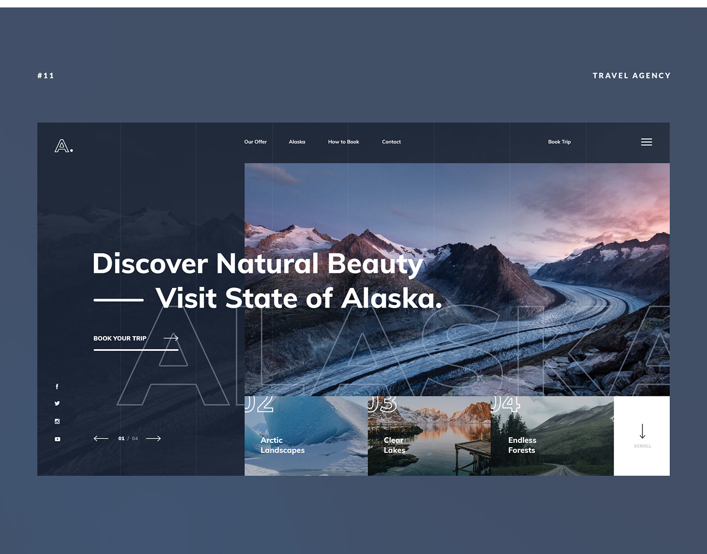
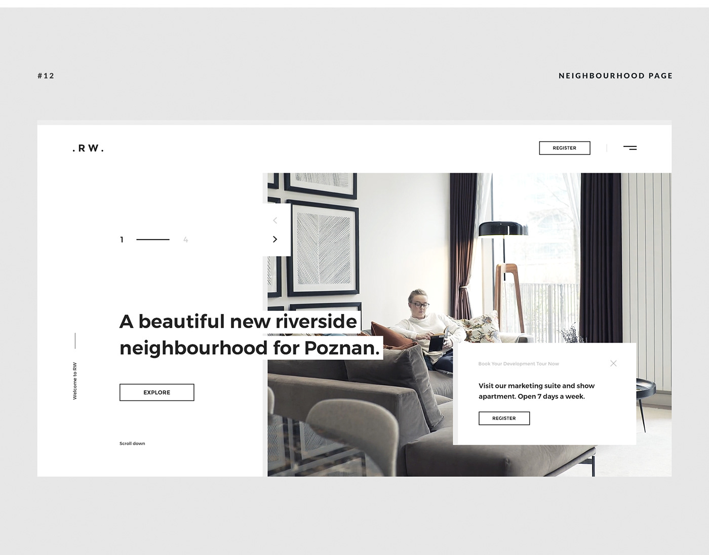
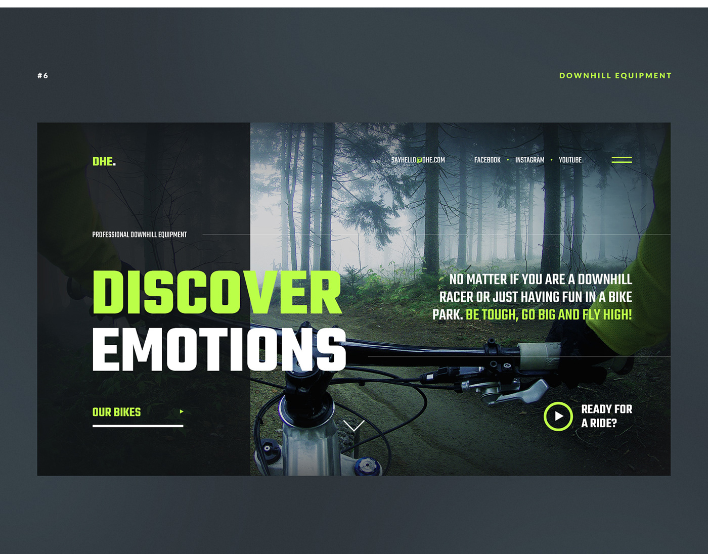
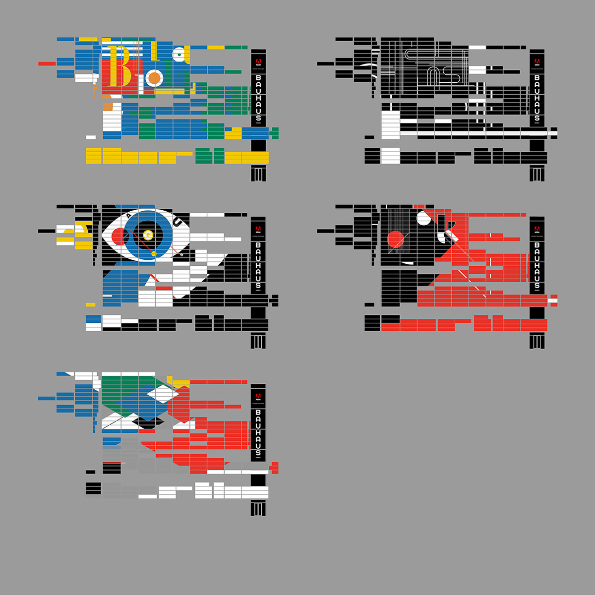
As for your logo, bright colors and simple shapes will be the best way to something memorable. Three colors is perfect, and some of the most recognizable logos are one color and even one or two shapes.

Don’t forget about your company blog. Posts shouldn’t just be a block of text! Use images and clever typography to create a more beautiful blog.

Advertisements

When it comes to adverts, resist the urge to make something that’s overly bright or flashing. No one likes seeing one of those pop up, and you’ll only get blacklisted.

Instead, create something simple that stands out from a typical webpage but still draws the eye. Incorporate small animations to further pull attention, without disrupting or annoying viewers.

Email Marketing

Emails may be made primarily of words, but that’s no excuse to ignore how it looks. The layout of text and images is the difference between a successful email campaign and ending up in the trash folder. Always use pictures; plain-text emails are visually boring.

Consider using a service like MailChimp to create more pleasing layouts for your mail. Sites like this contain templates you can customize and drag images into easily.

Social Media

Even on Twitter, graphic design plays a part. An account filled with nothing but links and text posts is no fun! You’ll get more followers if your social media is interesting and full of variety.

While this falls more under image and video editing, similar principles with color palettes and typography still apply.

Create Something That Stands Out

With knowledge of design and how to apply it, you should be able to launch a successful and beautiful marketing campaign. Just remember: simplicity, strong colors and shapes, clear theme, and good typography. Eye-catching, but not distracting.

Keep these guidelines in mind, and you’ll be effortlessly creating beautiful websites, eye-catching ad banners, and wonderfully laid out blog posts and emails. And you didn’t even have to hire an artist!


Dwelling On The Past: The Importance Of Self Reflection (Part 2)

Original Source: https://www.smashingmagazine.com/2018/01/importance-self-reflection-part-2/

Current and aspiring web professionals must continually grow in order to stay relevant. Our field doesn’t allow for stagnation. In part one of this series, I discussed the importance of project retrospectives in facilitating and documenting team growth. We don’t always have the luxury of engaging in team retrospectives, or even of working on teams. Personal reflection provides similar benefits, while focusing on your individual experiences.
Personal reflection enables us to process and make meaning of all of the great (and not so great) learning and working experiences we’ve had.

Archer Farms Coffee Packaging Illustration by Tom Haugomat

Original Source: http://feedproxy.google.com/~r/abduzeedo/~3/XX7hTvWP9YM/archer-farms-coffee-packaging-illustration-tom-haugomat

Archer Farms Coffee Packaging Illustration by Tom Haugomat

Archer Farms Coffee Packaging Illustration by Tom Haugomat

AoiroStudio
Jan 05, 2018

Staying in the layers of projects related to packaging, we are featuring this lovely series of illustrations for Target’s renowned Archer Farms Coffee by Collins. Designed by Paris-based illustrator and art director Tom Haugomat from Messieurs Dame. Working mainly in illustration, animation and painting; you should definitely follow his Behance for the latest work. I would also add that the graphic design was done by Jules Tardy and Flora Chan, all the skillsets together for a beautiful and easy to ready packaging design.

More Links
Learn more about Tom Haugomat via his Tumblr
Follow Tom’s work on Behance
Packaging Illustration
Archer Farms Coffee Packaging Illustration by Tom HaugomatArcher Farms Coffee Packaging Illustration by Tom HaugomatArcher Farms Coffee Packaging Illustration by Tom HaugomatArcher Farms Coffee Packaging Illustration by Tom HaugomatArcher Farms Coffee Packaging Illustration by Tom HaugomatArcher Farms Coffee Packaging Illustration by Tom HaugomatArcher Farms Coffee Packaging Illustration by Tom HaugomatArcher Farms Coffee Packaging Illustration by Tom HaugomatArcher Farms Coffee Packaging Illustration by Tom HaugomatArcher Farms Coffee Packaging Illustration by Tom HaugomatArcher Farms Coffee Packaging Illustration by Tom Haugomat


illustration
illustrations
digital art


10 Surprising Ways Chatbots Are Revolutionizing Ecommerce

Original Source: https://www.webdesignerdepot.com/2018/01/10-surprising-ways-chatbots-are-revolutionizing-ecommerce/

From simply ordering food to booking appointments, hiring services, and or even making bids, customers use online shopping as a friendly, and efficient way to shop.

Establishing an online store as unique in its niche is essential for staying ahead of competitors. As the number of consumers increases on a daily basis, online stores have started deploying chatbots to engage customers. Here are 10 ways chatbots can be used to meet the needs of customers, and store owners, some of which may surprise you…

1. Gathering Customer Data

Chatbots are steadily becoming a major source for gathering data. They manage this because they gather far more customer data than any other form of analytics. Nuances in speech, response times, even typing accuracy can be mined as big data sets to understand users.

More importantly, rather that being generalized data, the information gathered is niche specific, and so far more valuable to a site’s owners.

2. Streamlined Store Management

Chatbots can be easily integrated within an online store which allows tasking of multiple operations from a single control point, be it a window or the dashboard. Rather than focusing on developing an application, stores can optimize their services since no application is required for users to gain access to facilities.

3. Greater Outreach

While mainstream marketing strategies provide a significant degree of success, chatbots bring an untapped potential for higher outreach on ecommerce stores. Through them, specific target groups can be catered uniquely, allowing each potential lead to be dealt according to their preferences.

Customers are not only more inclined to complete their purchases but are also willing to buy additional items recommended by chatbots.

4. Boosting Leads

Chatbots can be integrated into existing marketing strategies aimed at enhancing lead generation. They can be optimized with relevant responses depending on user choices, which guide them towards products and services either through manual search or interest.

If a chatbot detects a predefined pattern in customer navigation, it automatically sends related products and services offered by the seller or an affiliate to improve browsing. Moreover, it increases the chances that the customer will purchase additional items, leading to higher conversion rate.

Because the responses of chatbots can be programmed to be selective in nature depending on customer choices, data and behavior, it effectively reduces the chances of inadvertently spamming customers, yielding greater acceptance from the buyer.

5. Increasing Revenue Through Cross-Selling and Up-Selling

As the code is designed to review customer preferences and purchase history, chatbots can identify items which are related and recommend by shoppers. Often, customers are searching for complimentary products, and chatbots scale the analytics to suggest similar items.

While users keep browsing on various pages of the store, the data is being collected in the background for chatbots to assist leads into conversion.

6. Personalized Engagement

The AI behind chatbots is programmed to mimic human interaction and can respond to user behavior with the same information and pattern as a sales representative would. Because they have access to greater reserves of data, these tools can generate faster and more precise recommendations based on user profile. This allows chatbots to engage customers in real time on a personal level.

7. Managing Sales Services

Chatbots can handle complex customer queries, allowing them to become an integral part of sales and support. As an Interactive agent, chatbots function as an artificial conversational entity to initiate a textual or auditory dialogue with a customer who needs help regarding products and services.

By stimulating a human presence, customers are inclined to converse and get the information they need without any intermediate delay.

8. Reducing Human Resources

Chatbots not only augment the sales funnel but also help by sealing financial leakages to strengthen the revenue curve. While online stores are an ideal solution to unburden businesses from recruitment overheads, chatbots function by further reducing hiring cost by supplying all the abilities of many dedicated resources combined.

These tools can monitor store’s live interactions, queries, tracking, and analytics without the need of a single human resource.

However, this does not mean they are entirely self-sustaining modules. To ensure maximum performance is delivered, these tools require maintenance and testing on a periodic basis by qualified professionals.

9. Availability

Many online stores target global audiences located in different time zones. To ensure seamless user experiences, it is imperative for sales services to remain functional at all times; if a potential lead is unable to receive help and support during a query, it is more than likely that an abandonment will follow as a consequence.

Chatbots can function consistently by relaying information simultaneously, catering to all types and category of audiences. Deploying them for sales support guarantees your customers have a reliable channel for resolving queries at their disposal.

10. Gathering Customer Feedback

Customers are among the most valuable sources for gathering information when optimizing websites and its elements. In case the webpage is receiving traffic but is unable to convert leads, chatbots can be set to conduct surveys regarding what they seek in an online store to revise the store elements accordingly.

Chatbots and Ecommerce

As technology introduces new online solutions to customers and merchants, ecommerce stores have transitioned from static shopping platforms into evolved machines that not only enhance their business but also provide an improved user experience for customers.

Auto-interaction tools such as Chatbots provide an excellent list of compelling features that can be integrated into online stores to passively modify store management and ultimately win the increased revenues every online store hopes to achieve.

20+ Fineliner Brushes & Patterns from The Artifex Forge – only $8!

Source

p img {display:inline-block; margin-right:10px;}
.alignleft {float:left;}
p.showcase {clear:both;}
body#browserfriendly p, body#podcast p, div#emailbody p{margin:0;}

Managing and Promoting Your Online Courses

Original Source: https://www.hongkiat.com/blog/managing-promoting-your-online-courses/

E-learning market has shown a humungous growth in the past 5 years. From college students and stay-at-home moms to retirees and even regular company employees, millions of people are now depending on…

Visit hongkiat.com for full content.

Collective #379

Original Source: http://feedproxy.google.com/~r/tympanus/~3/sHfFGpssON0/

C379_WOTW

Inspirational Website of the Week: Crux

An old schoolish, yet refreshingly realistic design with a brilliant navigation. Our pick this week.

Get inspired

C379_hellosign

This content is sponsored via Syndicate Ads
HelloSign API: The dev friendly eSign

Embed HelloSign API into your app in minutes, with only a few lines of code.

Check it out

C379_blue

365 shapes of blue

Explore Julien Espagnon’s journey of learning to code with experiments he made each day in 2017.

Check it out

C379_method

Object Explorer

A resource to help figure out what JavaScript object method would be best to use at any given time. By Sarah Drasner.

Check it out

C379_grid

Auto-Sizing Columns in CSS Grid: ‘auto-fill’ vs ‘auto-fit’

Sara Soueidan explains how to auto-size columns in a CSS grid layout in this great article.

Read it

C379_framework

lit

A tiny CSS framework that aims to preserve everything Skeleton, Milligram, and other micro frameworks have to offer. By Arham Jain.

Check it out

C379_checklist

Front-End Performance Checklist 2018

A very useful front-end performance checklist for 2018 by Vitaly Friedman.

Check it out

C379_2018

Top JavaScript Libraries & Tech to Learn in 2018

Eric Elliott’s fantastic analysis and predictions for 2018.

Read it

C379_stimulus

Stimulus

A JavaScript framework that doesn’t take over your complete front-end but adds to it.

Check it out

C379_cssdemo

The Future Belongs to CSS

An interesting demo employing CSS Grid, Flexbox and position: sticky. Made by Josh Collinsworth.

Check it out

C379_joishi

Cyberspace

An interesting three.js experiment by Yoichi Kobayashi.

Check it out

C379_objectfit

Cropping & Scaling Images Using SVG Documents

Sara Soueidan shares an SVG snippet that replaces a CSS object-fit declaration.

Read it

C379_sapper

Sapper: Towards the ideal web app framework

Read about Sapper, a new web app framework by Svelte.

Read it

C379_webic

Building a webic community

Read Chen Hui Jing’s inspiring article on building a ‘webic’ community in Singapore.

Check it out

C379_headless

headless-devtools

Headless-devtools lets you perform Chrome DevTools actions from your code by leveraging Headless Chrome with Puppeteer.

Check it out

C379_preload

Can Preload Cut the Mustard?

Scott Jehl writes on a an interesting peculiarity of link[rel=preload].

Read it

C379_feedback

Fizzl

A tool for collecting design feedback quickly and easily. Free for the first couple of months.

Check it out

C379_gradients

The Secret of Great Gradient

Anna Grenn shows how to create the perfect gradient inspired by nature.

Read it

C379_2017

A recap of front-end development in 2017

A list of the most notable events in front-end engineering in 2017.

Read it

C379_insta

Instagram.css

Complete set of Instagram filters in pure CSS inspired by CSSgram.

Check it out

C379_2018trends

19 web design trends for 2018

John Moore Williams explores the hottest web design trends, techniques, and tools for 2018.

Read it

Collective #379 was written by Pedro Botelho and published on Codrops.

How to add texture to your pastels with primers

Original Source: http://feedproxy.google.com/~r/CreativeBloq/~3/OURdJ5XFMkU/add-texture-to-your-pastels-with-primers

Using pastel primers to create surfaces for your art means you can build a more textured surface to work on than paper, which holds more layers of pastel. Primers also allow you to vary that texture, helping you to add interest and even to add drama to your pastel artworks.

For me, the most exciting thing about them is the way that I can create an underpainting to work over, which gets my paintings off to a lively start, and takes away that 'fear of the blank canvas'.

By underpainting first, you combine drawing and painting skills even more than before, and inject a mixed media feel into your work. This can lead to unexpected developments and unplanned outcomes, keeping the experience fresh and exciting. So read on to breathe life into your pastel work.

01. Choose a pastel primer

Pots of primers, tubes of acrylic paint and a paintbrush

It’s easiest to buy your primers ready-made

Many artists prepare their own textured grounds, using various mixtures of gesso, pumice, or grit and acrylic primers, but it is easier to buy them already prepared. I like the Art Spectrum Colourfix range, which has 20 colours, plus a clear version. They can be brushed or rolled on, and thinned with water to adjust the texture.

02. Mix two colours for a tailored tone

Photo of artist applying a tan-coloured primer

Use a cheap decorator’s brush with a bit of water to apply your primer

Loosely mixing Raw Sienna and Sand Colourfix Primer with a cheap decorator's brush gives a lovely soft base colour for portraits. Using mount card as the base, use a little water on the same brush to brush the primer on. Speed really is essential in this process, as the primers dry extremely quickly. Remember that the more water you use, the less texture you'll have.

Pastel portrait of a man with headphones around his neck

Primer gives your an excellent base colour for portraits

When painting Nathaniel, I build up many layers, using Unison Soft Pastels, Conté crayons and pastel pencils. You can use a pencil eraser to rub out, and even add water to your pastel work. A pastel primed surface is a strong and forgiving surface.

03. Create texture with Golden Acrylic Ground

Pastel drawing of birch trees

A layer of Golden Acrylic Ground is great for adding texture

This quick sketch of birch trees was done over a layer of Golden Acrylic Ground for Pastels. This product has no colour, so you need to add your own, or underpaint the first layer with acrylic paints, for example. I like the way that on this piece, the rough brushstrokes show through.

04. Create bright surfaces

Applying a clear coat of primer to a bright blue surface with a brush

Coat layers of acrylic with Clear Colourfix Primer for a bright background

When I want a bright surface to work on, I paint two or three layers of acrylic paint – in this case, System 3 Acrylic in Ultramarine. When dry, I coat with Clear Colourfix Primer, which looks milky as you paint it on, but dries transparent. This clear primer can be painted over many other types of paint or surface, so is also great for collage.

Pastel jack russell dog portrait on a bright blue background

A blue background can make your foreground colours really pop

It can liven up your work to use background colours that are unexpected. I like the way that blues are part of the shadow colours for white animals, they also look good behind black, and make browns and oranges (a complementary colour for blue) jump off the page. Remember that you don't have to 'colour it all in' – create a feeling of space by leaving some areas unpainted. 

05. Tint primers with acrylics

A pastel seascape

The more colour you add to your primer, the less texture you’ll get

Pastel primers can be tinted with any water-based paint or ink. Keep in mind that the more paint you use, the less texture you will have to work with when applying pastel. You can let the primer dry and then wash colour over it to retain texture. In this base for a seascape, I loosely paint Yellow Ochre and Burnt Umber acrylics and primer together.

06. Treat primers as paint

Roughly painting a blue mound

Paint in a base with Colourfix Primers Sand and Deep Ultra

To create the feeling of a windswept day up on the high moor in this piece, I loosely paint a base using Colourfix Primers Deep Ultra and sand, treating them like paint and using my cheap decorator's brush.

Blue and sand-painted background

Don’t hang about!

The finished underpainting dries in about 20 minutes, so I have to work quickly and cannot dwell on detail or worry about strokes.

Yellow and green pastel marks added to the blue background form the shape of a moor

Make sure that some of your underpainting shows through

Once the underpaint is dry, I work into the piece in some areas with Unison soft pastels, limiting my palette, and making sure that I leave areas of the underpainting showing. It is easy to get carried away and cover it all up, but that would lose a lot of the life and energy.

People are added to the scene, drawn in pastel

Be careful not to overdo it

I add more definition to the rocks, by creating sharper edges and using strong lights and darks. By adding figures, I create a sense of scale to the piece. I want the painting to have a light, sketchy feel, so I am stopping at this point. They say that paintings are never finished, they just stop in interesting places.

07. Use shades of primer to add depth

A hillside scene with a tree clinging to rocks

Here, different shades of primer add depth to the finished painting

This painting, Deep Roots, is a much larger pastel, worked over pastel primers as in the previous example, but with more depth and definition. I paint a dark blue under the rocks to emphasise their strength and weight, and cream under the sky to create contrast. In the bottom right-hand corner, I leave the brushstrokes of primer showing.

This article was originally published in issue 12 of Paint & Draw, the magazine offering tips and inspiration for artists everywhere. Buy it here.

Related articles:

How to master colour theoryDrawing techniques: 7 fundamentals of pencil drawingHow to make your own canvas boards

Tried & Tested Methods of Reducing Shopping Cart Abandonment

Original Source: http://feedproxy.google.com/~r/1stwebdesigner/~3/oD1k80wvaM0/

When it comes to the sales process, it’s easy to assume that your potential customers take transaction forms for granted, especially since they are so commonplace in online shopping. Besides, your offerings are already tempting enough to convince them to shop with you, right?

Realize that your transaction forms are an opportunity for you to gain your customers’ trust. Through your transaction forms, you’re asking them for sensitive information such as online identity, credit card details, and shipping addresses. Your customers have plenty of reasons not to give this information away blindly.

Be sure to place the recognizable security logos (such as “Norton Secured” and “Verisign Secured” logos) in prominent positions. More importantly, make sure you have the infrastructure to back it up.

Be Clear About All Costs Up Front

One of the most frustrating things about shopping online is expecting to pay a specific amount, only to find out at checkout that you’re paying a whole lot more in hidden costs, fees, and surcharges. Even more egregious than these charges are the dreaded shipping charges.

Based on data from UPS, shipping costs can be such an obstacle to online shopping as to be the single biggest reason cited for shopping cart abandonment above all others.

Be as forthcoming about shipping as possible. As for the delivery estimates, be equally transparent about the lead times, so your customers can decide whether it’s worth their money to have their items arrive sooner, especially if the difference can be days instead of weeks.

Offer Free Shipping

In the spirit of making shipping a painless process as opposed to a deal-breaker for online shoppers, consider waiving the shipping costs altogether. Free shipping is such an incentive when shopping online that customers may even happily accept higher nominal prices when the shipping is free.

If you choose to offer free shipping, of course make sure you make it as obvious as possible. Use large, bold fonts and icons to point to this selling point, and win your customers over.

Retarget Shoppers with Reminder Emails and Ads

Online shoppers can abandon their carts for a number of reasons, none of which are as critical as the time that elapses when they do. It is important to reach out to them with a reminder to finish what they started.

Approximately 72 percent of online shoppers return to their abandoned shopping carts within 12 to 24 hours to complete their shopping.

Coupons can be a great incentive here, as well as pop-up ads. By utilizing cookies, retailers can have the reminders appear after the shopper leaves the page without completing the transaction, which helps avert abandonment entirely.

Keep The Cart Visible

With almost three out of four shoppers coming back to their carts within a day, the vast majority of the remaining shoppers abandon their carts with the intention of saving their items for future consideration.

This makes it really important to have the cart in clear view and easily accessible, to keep your customers aware of their unfinished shopping.

If you know how to create your own website for online shopping, you probably know about the various customized cart icons that you can install to remind your customers that you haven’t forgotten about them.

Make Navigation Between Cart And Store Effortless

This is one of the most difficult strategies to implement, mostly because trying to manage shoppers’ behaviors is like trying to hit a moving target.

As shopping in a brick-and-mortar store is nuanced, often non-linear and counterintuitive, from a merchant’s standpoint, it still helps to tailor the user experience to enable the customer to navigate effortlessly between shopping cart and store.

Offer logical, intuitive navigation options and adhere to the old adage “the Back button doesn’t exist.” The less frustrating the experience, the more likely your customers will complete the transaction.

Offer Multiple Payment Options

“Overcome obstacles.” This golden rule is usually reserved for salespeople who need to get past unwilling potential consumers to make a sale. But what about the willing ones?

Making sure that more payment options are available is another way that online sellers can overcome obstacles. Aside from the usual options such as credit cards and debit accounts, PayPal is still a popular option. Also, Apple Pay and Google Wallet are gaining traction among younger shoppers.

Having a wide variety of payment gateways means that more people can shop at your online store, and that’s a good thing.

Enable Guest Checkout

They say membership has its privileges, but by making membership a prerequisite, you alienate an entire market of casual shoppers who just want to buy what you have to sell. Of course, it would make things easier for both you and your customers if they would sign up, but if the goal is to minimize shopping cart abandonment, then enabling guest checkout is a no-brainer.

There are plenty of online tools that allow you to make guest checkout possible for your customers. By showing them that you are committed to their satisfaction as customers first, they will be more willing to become members in the future.

Make Checkout Lightning Fast

Online shoppers may have a wide range of tolerance for inconvenience, but it’s best for you as a merchant to assume that making them jump through hoops just to be a customer of yours is a bad idea.

The more you can streamline the checkout process, whether by reducing windows, steps, or pieces of personal information, the more likely their shopping experience will be a successful one.

Implement Exit-Intent Pop-Ups

Exit-intent pop-ups can detect when a user is about to leave a particular page. They serve to encourage the user to stay on the page, often offering incentives or vital information about their shopping session.

Offer a Bulletproof Money-Back Guarantee

eCommerce is founded on trust, and a faithless transaction can be damning to your online business. Once payment has been processed, the pressure is on you to deliver on your promise, and this pressure can be tremendous.

By demonstrating your willingness to stand behind your products and services, whether by offering money-back guarantees or implementing a generous return policy; make sure your customers are fully aware of your willingness to look out for them.


Dedicated Servers: Gateway to a Secured and Reliable Web Hosting Service

Original Source: http://feedproxy.google.com/~r/Designrfix/~3/YAHISkxPSb8/dedicated-servers-gateway-secured-reliable-web-hosting-service

Dedicated web hosting is also known as managed hosting service or simply dedicated servers. This is one of the best options for web hosting services that offer immense benefits. Before moving forward with dedicated servers, it is important to understand, what is a web hosting service? Web hosting is a kind of service that enables […]

The post Dedicated Servers: Gateway to a Secured and Reliable Web Hosting Service appeared first on designrfix.com.

How to Track Ecommerce Transactions with Google Analytics

Original Source: https://www.sitepoint.com/track-ecommerce-transactions-google-analytics-reports/

Google Analytics is a really useful tool for tracking visitors on your website, but few developers go beyond adding the standard tracking code, which consists of a JavaScript snippet.

Other than custom Events (see the link above if you’re curious what Events are), we can also track ecommerce transactions in Google Analytics using some extra code.

Why Track Ecommerce Transactions in Google Analytics?

Most ecommerce systems offer detailed transaction statistics, but you can’t necessarily relate them to sessions, devices, demographics or other important metrics. For example, was an increase in sales caused by UX improvements, a successful marketing campaign, or seasonal variations? Who knows.

Recording transactions in Google Analytics means that:

product and user reports are richer and more insightful
you can relate transactions directly to AdWords and other campaigns systems
you can assess the success of campaigns and concentrate on those that lead to a high return on investment
you can award access to these reports to those in your company without having to add them to the ecommerce system.

Let’s dive in.

The Overall Concept

Typically, your users will add items to a cart, check out, possibly register, pay an amount, and then be redirected to a confirmation screen. The transaction details will then show up in Google Analytics, once the user has officially checked out.

Ecommerce transaction data is usually stored in your back-end system or the back-end system of a payment gateway. For this information to show up in Google Analytics, we need to update our JavaScript code so Google Analytics can track this data too.

How to Enable Ecommerce Tracking

Proceed to the Admin area (cog icon) on the left-hand side, select your PROPERTY (your website), and then select Ecommerce Settings. Switch the “Status” to ON.

Note: the Related Products feature was deprecated in April 2017, so avoid this entirely.

Enhanced Ecommerce Settings allows you to record product impressions, promotions and actions such as coupon usage. I recommend that you implement standard ecommerce tracking first, then consult the Enhanced Ecommerce Documentation when you want to move on to more advanced ecommerce tracking later down the line.

Finally, open the View Settings menu and change the Currency displayed as value if necessary.

Enable Ecommerce Transactions

Next, use this snippet to enable ecommerce transactions:

ga(‘require’, ‘ecommerce’);

Note: this must be run after the page tracking snippet and before any ecommerce functionality is used.

Starting a New Transaction

Next, the transaction is initiated with this JavaScript code:

ga(‘ecommerce:addTransaction’, {
‘id’: ‘[transactionId]’,
‘affiliation’: ‘[storeName]’,
‘revenue’: ‘[totalCost]’,
‘shipping’: ‘[shippingCost]’,
‘tax’: ‘[taxCost]’,
‘currency’: ‘[currency]’
});

Let’s look at each of the lines in this object individually …

[transactionId] (required)

The unique transaction identifier, e.g. ‘ABC-123’.

[storeName] (optional)

The affiliation or store name, e.g. ‘My Online Shop’.

[totalCost] (optional)

The total cost including shipping and taxes. A string-encoded number without currency symbols must be used, e.g. ‘12.99’.

[shippingCost] (optional)

The (numeric) cost of shipping, e.g. ‘2.99’.

[taxCost] (optional)

The (numeric) tax, e.g. ‘1.64’.

[currency] (optional)

We already set up the default currency earlier, but you can alternatively specify a 3-character ISO 4217 country code such as EUR (Euros) or GBP (British Pound) if the shopper opts to pay using a different currency.

Adding Items to a Transaction

Items are added to an existing transaction with this snippet:

ga(‘ecommerce:addItem’, {
‘id’: ‘[transactionId]’,
‘name’: ‘[productName]’,
‘sku’: ‘[productCode]’,
‘category’: ‘[categoryName]’,
‘price’: ‘[price]’,
‘quantity’: ‘[quantity]’
});

Again, let’s look at each of the lines in this object individually …

[transactionId] (required)

The unique transaction identifier, e.g. ‘ABC-123’. This must match the code used in the transaction above, to clarify that this item relates to the basket the user already has.

[productName] (required)

The product name, e.g. ‘mens blue shirt’.

[productCode] (optional)

A unique product code or stock-keeping unit (SKU), e.g. ‘MBS-00001’.

[categoryName] (optional)

A category or variation, e.g. ‘mens shirts’.

[price] (optional)

The numeric price of this item, e.g. ‘9.99’.

[quantity] (optional)

The quantity purchased, e.g. ‘2’.

Clearing Items in a Transaction

In case the user empties their cart, the following JavaScript command clears all items from the transaction:

ga(‘ecommerce:clear’);

Submit the Transaction to Google Analytics

The final transaction with all items must then be submitted with the following JavaScript command:

ga(‘ecommerce:send’);

Naturally, this would happen on the confirmation screen.

Continue reading %How to Track Ecommerce Transactions with Google Analytics%