Original Source: https://www.smashingmagazine.com/2018/11/gif-to-video/
Improve Animated GIF Performance With HTML5 video
Improve Animated GIF Performance With HTML5 video
Ayo Isaiah
2018-11-05T14:30:14+01:00
2018-11-06T12:34:07+00:00
Animated GIFs have a lot going for them; they’re easy to make and work well enough in literally all browsers. But the GIF format was not originally intended for animation. The original design of the GIF format was to provide a way to compress multiple images inside a single file using a lossless compression algorithm (called LZW compression) which meant they could be downloaded in a reasonably short space of time, even on slow connections.
Later, basic animation capabilities were added which allowed the various images (frames) in the file to be painted with time delays. By default, the series of frames that constitute the animation was displayed only once, stopping after the last frame was shown. Netscape Navigator 2.0 was the first browser to added the ability for animated GIFs to loop, which lead to the rise of animated GIFs as we know them today.
As an animation platform, the GIF format is incredibly limited. Each frame in the animation is restricted to a palette of just 256 colors, and over the years, advances in compression technology has made leading to several improvements the way animations and video files are compressed and used. Unlike proper video formats, the GIF format does not take advantage of any of the new technology meaning that even a few seconds of content can lead to tremendously large file sizes since a lot of repetitive information is stored.
Even if you try to tweak the quality and length of a GIF with a tool like Gifsicle, it can be difficult to cut it down to a reasonable file size. This is the reason why GIF heavy websites like Giphy, Imgur and the likes do not use the actual GIF format, but rather convert it to HTML5 video and serve those to users instead. As the Pinterest Engineering team found, converting animated GIFs to video can decrease load times and improve playback smoothness leading to a more pleasant user experience.
Hence, we’re going to look at some techniques that enable us use HTML5 video as a drop in replacement for animated GIFs. We’ll learn how to convert animated GIFs to video files and examine how to properly embed these video files on the web so that they act just like a GIF would. Finally, we’ll consider a few potential drawbacks that you need to ponder before using this solution.
Convert Animated GIFs To Video
The first step is to convert GIF files to a video format. MP4 is the most widely supported format in browsers with almost 94% of all browsers enjoying support, so that’s a safe default.

94% of all browsers support the MP4 format (Large preview)
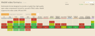
Another option is the WebM format which offers high quality videos, often comparable to an MP4, but usually at a reduced file size. However, at this time, browser support is not as widespread so you can’t just go replacing MP4 files with their WebM equivalents.

Internet Explorer and Safari are notable browsers without WebM support (Large preview)
However, because the <video> tag supports multiple <source> files, we can serve WebM videos to browsers that support them while falling back to MP4 everywhere else.
Let’s go ahead and convert an animated GIF to both MP4 and WebM. There are several online tools that can help you do this, but many of them use ffmpeg under the hood so we’ll skip the middle man and just use that instead. ffmpeg is a free and open source command line tool that is designed for the processing of video and audio files. It can also be used to convert an animated GIF to video formats.
To find out if you have ffmpeg on your machine, fire up a terminal and run the ffmpeg command. This should display some diagnostic information, otherwise, you’ll need to install it. Installation instructions for Windows, macOS and Linux can be found on this page. Since we’ll be converting to is WebM, you need to make sure that whatever ffmpeg build you install is compiled with libvpx.
Getting workflow just right ain’t an easy task. So are proper estimates. Or alignment among different departments. That’s why we’ve set up “this-is-how-I-work”-sessions — with smart cookies sharing what works well for them. A part of the Smashing Membership, of course.
Explore Smashing Membership ↬

To follow along with the commands that are included in this article, you can use any animated GIF file lying around on your computer or grab this one which is just over 28MB. Let’s begin by converting a GIF to MP4 in the next section.
Convert GIF To MP4
Open up a terminal instance and navigate to the directory where the test gif is located then run the command below to convert it to an MP4 video file:
ffmpeg -i animated.gif video.mp4
This should output a new video file in the current directory after a few seconds depending on the size of the GIF file you’re converting. The -i flag specifies the path to the input GIF file and the output file is specified afterwards (video.mp4 in this instance). Running this command on my 28MB GIF produces an MP4 file that is just 536KB in size, a 98% reduction in file size with roughly the same visual quality.
But we can go even further than that. ffmpeg has so many options that you can use to regulate the video output even further. One way is to employ an encoding method known as Constant Rate Factor (CRF) to trim the size of the MP4 output even further. Here’s the command you need to run:
ffmpeg -i animated.gif -b:v 0 -crf 25 video.mp4
As you can see, there are a couple of new flags in above command compared to the previous one. -b:v is normally used to limit the output bitrate, but when using CRF mode, it must be set to 0. The -crf flag controls the quality of the video output. It accepts a value between 0 and 51; the lower the value, the higher the video quality and file size.
Running the above command on the test GIF, trims down the video output to just 386KB with no discernable difference in quality. If you want to trim the size even further, you could increase the CRF value. Just keep in mind that higher values will lower the quality of the video file.
Convert GIF To WebM
You can convert your GIF file to WebM by running the command below in the terminal:
ffmpeg -i animated.gif -c vp9 -b:v 0 -crf 41 video.webm
This command is almost the same as the previous one, with the exception of a new -c flag which is used to specify the codec that should be used for this conversion. We are using the vp9 codec which succeeds the vp8 codec.
In addition, I’ve adjusted the CRF value to 41 in this case since CRF values don’t necessarily yield the same quality across video formats. This particular value results in a WebM file that is 16KB smaller than the MP4 with roughly the same visual quality.
Now that we know how to convert animated GIFs to video files, let’s look at how we can imitate their behavior in the browser with the HTML5 <video> tag.
Replace Animated GIFs With Video In The Browser
Making a video act like a GIF on a webpage is not as easy as dropping the file in an <img> tag, but it’s not so difficult either. The major qualities of animated GIFs to keep in mind are as follows:
They play automatically
They loop continuously
They are silent
While you get these qualities by default with GIF files, we can cause a video file to act the exact same way using a handful of attributes. Here’s how you’ll embed a video file to behave like a GIF:
<video autoplay loop muted playsinline src=”video.mp4″></video>
This markup instructs the browser to automatically start the video, loop it continuously, play no sound, and play inline without displaying any video controls. This gives the same experience as an animated GIF but with better performance.
To specify more that once source for a video, you can use the <source> element within the <video> tag like this:
<video autoplay loop muted playsinline>
<source src=”video.webm” type=”video/webm”>
<source src=”video.mp4″ type=”video/mp4″>
</video>
This tells the browser to choose from the provided video files depending on format support. In this case, the WebM video will be downloaded and played if it’s supported, otherwise the MP4 file is used instead.
To make this more robust for older browsers which do not support HTML5 video, you could add some HTML content linking to the original GIF file as a fallback.
<video autoplay loop muted playsinline>
<source src=”video.webm” type=”video/webm”>
<source src=”video.mp4″ type=”video/mp4″>
Your browser does not support HTML5 video.
<a href=”/animated.gif”>Click here to view original GIF</a>
</video>
Or you could just add the GIF file directly in an <img> tag:
<video autoplay loop muted playsinline>
<source src=”video.webm” type=”video/webm”>
<source src=”video.mp4″ type=”video/mp4″>
<img src=”animated.gif”>
</video>
Now that we’ve examined how to emulate animated GIFs in the browser with HTML5 video, let’s consider a few potential drawbacks to doing so in the next section.
Potential Drawbacks
There are a couple of drawbacks you need to consider before adopting HTML5 video as a GIF replacement. It’s clearly not as convenient as simply uploading a GIF to a page and watch it just work everywhere. You need to encode it first, and it may be difficult to implement an automated solution that works well in all scenarios.
The safest thing would be to convert each GIF manually and check the result of the output to ensure a good balance between visual quality and file size. But on large projects, this may not be practical. In that case, it may be better to look to a service like Cloudinary to do the heavy lifting for you.
Another problem is that unlike images, browsers do not preload video content. Because video files can be of any length, they’re often skipped until the main thread is ready to parse their content. This could delay the loading of a video file by several hundreds of milliseconds.
Additionally, there are quite a few restrictions on autoplaying videos especially on mobile. The muted attribute is actually required for videos to autoplay in Chrome for Android and iOS Safari even if the video does not contain an audio track, and where autoplay is disallowed, the user will only see a blank space where the video should have been. An example is Data Saver mode in Chrome for Android where autoplaying videos will not work even if you set up everything correctly.
To account for any of these scenarios, you should consider setting a placeholder image for the video using the poster attribute so that the video area is still populated with meaningful content if the video does not autoplay for some reason. Also consider using the controls attribute which allows the user to initiate playback even if video autoplay is disallowed.
Wrap Up
By replacing animated GIFs with HTML5 video, we can provide awesome GIF-like experiences without the performance and quality drawbacks associated with GIF files. Doing away with animated GIFs is worth serious consideration especially if your site is GIF-heavy.
There are websites already doing this:
Twitter converts animated GIFs to MP4 files on upload
GIF performance was improved on Pinterest by converting them to videos
Imgur, a GIF heavy website, converts all GIF uploads to HTML5 video
Taking the time to convert the GIF files on your site to video can lead to a massive improvement in page load times. Provided your website is not too complex, it is fairly easy to implement and you can be up and running within a very short amount of time.

(ra,dm)


 A colleague recently said to me, “I’ve heard that you’re a client relations guru. Are there any tips or tricks that you have for starting to build up those relationships?”
 There’s something very special about social media marketing and how it compels consumers to engage with it.


