20 Best New Portfolios, February 2019

Original Source: https://www.webdesignerdepot.com/2019/02/20-best-new-portfolios-february-2019/

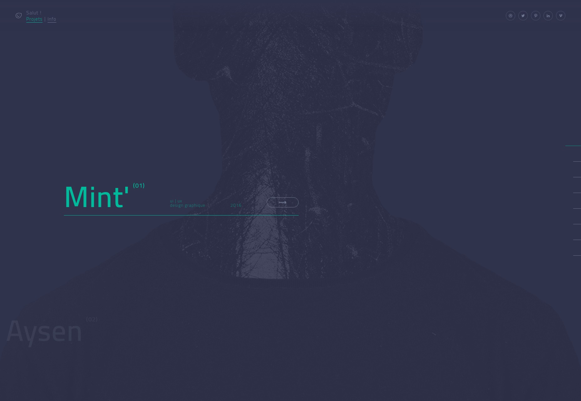
Welcome back, Readers! It’s February, and I don’t think I have a single pink or chocolate-themed site anywhere in the mix. Ah well…

I really shouldn’t have typed that. Now I want to either eat some peanut-butter and chocolate goodies, or base a design on that color scheme. I probably will.

Anyway, we’ve got a generally mixed bag of portfolios for you to check out, with a number of aggressively monochromatic designs in there. Enjoy!

Note: I’m judging these sites by how good they look to me. If they’re creative and original, or classic but really well-done, it’s all good to me. Sometimes, UX and accessibility suffer. For example, many of these sites depend on JavaScript to display their content at all; this is a Bad Idea™, kids. If you find an idea you like and want to adapt to your own site, remember to implement it responsibly.

Rob Weychert

Rob Weychert’s portfolio may not be new as such, but I just found it… and probably should have found it sooner. He used to be a designer at Happy Cog, and is now at ProPublica, so you should expect earthy tones and fantastic typography. He sells his expertise mostly through his client list and his extensive blog, using the “go look at my work, it’s super famous” approach to marketing.

Well, it works.

Platform: Static Site (as far as I can tell)

Transatlantic Film Orchestra

The Transatlantic Film Orchestra do exactly what you think they do. Music for video. And on their website, they do it right: no music plays when you load the site. All you get is a calm, dark, and monochromatic one-page portfolio.

I do particularly like the implementation of the audio players, though. The Morse code, the grainy photos, it all works.

Platform: WordPress

Ramon Gilabert

Ramon Gilabert’s portfolio brings us a calming and classic minimalist design combined with some beautifully-used SVG graphics. Mind you, it’s a little confusing when you click on the “social” link in the navigation, as the social links are practically hidden at the bottom, on the right, and on their side. Otherwise, it’s a beautiful and charming design.

Platform: Static Site

Charlie Gray

Charlie gray’s portfolio is full of cinematic-looking photography and Hollywood celebrities, so this layout that feels like a cross between a magazine layout and a PowerPoint is actually right on the money. I’d almost be disappointed if a site like this wasn’t loaded down with a bit too much JS.

In the end, it’s the images that sell everything anyway.

Platform: WordPress

Jordy van den Nieuwendijk

This portfolio is pretty much an art gallery, and it embraces the theme with a full-screen slideshow on the home page, lots of white space, and monospaced type. It’s a classic approach and it hold up well in this case.

Platform: Static Site

Atelier Florian Markl

Atelier Florian Markl has taken the inherent “blockiness” of web design and absolutely run with it. The theme of the day is rectangles and bold colors. You might have a hard time seeing anything, but once your eyes adjust to the glare, you won’t forget this highly modernist design in a hurry.

Platform: Joomla

Nathan Mudaliar

Nathan Mudaliar’s copywriting portfolio may not be the fanciest out there, but it is a master class in showcasing your work creatively. There’s a sort of conversational bit of UI where he showcases his work in different “voices”, interactive examples of his copywriting techniques, and more.

It’s a bit hard sell, perhaps, but you can’t argue with results.

Platform: Static site

WebinWord

WebinWord know how to to stick to a theme. This minimal-ish but highly animated site manages to use the shape of their logo mark all over just about every page. And weirdly enough, it works.

Platform: WordPress

Okalpha

Okalpha goes right for bright colors and pseudo-3D graphics to catch your attention. Honestly, they’re using the same colors and shapes people have been using on us since we were toddlers, so why wouldn’t it work? Slightly kid-ish or not, I think it works.

Platform: Custom CMS (Probably)

Makoto Hirao

Makoto Hirao’s portfolio is ticking a lot of boxes for me, including great type, good use of imagery, and a horizontal home page layout that I actually really like, and that feels intuitive.

My only real criticism would the the usual one about JS dependence.

Platform: Custom CMS

Lydia Amaruch

Lydia Amaruch brings us a beautiful grid-themed portfolio (I am, as always, a sucker for this look) combined with some fantastic illustrations, and decidedly modernist layout. Some bits are weirdly low-contrast, but it’s a darned pretty site overall.

Platform: Static Site

The Sweetshop

The Sweetshop, being a video production company, naturally puts a lot of video front and center with the dark layout you’d expect. But even so, their typography game is surprisingly strong, and there’s not a serif in sight. Even their press releases look pretty.

Platform: WordPress

Noughts & Ones

Noughts and Ones is another agency that’s sticking to their theme, with their branding being a big part of their site’s aesthetic. Other than that, it’s pretty classic minimalism. I personally adore their footer.

Is that a weird thing to say?

Platform: Squarespace

Margaux Leroy

If I had to describe Margaux Leryo’s portfolio—and I do, that’s my job—I’d call it a fusion of ‘90s era futurist design with more modern trends. It’s dark, it’s sleek, and some of the text might be a little too small and low-contrast.

Why did we think text would be that small in the future anyway? Did we think everyone would have augmented eyes?

Anyway, flaws aside, it looks fantastic.

Platform: Static Site (as far as I know)

Julia Kostreva

Julia Kostreva’s portfolio keeps it simple with some pseudo-asymmetry and soft tones. As a branding designer, she lets that branding work do, well, most of the work. And it works.

Platform: Squarespace

Baibakov Art Projects

Baibakov Art Projects takes the monochromatic to another level, and the animations are only sometimes in the way. It’s tall, dark, and elegant, like the work it features. Fantastic use of asymmetry, too.

Platform: Static Site

Kolaps

Kolaps has a decidedly modernist design that feels at once very “business-friendly” and quite eye-catching. It’s classic minimalism come back again with a touch of sci-fi futurism and particle effects.

Platform: Custom CMS (I think)

Betty Montarou

Betty Montarou’s portfolio is kept dead simple with a sort of “click to collage” method of showing off her work. It keeps the whole experience down to about two pages, and only shows off the very best of what she does.

Platform: Static Site

Jordan Sowers

Jordan Sower’s portfolio is another artsy one that sort of mimics the art gallery aesthetic a little. Still, it’s pretty. It’s interesting in that it functions as a portfolio and a store at the same time, but the store is kept almost hidden unless you actually click a link to buy something. It’s a store without the hard sell, and so it’s free to be artistic in its own right.

Platform: Static Site

Heller

And finishing off our list we have another monochromatic design with Heller. It’s modern, it’s pretty, and it has an interesting approach to the collage patterns we see everywhere. This one is definitely going for a futurist feel, even as it’s grounded in the trends of yester-month.

I like the horizontal swipe-in animation they use for images. I mean, if you’re going to animate everything, why not give it that Star WarsTM feel?

Platform: Static Site

Add Realistic Chalk and Sketch Lettering Effects with Sketch’it – only $5!

Source

p img {display:inline-block; margin-right:10px;}
.alignleft {float:left;}
p.showcase {clear:both;}
body#browserfriendly p, body#podcast p, div#emailbody p{margin:0;}

How to Increase Mobile Engagement with Simpler Contact Forms

Original Source: https://www.webdesignerdepot.com/2019/02/how-to-increase-mobile-engagement-with-simpler-contact-forms/

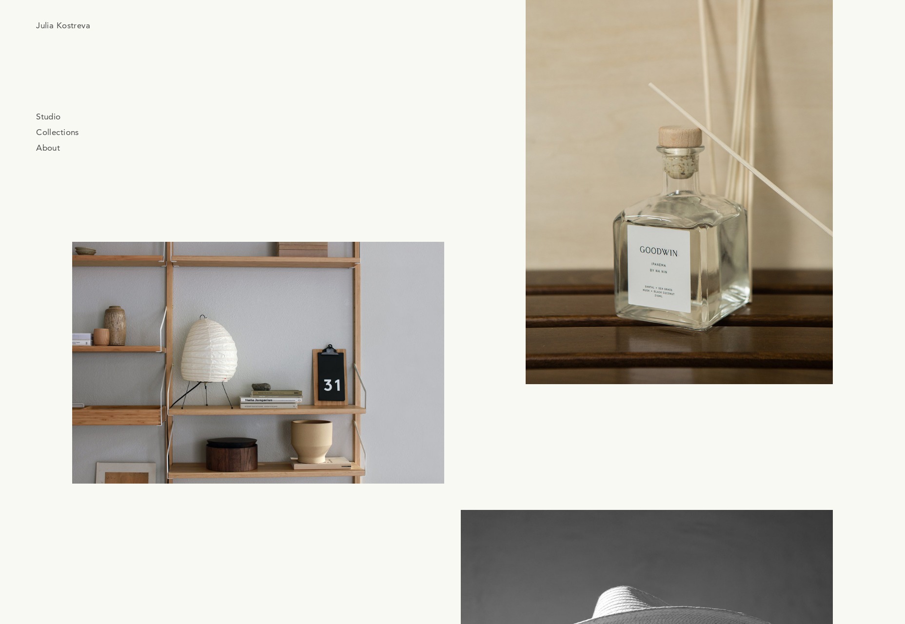
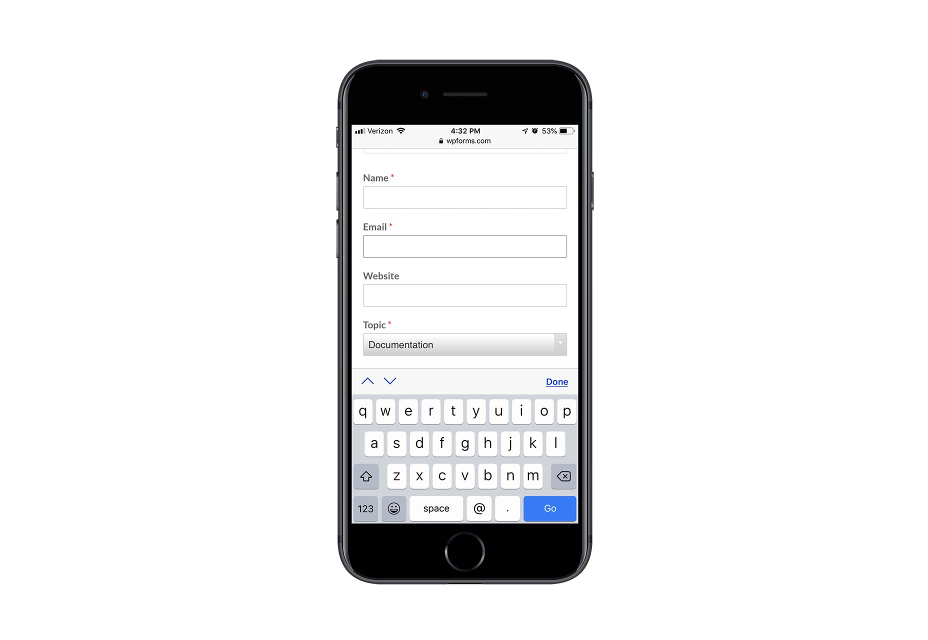
Contact forms are a necessity for websites. Without them, your clients would be relegated to handling website- or business-related matters over the phone or email. Worse, they’d have absolutely no context for the call or message, which would increase the amount of time they’d have to spend responding to it.

Contact forms, instead, gather essential details from visitors so that your clients can go into each conversation better prepared.

Of course, mobile contact forms are tricky. With less screen space to work with, how do you design a form that captures all the details your clients require? The fact of the matter is, you might not be able to. Instead, you’ll have to look at ways to do more with less.

Even if all a form does is collect a name, email, and phone number for someone interested in learning more about a service, the digital collection of that data ensures your clients won’t lose track of leads or capture details incorrectly when writing them by hand. And when forms collect more than that (say, details about an issue they’re experiencing with the website or product), your clients can better prepare themselves for a possibly stressful encounter.

But there’s a delicate balance you must strike when designing forms for mobile users. If you want them to engage with the forms so you can keep your clients from missing out on leads as well as sales, you have to keep a number of things in mind.

Columns

Plain and simple: there’s no excuse for using more than one column on a mobile contact form. Leadformly has a beautiful example of a mobile contact form that keeps everything in a vertical line.

The same principle applies to the fields themselves. If you’re thinking about breaking up the “Name” field into “First Name” and “Last Name”, don’t do it. It’s hard enough inputting information into a mobile contact form. Instead, only place one field per horizontal line and always merge fields that belong together.

Fields

When creating a contact form for your clients’ website, ask yourself: Is each of these fields necessary?

Take, for instance, the Shopify mobile contact form:

Although the store address field is optional, it’s a good choice in this context since this is a support contact form. If someone’s asking for support, then they’re a Shopify customer with a corresponding store address to share.

The “Subject” field, on the other hand, seems like a waste. This form is coming from the help desk. The designer could easily program submissions from this form to include a descriptive subject line so the support representative knows what he or she is about to read.

When too many unnecessary or optional fields are shown, a few things can happen:

Visitors will be frustrated with the extra time spent reading each label, deciding whether or not it’s necessary, and then tabbing over to the next one.
Visitors will give up before they ever get started because the length of the form alone is daunting.
Visitors will be confused by some of the fields, wondering what they’re for and trying to figure out the answer to them.

All in all, a poor selection of form fields can lead to a negative user experience. But only your client and the end user will know which of these fields is absolutely necessary, so make sure you engage with them so you can create the optimal mobile form experience.

Pages

In cases when you have a lengthy contact form you want to put on mobile, you have to think of ways to keep it from appearing overwhelmingly long.

One way to do this is by creating a multi-page form. While you can do this for mobile contact forms that are legitimately lengthy, this is something anyone could use really. Here’s an example from Typeform:

With a handy progress bar at the bottom of the form, users have a clear picture of how much more is left to fill out.

I’d also argue that this is a more engaging mobile contact form experience than a static form stuck to the page.

If you’re not too keen on creating multi-page forms, that’s fine too. There are other things you can do to shorten the space without compromising how many fields are shown. For instance, you can use collapsible menus to only display certain parts of the form at any given time. You can also turn checkbox or radio dial lists into hidden dropdowns.

Labels

In your attempts to conserve space in mobile contact forms, you have to be careful with labels, hints, and error messages that appear within them. Just because you make a form faster to get through space-wise doesn’t mean the instructive text won’t cause friction.

Here’s a good example from MailChimp you can use:

Within this form:

Each field is succinctly and clearly labeled outside of the field.
Any hint text (i.e. instructions on what to do with the field) appears inside the field in a lighter color.
Error messages immediately appear once a user has failed to properly fill in a field.

Also, take notice of the fact that MailChimp does not use asterisks to indicate required fields. This keeps labels clear of unnecessary debris and easy to focus on. If the majority or all of your fields are required, it’s not necessary to mark them as such.

Keyboards

Want to decrease the time it takes users to fill out your mobile contact form? Program it to display the correct keyboard per field. Here is how WPForms does this:

Basic text fields show a standard alpha keyboard:

Email fields show a lowercase alpha keyboard along with punctuation commonly used in email addresses:

Website fields provide options for “/” as well as “.com”:

Saving users time hunting down punctuation and numbers, or typing out expected responses or snippets, will encourage more of them to complete your form.

Wrap-Up

Let’s be honest: for most businesses, the chances of someone converting from a mobile website are quite low — at least lower than they are on desktop. Until consumers become more confident in converting from a smartphone, we have to find other ways to capture their information so we can stay in touch.

That said, just because mobile visitors are unwilling to convert doesn’t mean they’ll be unwilling to fill out a mobile contact form. It’s a low-risk alternative to entering their sensitive data into a mobile website and device, and puts the onus on the company to take the next step. Of course they’re going to prefer this option, so make sure it’s a worthwhile one to take.


Featured image via Unsplash.

Add Realistic Chalk and Sketch Lettering Effects with Sketch’it – only $5!

Source

p img {display:inline-block; margin-right:10px;}
.alignleft {float:left;}
p.showcase {clear:both;}
body#browserfriendly p, body#podcast p, div#emailbody p{margin:0;}

SVG Filter Effects: Conforming Text to Surface Texture with <feDisplacementMap>

Original Source: http://feedproxy.google.com/~r/tympanus/~3/Y4bYyA4e2OY/

SVGFilterEffects_displacementMap_featured

Applying texture to text is one of the most popular text effects in graphic design. As much of print and graphic design has made its way into the Web platform, such effects have also been recreated on the Web using CSS, as well as using features of SVG such as patterns, masks and clipping paths. I have an article right here on Codrops that gives you a full overview of different ways to create textured text on the Web using CSS and SVG today that you may be interested in checking out. Yoksel touched on another area of this topic and wrote an article all about animating text fills.

However, one effect that was untouched on was that of text conforming to the texture of a surface. When text conforms to a surface, it takes the shape of that surface. Depending on the surface and texture used, you could end up some really eye-catching results. This is what this article will touch on. And the best part? All these effects are applied to real, searchable, selectable and accessible text.

This is the fifth in a series of articles on SVG filters. In the previous weeks, we got an introduction to SVG filters and learned how to create and use them to produce various effects from outlined text to posterized images, and how to replicate Photoshop-like duotone image effects with SVG filter operations.

Conforming Text to Surface Texture: The Photoshop Way

As with the duotone effect, I looked into how to make text conform to surface texture in Photoshop in an attempt to replicate that effect with SVG filters. I found this step-by-step tutorial on YouTube. The following video is a sped-up version of that tutorial:

In the Photoshop tutorial, the designer created this effect by using what is known as a displacement map. A displacement map is an image whose color information is used to distort the content of another element. To create our text effect, the texture of the image will be used to distort the text so that it conforms to the shape of the texture.

In Photoshop, in order to conform text to a surface the designer followed these steps:

Desaturate the image.
Reduce the amount of detail in the image by blurring it by 1px.

Save the image as a displacement map.

Create the text, and apply a distortion filter to it using the image as a displacement map.
Re-use the original image as a background behind the text.

Then refine the effect more by adding a slight transparency to the text and blending it with the background image.

The displacement map image is blurred in the second step before it is used to displace the text because if the image has too much or too little detail the resulting effect would look less realistic. Usually blurring the image up to 2px is enough to get a moderate amount of detail that’s just enough.

If you’ve read the previous articles in this series, you know that thinking in steps is important to create and recreate effects with SVG filter primitives. And you may have already guessed how to replicate some of these steps using SVG filter primitives, a few of which we have covered in the previous articles.

But the most important step in this effect is the creation and application of the displacement map. How do we do that in SVG?

Conforming Text to Surface Texture in SVG

In order to recreate the effect from the Photoshop tutorial above, we need to first create a displacement map. In SVG, the feDisplacementMap primitive is used to displace content using a displacement map.

feDisplacementMap takes two inputs to produce one result. The image you want to use to displace your content is specified in the in2 attribute. The in attribute is reserved for the input that you want to apply the displacement effect to.

And as with all other primitives, the input for feDisplacementMap can be anything from the SourceGraphic itself to the result of another filter operation. And since we want to apply the displacement map to our source text, this means that the in attribute will have SourceGraphic for a value.

So let’s recreate the Photoshop tutorial steps with SVG filter primitives. The process of conforming text to texture in SVG is very similar to that we saw in Photoshop. I’ll elaborate on each step as we go.

Get the image that will be used as a texture using feImage.

Desaturate the image using feColorMatrix.
Apply a 0.5px Gaussian blur to the image using feGaussianBlur.
Use the image to distort the text using feDisplacementMap.
Blend the text into the background image using feBlend and apply a translucent effect to it (decrease opacity using feComponentTransfer).

Display the text and the image behind it by merging the two layers using feMerge.

The feImage filter primitive is the filter version of the <image> element and has the same attributes as the <image> element too. So in order to render an image in the filter region, we will use feImage. Once we’ve got our image, we can use it as input to other filter operations. It will be used by the feColorMatrix operation to boot because we need to desaturate it.

We’ve mentioned feColorMatrix before, but what we didn’t mention is it comes with a few keywords that are shortcuts to pre-defined matrices. Instead of always having to provide a matrix as a value, you can change the type attribute and use one of the keywords available:

matrix | saturate | hueRotate | luminanceToAlpha

The matrix type is what you’d use when you want to provide a custom matrix as a value for the matrix operation. The other keywords are convenience shortcuts.

To desaturate an image, we use the saturate type. You specify the amount by which you want to desaturate the image in the values attribute. Since we want to completely desaturate our image, we will provide 0 as a value. Note that values are provided as fractions, with 1 (default value) being fully saturated and 0 being completely desaturated (grayscale).

So, let’s start translating our steps into code:

<!– I’m extending the filter region just to increase its area for visual purposes. This is not required or needed for the effect to work.–>
<filter id=”conform” x=”-50%” y=”-50%” width=”200%” height=”200%”>

<!– Get the image. –>
<feImage xlink:href=”…” x=”0″ y=”0″ width=”100%” height=”100%” preserveAspectRatio=”none”></feImage>

<!– Desaturate the image. –>
<feColorMatrix type=”saturate” values=”0″ result=”IMAGE”/>

<!– … –>

At this point, our filter region looks like this:

Screen Shot 2019-01-16 at 15.15.00

After desaturating the image, we will blur it by a small amount enough to reduce the amount of detail without losing too much of it. For this particular effect, I chose to blur it by 0.25 pixels only. You may need to experiment with the values to get the right one depending on the image you use and the effect you’re after.

<!– I’m extending the filter region just to increase its area for visual purposes. This is not required or needed for the effect to work.–>
<filter id=”conform” x=”-50%” y=”-50%” width=”200%” height=”200%”>

<!– Get the image. –>
<feImage xlink:href=”…” x=”0″ y=”0″ width=”100%” height=”100%” preserveAspectRatio=”none”></feImage>

<!– Desaturate the image. –>
<feColorMatrix type=”saturate” values=”0″ result=”IMAGE”/>

<!– decrease level of details so the effect on text is more realistic –>
<feGaussianBlur in=”IMAGE” stdDeviation=”0.25″ result=”MAP”></feGaussianBlur>

<!– … –>

And our displacement map now looks like this:

Screen Shot 2019-01-16 at 15.43.19

Using feDisplacementMap we can now distort the text with our displacement map:

<!– I’m extending the filter region just to increase its area for visual purposes. This is not required or needed for the effect to work.–>
<filter id=”conform” x=”-50%” y=”-50%” width=”200%” height=”200%”>

<!– Get the image. –>
<feImage xlink:href=”…” x=”0″ y=”0″ width=”100%” height=”100%” preserveAspectRatio=”none”></feImage>

<!– Desaturate the image. –>
<feColorMatrix type=”saturate” values=”0″ result=”IMAGE”/>

<!– decrease level of details so the effect on text is more realistic –>
<feGaussianBlur in=”IMAGE” stdDeviation=”0.25″ result=”MAP”></feGaussianBlur>

<!– Use the displacement map to distort the source text –>
<feDisplacementMap in=”SourceGraphic” in2=”MAP” scale=”15″ xChannelSelector=”R” yChannelSelector=”R” result=”TEXTURED_TEXT”></feDisplacementMap>

<!– … –>

At this point, the image we used to distort the text is no longer rendered as it has been used to generate a new result, which is the distorted text. The filter region at this point thus only contains the text that is now conforming to the shape and texture of the fabric in our displacement map:

Screen Shot 2019-01-16 at 15.39.23

You can already see the texture of the fabric take shape on the edges of the text. This is great.

Just like in the Photoshop tutorial, we will now re-display the image behind the text. We will do that by using feImage again:

<!– I’m extending the filter region just to increase its area for visual purposes. This is not required or needed for the effect to work.–>
<filter id=”conform” x=”-50%” y=”-50%” width=”200%” height=”200%”>

<!– Get the image. –>
<feImage xlink:href=”…” x=”0″ y=”0″ width=”100%” height=”100%” preserveAspectRatio=”none”></feImage>

<!– Desaturate the image. –>
<feColorMatrix type=”saturate” values=”0″ result=”IMAGE”/>

<!– decrease level of details so the effect on text is more realistic –>
<feGaussianBlur in=”IMAGE” stdDeviation=”0.25″ result=”MAP”></feGaussianBlur>

<!– Use the displacement map to distort the source text –>
<feDisplacementMap in=”SourceGraphic” in2=”MAP” scale=”15″ xChannelSelector=”R” yChannelSelector=”R” result=”TEXTURED_TEXT”></feDisplacementMap>

<!– Re-display the image as a background image –>
<feImage xlink:href=”…” x=”0″ y=”0″ width=”100%” height=”100%” preserveAspectRatio=”none” result=”BG”></feImage>

<!– … –>

Lastly, we want to blend the text into the background image to improve the effect. We will decrease the opacity of the text to 0.9 using feColorMatrix, and then we will use the feBlend primitive to apply a blending mode to the text.

Similar to CSS Blend Modes, we have 16 blend modes to choose from. For our effect, the multiply blend mode will do. (In the Photoshop tutorial, the designer used the linear burn, which is not available in SVG/CSS.)

feBlend will take two inputs to blend together: the text and the background image:

<!– I’m extending the filter region just to increase its area for visual purposes. This is not required or needed for the effect to work.–>
<filter id=”conform” x=”-50%” y=”-50%” width=”200%” height=”200%”>

<!– Get the image. –>
<feImage xlink:href=”…” x=”0″ y=”0″ width=”100%” height=”100%” preserveAspectRatio=”none”></feImage>

<!– Desaturate the image. –>
<feColorMatrix type=”saturate” values=”0″ result=”IMAGE”/>

<feGaussianBlur in=”IMAGE” stdDeviation=”0.25″ result=”MAP”></feGaussianBlur>

<!– Use the displacement map to distort the source text –>
<feDisplacementMap in=”SourceGraphic” in2=”MAP” scale=”15″ xChannelSelector=”R” yChannelSelector=”R” result=”TEXTURED_TEXT”></feDisplacementMap>

<!—->
<feImage xlink:href=”…” x=”0″ y=”0″ width=”100%” height=”100%” preserveAspectRatio=”none” result=”BG”></feImage>

<!– Reduce the opacity of the text –>
<feColorMatrix in=”Textured_Text” result=”Textured_Text_2″ type=”matrix”
values=”1 0 0 0 0
0 1 0 0 0
0 0 1 0 0
0 0 0 .9 0″ />

<!– Blend the text with the background –>
<feBlend in=”BG” in2=”Textured_Text_2″ mode=”multiply” result=”BLENDED_TEXT”></feBlend>

<!– … –>

And last by not least, we will layer the new blended text layer on top of the background image layer with feMerge:

<!– I’m extending the filter region just to increase its area for visual purposes. This is not required or needed for the effect to work.–>
<filter id=”conform” x=”-50%” y=”-50%” width=”200%” height=”200%”>

<!– Get the image. –>
<feImage xlink:href=”…” x=”0″ y=”0″ width=”100%” height=”100%” preserveAspectRatio=”none”></feImage>

<!– Desaturate the image. –>
<feColorMatrix type=”saturate” values=”0″ result=”IMAGE”/>

<!– decrease level of details so the effect on text is more realistic –>
<feGaussianBlur in=”IMAGE” stdDeviation=”0.25″ result=”MAP”></feGaussianBlur>

<!– Use the displacement map to distort the source text –>
<feDisplacementMap in=”SourceGraphic” in2=”MAP” scale=”15″ xChannelSelector=”R” yChannelSelector=”R” result=”TEXTURED_TEXT”></feDisplacementMap>

<!—->
<feImage xlink:href=”…” x=”0″ y=”0″ width=”100%” height=”100%” preserveAspectRatio=”none” result=”BG”></feImage>

<!– Reduce the opacity of the text –>
<feColorMatrix in=”Textured_Text” result=”Textured_Text_2″ type=”matrix”
values=”1 0 0 0 0
0 1 0 0 0
0 0 1 0 0
0 0 0 .9 0″ />

<!– Blend the text with the background –>
<feBlend in=”BG” in2=”Textured_Text_2″ mode=”multiply” result=”BLENDED_TEXT”></feBlend>

<!– Layer the text on top of the background image –>
<feMerge>
<feMergeNode in=”BG”></feMergeNode>
<feMergeNode in=”BLENDED_TEXT”></feMergeNode>
</feMerge>
</filter>

<text dx=”60″ dy=”200″ font-size=”10em” font-weight=”bold” filter=”url(#conform)” fill=”#00826C”> organic </text>

And this is our final result:

Screen Shot 2019-01-16 at 16.12.16

Notes about using Displacement Maps in SVG

The feDisplacementMap element has three attributes that determine how the displacement map will affect the source graphic:

xChannelSelector: specifies which color channel (R/G/B/A) from in2 to use for the horizontal displacement;
yChannelSelector: specifies which color channel (R/G/B/A) from in2 to use for the vertical displacement;
scale: determines the amount by which you want to distort the image. The higher the scale, the stronger the distortion effect is. You’ll probably find yourself experimenting with this value to get the desired result.

Possibly the most important thing to be aware of when using images to displace content in SVG filters is that the image and the content are subject to CORS rules. Make sure you’re serving both the image and the content from the same source to ensure that the browser does not skip the displacement operation.

You can also inline an image in the filter (in feImage) and use it as a displacement map. This pen by Gabi is a great example which uses an inlined SVG pattern to distort the source image. The circular pattern resulting in a ripple-like effect is my favorite.

Applying a Transformation to the Source Text

In the Photoshop tutorial that we followed for this effect, the designer applies a rotation transformation to the text that adds a nice touch to the overall effect.

If we apply a rotation transformation to the <text> to which we are applying the filter, the whole filter region will be rotated, including the image in the background:

Screen Shot 2019-01-16 at 19.32.58

This also happens if you apply other styles to the source text. For example, if you set the opacity on the <text> to 0.5, the text and the image in the background will also be affected by that.

In order to rotate the text but not the rest of the filter region, we can wrap the text in a group (<g>) and apply the filter to the group, and then apply the rotation transformation on the text. This will ensure that only the text is rotated, while the rest of the filter region, which is now defined by the group wrapper, remains unaffected by the transformation. This workaround is courtesy of Amelia Bellamy-Royds.

<g filter=”url(#conform)”>
<text dx=”60″ dy=”200″ font-size=”10em” transform=”translate(-20 30) rotate(-7)” fill=”#00826C”>organic</text>
</g>

I’ve tweaked the transformation a little to add a translation to make sure the text remains centered in the filter region. The result of this transformation now looks like this:

Screen Shot 2019-01-16 at 19.40.50

Note that I’m applying the rotation transformation to the text using the SVG transform attribute and not via CSS because, at the time of writing of this article, Internet Explorer and MSEdge don’t support CSS transformations on SVG elements.

Live Demo

This text displacement effect currently works in all major browsers, including MSEdge. The following is a screenshot of the effect in MSEdge:

Screen Shot 2019-01-16 at 17.44.57

This said, Chrome has recently stopped applying the distortion effect on the text. There’s some more information about this issue in this thread. The rest of the filter operations, however, work and are applied just fine, so, until Chrome fixes this issue, you should be able to see the text blended with the background, only without the distortion along its edges. The following is a screenshot of what the demo looks like in Chrome:

Screen Shot 2019-01-16 at 18.06.57

You can check the live demo out here.

Final words

I hope you’re starting to enjoy the power of SVG filters and thinking of more possibilities and effects to create with them already.

If you liked the idea of conforming text to surface texture, then you’re going to love learning how to create your own texture in SVG. Yup, you read that right. SVG can create texture. In the next article, we’re going to learn how to create a simple texture using a combination of SVG-generated noise and lighting effects. Stay tuned.

SVG Filter Effects: Conforming Text to Surface Texture with <feDisplacementMap> was written by Sara Soueidan and published on Codrops.

When Is It Time to Abandon a WordPress Plugin?

Original Source: http://feedproxy.google.com/~r/1stwebdesigner/~3/RHX7N8ab_z4/

One of the biggest reasons to love WordPress is the sheer number of available plugins. It seems like, no matter what type of functionality you need, there is at least one plugin that can do the job.

But it’s no secret that plugins can sometimes outlive their usefulness. As both our needs and WordPress itself change, we can find ourselves looking for better options. That can mean moving on from a plugin that had previously served us well.

Still, it’s not always the easiest decision to make. Sort of like an athlete that’s past their prime, we can let plugins hang around long after their best days have come and gone.

So, how do you know when it’s time to ditch a plugin and start fresh with something new? The following are a few telltale signs to watch out for.

It Hasn’t Been Updated in a Long Time

Think of a WordPress plugin as a living thing. If it’s properly cared for, it will flourish. If not, the results won’t be nearly as good.

Those of us who build websites with WordPress would ideally like to see that a plugin is updated at least on a semi-regular basis. That shows that its author is still actively involved, adding new features and fixing bugs.

That’s never been more important, what with WordPress moving to the Gutenberg editor and PHP 5.x being phased out. If a plugin hasn’t been actively maintained, then it’s likely to fall short of being compatible with either of these major changes. Plus, there could be serious concerns regarding security as well.

Now, that doesn’t mean that a particular plugin has to be updated weekly or even monthly. Depending on its purpose, that may not be necessary. But you will want to look for, at the very least, a couple of updates per year. Anything less than that and you might as well give it one last hug goodbye.

An abandoned cockpit.

Updates Routinely Break

On the opposite end of the spectrum are plugins that, while continuously maintained, have become functionally unreliable. Updates are released frequently, but it’s usually because the previous ones have wreaked havoc on a number of websites.

This is frustrating, as you have a plugin that (at one point) did what you needed it to do. However, an over-aggressive developer has managed to cause as many problems as they have solved (if not more).

Depending on your personality, you may be willing to show some patience in this situation. Sometimes it actually pays off, as even a quality plugin can go through a rough patch and eventually right the ship. But inevitably things have to get better in short order. Otherwise, it’s just not worth the trouble.

Bits of broken glass.

It Has Become Bloated

A plugin quite often starts out trying to solve a specific problem. If it accomplishes that goal, its author may decide to add some related features to make it even more useful. This can be a great thing, if the new additions are well-executed.

The downside is that, over time, some plugins morph from solving a single problem into something that tries to solve every problem. This once terrific piece of software now is more accurately described as bloatware.

This can have negative effects on your website. For one, more features mean more code. The chances of both annoying bugs and hits to performance rise with every new feature.

It can get to the point where a plugin is no longer a good fit. In that case, it’s time to look for one that’s more focused and efficient in its functionality.

A boulder sitting in grass.

There’s Something Better

When it comes to plugins, part of a web designer’s job is to provide clients with the best option available. But just because a plugin was once the best option doesn’t mean it will stay that way forever.

This is especially so when it comes to plugins that occupy overcrowded categories like SEO or photo galleries. It seems like someone always comes along and tops whatever the previous leaders have done.

That doesn’t necessarily mean that we should immediately jump off the bandwagon when something new comes out. But it does suggest that it’s worth keeping an eye on what else is out there. You may find that another plugin offers something that you just can’t pass up.

Sky with the word "CHANGE" written in clouds.

Change Can Be Difficult, but Necessary

Let’s face it. It can be a real pain to swap one plugin for another. The process often involves refactoring or even recreating content that was being used by the old plugin so that it plays nicely with the new one. Therefore, it’s not a decision to take lightly.

Then, there’s always the unknown of how that new plugin will work out. Will there be any unintended consequences from using it? How can you be sure that it will still be around in a few years? Testing helps, but there’s still a leap of faith required when making a switch.

In the end, this is all part of a website’s lifecycle. The good news is that, with so many choices out there, making those changes to a WordPress website will just about always lead you to a better path forward.


Collective #491

Original Source: http://feedproxy.google.com/~r/tympanus/~3/UtlBtoRlrDg/

C491_regex

New JavaScript Features That Will Change How You Write Regex

Faraz Kelhini explains the new JavaScript features that enhance text processing capabilities.

Read it

C491_VueBook

Affiliate Link
Vue.js 2 Cookbook: Build modern, interactive web applications with Vue.js

101 hands-on recipes that teach you how to build professional, structured web apps with Vue.js.

Check it out

C491_videopl

IVID

IVID is an interactive video player for modern browsers that is easy to setup and use.

Check it out

C491_alistapart

Paint the Picture, Not the Frame: How Browsers Provide Everything Users Need

A very interesting article by Eric Bailey Every on how adjustments to the appearance and behavior of the features browsers can come at the expense of alienating users.

Read it

C491_vue

Vue 2.6 released

Evan You writes about all the new features that come with this update of Vue.

Read it

C491_captureWebsite

capture-website

A tool that lets you capture screenshots of websites.

Check it out

C491_vixel

Vixel

A WebGL path tracing voxel renderer built with regl.

Check it out

C491_activetheory

The Story of Technology Built at Active Theory

Read about the interesting tools that were developed at Active Theory for streamlining their workflow.

Read it

C491_hackertools

Hacker Tools

Learn to make the most of the tools that hackers have been using for decades.

Check it out

C491_sticky

Position: stuck; – and a Way to Fix It

Dannie Vinther writes about the shortcomings of position: sticky when working with overflow.

Read it

C491_svgfilter

SVG Filters are 💕

An amazing SVG filters demo by yoksel as part of her latest talk.

Check it out

C491_remedy

CSS Remedy

Start your project with a remedy for the technical debt of CSS.

Check it out

C491_whitespace

Contrast illusion, negative space animation

A beautiful collection of demos by Kunuk Nykjaer.

Check it out

C491_boring

Make it Boring

Jeremy Wagner explains why “boring” can be preferable to “exciting” when it comes to front-end development.

Read it

C491_terminal

Qoa

Lightweight and without any external dependencies, qoa enables you to receive various types of user input through a set of intuitive, interactive and verbose command-line prompts.

Check it out

C491_thirdparty

Third Party Web

A summary of which third party scripts are most responsible for excessive JavaScript execution on the web.

Check it out

C491_github

User owned projects—your personal workspace

Learn about user owned project boards, GitHub’s latest release.

Read it

C491_issuesorgan

GitHub Organization Issues Link

A Chrome extension that adds an Issues tab and lets you browse all issues of an organization.

Check it out

C491_shapesdemo

Canvas Times Tables (Circles)

A fantastic demo for the February 2019 CodePen Challenge on shapes.

Check it out

C491_performance

Vue.js App Performance Optimization Part 1

Filip Rakowski’s first article in a series on Vue performance optimization techniques.

Read it

C491_inputcolor

Dear web developers: set the font color, too

Steven Luu on the importance of setting the text color and background color of form inputs.

Check it out

C491_setupmac

How to set up your Mac for Web Development

Michael Uloth guides us through the minimum setup for getting up and running with JavaScript-based web development on a Mac.

Read it

C491_blotter

From Our Blog
Text Distortion Effects using Blotter.js

Some text distortion experiments using the Blotter.js library. The idea is to distort text as we scroll or move the mouse.

Check it out

Collective #491 was written by Pedro Botelho and published on Codrops.

10 Creative Techniques Using CSS3 Box Shadow

Original Source: https://www.hongkiat.com/blog/css3-box-shadows-effects/

We have seen a tremendous number of advancements in CSS3 web development over just the past few years. Popular websites all around the Internet have begun incorporating many unique styles such as…

Visit hongkiat.com for full content.

7 Awesome Wireframing Tools You Should Be Using

Original Source: https://www.sitepoint.com/best-wireframing-tools/

A Roundup of the Best Wireframing Tools

Over the years, we’ve become so much more knowledgeable about the UX design process, especially in regards to wireframing — a highly useful design exercise that can significantly improve the overall user experience of the final product.

In this roundup, we’ll take a look at the best wireframing tools.

What is a Wireframe?

A wireframe is the skeletal mockup of a design — the unstyled, barebones foundation that exists before the addition of fonts, colors, and any other visual aesthetics. Wireframing often happens after ideation but before high-fidelity prototyping.

Wireframing is sometimes referred to as “mid-fidelity,” and what defines a wireframing tool is the fact that they allow designers to drag and drop ready-made design elements and components onto the canvas, so that they can experiment with ideas quickly in a non-destructive environment, collect feedback from stakeholders, and even conduct user testing.

How Are Wireframes Used in UX?

Wireframing offers designers a chance to carefully think about the core UX of their design, meaning the usability, accessibility, scannability, clickability, and so on (often with special focus on the navigation, form, and checkout UX).

While visual design contributes to UX as well, designing the “surface layer” alongside the core UX can quickly turn into a complicated mess, which is why we design these skeletal mockups known as wireframes before moving to high-fidelity.

Let’s take a look at the best wireframing tools that are currently available.

Balsamiq

Platforms: Web, macOS, Windows
Pricing: various options for web and desktop

Balsamiq is a major player in the wireframing space.

What makes it stand out from the rest is its (optional) sketch-like visual aesthetic, which reminds us that wireframes should be experimental, low/mid-fidelity, and even disposable — the kind of attitude that makes wireframing thrive.

An example of the Balsamiq interface

Balsamiq is ideal for lean, agile teams, with features that help designers test wireframes on real devices, as well as collaborate on feedback with stakeholders. With integrations that enable bug-tracking (for example, with Jira Cloud), Balsamiq suits both designers and manager types alike.

As for wireframing components, Balsamiq is one of the most-equipped, being one of the most-seasoned tools on the market today. As with all wireframing tools, these are used by simply dragging components onto the canvas to visualize ideas quickly.

Whimsical

Platforms: Web only
Pricing: Free Plan, $8, or $12 (/month)

Despite being relatively new to the industry, and thus having the smallest repertoire of wireframing components, Whimsical is the best looking, the easiest to use, the most fun to use, and finally, the cheapest wireframing tool on the market today (minus Justinmind, which is free for “wireframing only”).

An example of the Whimsical workspace

A major downside is that there aren’t any user testing features. However, other collaborators can at least add their feedback by commenting on wireframes, and even manage bugs, tasks, and improvements in a Trello-like, kanban-style board. So far, the feature set is gearing up to be massively useful in a design sprint-style workflow.

Also, mind-mapping features are on the way.

Axure RP

Platforms: macOS and Windows
Pricing: various options for teams and individuals

Axure RP, like Balsamiq, is another huge wireframing tool, modestly offering dynamic, data-driven content features, animation features, and also adaptive and conditional layouts. It’s no wonder that “87% of the Fortune 100 companies use Axure”.

The Axure interface

Axure has been around for a whopping 16 years. Its only downside is the lack of user/usability testing features.

Marvel

Platforms: Web
Pricing: Free Plan, $12, $42, or $84 (/month)

Marvel is known as being one of the easiest tools to master, which includes its wireframing features. Although the majority of the workflow happens in Sketch, where designs are then handed off to developers, Marvel’s lesser-known wireframing tools are both easy to use and nice to look at — much like Whimsical’s.

The Marvel workspace

Since Marvel integrates with user testing tool Lookback, you could say that Marvel is a more-seasoned Whimsical, albeit more expensive due to the addition of prototyping and handoff features, but nonetheless a very worthy addition to this list.

The post 7 Awesome Wireframing Tools You Should Be Using appeared first on SitePoint.

A Look Into: Setting Up Local Server with AMPPS

Original Source: https://www.hongkiat.com/blog/ampps-server/

MAMP is one of the most popular application in OSX to run local server; for Windows users, WAMP or XAMPP is likely the most widely used options. These 3 applications are sufficient for the job. But…

Visit hongkiat.com for full content.

Inside Look at Tony Hawk's Skate Jam Game UI Design & Process

Original Source: http://feedproxy.google.com/~r/abduzeedo/~3/2LyUTxjnQeQ/inside-look-tony-hawks-skate-jam-game-ui-design-process

Inside Look at Tony Hawk’s Skate Jam Game UI Design & Process
Inside Look at Tony Hawk's Skate Jam Game UI Design & Process

AoiroStudioFeb 06, 2019

Our pals from Adobe XD have shared a story with a recent collaboration between the legendary Tony Hawk and the team over Maple Media for his new game Skate Jam. Now tackling the mobile game’s world, Tony Hawk’s Skate Jam is now out on iOS and Android. Using Adobe XD for the design process, we are following their journey at designing for a dozen of screen sizes, countless different devices, two dominant operating systems, and an iterative development process where content will continue to be added and updated, long after the game is released. Also you should definitely check out Tony Hawk’s Skate Jam Contest where you will get to create, skate, and win! Design an original skateboard deck for Tony Hawk’s Skate Jam game.

In their words

Inside Look at Tony Hawk's Skate Jam Game UI Design & Process

It’s the one ‘console’ almost everyone owns,” Tony Hawk said when asked why he is taking his video game franchise into the mobile world. “The technology has come far enough to create a skateboarding game reminiscent of my previous series. Players can look forward to short bursts of action-packed gameplay that instills a desire to return and finish new challenges with bigger scores

Tony entrusted Maple Media with the design of his mobile game. The company is known for creating mobile properties and has designed a mobile skateboarding game before, but even chief operating officer David Bos admits the caliber and scale of the Tony Hawk game franchise presented a unique challenge for the company. To create a mobile experience that would meet Tony’s high bar, Maple Media adopted Adobe XD into its workflows. Watch the video below to see their story (and hear more from Tony himself), and read on to learn more about the UX process that went into designing Tony Hawk’s Skate Jam.

Links

Skate Jam
Maple Media
Game UI Design

Inside Look at Tony Hawk's Skate Jam Game UI Design & ProcessInside Look at Tony Hawk's Skate Jam Game UI Design & ProcessInside Look at Tony Hawk's Skate Jam Game UI Design & Process

Creating an awesome and authentic skateboarding experience on mobile

“Skateboarding and Tony Hawk are super popular in Brazil. Brazil is largely an Android market. On Android, there’s no consistent device size whatsoever, so we have players there who are playing on the latest and greatest devices that are streaming faster than the average computer, to devices that are four or five years old and have a screen size half the size or smaller than some of the large devices,” said David, adding that accessible and authentic customizable controls were also a priority for Tony, to make the game both easy to pick up and play, and true to real skateboarding techniques.

UX designer Xiaoxuan (Sally) Liu was tasked with designing the game’s UI at scale. With so many UI elements on each screen, and so many different devices to serve, managing buttons and icons and keeping them consistent across multiple layouts and aspect ratios was her greatest challenge. She used Adobe XD’s Linked Symbols feature to maintain her design system; while she laid out user flows across artboards for the various device sizes, she was able to change aspects of individual symbols and apply those changes across all iterations of the game (or not, in cases where she needed to alter a symbol for a specific screen size).

The push-and-pull of multi-device design

While designing for so many devices and screens is a UX challenge, UX designers are not the only ones who need to be worried about it. While the team at Maple Media thoroughly the importance of an intuitive user interface to creating a fun user experience, they also faced the pressure of deadlines and delivery. This resulted in a lot of conversations about how much each aspect Tony Hawk’s Skate Jam should be refined and retooled, with the knowledge it would have to scale across many different devices and devices sizes.

Collaborating one-on-one with Tony Hawk

With more than a dozen games under his belt, Tony Hawk is far from a newcomer in the video game world. He’s also much more than a figurehead for his games, taking a hands-on approach to ensuring the games he puts his name on deliver authentic skateboarding experiences. To collaborate with Tony in real-time and gather his feedback at multiple stages of design, Xiaoxuan published her Adobe XD prototypes to the web, creating a private link to a webpage Tony could access. Tony would then interact with the prototype and make comments right in the browser, which Xiaoxuan could and see and react to instantly. This grew increasingly important as release got closer.

Links

More on Adobe Blog


How People Make Decisions

Original Source: https://www.smashingmagazine.com/2019/02/human-decision-making/

How People Make Decisions

How People Make Decisions

Susan Weinschenk

2019-02-07T13:30:37+01:00
2019-02-07T15:05:47+00:00

(This article is sponsored by Adobe.) Kelly’s in charge of choosing IT cloud services at her company. She has signed the company up for a chatbot service, and has had the “Pro” level service (not the “Free” or “Standard”) for two years.

It’s time for the annual renewal. Will she renew? Will she decide to renew, but switch to the free service only? Is there anything about the email notice and/or webpage for the service that will either encourage her or discourage her from renewing?

A pricing plan that is presented to Kelly

The pricing plan that is presented to Kelly. (Large preview)

There is a lot of research on human decision-making. Here are some of my favorite insights from the research.

Most Decisions Are Not Made “Logically”

We like to think that we are logical and that when we are making a decision, we carefully weigh all of our alternatives. When it’s time to buy a new car, do we read all the specs and reviews, and choose the one that is the safest and most economical? When it’s time to renew the chatbot service, does Kelly do a study to see how much use she has made of the “Pro” services and evaluate whether she should stay with that level and pay that amount each month?

These would be the logical ways to make the decision, and although we sometimes make decisions rationally and logically, there are hundreds of decisions we make every day, and we don’t do a logical think through of every one. Even the big decisions where we think we are being logical, the research shows that most of our decisions — big or small — are made unconsciously and involve emotion.

Here are some facts about decisions that may surprise you.

Most Of Our Decisions Are Made Unconsciously

By looking at brain activity while making a decision, researchers could predict what choice people would make 7-10 seconds before they themselves were even aware of having made a decision. This means that even when people think they are making a conscious, logical, decision, chances are that they aren’t aware that they’ve already made a decision and that it was unconscious. We aren’t even aware of our own process.

Do you write your messaging and content to appeal to logical thinking?

If so, it’s possible and even probable that your logical, persuasive arguments to your target audience about why they should go with the premium service, or why they should purchase a particular product may be in vain.

Be suspicious of what people say.

Another problem is that if you are diligent in your design process and ask people what factors are important to them, you might not be getting a true answer.

For example, if someone interviewed Kelly and asked her why she chooses the “Pro” level each year, it is likely that she will come up with an answer that sounds very logical (i.e. about the service, how her company uses it and so on) when the real reason she stays with “Pro” rather than the “Free” plan may be emotional (“I don’t want to have things go wrong and if I pay money things won’t go wrong”) or just habit (“It’s what we always sign up for”). What people tell you is the reason for why they do what they do may not be the actual reason.

People need to feel in order to decide.

If you can’t feel emotions, then you can’t make decisions — thanks to our ventro-medial pre-frontal cortex (or ‘vmPFC’).

The vmPFC is part of the prefrontal cortex, i.e. the front of your brain. It is important in regulating fear. Other parts of your brain (in particular the amygdala) tell you when you should be afraid and what you should be afraid of. The amygdala is where “conditioned” fear responses are born and perpetuated. The vmPFC, in contrast, has an opposite role. It mitigates conditioned fear. It stops you from continuing to be afraid in certain situations. When the vmPFC is active then you are able to let go of conditioned fears. As a result, you are then able to make a decision.

You should just assume that all decisions involve emotions. Rather than just making logical arguments to persuade, you are more likely to persuade people to take an action if you understand how they are feeling about the decision and feed their feeling. For example, if Kelly is feeling apprehensive about making a wrong decision then your messaging should be more about making her feel secure and safe than it is about product features.

People buy when they feel confident of their decision.

There is actually a neuron that fires up in the brain that triggers people to take action when the brain decides it is confident of a decision. This is subjective. It’s not necessarily based on the amount of information you’ve collected — it’s a feeling of confidence.

If you want people to take an action then you need to make them feel confident. If you want Kelly to choose the “Pro” level again, then you need to give her messaging about the “Pro” version that makes her confident of her choice. For example, feed data back to her about how much she has used the service. This will make her feel confident that she is making the correct choice.

Don’t Confuse Unconscious With Irrational Or Bad

I take exception with writers who equate unconscious decision making with making poor or irrational decisions. For example, Dan Ariely in his book, “Predictably Irrational: The Hidden Forces That Shape Our Decisions” implies that unless we work hard to prevent it, many to most of our decisions are poor and irrational.

Most of our mental processing is unconscious, and most of our decision-making is unconscious, but that doesn’t mean it’s faulty, irrational, or bad. We are faced with an overwhelming amount of data (11,000,000 pieces of data come into the brain every second according to Dr. Timothy Wilson in his book “Strangers To Ourselves: Discovering The Adaptive Unconscious”) and our conscious minds can’t process all of that.

Our unconscious has evolved to process most of the data and to make decisions for us according to guidelines and rules of thumb that are in our best interest most of the time. This is the genesis of “trusting your gut”, and most of the time it works!

People do like to think that they are being logical and thorough, however, so you may want to offer logical reasons for why a certain decision should be made so that the person making the decision has a rational reason they can give themselves and others. Go ahead and give Kelly the rational reasons she should renew for the “Pro” level, but just understand that that reason is probably not the actual reason.

Recommended reading: Grabbing Visual Attention With The Visual Cortex

Only Give More Information If People Are Making A Goal-Based Decision

There are two different types of decisions that people make. Value-based decisions are made in the orbitofrontal cortex (OFC). So, during those times when you really are comparing the Honda to the Subaru when you are shopping for a car, then you are making a value-based goal decision. If Kelly was comparing the features of the different levels for the chatbot service then she would be making a value-based goal decision.

Habit-based decisions occur in the basal ganglia (deep in the brain). When you pull your usual cereal off the shelf at the grocery store and put it in your cart, that’s a habit-based decision. If Kelly presses the ‘Renew’ button for the Chatbot software then she is making a habit-based decision.

What’s interesting is that if the OFC is quiet then the habit part of the brain takes over. This means that people are either making a goal-directed decision or a habit decision, but not both at the same time.

An illustration showing the parts of the human brain

Structure of the human brain and location of the basal ganglia (Large preview)

If you give someone a lot of information then they will switch from habit to goal-directed. So if you want someone to make a habit decision, don’t give them too much information to review. If you want them to make a goal-directed decision then do give them information to review.

If you want Kelly to renew for the “Pro” level then don’t give her lots of data. Let her make the habit-based decision to renew. If you are hoping that she will go up a level (not down) then you may want to give her data on her options as that will kick her from a habit decision to a goal-directed decision.

Too Many Choices Means People Won’t Choose

You may have heard the idea that people can only remember, or deal with 7 plus or minus 2 things at a time (5 to 9). This actually is not true. It was a theory first mentioned by Miller in 1956 at a talk he gave at the American Psychological Association meeting. But research since then shows that 7 +- 2 is a myth. The real number is 3-4 not 5-9. Refuting research includes:

“The Magical Number 4 In Short-Term Memory: A Reconsideration Of Mental Storage Capacity,” Nelson Cowan, Behavioral and Brain Sciences (2001)
“The Magical Number Seven: Still Magic After All These Years?,” Alan Baddeley, Psychological Review (1994)
“The Magic Number Seven After Fifteen Years,” Donald Broadbent, Wiley (1975)

And most recently, Sheena Iyengar (author of “The Art Of Choosing”), has conducted several studies that clearly show that if you give people too many choices then they end up not choosing anything at all.

People liked having more choices to choose from but they were more satisfied with their choice when there was less to choose from.

So, if you show someone too many choices (in this case of sales/CRM services) they might not choose any and instead abandon the page.

An example of a ‘customer success platform’ with 12 options to choose from

Showing too many options can only overwhelm your users. Choose less with your goals in mind. (Large preview)

Kelly was given five choices for the Chatbot service. Three to four would have been better.

So, is there anything you can do to encourage Kelly to re-subscribe and not change her level of membership?

In this case, the decision is probably a habit-based decision. The best thing to do, then, is to not do much at all. Don’t send her an email with information on all the membership levels. Instead, give her one or two reasons why continuing with her current subscription is the way to go and leave it at that. At a different time (not when she is deciding whether to renew), you can make a pitch for a higher premium level. But if you do that pitch while she is about to renew, you may jeopardize her habit-based renewal.

Recommended reading: Don’t Let Your Brain Deceive You: Avoiding Bias In Your UX Feedback

Takeaways

If someone is making a habit-based decision, do not give them a lot of information.
Provide people with a brief, but a logical reason for their decision so they can use that to tell themselves and others why they did what they did.
Limit the number of choices people have to make to one, two or three. If you provide too many choices then people likely won’t choose at all.

This article is part of the UX design series sponsored by Adobe. Adobe XD tool is made for a fast and fluid UX design process, as it lets you go from idea to prototype faster. Design, prototype and share — all in one app. You can check out more inspiring projects created with Adobe XD on Behance, and also sign up for the Adobe experience design newsletter to stay updated and informed on the latest trends and insights for UX/UI design.

Smashing Editorial
(cm, ms, ra, il)