3 Essential Design Trends, February 2020

Original Source: https://www.webdesignerdepot.com/2020/02/3-essential-design-trends-february-2020/

Designers are embracing big, bold concepts with oversized elements, bright color, and even a little rule-breaking. (The best part? Most of these trends seem to overlap somewhat.) Here’s what’s trending in design this month.

Homepage Headline Heroes

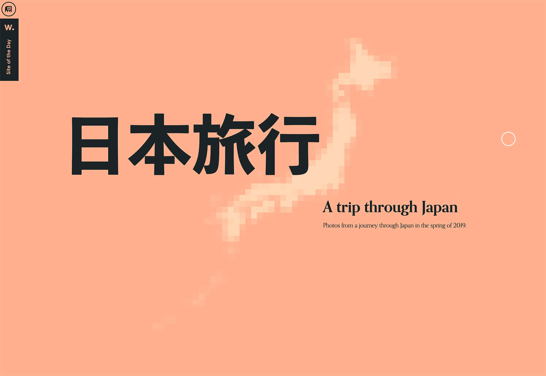
Homepage hero areas are shifting again from website entryways with plenty of text, CTAs, and options for users, to simple displays with big headlines (and maybe not much else).

Use of oversized headlines and text elements make it clear from the start what a website or design is about, but doesn’t provide a lot of opportunity for users to explore without scrolling. And that might be okay. Thanks to mobile dominance, users have become accustomed to the scroll. It may even be shifting to the preferred method of digesting content. (Even more than clicks or taps.)

Scroll is fast and allows users to glance at content and information with little delay or interaction.

Each of the website examples below are designed for just that:

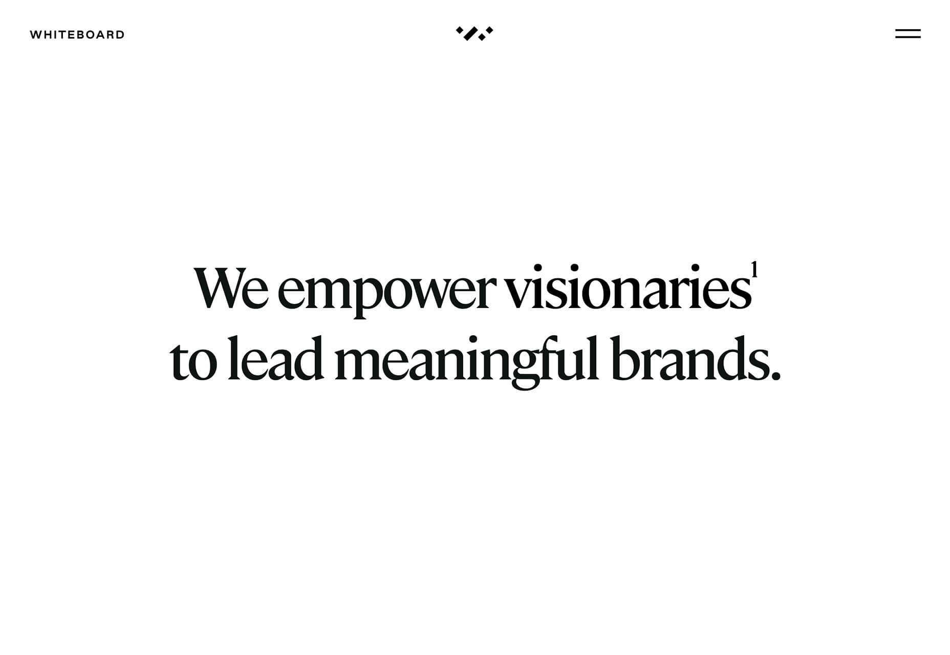
Whiteboard opens with a large headline that encompasses their vision statement and nothing else. On scroll you get access to projects and a deeper dive into information about the brand.

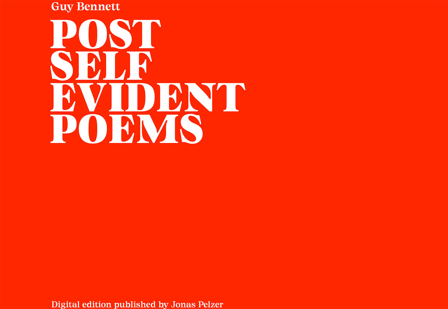
Self-Evident Poems doesn’t actually scroll but moves into prompts for usability. It’s rooted in the same homepage headline hero area that’s designed to draw you into the content.

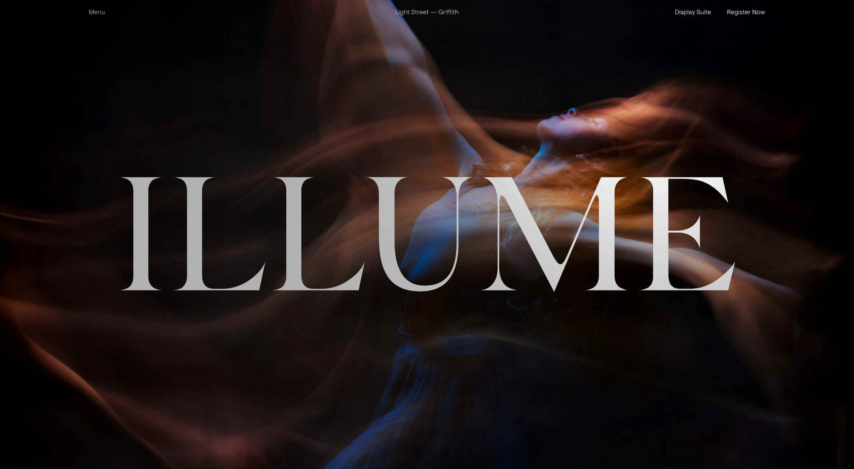
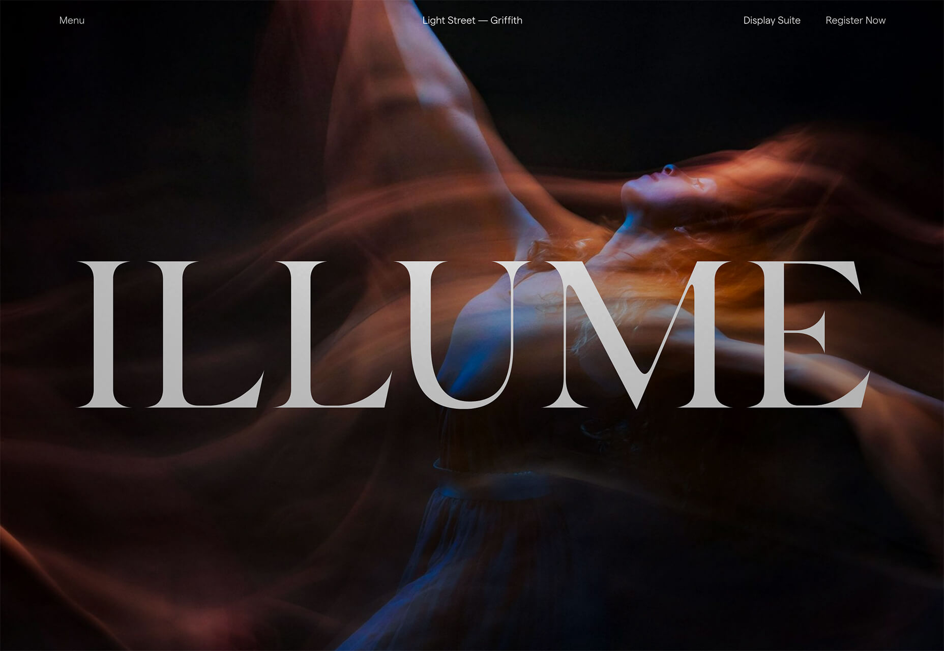
Illume has additional content below the scroll beneath a giant headline in the hero area. What this design does differently is that it does include some imagery, although it is still secondary to the text because of typography size.
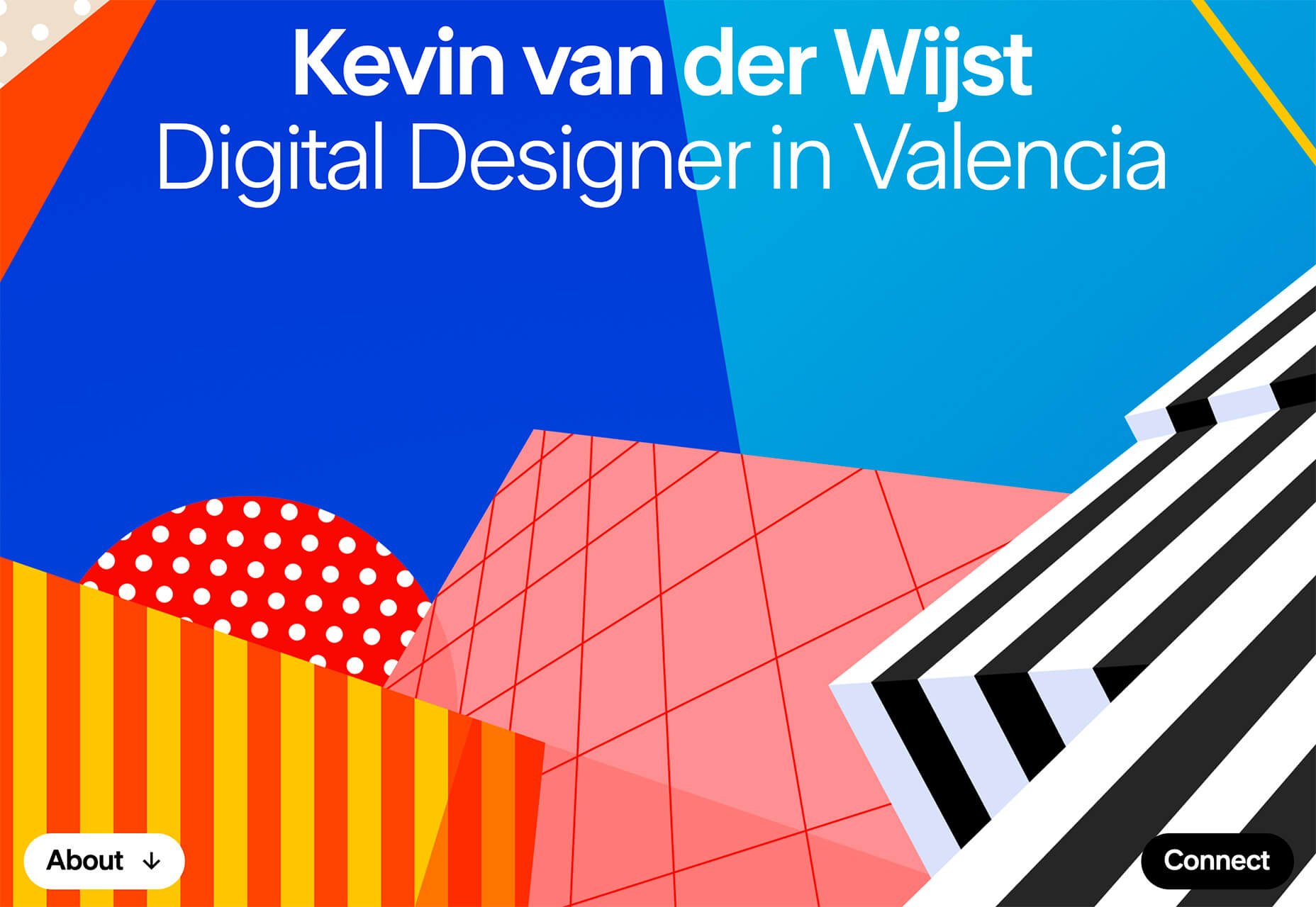
Peachy Tones

Beat the Winter blues with a dose of Spring color! Peachy tones seem to be everywhere.

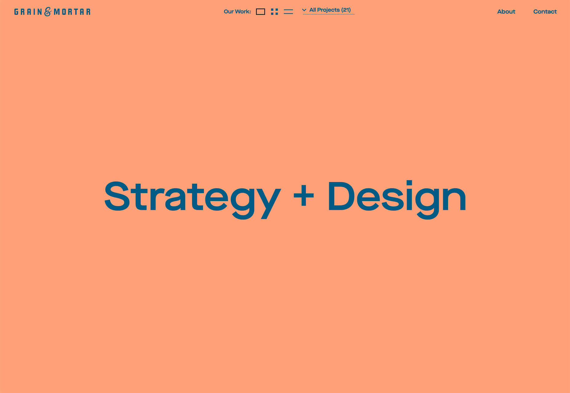
While this trend might be an evolution from other bright colors such as pinks and oranges that have been popular, it has a lot of practical application. Use it as a dominant color such as Grain & Mortar, and Monokai, or to create an accent like Kevin van der Wijst’s portfolio.

Peachy tones provide plenty of options and can be more pinkish or push toward orange. The color can be highly saturated or fairly pale. The nice thing about peachy tones is that they aren’t that overpowering, and work equally well as background or foreground color. Peach can get a little tricky when used for typographic elements, depending on the font style and contrasting elements.

Larger swaths of peach tend to stand up against other elements better than tiny ones. Note that even as an accent in the featured portfolio below, peach tones encompass a significant portion of the canvas. (You might also want to click through and play with that design, which also includes cool liquid animation. You can even make the peach area take up most of the screen.)
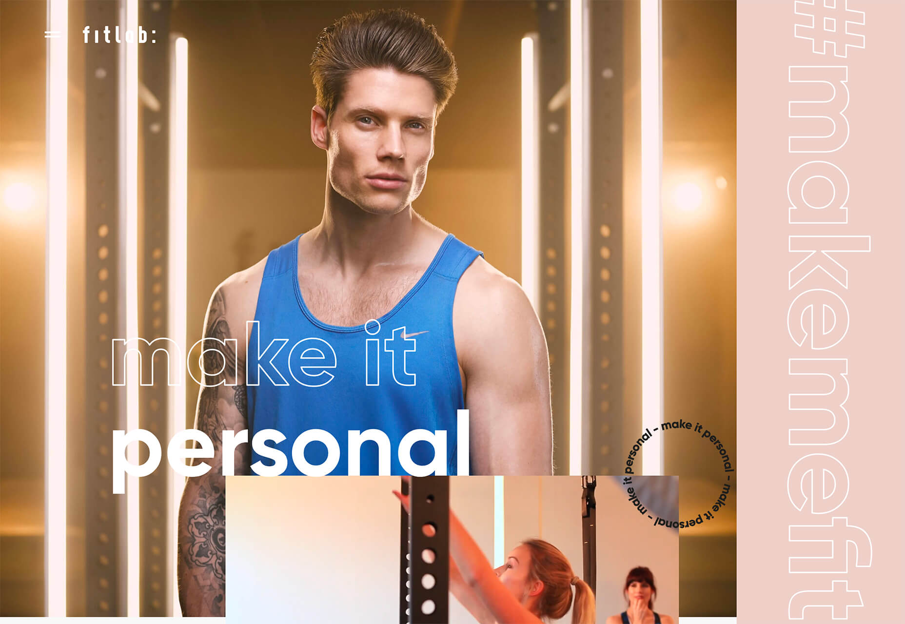
Outline Fonts

This trend is exploding in use from small projects to big brands. Outline fonts are a big deal. It’s one of those trends that you would shake your head at and say “no way” if you didn’t see it in action … and used so well.

Outline fonts can be a challenge. They create an effect that’s almost the opposite of the oversized typography in another trend mentioned here. But they do create an eye-catching effect that draws you into the words on screen.

Outline fonts are almost always paired with the same font filled. It creates and yin and yang effect that can help keep users reading longer and engaging with content. The contrast between and outline and filled font also put specific emphasis on the bolder element in the lettering pair.

The trick to making it work is not to get too crazy with the design and design outline fonts so that there’s plenty of contrast for the letters to remain readable.

Fitlab is the busiest of the examples of this trend with multiple use of outline fonts and even a quick-moving video roll. Put it all together and the emphasis is on “personal” training. It works.

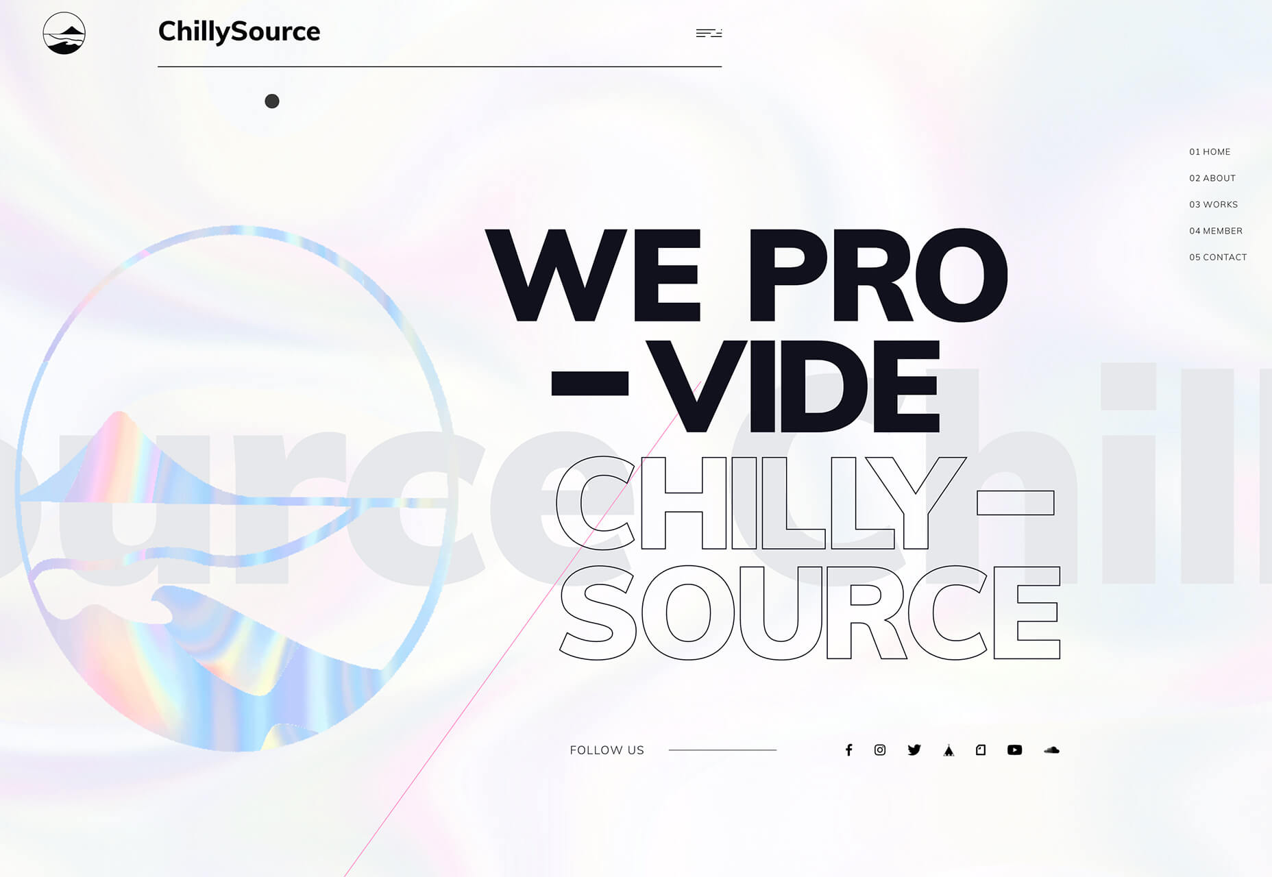
Chilly Source uses an outline font for its brand name so that you get another intro to it without too much brand in your face. (The name is mentioned three time on the homepage.)

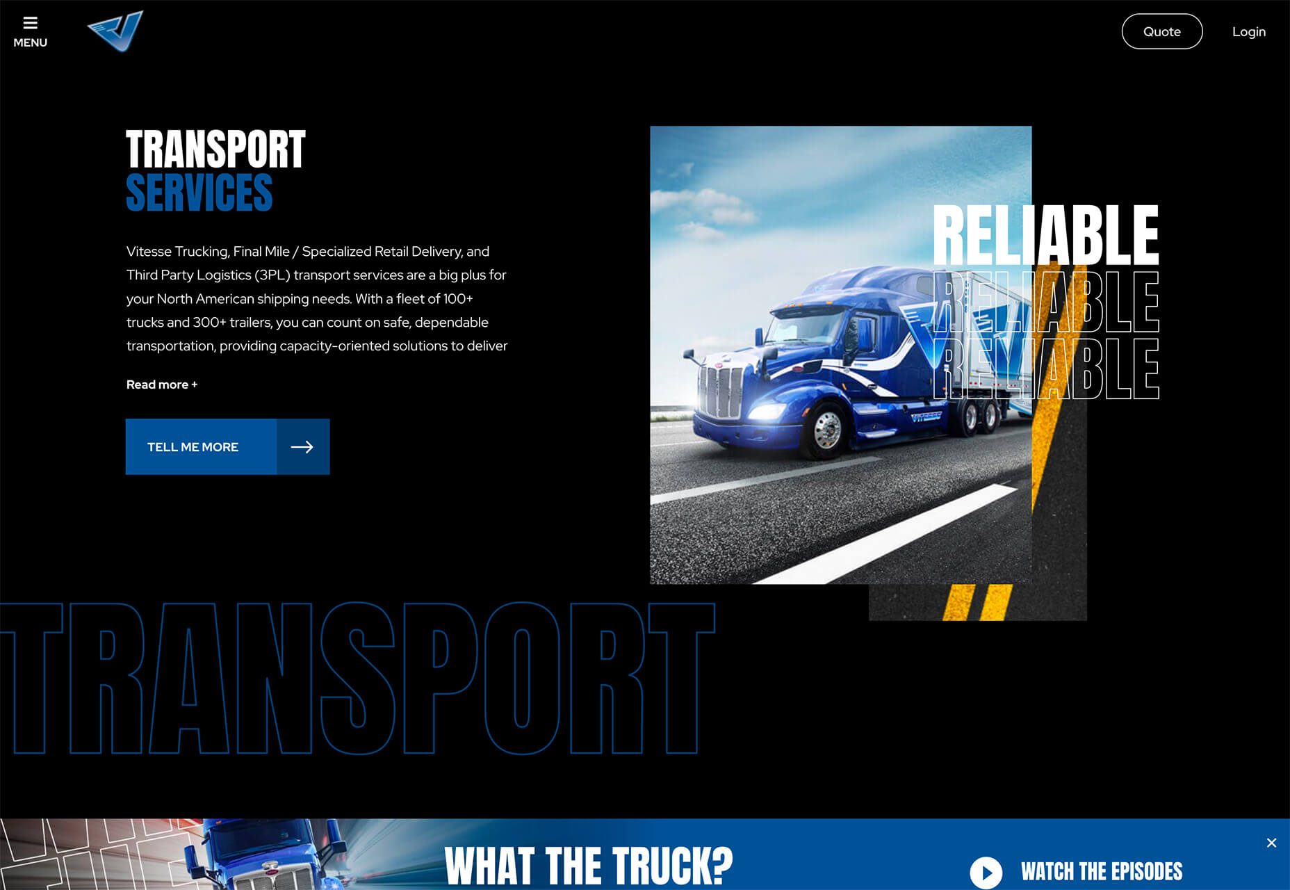
Vitesse Trucking uses outline text to tell you what they do throughout the design. Text is information but also serves as an art element with movement in the parallax-style scrolling design. Outline type elements mirror smaller filled words and even include some layering and overlays to keep the eyes moving. It’s an interesting use of this trend in an industry where you might not expect it.

Conclusion

I’ll be the first to admit, you probably won’t find me designing with a lot of peachy coloring. While it works for these projects, it’s not a favorite of mine.

On the flip side, I adore all the outline font options. It’s funky and provides depth to text elements that we haven’t seen a lot of. How about you? What design trends can you see yourself using in the coming months?

Source

p img {display:inline-block; margin-right:10px;}
.alignleft {float:left;}
p.showcase {clear:both;}
body#browserfriendly p, body#podcast p, div#emailbody p{margin:0;}

Building a Headless WordPress Website with GatsbyJS

Original Source: http://feedproxy.google.com/~r/1stwebdesigner/~3/YUX_9KCa43I/

Recently, we took a look at the rising trend of “headless” WordPress configurations. The term describes the process of creating content within WordPress, then pushing it out for use in another application. In essence, this works to separate (or decouple) the front and back ends.

One of the more exciting features of this setup is the ability to create content within the familiar confines of a CMS and use it to feed just about anything you want. Among the most common destinations for this content would be mobile apps, progressive web applications and static websites.

Today, the focus will be on the latter. We’ll take you through the process of using a headless WordPress installation to create a static website. For this, we’ll utilize GatsbyJS, a React-based framework that can work in tandem with WordPress.

The result will be a basic static website that will run incredibly fast, while allowing us to keep the content management abilities of WordPress. Let’s get started!

UNLIMITED DOWNLOADS: 500,000+ WordPress & Design Assets

DOWNLOAD NOW

A Quick Look at GatsbyJS

GatsbyJS has become a popular tool for generating static websites. It offers a lot of flexibility, as well as a number of plugins and starters to help get your project going rather quickly. This goes well beyond WordPress, with the ability to work with a number of different CMS and other data sources.

But for our purposes, WordPress compatibility is exactly what we’re looking for. And while there are some WordPress-specific starters available, we’re taking a very barebones approach. The starters are outstanding, but do have some dependencies which could trip up beginners.

The GatsbyJS home page.

Requirements

In order to use GatsbyJS, you’ll need to familiarize yourself with the command line. And you’ll need, among other things, to have Node.js, Git and the Gatsby CLI tool installed on your web server or local machine (that’s where we’re building our demo).

You may be wondering: How is a local machine set up? While we won’t go into too much detail here, there are a number of ways to go about it. For example, XAMMP (which we’re using) is a great option and will work on Mac OS, Windows and Linux. In essence, it’s a matter of downloading the server you want, installing it and then hitting the command line.

There’s a tutorial available that will walk you through the various software packages you need for your particular environment.

The other big requirement is, of course, an installation of WordPress. To push data from WordPress to your GatsbyJS static website, you can use the default REST API that comes built into the CMS.

Inside WordPress

Inside our WordPress site, we created a handful of test pages, along with a test blog post. You don’t need to do anything more than this when first experimenting.

In addition, we put our pages in a menu called “Main Menu”.

By default, WordPress menus aren’t available in the REST-API. Installing the WP REST API Menus plugin will do the trick. We’ll be using this as well to help auto-create menus on our static site.

Our headless WordPress website.

Creating a New GatsbyJS Website

So, we’ve installed the necessary command line software on our local machine and created a fresh install of WordPress (with the WP REST API Menus plugin installed and activated) on a remote web host.

According to the GatsbyJS documentation, we need to run a command in order to create a new website. First, navigate to a directory where you’d like to build (we’re using C:gatsby on a Windows 10 machine). We’ll deviate a little from their notes, as we’ll be using a custom site title “1wd-static” (which will create a folder with the same name).

Here’s the command for building this new website:

gatsby new 1wd-static

The command takes a little time to run, as it installs the package. When the process finishes up, we can navigate to that new site via the command line. In our case, it’s:

cd 1wd-static

Okay. We’re in the directory where our static website has been created.

Next, we’ll install the gatsby-source-wordpress plugin. This allows us to fetch data from WordPress:

npm install gatsby-source-wordpress

In addition, gatsby-plugin-sitemap and gatsby-plugin-sass will be installed, as they are dependencies for the demo code we’ll use later on:

npm install gatsby-plugin-sitemap gatsby-plugin-sass

Now, it’s time to put GatsbyJS into development mode:

gatsby develop

If everything went smoothly, you should now be able to view the site in your web browser by visiting http://localhost:8000

The site is nothing fancy so far, just a basic page with default content. We still have to configure some files to get GatsbyJS talking to our WordPress site.

The GatsbyJS starter home page.

Tip: If you need clarification on the process, check out this helpful tutorial on the official GatsbyJS blog.

Pushing Site Content from WordPress to GatsbyJS

The next step on our journey involves grabbing the content from our WordPress install and feeding it into our new GatsbyJS static website.

The first part of the process is in customizing some GatsbyJS files.

Download and Replace the Files

Before we move along, you’ll want to download a copy of the example GatsbyJS site and replace the existing files. Several of the files have been changed from the default in order to grab pages and posts from a WordPress install. There is also a GitHub repository of the files if you’d like to take a look around.

The original code is courtesy of Tim Smith, who wrote the GatsbyJS blog tutorial we referenced above.

Options to change:

Assuming you have downloaded the necessary files above, there is only one place you’ll need to make changes. Open up gatsby-config.js, located in the root folder of the static website.

Head to the section that reads: resolve: “gatsby-source-wordpress” and take a look at the following:

baseUrl: “gatsbypress.iamtimsmith.com”, // Change to your WordPress URL, without the ‘http://’.
protocol: “https”, // Use https if you have SSL installed on your WordPress website. Otherwise, use http.
hostingWPCOM: false, // Keep as ‘false’ UNLESS you are hosting with WordPress.com.

A little farther down, look for:

searchAndReplaceContentUrls: {
sourceUrl: “http://gatsbypress.iamtimsmith.com”, // Replace with the full URL of your WordPress website.
replacementUrl: “https://localhost:8000”, // The local URL of your GatsbyJS website – this should be fine as-is.
},

Testing

Now that we’ve customized gatsby-config.js, it’s time to test! In order for GatsbyJS to recognize the updated files we’ve installed, we’ll need to:

Restart the local server;
In the command line, navigate over to the folder where our static website exists, /1wd-static/

Then, enter the following command:

gatsby develop

Once GatsbyJS starts up, the test site will be available once again at: http://localhost:8000

The Results

It works! The static website now displays our blog posts on the front page, while a top navigation menu will direct visitors to our secondary pages. Notice the site’s title also reflects what we set in WordPress.

The site is not ready for public consumption just yet, but we’ve got a great foundation to build on.

The GatsbyJS website, using content from WordPress.

Moving Forward

Now that we have the basics of a headless configuration, there are plenty of goodies to add. The most obvious of them is the design. Check out the documentation to see how to style a GatsbyJS website and use a theme.

Another thing missing from our demo are images, which is covered in Adding Images to a WordPress Site.

Finally, if you’re looking for a complete and thorough guide to the site building process, check out this step-by-step tutorial. It will take you through site set up, development and launch.

Final Thoughts

The experience of building a headless WordPress configuration was full of ups and downs – sometimes even a bit discouraging. That’s to be expected, as there is just about always a learning curve when experimenting with new tools. However, once you get the process down and gain a better understanding of what GatsbyJS is doing, things improve.

That being said, it’s worth taking the time to read the documentation. Setting up GatsbyJS is much more intricate than WordPress alone. It seemed like one false move led to lots of error messages. Each time, some research was required to sort things out.

Once you get it running, though, you can see why developers are adopting this approach. We’re just in the beginning stages, but the future looks awfully bright.


How to Tackle a Python Interview

Original Source: https://www.sitepoint.com/tackle-python-interview/?utm_source=rss

How to Tackle a Python Interview

Have you cleared the first round of calls with the HR? Are you going for a Python interview in person? If you’re wondering what Python-related questions may be asked, this guide should be of help.

In the first section, we’ll discuss a few questions about Python’s philosophy — those that help you make decisions about the architecture of a project. In the next section, we cover questions related to the Pythonic way of programming — which may manifest in the form of review or finding the output of a code snippet.

A word of caution before we start. This guide talks primarily about Python’s built-in capabilities. The aim of this guide is to help you get up to speed with the inherent Python functionalities that enable quick development. So we won’t be able to cover every question you may face from the various types of companies out there.

Development in Python: Project Architecture
What is Python? Why should you use Python?

If you’re interviewing for a Python role, you should have a clear idea of what Python is and how it’s different from other programming languages. Here are a few key points regarding Python that you should be aware of.

First, you should not be wrong about the etymology. A large section of Python programmers wrongly think that Guido van Rossum named it after the snake! On the contrary, Python is named after British sketch comedy Monty Python’s Flying Circus. The next time you see a Python book with a snake on the cover, you may perhaps wish to stay away from it.

Next, Python is a high level, object-oriented, interpreted programming language. This means that Python code is executed line by line. Python is also dynamically typed, as it doesn’t require you to specify the type of variables when declaring them.

Given Python’s ease of use, it has found uses for common automation tasks. Python is often the go-to scripting choice for programmers who know multiple languages. With the increasing popularity of Python-based web frameworks like Django and Flask, Python’s share of the pie has increased significantly in recent years.

Limitations of Python

While it’s good to know about the capabilities of a programming language, it’s also good to be aware of its limitations to truly comprehend the situations you need to be wary of.

The first limitation of Python is execution speed. Though development in Python is quick, executing a similar block of Python code is often slower compared to compiled languages such as C++. For this reason, hackathons often give Python programs some extra time for execution. There are ways to circumvent this issue, though. For instance, you can integrate Python with a compiled language like C to perform the core processing through the other language.

In a world which is going mobile first, Python is not native to mobile development. You will rarely find mobile applications developed in Python. The two major mobile operating systems, Android and iOS, don’t support Python as an official programming language.

Package Determination: Django vs Flask

In addition to Python’s capabilities and limitations, a category of questions that are popular in interviews focuses around choosing between packages based on your requirements. Let’s look at one approach that you may take when tackling such questions.

Let’s say you’re given a choice between Django and Flask to start a web application. The answer to this question should lie within an amalgamation of the requirements of the project and the culture of the organization.

At the outset, you should know that with the use of plugins, there’s no right answer here: you can create the similar applications using either framework. However, there’s a stark difference between the design philosophies of each framework. Flask provides you the bare minimum features for you to create a web application like URL routing, templating, unit testing and a development server, thereby giving you a lot of freedom to design your application. On the other hand, Django provides you a large array of built in features from the beginning — database support, extensive admin functionality, and security features.

If you’re building an application that will use relational databases, with a lot of dynamic content, you should probably choose Django. However, if you’re looking for a lot of freedom in your project, you should opt for Flask.

The post How to Tackle a Python Interview appeared first on SitePoint.

This Week In Web Design – January 31, 2020

Original Source: http://feedproxy.google.com/~r/1stwebdesigner/~3/GvPGsvKRImU/

We’re ending the month of January by kicking off a new weekly roundup series, “This Week In Web Design”, in which we will bring you a curated list of web design related articles published in the past week. Every Friday we will provide a list of links to helpful tips, tutorials, and learning opportunities to help you continue to grow your web design knowledge and skills. Of course, we have a wealth of information here at 1stWebDesigner to aid in that endeavor, but we hope these lists will help you to expand your resources beyond our own site.

So, here’s what we’ve found this week. Enjoy!

Your Web Designer Toolbox
Unlimited Downloads: 500,000+ Web Templates, Icon Sets, Themes & Design Assets


DOWNLOAD NOW


UI Interactions & Animations Roundup #2

Some selected shots of great UI interactions and animations for your inspiration.

How To Keep Designing When Tragedy Strikes

You’re going to face these things sooner or later, here’s how you too, can overcome your personal disasters.

How Web Designers Can Maximize On-SERP SEO and Traffic with Structured Data

Get your SEO hat on. How web designers can use structured data markup to qualify for key SERP features.

How To Design Powerful Narratives On Mobile

Want to build a website or PWA that attracts a large audience and then converts as much of that audience into paying customers as possible? If that’s the case, what you need to do is use storytelling in your web design.

How to Install MySQL

This article discusses various options for using MySQL on your local system during development.

How to Add a WordPress Author Box to Your Blog Posts

Using a theme, plugin, or coding yourself.

How to design a portfolio that will land you clients

Your portfolio website is the place to show off your best work and establish your brand. It needs to be easy to get to, pleasing to the eye and professional looking. It is a combination of business card, elevator pitch and samples of your work.

Going Beyond Sales: 7 Types of Website Conversions to Optimize for on Your Website

What a conversion goal is, seven types of website conversions, and four steps for setting up your conversion rate goals.

Use and Reuse Everything in SVG… Even Animations!

Learn how to build and optimize your code with <use> element, CSS Variables and CSS animations.

A Rational Approach to Updating Your WordPress Install

Take a look at some techniques to mitigate risk and give you some peace of mind.

What Is Modern Web Design in 2020? 20 Stunning Examples

You know an outdated design when you see it for sure. Here’s a collection of 20 examples of modern web designs to help shape a better idea of what it looks like.

How to Be a Sustainable Web Designer

Talking about the practicalities of going green and asking whether it is possible to be a sustainable web designer.

How to Improve Security on WordPress Websites for Optimal Performance

A discussion of some rather small but significant tips that can be used to achieve improved security on your WordPress website and as a result improve performance.

WordPress 5.4 Will Add Lazy-Loading to All Images

WordPress announced that WordPress 5.4 may feature image lazy-loading by default.

Sticky Table of Contents with Scrolling Active States

A fairly common pattern for documentation.

How to Automatically Update Your JavaScript Dependencies

One frustrating aspect of the modern JavaScript ecosystem is keeping all your dependencies up to date. Thankfully, there are automated tools that can handle this thankless task for you.

That’s A Wrap!

We hope you have found this list helpful in your continuing growth as a web designer. If you are a publisher, blogger, or own a website that is publishing articles about or related to web design and you would like to make sure you get included in our lists, please contact us here.

Cover photo courtesy of ShotStash


Website Optimization for Mobile Devices

Original Source: http://feedproxy.google.com/~r/Designrfix/~3/XITF-cywQUc/website-optimization-for-mobile-devices

There are billions of people on Earth and more and more people are using mobile phones. A mobile phone gives you access to the world. If you have a small business, target their phones. That’s where they get all their information about products and services. For that, your website needs to be mobile-friendly. That’s where […]

The post Website Optimization for Mobile Devices appeared first on designrfix.com.

From Toilet Roll To Paper Art: 12 Amazing Examples

Original Source: https://www.hongkiat.com/blog/creative-toilet-paper-rolls/

If your creativity is wild, no medium is a limitation. This fact is exceptionally true with Anastassia Elias, a french artist who collects toilet rolls and turns them into great works of unbelievable…

Visit hongkiat.com for full content.

5 Free Android Apps to Monitor Your Kids’ Smartphones Activities

Original Source: https://www.hongkiat.com/blog/parental-control-apps-android/

Google Play Store may not have tougher restrictions than those found on Apple’s AppStore so if your kids own an Android device (or have access to your device at their liberty), you might want…

Visit hongkiat.com for full content.

800+ Free & Premium Procreate Brushes

Original Source: http://feedproxy.google.com/~r/1stwebdesigner/~3/sVIpbiCY5Io/

Procreate makes it easy to create stunning designs and pieces of artwork for personal and professional use. However, gathering all the resources you need, like Procreate brushes, can seem like a daunting task when you’re first starting out.

Instead of having to hunt down brushes to use in your art, we’ve put together a resource you can reference whenever you need a new brush. Here, we’ve compiled some premium brushes, free collections, as well as premium (free & premium) collections you can use in your work starting right now.

All The Best Procreate Brushes
Unlimited Downloads: Hundreds of Procreate Brushes For Your Designs

Envato Elements - Procreate Brushes
DOWNLOAD NOW

Premium Procreate Brushes
Vintage Comic Brushes

Procreate Brushes - Vintage Comic

The Vintage Comic Brushes set contains 51 brushes for Procreate that are heavily inspired by the vintage comic halftone look.

Procreate Texture Brushes.Sand

Procreate Brushes - Texture

This set of texture brushes offer a variety of sand effects for your Procreate projects. The set comes with 6 sand texture brushes.

Fabulous Pencils for Procreate

Procreate Brushes - Pencils

The Fabulous Pencils set comes with 44 different brushes that offer realistic pencil textures for any project that requires a hand drawn look.

Graffiti Brush for Procreate

Procreate Brushes - Graffiti

The Graffiti Brush set makes it easy to create analog graffiti looks in your digital artwork.

The Jungle Brushes

Procreate Brushes - Jungle

The Jungle Brushes is a set of 20 brushes for Procreate that can be used to add an earthy and grungy look to any project.

Free Procreate Brush Collections
Watercolor & Paint Brushes

Procreate Brushes - Watercolor

This is a lovely collection of free watercolor and paint brushes.

250+ Creative and Free Brushes for the iPad Pro

Procreate Brushes - Creative

This is a real treasure trove of free resources! Here, you can find over 250 free brushes that offer you new creative ways to make what you want to make.

351+ Inking, Lettering, and Calligraphy Brushes for the iPad Pro

Procreate Brushes - 351+

If lettering is what you’re interested in, why not browse the 350+ brushes listed in this resource?

Free Procreate Brushes

Procreate Brushes - Free

Here’s another lovely set of brushes that you can browse and use for free.

Free Brushes: A Stockpile of all My Freebies

Procreate Brushes - Stockpile

In this collection, you can browse through all the free brushes a fellow artist has compiled. How generous!

50 of the Best Free Brushes

Procreate Brushes - 50 best free

Another great list here, this time of 50 fantastic free brushes.

Premium Procreate Brush Collections
Premium Brushes for Artists & Illustrators

Procreate Brushes - master bundle

If it’s within your budget, you can always splurge on a new brush or two after browsing those listed here.

34 of the Best Brushes

Procreate Brushes - 34 best

This list of 34 all-time favorite brushes can really take you far when it comes to professionalism — plus there are some freebies included here as well.

The Best Procreate Brushes for iPad (Free & Premium Packs)

Procreate Brushes - iPad

Another free and premium list here, chock full of some of the best brushes you could ever ask for.

The Best Procreate Brushes to Download in 2019

Procreate Brushes - essential bundle

Over 300 brushes are listed at this resource. Odds say you’ll find what you’re looking for here.

100+ Brushes for Artists (Best Free & Premium Brush Sets)

Procreate Brushes - 100+

Last on our list is this collection of over 100 brushes that includes free and premium selections, all of which are great for working artists.

Use These Procreate Brushes to Create Your Next Stunning Work

Don’t let a lack of on-hand resources stunt your next project. Instead, see what’s available to you for or for a nominal fee. What’s available might really surprise you. And hopefully, this collection of Procreate brushes will send you well on your way toward putting together something truly eye-catching. Be sure to check out our other brush resources here.


How to Get More Google Now Custom Voice Commands

Original Source: https://www.hongkiat.com/blog/google-now-custom-voice-commands/

Google Now, the smart voice assistant from the search giant, allows you to accomplish many tasks using nothing but your voice. You can use voice control on your device with this application, but…

Visit hongkiat.com for full content.

Beautiful Liquify Logo Animation in After Effects

Original Source: http://feedproxy.google.com/~r/abduzeedo/~3/W0uqFEhNjQw/beautiful-liquify-logo-animation-after-effects

Beautiful Liquify Logo Animation in After Effects

abduzeedoJan 24, 2020

I have been going back through old tutorials to fix some of the images that might be broken or with old formatting. The blog has changed quite a lot since we started 12 years ago. It’s incredible to see how many Photoshop tutorials we’ve written and how some of them stood the test of time. One of them was the Beautiful Water Effect in Photoshop. I love that tutorial, and it gave me the motivation that I need to continue studying After Effects. My goal was to try to reproduce the effect with some cool motion to it. With that, I would love to share a little After Effects tutorial on how I achieved the result.

A little disclaimer, I am not a pro with After Effects, on the contrary, I am learning, and my goal is to share the step by step on the things I discover along the way. I am sure there are more natural ways or better ways from other great resources, this one here is just a bit of my way of learning.

After Effects Tutorial

Step 1

The first thing to do is to try to understand how much in common After Effects and Photoshop have. In Photoshop this effect is quite simple, you use a displacement map. For my surprise, After Effects also have one.

So let’s get this started. Create a new project and add a new composition. Composition>New Composition.

Step 2

For my Photoshop image, I used a photo of ocean waves. So now we need to find a video for this project. It’s amazing how similar things feel when I started doing Photoshop tutorials. It was tough to find high-quality resources; we didn’t have Unsplash back in the day.

Now for photography, we have a plethora of excellent places. For video, the story is a bit different. I started this project using a sample for Adobe Stock, however, after searching I found a right place, it’s called Pexel Videos. The clip I am using is from there; it’s titled Close-Up Video Of Water Ripples by Stas Knop.


Step 3

Download the video and drag it to your Project panel. In Project pane, select the clip and hit “Enter,” to rename it. I like to keep the names short. I just called mine “Ocean.”

After that, drag the “Ocean” clip to your composition timeline panel. That way it gets centralized automatically.

Step 4

Let’s change opacity to 90%. In the timeline, expand the Ocean object, the expand Transform, and you will see Opacity. Just turn it to 90%

Step 5

Now let’s adjust the colors. Go to Effect>Color Correction>Hue/Saturation. Reduce the Saturation to -100.

Step 6

Let’s tweak the Levels now to remove the greyish look. Go to Effect>Color Correction>Levels. Use the values below.

Step 7

Let’s import the artwork we want to use for the displace effect. I am using the Abduzeedo logo. My logo is in vector format in Illustrator. Importing it to After Effects is straightforward. Again, I don’t know if it’s the right way, but this is how I did.

Select the vector in Illustrator and copy it.
In After Effects add a new solid layer. For the name use Logo and make sure the color of the layer is white.
Paste the logo in the composition as a path mask, and that’s it.
Select the layer in the timeline and go to Layer>Pre-Compose. The reason for this is if you want to replace the paths later you can do it without worrying about the timeline, imagine Smart Objects in Photoshop.

Step 8

Time to add some magic, at least it feels like that for me. One thing that I love about After Effects is that it does have some neat tricks, for example, the Effect & Presets panel has a search box. So you can type Displacement and boom, you will find what you need. In our case the Displacement Map. It can also be found via Effect>Distort>Displacement Map.

Make sure the Logo layer is select and just double-click on the Displacement Map option. You will notice on the left side there’s a new panel called Effect Controls. Let’s tweak these numbers to apply the effect to our layer.

For the Displacement Map Layer select the Ocean layer.
Tweak the Max Horizontal and Vertical Displacement. Depending on the logo and how much distortion you want. The cool thing is that you can animate these values too. I will show you an example at the end.

Step 9

To make it more realistic, duplicate the Ocean layer and reorder, so it’s on top of the Logo layer. After that change the Blend Mode to Multiply. After that change the opacity to 70%.

Step 10

The effect is pretty much done, but you can also try to add a little radial gradient to focus everything on the center of the composition. I haven’t found an easy way to add one, but here’s my hacky way.

Create a new composition. Make sure the background is black
Add a new solid layer with white color.
With the Ellipse Tool Q add a Circle in the center. It will mask the white layer.
Go to Effect>Blur & Sharpen>Gaussian Blur. Apply a significant value according to the gradient you want.

Step 11

Back to the main composition. Drag the Gradient composition to the timeline, below the logo but above the Ocean layer. Change the Blend Mode to Overlay.

Step 12

That’s it. The necessary effect is done. What you can do now is try to animate the in and out of the composition. You can do that by tweaking some of the values of the displacement, for example:

Select the Logo and go to Effect Controls>Displacement Filter.
Make sure the timeline is in the 0s. And click on the little Clock/Time watch icon next to Max Horizontal Displacement and Max Vertical Displacement.
Move the timeline to 3s and add keyframes. It’s the little diamond icon on the left side
Move to 7s and add more keyframes
Move to the end of the timeline and add two more keyframes. For these, change the values of the displacement to 300.
Move to the beginning and change the displacement values to 300 as well.
Select all keyframes, then with the right-click select Keyframe Assistant and then select Ease Ease.

Step 13

Let’s make the ocean fade in and fade out. To do that is quite simple.

Select the Ocean Layer and go to the 0s of the timeline. Expand the layer and select Transform>Opacity.
Click on the little stopwatch icon to add a keyframe.
Move to the 2s time and click on the “add keyframe” diamond icon.
Move to 8s and add another keyframe.
Move to the end of the timeline and change the opacity to 0%. It will automatically add a keyframe.
Select all keyframes, then with the right-click select Keyframe Assistant and then select Ease Ease.
With the keyframes selected, copy them. Select the Logo layer, go to Opacity and paste them to replicate the keyframes on that layer.

Conclusion

The effect is pretty much done. You can adjust the timing and add more finesse. That for me is the most challenging part, so have fun and let us know if you have any questions.

Download After Effects File


<!–

<!–

/**/

//–>

//–>