Original Source: https://www.smashingmagazine.com/2020/02/people-hate-brand-mascot-guide/
What To Do If People Hate Your Brand Mascot
What To Do If People Hate Your Brand Mascot
Suzanne Scacca
2020-02-17T13:00:00+00:00
2020-02-17T21:38:41+00:00
There are a number of reasons why businesses decide to use mascots to represent their brands:
They want there to be a friendly and reliable face to welcome visitors to the site.
They know they need something more than an inventory of products to make an emotional connection with shoppers.
They want a strong and recognizable personality that can tie all of their marketing channels together.
While it’s clear that mascots can be invaluable for the business-consumer connection, there’s a very thin line between mascots turning customers into loyal advocates and sending prospects running away in fear.
If you’re struggling to get traction on an existing website and fear the mascot might have something to do with it, this post is for you. You should also keep reading if you’re designing a mascot from-scratch and aren’t sure how to create something your audience will fall in love with.
There’s a very thin line between brand mascots turning customers into loyal advocates and sending prospects running away in fear.
“
Things You Can Do to Create a Brand Mascot People Love
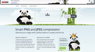
Not everyone is going to get as lucky as TinyPNG, which has had the same brand mascot for years.
This was the mascot that sat at the top of the page in 2014:
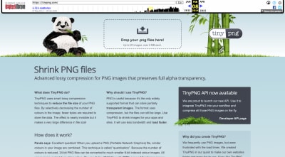
A snapshot of the TinyPNG website in 2014 with its panda mascot. (Image source: TinyPNG) (Large preview)
Here it is again in 2017, only it’s a bit brighter and larger in size:
A snapshot of the TinyPNG website in 2017 with its panda mascot. (Image source: TinyPNG) (Large preview)
The mascot also started appearing with a crown on the bottom right. This callout encouraged users to subscribe to the Pro tool.
To this day, the website continues to use the mascot in this manner (and with nearly the same layout and content):
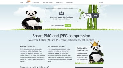
A snapshot of the TinyPNG website in 2020 with its panda mascot. (Image source: TinyPNG) (Large preview)
The panda mascot works for a number of reasons. It looks very happy, for one. Also, it’s got a welcoming presence, like “Hey, I’m just chilling here, eating my bamboo. Feel free to upload your images whenever.” And it’s downright adorable.
But not every seemingly happy, friendly or cute brand mascot works out this well. Mascots are a subjective thing. It’s like they always say: beauty is in the eye of the beholder.
So, if your audience doesn’t interpret the attractiveness, humor or personality of the mascot as the original creators did, it’s going to be a problem for the business as a whole.
Let’s take a look at what your options are if you suspect that your client’s brand mascot isn’t as adored as they hoped it would be.
Option #1: Modernize It
The first thing to think about is whether or not the mascot is worth salvaging. Is there anything good about the mascot or its personality… or should you start over?
Don’t just go based on your gut. Do some market research and throw some user surveys out there. Maybe message old customers of your client or do a poll on Twitter. You need to know why the mascot isn’t hitting the mark.
Is it boring?
Does it look too much like other mascots?
Is it difficult to tell what it is?
Is it inconsistent with the rest of the website’s messaging and vibe?
Does it fail to reflect the target audience well?
Does it look outdated?
Once you’ve nailed down what’s wrong, it’s time to redesign it. Let’s look at some websites that have given their mascots facelifts over the years, starting with HostGator:
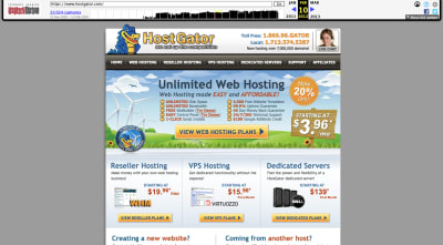
A snapshot of the HostGator website from 2012 with its alligator mascot logo and imagery. (Image source: HostGator) (Large preview)
This is what the HostGator website looked like in 2012. The alligator mascot had a heavy presence in the header of the website. His head also appears to be peaking out of the main banner.
Fast forward to 2017 and we see a different side of the HostGator mascot:
A snapshot of the HostGator website from 2017 with its mascot slightly revamped. (Image source: HostGator) (Large preview)
For starters, the alligator in the logo is much smaller, so we can now see the entire body. This gives it a more human-like feeling as opposed to the bottomless gator which more closely resembles a puppet.
The mascot in the main banner is designed the same way it’s always been designed (including the facial expression). However, it’s now donning winter gear for a seasonal touch.
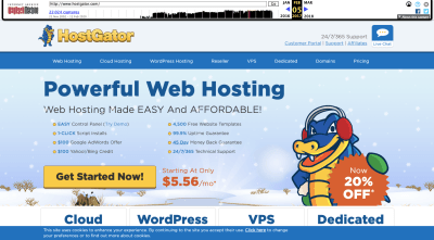
Since then, HostGator has given its mascot a major touchup:

A snapshot of the HostGator website in 2020 with a redesigned alligator mascot. (Image source: HostGator) (Large preview)
Do you know what this redesign looks like to me? It looks like the CGI used in The Irishman.

Vulture magazine shares a side-by-side look at CGI in the movie The Irishman from Netflix. (Image source: HostGator) (Large preview)
I’m not sure if that was the intention behind HostGator’s mascot redesign, but I’m going to assume that there was some user feedback that suggested that a softer and less intimidating mascot would perform better.
Another website that’s given its well-known mascot a touch-up is Chuck E. Cheese.
This was the Chuck E. Cheese website in 2011:
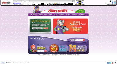
A snapshot of the Chuck E. Cheese website from 2011 with its cartoon mouse mascot (Image source: Chuck E. Cheese) (Large preview)
Not even a decade ago, the Chuck E. Cheese website and its mascot looked like something out of Nickelodeon. Obviously, a design like this would’ve needed an upgrade no matter what considering how much web design has changed.
This is what the website looks like today:
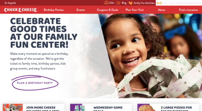
A snapshot of the Chuck E. Cheese website in 2020 without a mascot. (Image source: Chuck E. Cheese) (Large preview)
Gone are the crazy color palette and illustrations. Today, the website is much more subdued and customer-centric.
That said, the mascot pops up from time-to-time. Obviously, though, it’s undergone a much-needed redesign:
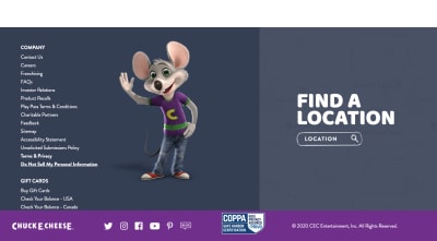
The Chuck E. Cheese mascot in 2020. (Image source: Chuck E. Cheese) (Large preview)
The new mascot is still a buck-toothed mouse with a welcoming smile and wave. However, it looks more on par with the kinds of animations you’d see coming out of Pixar than old Saturday morning cartoons.
Even if there’s nothing necessarily wrong with the mascot your website is using, it might be worth looking at upgrading it so it better fits with the times as Chuck E. Cheese has done.
Option #2: Change The Tone Of It
Mascots can be really helpful at getting a brand’s message across — over and over again. However, there may be times when the kind of mascot you’ve chosen (or a lack of one) actually stands in the way of the message you’re trying to convey.
Take the old GEICO mascot: the caveman.
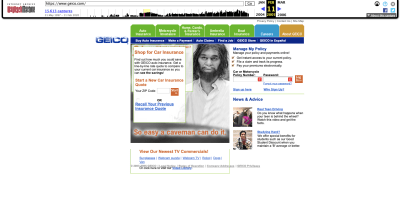
A snapshot of the GEICO website in 2005 when it featured the caveman mascot. (Image source: GEICO) (Large preview)
I don’t know that there was anything wrong with the caveman advertisements. They were smart and funny and were lauded for taking on the subject of political correctness.
That said, GEICO’s customer data must’ve told them that a change-up was needed. Maybe the messaging was too serious or the humor went over some people’s heads.
So, they scrapped the caveman mascot for an animated Cockney-accented gecko:
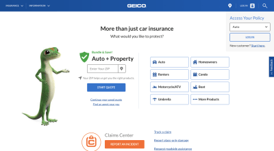
A snapshot of the GEICO website in 2020 with its gecko mascot. (Image source: GEICO) (Large preview)
Whereas the cavemen were always offended and storming off whenever someone would say “It’s so easy a caveman could do it”, this anthropomorphic mascot is a much more lighthearted figure in the GEICO landscape. The gecko is always there, ready to provide tips on how to get the most with GEICO.
In other words, it might not be enough to change your mascot to an adorable critter. You might also need to switch up your messaging, too.
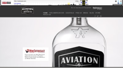
While I was writing my last article on mobile storytelling, I did some digging into the alcohol industry. One company, in particular, stood out for its use of a human mascot and storyteller: Aviation Gin.
Now, what I hadn’t covered in that write-up was the fact that Aviation Gin has been around for a while. It was founded in the mid-2000s, long before current co-owner and mascot Ryan Reynolds had anything to do with it.
This was the Aviation Gin website in 2007:
A snapshot of the Aviation Gin website from 2007. (Image source: Aviation Gin) (Large preview)
Granted, these are the early days of the web, so we can’t expect much in the way of design. However, as far as mascots go, there are none to be seen. Unless you count the actual bottle of Aviation Gin.
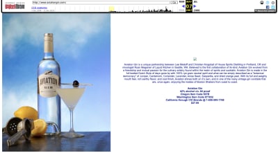
Nearly 10 years later, Aviation Gin was still rocking the product-centric design:
A snapshot of the Aviation Gin website in 2016. (Image source: Aviation Gin) (Large preview)
It was still very simple in design and the bottle of gin remained the sole focus. Aside from some industry awards, Aviation Gin wasn’t the media darling it is now.
In 2018, Ryan Reynolds bought shares in the company and changed the whole tone of the brand:
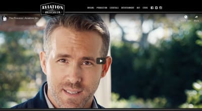
A snapshot of the Aviation Gin website in 2020 featuring Ryan Reynolds. (Image source: Aviation Gin) (Large preview)
Today, Ryan Reynolds has become the face of Aviation Gin, pushing it at every turn on his social media. It hasn’t changed the direction of the company itself, but by having a human mascot like Reynolds on its side, the message (and likely the audience, too) has changed.
It’s also opened the brand up to bigger opportunities, like Reynolds’ latest announcement about their partnership with the Westminster Kennel Club Dog Show:
So, if you have a website that performs just “okay” with its audience, a change of tone and pace might be needed. And if you don’t have a mascot yet or one that’s not a good fit, creating one that’s well-designed for a modern-day audience might be exactly what you need.
Option #3: Minimize Its Presence On The Website
Let’s say the mascot’s design and the message it brings with it isn’t the problem. What you suspect is that it’s the amount of space given to it that’s the problem.
This is easy enough to confirm with A/B testing. You’ll just need to study your heatmaps as well as your user personas to come up with some hypotheses about where your mascot should or should not be on the site.
Let’s use Cats Who Code as an example. This was the website back in 2009:
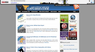
A snapshot of the Cats Who Code website in 2009 with cat logo and imagery. (Image source: Cats Who Code) (Large preview)
Back then, cats were quite prevalent on the site, from the laptop-using cat in the header to the cats in the blog images. What’s more, the tagline of the site “Learn as fast as I catch mice!” made it perfectly clear that the kind of “cats” referred to here wasn’t referring to hip or cool cats. It really was referring to the furry pet.
Skip ahead to 2014 and the cat mascot and tagline has received a makeover:
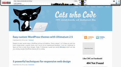
A snapshot of the Cats Who Code website from 2014 with a new mascot. (Image source: Cats Who Code) (Large preview)
For starters, the mascot has gone from a small tabby to a large black-and-white cat. In addition, the website’s tagline now reads “100% animal-friendly web development blog”. Those are both pretty significant changes.
Now, let’s look at the website in the present day:
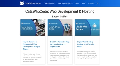
A snapshot of the Cats Who Code website in 2020. (Image source: Cats Who Code) (Large preview)
The cat mascot no longer exists in its previous iterations. Now, it’s relegated to a small cat-like icon with code brackets where its face used to be. The website’s cat-friendly messaging is gone, too.
Whether it’s because the cat imagery was distracting or people didn’t like it, this website has undergone a drastic change. Everything is now very buttoned-up.
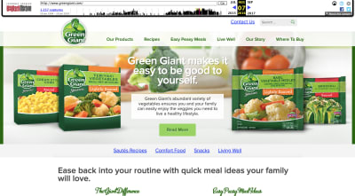
Another brand that cut back on the appearance of its mascot is Green Giant.
This was the website in 2013:
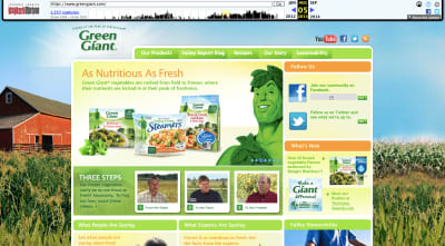
A snapshot of the Green Giant website and its mascot in 2013. (Image source: Green Giant) (Large preview)
The jolly green giant mascot is front-and-center on the home page. This is in addition to all the small appearances it makes in every product featured on the site.
In 2016, however, the giant’s likeness was removed from the hero banner and moved up to the logo:
A snapshot of the Green Giant website in 2016 with the mascot in the logo. (Image source: Green Giant) (Large preview)
It looks like the company was experimenting here, trying to see if moving the mascot’s face to the logo would give them more room to allow their products to shine.
In 2020, though, there’s barely any trace of the mascot left:
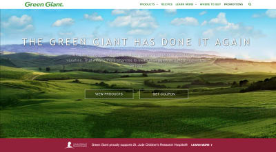
A snapshot of the Green Giant website in 2020. (Image source: Green Giant) (Large preview)
The mascot is gone from the logo as well as the hero image… sort of. It’s subtle, but the mascot’s shadow remains.
The website now appears to be more focused towards sustainability and its mission to contribute to a better world. In that sense, it’s completely justified why the mascot and even the blatant pushing of its products would be moved out of the way.
So, if you feel like your mascot might be getting in the way of getting your point across or perhaps the brand has evolved in a way where a cartoonish figure no longer fits, test out other ways to keep your mascot but in a very lowkey way.
Option #4: Lean Into The Creepiness/Weirdness/Ugliness
One other option you have is to lean into it.
Obviously, you shouldn’t go this route if customers find the mascot to be offensive or boring. If it’s just not working and there’s no way to turn the situation around, just scrap the mascot altogether. You’ll be better off focusing on strengthening your content and building trust that way than to push an already delicate situation.
That said, if you feel like people are reacting negatively to the mascot because of how novel or different it is, then you might want to go crazy with it and see what happens. Before I show you an example of a website that does this, I’m going to show you a real-world example of a sports mascot that turned haters into the biggest of fans.
I was living outside of Philadelphia around the time the Flyers hockey team introduced their new mascot Gritty. It didn’t go over well — at first.
This is how they introduced Gritty:

The Philadelphia Flyers introduce their mascot Gritty on Twitter. (Image source: Twitter) (Large preview)
Here are some of the initial responses people had to the creature with the giant beer gut and flaming-orange googly eyes:
@shocks23 speculated about its origins:
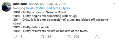
Twitter user @shocks23 suspects the Flyers’ mascot has a seedy past. (Image source: Twitter)
@aclee_clips expressed fear:
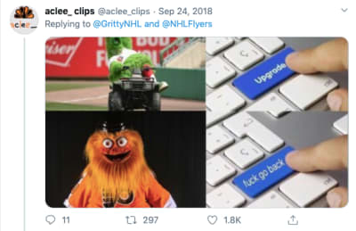
Twitter user @aclee_clips is horrified by the Philadelphia Flyers’ new mascot. (Image source: Twitter)
And, like so many others, @mirtle was shocked and confused:

Twitter user @mirtle expresses confusion about Philadelphia Flyers’ mascot. (Image source: Twitter)
However, this isn’t a story of a brand mascot that failed.
The city of Philadelphia (along with the rest of the world) eventually fell in love with Gritty after it posed Kim Kardashian-like with a champagne bottle and entered the arena on a wrecking ball Miley Cyrus-style.
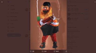
Flyers mascot Gritty gets cheeky by posing with a champagne glass on his bum. (Image source: Twitter)
Over the past couple of years, Gritty has worked very hard to win the hearts of consumers bringing a fun and lighthearted approach to everything it does both on the ice as well as off. And win the hearts it has.
Take, for instance, an incident that happened earlier this year when Gritty was accused of hitting a child at a game. The accusation was investigated and Gritty was cleared of the charges. Through it all, fans had the mascot’s back.
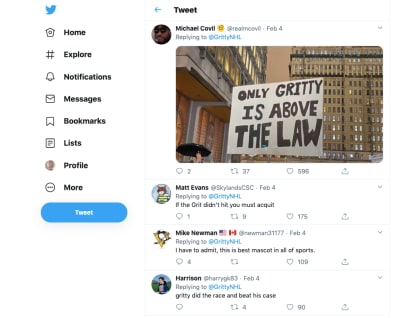
Twitter users love Gritty even in the face of scandal. (Image source: (Image source: Twitter)
If you can create a mascot with the right kind of personality, message and purpose, your website and brand will be able to experience this kind of die-hard fandom and support.
That said, this is social media we’re talking about. While the Flyers’ have gone all-in on showing off Gritty in the most awkward of situations or while humorously riffing on pop culture, the website itself only has one page where the mascot appears:
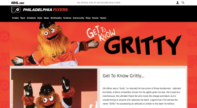
The Get to Know Gritty fan page on the Philadelphia Flyers website. (Image source: Philadelphia Flyers (Large preview)
So, leaning into an awkward/strange/nightmare-inducing mascot might not be right for every site. Here’s one very well-known example where it was the right call:
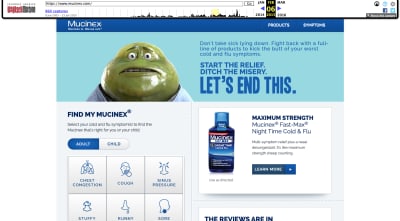
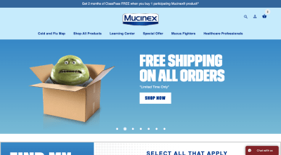
This is the Mucinex website from 2010:

A snapshot of the Mucinex website in 2010 featuring its fat, green mucus mascot. (Image source: Mucinex) (Large preview)
If you ask me, this is one of the grossest mascots ever created. It’s literally mucus in human-like form. And yet, it works somehow because it’s done in a humorous manner.
In 2015, Mr. Mucus took on a sweaty and ill-looking appearance:
A snapshot of the Mucinex website in 2015 with its mucus mascot. (Image source: Mucinex) (Large preview)
This is the only look we get at Mr. Mucus on the website and I’m not sure it worked out very well for the brand. That may be because the mascot resembles Jabba the Hutt instead of a fun-loving mucus ball you want to watch walk down the aisle with Mrs. Mucus.
Nevertheless, the company pushed forward with the mascot, giving it even more airtime. The 2020 version of the website has Mr. Mucus appearing in various states:
The Mucinex 2020 website shows off Mr. Mucus in different states. This is the mascot nervous about shipping. (Image source: Mucinex) (Large preview)
This looks similar to the Mr. Mucus we saw in 2015. However, something about the messaging in this banner gives his facial expression and clammy skin a different vibe this time around. It says, “Please don’t order this cold medicine. I don’t want to go away!”
In another banner image, we see Mr. Mucus rocking a dad bod alongside a message about working out:
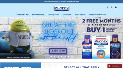
The Mucinex 2020 website shows off Mr. Mucus in different states. This is the mascot with its dad bod. (Image source: Mucinex) (Large preview)
The mascot is still pretty gross, but there’s no denying how funny this image is. And then you have this banner that’s targeted at cold remedies for kids:
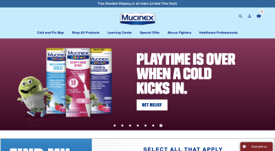
The Mucinex 2020 website shows off Mr. Mucus in different states. This is the mascot in kid form. (Image source: Mucinex) (Large preview)
I’m not sure if this is supposed to be Mr. Mucus as a kid or the child he had with Mrs. Mucus, but it’s another creative adaptation of the mascot.
According to CBC, Mucinex made a ton of money after launching its Mr. Mucus campaign in 2004, more than doubling its profits. And despite Mr. Mucus being one of the most recognizable mascots, it is also one of the least liked, too.
In this case, being hated was a good thing. Mucinex wanted its customers to be disgusted by Mr. Mucus. The whole purpose of the company is to help people fight off phlegmy throats and stuffed noses.
So, before you throw your hated mascot away, think about where the hate is coming from and if you can make it work to your advantage in another way.
If you can create a mascot with the right kind of personality, message and purpose, your website and brand will be able to experience this kind of die-hard fandom and support.
“
Wrapping Up
If your website could benefit from a little levity, a mascot would be a fantastic way to draw visitors into the content of your website as well as into the brand’s story. That doesn’t mean that every mascot should draw laughs or be shocking. There are plenty of recognizable and well-loved mascots that have subdued personalities. It’s all about working with the personality of your brand and fitting a mascot to it.
Further Reading on SmashingMag:
Transforming Lufthansa’s Brand Strategy: A Case Study
Brand Illustration Systems: Drawing A Strong Visual Identity
Analyzing Your Company’s Social Media Presence With IBM Watson And Node.js
The Case For Brand Systems: Aligning Teams Around A Common Story

(ra, il)
 Here are 3 strategies you should consider if your website is struggling. We’ll cover:


 My favourite café — October Coffee Gaya, Kota Kinabalu, Malaysia)
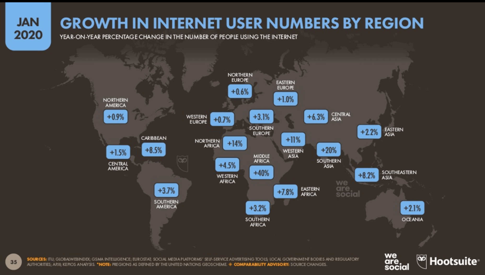
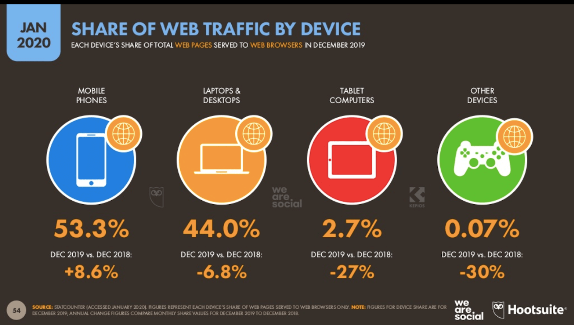
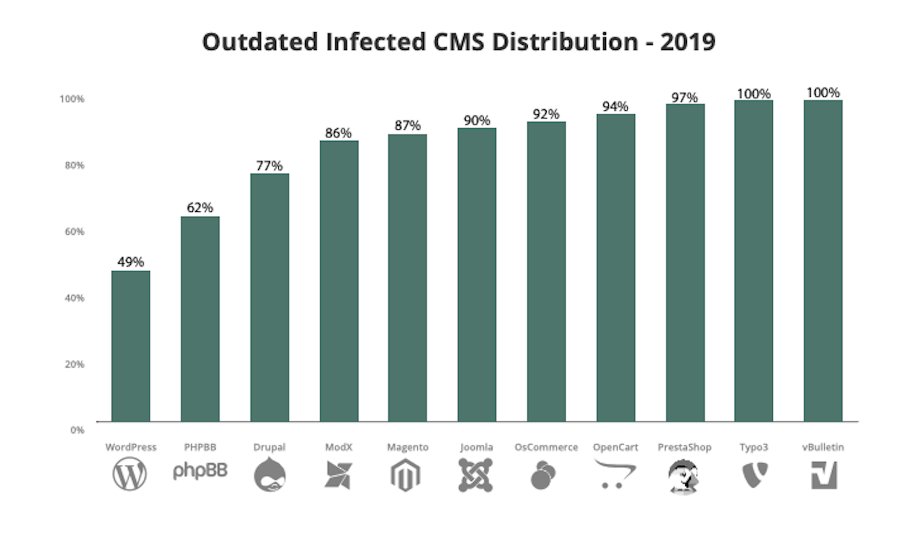
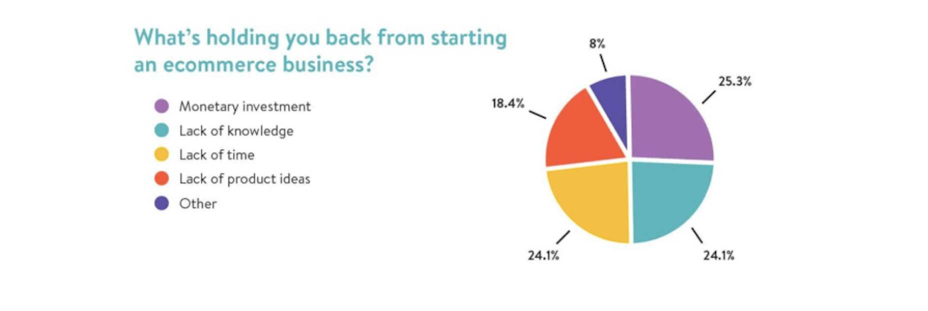
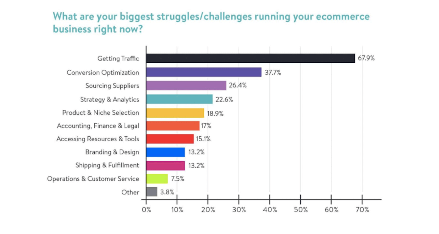
 In the following roundup of the latest research for web designers, I’ve included reports and surveys that shed light on: The battle between mobile and desktop, Why so many websites keep getting hacked, What’s keeping ecommerce business owners awake at night, and What Google is now saying about mobile-first indexing.