Say Cheese: Photography for beginners

Original Source: http://feedproxy.google.com/~r/abduzeedo/~3/qFIiwBq7Hvw/say-cheese-photography-beginners

Say Cheese: Photography for beginners

abduzeedo06.05.20

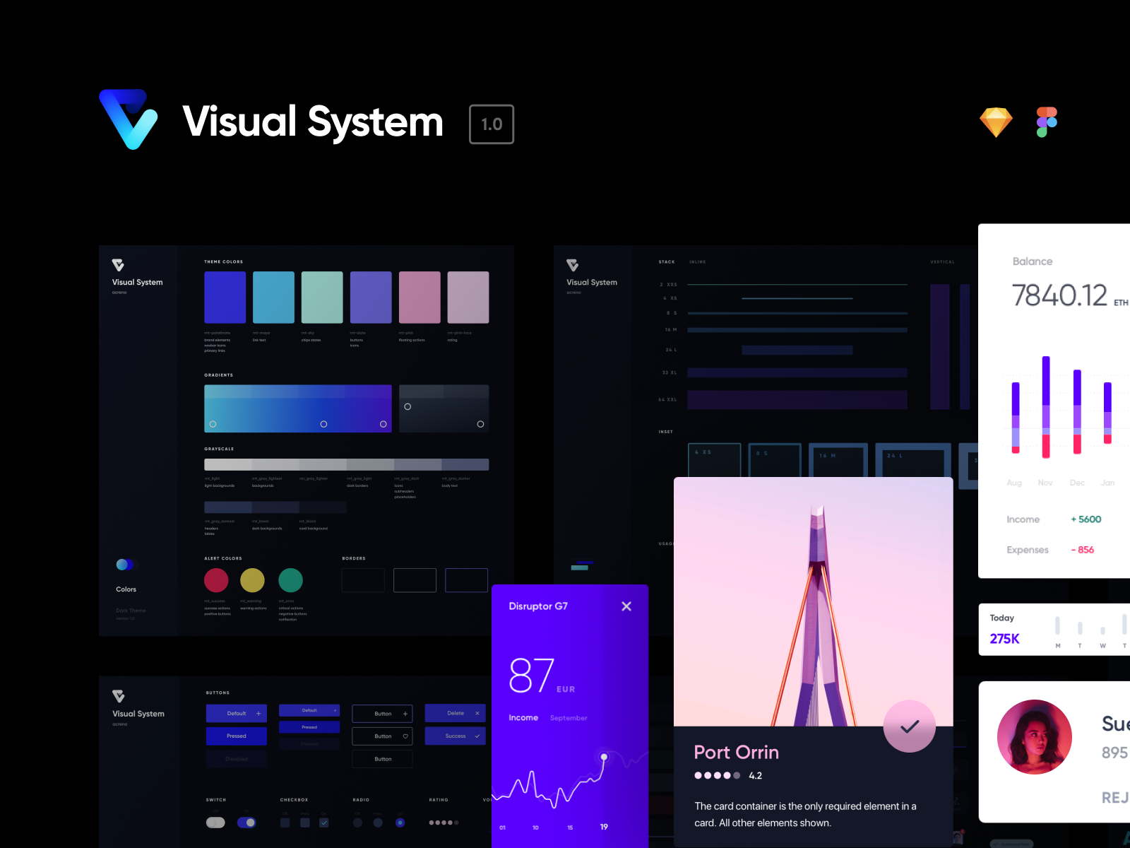
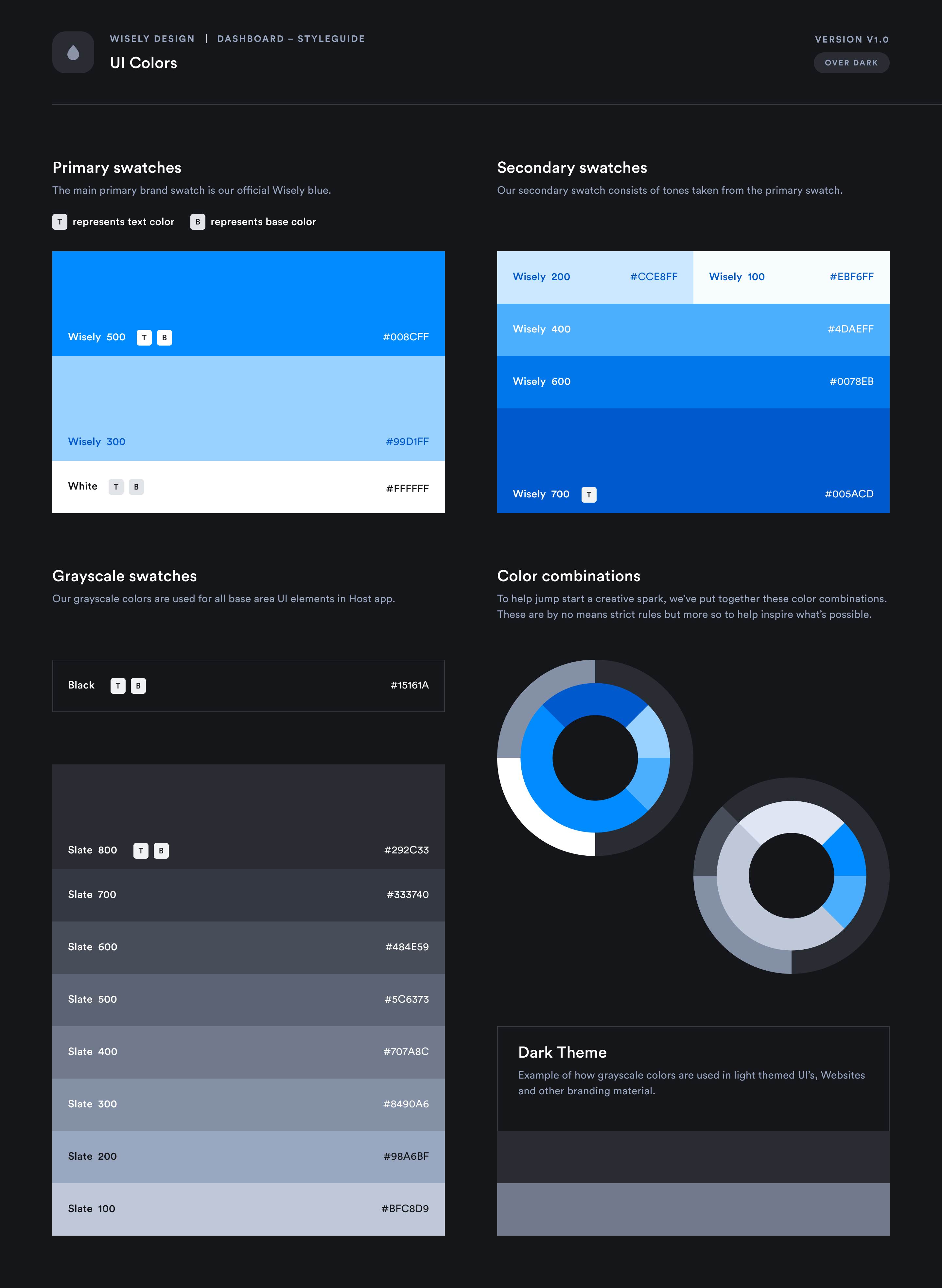
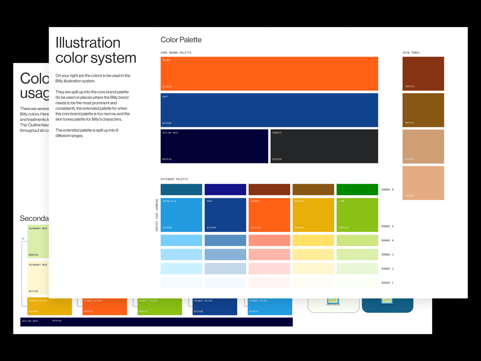
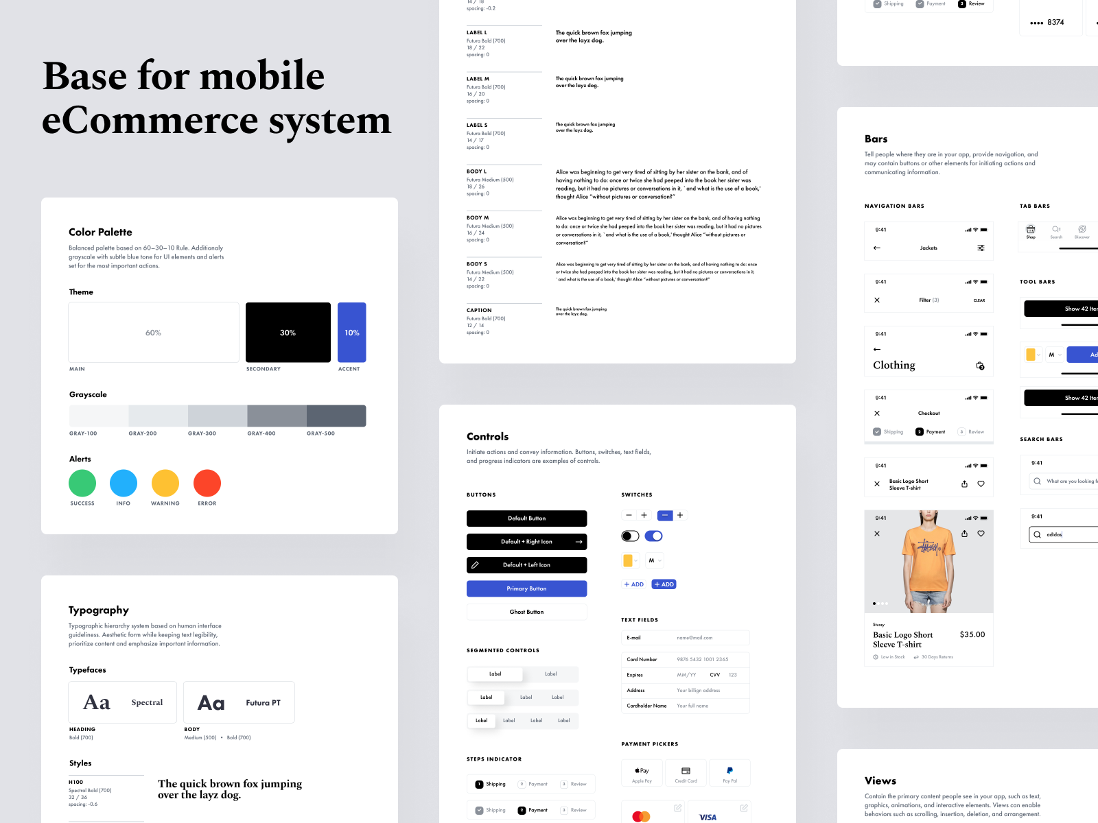
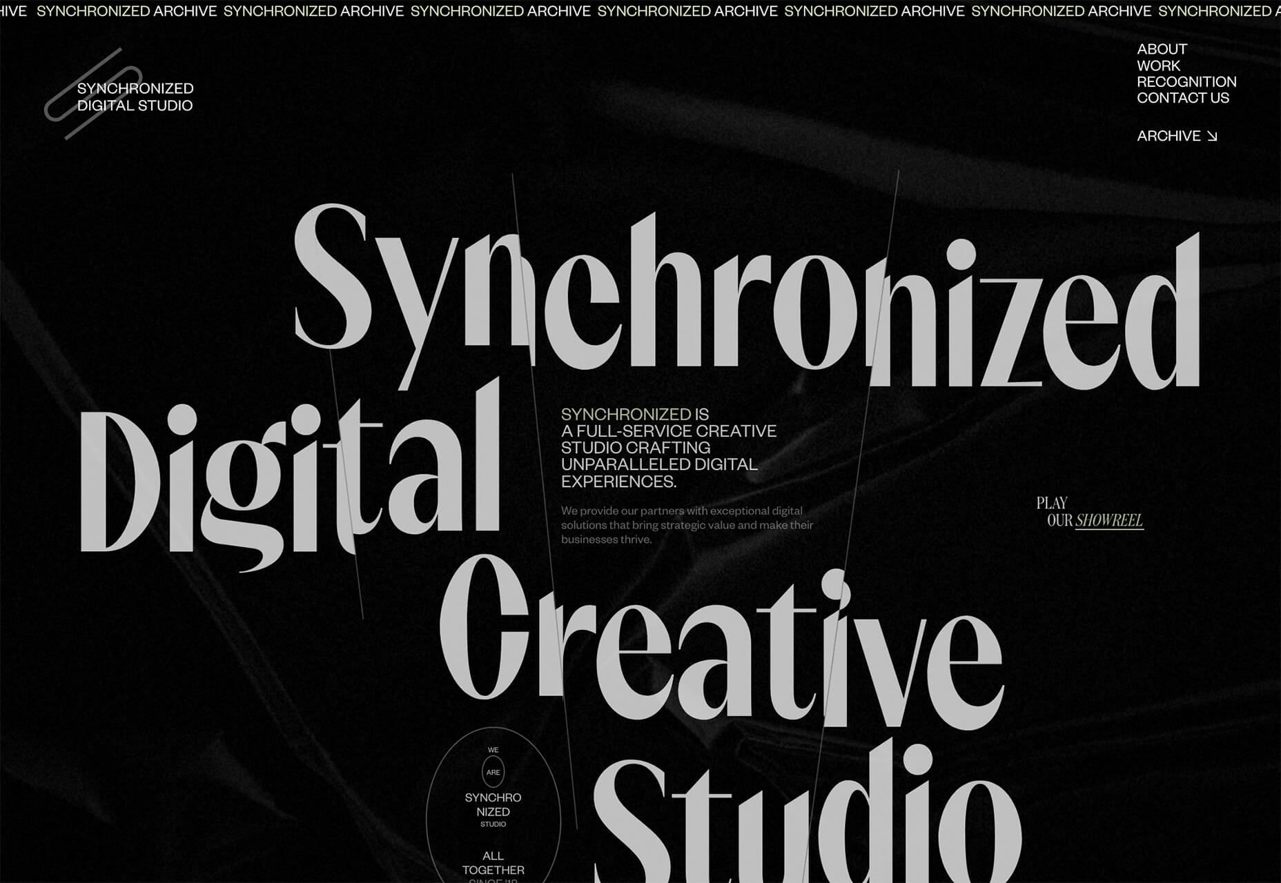
Say Cheese is an amazing project by Arthur de Almeida, a brazilian designer based in São Paulo. It’s a long-read website that focus on teaching basic photography concepts for people who wants to start in this area. Photography has always been a passion for Arthur. It all started in his early days of learning about photography,  he recalls that the photography triad (aperture, shutter speed and ISO) was one of the few things that he could understand, but even so some important details were always confusing. “It is difficult to talk about something visual with text only” – he added.

When I thought about creating a project to teach this content to people, I had one thing in mind: this should be as simple and accessible as possible, I should avoid talking about technical words and that must start with the name itself.

Photography for beginners

“Say Cheese” seemed to him to be the most popular expression in photography. His goal was to be able to communicate what the website would talk about. Not limiting only to people in the world of photography. After creating the name, he started to write the content in a simple way, as if he was talking to a friend.

I wanted to make sure that each chapter begun in a very informal and non-technical way (like Friends names its episodes). It wouldn’t do me any good to explain something technical if people didn’t know how it could be applied on a daily basis. 

So, after creating all the content and seeing that it was already very clear, he started explore different ways to streamline the communication through visual resources but without trying to rush, especially for the readers that were just starting.

I believed that things needed to be said slowly and always with the same objective: to communicate in the simplest way possible with people, after all I am not talking to professional photographers, but with people who just want to take their first cool picture.


New Black Mirror Series 6 Netflix poster is terrifying yet genius

Original Source: http://feedproxy.google.com/~r/CreativeBloq/~3/Myy4PgYYu_8/new-black-mirror-series-6-poster-is-terrifying-yet-genius

If you're feeling like the plot of 2020 is straight out of a dystopian drama, you're not alone. One Madrid-based advertising agency has turned the concept into a reality with a speculative poster campaign that places us all quite literally inside Netflix's next series of Black Mirror.

The ingenious poster (below), which has popped up at bus stops across Madrid, features the text: "Black Mirror. 6th season. Live now, everywhere", above a literal mirror. The darkly comic ad couldn't be simpler, and could well make its way into our favourite examples of billboard advertising. 

Black Mirror ad

Apt

The ad works extremely well – not only because the apocalyptic vibe of these strange times seems lifted from one of Charlie Brooker's scripts (here's where to buy a face mask, by the way). The series is also known for its form-pushing experimentalism (such as its recent choose-your-own-adventure-episode), so the idea of the Black Mirror team letting a series play out in reality is somehow strangely believable.

Fortunately, there's no need to pinch yourself – Brooker recently told Radio Times he wasn't currently working on a new series of Black Mirror. "At the moment, I don’t know what stomach there would be for stories about societies falling apart," he said.

The joke poster, created by Madrid agency Brother, has been a huge hit online. "I need this to be everywhere," one Reddit user commented, "Let people laugh for at least a second." Others rushed to Netflix to check whether a new series had actually dropped: "I got excited and went to Netflix to find it, couldn't find it, Googled the release date, and only then did I realise."

We might not be living in a new series of Black Mirror, but it's certainly a new normal. Check out our guide to working from home more productively if you're stuck indoors, and if you fancy unleashing a little creativity, our how to make a face mask guide has you covered. 

Read more:

Netflix concept ads will ruin your dayNew Apple iPhone design concept is the one we've been waiting forDisney face masks feature most popular characters

Collective #608

Original Source: http://feedproxy.google.com/~r/tympanus/~3/Bi15MBfFXYQ/

Collective Item Image
Inspirational Website of the Week: 14islands

Fall in love with this amazing website of 14islands and its fantastic organic shapes and effects. Can you discove the easter egg?

Get inspired

Collective Item Image
A user’s guide to CSS variables

Lea Verou’s guide to help us understand the differences between declarative CSS variables and variables in other programming languages, and how you can leverage their power.

Read it

Collective Item Image
Our Sponsor
Simply build visually with Divi

You’ve never built a WordPress website like this before. Divi is more than just a WordPress theme, it’s a completely new website building platform that replaces the standard WordPress post editor with a vastly superior visual editor.

Discover Divi

Collective Item Image
AudioMass

AudioMass is a free full-featured web-based audio and waveform editing tool. Find the GitHub repo here.

Check it out

Collective Item Image
ScrollTrigger

The new ScrollTrigger plugin by GreenSock creates amazing scroll-based animations with minimal code. You can also trigger anything scroll-related, even if it has nothing to do with animation.

Check it out

Collective Item Image
Free The Docs

Instantly convert documents within Google Docs into reStructuredText. Downloads images, converts markup, bulleted lists, tables, and more.

Check it out

Collective Item Image
Twin

With twin, you can use Tailwind classes within css-in-js libraries.

Check it out

Collective Item Image
CUBE CSS

Learn about the CSS methodology oriented towards simplicity and consistency with a heavy dosage of pragmatism.

Read it

Collective Item Image
Consoleimg

Add images to your website’s developer console with this script.

Check it out

Collective Item Image
Global and Component Style Settings with CSS Variables

Sara Soueidan explains how she uses scoped CSS variables in her own pattern library to speed up prototyping and client work.

Read it

Collective Item Image
Colors in CSS

Ahmad Shadeed dives into CSS colors and explains many useful details.

Read it

Collective Item Image
3D First Person Art Gallery – No Javascript!

An amazing demo by Ben Evans.

Check it out

Free Font HK Grotesk Wide
Free Font: HK Grotesk Wide

HK Grotesk Wide is a free font, great for posters, headlines or book/magazine covers.

Check it out

Collective Item Image
The ? menu

A step by step guide to creating a hamburger menu in SVG and CSS by Mikael Ainalem.

Read it

Collective Item Image
Overlapping Header with CSS Grid

A great CSS grid based solution to an overlapping layout.

Check it out

Collective Item Image
Colors and Fonts

Colors & Fonts is a curated library of colors and fonts for digital designers and web developers.

Check it out

Collective Item Image
ScrollTrigger Demo

Mariusz Dabrowski’s cool demo that showcases the new ScrollTrigger plugin by GreenSock.

Check it out

Collective Item Image
Object.is() vs Strict Equality Operator in JavaScript

When should you use Object.is() instead of the strict equality check in JavaScript?

Read it

Collective Item Image
Semilattice

A collection of system and interaction concepts for personal knowledge management tools that reimagines how we work with and organize information. By Aosheng Ran.

Check it out

Collective Item Image
Fun with Fonts

Two short multiple choice quizzes on Gutenberg and font identification.

Check it out

Collective Item Image
Stranger Things, JavaScript Edition

Find the explanation to some of the weirdest JavaScript moments in this article.

Read it

Collective Item Image
TitleRun

TitleRun is a game that lives in your title bar: jump over the obstacles to survive and reach the flag!

Check it out

Collective Item Image
From Our Blog
Kinetic Typography with Three.js

Discover how to use Three.js to render kinetic typography.

Check it out

Collective Item Image
From Our Blog
UI Interactions & Animations Roundup #7

Some modern UI animation shots to keep you up-to-date with the new motion trends and get you inspired.

Check it out

The post Collective #608 appeared first on Codrops.

5 Ways to Stay Productive (Even When You Are Jobless)

Original Source: https://www.hongkiat.com/blog/be-productive-when-out-of-job/

The typical freelance career, illustrated, would probably look like a wave. It has “crests”, where you have more than enough work to keep you going, and “troughs”, where you have little, if any, work…

Visit hongkiat.com for full content.

How to Replace Redux with React Hooks and the Context API

Original Source: https://www.sitepoint.com/replace-redux-react-hooks-context-api/?utm_source=rss

The most popular way to handle shared application state in React is using a framework such as Redux. Quite recently, the React team introduced several new features which include React Hooks and the Context API. These two features effectively eliminated a lot of challenges that developers of large React projects have been facing. One of the biggest problems was ‘prop drilling’ which was common with nested components. The solution was to use a state management library like Redux. This, unfortunately, came with the expense of writing boilerplate code — but now, it’s possible to replace Redux with React Hooks and the Context API.

In this article, you are going to learn a new way of handling state in your React projects, without writing excessive code or installing a bunch of libraries — as is the case with Redux. React hooks allow you to use local state inside of function components, while the Context API allows you to share state with other components.

Prerequisites

In order to follow along with this tutorial, you will need to have a good foundation in the following topics:

Getting Started with React
Your First Week with React
React Hooks
Foundation in Redux

The technique you will learn here is based on patterns that were introduced in Redux. This means you need to have a firm understanding of reducers and actions before proceeding. I am currently using Visual Studio Code, which seems to be the most popular code editor right now (especially for JavaScript developers). If you are on Windows, I would recommend you install Git Bash. Use the Git Bash terminal to perform all commands provided in this tutorial. Cmder is also a good terminal capable of executing most Linux commands on Windows.

You can access the complete project used in this tutorial for this GitHub Repository.

About the New State Management Technique

There are two types of state that we need to deal with in React projects:

Continue reading
How to Replace Redux with React Hooks and the Context API
on SitePoint.

Collective #607

Original Source: http://feedproxy.google.com/~r/tympanus/~3/pL8vip7taSk/

Collective item image
Inspirational Website of the Week: SEMP.AI

The portfolio of Ernesto Aguirre has a super-cool design with a futuristic touch and nice effects.

Get inspired

Collective item image
Our Sponsor
8 Great WordPress Plugins You Need to Try Out Now

There are so many fantastic WordPress plugins on the market. The WordPress plugins we bring you today are the MUST-HAVE tools.

Discover them now

Collective item image
PureCSS Gaze

A pure CSS oil painting by Diana Smith inspired by the Italian Renaissance.

Check it out

Collective item image
Tailblocks

An great project of ready-to-use Tailwind CSS blocks.

Check it out


Responsive web design turns ten

Ethan Marcotte remembers the first article on responsive web design and the history of the term and idea behind it.

Read it

Collective item image
Windups

A really nice typewriter effect library for React.

Check it out

Collective item image
Modern Touch-Friendly Design

Addy Osmani shares what he learned from Steven Hoober about designing for touch interfaces.

Read it

Collective item image
Today’s Javascript, from an outsider’s perspective

Lea Verou writes about how difficult the experience with today’s JavaScript workflow can be for novices.

Read it

Collective item image
Untools

A collection of thinking tools and frameworks to help you solve problems, make decisions and understand systems.

Check it out

Collective item image
CSS-only Slide-up Caption Hover Effect

Michelle Barker shows how to create a caption transition for an image. If you enjoy this, you might also like these demos on Codrops.

Check it out

Collective item image
RoughNotation

A small JavaScript library to create and animate hand-drawn annotations on a web page.

Check it out

Collective item image
Figma Plugins

Some great insight into Figma plugins by Varun Vachhar.

Read it

Collective item image
On fixed elements and backgrounds

Chen Hui Jing dives into containing blocks, rendering and scroll performance.

Read it

Collective item image
The Git Commit Hash

Mike Street writes about the magic 40 character string that is attached to every commit you do.

Read it

Collective item image
Boids

Marius Ballot made this wonderful boid simulation with Three.js.

Check it out

Collective item image
Ask an expert: Why is CSS …the way it is?

Chris Lilley unpacks the histories and mysteries of CSS in this great article.

Read it

Collective item image
Here’s what I didn’t know about “content”

Manuel Matuzovi? is sharing what he I didn’t know about the ‘content’ property.

Read it

Collective item image
Sorted CSS Colors

A tool to sort the named CSS colors for showing related colors together.

Check it out

Collective item image
Free Font: Ephemera

Inspired by ephemera from the printing tradition, Barrett Reid-Maroney designed this font.

Check it out

Collective item image
Single div CSS �Six�

A great single-div demo by Lynn Fisher.

Check it out

Collective item image
Safe/unsafe alignment in CSS flexbox

Learn how safe alignment can prevent data loss in CSS flexbox layouts.

Read it

Collective item image
Water

A lovely water effect demo made by Kasper De Bruyne.

Check it out

Collective item image
Svelte, why so much hype?

In this article, Anthony Le Goas answers some questions related to Svelte.

Read it

Collective item image
Web Engine Diversity and Ecosystem Health

Brian Kardell argues that we actually have a very healthy and open web ecosystem.

Read it

Collective item image
Browsers are not rendering engines

Stuart Langridge’s perspective on the narrative of Brian Kardell’s article on the web ecosystem.

Read it

Collective item image
Htmx

Htmx allows you to access AJAX, WebSockets and Server Sent Events directly in HTML, using attributes, so you can build modern user interfaces with the simplicity and power of hypertext.

Check it out

Collective item image
The Buggiest Site On The Web

Check out the horror in your browser’s developer console.

Check it out

Collective item image
From Our Blog
An Infinitely Scrollable Vertical Menu

A quick look at how an infinitely scrollable menu works based on a looping scroll illusion of cloned items.

Check it out

The post Collective #607 appeared first on Codrops.

Free Vector Tech Illustrations You Can Download, Edit, & Use

Original Source: http://feedproxy.google.com/~r/1stwebdesigner/~3/-CNh3cP3KK4/

Today we are sharing five free vector tech illustrations that you can download and use in your commercial or personal projects without any limitations. Included in the download is an Adobe Illustrator file that you can use to customize colors, add your own elements, or edit in any other way you desire. High resolution exported JPG files are also included.

These vector tech illustrations were created specifically for 1stWebDesigner readers and cannot be found anywhere else, so you can use them knowing that you will be among a select number of designers who have access to them. We always enjoy giving something back to all of our loyal followers and readers, so we created these free vector tech illustrations just for you!

All The Best Procreate Brushes
Unlimited Downloads: Hundreds of Procreate Brushes For Your Designs

Envato Elements - Procreate Brushes
DOWNLOAD NOW

Smartwatch

Free Vector Tech Illustrations - Smartwatch

First in our collection of free vector tech illustrations is a pair of hands using a messaging app on a smartwatch. You’ll notice the recurring theme throughout, with the background reflecting what is on the screen in the foreground.

Cell Phone

Free Vector Tech Illustrations - Cell Phone

Next is a familiar scene – “liking” something on an app on a mobile phone. Has anyone ever not done this?

Tablet

Free Vector Tech Illustrations - Tablet

Who hasn’t used a tablet to submit a thumbs up? Here’s a colorful representation of this oft-used action.


Laptop

Free Vector Tech Illustrations - Laptop

In this illustration, the user is checking statistics of some type on a laptop. You could use this to represent almost any type of stat-checking setting.


Desktop Computer

Free Vector Tech Illustrations - Desktop Computer

Our fifth and final illustration depicts a pie chart being viewed on a desktop computer.

Ready To Download & Use These 5 Free Vector Tech Illustrations?

Go for it! We hope you have fun with and enjoy utilizing these illustrations in your projects. Keep following 1stWebDesigner so you don’t miss out on future freebies, along with everything else we have to offer.

Download Illustrations


Creatives stand with the black community in the fight against racism

Original Source: http://feedproxy.google.com/~r/CreativeBloq/~3/P_1EolsMzBg/black-lives-matter-creative-community

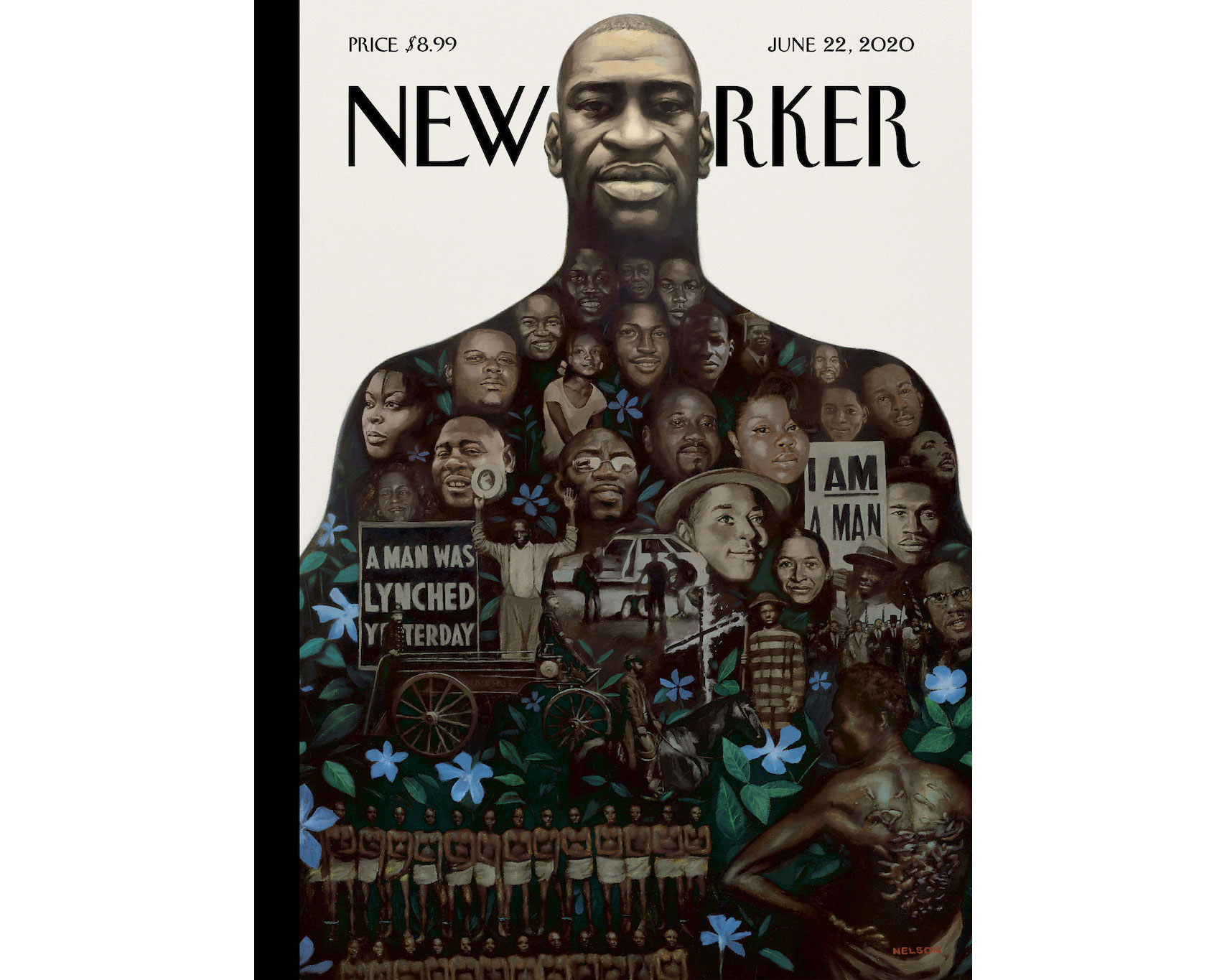
As protests in the US continue over the brutal killing of George Floyd by Minneapolis police officers, creatives across the globe are showing solidarity for the Black Lives Matter movement. While some highlight the cause through moving tributes to Floyd, others are harnessing their positions to make positive moves to amplify black people in the creative industries.

In this article, we have examples of both – but must emphasise that this is a starting point. Our commitment to cultivate change will ensure we continue to amplify black voices to help make Creative Bloq and the creative industry as a whole a more inclusive space for black communities. We all need to triple our efforts to support black creatives, starting now. 

Please feel free to get in touch with any suggestions or relevant news – we plan to keep this page regularly updated. Let's start with a list of some very worthy causes that are working right now in this fight.

Where you can donate

Official George Floyd Memorial FundBlack Lives MatterMinnesota Freedom FundShow racism the red card (UK)Resourcing racial justice (UK)
Black Lives Matter: Portfolio reviews

A number of artists and designers have taken to social media to offer support to black artists in the form of portfolio reviews. 

Black Lives Matter: George Floyd tributes

Below are some examples of artists across the world who have responded to the death of George Floyd, producing work in support of Black Lives Matter.


Kinetic Typography with Three.js

Original Source: http://feedproxy.google.com/~r/tympanus/~3/2TbBWbmkE3E/

Kinetic Typography may sound complicated but it’s just the elegant way to say “moving text” and, more specifically, to combine motion with text to create animations.

Imagine text on top of a 3D object, now could you see it moving along the object’s shape? Nice! That’s exactly what we’ll do in this article ? we’ll learn how to move text on a mesh using Three.js and three-bmfont-text.

We’re going to skip a lot of basics, so to get the most from this article we recommend you have some basic knowledge about Three.js, GLSL shaders, and three-bmfont-text.

Basis

The main idea for all these demos is to have a texture with text, use it on a mesh and play with it inside shaders. The simplest way of doing it is to have an image with text and then use it as a texture. But it can be a pain to figure out the correct size to try to display crisp text on the mesh, and later to change whatever text is in the image.

To avoid all these issues, we can generate that texture using code! We create a Render Target (RT) where we can have a scene that has text rendered with three-bmfont-text, and then use it as the texture of a mesh. This way we have more freedom to move, change, or color text. We’ll be taking this route following the next steps:

Set up a RT with the textCreate a mesh and add the RT textureChange the texture inside the fragment shader

To begin, we’ll run everything after the font file and atlas are loaded and ready to be used with three-bmfont-text. We won’t be going over this since I explained it in one of my previous articles.

The structure goes like this:

init() {
// Create geometry of packed glyphs
loadFont(fontFile, (err, font) => {
this.fontGeometry = createGeometry({
font,
text: “ENDLESS”
});

// Load texture containing font glyphs
this.loader = new THREE.TextureLoader();
this.loader.load(fontAtlas, texture => {
this.fontMaterial = new THREE.RawShaderMaterial(
MSDFShader({
map: texture,
side: THREE.DoubleSide,
transparent: true,
negate: false,
color: 0xffffff
})
);

// Methods are called here
});
});
}

Now take a deep breath, grab your tea or coffee, chill, and let’s get started.

Render Target

A Render Target is a texture you can render to. Think of it as a canvas where you can draw whatever is inside and place it wherever you want. Having this flexibility makes the texture dynamic, so we can later add, change, or remove stuff in it.

Let’s set a RT along with a camera and a scene where we’ll place the text.

createRenderTarget() {
// Render Target setup
this.rt = new THREE.WebGLRenderTarget(
window.innerWidth,
window.innerHeight
);

this.rtCamera = new THREE.PerspectiveCamera(45, 1, 0.1, 1000);
this.rtCamera.position.z = 2.5;

this.rtScene = new THREE.Scene();
this.rtScene.background = new THREE.Color(“#000000”);
}

Once we have the RT scene, let’s use the font geometry and material previously created to make the text mesh.

createRenderTarget() {
// Render Target setup
this.rt = new THREE.WebGLRenderTarget(
window.innerWidth,
window.innerHeight
);

this.rtCamera = new THREE.PerspectiveCamera(45, 1, 0.1, 1000);
this.rtCamera.position.z = 2.5;

this.rtScene = new THREE.Scene();
this.rtScene.background = new THREE.Color(“#000000”);

// Create text with font geometry and material
this.text = new THREE.Mesh(this.fontGeometry, this.fontMaterial);

// Adjust text dimensions
this.text.position.set(-0.965, -0.275, 0);
this.text.rotation.set(Math.PI, 0, 0);
this.text.scale.set(0.008, 0.02, 1);

// Add text to RT scene
this.rtScene.add(this.text);

this.scene.add(this.text); // Add to main scene
}

Note that for now, we added the text to the main scene to render it on the screen.

Cool! Let’s make it more interesting and “paste” the scene over a shape next.

Mesh and render texture

For simplicity, we’ll first use as shape a BoxGeometry together with ShaderMaterial to pass custom shaders, time and the render texture uniforms.

createMesh() {
this.geometry = new THREE.BoxGeometry(1, 1, 1);

this.material = new THREE.ShaderMaterial({
vertexShader,
fragmentShader,
uniforms: {
uTime: { value: 0 },
uTexture: { value: this.rt.texture }
}
});

this.mesh = new THREE.Mesh(this.geometry, this.material);

this.scene.add(this.mesh);
}

The vertex shader won’t be doing anything interesting this time; we’ll skip it and focus on the fragment instead, which is showing the colors of the RT texture. It’s inverted for now (1. – texture) to stand out from the background.

varying vec2 vUv;

uniform sampler2D uTexture;

void main() {
vec3 texture = texture2D(uTexture, vUv).rgb;

gl_FragColor = vec4(1. – texture, 1.);
}

Normally, we would just render the main scene directly, but with a RT we have to first render to it before rendering to the screen.

render() {

// Draw Render Target
this.renderer.setRenderTarget(this.rt);
this.renderer.render(this.rtScene, this.rtCamera);
this.renderer.setRenderTarget(null);
this.renderer.render(this.scene, this.camera);
}

And now a box should appear on the screen where each face has the text on it:

Looks alright so far, but what if we could cover more text around the shape?

Repeating the texture

GLSL’s built-in function fract comes handy to make repetition. We’ll use it to repeat the texture coordinates when multiplying them by a scalar so it wraps between 0 and 1.

varying vec2 vUv;

uniform sampler2D uTexture;

void main() {
vec2 repeat = vec2(2., 6.); // 2 columns, 6 rows
vec2 uv = fract(vUv * repeat);

vec3 texture = texture2D(uTexture, uv).rgb;
texture *= vec3(uv.x, uv.y, 1.);

gl_FragColor = vec4(texture, 1.);
}

Notice that we also multiply the texture by the uv components to visualize the modified texture coordinates.

We’re getting there, right? The text should also follow the object’s shape; here’s where time comes in. We need to add it to the texture coordinates, in this case to the x component so it moves horizontally.

varying vec2 vUv;

uniform sampler2D uTexture;
uniform float uTime;

void main() {
float time = uTime * 0.75;
vec2 repeat = vec2(2., 6.);
vec2 uv = fract(vUv * repeat + vec2(-time, 0.));

vec3 texture = texture2D(uTexture, uv).rgb;

gl_FragColor = vec4(texture, 1.);
}

And for a sweet touch, let’s blend the color with the the background.

This is basically the process! RT texture, repetition, and motion. Now that we’ve looked at the mesh for so long, using a BoxGeometry gets kind of boring, doesn’t it? Let’s change it in the next final bonus chapter.

Changing the geometry

As a kid, I loved playing and twisting these tangle toys, perhaps that’s the reason why I find satisfaction with knots and twisted shapes? Let this be an excuse to work with a torus knot geometry.

For the sake of rendering smooth text we’ll exaggerate the amount of tubular segments the knot has.

createMesh() {
this.geometry = new THREE.TorusKnotGeometry(9, 3, 768, 3, 4, 3);


}

Inside the fragment shader, we’ll repeat any number of columns we want just to make sure to leave the same number of rows as the number of radial segments, which is 3.

varying vec2 vUv;

uniform sampler2D uTexture;
uniform float uTime;

void main() {
vec2 repeat = vec2(12., 3.); // 12 columns, 3 rows
vec2 uv = fract(vUv * repeat);

vec3 texture = texture2D(uTexture, uv).rgb;
texture *= vec3(uv.x, uv.y, 1.);

gl_FragColor = vec4(texture, 1.);
}

And here’s our tangled torus knot:

Before adding time to the texture coordinates, I think we can make a fake shadow to give a better sense of depth. For that we’ll need to pass the position coordinates from the vertex shader using a varying.

varying vec2 vUv;
varying vec3 vPos;

void main() {
vUv = uv;
vPos = position;

gl_Position = projectionMatrix * modelViewMatrix * vec4(position, 1.);
}

We now can use the z-coordinates and clamp them between 0 and 1, so the regions of the mesh farther the screen get darker (towards 0), and the closest lighter (towards 1).

varying vec3 vPos;

void main() {
float shadow = clamp(vPos.z / 5., 0., 1.);

gl_FragColor = vec4(vec3(shadow), 1.);
}

See? It sort of looks like white bone:

Now the final step! Multiply the shadow to blend it with the texture, and add time again.

varying vec2 vUv;
varying vec3 vPos;

uniform sampler2D uTexture;
uniform float uTime;

void main() {
float time = uTime * 0.5;
vec2 repeat = -vec2(12., 3.);
vec2 uv = fract(vUv * repeat – vec2(time, 0.));

vec3 texture = texture2D(uTexture, uv).rgb;

float shadow = clamp(vPos.z / 5., 0., 1.);

gl_FragColor = vec4(texture * shadow, 1.);
}

Fresh out of the oven! Look at this sexy torus coming out of the darkness. Internet high five!

We’ve just scratched the surface making repeated tiles of text, but there are many ways to add fun to the mixture. Could you use trigonometry or noise functions? Play with color? Text position? Or even better, do something with the vertex shader. The sky’s the limit! I encourage you to explore this and have fun with it.

Oh! And don’t forget to share it with me on Twitter. If you got any questions or suggestions, let me know.

Hope you learned something new. Till next time!

References and Credits

Three.jsThe Book of Shadersthree-bmfont-textAll Your Html S3E20

The post Kinetic Typography with Three.js appeared first on Codrops.

Click! Here: Meet Our New Smashing Book

Original Source: https://www.smashingmagazine.com/2020/06/encouraging-clicks-book-release/

Click! Here: Meet Our New Smashing Book

Click! Here: Meet Our New Smashing Book

Vitaly Friedman

2020-06-02T12:00:00+00:00
2020-06-02T19:36:16+00:00

You’ve been there before, haven’t you? Perhaps your manager insists on using a dark pattern to trick customers into buying. Or an A/B test has just shown that an annoying pop-up does increase sign-ups. Or maybe you always end up firefighting negative reviews and angry customer inquiries and your calls to action don’t perform well.

Whether we are designers, marketers, entrepreneurs, or product owners, we are all in the same boat. We want to give users a good experience, but we also need them to take action. More often than not, these things are considered to be mutually exclusive, but they don’t have to be.

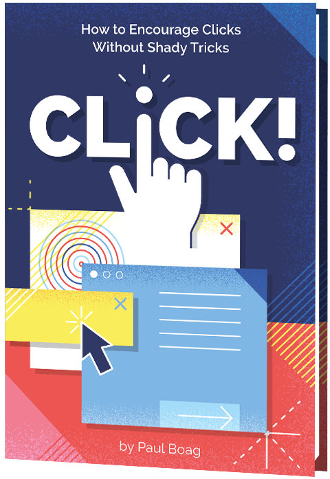
That’s why we’ve teamed up with Paul Boag to work on Click! How To Encourage Clicks Without Shady Tricks, a detailed guide on how to increase conversion and boost business KPIs without alienating customers along the way. A book that shows how to increase clicks, build trust, loyalty and drive leads while keeping users respected and happy at the same time. Jump to table of contents and download a free PDF excerpt (17.3 MB).

Print + eBook

eBook

Print + eBook

{
“sku”: “click”,
“type”: “Book”,
“price”: “39.00”,

“prices”: [{
“amount”: “39.00”,
“currency”: “USD”,
“items”: [
{“amount”: “29.00”, “type”: “Book”},
{“amount”: “10.00”, “type”: “E-Book”}
]
}, {
“amount”: “39.00”,
“currency”: “EUR”,
“items”: [
{“amount”: “29.00”, “type”: “Book”},
{“amount”: “10.00”, “type”: “E-Book”}
]
}
]
}

$
39.00

Get Print + eBook

Quality hardcover. Free worldwide shipping. 100 days money-back-guarantee.

eBook

{
“sku”: “click”,
“type”: “E-Book”,
“price”: “19.00”,

“prices”: [{
“amount”: “19.00”,
“currency”: “USD”
}, {
“amount”: “19.00”,
“currency”: “EUR”
}
]
}

$
19.00

Free!

Get the eBook

DRM-free, of course.

ePUB, Kindle, PDF.
Included with Smashing Membership.

Get the eBook

Download PDF, ePUB, Kindle.
Thanks for being smashing! ❤️

About The Book

There is no shortage of books on marketing and user experience. But when it comes to bridging the gap between the two, many of us struggle to find the right balance. As businesses, we need to meet out targets — be it with install app prompts, newsletter overlays, or infamous chat widgets. But as designers, we don’t want to end up with a frustrating user experience. We really need both, and we need a strategy to get there.

That’s why we’ve written Click! — a guide with practical strategies for improving conversion and retention while building user’s loyalty and trust. The book explores how to effectively address user concerns, overcome skepticism, and encourage users to act — helping you meet your business targets and KPIs along the way. Whether you are a designer, marketer, entrepreneur or product owner, this book will surely help you avoid hidden costs and drive sales.

Here’s a short video message from Paul Boag, the author of Click!, explaining why he’s written the book and what it’s all about:

By reading this book, you will learn to:

Measure and boost business KPIs effectively,
Build a user-centric sales funnel,
Reduce risks and address objections,
Build trust and overcome skepticism,
Persuade people without alienating them,
Establish a strategy for higher conversion.
Psst! A little surprise shipped with the first 500 books.
Download a free PDF sample (17.3 MB) and get the book right away.

The book features interface design examples that take ethical design principles into account. Large preview.

The cover and chapter illustrations carefully designed by Veerle Pieters.

Table Of Contents

The book is split into 11 chapters. We’ll start by exploring the psychology of decision making and how to measure conversion. Then we’ll build a user-centric sales funnel and address user concerns effectively. Finally, we’ll explore how to encourage users to act without alienating them.

1. Avoid the Dangers of Persuasion

+

Paul begins your journey with a rock-solid business case you can take to management or clients to avoid the more manipulative techniques you see online.

You will learn:

How online choice has empowered the consumer.The hidden marketing costs of manipulation.The dangers of buyers remorse.

2. Measure Conversion Effectively

+

You cannot improve what you are not measuring. That is why, in Paul’s second chapter, he explores how to measure your conversion rate effectively. Only then can you start to improve it.

You will learn:

The dangers of having no metrics or bad ones.How to establish your key performance indicators.What to track and how to track it.

3. Get to Know Your Users

+

If you want to persuade people to act, you need to understand how they think and what they want. To do that you need to carry out at least some user research. In this chapter, Paul introduces you to easy to use techniques that will get the job done with the minimum of investment.

You will learn:

What exactly you need to understand about your audience.How to consolidate all you know about your users.How to carry out lightweight user research.

4. Build a User-Centric Sales Funnel

+

The decision to act doesn’t take place in isolation and is part of the broader user journey. In this chapter, Paul explains how to understand that journey and build a sales funnel that supports the user’s experience, rather than seeking to interrupt it.

You will learn:

What a sales funnel is and how it helps.How to map your customer’s journey.How to build a sales funnel around the user’s journey.

5. Address Objections and Reduce Risks

+

This chapter explores one of the most important aspects of encouraging users to act — addressing their concerns. We’ll see how to identify user’s objections and then overcome them, so reducing the risk of taking action in the minds of users.

You will learn:

How to identify the concerns your audience has about taking action.How to address common concerns.A process for handling any objection users might have.

6. Establish Trust and Overcome Scepticism

+

People will not hand over money or personal information if they do not trust you. To make matters worse users have learned to be sceptical online. In this chapter, you will learn how to build a connection with your audience and help them learn to trust you.

You will learn:

Why trust is essential for improving conversion.
How to build trust through openness and empathy.
The role of social proof and connecting consumers in building trust.

7. Defeat Cognitive Overload

+

In this chapter, you will discover how to reach an audience that is distracted and time-poor. You will learn the importance of not making users think and learn valuable techniques for making acting with you an effortless experience.

You will learn:

What cognitive load is and why it is so dangerous for your conversion rate.Methods for reducing the cognitive load of your websites.Techniques for keeping any interface simple.

8. Overcoming the Problem With Perception

+

Are your users taking away the right message from your website? Do they understand what you offer or that it is relevant to them? It is easy to leave a website without acting because you had the wrong impression. This chapter shows you how to address this genuine danger.

You will learn:

How to position our products and services in a positive light.The role that mental models play in conversion.Techniques for ensuring your content reflects the user’s mindset.

9. Never Stop Testing and Iterating

+

While Click! is packed with great tips and techniques, the real key to success is a programme of ongoing testing and iteration. In this chapter, Paul shows you how to put in place a methodology that will keep your conversion rate growing for years to come.

You will learn:

Techniques for ensuring you are working on the right projects to improve conversion.Ways to test how compelling a design concept is.How to integrate testing into every aspect of your development cycle.

10. Address the Whole Experience

+

While marketers and UX designers have an enormous impact on conversion, they are only a part of the story. That is why in this chapter, we explore how to address the whole user experience and start encouraging colleagues to help improve the conversion rate too.

You will learn:

The role of your developer in improving your conversion rate.How to use other digital channels to improve your website conversion rate.How broader organisational changes can help boost revenue and online leads.

11. Where to Go From Here

+

With a book packed with advice, it can be overwhelming. The book concludes with some practical next steps that you can take, wherever you are on your journey to improve conversion.

You will learn:

Quick wins that can get you started today.Budget testing techniques you can implement immediately.A more ambitious and ongoing approach to optimisation.

Per Axbom“This is a great book on how to practically, and ethically, optimise website conversion rates. Before, I was roughly aware of what CRO was, but now I feel confident to start implementing these techniques in projects. As you would expect, Paul explains all of the concepts in an easy-to-follow and friendly manner.”

— Dave Smyth, Agency Owner

Per Axbom“I picked up a super simple testing idea, and saw a 42% lift in conversion rate. It was surprising to me, so I ran it again to significance with the same result. That equates to about 2.5 million USD/year in revenue at no additional cost. So I’d say I got my money’s worth!”

— Brandon Austin Kinney, Director of Lead Generation

304 pages. The eBook is available (PDF, ePUB, Amazon Kindle) and printed copies are shipping now. For designers, marketers, entrepreneurs and product owners. Written by Paul Boag. Designed by Veerle Pieters.

Print + eBook

eBook

Print + eBook

{
“sku”: “click”,
“type”: “Book”,
“price”: “39.00”,

“prices”: [{
“amount”: “39.00”,
“currency”: “USD”,
“items”: [
{“amount”: “29.00”, “type”: “Book”},
{“amount”: “10.00”, “type”: “E-Book”}
]
}, {
“amount”: “39.00”,
“currency”: “EUR”,
“items”: [
{“amount”: “29.00”, “type”: “Book”},
{“amount”: “10.00”, “type”: “E-Book”}
]
}
]
}

$
39.00

Get Print + eBook

Quality hardcover. Free worldwide shipping. 100 days money-back-guarantee.

eBook

{
“sku”: “click”,
“type”: “E-Book”,
“price”: “19.00”,

“prices”: [{
“amount”: “19.00”,
“currency”: “USD”
}, {
“amount”: “19.00”,
“currency”: “EUR”
}
]
}

$
19.00

Free!

Get the eBook

DRM-free, of course.

ePUB, Kindle, PDF.
Included with Smashing Membership.

Get the eBook

Download PDF, ePUB, Kindle.
Thanks for being smashing! ❤️

<!–

About The Author

Paul is a leader in conversion rate optimisation and user experience design thinking. He has over 25 years experience working with clients such as Doctors Without Borders and PUMA. He is the author of six books and a well respected presenter.

null

–>

About the Author

Trine FalbePaul Boag is a leader in conversion rate optimisation and user experience design thinking. He has over 25 years experience working with clients such as Doctors Without Borders and PUMA. He is the author of six books and a well respected presenter.

Technical Details

ISBN: 978-3-945749-83-8 (print)
Quality hardcover, stitched binding, ribbon page marker.
Free worldwide airmail shipping from Germany. (Check your delivery times). Due to Covid-19 and import restrictions, there could be some delays. But you can start reading the eBook right away.
eBook is available as PDF, ePUB, and Amazon Kindle.
Get the book right away.


A quality hardcover with a bookmark. Designed with love by Veerle Pieters. Photo by Marc Thiele.


A quality hardcover with a bookmark. Designed with love by Veerle Pieters. Photo by Marc Thiele.

Community Matters ❤️

With Click!, we’ve tried to create a very focused handbook with pragmatic solutions to help everyone create a better digital product that doesn’t get abandoned due to the sheer number of pop-ups, install prompt and newsletter box overlays.

There is quite a bit of work to do on the web, but our hope is that with this book, you will be equipped with enough techniques to increase conversion and the number of happy customers.

Producing a book takes quite a bit of time, and we couldn’t pull it off without the support of our wonderful community. A huge shout-out to Smashing Members for their ongoing support in our adventures. As a result, the eBook is and always will be free for Smashing Members. Plus, Members get a friendly discount when purchasing their printed copy.

Stay smashing, and thank you for your ongoing support, everyone!

The Ethical Design Handbook

Print + eBook

eBook

Print + eBook

{
“sku”: “click”,
“type”: “Book”,
“price”: “39.00”,

“prices”: [{
“amount”: “39.00”,
“currency”: “USD”,
“items”: [
{“amount”: “29.00”, “type”: “Book”},
{“amount”: “10.00”, “type”: “E-Book”}
]
}, {
“amount”: “39.00”,
“currency”: “EUR”,
“items”: [
{“amount”: “29.00”, “type”: “Book”},
{“amount”: “10.00”, “type”: “E-Book”}
]
}
]
}

$
39.00

Get Print + eBook

Quality hardcover. Free worldwide shipping. 100 days money-back-guarantee.

eBook

{
“sku”: “click”,
“type”: “E-Book”,
“price”: “19.00”,

“prices”: [{
“amount”: “19.00”,
“currency”: “USD”
}, {
“amount”: “19.00”,
“currency”: “EUR”
}
]
}

$
19.00

Free!

Get the eBook

DRM-free, of course.

ePUB, Kindle, PDF.
Included with Smashing Membership.

Get the eBook

Download PDF, ePUB, Kindle.
Thanks for being smashing! ❤️

More Smashing Books

Promoting best practices and providing you with practical tips to master your daily coding and design challenges has always been (and will be) at the core of everything we do at Smashing.

In the past few years, we were very lucky to have worked together with some talented, caring people from the web community to publish their wealth of experience as printed books that stand the test of time. Trine, Alla and Adam are some of these people. Have you checked out their books already?
Ethical Design HandbookEthical Design Handbook

Add to cart $39

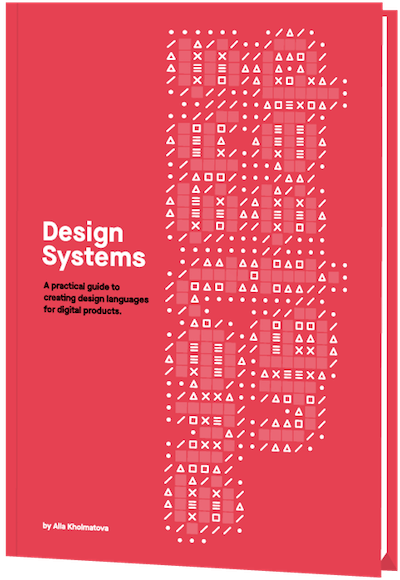
Design SystemsDesign Systems

Add to cart $39

Form Design PatternsForm Design Patterns

Add to cart $39