CSS tricks to shake up your web layouts

Original Source: http://feedproxy.google.com/~r/CreativeBloq/~3/caVSGeEuqLI/css-tricks-to-revolutionise-your-layouts

Learning new CSS tricks is one of the best ways to shake up your website design. If you've been working in the web industry for a while, you may feel you're always coding or designing the same layouts. Trends come and go but the majority of sites look the same – using the 12-column grid, two and three-column boxed layouts and similar shapes. Not only is it getting a little boring to look at, but the user experience isn't that great.

One way to change it up is to draw inspiration from fields or areas that go beyond digital design. Why not use print or editorial designs for your website? You can break old habits with new CSS properties that open a new world of possibilities.

If you'd like more web design advice, see our guide to the perfect website layout, plus here are the user experience tips you need to know.

30 web design tools to speed up your workflow in 2018

A CSS revolution is underway – tools like Flexbox or CSS Grid offer easy ways to build interesting layouts. Using CSS, you can create in visual styles that go way beyond the ones you may be familiar with.

In this article, we'll share some CSS tips that will help you break the mould in your website layouts, with just a couple of lines of code.

01. Explore CSS blend modes

Duotone imagery and colouriser effects are some of the hottest web design trends. They are widely popular across the web thanks to Spotify, which implements them cohesively. Now you can finally stop creating multiple different coloured versions of your assets, and apply the effects directly in the browser.

Using CSS blend modes is not only a great way to unify the look of the content across websites, it also enables you to set different colour versions of an image, changing only one value in CSS: the colour. There are 15 possible blend mode values, including screen, overlay, lighten and darken.

CSS tricks: Ortiz Leon Architects  website CSS

Ortiz Leon Architects uses blend modes to generate a duotone image background

There are a couple of implementation methods, depending on the type of element you would like to apply the effect to. For example, you can use background-image and background-colour set on the container background-blend-mode: darken;, or create an overlay with pseudo-elements (i.e. :before and :after) on the image wrapper in order to get a colourising effect.

To achieve a satisfying duotone effect, it’s recommended that you use a high-contrast black and white image. You can do this by applying CSS filters to set greyscale and a high contrast level.

CSS tricks: Bolden

Bolden’s website has this great example of mix-blend-mode, which has been fully achieved in CSS

Another cool property is mix-blend-mode, which lets you blend content of the element with the content or background of its direct parent. This works especially well on overlapped lettering. You may ask why in this case we don’t just adjust opacity – the answer is simple: we can easily lose the colour vividness using transparency only.

The era of images that can be edited directly in your web browser is coming, but we can’t forget about browser compatibility – support is limited for blend modes at the moment.

02. Add a mask

Masking tells your browser which asset elements should be visible, and is very useful for building creative shapes and layouts. Masking can be done in three ways: using a raster image (eg PNG format with transparency parts), CSS gradients or SVG elements.

Note that unlike a typical raster image, SVG can be scaled or transformed without a significant loss of quality.

It’s important to mention that Firefox supports only the latest one, so we need to use an inline SVG mask element. What if we use a raster image with transparency levels? The transparent parts of the image won’t be seen – so in other words, the opaque fragments will be displayed, hiding other pieces. 

Masking is particularly powerful because it enables you to apply the same properties to background images, defining their position, size and repetition.

CSS tricks: Add a mask

Here, the red background is the visible part, and text will emerge from behind the mountains (click the image to see the final mask)

One great use case for CSS masking is in articles that combine text and images. Irregular containers and images are very popular in print, but tedious and time-consuming to implement on the web. But thanks to masking, not any more! 

You can also have fun using transparency levels to cut out part of animated images (eg. GIF files). However, when using these properties, don’t forget about cross-browser support, and add vendor prefixes.

03. Don’t be afraid of clipping

Another great feature is CSS clipping. A shape’s boundary is called the clip-path (not to be confused with the deprecated clip property), and clipping defines which image area should be visible. Clipping is similar to cutting out a piece of paper – anything outside the path will be hidden, while anything inside the path will be visible.

For example, if a circle function sets a clipping mask over the top of an image, you will only see the part of the image within this circle.

The cool thing is that we can use shape functions and SVG as clip paths, which gives us a lot of opportunities – for instance, we could animate them into morphing shapes. Check out this article from Chris Coyier about creating transparent JPG using SVG clip path.

CSS websites

With clip path you can remove background from your image (click to see the full example)

If you are wondering what the difference between clipping and masking is, then remember that masks are images and clips are only vector paths. It's worth mentioning that masking will consume more memory, as you're working with a full image so everything has to be done pixel by pixel.

This is why it’s recommended that you use masks when you want a partial transparency effect; if you want crisp edges, it’s best to use the clip paths.

04. Think outside the box

Shape-outside and shape-inside to the rescue! Who said that text containers always need to be rectangular? Let’s step out of the box, literally, and discover new forms making our page layouts richer and less boxy. shape-outside and shape-inside properties allow you to wrap your content around custom paths in CSS. 

So how does it work? Simply apply the following code to the given floating image or container:

It is important to note that the float property and the dimensions of the element – height and width – have to be defined, otherwise this won't work. For the shape you can go with circle(), polygon(), inset() or ellipse(). 

Another possible value is the url() function. In this case, this enables the shape-outside property to define an element shape based on the image. You might choose to use the url() function instead of the polygon() when you have a particularly sophisticated graphic with many curves and points, and you want the content to wrap around it smoothly.

CSS tricks: DevTools

Use DevTools to check how the shape you’ve designed for your text behaves (click the image to see this example)

If you’d like to create more room between your element and the content, use the shape-margin property, which will act just like a margin. Shape functions can be animated, but only for defined polygons – the url() function unfortunately is not able to be animated. 

Browser support for shape-outside is limited at the moment, but keep your fingers crossed for its fast implementation in other browsers.

05. Try SVG for animation

To be honest, I cannot imagine today’s web without SVG (scalable vector graphics). Its name speaks for itself – it scales, so it answers all concerns regarding responsive web design. The SVG graphic will be crisp no matter the screen resolution of the device it’s viewed on.

Aside from scalability, there is another feature that should encourage you to play with SVG: the ability to manipulate SVG with CSS. If you have never tried dabbling in CSS animations and SVG code, you must try it now – it’s unbelievable how quickly you can achieve amazing effects.

CSS tricks: CSSconf Nordic

This animated slideshow is from Aga’s presentation at CSSconf Nordic, and was created entirely in HTML and SVG (click to see it in action)

You may think that in some cases it’s easier to use raster images, however, SVG has one big advantage over ordinary images. Words included in SVG are kept in the <text> tag and so remain text, which makes it searchable, selectable and accessible. It also means you can edit it directly in the code. However, we have to remember to embed the font face to be sure that the font will be rendered.

Animating SVG with CSS is like animating any other element in HTML – it can be done with transitions, transforms and keyframe animations. Once you’re familiar with the SVG code, the rest is straightforward and very intuitive, because you basically do it just like you would in HTML.

The coolest thing about SVG is that you can grab whatever part you want and make it come alive with CSS animations. This means we can create some very interesting dynamic effects, not necessarily using JavaScript. SVG has its own DOM API, so as a matter of fact the whole SVG code can be easily inspected using DevTools, which I strongly recommend using while exploring this topic. 

06. Make some noise

The 1980s and 1990s are back! Glitch – the aesthetics of chaos, noise and jamming – is becoming a popular design trend this year. The celebration of glitches, failures and errors can be seen on the web as well. If you’d like to play with perspective and be more visually chaotic, you can do so easily by transforming and skewing your site’s elements. 

CSS tricks: Tennent Brown

This effect is very easy to code, and adds a strong visual accent to a website (click to see it live)

The perfect example of how to do it in CSS only can be found on Captain Anonymous' CodePen, which presents skewed, animated text. One line of code does the magic: 

07. Get creative with collage

Collage-inspired designs are enjoying their moment in visual arts – while researching this article, the work of Rosanna Webster and Barrakuz immediately stole my heart – and even on the web they’re getting more and more attention. If you are in doubt, check out the MailChimp homepage (below). Did you notice the collage?

CSS tricks: MailChimp

Mailchimp’s homepage collages have been created using playful CSS properties

The traditional approach is to simply attach raster images that have been prepared in a graphics editor, but with the techniques I've discussed in this article, it is possible to create similar effects by using CSS properties. You can even prepare collages that truly adjust to the web’s requirements – and are scalable, animated and interactive.

I've prepared some examples using all these cool CSS properties, so you can see how they can be combined to achieve a collage-like style on the web. Take a look at my examples.

08. Don't forget browser support

If you feel held back when you want to use CSS properties that you suspect are not supported by all browsers, the @supports rule is there to help you. @supports allows you to check the browser support for CSS property:value pairs. 

The code that is included in the @supports block will be rendered only if these conditions are true, otherwise the code has not been read by the browser. In a case where the browser doesn’t understand @supports, it doesn’t generate a given part of the code either.

Combining features such as blending modes, masking, clipping, CSS shapes and the power of SVG gives us a great set of tools to boost our creativity and break from the norm. With these tools we have an opportunity to create a web version of things we currently see in print.

Although some properties may still experience problems with browsers’ compatibility, don’t hesitate to play with them. Although browser support may be limited now, this will likely not be the case in the future. It is just a matter of time. 

This article was originally published in net magazine.

Related articles:

11 CSS secrets you need to know in 202024 cool CSS animation examples to recreate12 tips for amazing CSS animation

20 Free Best WooCommerce Extensions and Add-ons (2020)

Original Source: https://www.hongkiat.com/blog/woocommerce-addons-extensions-for-wordpress/

WooCommerce is one of the most popular e-Commerce plugins in WordPress. In fact, it may also be the most popular platform to run an e-Commerce site. One of the reasons for its popularity is the vast…

Visit hongkiat.com for full content.

How to Start Promoting Your Own Blog

Original Source: http://feedproxy.google.com/~r/Designrfix/~3/8MkCDo0iXd4/how-to-start-promoting-your-own-blog

Promoting your blog is sometimes more difficult than creating it at all. But it is still wholly possible without paid advertisement or being a celebrity from the very beginning. There are tips and strategies for any other website promotion. Here we picked some ideas for you to choose: don’t try all of them at once; […]

The post How to Start Promoting Your Own Blog appeared first on designrfix.com.

Brand typography: A complete guide

Original Source: http://feedproxy.google.com/~r/CreativeBloq/~3/ePOM97yYZE4/choose-the-right-typeface-for-a-brand

Brand typography is key to the message being delivered. From a distinctive approach to using type, right through to a fully bespoke typeface, brands are exploiting the wide-ranging potential of typography to express themselves. There's no one-size-fits-all solution, but every brand should be aware of typography's power as a differentiator, and have a strategy for using it in the most appropriate way.

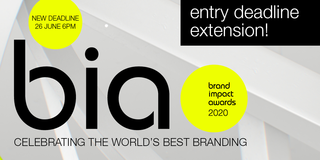
Typography in branding so important that it's recently been added as one of three new craft categories in our annual awards scheme, the Brand Impact Awards. Enter your best typography in branding by 26 June, and learn more about using type in visual identities below.

Brand Impact Awards 2020

For this article, we talked to professionals who gave us five approaches to creating brand expression through typography – related to actual case studies. Then, (on page 2) we share five expert tips to help you to choose the perfect typeface for your brand. If it's resources you need, check out our list of top free fonts and italic fonts. Or, for tips on creating your own font, see our guide to font design.

Type is crucial to brand expression

"No matter the medium or the audience, type is everywhere that a written message needs to be conveyed," says Lukas Paltram, creative director at leading type design studio Dalton Maag. "Creating a unique expression at that essential level of communication is extremely powerful. It can be a big asset for brands to stand out, and it enables them to use a unique voice in their visual communication."

Creating bespoke typefaces is expensive and time-consuming, and may not always be worth the investment. However, the one-off cost for a truly ownable asset may be more attractive than buying multiple licenses to an existing typeface that others can use. For more on this, see our guide to font licensing.

How is personality conveyed through type?

When it comes to conveying personality through type, certain details within letterforms offer particularly rich opportunities. "Characters with more curvature are always easier to build a sense of personality into," says multi-disciplinary designer Caterina Bianchini, who has created many custom fonts for her clients. "For instance, a G, C or O lends itself nicely to having a more charismatic aesthetic," she continues. "Crossbars are also interesting: they can be manipulated even just a small amount to give a different feeling: perhaps they sit lower or higher, or have a curve added."

"Virtually anything is possible, as long as it looks good," agrees Pentagram partner Paula Scher. "Small customisations can make fonts more recognisable, such as filling in the inside of a lower case o, g, d or b, stencilling it in a creative way, or slicing parts of letterforms."

However, Paltram cautions that while certain characters have greater potential for personalisation – he adds the capital Q and ampersand to the list above – a typeface needs to be balanced across the entire character set. "It's not about individual letters that stand out, it's the entire system that needs to be convincing," he argues.

Read on to discover how to create brand expression through typography…

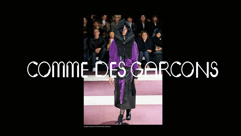
01. Put typography at the heart of brand expression: The Public

Brand typography: The Public

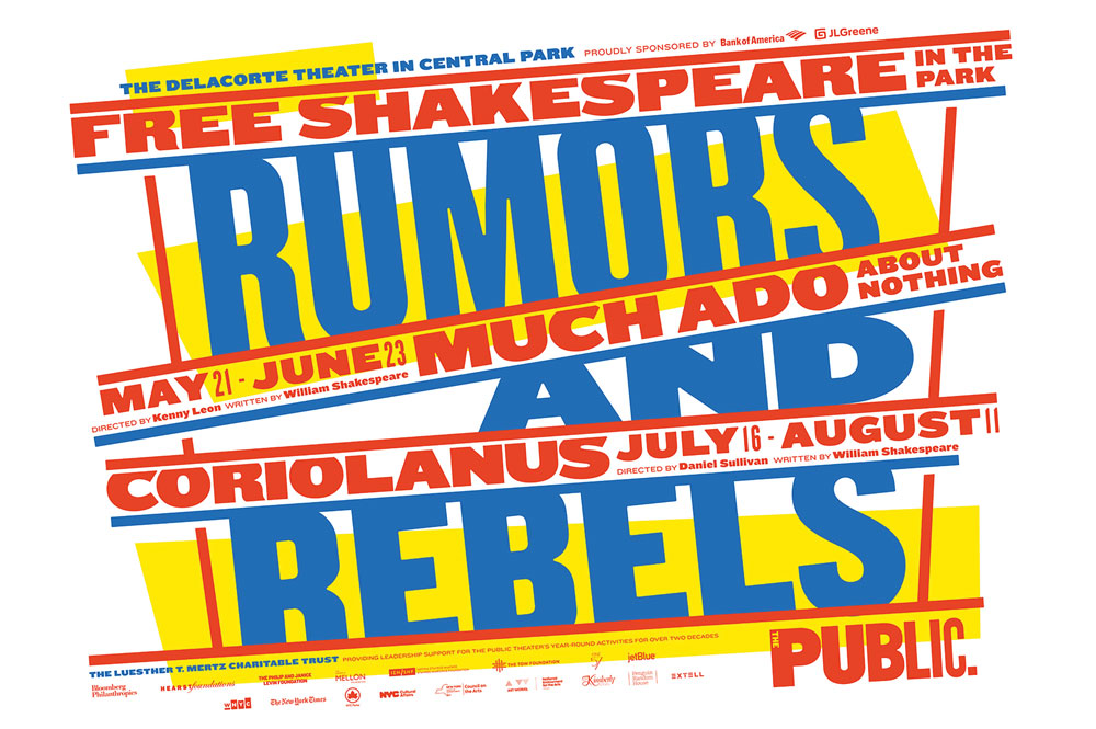
Much Ado About Nothing/King Lear (2014)

Typography has defined The Public Theatre's brand identity since 1994, when Scher crafted its logotype using original wood-block letters that had not yet been digitised. Fourteen years later, in 2008, Scher updated the logotype, setting it in six different weights of the Knockout typeface.

"I selected the wood fonts, and later Knockout, because they were used in newspapers in the late 1800s, and then in boxing posters in the 30s, 40s and 50s," she explains. "The type is populistic, so it was perfect for this not-for-profit, inclusive, and often groundbreaking theatre."

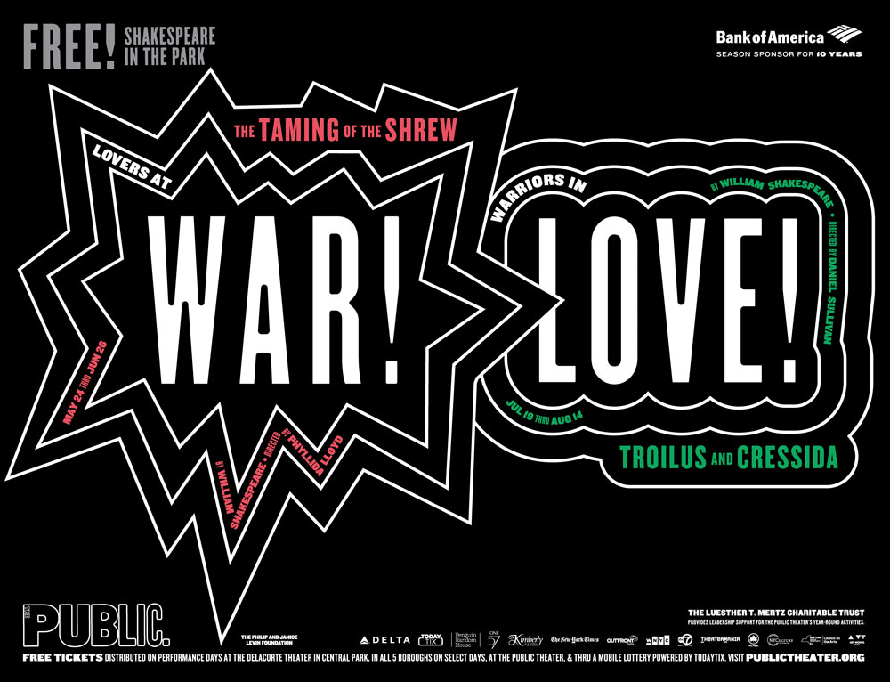
Each season, Scher collaborates with artistic director Oskar Eustis to agree a summer headline that captures the spirit of those productions – past examples have included Free Love and War and Love.

Brand typography: The Public

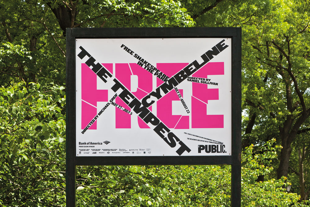
The Tempest/Cymbeline (2015)

Working primarily with different weights and colours of Knockout, with some creative tweaks to the typeface where necessary, Scher and her team at Pentagram design a distinctive look and feel for Shakespeare in the Park every season. This then serves as a creative framework for a range of other promotional material rolled out by The Public's in-house team.

"Generally, I try to design each season as a counter-balance to the one that came before it," says Scher. "The 2018-19 season used a gradated background and heavy black typography, where the left-hand side of a straight letterform, like an F or an L, might be extended by as much as an inch, giving the typography a rather heavy black appearance."

Brand typography: The Public

The Taming of the Shrew/Troilus & Cressida (2016)

The most recent 2019-20 season, meanwhile, is a riot of colour by contrast. "It has type at tangents using underlining bars," she continues. "The blue, red, and yellow is upbeat, influenced by the colours of Wonder Bread packaging and Bazooka gum."

Scher admits that each season some trial and error is required to achieve a suitably eclectic range of brand expression using the same typeface. "I'm trying to find the right eccentricity to build into the typography," she says. "Typefaces have spirit, and can be highly recognisable. If the typographic style used by an organisation has enough specific eccentricity, it can be recognised by the typeface alone – without a logo."

02. Build type on a versatile grid-based system: SKP Beijing

Brand typography: SKP

SKP wanted the font to have an edge

Designer and art director Bianchini worked with luxury Chinese department store SKP on a bespoke typeface that pushed the boundaries of convention. "A brand's typeface is usually one of the first things a consumer interacts with, and it's a very simple way to showcase a sense of feeling or character," Bianchini says. "SKP is streetwear focused, so it wanted the font to have an edge to it. "The overarching concept was a five-sided shape, which we named Wu. This became a visual metaphor to represent different parts of the store and SKP's brand, as well as touching on Chinese culture."

Brand typography: SKP

SKP Beijing’s typeface uses a grid based on a five-sided shape called Wu

This simple shape was the foundation of a grid, which in turn became the basis for the entire graphic system. Once the grid was established, it became a tool for building SKP's iconography and wayfinding systems.

"The result is something that feels quite multi-dimensional and multi-faceted," says Bianchini. "We developed three different weights: light, medium and finally faceted. The font is blocky and black, which gives it a distinct and instantly recognisable aesthetic."

Brand typography: SKP

Each character is built from shapes defined by this grid, and the concept translates to iconography and signage

Bianchini adds that this multi-faceted approach helps establish a unique identity for the department store. "A lot of the time people try to create something more functional, with the idea that less is more," she says. "With this type we wanted to create more. We wanted it to feel like the pioneer, the one doing things differently. We also always try to build a sense of something being a little 'off' into our work, and I think the unbalanced feeling of the shape pieces when they come together gives the typeface that exact feeling."

Conscious of not creating something that felt too 'over-designed', Bianchini had to strike the right balance between intriguingly esoteric, and overly confusing. "The font is heavily rooted in the grid formation, which usually simplifies things, but in our case it created a complicated system that could have been pushed too far in the wrong direction," she says. "We pushed it just enough."

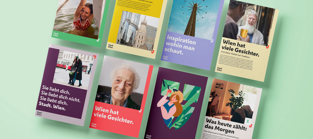
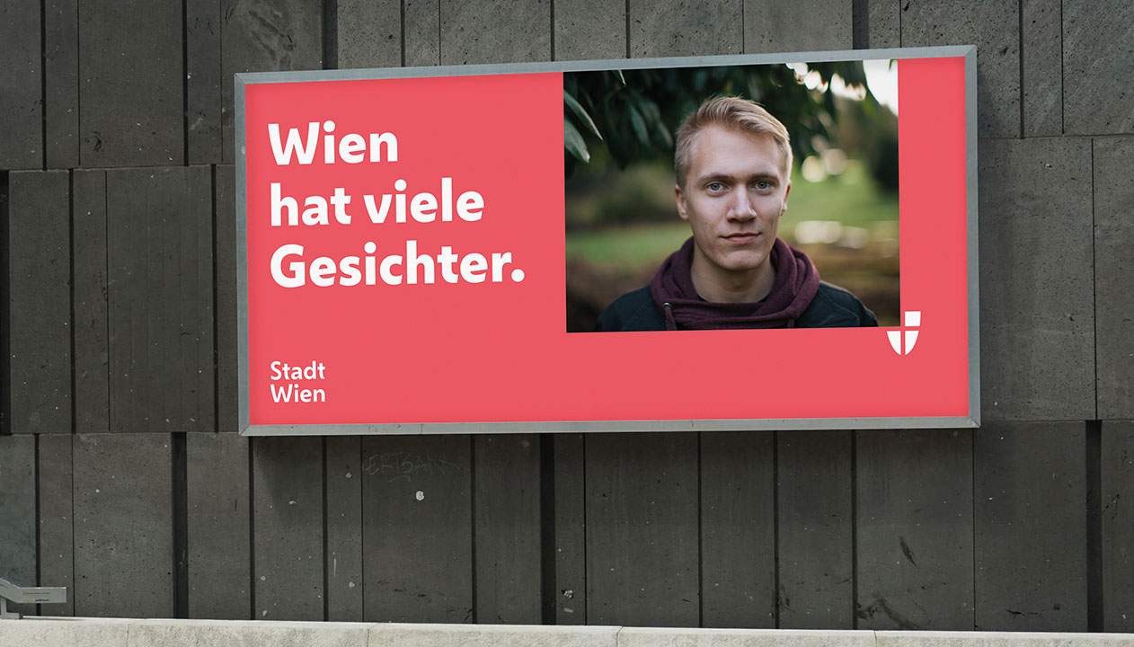
03. Provide ownable typographic personality: City of Vienna

Brand typography: City of Vienna

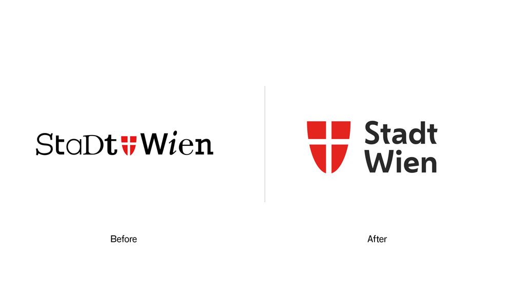
Vienna’s coat of arms was a key inspiration for its bespoke typeface: the curves of the t and W echo the shape of the shield. The typeface brings warmth and personality to the city’s marketing materials

Working alongside Saffron Brand Consultants, Dalton Maag put together a bespoke typeface for the City of Vienna entirely from scratch. The brief was for a contemporary sans-serif font family, with three weights, that could convey a uniquely 'Viennese' feeling across all media.

"We started by gathering inspiration from the city itself – its architecture, culture and history – and used these references to directly inspire the typeface's design language," explains creative director Paltram.

"It's this unique process that makes the typeface distinctive and ownable. The typeface is clean and mature enough to support the efficiency of the government, but it also embodies the diversity and humanity of Vienna and its residents."

Brand typography: City of Vienna

The typeface needed to be expressive – friendly yet confident

When Dalton Maag came on board, Saffron had already established the foundations of the visual identity, but the typeface remained a critical component. It needed to be expressive, giving the city a friendly yet confident tone of voice without compromising functionality or readability.

"Next to historic and cultural references, we used the long-established shape of the shield, the coat of arms of the city, as an inspiration," says Paltram, giving the example of the diagonal glyphs on the W and V.

"There's a specific tension in the curvature which is repeated across multiple characters, together with other unique elements such as the e with an inclined middle bar, and the simplified u shape," Paltram continues. "The softened diagonal strokes of the letters, round shapes and open counters give the typeface an approachable and warm expression throughout, but also deliver excellent legibility – even at smaller sizes."

Brand typography: City of Vienna

Vienna’s citizens are the ultimate end clients

As Paltram points out, the ultimate end clients are the citizens of Vienna. "In my opinion, Vienna is a modern and cosmopolitan place, but you can feel the history and tradition in the city," he says.

"Merging these elements and understanding the right level of influence to the typographic expression was key," continues Paltram. "Together with the working group of agencies, and the client's team, I'm confident we achieved something that doesn't just follow a fashion, but will last and find the right place in our time."

04. Create a cohesive design system driven by type: Top Gear

Brand typography: TG

DixonBaxi collaborated with Fort Foundry to create the bold, dynamic brand typeface, TG Industry

To help drive brand recognition for BBC Top Gear, DixonBaxi developed TG Industry: a distinctive typeface designed to give the global motoring brand a consistent, ownable presence across its many platforms.

According to co-founder and creative director Dixon, an extensive range of weights was essential to create enough nuances to work with across print, broadcast and digital applications. "At times sleek and reductive with a cinematic quality, yet bold and expressive in other moments, it packs a punch for eye-catching headlines and iconic title sequences," says Dixon. "It's a digital-first typeface, crafted to remain highly legible on the smallest of screens."

Brand typography: TG

Its distinctive angular cuts are inspired by the teeth in Top Gear’s cog-based logo

Created in close collaboration with Mattox Shuler from Fort Foundry, the typeface is at the heart of a cohesive and creative design system for Top Gear – and clear visual signifiers emphasise its relationship to the main brand. "TG Industry is inspired by the angular cuts of the Top Gear cog, a core part of the logo," continues Dixon. "The blunt end of the uppercase A is a good example, or where the curved part of the lowercase b meets the upright stroke – this has been given an aggressive angular edge that is inspired by the shape of the teeth on the cog icon."

As Dixon points out, great branding tends to be in the detail. "It's the specifics that make the experience more relatable and ownable," he adds. "The tracking and kerning. The legibility and different sizes. The satisfying feel of a font that feels right in many applications."

Dixon's advice is to be clear from the outset why you're choosing to design a bespoke font. "It needs a clear rationale," he insists. "See the typeface as part of a larger design eco-system. The typeface is delivering the brand's voice. Look at the details: it's easy to skim through the finer points, so diligence pays off. It can't be rushed."

05. Evolve a full typeface from a logo design: Duolingo

Brand typography: Duolingo

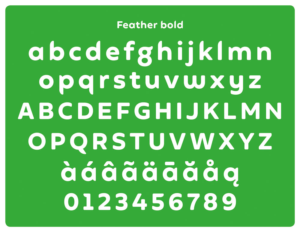
Duolingo’s feathery mascot Duo was the starting point for the brand’s own typeface, Feather Bold

Sometimes the development of a typeface evolves as part of the creative process, even if it wasn't originally part of the brief. That was the case with Johnson Banks' recent rebrand of language-learning platform Duolingo.

"The first type conversations stemmed from a desire to improve its logotype," reveals creative director Michael Johnson. "It was based on a typeface called Chalet, which we all felt wasn't fit for purpose."

Although discussions initially turned down the 'neutral' sans-serif route, Johnson pointed out the ubiquity of the style in the tech space. "We were keen that they had something more unique," he adds.

"As we experimented with juxtaposing the mascot with their name, a 'What if?' unlocked the solution," continues Johnson. "We redrew the logotype, drawing inspiration from Duo's feathery form to reflect the company's quirky personality."

Brand typography: Duolingo

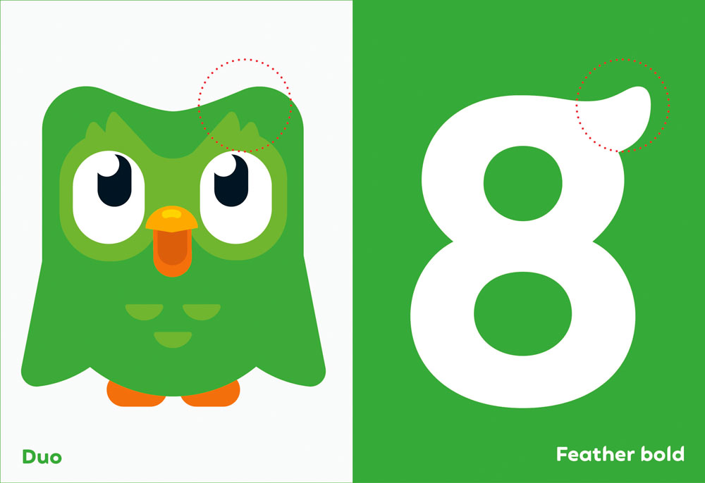
This included wing-inspired ascenders and descenders, and a flicked g that echoes the shape of Duo’s eyebrows

While he admits the first few attempts looked "very odd", as the concept was refined the potential emerged for a bespoke typeface – developed in partnership with Fontsmith. "A lot of the initial decisions stem from the logotype, where you have round characters (the d and two o's), a repeated character (the u and n) and the relatively neutral l and capital i," says Johnson. "Then you have the mnemonic character: the g. Little quirks, such as the flick of the lowercase g were used sparingly, beta versions were crash-tested, and eventually 'Feather Bold' was ready."

The Feather Bold typeface was reverse-engineered from the shapes used to draw Duolingo's mascot, Duo the owl. Johnson reveals that, "It finally let us put the word 'duolingo' next to their mascot without it looking like an unhappy marriage."

Brand typography: Duolingo

“We look for something that can encapsulate the unique feelings we’re trying to convey with the brand,” says Johnson

For Johnson, a brand's use of typography is interlinked with its tone of voice. "It's rare for us to use the same typeface from project to project," he says. "We're always looking for something that can encapsulate the unique feelings that we're trying to convey with the brand. Using 'generics' like Helvetica strikes me as a cop-out, unless there's a good reason to look and sound the same as others."

Next page: How to choose the right typeface for your brand

Make the right choice

Why do certain types of brands adopt certain types of fonts and font pairings? Partly, at least, this can be attributed to a ‘trend effect’. This is a collective interpretation of design, absorbed through our familiarity with – and understanding of – the culture we happen to be part of.

But there’s also the way brands from different industry sectors choose to position themselves. Trends within specific sectors don’t follow a strict rulebook, but certain styles of fonts represent specific emotional attributes.

For instance, geometric fonts with homogenised proportions tend to represent design purity, cleanliness and simplicity – values that many technology brands are currently keen to express.

Many fashion brands, on the other hand, have an ongoing love affair with high contrast modern designs with their elegant hairline strokes, bracketed serifs and smooth arching curves, expressing a timeless style.

Brand typography: AT&T's extensive brand font

AT&T’s extensive brand font comes in a number of styles all built around the same humanist structure

Consumer banking also offers an interesting example, as these brands have been progressively moving away from authoritarian serif designs in favour of softer expressions, perhaps to appear more human and friendly as they aim to rebuild trust following the financial crisis.

In 1923, when Poffenberger & Franken conducted research into how readers perceive different typefaces used to advertise products, they discovered that people responded almost uniformly to typeface and product combinations, and mostly used similar adjectives to describe what they felt about the different fonts they were asked to comment on.

Subliminal messages 

Brand typography: man kicking a football

Slab Serifs are typographically strong and distinctive and usually stand up well individually

Through a lifetime of exposure we learn, or are prepared to be seduced by, the subliminal messages presented to us through branding and communication. Fonts, and typography in general, contain layers of subliminal communication, and carry a wealth of meaning, even for viewers who are not well-versed in typography.

The contrast and modulation of the strokes, how a stroke termination is shaped, and height to width proportions determine whether a design is perceived as warm and friendly, or cold and mechanical.

This is why picking the right font is key to a brand’s successful communication. Just like a logo or colour palette, the right font can help consumers identify the key characteristics behind a brand’s attitude and encourage them to make positive associations with its products and services.

Developing an ownable brand font

Typographic consistency across different communication channels establishes a sense of empathy and loyalty between the brand and its audience over time, and is an unquestionable asset in a brand’s toolkit. So how do we choose, or develop an ownable brand font? This is a question that we’re asked every day.

A multitude of parameters and features affect the stylistic and functional properties of a typeface: some are global, affecting all glyphs within a font family; some are specific to style variants, such as Regular, Italic, Bold, Bold Italic; others apply to shared elements within each style variant; while a few relate to just individual letters.

With the democratisation of type design tools and the boom of available designs you can pick from, there are a number of criteria to take into account if you choose to license a font family for a brand. Being aware of the conventions at play behind our interpretation of the emotional qualities conveyed by a typeface will always be helpful.

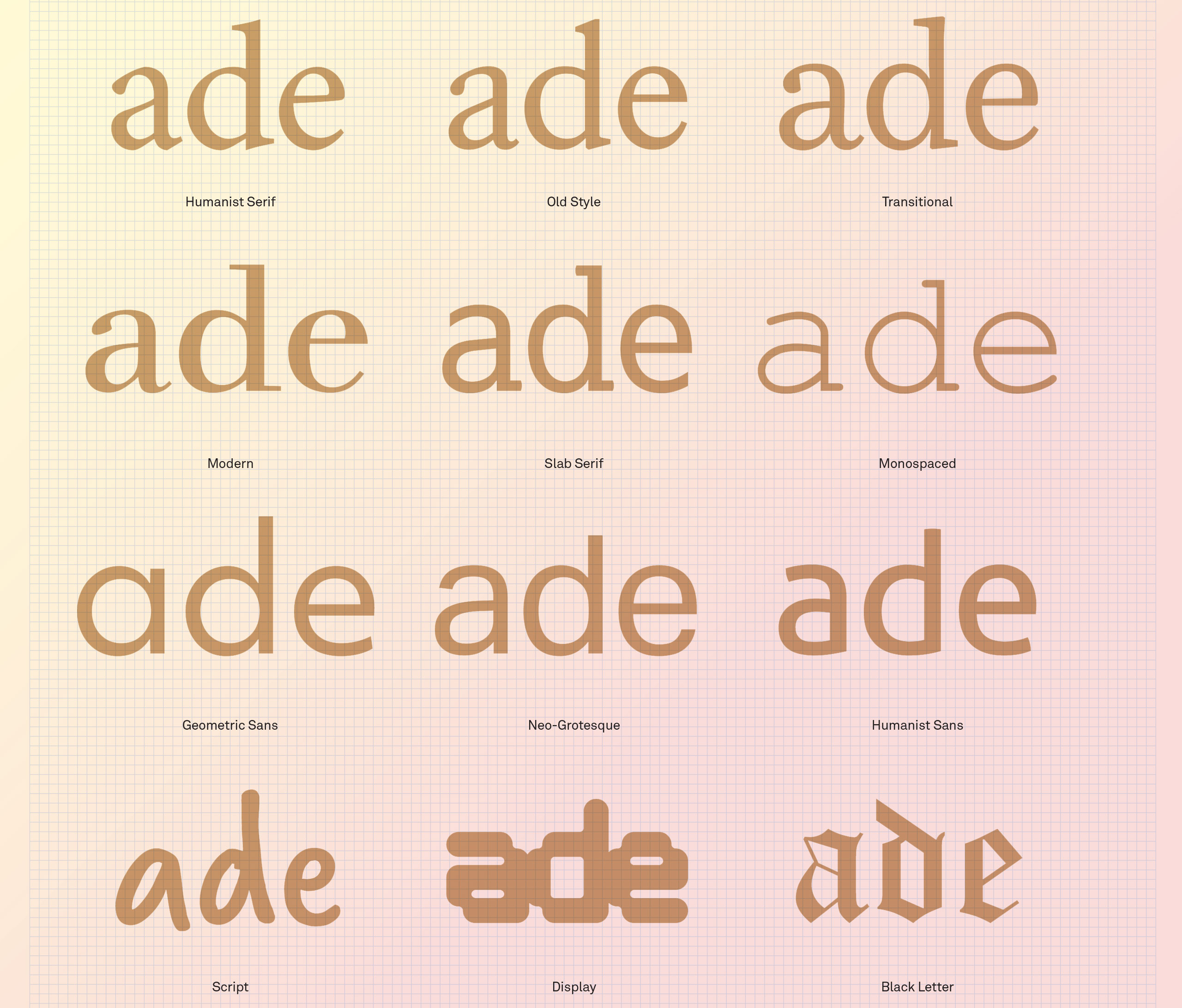
Use this handy reference guide as a reminder of the 12 main styles of typeface (click the top-right arrows icon to expand the image)

First off, you could start by considering whether a serif or sans serif design is suitable. Serifs originate from carved inscriptions, mostly from the Roman Imperial period, and while lowercase letters have since evolved into a variety of other letter shapes, capitals and their associated serifs have survived with very few fundamental changes. 

This deep-rooted history brings with it an inescapable association between serifs and their antique origins, making serif fonts more suited to cultivated, academic and more thoughtful communication. 

The advantage of serifed letters has been understood for hundreds of years of print-based typography: they help to combine or ‘glue’ letterforms together into word elements. The internal density that serifs provide also creates more clearly defined horizontal rows of text, making the process of switching from the end of one line of text to the beginning of the next more efficient.

The boom of screen-based technology over the last decade or so has brought a resurgence in the popularity of the sans serif.

Sans serifs, for their part, made their first appearance in the 19th century and were used initially for commercial headlines and advertisements. In the age of print, their low contrast and absence of serifs made most sans typefaces harder to follow for general reading and so they were not a suitable choice for the text of a book, magazine or newspaper. 

But the boom of screen-based technology over the last decade or so has brought a resurgence in the popularity of the sans serif. 

The complex texture and density of the serifed fonts did not always perform well in digital form, and screen resolutions were not sufficient to render as accurately the reading sizes we normally find comfortable in print media. 

In this context, the monolinear stroke weight and functionality of the sans serif made it an appropriate choice for their association with a more rational and industrial ideology and their functionality in digital environments.

02. Consider the font contrast

Next, you should consider which contrast in a font will be more appropriate for your brand. Despite the passing of many generations, the same calligraphy inspired stroke modulation between thick and thin strokes that was incorporated into those earliest forms of movable type is still recognised today, informing the construction of digital type.

High contrast fonts generally are more effective when used at display sizes, where their elegance can be appreciated. However, their use for text can prove problematic due to the delicacy of their thin strokes, which have a fracturing effect at small sizes, reducing visual definition. 

Low contrast fonts can also present limitations, but for different reasons. In display and larger text sizes they perform well, but for text use in general, their reduced internal space also reduces visual definition. Both extremes have an important role to play in display typography: high contrast designs can provide an impression of classical dignity and grace, while lower contrast designs can contribute a sense of robust solidity, confidence 
and permanence.

03. Think about font stress

You should consider the stress or axis of the font, which refers to the angle at which contrast occurs in a letterform, usually ranging from vertical to a somewhat back-slanted diagonal. This can best be noted by looking at the letter ‘O’ and noting if the bottom left is thicker than the top left, and if the top right 
is thicker than the bottom right. 

If this difference exists, the letter has diagonal stress. The reason for this angled stress is due to calligraphic construction and principles applied to traditional Roman type styles we use for text copy. These ‘old style’ designs are generally considered warm and friendly with their angled stress providing a slightly coarse, organic texture on the page. 

The flowing rhythm of the text, enhanced by naturally occurring oblique ascender and x-height serifs, serve to combine individual letters more readily into clearly defined word elements. The irregularity and down-to-earth familiarity of these designs seems to invite the reader to enter the text and read.

04. Don't forget vertical stress

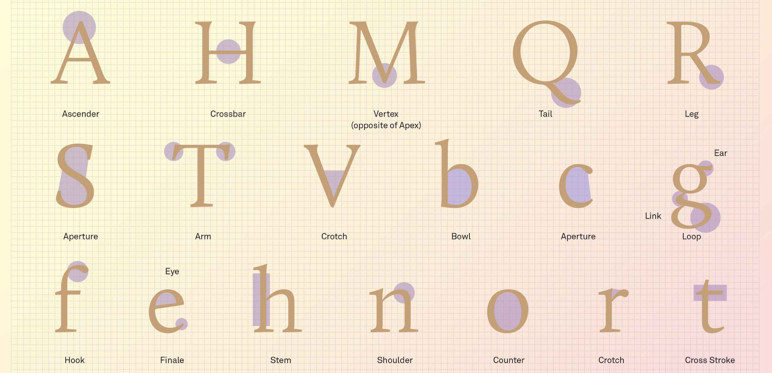
Letterform anatomy (click the top-right arrows icon to expand the image)

If the two halves of the ‘O’ are horizontal mirror images of each other, with the sides thicker than the top and bottom, then the letter has vertical stress. Unlike the Roman typefaces, which developed naturally over time, a more rational approach to verticality emerged in the 18th century with the development of typefaces we now call ‘modern’. 

Aside from their functional properties, vertically stressed moderns have a more refined, austere elegance about them, qualities that are best appreciated when used at display sizes for magazines and posters. At text sizes, however, they seem to convey a sense of cool clinical detachment, inviting the reader to look at the text rather than read.

A tall high x-height will help maintain clarity of the characters, but this may come at the expense of word and line definition.

Another element that should influence your font choice is a font’s vertical parameters (ascender, x-height and descender). If we are familiar with most words we encounter, when our eyes scan the page we look for clues based around the context of the passage we are reading. This makes us able to guess collections of words within a phrase or sentence based on their length, architecture and context as our eye moves forward and backward in saccades.

A tall high x-height will help maintain clarity of the characters, but this may come at the expense of word and line definition. A short x-height will restrict definition within the x-height portion of a font, particularly in bolder weights, but will define more clearly the silhouette or shape of words within a text. 

The ideal x-height for your brand font will allow sufficient space to build lowercase letters, including the more complex ‘a’, ‘e’, ‘s’ and ‘x,’ without compromising their definition at whatever range of sizes the font is designed to cover, as well as taking into account its relationship with the ascender height.

05. Counter balance

The architecture of the letters is also heavily influenced by whether the designer opted for open or closed counters. This is particularly relevant for corporate branding needs, where fonts are required to perform effectively over a wide range of media and sizes with an economy of space. 

Since these fonts are often monolinear, the designer is required to ensure that there is sufficient internal space within the letterforms and 
to consider restrictions to their width proportions. To overcome these constraints, designers will often resort to humanist designs, where the construction and architecture of the letters helps provide more internal space.

There is no overarching formula as to which designs are right or wrong.

Closed counter styles are available in the form of grotesque (grotesk) designs in which the outer loops of ‘a’, ‘c’, ‘e’ and ‘s’ are hooked in towards the middle of each letter. To maintain their flexibility and legibility at small sizes, these fonts are generally made with an enlarged x-height and with the widths of the enclosed characters increased but, as discussed earlier, there is a corresponding reduction in legibility at text sizes.

These are just a sample of the criteria that should be considered in your choice of a brand font and there are many features which will influence a decision that should be articulated around a solid understanding of the brand’s identity. 

There is no overarching formula as to which designs are right or wrong and the most important thing is to thoroughly map the requirements and context in which the typeface will be used. This will very much be determined by how expressive or functional it should be, what it should look like, and in which digital environments, operating systems and screen resolutions it will be used.

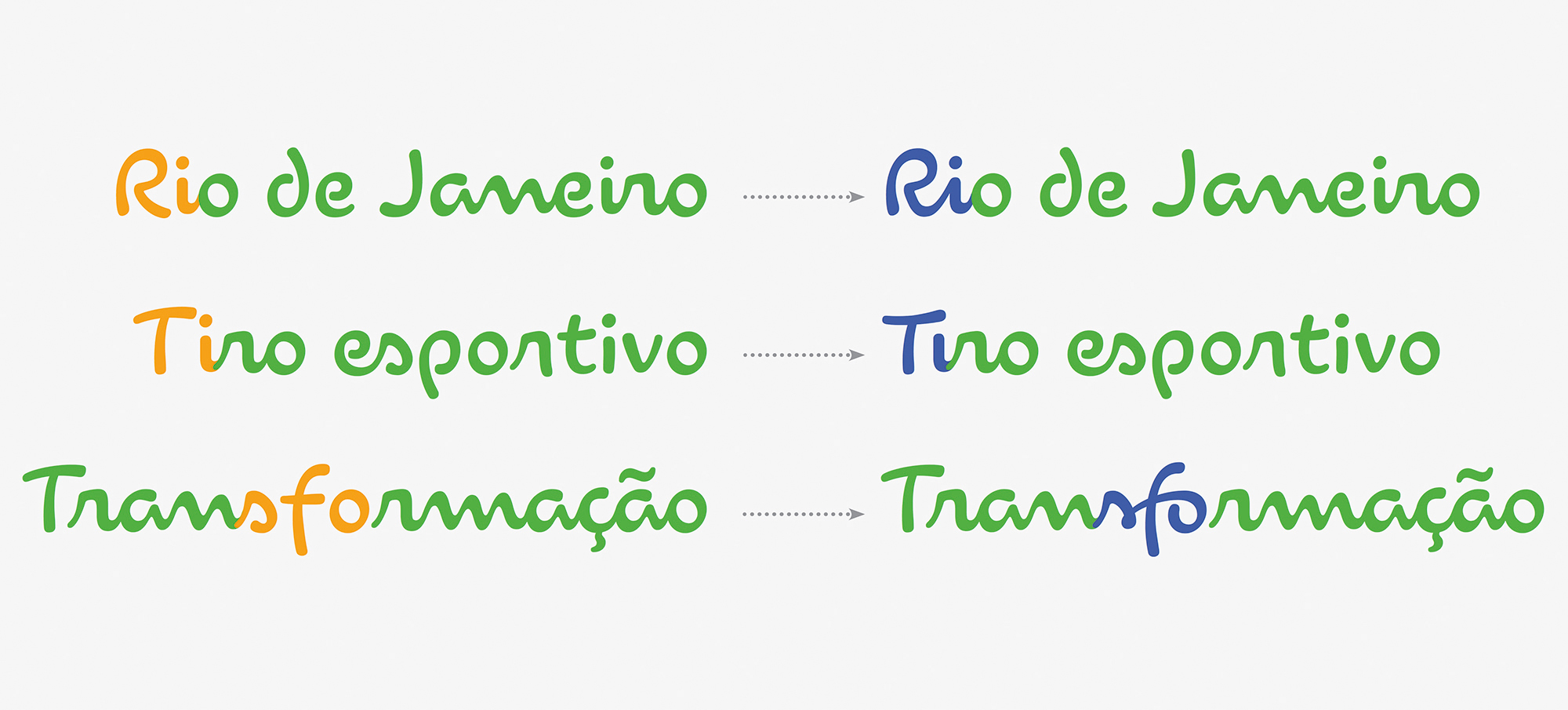
The nature of a script font requires several variants of each character if it is to reach its full potential, as with Dalton Maag’s brand font for the Rio Olympics

Considering which required writing systems will be needed at an early stage is also paramount. After all, it would be a shame to pick a font family that looks good, but doesn’t cover all the script systems that the brand will need to communicate in its other markets. It’s possible to pair or match a Latin font in another script system, but this is at the risk of diluting the brand’s expression.

In a nutshell, picking the right brand font should come from discussing emotional features, visual language, technical, linguistic and logistic requirements with the brand. 

If possible, you should also liaise not only with the client’s design and marketing departments, but also with IT and legal, as each team often has different or additional needs. Ultimately, the sweet spot where brand expression and functionality meets is where you’ll find the right typeface for your brand.

This content originally appeared in Computer Arts magazine. 

Related articles:

Font vs typeface: the ultimate guideHow to add fonts in Photoshop35 great free script fonts

45 Best Sites to Download Free Vectors

Original Source: https://www.hongkiat.com/blog/50-websites-for-free-vector-images-download/

Unlike raster images, vector images are flexible and scalable enough to not lose quality when stretched out beyond their original size. This makes it perfect for use for both web and print design. In…

Visit hongkiat.com for full content.

Popular Design News of the Week: June 29, 2020 – July 5, 2020

Original Source: https://www.webdesignerdepot.com/2020/07/popular-design-news-of-the-week-june-29-2020-july-5-2020/

Every week users submit a lot of interesting stuff on our sister site Webdesigner News, highlighting great content from around the web that can be of interest to web designers.

The best way to keep track of all the great stories and news being posted is simply to check out the Webdesigner News site, however, in case you missed some here’s a quick and useful compilation of the most popular designer news that we curated from the past week.

Apple, Big Sur, and the Rise of Neumorphism


GIF Directions


How to Design a Sleek Dashboard UI


8+ Web Design Myths Busted: Old Ideas & Modern Best Practices


4 Unique ‘About Me’ Page Ideas to Inspire your own


Webdesign Toolbox – Discover the Newest and Best Resources for Web Designers


Altermind


$0 Marketing Budget? Here are 10 Creative Ways to Land Clients


Visual Storytelling for UI-UX Design with Examples


DeLorean Ipsum


How to Stay Transparent When WFH


Scraper AI – Automate Website Data Extraction in a Few Clicks


UX Website Audit: How UX Tests Can Make your Site like a 5-Star Resort


How Working from Home is Helping Me Design Better Products


SEO for Designers: A 101 Primer


18 Things Apple Announced for iOS 14 that We Want on Android


PEST – Pest is a Testing Framework with a Focus on Simplicity


7 Best Practices for Highly Relevant Email Automation


Font in Logo – Search Engine for Logos & Fonts


25 Most Common Web Developer Interview Questions and Answers


Online Illustrations: How to Draw Illustrations on your Computer


Introduction to UX Writing


8 Essential Bootstrap Components for your Web App


Writing Design in a French Style


Type Directors Club Shuts Down Amid Allegations of Racism


Want more? No problem! Keep track of top design news from around the web with Webdesigner News.

Source

p img {display:inline-block; margin-right:10px;}
.alignleft {float:left;}
p.showcase {clear:both;}
body#browserfriendly p, body#podcast p, div#emailbody p{margin:0;}

Mischievous take on classic cartoon characters in 3D

Original Source: http://feedproxy.google.com/~r/abduzeedo/~3/UKk5nAAerwE/mischievous-take-classic-cartoon-characters-3d

Mischievous take on classic cartoon characters in 3D

abduzeedo07.10.20

Gal Yosef, a 3D artist from Israel, has been working on a cartoon series of old and lovely characters like Mickey Mouse, Bugs Bunny… and bringing them to life in some mischievous, yet hilarious compositions. Because of this Gal in June he was featured as the 3D artist of the month from Autodesk. If you don’t know who Autodesk is, they are the makers of some of the most popular 3D applications like Maya, 3ds Max and AutoCAD.

I use a combination of software. For characters, I usually use Maya for modeling, look development, grooming, rigging, and animation. I’ll follow that up with Arnold for rendering. For anything hard surface, I use 3ds Max for look development, XGen for grooming, and Corona Renderer for rendering. I also generally use ZBrush for sculpting and paint with Substance Painter.

For more information make sure to check out

https://www.behance.net/galyosef

View this post on Instagram

After 2 months of work The “Iconic Series Vol.1” is finally done! And this time “Pooh Sold The Honey”. I've created this series gesture for these iconic characters that changed the world. These icons were the reason I've become a 3D Artist & Characters lover from the first beginning, so it's time to bring them to life. I've taken these art pieces to modern life, to show what would happen if they were brought to life these days For the full project: https://www.behance.net/gallery/99319065/Iconic-Series-Vol1 @wacom @louisvuitton @adobe @disney @warnerbrosentertainment @zbrushatpixologic @behance @autodesk @substance3d @photoshop @artstationhq #studioshare #autodeskmaya #autodesk3dsmax #disneyart #warnerbros #characters #galyosef #galyosefart #louisvuitton

A post shared by Gal Yosef (@galyosef) on


8 Design Secrets of B2B Vs B2C Websites

Original Source: https://www.webdesignerdepot.com/2020/07/design-secrets-of-b2b-vs-b2c-websites/

Web design clients come from a wide variety of backgrounds. One day, you’ll be designing a portfolio website for a voiceover artist, the next you’ll be creating a comprehensive ecommerce site for a leading retailer. In an ideal world, you’ll get to a point where you eventually specialize in a niche. However, you’ll need to master both avenues first.

The more time you spend in this industry, the more you’ll learn that every client comes with their own unique requirements and challenges to consider. However, there’s a particularly huge divide between the kind of web design projects you do for B2B clients, and the ones you do for B2C customers.

Both B2B (Business to Business) and B2C (Business to Consumer) websites need to be clear, concise, and aesthetically pleasing. They should always have a strong focus on user experience, and they need to work consistently across devices. However, being aware of the difference between B2B and B2C projects will help you to deliver better results to your customers.

Defining the Differences Between B2B and B2C Sites

Some web design trends remain consistent in any environment.

Whether you’re creating a site for a hairdresser, or a leading SaaS company, you’ll need to deliver responsive design, intuitive navigation, and excellent site security.

Your process is unlikely to differ from B2B to B2C much in terms of project milestones, phases, prototyping and wire-framing. The differences that arise between B2B and B2C projects often come in the approach you take to building certain elements.

Let’s take a closer look at the things you might need to consider:

1. The Target Audience

In any design project, it’s always important to keep the end customer in mind. Knowing your client’s target audience will help you to create both an image and a tone of voice that appeals to the right people.

B2B Websites

With B2B websites, you’ll be speaking to a range of highly-educated individuals who already have a general knowledge of your service. The aim here will be to show the end-user how you can help them achieve better results. For instance, m.io highlights “syncing communication” so you can “effortlessly chat” with your team.

The language and content of the website is all about highlighting the key benefits of the products, and the kind of outcomes that they can deliver. The Nielsen Norman Group reports that there’s often a lot of discussion between decision-makers when they’re checking out a B2B website.  

Designers need to work harder at convincing B2B buyers that they’re making the right decision. This is particularly true when you’re selling something like a software subscription that requires a lot of long—term investment.

B2C Websites

On the other hand, while B2B customers make decisions based on logic, information, and well-explained benefits, B2C customers are more influenced by emotion. They want quick solutions to their problems, and the opportunity to purchase from a brand that “understands” them.

Look at the Firebox website, for instance. It instantly highlights an ongoing sale at the top of the homepage, addressing any concerns a customer might have about price. That combined with a quirky layout full of authentic photos and bright colors means that customers are more inclined to take action.

2. The Purpose

Another factor that can vary from B2C to B2B websites, is the motive behind a customer’s purchase. Knowing what’s pushing a target audience to interact with a brand will help you to create a website that appeals to specific goals.

B2B Websites

B2B websites often aim to solve expensive and time-consuming problems for companies. To sell a decision-maker on the validity of a solution, it’s important to thoroughly explain what the solution is, how it works, and how it addressees a specific pain point.

Look at the Zoom website for instance, they don’t just tell people that they offer video conferencing, they address the practical applications of the platform:

B2C Websites

Consumers are a lot easier to appeal to in terms of emotional impact, because many of them come to a website looking to fulfill an urgent need. Because of this, many web designers can take advantage of things like urgency and demand to encourage conversions. For instance, look at this website from TravelZoo. It takes advantage of a customer’s desire to get away:

A B2B website needs to focus on providing information that helps companies to make more confident decisions. What’s more, with B2B sites, decisions are often made by several stakeholders, while B2C sites ask a single person to make a choice. A B2C website needs to address immediate concerns and connect with customers on an emotional level. B2C buyers still want to do their research on products or services, but the turnaround is much quicker, and often requires less information.

3. The Design Elements (Visual Appearance)

Just as the focus of your website design and the audience that you’re creating the experience for can differ from B2B to B2C websites, the visual elements of the design might change too.

B2B Websites

In most cases, B2B websites are all about presenting a highly professional and respectable image. You’ll notice a lot of safe and clear choices when it comes to typography and imagery. It’s unusual to see a B2B website that takes risks with things like illustrations and animations.

Look at the Green Geeks website for instance. Everything is laid out to encourage clarity and understanding. Information is easy to find, and there are no other issues that might distract a customer.

B2C Websites

On the other hand, B2C websites can be a little more daring. With so many different options to choose from, and most customers buying out of a sense of urgency or sudden demand, designers are under pressure to capture attention quick. This means that it’s much more likely to see large pieces of eye-catching imagery on B2C sites, with very little text.

Movement, like slideshows and animations often play more of a role here. Additionally, there’s a good chance that you’ll be able to experiment more aggressively with color. Take a look at the Yotel website, for instance. There’s very little textual information here, but the appeal of the website is conveyed through sliding images:

4. Website Content

The way that information is conveyed on a B2B website is very different to the messages portrayed on a B2C site. Usually, everything from the language, to the amount of content that you use for these projects will differ drastically.

B2B Websites

When designing for a B2B website, you’ll need to be careful with content, as you’ll be speaking to a very mixed audience. If your site caters to different industries, you’ll need to ensure that you show authority, without using too much jargon. Some companies even create different pages on their site for specific customers. The aspin.co.uk website covers the benefits from a company, sale and integration perspective:

Rather than try to talk to all business owners about their differing communication pains, G-Suite anticipates its audience and creates pages for each.

B2C Websites

Alternatively, B2C websites can make things a little simpler. For instance, on glossybox.co.uk, there’s no need to provide a ton of information for different types of shopper, designers can appeal to one audience, i.e. the “beauty addict”:

In both B2B and B2C websites, the aim of the content should always be to answer any questions that the end user might have.

5. CTA Buttons

Call to Action buttons are often a crucial part of the web design journey. However, it’s sometimes difficult to determine where they should be placed, or how many buttons you need.

B2B Websites

Because the decision to buy something won’t always happen immediately with a B2B website, these kinds of sites often use a variety of CTAs. For instance, you might have a “Request a Quote” button at the top of a page, as well as a Sign in button.

On the Klaviyo site, for instance, you can request a demo, sign up or log in:

You can place CTAs lower on the page with B2B websites too, as it’s more likely that your customers will be scrolling through the site to collect more information before they decide to buy.

B2C Websites

On the other hand, with B2C websites, you usually don’t need to give your visitors as many options. A single option to “Add to Cart”, or perhaps an extra choice to “Add to Favorites” is all your user will need. Customers need to instantly see what they need to do next as soon as they arrive on a page:

On the Evil Hair website, you immediately see how to add a product to your cart.

Remember, the sales process is a lot quicker with B2C customers. This means that you need your CTA buttons to be front and center as soon as someone clicks on a page.

6. Contact Forms

In a similar vein, the way that you design your contact forms will also depend on the end-user that the website wants to appeal to. There’s a very different process for getting in touch on a B2B website, compared to a B2C site.

B2B Websites

B2B websites often require longer contact forms, as clients need to collect additional information about a prospect’s position in a company, and what that company does. B2B companies need to share things like what they’re looking for in a service, and how many users they have, so a sales team knows what kind of demonstration to give.

As with any strategy for contact form design, you should always only include the fields that your client needs and no more. If you demand too much from any client, you could send them running in the opposite direction. Check out this straightforward option from Ironpaper, for instance:

The form addresses as many relevant questions as possible without overwhelming the customer. Because the site handles things like design, it makes sense that they would ask for a link to the company’s existing website.

B2C Websites

On a B2C website, there are very different approaches to contact forms. You may have a dedicated contact form on your website where people can get in touch if they have any questions. A FAQ page where customers can serve themselves is another great way to help your client stand out from the competition. Check out this option from River Island, for instance:

On the other hand, you might implement pop-up contact forms into a website if your client wants to collect emails for email marketing. In that case, it’s important to make sure that you’re only asking for the information you need, and nothing more.

The easier it is to sign up for a newsletter, the more likely it is that customers will do it. Being able to enter their name and email address and nothing else will make the signup seem less tasking.

7. Search Bars and Navigation

Whether you’re designing for B2B or B2C companies, navigation will always be a critical concern. End users need to find it easy to track down the information that they need about a company, whether they’re looking for a particular product or a blog.

B2B Websites

On a B2B website, the search bar often takes up a lot less prominence than it does on a B2C site. That’s because all of the information that a client needs, and the buttons they need to take their next steps, are already visible front-and-center.

As a designer, it will be your job to push as many people to convert as possible, by making the purchasing journey the most appealing path for visitors. For instance, on the Copper website, the “Try Free” buttons are much easier to see than “Continue with Google” or “Login”:

With B2B sites, the focus is on a very specific goal. Although navigation still needs to be available, it doesn’t need to be as obvious as it is on a B2C site.

B2C Websites

On the other hand, most B2C websites offer a wide range of products, and they’re perfectly happy for their customers to purchase anything, as long as they eventually convert. Because of this, they make navigation a much more significant part of the customer journey.

The search bar is often presented at the very top of the screen where customers can see it immediately. Additionally, there may be multiple pages within certain product categories, so that customers can browse through the items they’re most interested in. For instance, look at the homepage on the IWoot website:

The navigation elements in B2C websites need to be a lot more obvious, because consumers are more likely to use them when they’re searching through their options.

8. Social Proof and Testimonials

Finally, social proof is one of the things that will work well for improving conversions on any kind of website. When your customers aren’t sure whether or not they should buy from you, a review or testimonial could be just the thing to push them over the edge.

B2B Websites

On a B2B website, the decision-making process takes a lot longer. Because of this, it’s worth including as much social proof as possible in every part of the website. Client testimonials, reviews and ratings, and even high-profile company logos make all the difference. Many B2B websites include a page dedicated to case studies highlighting the success of other brands.

Your client might even go as far as to ask for a page that highlights their awards and recognition or showcases comparison tables that pit their products against the competition.

For instance, Authority Hacker has a “what the pros say about us” section as social proof:

B2C Websites

With a consumer website, you can include consumer ratings and reviews wherever you like. However, it’s most likely that you’ll want to have a place where customers can see the reviews of other clients on the product pages themselves. On the EMP website the company gives users the option to click on the star review section to jump to a different space on the page where testimonials are listed. This ensures that customers don’t have to scroll through a lot of excess information if they just want to add an item straight to their cart.

Designing for B2B vs B2C

In the world of web design, no two customers are ever the same. While you’ll need to adapt your processes to suit each customer you interact with, you can set your expectations in advance by learning the differences between B2B and B2C strategies.


Featured images by Chris Ross Harris and Mike Kononov.

Source

p img {display:inline-block; margin-right:10px;}
.alignleft {float:left;}
p.showcase {clear:both;}
body#browserfriendly p, body#podcast p, div#emailbody p{margin:0;}

Adobe Photoshop Camera: Free new app will transform your Insta feed

Original Source: http://feedproxy.google.com/~r/CreativeBloq/~3/RG3gfTPS77U/adobe-photoshop-camera

Creatives everywhere have been waiting for Photoshop on their phones for a long time, and Adobe has finally released Photoshop Camera on Android and iOS devices. Although it may not be exactly what professionals have been yearning for in terms of bringing Photoshop's capabilities to the small screen, it's a fun app that will have its uses – especially for social media users.

Photoshop Camera (now out of beta) is powered by Adobe’s Sensei AI, and gives users "real-time Photoshop-grade magic right from the viewfinder" with its powerful effects and filters. Essentially, it uses the AI technology to add flashy lens effects (you'll definitely want the best camera phone to fully enjoy this), and though you can do some basic photo-editing, it's limited to exposure, contrast, saturation and so on.

Want the real thing? Here's how to download Photoshop, and some top-class Photoshop tutorials to get you started. 

Get Adobe Creative Cloud

Photoshop Camera's effects are created by influencers and artists, with more added frequently, and Adobe has targeted younger users right off the bat with its inclusion of effects created by pop singer, Billie Eilish. The latest AI technology gives the camera some nifty auto-recognition tricks, which enables it to automatically recommend filters and effects that will best complement the photograph you're about to take. 

In truth, there may not yet be much here that isn't already found elsewhere (check out more options in our pick of the best photo-editing apps). However, the powerful technology has the capability for further innovation down the line, and the Adobe name means it'll be a platform for some standout creative work. 

The integrated features, which include the ability to publish to social media straight from the app, make this the perfect companion for a social media user, especially on visual platforms like Instagram. If you're still not using social media to its full extent, here's our guide packed full of social media tips for professional artists and designers.

Read more:

The best social media schedulers in 20205 tips for presenting your work on social media8 top social media platforms for artists and designers