Shopify to BigCommerce Migration in 6 Easy Steps (2024)

Original Source: https://ecommerce-platforms.com/articles/shopify-to-bigcommerce-migration

At some point, you may find that another ecommerce platform suits your online business better. Perhaps you plan to migrate from Shopify to BigCommerce.

If that’s the case, we’re here to guide you through the process. Regardless of your reasoning, the migration from Shopify to BigCommerce can be completed in various ways.

We’ll outline those below, but mainly focus on the manual method, since that’s the only way to truly transfer over the most specific data required.

And most of the automated methods eventually require you to work on your site manually, so we find the manual method to be the easiest of them all.

Content:

Step 1: Sign Up For a BigCommerce Account

Step 2: Export All Essential Data from Shopify

Step 3: Import Shopify Store Data to BigCommerce

Step 4: Review the Site for Accuracy

Step 5: Design Your Store

Step 6: Connect Your Domain Name to BigCommerce

Visit site

Highly Customizable

99% Uptime Rate

Free Trial
From $29.95/month
Built-In Blog
SEO Friendly
App store

Visit site

Read review

Visit site

6,000+ apps

1,2 Million Stores

Full solution from $29/month
Limited time offer: first 3 months for $1/month
SEO Friendly
Offline Store
App Store
24/7 Support
Beautiful Templates

Visit site

Read review

Methods to Migrate from Shopify to Bigcommerce

There are three ways to migrate from Shopify to Bigcommerce:

A manual migration: This method works for all experience levels and gives you the most control over which data you migrate from Shopify to Bigcommerce. It may take a little longer than using a migration app, but you at least see the data get transferred as opposed to hoping everything works out with a more automated process.

Using a migration app: Some automation apps (to migrate from Shopify to Bigcommerce) include LitExtension, Next-Cart, and Cart2Cart. They allow you to select and automatically move over data like customers, products, categories, orders, and SEO URLs. As premium tools, you must pay for the vast majority of features. They’re great for quickly moving large amounts of data, but that also means you have to double check the entire automation process, since it doesn’t always work out as well as you’d think. The entire website design also requires manual work, so that’s why we usually recommend you stick with the manual method.

Hiring a professional to complete the migration: This is perhaps the most expensive option, but it allows you to take a hands-off role in the migration, yet you know that a real person controls the data transfer. Realistically, that person will probably use a combination of manual and automated techniques to migrate from Shopify to BigCommerce.

How to Migrate from Shopify to Bigcommerce using the Manual Method (A Method That’s Simple and Offers the Most Control)

No one needs technical expertise to migrate from Shopify to BigCommerce. In fact, you should only have to spend a few hours to completely move over data for your customers, orders, and products.

You’ll then go into the process of designing your website on the new platform (BigCommerce) to match or improve upon what you had on Shopify.

Let’s jump right in.

Step 1: Sign Up For a BigCommerce Account

We’re assuming you already have a Shopify account, since you want to move away from that platform. You must, however, create a free Bigcommerce account before attempting to migrate from Shopify to Bigcommerce.

Go to the Bigcommerce.com website and start a free trial. This gets you a 15-day free trial to test out Bigcommerce, move over data from Shopify, and design your website long before you launch it and start selling. At this point, you can use the free sub-domain provided by Bigcommerce. Eventually, you’ll want to point your real domain to the Bigcommerce website.

It’s best, however, to keep the Shopify site active (with its domain name) until you’ve tested out the BigCommerce site and know it’s ready to launch to the public.

Initial Bigcommerce Settings to Configure:

Although optional, it’s wise to set up up some of the basic Bigcommerce settings prior to migrating data.

Things like:

Tax settings

Staff accounts

Shipping settings

Business location

Payment information

Step 2: Export All Essential Data from Shopify

With a Bigcommerce account ready to go, you can jump back to your Shopify account to export or download the data you need to move to a Bigcommerce site.

Here are the steps required to export data for customers, products, and orders:

To Export Product Data From Shopify:

Open the Shopify dashboard

Click on Products in the main menu

Select the Export button

Choose to export the Current Page, All Products, Selected Products, or Products Matching Your Search

Pick whether you’d like to export the file as a CSV (for spreadsheet programs) or a Plain CSV File

Click on the Export button

This compiles the download file and sends it to the email address associated with your account. You should then save that file to be used later when you upload it into the Bigcommerce dashboard.

To Export Customer Data from Shopify:

Open the Shopify dashboard

Click on the Customers tab in the main menu

Select the Export button

Choose to export the Current Page, All Customers, Selected Customers, or Customers Matching Your Filters

Mark whether you’d like to export as a CSV (for spreadsheet programs) or a Plain CSV File

Click on Export Customers

As a result, you receive an exported list of your customers sent to the email address associated with your account. Download the file to your machine for later use when we upload it back to Bigcommerce.

To Export Order Data from Shopify:

Open the Shopify dashboard

Click on Orders in the main menu

Choose filters to decide on which orders to export; for instance, you might only want to export orders By Date

Choose a file format under the Export As section

Click Export Orders to download all information attached to your orders; otherwise, choose Export Transaction Histories to only download transactional information

Depending on the size of the file, you will either see the file downloaded in your browser or sent to the email address associated with your account.

Step 3: Import Shopify Store Data to BigCommerce

The next step involves taking all of that data you just downloaded from Shopify and uploading it into the new Bigcommerce account.

To Import Product Data to BigCommerce

Open the Bigcommerce dashboard

Go to Products > Import

Click Upload File, or drag and drop a CSV file into the designated area

Mark whether you’d like to Overwrite Existing Products

Click Preview

View how Bigcommerce has matched the CSV header columns with the required values for import (make changes to the upload file as necesarry)

Click on Start Import

Review the import when it’s done and click on View Product List

Things always change, but at the time of this article the fields from a Shopify export CSV match up pretty well to what you need to import to Bigcommerce. For instance, Bigcommerce recognizes the Product Category, Title, Handle, Price, and various other elements.

If you need to change the column headers for the import file (to make it compatible with Bigcommerce), use the sample product import file provided by Bigcommerce. We recommend transferring the Shopify data into this sheet so that it’s ready to upload into Bigcommerce.

To Import Customer Data to BigCommerce

Open the Bigcommerce dashboard

Go to Customers > Import

Leave this checkbox empty: File was exported using the ‘Bulk Edit’ template

Only check the Override Existing Records box if that’s appropriate for your migration

Mark the option to Upload a CSV File From My Computer

Click the Choose File button

Choose the customer data file you previously downloaded from Shopify

Mark the box for This File Contains Headers

Leave everything else as is, then click Next

On the Link Import Fields page, match each field on the imported spreadsheet to what it should be in Bigcommerce (like making the Email field from Shopify match with the Email Address field in Bigcommerce); click Next to proceed

Click the Start Import button

As a result you should see a how many customer records imported successfully to Bigcommerce. Click on the View Customers button to see if everything moved over the way you intended. You can always click on the Import Again button if needed.

To Import Order Data to BigCommerce:

Importing orders to Bigcommerce requires access to the API. Therefore, you have a few options to consider:

Hire someone to complete the transfer by going to the Bigcommerce Partner Directory and finding a company to make the order migration for you

Talk to Bigcommerce; they offer an order migration service for those moving from another platform (like Shopify)

Use an order migration app like Migration of Orders by Be A Part Of; the Bigcommerce App Store has many other order migration apps – the one suggested has a one-time fee, while others tend to have recurring fees

Step 4: Review the Site for Accuracy

Now it’s time to review your export and import work on the Bigcommerce website. Go to the Products page to review products, the Customers page to review customers, and the Orders page to review orders. Check that all necesarry specifics transfered over properly, like the product name, pricing, and media elements for all products.

Complete this review for the customers and orders as well. Keep in mind that order migrations are for historical purposes only. You won’t have much control over the orders (like to change their statuses), but you can look back on past orders to incorporate them into reports or view customer histories.

We also recommend looking at the frontend of your store, since you want to ensure that the product details appear there as well. Be sure that every new product is marked as Visible on Storefront.

Step 5: Design Your Store

You can’t move a Shopify theme to Bigcommerce (or vice versa). Therefore, you need to pick a new Bigcommerce theme that hopefully matches, or gets close to the original design you had on Shopify. As an alternative, you might consider this as an opporuntity to completely revamp the branding of your store.

Start with these steps:

Go to the Storefront tab in the dashboard

Use the Logo option to upload a logo and favicon

Consider using a text logo with specific colors and a larger font size

Go to the Blog tab to customize what your blog looks like

To customize the overall design of your store:

Click View Store

Click the button to Design This Page In Page Builder

Use the Widgets, Layers, and Theme Style buttons to customize every part of the homepage

Click on the Page dropdown field to either add a new page or customize an already created page

Step 6: Connect Your Domain Name to BigCommerce

There are many other settings to configure in Bigcommerce – including payments, tax rates, and shipping settings – but the main thing you want to do in order to publish your new website is to connect your domain name to the Bigcommerce platform.

In some situations, you may want to transfer the domain you had on the Shopify site. Other times, you might want to buy a completely new domain. You can complete either task through the Bigcommerce dashboard.

How to buy or add an existing domain name to Bigcommerce:

In the Bigcommerce dashboard, go to Settings > Domain Name

Click the Purchase button if you’d like to buy a new domain name

Click the Add New button if you already own a domain name and want to transfer it to this Bigcommerce website; this is the route you would take if trying to move a domain name from Shopify to Bigcommerce

Walk through the steps provided by either option. You may have to verify domain name ownership and redirect where the DNS points to.

Go to the top

Our Conclusion on How to Migrate from Shopify to Bigcommerce

You have several methods to consider when trying to migrate from Shopify to Bigcommerce. We highly recommend moving most of your data manually, since it gives you full control over the process and removes the risk of missing something along the way. You are more than welcome to use some of the more automated methods, but just keep in mind that you still have to design the site yourself, and it’s wise to double check every automated process to see if the app missed something.

One note to remember is that migrating orders into Bigcommerce requires some sort of API integration. This means you must either hire someone to complete the job for you, talk to Bigcommerce about their order migration process, or use an app.

Other than that, the manual importing and exporting of products and customers goes pretty smoothly between Shopify and Bigcommerce. You receive some field mapping tools right inside Bigcommerce, and you can bulk import instead of individually importing items. You can also individually add products, orders, and customer whenever you want, which gives you an opportunity to correct any mistakes that may occur with bulk or automated migrations.

If you have any questions about how to migrate from Shopify to Bigcommerce, let us know in the comments section below! Good luck with your migration.

The post Shopify to BigCommerce Migration in 6 Easy Steps (2024) appeared first on Ecommerce Platforms.

Five-Second Testing: Taking A Closer Look At First Impressions (Case Study)

Original Source: https://smashingmagazine.com/2023/12/five-second-testing-case-study/

In today’s world of shortening attention spans and omnipresent hustle, wasting even a second could mean losing the chance to earn more time from a person you want to impress. If your interests lie in creating good user experiences, there is a fair chance you have heard of five-second testing.

Five-second testing is an established technique of usability research used by UX researchers, designers, product managers, and in a variety of other professions, such as marketing or business analysis.

In short, you show a picture of whatever you are designing (site, app, pair of socks) to a member of your intended audience for exactly five seconds. Then, you hide the picture and ask the participant a couple of questions. The goal is to learn whether the reaction — the participants’s first impression — is what you wanted to see. Did you get the main message across? Do people remember the company’s name? Sounds like an efficient way to test your product without needing to turn to full-on usability testing, right?

Note: The word “participant” in this article is used to refer to users involved in five-second testing or related usability research methods. The word “user” is used in more general contexts since users form first impressions all the time, not just when you are testing it.

Why is it five seconds exactly, though? Are five seconds some magical moment when everything we see should become clear? And if it does not, does it automatically mean that a user experience is bad? Or are five seconds just the right amount of time for first impressions to brew in the user’s mind so that they’re neither undercooked nor overcooked?

These are some of the questions that we asked ourselves. Not satisfied with the answers written by others who covered the topic before us, we kept drilling and conducted an actual peer-reviewed scientific case study, exploring the hidden truths behind the testing of first impressions. The research paper examines the five-second test and discusses the results.

So strap in and read what science has to say about five-second testing. And then, what the implications are for you so that you can take practical advantage of this new knowledge to develop better first impressions of your services or products. But first, let us delve into what we know about five-second testing and its caveats so that you see the greater picture of the focal points of our investigation.

The Mythos Of Five Seconds And Its Gaps

You may be familiar with the well-known statistic that a website has about ten seconds to communicate its key message to the user. Knowing that waiting only five seconds to ask testing participants about their first impressions may suddenly seem like an odd choice. If indeed visitors of a website have about ten seconds to grasp a message, are five seconds really enough time for users? There is an alleged justification, as we explain below.

Cutting a bit forward, though, the factual basis for it is admittedly a bit of a Wild West if you look for hard data to support it. There is an almost uncanny resemblance to another not wholly scientific five-second rule that says it’s okay to eat food off the ground if it’s within five seconds from when it dropped there.

The five-second testing method has its origins as a simplification of usability testing. The first references to five-second testing point to Christine Perfetti, who coined the term for the method in the mid-2000s. The answer to “Why five seconds exactly?” comes largely from anecdotal evidence in the form of the experience of usability researchers.

The common story is that if something is shown to participants for more than five seconds, their first impressions will start to deviate from the actual user’s genuine initial impressions. The participant’s perspective becomes more analytical and less task-driven. The five-second test lets you avoid overtly speculative feedback that nobody would give you under normal circumstances.

Fair enough, that could potentially be true. But five seconds is still quite a short period of time. Consider how different people can be when it comes to their cognitive abilities (and there is nothing wrong with that). For example, one user’s sharp perception may let them realistically form first impressions in five seconds or faster, but another user may barely have the time to blink, much less absorb any meaningful information–they need a moment to take it in at their own tempo.

The reasoning starts to fall apart a bit more at its seams once you also consider the visual complexity of the stimulus (a.k.a., the picture you show to the participants). The nature of the things you may want to test can range from very simple to very complex. If the stimulus is simple, it is possible to take even less than five seconds for participants to form their initial impressions. Would this mean that there would be the risk of them using the remaining time to get over-exceedingly analytical?

Conversely, there is the question of whether five seconds is enough time to let participants realistically visually scan a more complex stimulus. I can already hear staunch proponents of five-second testing saying that this last discrepancy is actually rightfully intentional. It’s a feature, not a bug, if you will.

After all, if a stimulus is too complex, that is exactly why you conduct five-second testing. It allows us to find out about things like complexity. It can help you find out if participants cannot extract the key information you want to communicate so that you can fix it.

However, we need to consider that not all user interfaces are the landing pages of websites. They serve to support different user tasks, some of which cannot avoid having a certain degree of complexity.

Five-second testing guides typically avoid directly addressing testing of these types of user interfaces by saying that the method has the following limitation: it should not be used to test user interfaces with multiple purposes. If the same stimulus serves for more than one task, it is alleged that you should probably conduct full-fledged usability testing, which is technically correct (the best kind of correct).

Giving up on the five-second testing in the inherently more complex user interfaces, however, also gives up on its advantages for measuring and optimizing first impressions. For instance, the idea that a screenshot or a mockup is all you need to quickly find usability problems and iterate your designs. This is where five-second testing really shines.

Usability testing does not tell you accurately what the actual first impressions are without considerably interrupting the participant. And even then, you would encounter the same problem: At what moment from when the participant is exposed to a design should their first impressions be gauged so that they are genuine?

As we have discussed so far, there are certainly a fair number of question marks surrounding five-second testing. The method still undeniably has a number of merits, as proven by our experience at UXtweak, where we also provide our own Five Second Test tool. A lack of proper research on the topic is what drove us at UXtweak Research to conduct our very own case study.

The Science, Abridged

Essentially, what we sought to investigate in our case study are the relations of a number of key factors that are absolutely crucial for five-second testing:

What are the cognitive abilities of the participant engaging in the five-second test?
How visually complex is the stimulus shown to the participant?
For how long is the stimulus shown to the participant?
What kinds of questions do we ask the participants afterward?
What is the feedback that participants give you?

As you may have noticed, time — that iconic yet controversial five-second threshold — is considered a variable factor. In our experiment, we investigate the differences in feedback between three separate groups of participants who are shown pictures for either five (5) or alternatively two (2) or (10) seconds (so a bit less and a bit more time, respectively). This means that it would not be correct to refer to it as just a five-second test anymore, but rather an N-second test (or a first impression test, if you do not wish to be too pedantic about the number of seconds).

Each participant first passes not just one but two cognitive ability tests. Human minds are multifaceted, and there is not just a single “cognitive ability” metric that would encompass everything that the mind can do. Among standard tests used by psychologists, we picked two that are linked to abilities that can be found as the most relevant to the formation and testing of first impressions:

Perceptual speed: How quickly you pick up visual information.
Working memory: How much information you can mentally process at the same time.

Working memory is the appropriate memory ability to focus on since it operates with information that receives the user’s attention. This distinguishes it from sensory memory (the memory processing information that our senses pick up) and long-term memory, where information is stored persistently for later use.

For the first impression test itself, six website screenshots were used as the stimuli. These screenshots were selected for possessing a broad range of visual complexity, from the simplest with just a few visual elements to the most complex with a number of distinct sections that serve different purposes.

Screenshots of real websites local to Czechia and Slovakia were translated into English, and their logos were replaced with fictional brand names so that, for all intents and purposes, the website screenshots would be authentic yet also unfamiliar to the participants who were recruited in the UK.

Finally, participants were asked to provide feedback by answering practically a complete portfolio of the various types of questions that can be typically asked during a first impression test. Each type of question tests a different aspect of the first impressions that the participants have formed inside their heads:

Attitudinal questions: Rating a perceived quality of the website (e.g., ugly vs. attractive) on a scale from 1 to 7.
Target identification questions: Questions directed at specific elements or aspects of the stimulus.
Memory dump questions: Asking participants to describe everything that they remember about what they saw.

The resulting answers were analyzed both quantitatively (with statistics) and qualitatively (by inspecting the contents of the received answers on an individual level). With it, a number of conclusions can be reached, some expected and some rather surprising.

Now that you have a picture of what our case study was about let’s dive into the actual, interesting implications for developing the first impressions of your product.

Note: If you would like to immerse yourself in further details of how our case study was conducted, you can learn more in our scientific paper.

Takeaways

Statistically, all the variables we experimented with — the time duration of showing pictures to participants, the participants’ innate cognitive abilities, and the visual complexity of pictures — had a significant effect on the first impression answers.

For instance, between the groups that were shown screenshots of websites for two, five, and ten seconds, the number of answers that incorrectly identified what the websites were for dropped as time progressed. Notable is the difference between five and ten seconds. If the participants were really focusing on inconsequential details after five seconds, there should not be differences in recognition of such a key aspect as the website’s entire purpose.

Statistical differences lay the grounds for further observations on how changing the conditions of a test can (or cannot) affect its results:

Attitudes crystallize faster than in five seconds.
In attitudinal questions where participants are asked to rate how they view the picture’s various qualities (e.g., from clear to confusing, from captivating to dull), answers stay relatively consistent, regardless of how much time the participant has or how good their cognitive abilities are. If you are laser-focused on assessing participants’ attitudes about your product and nothing else, you could present pictures for two seconds, or possibly even less, as research done by others on a related topic also implies.
Logos are recognized earlier than in five seconds (with one exception).
The target identification questions where participants are asked to recall the company name from the logo are, on the whole, impacted by time very little. This is to be expected: when viewing a website, our eyes are usually drawn to the top left corner to find out where we have found ourselves. There is an exception to this rule, however.
Among participants with slower perceptual speed, significantly fewer identified the company name correctly at two seconds when compared to five seconds. This establishes five seconds as a more inclusive choice for timing your first impression test if you expect your target audience to have, on average, lower perceptual speed than the general populace and if the primary aim is to test contents of the header, such as logo design or company name identification. Otherwise, two seconds is a safe bet.
Irrelevant nitpicking? Yes, if visual complexity is low.
In some cases, the popular narrative about five seconds being a good viewing time for testing first impressions is indeed true. Particularly for the simplest website screenshots, once five seconds have elapsed, participants start paying attention to minute details (e.g., the girl’s shirt color in the hero image).
Curiously, though, having more time does not mean that participants would write longer or more complex answers. Instead, when participants have ten seconds to view the screenshots, the higher visual complexity of the screenshots is reflected in better-quality answers. Participants stay more on-topic–describing how the site is visually structured or justifying their criticisms of the page’s design. Different viewing times may be optimal in different situations. Especially since…
Low working memory warrants longer viewing time.
When asked to reiterate what they saw in their own words, participants with low and high working memory provided significantly different answers. With low working memory, answers become shorter, less complex, and recall fewer concepts overall. However, when the viewing time is extended to ten seconds, these differences disappear. This implies that the same information is being processed — memory capacity just dictates how fast it can happen.
Without knowing where each participant’s memory ability stands, it is difficult to tell what they would actually recall if we left them to work at their own pace. Consequently, assessment of working memory before testing first impressions (and adjusting viewing time accordingly) should be considered a good practice.
For cognitive powerhouses, five seconds are enough.
A less practical point maybe, but if you are developing an app for people with reasonably high perceptual speed and working memory — be it the mentally gifted, hyperproductive hustle enthusiasts, or caffeine addicts — you could likely show them your screenshots for just two seconds and get similar results as in a five-second test.
Give participants the proper amount of time to form a first impression.
When the visual stimulus is more visually complex in a first impression test, the task of mentally processing it becomes more difficult and time-consuming (just like in any normal scenario). This manifests in test results. Fewer people correctly identify the purpose of a more visually complex website, and they recall fewer elements and aspects of the website.
This could be seen as a bit of a paradox since more complex stimuli mean there is actually more content that participants could potentially remember and comment on, but only if they had the time to absorb the information properly. Data shows that when participants are given ten seconds, the answers do actually normalize, becoming more similar to stimuli of lower visual complexity.

If the purpose of the particular first impression test is not to remove all visual complexity at any cost outright, we would suggest adjusting the viewing time to reflect the visual complexity of the stimulus.

Keep in mind there are still aspects of first impression testing that remain unknown. A reasonable question that you can ask now would be: “Okay, so how exactly do I time my first impression test?” While we can sum up our observations into a conceptual framework of how time can be treated in first-impression test planning, it is not an exact guideline; there may be other interpretations or exceptions.

Take this more as an eye-opener and a call to action. Indeed, in our study, ten seconds yielded more appropriate results for more complex websites than five seconds did. But there is nothing to say that for other websites, the best timing could not be fifteen or even twenty seconds. Even more so, once you also factor in the influence of the cognitive ability of each individual participant.

The key takeaway? When you gauge your audience’s first impressions about something, take a more holistic approach.

Consider your goals for your test. What kind of questions do you want to ask? Use some of the tools that are available to measure the visual complexity of the pictures that you want to present. Give your participants a short working memory test before you start bombarding them with pictures and questions.

Try to adjust the timing in your first impression test to match the situation. To give an analogy, by blindly following a different five-second rule and eating off the floor, you could end up getting sick. Be just as cautious about relying on myths in your usability research methods. This is not to discount five seconds. As we show, it is still good timing for first impression tests in plenty of cases, but it is not the be-all and end-all as far as first impression testing goes. By broadening your perspective, you can do even better.

Resources

“Cognitive abilities and visual complexity impact first impressions in five-second testing”
The paper by UXtweak Research investigates the impact of timing, cognitive abilities, and visual complexity on first impression testing. Read for further details about the experiment, its outcomes, and a discussion of findings.
“How Long Do Users Stay on Web Pages?”
Jakob Nielsen’s article on how long it takes people to leave a website (a fact to consider when testing first impressions).
“Attention web designers: You have 50 milliseconds to make a good first impression!”
The paper by Lindgaard et al. shows that when it comes to attitudes, some first impressions are genuinely formed in a flash.
“The UX Five-Second Rules: Guidelines for User Experience Design’s Simplest Testing Technique”
Paul Doncaster’s book on five-second testing provides a thorough summary of existing knowledge about the method and its applications.
“How to Test a Design Concept for Effectiveness”
Paul Boag’s walkthrough of key concept testing methods, including five-second testing.
“5-Second Tests: Measuring Your Site’s Content Pages”
This article by Christine Perfetti, dating back to 2007, can be seen as the first reference to modern five-second testing.
Aalto Interface Metrics tool for measuring visual complexity of user interfaces
Human Benchmark test of visual working memory
UXtweak’s Five Second Test tool

30 Most Exciting New Tools for Designers, 2023

Original Source: https://www.webdesignerdepot.com/30-most-exciting-new-tools-for-designers-2023/

As we near the end of 2023, we wanted to take a look back over all the tools we collected over the past year, to pick out our favorites.

Frontend Rewind 2023 – Day 05

Original Source: https://tympanus.net/codrops/2023/12/05/frontend-rewind-2023-day-05/

Join us in opening the next door to unveil what’s in store for Day 5 of “Frontend Rewind 2023”

Innovative Editorial Design: Placebo Studio's Masterpiece

Original Source: https://abduzeedo.com/innovative-editorial-design-placebo-studios-masterpiece

Innovative Editorial Design: Placebo Studio’s Masterpiece
Innovative Editorial Design: Placebo Studio's Masterpiece

abduzeedo1204—23

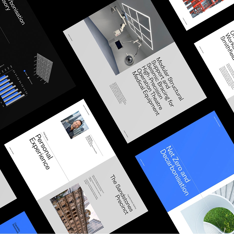
Explore Placebo Estudio’s exceptional approach to editorial design and visual identity in their latest work for CCE’s Capability Statement.

Placebo Estudio, a distinguished name in the design industry, recently undertook an inspiring project for Concept Consulting Engineers (CCE). Their task was to craft the editorial design for CCE’s Capability Statement, a comprehensive showcase of the engineering consultancy’s diverse projects.

Based in Sydney, Australia, Concept Consulting Engineers specialize in boutique structural and façade consultancy. They sought to encapsulate their expertise and project spectrum in a visually striking format. This is where Placebo Estudio’s expertise came into play, transforming the Capability Statement into not just a document, but a piece of art.

Placebo Estudio’s approach to this project is a testament to their mastery in blending simplicity with functionality. Their design philosophy pivots around minimalist yet impactful elements. The grid system they employed is a perfect example of this balance. It harmonizes photographs with spot-on typography, creating a visual narrative that is both compelling and informative.

A standout feature of this design is the contrast in typography. The interplay of type sizes for titles and headings injects a dynamic rhythm into the pages. Columns of text are punctuated with cleverly placed dividers, reminiscent of a well-composed poster. This thoughtful structuring of content enhances readability while maintaining aesthetic appeal.

The color palette is another element where Placebo Estudio’s expertise shines. The use of black, white, and a striking blue as an accent creates a bold statement. This palette is not just visually pleasing but also strategically used to underscore key information. Designers alternating white and black text over blue backgrounds is a striking choice, showcasing their ability to play with color for maximum impact.

In conclusion, Placebo Estudio’s work on the Capability Statement for CCE is a masterclass in editorial design. It demonstrates how visual identity can be powerfully conveyed through thoughtful design elements. Their work is not just a representation of CCE’s projects but an embodiment of design excellence itself, setting a high bar in the field of editorial design and visual identity.

Editorial design artifacts 

editorial design  magazine brochure brand identity graphic design  typography   Engineer Identity art direction  brochure design printeditorial design  magazine brochure brand identity graphic design  typography   Engineer Identity art direction  brochure design printeditorial design  magazine brochure brand identity graphic design  typography   Engineer Identity art direction  brochure design printeditorial design  magazine brochure brand identity graphic design  typography   Engineer Identity art direction  brochure design printeditorial design  magazine brochure brand identity graphic design  typography   Engineer Identity art direction  brochure design printeditorial design  magazine brochure brand identity graphic design  typography   Engineer Identity art direction  brochure design printeditorial design  magazine brochure brand identity graphic design  typography   Engineer Identity art direction  brochure design printeditorial design  magazine brochure brand identity graphic design  typography   Engineer Identity art direction  brochure design printeditorial design  magazine brochure brand identity graphic design  typography   Engineer Identity art direction  brochure design printeditorial design  magazine brochure brand identity graphic design  typography   Engineer Identity art direction  brochure design printeditorial design  magazine brochure brand identity graphic design  typography   Engineer Identity art direction  brochure design print

For more information check out ©PLACEBO, Behance and INSTAGRAM.

I’m in love with the entire Tiffany x Pokémon collection

Original Source: https://www.creativebloq.com/news/tiffany-pokemon-jewellery-collection

Gold Pikachu, I choose you.

Cold Days, Shining Lights (December 2023 Wallpapers Edition)

Original Source: https://smashingmagazine.com/2023/11/desktop-wallpaper-calendars-december-2023/

As the year is coming to a close, many of us feel rushed, meeting deadlines, finishing off projects, or preparing for the upcoming holiday season. So how about some beautiful, wintery desktop wallpapers to cater for some fresh inspiration and get you in the mood for December (and the holidays, if you’re celebrating)?

As every month since more than twelve years already, artists and designers from across the globe once again got their ideas bubbling and created wallpaper designs to sweeten up your December. They come in versions with and without a calendar and can be downloaded for free. As a little bonus goodie, we also added a selection of December favorites from our wallpapers archives to the collection that are just waiting to be rediscovered, so maybe you’ll spot one of your almost-forgotten favorites in here, too.

A huge thank you to everyone who took on the challenge and shared their designs with us — this post wouldn’t exist without you! Happy December!

You can click on every image to see a larger preview,
We respect and carefully consider the ideas and motivation behind each and every artist’s work. This is why we give all artists the full freedom to explore their creativity and express emotions and experience through their works. This is also why the themes of the wallpapers weren’t anyhow influenced by us but rather designed from scratch by the artists themselves.
Submit a wallpaper!
Did you know that you could get featured in our next wallpapers post, too? We are always looking for creative talent.

Sweet Ride Into The Holidays

“December is here, and that means it’s time to celebrate National Cookie Day and embrace the festive spirit with our snowboarding cookie man! This delightful illustration captures the essence of the holidays — a time for indulging in our favorite treats, spreading joy, and creating unforgettable memories with loved ones. So, grab your favorite cookie, put on your coziest pajamas, and let the holiday cheer commence!” — Designed by PopArt Studio from Serbia.

preview
with calendar: 320×480, 640×480, 800×480, 800×600, 1024×768, 1024×1024, 1152×864, 1280×720, 1280×800, 1280×960, 1280×1024, 1400×1050, 1440×900, 1600×1200, 1680×1050, 1680×1200, 1920×1080, 1920×1200, 1920×1440, 2560×1440
without calendar: 320×480, 640×480, 800×480, 800×600, 1024×768, 1024×1024, 1152×864, 1280×720, 1280×800, 1280×960, 1280×1024, 1400×1050, 1440×900, 1600×1200, 1680×1050, 1680×1200, 1920×1080, 1920×1200, 1920×1440, 2560×1440

Spread The Soul Of Christmas

Designed by Bhabna Basak from India.

preview
with calendar: 1440×900, 1600×1200, 1680×1050, 1680×1200, 1920×1080, 1920×1200, 1920×1440, 2560×1440
without calendar: 1440×900, 1600×1200, 1680×1050, 1680×1200, 1920×1080, 1920×1200, 1920×1440, 2560×1440

Views Of The Alhambra

“This last month of the year, we wanted to put the focus on one of the most visited buildings in the world whose beauty is unmatched: the Alhambra in Granada. Together, from the Albaicín we will see this beauty and tour its gardens and rooms. We wish you a very merry Christmas and all the best for the coming year!” — Designed by Veronica Valenzuela Jimenez from Spain.

preview
with calendar: 640×480, 800×480, 1024×768, 1280×720, 1280×800, 1440×900, 1600×1200, 1920×1080, 1920×1440, 2560×1440
without calendar: 640×480, 800×480, 1024×768, 1280×720, 1280×800, 1440×900, 1600×1200, 1920×1080, 1920×1440, 2560×1440

Energy Drink

Designed by Ricardo Gimenes from Sweden.

preview
with calendar: 640×480, 800×480, 800×600, 1024×768, 1024×1024, 1152×864, 1280×720, 1280×800, 1280×960, 1280×1024, 1366×768, 1400×1050, 1440×900, 1600×1200, 1680×1050, 1680×1200, 1920×1080, 1920×1200, 1920×1440, 2560×1440, 3840×2160
without calendar: 640×480, 800×480, 800×600, 1024×768, 1024×1024, 1152×864, 1280×720, 1280×800, 1280×960, 1280×1024, 1366×768, 1400×1050, 1440×900, 1600×1200, 1680×1050, 1680×1200, 1920×1080, 1920×1200, 1920×1440, 2560×1440, 3840×2160

Go Green

“We’d love to invite you to our free Smashing Meets Goes Green on Thursday, December 7, to explore how we as designers and developers can make our world just a bit greener.” — Designed by Ricardo Gimenes from Sweden.

preview
with calendar: 640×480, 800×480, 800×600, 1024×768, 1024×1024, 1152×864, 1280×720, 1280×800, 1280×960, 1280×1024, 1366×768, 1400×1050, 1440×900, 1600×1200, 1680×1050, 1680×1200, 1920×1080, 1920×1200, 1920×1440, 2560×1440, 3840×2160
without calendar: 640×480, 800×480, 800×600, 1024×768, 1024×1024, 1152×864, 1280×720, 1280×800, 1280×960, 1280×1024, 1366×768, 1400×1050, 1440×900, 1600×1200, 1680×1050, 1680×1200, 1920×1080, 1920×1200, 1920×1440, 2560×1440, 3840×2160

Dear Moon, Merry Christmas

Designed by Vlad Gerasimov from Georgia.

preview
without calendar: 800×480, 800×600, 1024×600, 1024×768, 1152×864, 1280×720, 1280×800, 1280×960, 1280×1024, 1366×768, 1400×1050, 1440×900, 1440×960, 1600×900, 1600×1200, 1680×1050, 1680×1200, 1920×1080, 1920×1200, 1920×1440, 2560×1440, 2560×1600, 2880×1800, 3072×1920, 3840×2160, 5120×2880

The House On The River Drina

“Since we often yearn for a peaceful and quiet place to work, we have found inspiration in the famous house on the River Drina in Bajina Bašta, Serbia. Wouldn’t it be great being in nature, away from the civilization, swaying in the wind and listening to the waves of the river smashing your house, having no neighbors to bother you? Not sure about the Internet, though…” — Designed by PopArt Studio from Serbia.

preview
without calendar: 640×480, 800×600, 1024×1024, 1152×864, 1280×720, 1280×960, 1280×1024, 1366×768, 1400×1050, 1440×900, 1600×1200, 1680×1200, 1920×1080, 1920×1200, 1920×1440, 2560×1440

Cardinals In Snowfall

“During Christmas season, in the cold, colorless days of winter, Cardinal birds are seen as symbols of faith and warmth. In the part of America I live in, there is snowfall every December. While the snow is falling, I can see gorgeous Cardinals flying in and out of my patio. The intriguing color palette of the bright red of the Cardinals, the white of the flurries and the brown/black of dry twigs and fallen leaves on the snow-laden ground fascinates me a lot, and inspired me to create this quaint and sweet, hand-illustrated surface pattern design as I wait for the snowfall in my town!” — Designed by Gyaneshwari Dave from the United States.

preview
without calendar: 640×960, 768×1024, 1280×720, 1280×1024, 1366×768, 1920×1080, 2560×1440

Winter Coziness At Home

“Winter coziness that we all feel when we come home after spending some time outside or when we come to our parental home to celebrate Christmas inspired our designers. Home is the place where we can feel safe and sound, so we couldn’t help ourselves but create this calendar.” — Designed by MasterBundles from Ukraine.

preview
without calendar: 320×480, 640×480, 800×480, 800×600, 1024×768, 1024×1024, 1152×864, 1280×720, 1280×800, 1280×960, 1280×1024, 1366×768, 1400×1050, 1440×900, 1600×1200, 1680×1050, 1680×1200, 1920×1080, 1920×1200, 1920×1440, 2560×1440

Bat Christmas

Designed by Ricardo Gimenes from Sweden.

preview
without calendar: 640×480, 800×480, 800×600, 1024×768, 1024×1024, 1152×864, 1280×720, 1280×800, 1280×960, 1280×1024, 1366×768, 1400×1050, 1440×900, 1600×1200, 1680×1050, 1680×1200, 1920×1080, 1920×1200, 1920×1440, 2560×1440, 3840×2160

Enchanted Blizzard

“A seemingly forgotten world under the shade of winter glaze hides a moment where architecture meets fashion and change encounters steadiness.” — Designed by Ana Masnikosa from Belgrade, Serbia.

preview
without calendar: 320×480, 640×480, 800×480, 800×600, 1024×768, 1024×1024, 1152×864, 1280×720, 1280×800, 1280×960, 1280×1024, 1400×1050, 1440×900, 1600×1200, 1680×1050, 1680×1200, 1920×1080, 1920×1200, 1920×1440, 2560×1440

King Of Pop

Designed by Ricardo Gimenes from Sweden.

preview
without calendar: 640×480, 800×480, 800×600, 1024×768, 1024×1024, 1152×864, 1280×720, 1280×800, 1280×960, 1280×1024, 1366×768, 1400×1050, 1440×900, 1600×1200, 1680×1050, 1680×1200, 1920×1080, 1920×1200, 1920×1440, 2560×1440, 3840×2160

Winter Garphee

“Garphee’s flufiness glowing in the snow.” Designed by Razvan Garofeanu from Romania.

preview
without calendar: 320×480, 1024×768, 1024×1024, 1280×800, 1280×1024, 1366×768, 1440×900, 1680×1050, 1920×1080, 1920×1200, 2560×1440

Joy To The World

“Joy to the world, all the boys and girls now, joy to the fishes in the deep blue sea, joy to you and me.” — Designed by Morgan Newnham from Boulder, Colorado.

preview
without calendar: 320×480, 640×480, 800×480, 800×600, 1024×768, 1024×1024, 1152×864, 1280×720, 1280×800, 1280×960, 1280×1024, 1400×1050, 1440×900, 1600×1200, 1680×1050, 1680×1200, 1920×1080, 1920×1200, 1920×1440, 2560×1440

Ninja Santa

Designed by Elise Vanoorbeek from Belgium.

preview
without calendar: 1280×1024, 1366×768, 1400×1050, 1440×900, 1600×1200, 1680×1050, 1680×1200, 1920×1080, 1920×1440, 2560×1440

Hot Hot Hot!

Designed by Ricardo Gimenes from Sweden.

preview
without calendar: 640×480, 800×480, 800×600, 1024×768, 1024×1024, 1152×864, 1280×720, 1280×800, 1280×960, 1280×1024, 1366×768, 1400×1050, 1440×900, 1600×1200, 1680×1050, 1680×1200, 1920×1080, 1920×1200, 1920×1440, 2560×1440, 3840×2160

Christmas Cookies

“Christmas is coming and a great way to share our love is by baking cookies.” — Designed by Maria Keller from Mexico.

preview
without calendar: 320×480, 640×480, 640×1136, 750×1334, 800×480, 800×600, 1024×768, 1024×1024, 1152×864, 1242×2208, 1280×720, 1280×800, 1280×960, 1280×1024, 1366×768, 1400×1050, 1440×900, 1600×1200, 1680×1050, 1680×1200, 1920×1080, 1920×1200, 1920×1440, 2560×1440, 2880×1800

Sweet Snowy Tenderness

“You know that warm feeling when you get to spend cold winter days in a snug, homey, relaxed atmosphere? Oh, yes, we love it, too! It is the sentiment we set our hearts on for the holiday season, and this sweet snowy tenderness is for all of us who adore watching the snowfall from our windows. Isn’t it romantic?” — Designed by PopArt Studio from Serbia.

preview
without calendar: 320×480, 640×480, 800×480, 800×600, 1024×768, 1024×1024, 1152×864, 1280×720, 1280×800, 1280×960, 1280×1024, 1366×768, 1400×1050, 1440×900, 1600×1200, 1680×1050, 1680×1200, 1920×1080, 1920×1200, 1920×1440, 2560×1440

All That Belongs To The Past

“Sometimes new beginnings make us revisit our favorite places or people from the past. We don’t visit them often because they remind us of the past but enjoy the brief reunion. Cheers to new beginnings in the new year!” Designed by Dorvan Davoudi from Canada.

preview
without calendar: 800×480, 800×600, 1024×1024, 1152×864, 1280×720, 1280×800, 1280×960, 1280×1024, 1366×768, 1400×1050, 1440×900, 1600×1200, 1680×1050, 1680×1200, 1920×1080, 1920×1200, 1920×1440, 2560×1440

Trailer Santa

“A mid-century modern Christmas scene outside the norm of snowflakes and winter landscapes.” Designed by Houndstooth from the United States.

preview
without calendar: 1024×1024, 1280×800, 1280×1024, 1440×900, 1680×1050, 2560×1440

Getting Hygge

“There’s no more special time for a fire than in the winter. Cozy blankets, warm beverages, and good company can make all the difference when the sun goes down. We’re all looking forward to generating some hygge this winter, so snuggle up and make some memories.” — Designed by The Hannon Group from Washington D.C.

preview
without calendar: 320×480, 640×480, 800×600, 1024×768, 1280×960, 1440×900, 1600×1200, 1680×1050, 1680×1200, 1920×1080, 1920×1440, 2560×1440

December Through Different Eyes

“As a Belgian, December reminds me of snow, cosiness, winter, lights, and so on. However, in the Southern Hemisphere, it is summer at this time. With my illustration I wanted to show the different perspectives on December. I wish you all a Merry Christmas and Happy New Year!” — Designed by Jo Smets from Belgium.

preview
without calendar: 320×480, 800×480, 1280×800, 1280×1024, 1920×1080, 2560×1440

Ice Flowers

“I took some photos during a very frosty and cold week before Christmas.” Designed by Anca Varsandan from Romania.

preview
without calendar: 1024×768, 1280×800, 1440×900, 1680×1050, 1920×1200

Bathtub Party Day

“December 5th is also known as Bathtub Party Day, which is why I wanted to visualize what celebrating this day could look like.” — Designed by Jonas Vanhamme from Belgium.

preview
without calendar: 320×480, 640×480, 800×480, 800×600, 1024×768, 1280×720, 1280×800, 1280×960, 1400×1050, 1600×1200, 1680×1200, 1920×1080, 1920×1200, 1920×1440, 2560×1440, 2560×1600

Silver Winter

Designed by Violeta Dabija from Moldova.

preview
without calendar: 1024×768, 1280×800, 1440×900, 1680×1050, 1920×1200, 2560×1440

Christmas Fail

Designed by Elise Vanoorbeek from Belgium.

preview
without calendar: 1024×768, 1024×1024, 1152×864, 1280×720, 1280×800, 1280×960, 1280×1024, 1366×768, 1400×1050, 1440×900, 1600×1200, 1680×1050, 1680×1200, 1920×1080, 1920×1200, 1920×1440, 2560×1440

Catch Your Perfect Snowflake

“This time of year, people tend to dream big and expect miracles. Let your dreams come true!” Designed by Igor Izhik from Canada.

preview
without calendar: 800×480, 800×600, 1024×768, 1024×1024, 1152×864, 1280×720, 1280×800, 1280×960, 1280×1024, 1400×1050, 1440×900, 1600×1200, 1680×1050, 1680×1200, 1920×1080, 1920×1200, 1920×1440, 2560×1440, 2560×1600

Dream What You Want To Do

“The year will end, hope the last month, you can do what you want to do, seize the time, cherish yourself, expect next year we will be better!” — Designed by Hong Zi-Qing from Taiwan.

preview
without calendar: 1024×768, 1152×864, 1280×720, 1280×960, 1366×768, 1400×1050, 1530×900, 1600×1200, 1920×1080, 1920×1440, 2560×1440

Time For Reindeer, Snowflakes And Jingle Bells

“Christmas is a time you get homesick, even when you’re home! Christmas reminds me of Harry Potter and his holidays when he would be longing to visit the Weasleys and have a Christmas feast with them at their table! The snowflakes, the Christmas tree, bundles of presents, and the lip smacking feast all gives you a reason to celebrate and stay happy amidst all odds! Life is all about celebration! Christmas is a reason to share the joy of happiness, peace and love with all, your near and dear ones.” — Designed by Acodez IT Solutions from India.

preview
without calendar: 320×480, 640×480, 800×480, 800×600, 1024×768, 1024×1024, 1152×864, 1280×720, 1280×960, 1280×1024, 1366×768, 1400×1050, 1440×900, 1600×1200, 1680×1050, 1680×1200, 1920×1080, 1920×1200, 1920×1440, 2560×1440

Winter Wonderland

“‘Winter is the time for comfort, for good food and warmth, for the touch of a friendly hand and for a talk beside the fire: it is the time for home.’ (Edith Sitwell) — Designed by Dipanjan Karmakar from India.

preview
without calendar: 1280×720, 1280×800, 1280×960, 1280×1024, 1366×768, 1400×1050, 1440×900, 1600×1200, 1680×1050, 1680×1200, 1920×1080, 1920×1440, 2560×1440

Cold Outside

“In December it is cold outside, so cute giraffe with scarf.” — Designed by Kim Lemin from Belgium.

preview
without calendar: 320×480, 640×480, 800×600, 1280×800, 1280×960, 1440×900, 1680×1200, 1920×1080, 2560×1440, 2560×2560

Christmas Lights Under The Sea

“Jellyfish always reminded me of Christmas because of the shiny magic they create. Lights of hope in the deep blue sea.” — Designed by Marko Stupić from Zagreb, Croatia.

preview
without calendar: 640×480, 800×600, 1024×768, 1152×864, 1280×720, 1280×960, 1400×1050, 1600×1200, 1920×1080, 1920×1440, 2560×1440

Christmas Time

Designed by Sofie Keirsmaekers from Belgium.

preview
without calendar: 320×480, 1024×1024, 1280×1024, 1440×900, 1920×1200, 2560×1440

Happy Holidays

Designed by Ricardo Gimenes from Sweden.

preview
without calendar: 640×480, 800×480, 800×600, 1024×768, 1024×1024, 1152×864, 1280×720, 1280×800, 1280×960, 1280×1024, 1366×768, 1400×1050, 1440×900, 1600×1200, 1680×1050, 1680×1200, 1920×1080, 1920×1200, 1920×1440, 2560×1440, 3840×2160

3 Essential Design Trends, December 2023

Original Source: https://www.webdesignerdepot.com/essential-design-trends-december/

While we love the holidays, too much of a seasonal theme can get overwhelming. Thankfully, these design trends strike a nice balance.

How to use the File System in Node.js

Original Source: https://www.sitepoint.com/accessing-the-file-system-in-node-js/?utm_source=rss

How to use the File System in Node.js

Learn the basics of the Node.js file system module, which provides an API for writing files to the macOS, Windows and Linux file systems.

Continue reading
How to use the File System in Node.js
on SitePoint.

How to Create a Sortable and Filterable Table in React

Original Source: https://www.sitepoint.com/create-sortable-filterable-table-react/?utm_source=rss

How to Create a Sort & Filterable Table in React

Learn how to create a sortable and filterable table component in React, which helps to speed up processes when working with large data sets.

Continue reading
How to Create a Sortable and Filterable Table in React
on SitePoint.