Collective #660

Original Source: http://feedproxy.google.com/~r/tympanus/~3/QSbXhSak_Hg/

Inspirational Website of the Week: Paul & Henriette

Sharp minimalism with great typography and a focus on beautiful image and layout animations. Our pick this week.

Get inspired

Collective 643 item image

Our Sponsor
Instant websites for your clients with Divi Layout Packs

With the Divi Layout Packs you’ll get world-class designs ready to be used for your client projects.

Check it out

The Humble <img> Element And Core Web Vitals

An excerpt from Addy Osmani’s new book Image Optimization.

Read it

Portfolio 2021 technical case study — Rendering a whole HTML website in WebGL

Martin Laxenaire shows how he created his portfolio using his own vanilla JavaScript open source tools.

Read it

Container Queries Explainer & Proposal

Miriam Eric Suzanne explains the proposed solution for container queries and shows how to use them.

Read it

The State of CSS Cross-Browser Development

Ahmad Shadeed thoughts on why cross-browser development is better than in the past.

Read it

Mantine

Mantine is a React components and hooks library with native dark theme support and focus on usability, accessibility and developer experience.

Check it out

Two options for using custom properties

Peter-Paul Koch shares an efficient way of using custom properties for component styling.

Read it

Toggling CSS Custom Properties with Radio Buttons

Michelle Barker explains how to use custom properties for a toggle functionality.

Read it

Iconic

A fantastic set of pixel-perfect icons with new icons added every week.

Check it out

Scroll-Linked Animations with CSS Scroll-Timeline (CSS Café)

Bramus shares his talk covering Scroll-Linked Animations with CSS @scroll-timeline on CSS Café.

Check it out

Fluid Typography

Calculate CSS declarations for beautiful fluid typography headings. Made by Erik André.

Check it out

(t,i,x,y,z) => “creative code golfing”

A minimalist three-dimensional coding environment. Control 8x8x8 dots with a single JavaScript function.

Check it out

Fower

A utility-first CSS-in-JS library for rapid UI development.

Check it out

CSS Cuboid Generator

A fantastic cuboid generator made with React and Prism by Jhey.

Check it out

Profiling site speed with the Chrome DevTools Performance tab

Learn how to use the Chrome DevTools Performance tab to measure and improve the speed of your website.

Read it

3D Game Shaders For Beginners

A step-by-step guide to implementing SSAO, depth of field, lighting, normal mapping, and more for your 3D game.

Check it out

Exploring color-contrast() for the First Time

Chris Coyier explores the color-contrast() function in CSS which is freshly supported in Safari Technical Preview 122.

Read it

How to Create Actions for Selected Text With the Selection API

Preethi shows how to reveal an options panel when selecting text on a website.

Read it

Don’t Confuse Function Expressions and Function Declarations in JavaScript

What are the differences between function declarations and function expressions in JavaScript? Find out in this article by Dmitri Pavlutin.

Read it

Measuring Web Performance in 2021: The Definitive Guide

A guide to the metrics, methods, and measurements of web performance in 2021.

Check it out

From Our Blog
Dynamic CSS Masks with Custom Properties and GSAP

Learn how to animate CSS masks based on the cursor position using GSAP and custom properties for a unique spotlight effect in this article by Michelle Barker.

Read it

The post Collective #660 appeared first on Codrops.

Create Beautiful WordPress Pages with Optimized Images Using Elementor and ImageEngine

Original Source: https://www.webdesignerdepot.com/2021/05/create-beautiful-wordpress-pages-with-optimized-images-using-elementor-and-imageengine/

WordPress powers nearly 40% of all websites, thanks to its commitment to making publication possible for everyone, for free. Combined with premium plugins and themes, it’s possibly the ultimate tool for building attractive, unique, and feature-rich websites without any coding or design experience.

However, you do pay the price for this experience, with WordPress and its third-party products not always being built for performance – whether it’s page loading times or SEO.

Image optimization is a particularly big concern. Images are one, if not the largest, contributors to page weight, and it’s growing significantly by the year. So, while images are crucial for beautifying your website pages, they are also one of the biggest factors slowing it down.

In terms of image optimization, WordPress+Elementor brings very little to the table. WordPress core now comes with both responsive syntax and lazy-loading. Elementor itself also only comes with responsive syntax out-of-the-box. However, these are baseline techniques for image optimization that will deliver the bare minimum of improvements.

This means that, while Elementor makes it easy to design sweet-looking WordPress pages (with tonnes of creatively utilized images), you will probably pay the price when it comes to performance. But don’t worry. We will show you how to dramatically improve web performance by over 30 points on scoring tools like Google’s PageSpeed Insight. 

Why Optimize Your Elementor Images with ImageEngine?

In general, image CDNs use various techniques to get image payloads as small as possible and deliver image content faster, all while minimizing the visual impact. ImageEngine is no different in that regard.

Firstly, ImageEngine, when used in auto mode, will apply all of the following optimizations that web performance tools like Google’s PageSpeed Insight recommend. For example:

Properly size images – ImageEngine automatically resizes images for optimal size-to-quality ratios depending on the screen size of the user device. ImageEngine supports Retina devices.
Efficiently encode images – Applies different rates of compression depending on the PPI of the user devices. For example, ImageEngine adapts and more aggressively compresses on higher PPI devices without losing visual quality.
Next-gen format conversion – Automatically converts images to the optimal next-gen format according to the browser, device, or OS. ImageEngine can convert images to WebP or JPEG-2000 as well as GIFs to MP4 or WebP.  AVIF is also available in a manual directive mode.
Strip unnecessary metadata

While these features are standard for most image CDNs, ImageEngine is unique for its use of WURFL device detection. This gives ImageEngine much deeper insight into the user device accessing a website page and, by extension, its images. Using the screen size, resolution, PPI, etc., ImageEngine can make more intelligent decisions regarding how to reduce image payloads while maintaining visual quality.

This is why ImageEngine brands itself as an “intelligent, device-aware” image CDN and why it can reduce image payloads by as much as 80% (if not more).

ImageEngine also provides a proprietary CDN service to accelerate image delivery. The CDN consists of 20 globally positioned PoPs with the device-aware logic built-in. This allows you to deliver image content faster in different regions while also serving images straight from the cache with a ~98% hit ratio.

ImageEngine also supports Chrome’s save data setting. If someone has a slow connection or has activated this setting, ImageEngine will automatically compress image payloads even more, to provide a better user experience on slower connections.

How to Use ImageEngine with WordPress and Elementor

If you’re using WordPress and Elementor, then chances are you want to spend as little time on development and other technicalities as possible. Luckily, ImageEngine is a highly streamlined tool that requires little to no effort to integrate or maintain with a WordPress site.

Assuming you already have a WordPress website with Elementor, here are the step-by-step instructions to use ImageEngine:

Go to ImageEngine.io and sign up for a 30-day free trial.
Provide ImageEngine with the URL of the website you want to optimize.
Create an account (or sign up with your existing Google, GitHub, or ScientiaMobile account).
Provide ImageEngine with the current origin where your images are served from. If you upload images to your WordPress website as usual, then that means providing your WordPress website address again.
Finally, ImageEngine will generate an ImageEngine delivery address for you from where your optimized images will be served. This typically takes the form of: {randomstring}.cdn.imgeng.in. You can change the delivery address to something more meaningful from the dashboard, such as myimages.cdn.imgeng.in.

Now, to set up ImageEngine on your WordPress website:

Go to the WordPress dashboard and head to Plugins -> Add New.
Search for the “Image CDN” plugin by ImageEngine. When you find it, install and activate the plugin.

Go to Settings -> Image CDN. OK, so this is the ImageEngine plugin dashboard. To configure it, all you need to do is:

a. Copy the delivery address you got from ImageEngine above and paste it in the “Delivery Address” field.

b. Tick the “Enable ImageEngine” box.

That’s literally it. All images that you use on your WordPress/Elementor pages should now be served via the ImageEngine CDN already optimized. 

ImageEngine is largely a “set-it-and-forget-it” tool. It will provide the best results in auto mode with no user input. However, you can override some of ImageEngine’s settings from the dashboard or by using URL directives to manipulate images.

For example, you can resize an image to 300 px width and convert it to WebP by changing the src attribute like this:

<img src=”https://myimages.cdn.imgeng.in/wp-content/uploads/2021/03/banner-logo.png?imgeng=/w_300/f_webp”>

However, use this only when necessary, as doing so will limit ImageEngine’s adaptability under different conditions.

What Improvement Can You Expect?

Let’s see what results you can expect from using an image CDN to improve your page loading times.

For this, I created two identical WordPress pages using the Elementor theme. The one page purely relied on WordPress and Elementor, while I installed and set up ImageEngine for the other. The page had some galleries as well as full-size images:

The pages used many high-quality images, as you might expect to find on a professional photography gallery, photography blog, stock photo website, large e-commerce site, etc. I then ran page performance tests using Chrome’s built-in Lighthouse audit tool, choosing scores representing the average results I got for each page.

For thoroughness, I tested both the mobile and desktop performance. However, I focused on the mobile results as these showcase more of the image CDN’s responsive capabilities. Mobile traffic also accounts for the majority share of internet traffic and seems to be the focus for search engines going forward.

So, first of all, let’s see the mobile score for the page without ImageEngine:

As you can see, there was definitely a struggle to deliver the huge amount of image content. Google has shown that 53% of mobile users abandon a page that takes more than 3s to load. So, clearly, this page has major concerns when it comes to user experience and retaining traffic.

The desktop version fared much better, although it still left much to be desired:

When digging into the reasons behind the slowdown, we can identify the following problems:

Most of the issues related somehow to the size and weight of the images. As you can see, Lighthouse identified a 3.8 MB payload while the total image payload of the entire page was close to 40 MB.

Now, let’s see what kind of improvement ImageEngine can make to these issues by looking at the mobile score first:

So, as you can see, a major improvement of 30 points over the standard WordPress/Elementor page. The time to load images was cut down by roughly 80% across the key core web vital metrics, such as FCP, LCP, and the overall Speed Index.

In fact, we just reached that critical 3s milestone for the FCP (the largest element on the visible area of the page when it initially loads), which creates the impression that the page has finished loading and will help you retain a lot of mobile traffic.

The desktop score was also much higher, and there was further improvement across the key performance metrics.

If we look at the performance problems still present, we see that images are almost completely removed as a concern. We also managed to bring down the initial 3.8 MB payload to around 1.46 MB, which is a ~62% reduction:

An unfortunate side effect of using WordPress and WordPress plugins is that you will almost inevitably face a performance hit due to all the additional JavaScript and CSS. This is part of the reason why we didn’t see even larger improvements. That’s the price you pay for the convenience of using these tools.

That being said, the more images you have on your pages, and the larger their sizes, the more significant the improvement will be.

It’s also worth noting that lazy-loaded images were loaded markedly faster with ImageEngine if you quickly scroll down the page, again making for an improved user experience.

Thanks to its intelligent image compression, there was also no visible loss in image quality, as you can see from this comparison:

Conclusion

So, as you can see, we can achieve significant performance improvements on image-heavy websites by using the ImageEngine image CDN, despite inherent performance issues using a CMS. This will translate to happier users, better search engine rankings, and an overall more successful website.

The best part is that ImageEngine stays true to the key principles of WordPress. You don’t have to worry about any of the nuts and bolts on the inside. And, ImageEngine will automatically adjust automation strategies as needed, future-proofing you against having to occasionally rework images for optimization.

Source

p img {display:inline-block; margin-right:10px;}
.alignleft {float:left;}
p.showcase {clear:both;}
body#browserfriendly p, body#podcast p, div#emailbody p{margin:0;}

The post Create Beautiful WordPress Pages with Optimized Images Using Elementor and ImageEngine first appeared on Webdesigner Depot.

How To Power Through Designer Apathy

Original Source: https://www.webdesignerdepot.com/2021/05/how-to-power-through-designer-apathy/

Sometimes you just don’t give a damn anymore. Possibly the only thing worse than designer’s block is designer’s apathy: that sinking feeling you get when you realize that you just don’t care about this particular piece of work anymore is disheartening.

The dread of going back to it is paralyzing.

There are many reasons you can stop caring about your work. Maybe you’ve just done the same thing too many times in a row. Maybe your client is insisting on asking for things you know won’t work for them. Maybe something much more important just happened in your life, and you’ve got bigger things to worry about. You could be discouraged by the apparent ‘sameness’ of bandwagon-hopping designs.

I’ve been not caring about my work ever since I was first asked to pick up my toys

Whatever the reason, we all experience times when we know exactly what we have to do… we just don’t care.

I’m something of an expert on this phenomenon. I’ve been not caring about my work ever since I was first asked to pick up my toys. Worse, I have the attention span of a goldfish, even now.

Web design is different. When I discovered it, it was new, exciting, and I could do it on the computer. I loved it, and I still do. Writing code that makes design happen in a browser window will never get old for me.

But even so, sometimes, a particular project will make me want to throw up my hands in exasperation and play video games ‘til Judgement Day. I’d welcome Skynet with tacos and RPGs.

So what do we do about it? First, answer this question: who is the project for?

For A Client

If the project is for a client, it’s just gotta get done. There’s no way around that. You made a commitment. You’re going to follow through and give it your best possible effort because you’re a professional. Anything less would be wrong.

However, that doesn’t mean you have to just power through with only coffee and misery for company. There are things you can do to make the work easier on yourself. The less miserable you are while you work, the better quality you can deliver.

For Yourself

There are a couple of schools of thought here. The first is that it’s perfectly fine to give up on personal projects when you stop caring. I mean, it’s your free time. Why spend it on something you don’t care about?

On the other hand, is a commitment made to yourself any less important than a commitment made to someone else? Many people seem to be perfectly fine with breaking promises to themselves when they’d never willingly do that to a client. Is that wrong?

I usually buy myself a drink and forgive myself, but it’s worth thinking about.

The deciding factor for me is whether my personal project will have any sort of lasting benefit. If whatever I’m designing, writing, or making counts as a long-term investment in my career or quality of life, then it absolutely has to get done, even when I’m not feeling it. Otherwise, I call it a learning experience and move on.

How To Power Through

So, for whatever reason — whether because you have to, or you want to — you’re gonna power through. Here are five ways to do it in style:

1. Start

The hardest part of doing work you don’t care about is starting. This is when you’ll be tempted to procrastinate until the last minute. Try not to.

2. Switch To A Different Part Of The Project

If you can safely (without causing problems) work on a different aspect of the project for a while, try that. The mere variety, the break from the work in front of you before, can boost your morale.

Indeed, working on a different part of the project can give you ideas of getting the most troubling bits done faster or more easily.

3. Do Something Old In A New Way

This one has its pros and cons.

Pro: You can look at this project as a chance to try out a new grid framework, script, code editor, or another tool of some kind. Injecting the process of discovery into an otherwise boring project can make it a lot more fun and even make you look forward to working on it.

Con: You’ll need to plan for extra hours and use some version control; because bringing a new tool or process into play is almost guaranteed to make something interesting go wrong — when this happens, you probably shouldn’t bill the client for the extra hours spent on StackOverflow.

4) Make Like Aziz Ansari And Treat Yo’self

Celebrate the milestones of your project. Don’t celebrate with video games if you need to get any more work done that day. That can go very wrong. But do celebrate. Reward yourself because you’re doing something difficult.

Have a snack. Give yourself a round of applause. Whatever it takes, make yourself look forward.

5) Outsource It

As a last resort, you can always outsource the project to someone else. Just make sure it’s someone you can trust to deliver the same quality of work you would normally provide yourself. Make sure to check it over before handing it off to a client.

Alternatively, you could just outsource the bits of the work that you don’t like. Either way, this is a risky strategy because whoever you outsource to might experience delays or, ironically, not care about the project.

Conclusion

You can do it! I believe in you. The really, really boring projects can seem like huge sinkholes of sadness, but they don’t last forever.


Featured image via Pexels.

Source

p img {display:inline-block; margin-right:10px;}
.alignleft {float:left;}
p.showcase {clear:both;}
body#browserfriendly p, body#podcast p, div#emailbody p{margin:0;}

The post How To Power Through Designer Apathy first appeared on Webdesigner Depot.

Reducing HTML Payload With Next.js (Case Study)

Original Source: https://smashingmagazine.com/2021/05/reduce-data-sent-client-nextjs/

I know what you are thinking. Here’s another article about reducing JavaScript dependencies and the bundle size sent to the client. But this one is a bit different, I promise.

This article is about a couple of things that Bookaway faced and we (as a company in the traveling industry) managed to optimize our pages, so that the HTML we send is smaller. Smaller HTML means less time for Google to download and process those long strings of text.

Usually, the HTML code size is not a big issue, especially for small pages, not data-intensive, or pages that are not SEO-oriented. However, in our pages, the case was different as our database stores lots of data, and we need to serve thousands of landing pages at scale.

You may be wondering why we need such a scale. Well, Bookaway works with 1,500 operators and provide over 20k services in 63 countries with 200% growth year over year (pre Covid-19). In 2019, we sold 500k tickets a year, so our operations are complex and we need to showcase it with our landing pages in an appealing and fast manner. Both for Google bots (SEO) and to actual clients.

In this article, I’ll explain:

how we found the HTML size is too big;
how it got reduced;
the benefits of this process (i.e. creating improved architecture, improving ode organization, providing a straightforward job for Google to index tens of thousands of landing pages, and serving much fewer bytes to the client — especially suitable for people with slow connections).

But first, let’s talk about the importance of speed improvement.

Why Is Speed Improvement Necessary To Our SEO Efforts?

Meet “Web Vitals”, but in particular, meet LCP (Largest Contentful Paint):

“Largest Contentful Paint (LCP) is an important, user-centric metric for measuring perceived load speed because it marks the point in the page load timeline when the page’s main content has likely loaded — a fast LCP helps reassure the user that the page is useful.”

The main goal is to have a small LCP as possible. Part of having a small LCP is to let the user download as small HTML as possible. That way, the user can start the process of painting the largest content paint ASAP.

While LCP is a user-centric metric, reducing it should make a big help to Google bots as Googe states:

“The web is a nearly infinite space, exceeding Google’s ability to explore and index every available URL. As a result, there are limits to how much time Googlebot can spend crawling any single site. Google’s amount of time and resources to crawling a site is commonly called the site’s crawl budget.”

— “Advanced SEO,” Google Search Central Documentation

One of the best technical ways to improve the crawl budget is to help Google do more in less time:

Q: “Does site speed affect my crawl budget? How about errors?”

A: “Making a site faster improves the users’ experience while also increasing the crawl rate. For Googlebot, a speedy site is a sign of healthy servers so that it can get more content over the same number of connections.”

To sum it up, Google bots and Bookaway clients have the same goal — they both want to get content delivered fast. Since our database contains a large amount of data for every page, we need to aggregate it efficiently and send something small and thin to the clients.

Investigations for ways we can improve led to finding that there is a big JSON embedded in our HTML, making the HTML chunky. For that case, we’ll need to understand React Hydration.

React Hydration: Why There Is A JSON In HTML

That happens because of how Server-side rendering works in react and Next.js:

When the request arrives at the server — it needs to make an HTML based on a data collection. That collection of data is the object returned by getServerSideProps.
React got the data. Now it kicks into play in the server. It builds in HTML and sends it.
When the client receives the HTML, it is immediately pained in front of him. In the meanwhile, React javascript is being downloaded and executed.
When javascript execution is done, React kicks into play again, now on the client. It builds the HTML again and attaches event listeners. This action is called hydration.
As React building the HTML again for the hydration process, it requires the same data collection used on the server (look back at 1.).
This data collection is being made available by inserting the JSON inside a script tag with id __NEXT_DATA__.

What Pages Are We Talking About Exactly?

As we need to promote our offerings in search engines, the need for landing pages has arisen. People usually don’t search for a specific bus line’s name, but more like, “How to get from Bangkok to Pattaya?” So far, we have created four types of landing pages that should answer such queries:

City A to City B
All the lines stretched from a station in City A to a station in City B. (e.g. Bangkok to Pattaya)
City
All lines that go through a specific city. (e.g. Cancun)
Country
All lines that go through a specific country. (e.g. Italy)
Station
All lines that go through a specific station. (e.g. Hanoi-airport)

Now, A Look At Architecture

Let’s take a high-level and very simplified look at the infrastructure powering the landing pages we are talking about. Interesting parts lie on 4 and 5. That’s where the wasting parts:

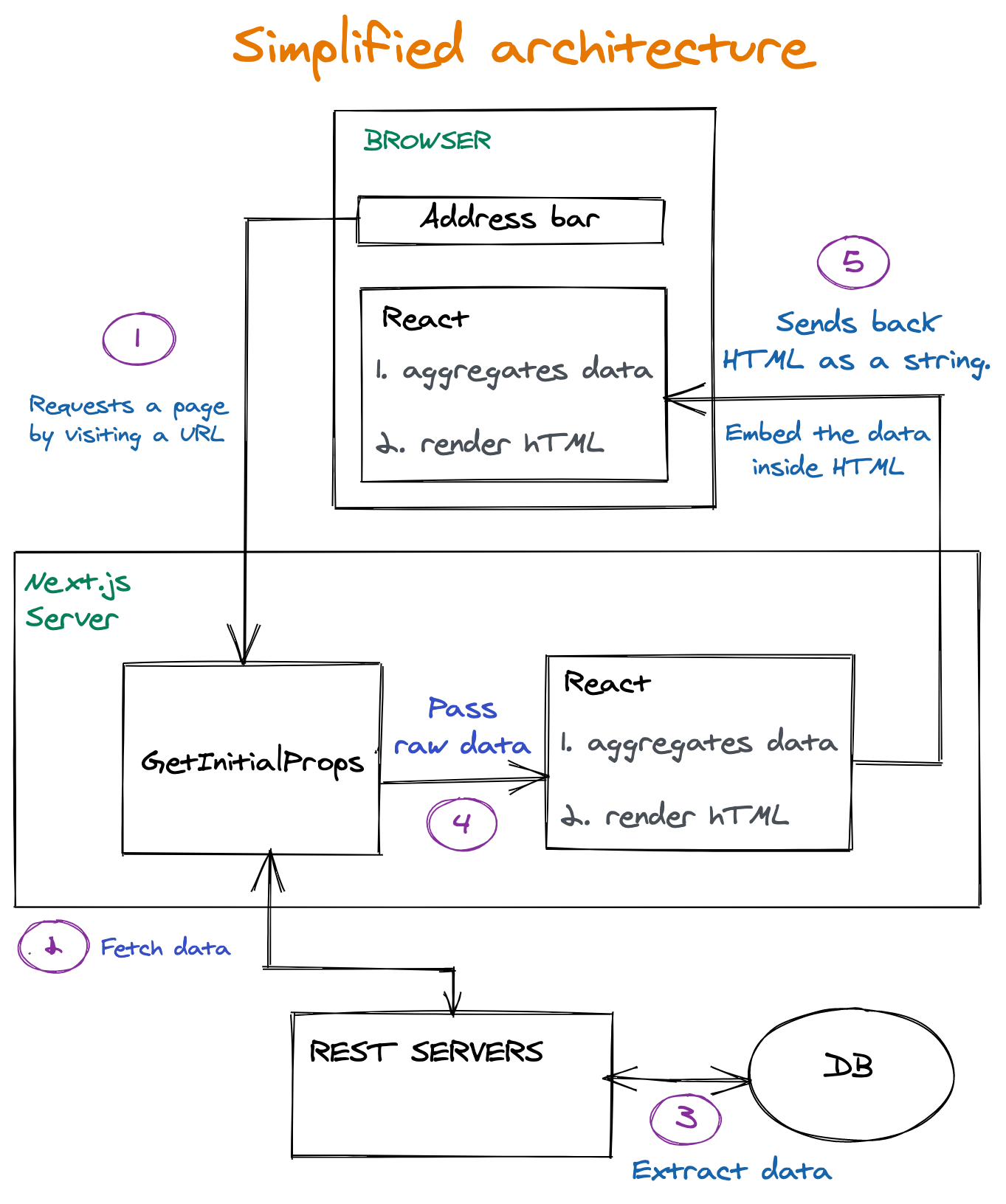
Key Takeaways From The Process

The request is hitting the getInitialProps function. This function runs on the server. This function’s responsibility is to fetch data required for the construction of a page.
The raw data returned from REST Servers passed as is to React.
First, it runs on the server. Since the non-aggregated data was transferred to React, React is also responsible for aggregating the data into something that can be used by UI components (more about that in the following sections)
The HTML is being sent to the client, together with the raw data. Then React is kicking again into play also in the client and doing the same job. Because hydration is needed (more about that in the following sections). So React is doing the data aggregation job twice.

The Problem

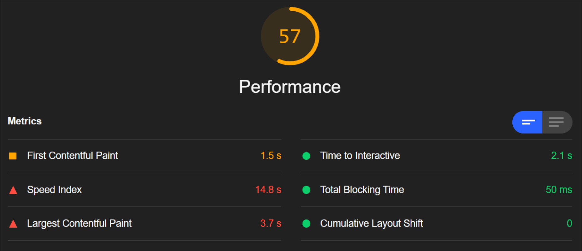
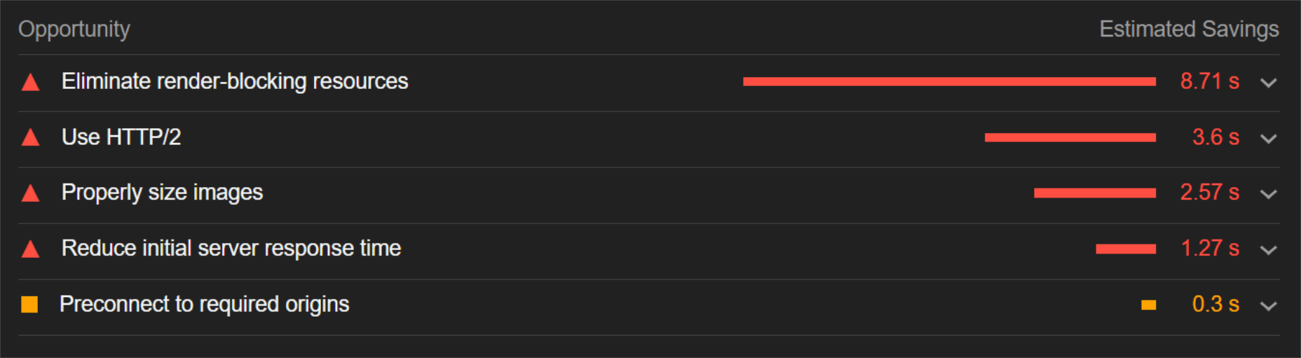
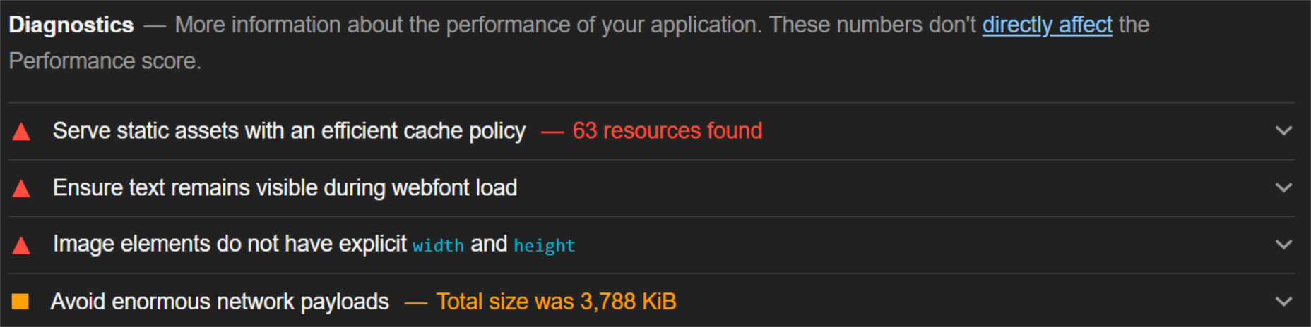
Analyzing our page creation process led us to the finding of Big JSON embedded inside the HTML. Exactly how big is difficult to say. Each page is slightly different because each station or city has to aggregate a different data set. However, it is safe to say that the JSON size could be as big as 250kb on popular pages. It was Later reduced to sizes around 5kb-15kb. Considerable reduction. On some pages, it was hanging around 200-300 kb. That is big.

The big JSON is embedded inside a script tag with id of ___NEXT_DATA___:

<script id=”__NEXT_DATA__” type=”application/json”>
// Huge JSON here.
</script>

If you want to easily copy this JSON into your clipboard, try this snippet in your Next.js page:

copy($(‘#__NEXT_DATA__’).innerHTML)

A question arises.

Why Is It So Big? What’s In There?

A great tool, JSON Size analyzer, knows how to process a JSON and shows where most of the bulk of size resides.

That was our initial findings while examining a station page:

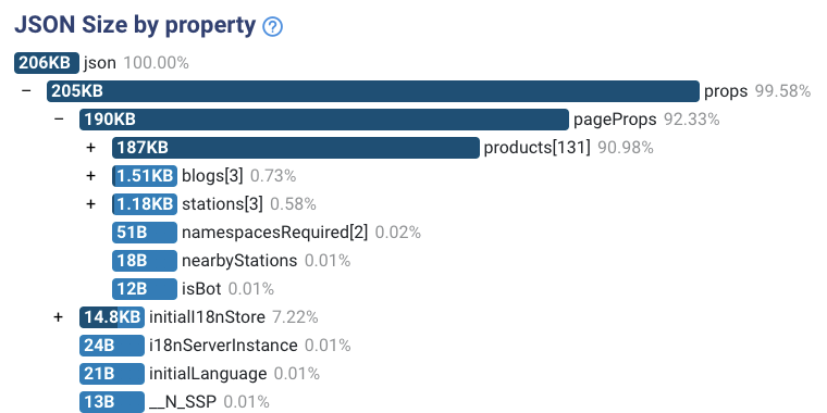
There are two issues with the analysis:

Data is not aggregated.
Our HTML contains the complete list of granular products. We don’t need them for painting on-screen purposes. We do need them for aggregation methods. For example, We are fetching a list of all the lines passing through this station. Each line has a supplier. But we need to reduce the list of lines into an array of 2 suppliers. That’s it. We’ll see an example later.
Unnecessary fields.
When drilling down each object, we saw some fields we don’t need at all. Not for aggregation purposes and not for painting methods. That’s because We fetch the data from REST API. We can’t control what data we fetch.

Those two issues showed that the pages need architecture change. But wait. Why do we need a data JSON embedded in our HTML in the first place? ?

Architecture Change

The issue of the very big JSON had to be solved in a neat and layered solution. How? Well, by adding the layers marked in green in the following diagram:

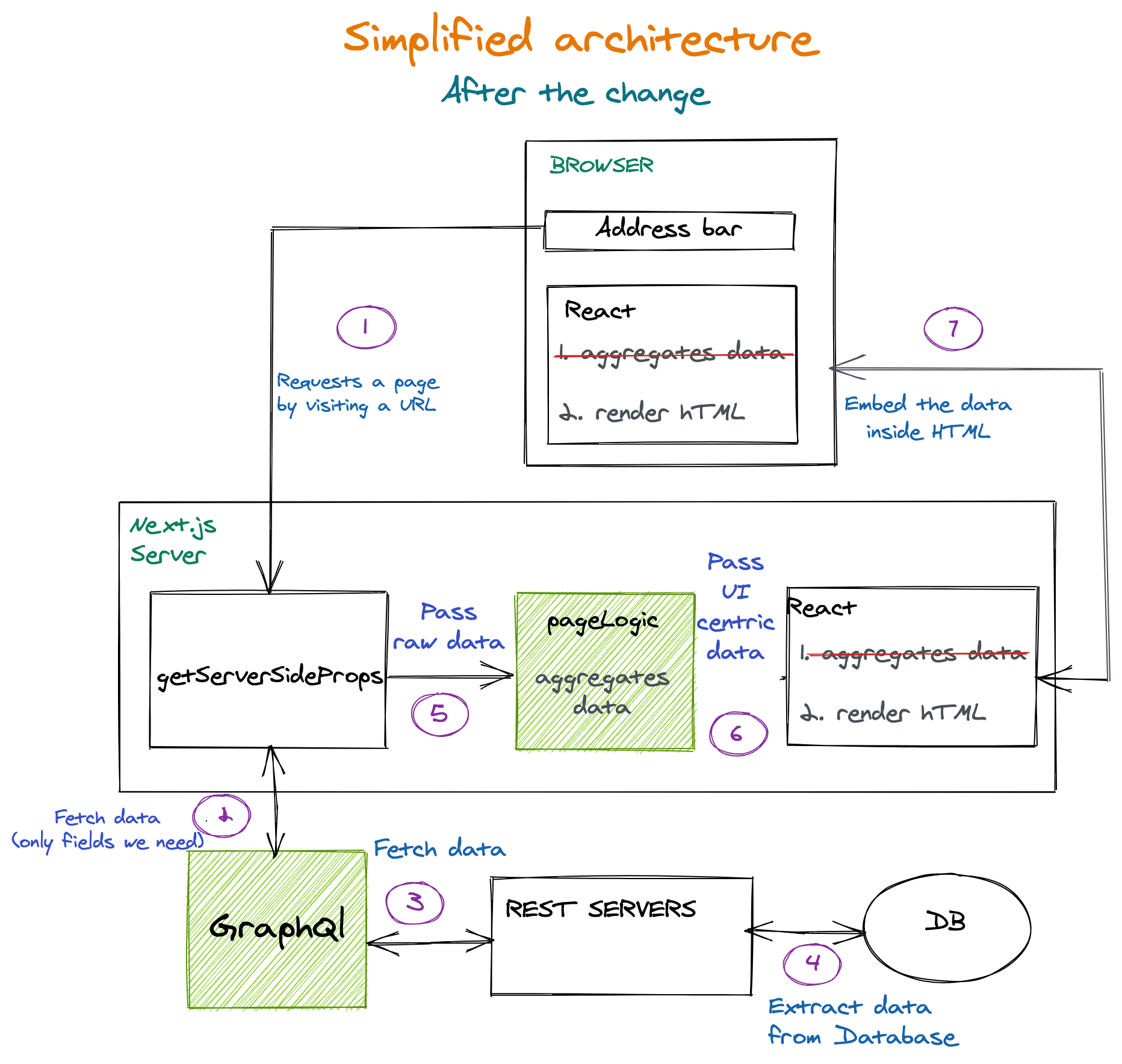
A few things to note:

Double data aggregation was removed and consolidated to just being made just once on the Next.js server only;
Graphql Server layer added. That makes sure we get only the fields we want. The database can grow with many more fields for each entity, but that won’t affect us anymore;
PageLogic function added in getServerSideProps. This function gets non-aggregated data from back-end services. This function aggregates and prepares the data for the UI components. (It runs only on the server.)

Data Flow Example

We want to render this section from a station page:

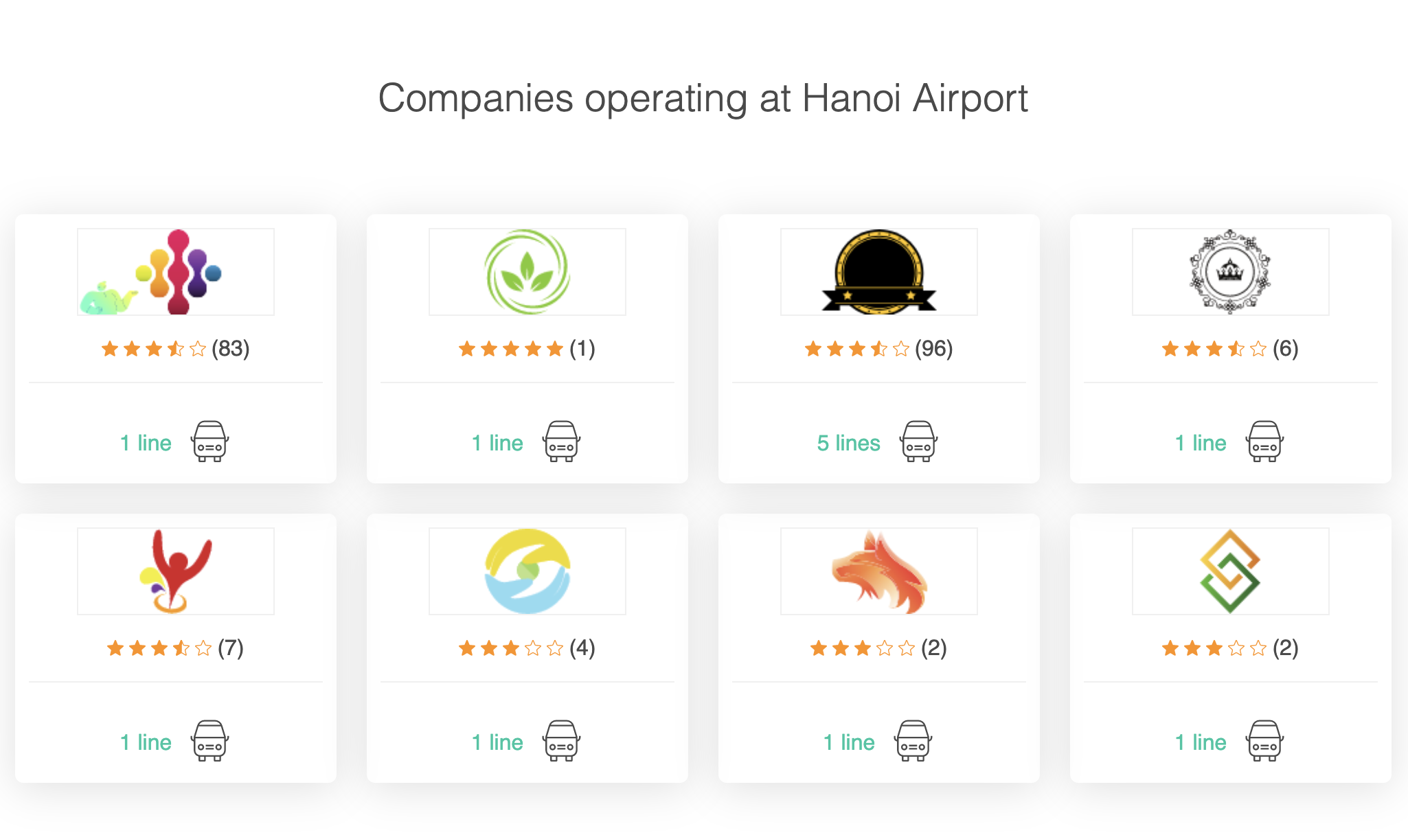
We need to know who are the suppliers are operating in a given station. We need to fetch all lines for the lines REST endpoint. That’s the response we got (example purpose, in reality, it was much larger):

[
{
id: “58a8bd82b4869b00063b22d2”,
class: “Standard”,
supplier: “Hyatt-Mosciski”,
type: “bus”,
},
{
id: “58f5e40da02e97f000888e07a”,
class: “Luxury”,
supplier: “Hyatt-Mosciski”,
type: “bus”,
},
{
id: “58f5e4a0a02e97f000325e3a”,
class: ‘Luxury’,
supplier: “Jones Ltd”,
type: “minivan”,
},
];
[
{ supplier: “Hyatt-Mosciski”, amountOfLines: 2, types: [“bus”] },
{ supplier: “Jones Ltd”, amountOfLines: 1, types: [“minivan”] },
];

As you can see, we got some irrelevant fields. pictures and id are not going to play any role in the section. So we’ll call the Graphql Server and request only the fields we need. So now it looks like this:

[
{
supplier: “Hyatt-Mosciski”,
type: “bus”,
},
{
supplier: “Hyatt-Mosciski”,
type: “bus”,
},
{
supplier: “Jones Ltd”,
type: “minivan”,
},
];

Now that’s an easier object to work with. It is smaller, easier to debug, and takes less memory on the server. But, it is not aggregated yet. This is not the data structure required for the actual rendering.

Let’s send it to the PageLogic function to crunch it and see what we get:

[
{ supplier: “Hyatt-Mosciski”, amountOfLines: 2, types: [“bus”] },
{ supplier: “Jones Ltd”, amountOfLines: 1, types: [“minivan”] },
];

This small data collection is sent to the Next.js page.

Now that’s ready-made for UI rendering. No more crunching and preparations are needed. Also, it is now very compact compared to the initial data collection we have extracted. That’s important because we’ll be sending very little data to the client that way.

How To Measure The Impact Of The Change

Reducing HTML size means there are fewer bits to download. When a user requests a page, it gets fully formed HTML in less time. This can be measured in content download of the HTML resource in the network panel.

Conclusions

Delivering thin resources is essential, especially when it comes to HTML. If HTML is turning out big, we have no room left for CSS resources or javascript in our performance budget.

It is best practice to assume many real-world users won’t be using an iPhone 12, but rather a mid-level device on a mid-level network. It turns out that the performance levels are pretty tight as the highly-regarded article suggests:

“Thanks to progress in networks and browsers (but not devices), a more generous global budget cap has emerged for sites constructed the “modern” way. We can now afford ~100KiB of HTML/CSS/fonts and ~300-350KiB of JS (gzipped). This rule-of-thumb limit should hold for at least a year or two. As always, the devil’s in the footnotes, but the top-line is unchanged: when we construct the digital world to the limits of the best devices, we build a less usable one for 80+% of the world’s users.”

Performance Impact

We measure the performance impact by the time it takes to download the HTML on slow 3g throttling. that metric is called “content download” in Chrome Dev Tools.

Here’s a metric example for a station page:

HTML size (before gzip)
HTML Download time (slow 3G)

Before
370kb
820ms

After
166
540ms

Total change
204kb decrease
34% Decrease

Layered Solution

The architecture changes included additional layers:

GraphQl server: helpers with fetching exactly what we want.
Dedicated function for aggregation: runs only on the server.

Those changed, apart from pure performance improvements, also offered much better code organization and debugging experience:

All the logic regarding reducing and aggregating data now centralized in a single function;
The UI functions are now much more straightforward. No aggregation, no data crunching. They are just getting data and painting it;
Debugging server code is more pleasant since we extract only the data we need—no more unnecessary fields coming from a REST endpoint.

The cheapest laptops on sale in April 2021: Our expertly selected deals

Original Source: http://feedproxy.google.com/~r/CreativeBloq/~3/rn01j1v0Sw0/cheap-laptop-deals

Get a bargain with the cheapest laptops on sale.

15 essential tools for graphic designers in 2021

Original Source: http://feedproxy.google.com/~r/CreativeBloq/~3/e4PswyNEMP0/tools-every-graphic-designer-should-have-6133208

Our guide to the must-have kit for creative professionals.

Adobe Creative Cloud now integrate with Google Docs and Slides

Original Source: http://feedproxy.google.com/~r/abduzeedo/~3/6Cb_NMVjywk/adobe-creative-cloud-now-integrate-google-docs-and-slides

Adobe Creative Cloud now integrate with Google Docs and Slides

abduzeedo05.04.21

Adobe today announced that Creative Cloud Libraries now integrate with Google Docs and Slides, allowing teams to directly access and use elements like brand colors, character styles and graphics inside the documents and presentations they use every day. Building on Adobe Creative Cloud’s existing integration with Gmail, this Google Workspace integration unlocks even smoother workflows for teams of all sizes to share ideas, get feedback and collaborate on work. 

Adobe also launched a new Adobe Fonts Recommendations feature that recommends similar or complementary fonts to a user’s selected font. Now, users can keep the creativity flowing by eliminating typographic dead ends and browsing recommended fonts at the top of a font family page.


Walmart calls out Kanye West for copycat logo

Original Source: http://feedproxy.google.com/~r/CreativeBloq/~3/qzo2o_eN7e0/walmart-kanye-west-logo

Things are not so sunny for Yeezy.

Rotated 3D Letters and Image Hover Effect

Original Source: http://feedproxy.google.com/~r/tympanus/~3/nYvjdBPY464/

Some months ago, I wrote about how to achieve a hover effect for a menu where an image would appear for each item. Then we saw how to apply this in Exploring Animations for Menu Hover Effects. When I discovered the fantastic site of One up Studio I wanted to combine their cool 3D-ish menu hover effect with that previous animation, so this is a little fusion between the two.

The 3D motion is slightly different and an image is shown in an angle, creating a playful look.

I really hope you like this little experiment and find it useful. Thanks for visiting!

The post Rotated 3D Letters and Image Hover Effect appeared first on Codrops.