Popular Design News of the Week: May 10 2021 – May 16, 2021

Original Source: https://www.webdesignerdepot.com/2021/05/popular-design-news-of-the-week-may-10-2021-may-16-2021/

Each day design fans submit incredible industry stories to our sister-site, Webdesigner News. Our colleagues sift through it, selecting the very best stories from the design, UX, tech, and development worlds and posting them live on the site.

The best way to keep up with the most important stories for web professionals is to subscribe to Webdesigner News or check out the site regularly. However, in case you missed a day this week, here’s a handy compilation of the top curated stories from the last seven days. Enjoy!

Little Smashing Stories

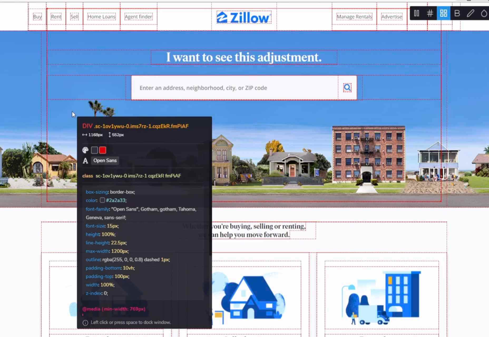
All-In-One Browser Extension For Web Development

26 Exciting New Tools For Designers, May 2021

10+ CSS Wave Animation Examples

Speeding Up Development Process with Bootstrap 5

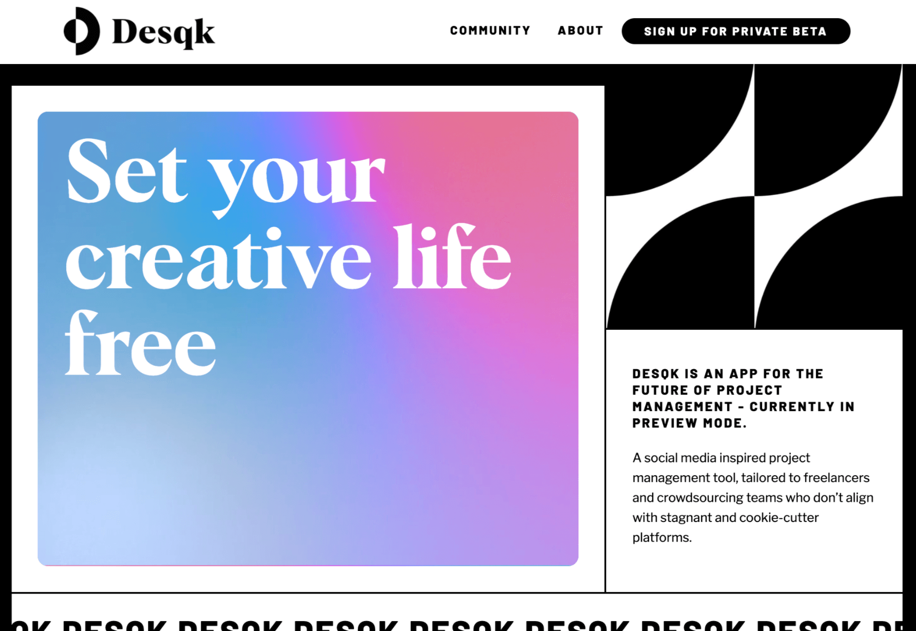
Desqk: Set Your Creative Life Free

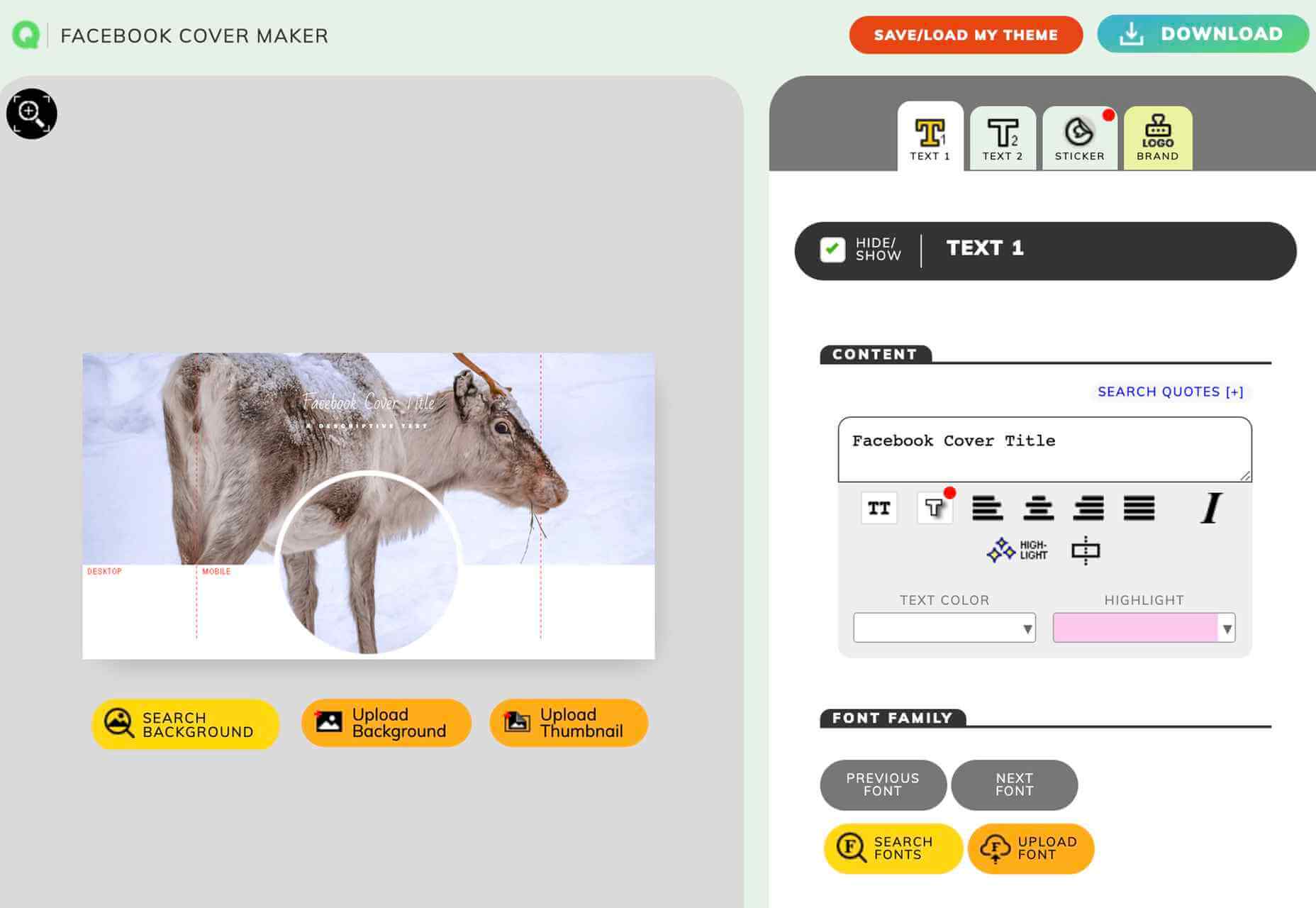
Facebook Cover Maker

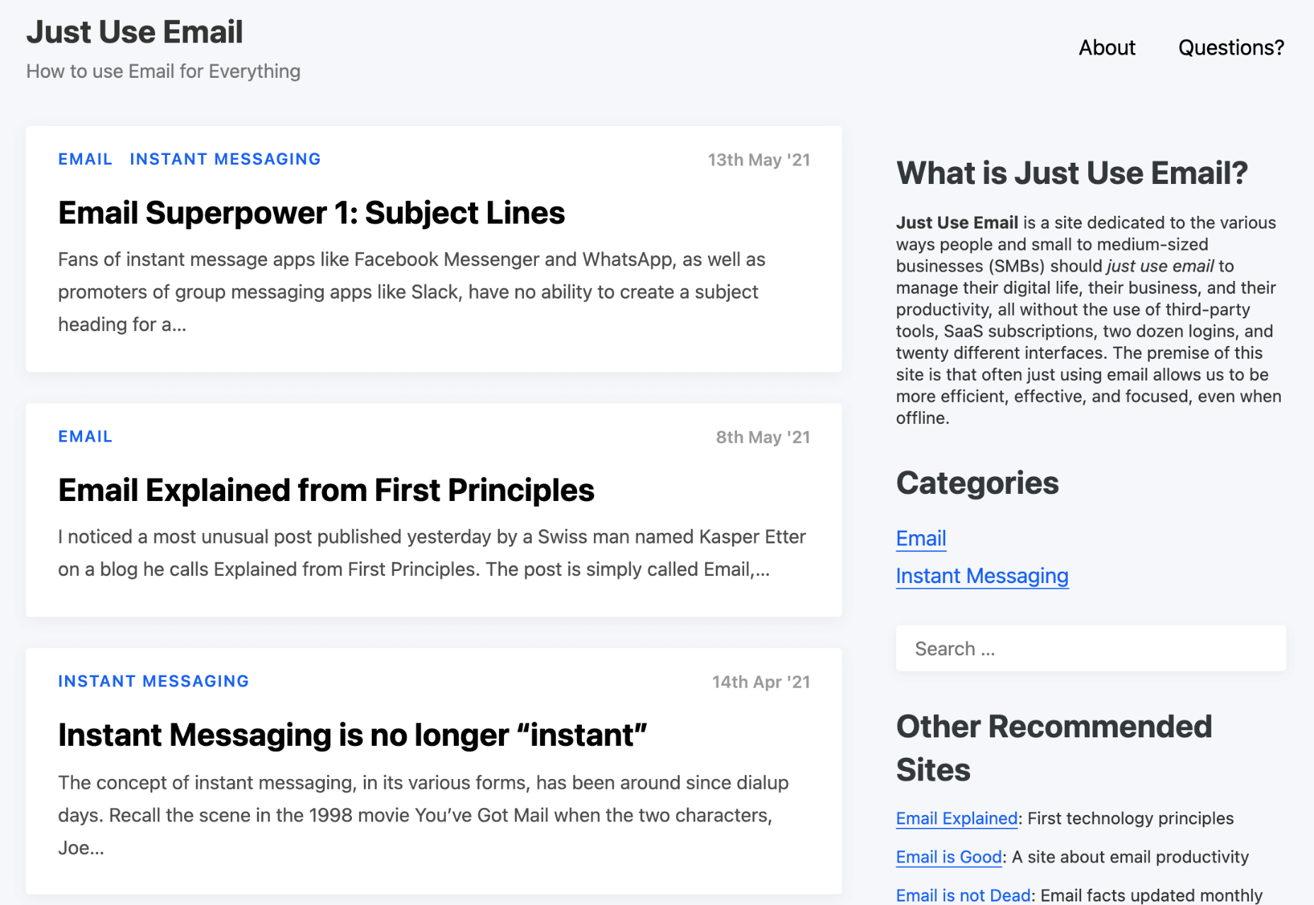
Just Use Email

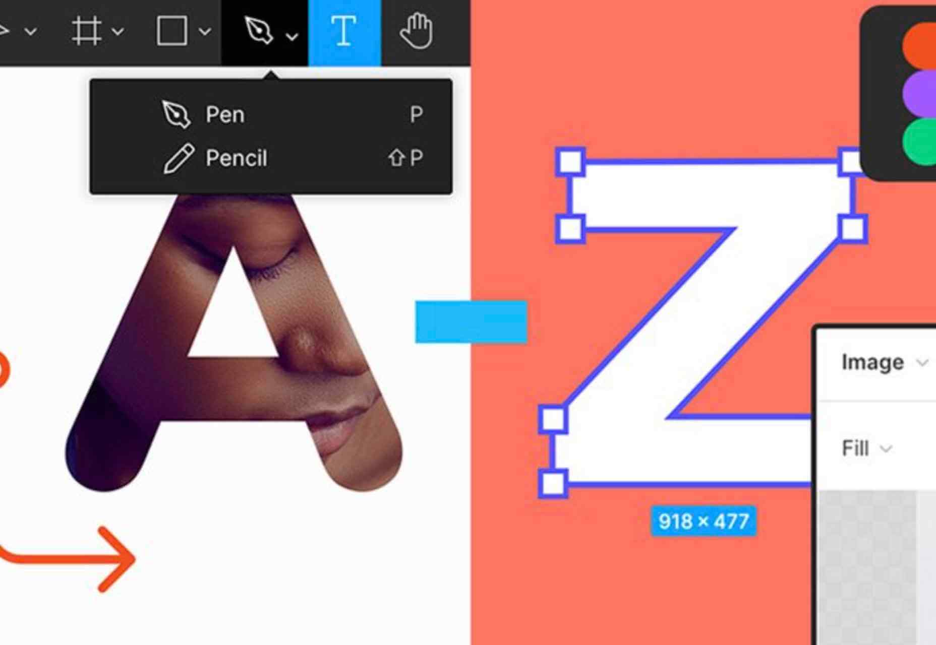
A to Z of Figma: Tips & Tricks!

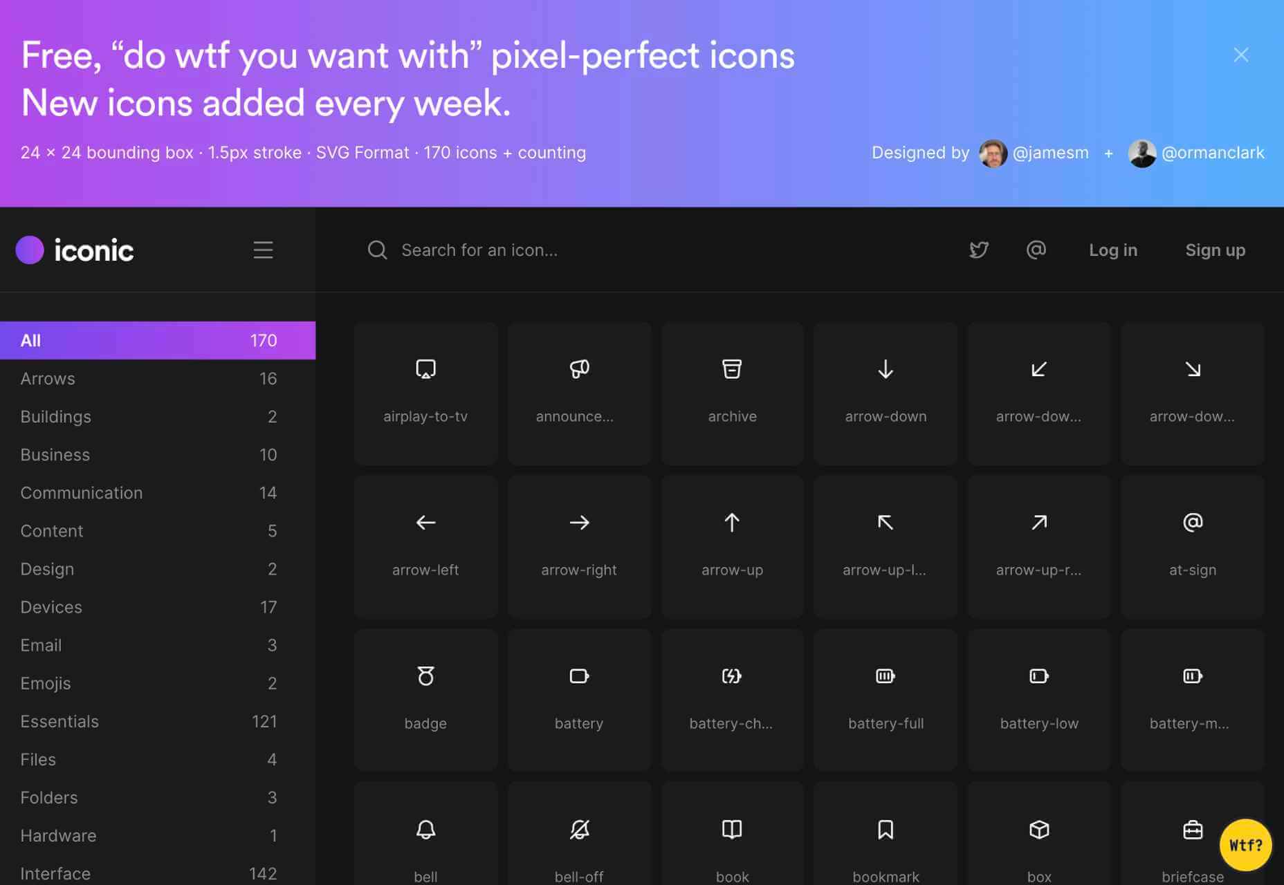
Free, “Do WTF You Want With” Pixel-Perfect Icons

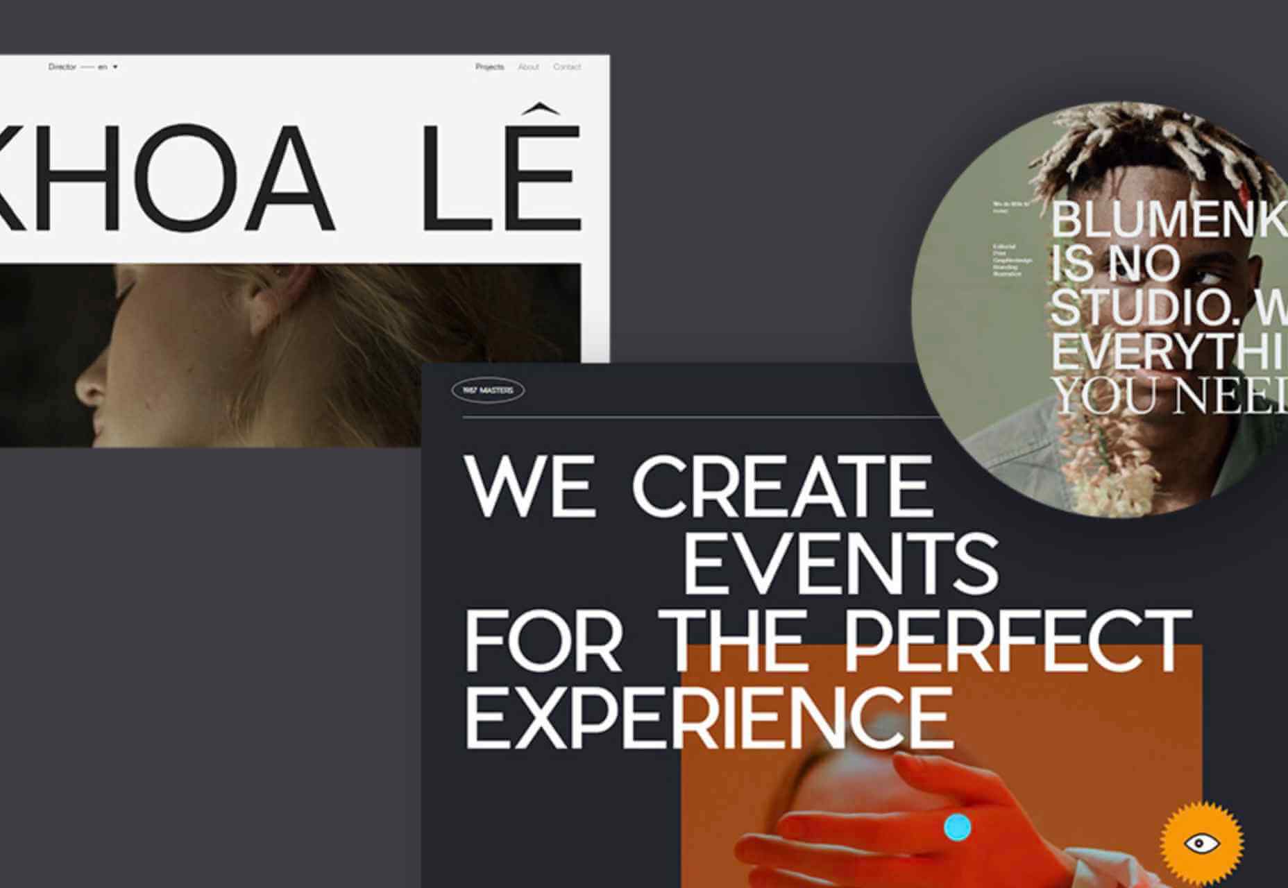
The Use of Uppercase Sans Serif Typography in Modern Web Design

Yes, You Need A Design Process

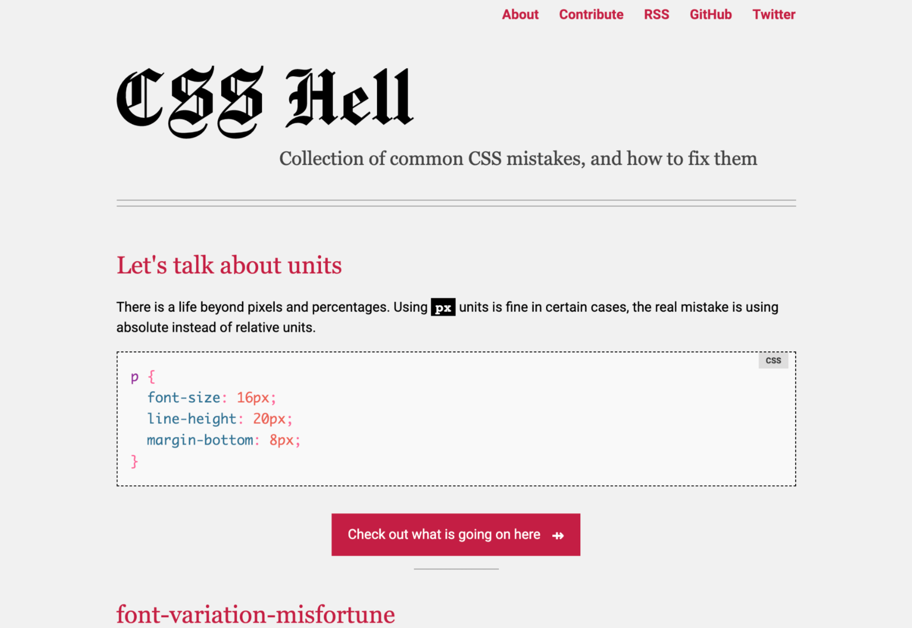
CSS Hell

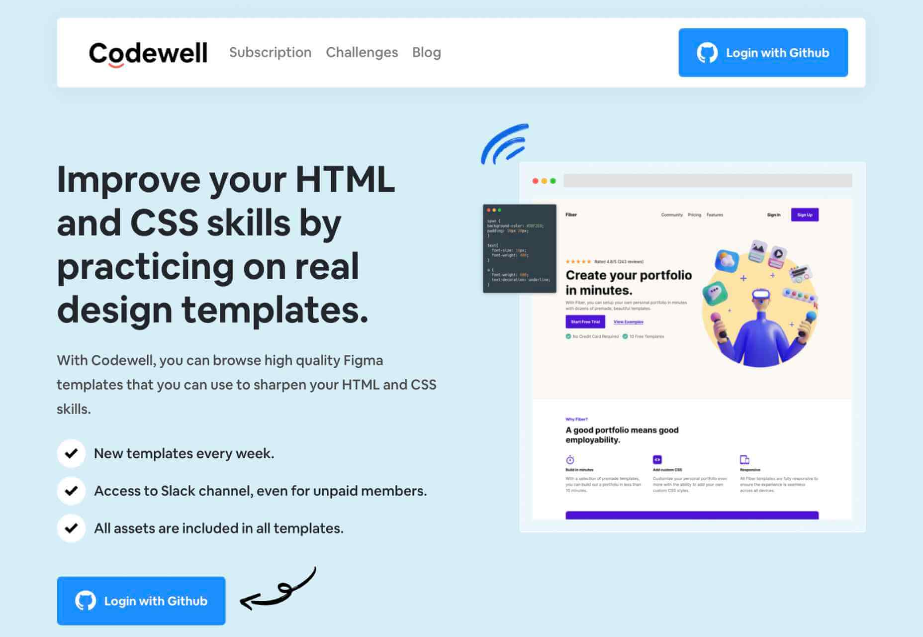
Codewell: Improve Your HTML And CSS Skills

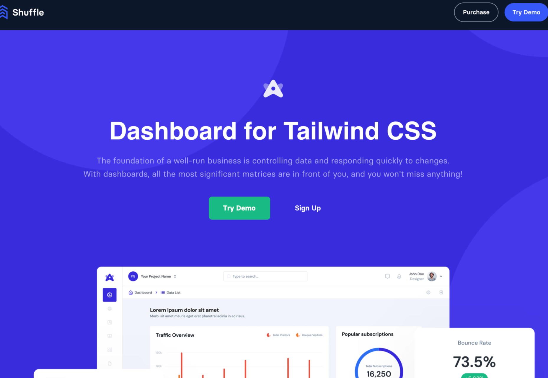
Dashboard for Tailwind CSS

Source

p img {display:inline-block; margin-right:10px;}
.alignleft {float:left;}
p.showcase {clear:both;}
body#browserfriendly p, body#podcast p, div#emailbody p{margin:0;}

The post Popular Design News of the Week: May 10 2021 – May 16, 2021 first appeared on Webdesigner Depot.

UX Design Doesn’t End With Your Website

Original Source: https://www.webdesignerdepot.com/2021/05/ux-design-doesnt-end-with-your-website/

User experience design is something that most of us associate with websites. But why isn’t it something we extend beyond the website?

Here’s why I ask this:

As a consumer, it’s so rare that your only interaction with a brand is through its website. Take an ecommerce site, for example. You buy a product from it, and then what happens?

You get a confirmation email;
You get another email when the package ships;
You might get another email or SMS notification when the package is delivered;
You retrieve the package and open it;
You open up your purchase and use it.

These are all an extension of that initial user experience on the site. If there’s just one hiccup along the way, it could easily erode the trust and happiness you felt after quickly finding and buying what you needed on the site.

So, what I’d like to do today is look at 10 areas where UX design should extend beyond the website to ensure that the frictionless experience started there remains untarnished.

Extending UX Design Beyond the Website

As a web designer, you might be thinking that this part of the user experience doesn’t fall under the umbrella of your responsibilities. And you may be right about that.

For brands to truly be successful and profitable, someone needs to carefully examine the bigger picture and ensure that the user experience is flawless no matter how far away from the site it is. At the very least, you should share the UX research and strategy you do for a client’s site so their team can ensure it carries over to other areas of the business.

Here are some things to think about:

1. Mobile App

It’s not uncommon for websites to have mobile app counterparts these days. The layout doesn’t need to be identical since mobile users tend to behave differently than those on desktop.

That said, an app shouldn’t force users accustomed to the desktop experience to re-learn how to navigate or engage with the brand. So, the branding, UI design, speed, security, and navigation all need to be on par with what’s already been established in terms of usability.

2. Email

Most websites have a direct connection to email. For example, blog newsletters, purchase confirmation emails, and lead generation follow-ups all start on the website.

Consumers are well aware that when they hand over their email address, they will receive an email in return. In many cases, those emails are welcomed when they’re done right. But if something feels off, that bridge could easily burn between brand and consumer.

To preserve the UX, emails should come with the following:

The same branding and visual style as the website;
A personalized subject line, greeting, or offer;
Consistent messaging as the site, especially when it comes to the CTA.

Another thing to remember is that email isn’t the time to inject dark patterns into the experience. So, the “Unsubscribe” option should be in an easy-to-spot area and a sharply contrasting font color.

3. Social Media

Social media is another channel that’s commonly connected to a website. While you can’t control the aesthetics of social media websites themselves, the visuals and messaging in posts need to be on-brand.

That means that things like memes and emojis — which are popular means of communication on social — should only be used if they’re normally part of the brand identity. If not, you’ll need to find other ways to communicate engagingly.

Another part of the user experience to think about is customer support. Social media is a lot like going into a store. If someone has an issue with what they bought or the service they received, there will be many people around to witness the complaint. Social media only amplifies that — so the quality of customer care needs to be consistent with how the brand handles it everywhere else.

4. SMS

Not every brand will need to be connected to customers via text messaging. eCommerce companies, news sites, and personal services providers likely will, though.

However a brand uses SMS, the same UX guidelines apply here as they do across all other channels:

Keep messages concise;
Make sure they’re relevant and valuable;
Use branded messaging and design;
Don’t abuse the privilege and send too many;
Make it easy to opt out.

Basically, if you can’t make it a valuable extension of the brand’s offering, don’t use it.

5. Phone

Any website that publishes its phone number should expect to receive calls from prospects and customers. While there’s nothing to design here visually, the experience of getting on the phone with a company should be consistent with what they experience elsewhere.

One way to do this is to design an easy-to-follow routing system. It should be simple for callers to figure out which number to choose. What’s more, there should be no endless loops. If a caller has exhausted the options, they should be immediately directed to a representative.

Another way to ensure consistency is to adhere to a script — that goes for call centers for enterprises as well as the local lawyer’s office. Every caller should be greeted with the same tone and handled in the same manner (depending on the situation, of course).

6. Ads

There are a lot of places where brands can advertise these days:

Google search;
Social media;
Ad networks;
TV;
Radio;
Podcasts;
Blogs;
Billboards;
Direct mail.

When designing an ad campaign, there should be consistent messaging, aesthetics (when relevant), and CTAs presented. If branding isn’t consistent from ad to ad, there may be a delay in consumers recognizing the brand or its offer. Or, worse, not recognizing it at all.

7. Packaging

For brands that sell products, you have to think about how the packaging will impact the user experience. There are two types of packages to consider, too.

The first is the product’s own packaging. Branding should be clear as day and consistent with the site they bought it from.

It should also be easy to open. There’s nothing more frustrating than finally getting your purchase, only to realize you need tools to get it out of the packaging.

You also have to think about packaging for products that get shipped.

The product should fit well within the packaging. A too-roomy package will feel downright wasteful. So will excessive bubble wrap and paper filler.

Having a shipping label present in the package is also important. If the website makes it easy to make a purchase, the package should offer a convenient way to return the product if they’re not happy.

8. Product

The product itself has to align with the expectations set by the website.

Take the example of a SaaS. You’ve built an awesome landing page and mobile app store page to promote it. It looks great, it loads fast, and it’s easy to get around. But if the SaaS itself is ugly, disorganized, slow, or otherwise just clunky, all of the work you did to market it will end up being just false advertising.

So, make sure the expectations set before and during purchase naturally carry over to the experience with the product.

9. Business Exterior

For brick-and-mortar companies, the business’s exterior matters just as much as what happens inside it.

The most obvious thing to focus on is the aesthetics of the building. Does it look attractive? Is it in a safe area? Is there clear signage around it? Is it easy to find?

But you also have to think about user experiences that take place outside of the building. For example, there’s now a rise in curbside pickup. There are tons of things that can affect how happy the customer is with the experience — like if the pickup area is hard to find, there are never enough spots or the associates who deliver the orders always seem to be in a foul mood.

The business’s exterior should always set a good impression for what takes place inside.

10. Business Interior

Here are some things to think about when it comes to “designing” business interiors for a good UX:

Decor;
Layout;
Signage;
Furnishings;
Product discoverability;
Availability (of products or people);
Quality of customer service;
Checkout process.

It doesn’t matter what the company does — whether it’s a large retailer like Walmart or your own freelance design business. If a business’s establishment doesn’t look good, operate flawlessly, or provide a good person-to-person experience, it’s going to be very hard to get people to return.

So, all those things you do to design a streamlined website journey should be applied to a bricks-and-mortar business’s interior.

Wrapping Up

Depending on the types of companies you build sites for, some of the channels and suggestions above might not be relevant. Hopefully, this has got you thinking about other ways you (and your clients) can extend the UX design and strategy from the website.

If you can maintain the high-quality user experience from channel to channel, your clients’ brands will get more business, grow their profitability, and see a rise in loyalty, too.


Featured image via Pexels.

Source

p img {display:inline-block; margin-right:10px;}
.alignleft {float:left;}
p.showcase {clear:both;}
body#browserfriendly p, body#podcast p, div#emailbody p{margin:0;}

The post UX Design Doesn’t End With Your Website first appeared on Webdesigner Depot.

Oin Ye Exhibiton — Branding to recognize the Asian culture

Original Source: http://feedproxy.google.com/~r/abduzeedo/~3/6w5c2YAQQFs/oin-ye-exhibiton-branding-recognize-asian-culture

Oin Ye Exhibiton — Branding to recognize the Asian culture
Oin Ye Exhibiton — Brand to recognize the Asian culture

abduzeedo05.17.21

Oin Ye is a ceramic artist from Vietnam. He is more known regionally and sells selected products at exhibitions or art markets. For Oin Ye next exhibition “Collection 2” Studio Fabio Biesel were allowed to develop the branding and visual identity work.

Studio Fabio Biesel created print and editorial products like posters, a catalog, cards, etc. The result is really impressive and very personal.

We want the brand to recognize the Asian culture. — Studio Fabio Biesel

Basic Idea: It’s all about culture. From the beginning the designers were looking for something very cultural and personal. They found the sketches and the artist’s handwriting very strong and memorable. So they used these as the basis for the entire identity. 

Branding

artist,brand,clean,Corporate Design,font,identity,lettering,Studio fabio biesel,Style,typography  artist,brand,clean,Corporate Design,font,identity,lettering,Studio fabio biesel,Style,typography  artist,brand,clean,Corporate Design,font,identity,lettering,Studio fabio biesel,Style,typography  artist,brand,clean,Corporate Design,font,identity,lettering,Studio fabio biesel,Style,typography  artist,brand,clean,Corporate Design,font,identity,lettering,Studio fabio biesel,Style,typography  artist,brand,clean,Corporate Design,font,identity,lettering,Studio fabio biesel,Style,typography  artist,brand,clean,Corporate Design,font,identity,lettering,Studio fabio biesel,Style,typography  artist,brand,clean,Corporate Design,font,identity,lettering,Studio fabio biesel,Style,typography  artist,brand,clean,Corporate Design,font,identity,lettering,Studio fabio biesel,Style,typography  artist,brand,clean,Corporate Design,font,identity,lettering,Studio fabio biesel,Style,typography  artist,brand,clean,Corporate Design,font,identity,lettering,Studio fabio biesel,Style,typography  artist,brand,clean,Corporate Design,font,identity,lettering,Studio fabio biesel,Style,typography  artist,brand,clean,Corporate Design,font,identity,lettering,Studio fabio biesel,Style,typography  artist,brand,clean,Corporate Design,font,identity,lettering,Studio fabio biesel,Style,typography  artist,brand,clean,Corporate Design,font,identity,lettering,Studio fabio biesel,Style,typography  artist,brand,clean,Corporate Design,font,identity,lettering,Studio fabio biesel,Style,typography  artist,brand,clean,Corporate Design,font,identity,lettering,Studio fabio biesel,Style,typography  artist,brand,clean,Corporate Design,font,identity,lettering,Studio fabio biesel,Style,typography  artist,brand,clean,Corporate Design,font,identity,lettering,Studio fabio biesel,Style,typography  artist,brand,clean,Corporate Design,font,identity,lettering,Studio fabio biesel,Style,typography  artist,brand,clean,Corporate Design,font,identity,lettering,Studio fabio biesel,Style,typography  artist,brand,clean,Corporate Design,font,identity,lettering,Studio fabio biesel,Style,typography

For more information make sure to check out:

STUDIOFABIOBIESEL.COM
INSTAGRAM


Collective #661

Original Source: http://feedproxy.google.com/~r/tympanus/~3/lr2ZXc80xwA/

Inspirational Website of the Week: Johannes Kempe

The kind of sites that just make you smile! A clear winner with excellent typography and details that will brighten your day.

Get inspired

A Primer On CSS Container Queries

A practical guide to getting started with container queries by Stephanie Eckles.

Check it out

PINTR

An open source tool to create single line SVGs from drawings. Great for avatars and pen plotter drawings.

Check it out

Our Sponsor
Instant websites for your clients with Divi Layout Packs

With the Divi Layout Packs you’ll get world-class designs ready to be used for your client projects.

Check it out

Frustrating Design Patterns That Need Fixing: Birthday Picker

Starting with the infamous birthday picker, Vitaly Friedman takes a closer look at some frustrating design patterns and explores better alternatives.

Read it

Optimizing Web Vitals using Lighthouse

Addy Osmani writes about finding opportunities to improve user-experience with Chrome’s web tooling.

Read it

Tiny Wins

Joel Califa writes about the big benefits of little changes.

Read it

Component-level art direction with CSS Container Queries

A great article by Sara Soueidan on how to use Container Queries for controlling what images to use in a layout.

Read it

Creating Generative SVG Characters

Michelle Barker shares the process behind a fantastic generative SVG characters demo.

Read it

Debugging vertical layouts in 2021

Chen Hui Jing reiterates an old vertical writing demo that used CSS grid for layout.

Read it

A Look at Tailwind CSS

Ahmad Shadeed’s insightful thoughts on Tailwind CSS.

Read it

SimpleLogin

A great open source email alias solution that helps you protect against spam, phishing and data breaches.

Check it out

zx: A tool for writing better scripts

With this tool you can do Shell scripting in JavaScript.

Check it out

Web History Chapter 8: CSS

Jay Hoffmann takes us back to the past and tells the fascinating story of the very beginnings of CSS and it’s evolution.

Read it

Psychology of Design: 101 Cognitive Biases & Principles That Affect Your UX

A complete list of cognitive biases and design principles. Tons of product examples, tips and checklists to improve your user experience.

Check it out

Aspect-ratio and grid

Peter-Paul Koch encountered a problem with using the new aspect-ratio declaration in a grid context and is asking for help.

Check it out

Making Generative Art with Rust

A great interview with generative artist Alexis André.

Check it out

3Dengine

Victor Ribeiro’s first attempt at a 3D engine using native JavaScript and WebGL.

Check it out

Ideas Filter

A great place to find apps/plugins/extensions from various marketplaces with the option to filter for ideas for which many people pay but that have a low rating.

Check it out

Performance-testing the Google I/O site

Jake Archibald takes a close look at the performance of the Google I/O event pages.

Check it out

Sketch: in 2021 and beyond

Learn what’s new in the latest big update of the Sketch platform.

Check it out

Readme.so

Use readme.so’s markdown editor and ready made templates to easily create a simple README for your repositories.

Check it out

How we use Web Components at GitHub

GitHub has long been a proponent of Web Components. Here’s how we use them.

Read it

CSS Only – Smooth Scrolling Sticky ScrollSpy Navigation

Davor Suljic made this CSS only version of Bramus’ demo.

Check it out

From Our Blog
Noisy Strokes Texture with Three.js and GLSL

Learn how to code up the noisy strokes effect seen on the website of Leonard using Three.js and GLSL.

Check it out

The post Collective #661 appeared first on Codrops.

8 Time Tracking Apps That Work Right Off Browser

Original Source: https://www.hongkiat.com/blog/time-tracking-apps-for-browser/

Time tracking apps work like a boon when you’re working with a remote team or managing freelancers for your projects. There are thousands of time tracking apps for macOS as well as Windows…

Visit hongkiat.com for full content.

Tree-Shaking: A Reference Guide

Original Source: https://smashingmagazine.com/2021/05/tree-shaking-reference-guide/

Before starting our journey to learn what tree-shaking is and how to set ourselves up for success with it, we need to understand what modules are in the JavaScript ecosystem.

Since its early days, JavaScript programs have grown in complexity and the number of tasks they perform. The need to compartmentalize such tasks into closed scopes of execution became apparent. These compartments of tasks, or values, are what we call modules. They’re main purpose is to prevent repetition and to leverage reusability. So, architectures were devised to allow such special kinds of scope, to expose their values and tasks, and to consume external values and tasks.

To dive deeper into what modules are and how they work, I recommend “ES Modules: A Cartoon Deep-Dive”. But to understand the nuances of tree-shaking and module consumption, the definition above should suffice.

What Does Tree-Shaking Actually Mean?

Simply put, tree-shaking means removing unreachable code (also known as dead code) from a bundle. As Webpack version 3’s documentation states:

“You can imagine your application as a tree. The source code and libraries you actually use represent the green, living leaves of the tree. Dead code represents the brown, dead leaves of the tree that are consumed by autumn. In order to get rid of the dead leaves, you have to shake the tree, causing them to fall.”

The term was first popularized in the front-end community by the Rollup team. But authors of all dynamic languages have been struggling with the problem since much earlier. The idea of a tree-shaking algorithm can be traced back to at least the early 1990s.

In JavaScript land, tree-shaking has been possible since the ECMAScript module (ESM) specification in ES2015, previously known as ES6. Since then, tree-shaking has been enabled by default in most bundlers because they reduce output size without changing the program’s behaviour.

The main reason for this is that ESMs are static by nature. Let‘s dissect what that means.

ES Modules vs. CommonJS

CommonJS predates the ESM specification by a few years. It came about to address the lack of support for reusable modules in the JavaScript ecosystem. CommonJS has a require() function that fetches an external module based on the path provided, and it adds it to the scope during runtime.

That require is a function like any other in a program makes it hard enough to evaluate its call outcome at compile-time. On top of that is the fact that adding require calls anywhere in the code is possible — wrapped in another function call, within if/else statements, in switch statements, etc.

With the learning and struggles that have resulted from wide adoption of the CommonJS architecture, the ESM specification has settled on this new architecture, in which modules are imported and exported by the respective keywords import and export. Therefore, no more functional calls. ESMs are also allowed only as top-level declarations — nesting them in any other structure is not possible, being as they are static: ESMs do not depend on runtime execution.

Scope and Side Effects

There is, however, another hurdle that tree-shaking must overcome to evade bloat: side effects. A function is considered to have side effects when it alters or relies on factors external to the scope of execution. A function with side effects is considered impure. A pure function will always yield the same result, regardless of context or the environment it’s been run in.

const pure = (a:number, b:number) => a + b
const impure = (c:number) => window.foo.number + c

Bundlers serve their purpose by evaluating the code provided as much as possible in order to determine whether a module is pure. But code evaluation during compiling time or bundling time can only go so far. Therefore, it’s assumed that packages with side effects cannot be properly eliminated, even when completely unreachable.

Because of this, bundlers now accept a key inside the module’s package.json file that allows the developer to declare whether a module has no side effects. This way, the developer can opt out of code evaluation and hint the bundler; the code within a particular package can be eliminated if there’s no reachable import or require statement linking to it. This not only makes for a leaner bundle, but also can speed up compiling times.

{
“name”: “my-package”,
“sideEffects”: false
}

So, if you are a package developer, make conscientious use of sideEffects before publishing, and, of course, revise it upon every release to avoid any unexpected breaking changes.

In addition to the root sideEffects key, it is also possible to determine purity on a file-by-file basis, by annotating an inline comment, /*@__PURE__*/, to your method call.

const x = */@__PURE__*/eliminated_if_not_called()

I consider this inline annotation to be an escape hatch for the consumer developer, to be done in case a package has not declared sideEffects: false or in case the library does indeed present a side effect on a particular method.

Optimizing Webpack

From version 4 onward, Webpack has required progressively less configuration to get best practices working. The functionality for a couple of plugins has been incorporated into core. And because the development team takes bundle size very seriously, they have made tree-shaking easy.

If you’re not much of a tinkerer or if your application has no special cases, then tree-shaking your dependencies is a matter of just one line.

The webpack.config.js file has a root property named mode. Whenever this property’s value is production, it will tree-shake and fully optimize your modules. Besides eliminating dead code with the TerserPlugin, mode: ‘production’ will enable deterministic mangled names for modules and chunks, and it will activate the following plugins:

flag dependency usage,
flag included chunks,
module concatenation,
no emit on errors.

It’s not by accident that the trigger value is production. You will not want your dependencies to be fully optimized in a development environment because it will make issues much more difficult to debug. So I would suggest going about it with one of two approaches.

On the one hand, you could pass a mode flag to the Webpack command line interface:

# This will override the setting in your webpack.config.js
webpack –mode=production

Alternatively, you could use the process.env.NODE_ENV variable in webpack.config.js:

mode: process.env.NODE_ENV === ‘production’ ? ‘production’ : development

In this case, you must remember to pass –NODE_ENV=production in your deployment pipeline.

Both approaches are an abstraction on top of the much known definePlugin from Webpack version 3 and below. Which option you choose makes absolutely no difference.

Webpack Version 3 and Below

It’s worth mentioning that the scenarios and examples in this section might not apply to recent versions of Webpack and other bundlers. This section considers usage of UglifyJS version 2, instead of Terser. UglifyJS is the package that Terser was forked from, so code evaluation might differ between them.

Because Webpack version 3 and below don’t support the sideEffects property in package.json, all packages must be completely evaluated before the code gets eliminated. This alone makes the approach less effective, but several caveats must be considered as well.

As mentioned above, the compiler has no way of finding out by itself when a package is tampering with the global scope. But that’s not the only situation in which it skips tree-shaking. There are fuzzier scenarios.

Take this package example from Webpack’s documentation:

// transform.js
import * as mylib from ‘mylib’;

export const someVar = mylib.transform({
// …
});

export const someOtherVar = mylib.transform({
// …
});

And here is the entry point of a consumer bundle:

// index.js

import { someVar } from ‘./transforms.js’;

// Use `someVar`…

There’s no way to determine whether mylib.transform instigates side effects. Therefore, no code will be eliminated.

Here are other situations with a similar outcome:

invoking a function from a third-party module that the compiler cannot inspect,
re-exporting functions imported from third-party modules.

A tool that might help the compiler get tree-shaking to work is babel-plugin-transform-imports. It will split all member and named exports into default exports, allowing the modules to be evaluated individually.

// before transformation
import { Row, Grid as MyGrid } from ‘react-bootstrap’;
import { merge } from ‘lodash’;

// after transformation
import Row from ‘react-bootstrap/lib/Row’;
import MyGrid from ‘react-bootstrap/lib/Grid’;
import merge from ‘lodash/merge’;

It also has a configuration property that warns the developer to avoid troublesome import statements. If you’re on Webpack version 3 or above, and you have done your due diligence with basic configuration and added the recommended plugins, but your bundle still looks bloated, then I recommend giving this package a try.

Scope Hoisting and Compile Times

In the time of CommonJS, most bundlers would simply wrap each module within another function declaration and map them inside an object. That’s not any different than any map object out there:

(function (modulesMap, entry) {
// provided CommonJS runtime
})({
“index.js”: function (require, module, exports) {
let { foo } = require(‘./foo.js’)
foo.doStuff()
},
“foo.js”: function(require, module, exports) {
module.exports.foo = {
doStuff: () => { console.log(‘I am foo’) }
}
}
}, “index.js”)

Apart from being hard to analyze statically, this is fundamentally incompatible with ESMs, because we’ve seen that we cannot wrap import and export statements. So, nowadays, bundlers hoist every module to the top level:

// moduleA.js
let $moduleA$export$doStuff = () => ({
doStuff: () => {}
})

// index.js
$moduleA$export$doStuff()

This approach is fully compatible with ESMs; plus, it allows code evaluation to easily spot modules that aren’t being called and to drop them. The caveat of this approach is that, during compiling, it takes considerably more time because it touches every statement and stores the bundle in memory during the process. That’s a big reason why bundling performance has become an even greater concern to everyone and why compiled languages are being leveraged in tools for web development. For example, esbuild is a bundler written in Go, and SWC is a TypeScript compiler written in Rust that integrates with Spark, a bundler also written in Rust.

To better understand scope hoisting, I highly recommend Parcel version 2’s documentation.

Avoid Premature Transpiling

There’s one specific issue that is unfortunately rather common and can be devastating for tree-shaking. In short, it happens when you’re working with special loaders, integrating different compilers to your bundler. Common combinations are TypeScript, Babel, and Webpack — in all possible permutations.

Both Babel and TypeScript have their own compilers, and their respective loaders allow the developer to use them, for easy integration. And therein lies the hidden threat.

These compilers reach your code before code optimization. And whether by default or misconfiguration, these compilers often output CommonJS modules, instead of ESMs. As mentioned in a previous section, CommonJS modules are dynamic and, therefore, cannot be properly evaluated for dead-code elimination.

This scenario is becoming even more common nowadays, with the growth of “isomorphic” apps (i.e. apps that run the same code both server- and client-side). Because Node.js does not have standard support for ESMs yet, when compilers are targeted to the node environment, they output CommonJS.

So, be sure to check the code that your optimization algorithm is receiving.

Tree-Shaking Checklist

Now that you know the ins and outs of how bundling and tree-shaking work, let’s draw ourselves a checklist that you can print somewhere handy for when you revisit your current implementation and code base. Hopefully, this will save you time and allow you to optimize not only the perceived performance of your code, but maybe even your pipeline’s build times!

Use ESMs, and not only in your own code base, but also favour packages that output ESM as their consumables.
Make sure you know exactly which (if any) of your dependencies have not declared sideEffects or have them set as true.
Make use of inline annotation to declare method calls that are pure when consuming packages with side effects.
If you’re outputting CommonJS modules, make sure to optimize your bundle before transforming the import and export statements.

Package Authoring

Hopefully, by this point we all agree that ESMs are the way forward in the JavaScript ecosystem. As always in software development, though, transitions can be tricky. Luckily, package authors can adopt non-breaking measures to facilitate swift and seamless migration for their users.

With some small additions to package.json, your package will be able to tell bundlers the environments that the package supports and how they’re supported best. Here’s a checklist from Skypack:

Include an ESM export.
Add “type”: “module”.
Indicate an entry point through “module”: “./path/entry.js” (a community convention).

And here’s an example that results when all best practices are followed and you wish to support both web and Node.js environments:

{
// …
“main”: “./index-cjs.js”,
“module”: “./index-esm.js”,
“exports”: {
“require”: “./index-cjs.js”,
“import”: “./index-esm.js”
}
// …
}

In addition to this, the Skypack team has introduced a package quality score as a benchmark to determine whether a given package is set up for longevity and best practices. The tool is open-sourced on GitHub and can be added as a devDependency to your package to perform the checks easily before each release.

Wrapping Up

I hope this article has been useful to you. If so, consider sharing it with your network. I look forward to interacting with you in the comments or on Twitter.

Useful Resources
Articles and Documentation

“ES Modules: A Cartoon Deep-Dive”, Lin Clark, Mozilla Hacks
“Tree Shaking”, Webpack
“Configuration”, Webpack
“Optimization”, Webpack
“Scope Hoisting”, Parcel version 2’s documentation

Projects and Tools

Terser
babel-plugin-transform-imports
Skypack
Webpack
Parcel
Rollup
esbuild
SWC
Package Check

Little Smashing Stories

Original Source: https://smashingmagazine.com/2021/05/little-smashing-stories/

This is not a regular Smashing article. Over a decade ago, we set out to send a truly smashing newsletter with useful tips and techniques for designers and developers. The first issue was sent out in early 2009. And we would have never imagined that we’d reach 190.000 wonderful folks like you, who read email every other week. In fact, most newsletters we send out these days have pretty much stayed true to our original course that we set out back in the day.

Today, we have a little celebration for our 300th newsletter edition which coincides with the birthday of our incredible illustrator Ricardo Gimenes who is the creative mind behind all of the Smashing Cats (over 150, and still counting!). Ricardo must be dreaming in cats at this point. Happy birthday, dear Ricardo! (Please sing along, if possible.)

In this post, we show stories of some of the people behind these weekly newsletters, and our little magazine. We asked everyone on the team to share a personal story, something from their memories, childhood or anything that made a world difference to them. These stories are the heart of this little article.

But of course you — yes, you, dear reader, and your story — are at the heart of this issue as well. We’d love to hear your story on Twitter and in the comments. When you started reading the newsletter, and perhaps how a little tip in the newsletter helped you in some way.

And of course, thank you so much for being and staying smashing. I would love to meet you, and hear your story, and I’m very hopeful that we all will be able to do just that in the nearest future.

— Vitaly (@smashingmag)

Esther Fernández (Sponsorships)

Last week, as my parents were tidying up the family house, they came across some old pictures that they chose to share with me. Amongst them was this old picture of me proudly standing on the top of an olive tree in the wild spaces that once surrounded my hometown.

The photo arrived at the perfect time. As a mirror, it reminded me of who I once was and who I still am. At times when I have to confront some of my deepest fears, this picture proves to me that I have the audacity of climbing and standing, hands-free.

Iris Lješnjanin (Editorial)

I had just turned five when my parents and I moved from Slovenia to the United Arab Emirates where I lived until high school. Later on, with my friends and family scattered all across the globe, I remember missing them so much that I made a promise to myself to write letters and send pictures so that we could stay in touch — even though it sometimes took ages to get one back or I never even heard back from them.

I loved collecting stickers, postcards, and different types of paper to write on, and even found penpals who also shared my passion of writing and lived in Germany, Bosnia, Australia, and even Brunei (just to name a few).

Later on, when communication turned into emails and chatting via various messaging apps (does anyone else still remember mIRC, MSN, and ICQ?), the hand-written letters slowly stopped filling our mailbox and all of the writing was turned into endless typing alongside emoticons and all sorts of ASCII art.

Still, I remember printing out my favorite emails on a continuous form paper (the one with punched holes on the sides), just so that I’d always have them at hand and could read them along with the other letters kept away in my memory box that I kept on the top shelf of my closet.

Now that I’m in my 30’s, I still love getting snail mail, and especially in times like these, a letter can be a considerate and gentle way to reach out to someone and not make them feel like they’re pressured to get back to you right away. (Dear Inbox, I’m looking at you.) There’s something special about writing letters. It’s a piece of paper that creates a sort of intimacy and connection that cannot be felt online.

It’s a sign that somebody has actually taken their time to sit down and prepare something just for you. It’s a piece of paper with somebody’s gentle touch who wrote down meaning into some words while thinking about you and put it in an envelope beautifully wrapped — with not just any stamp. That truly makes every letter I’ve ever received quite unique, special, and dear to my heart.

Before I joined Smashing, Vitaly had already started sending out the Smashing Newsletter, and what actually started out as a fun writing project for the entire team, turned into something so precious and valuable that we can’t imagine ourselves without today. Not only is it an opportunity to connect with folks who share their passion for the web, but it also allows us to contribute to designers and developers by shining the spotlight on those who don’t get the credit and attention they truly deserve for their dedication and hard work.

It is with that same enthusiasm of personally writing each and every letter that we (on behalf of the Smashing team) would like to personally say “Thank you” with each and every Smashing email newsletter that we send out. A heartfelt thanks to both those who share their work online, as well as you, dear reader, for sticking around throughout the years while supporting and inspiring others by simply spreading the word.

Alma Hoffmann (Editorial)

I’ve been in a long distance relationship with Smashing since 2010. It all started with a tweet from Vitaly looking for writers. I replied. The rest is history. Met Vitaly, Iris, Markus, Ricardo, Inge, Rachel, Amanda, and many others in person in 2017. It was one of the biggest highlights in my career.

I walked around with Iris looking for a sweater because I was so cold. We hustled as we walked around the streets finding the stores. She took me to stores to buy gifts to bring back home. And we did it all practically under an hour. She gave me a sketchbook which I filled with photos of Freiburg and a canary yellow bag which I still use to carry my art supplies around town. Love my bag! Some years before, I was having a sad day and on the mail was a gift from Smashing. It made my day!

I love working at Smashing. The commitment to quality is not only impressive, but also, an unifying element that keep all of us connected to a single purpose: to be the best magazine about web development and design. I’ve become a better writer because of it.

Jarijn Nijkamp (Membership)

I have worked in or ‘around’ the educational field for the better part of my professional life, and helping people find their path is just the coolest thing. I still feel very happy (and a bit proud) when an old student gets in touch and shares something with me — either personal or professional.

The other day I found this nice graduation photo from the first ‘cohort’ I taught and managed. A very international bunch of great students who have since grown up to be wonderful people!

Vitaly Friedman (Editorial)

I used to travel somewhere almost every week: from one place to another, between projects, conferences, workshops and just random coffee breaks in favorite places in the world. Back in 2013, I moved out of my apartment without moving in anywhere. I gave away all my belongings to a homeless shelter, and decided to run a creative experiment, traveling from one place to another. I’ve been privileged to have visited an incredible amount of places, and meet an incredible amount of remarkable people, and that experiment never really stopped.

Until 2020. It was a difficult and remarkably unsettling transition for me personally, but it did give me an extremely refreshing perspective on how things can be. We move forward by inertia at times, but stopping and looking around and revisiting things is such a healthy exercise in self-understanding. Over the last year, I’ve rediscovered the beauty of a mouse, secondary screen and a comfy external keyboard. I’ve learned about the importance of true, meaningful, deep relationships. Of letting go, and embracing things that lie in your heart. In my case, it’s writing, editing, building, designing.

I even started feeling comfortable in the online space with our online workshops, and having more focused time to write and code and build and design. I still miss traveling a lot, and can’t wait to meet dear friends all over the world in person. But it’s not as bad as I thought it would be a year ago. The new remote world changed my perspective around myself, and if anything, I can now make a more balanced and conscious choice of how to shape the future. And that’s a decision I won’t take lightly.

Amanda Annandale (Events)

I’ve been at Smashing for over four years, but that was all possible because of a small decision that completely changed my life ten years ago. I was a Stage and Event Manager in NYC, and decided to take a freelance job running events. In my first event, I assisted the ‘Carsonified/Future Of…’ event while working on the “Avenue Q” stage. Their team was lovely, including their tech guy, who has since become my husband!

After moving to England to be with my husband, I was able to spend more time with the ‘Carsonified/Future Of…’ friends, and one of them was just moving on from a job at Smashing. She introduced me to the the Smashing team, where I joined just a few months later. In an amazing twist, the first SmashingConf I produced was on that very same “Avenue Q” stage, where my Smashing journey began nearly ten years ago — over five years before I joined the team!

We’d Love To Hear Your Story!

These are just a few of our stories, but all of us have some as well. We’d love to hear yours! What changed your point of view around the world? What makes you smile and happy? What memory keeps your optimistic and excited about the future?

Or perhaps you have a story of how you learned about the newsletter in the first place, and when you first started reading it? We’d love to hear your story, perhaps how a little tip in the newsletter helped you in some way. And yet again, thanks for being smashing, everyone!

Frustrating Design Patterns That Need Fixing: Birthday Picker

Original Source: https://smashingmagazine.com/2021/05/frustrating-design-patterns-birthday-picker/

You’ve seen them before. Confusing and frustrating design patterns that seem to be chasing you everywhere you go, from one website to another. Perhaps it’s a disabled submit button that never communicates what’s actually wrong, or tooltips that — once opened — cover the input field just when you need to correct a mistake. They are everywhere, and they are annoying, often tossing us from one dead-end to another, in something that seems like a well-orchestrated and poorly designed mousetrap.

These patterns aren’t malicious nor evil. They don’t have much in common with deceptive cookie prompts or mysterious CAPTCHAs in disguise of fire hydrants and crosswalks. They aren’t designed with poor intentions or harm in mind either: nobody wakes up in the morning hoping to increase bounce rates or decrease conversion.

It’s just that over the years, some more-or-less random design decisions have become widely accepted and adopted, and hence they are repeated over and over again — often without being questioned or validated by data or usability testing. They’ve become established design patterns. And often quite poor ones. Showing up again and again and again among user complaints during testing.

In this new series of articles, let’s take a closer look at some of these frustrating design patterns and explore better alternatives, along with plenty of examples and questions to keep in mind when building or designing one. These insights are coming from user research and usability tests conducted by yours truly and colleagues in the community, and of course, they all will be referenced in each of the upcoming posts.

We’ll start with a humble and seemingly harmless pattern that we all had experienced at some point — the infamous birthday picker that too often happens to be inaccessible, slow and cumbersome to use.
We’ve written about perfect date and time pickers in much detail already, but birthday pickers deserve a separate conversation.

Frustrating UX: Birthday Dropdown/Widgets Starting In 2021

Every time you apply for a job application, open a bank account or book a flight, you probably will have to type in your date of birth. Obviously, the input is a date, and so it shouldn’t be very surprising to see interfaces using a well-adopted date-picker-calendar-alike widget (native or custom), or a drop-down to ask for that specific input.

We can probably spot the reasons why these options are often preferred. From the technical standpoint, we want to ensure that the input is correct, and catch errors early. Our validation has to be bulletproof enough to validate the input, provide a clear error message and explain what exactly the customer needs to do to fix it. We just don’t have all these issues with a dropdown or a calendar widget. Plus, we can easily prevent any locale or formatting differences by providing only the options that would fit the bill.

So it’s not uncommon to see dropdowns considered the UI of last resort, and usually replaced with buttons (e.g. for filters), toggles, segmented controls, or autocomplete boxes that combine the flexibility of a text box with the assurance of a <select>-box. Dropdowns aren’t bad per se; it’s just users spend way more time than necessary filling in the data in them.

And then there is a question about default values. While with dropdowns we often default to no input whatsoever (mm/dd/yyyy), with a date picker we need to provide some starting point for the calendar view. In the latter case, ironically, the “starting” date usually happens to be just around the date of when the form is filled, e.g. May 15th, 2021. This doesn’t appear optimal of course, but what should be the right date? We need to start somewhere, right?

Well, there really isn’t a right date though. We could start early or late, 3 months ago or tomorrow, but in the case of a birthday picker, all of these options are pure guesswork. And as such, they are somewhat frustrating: without any input, customers might need to scroll all the way from 1901 to the late 1980s, and with some input set, they’ll need to correct it, often jumping decades back and forth. That interaction will require impeccable precision in scrolling.

No matter what choice we make, we will be wrong almost all the time. This is likely to be different for a hotel booking website, or a food delivery service, and plenty of other use cases — just not birthday input. This brings us to the conversation about how to objectively evaluate how well-designed a form input is.

Evaluating The Quality Of Form Design

Design can be seen as a very subjective matter. After all, everybody seems to have their own opinion and preferences about the right approach for a given problem. But unlike any kind of self-expression or art, design is supposed to solve a problem. The question, then, is how well a particular design solves a particular problem. The more unambiguous the rendering of designer’s intent, the fewer mistakes customers make, the less they are interrupted, the better the design. These attributes are measurable and objective.

In my own experience, forms are the most difficult aspect of user experience. There are so many difficult facets from microcopy and form layout to inline validation and error messages. Getting forms right often requires surfacing back-end errors and third-party errors properly to the front-end and simplifying a complex underlying structure into a set of predictable and reasonable form fields. This can easily become a frustrating nightmare in complex legacy applications and third-party integrations.

So, when it comes to form design, in our projects, we always try to measure the quality of a particular solution based on the following 9 attributes:

Mental model
How well does our form design fit into the mental model of the customer? When asking for personal details, we need to ask exactly the minimum of what’s required for us to help our customers get started. We shouldn’t ask for any sensitive or personal details (gender, birthday, phone number) unless we have a good reason for it, and explain it in the UI.
Complexity
How many input elements do we display per page, on mobile and on desktop? If a form contains 70–80 input fields, rather than displaying them all on one page, or use a multi-column layout, it might be a good idea to use a task list pattern to break down complexity into smaller, manageable chunks.
Speed of input
How much time and effort does the customer need to fill in data correctly? For a given input, how many taps/keystrokes/operations are required to complete the form with a given data accurately, assuming that no mistakes are done along the way.
Accessibility
When speaking about the speed of input, we need to ensure that we support various modes of interaction, primarily screen reader users and keyboard users. This means properly set labels, large buttons, labels placed above the input field, and errors properly communicated, among many other things.
Scalability
If we ever needed to translate the UI to another language or adapt it for another form factor, how straightforward would it be, and how many issues will it cause? (A typical example of a problematic solution is a floating label pattern, and we’ll talk about it in a separate post.)
Severity of interruptions
How often do we interrupt customers, be it with loading spinners, early or late inline validation, freezing parts of the UI to adjust the interface based on provided UI (e.g. once a country is selected), the frequency of wrongly pre-filled data, or wrongly auto-corrected data?
Form success rate
How many customers successfully complete a form without a single mistake? If a form is well designed, a vast majority of customers shouldn’t ever see any errors at all. For example, this requires that we tap into browser’s auto-fill, the tab order is logical and making edits is conventional and obvious.
Speed of recovery
How high is the ratio of customers who succeed in discovering the error, fixing it, and moving along to the next step of the form? We need to track how often error messages appear, and what error messages are most common. That’s also why it’s often a good idea to drop by customer support and check with them first what customers often complain about.
Form failure rate
How many customers abandon the form? This usually happens not only because of the form’s complexity, but also because customers can’t find a way to fix an error due to aggressive validators or disabled “submit” buttons. It also happen happens because the form asks too much sensitive and personal information without a good reason.

To understand how well a form works, we run usability studies with customers accessing the interface on their own machine — be it mobile device, tablet, laptop or desktop — on their own OS, in their own browser. We ask to record the screen, if possible, and use a thinking-aloud protocol, to follow where and how and why mistakes happen. We also study how fast the customer is moving from one form field to another, when they pause and think, and when most mistakes happen.

Obviously, the sheer number of taps or clicks doesn’t always suggest that the input has been straightforward or cumbersome. But some modes of input might be more likely to generate errors or cause confusion, and others might be outliers, requiring just way more time compared to other options. That’s what we are looking for in tests.

Now, let’s see how we can apply it to the birthday input problem.

Designing A Better Birthday Input

If somebody asks you for your birthday, you probably will have a particular string of digits in mind. It might be ordered in dd/mm/yyyy or mm/dd/yyyy, but it will be a string of 8 digits that you’ve been repeating in all kinds of documents since a very young age.

We can tap into this simple model of what a birthday input is with a simple, single-input field which would combine all three inputs — day, month, and year. That would mean that the user would just type a string of 8 numbers, staying on the keyboard all the time.

However, this approach brings up a few issues:

we need to support auto-formatting and masking,
we need to explain the position of the day/month input,
we need to support the behavior of the Backspace button across the input,
we need to track and hide/show/permanently display the masking,
we need to support jumps into a specific value (e.g. month),
we need to minimize rage clicks and navigation within the input to change a specific value on mobile devices,
If auto-making isn’t used, we need to come up with a set of clean-up and validation rules to support any kind of delimiters.

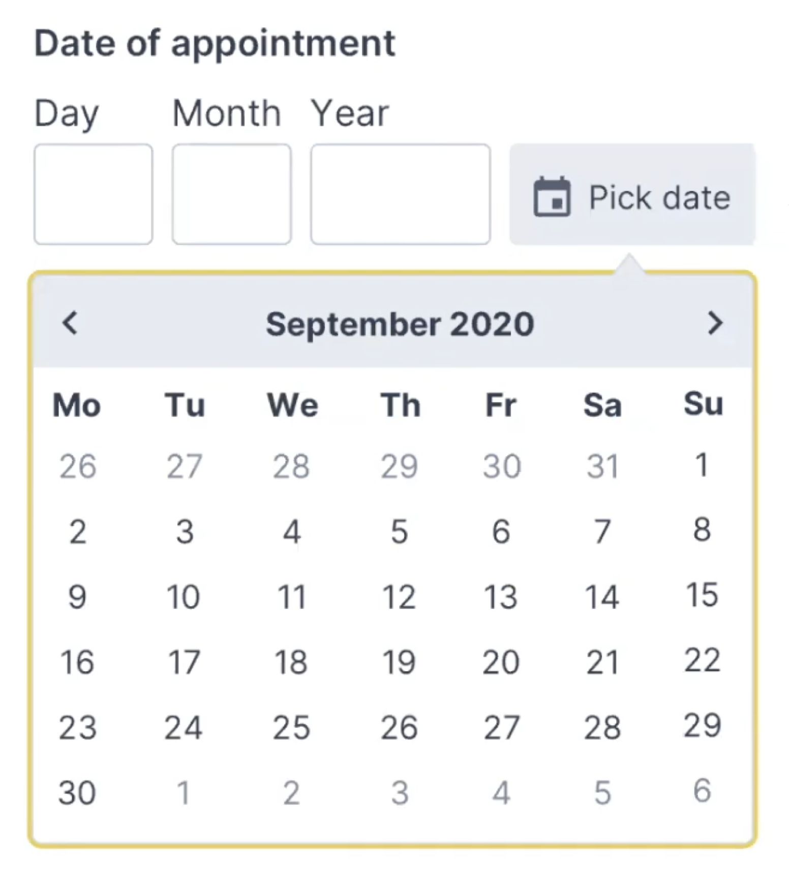
In his book on Form Design Patterns, Adam Silver argues that using multiple inputs instead of one input is rarely a good idea, but it is a good option for dates. We can clearly communicate what each input represents, and we can highlight the specific input with focus styles. Also, validation is much easier, and we can communicate easily what specific part of the input seems to be invalid, and how to fix it.

We could either automatically transition the user from one input to the next when the input is finished, or allow users to move between fields on their own. At the first glance, the former seems better as the input would require just 8 digits, typed one after another. However, when people fix errors, they often need input buffers — space within the input field to correct existing input.

For example, it’s common to see people typing in 01, realizing that they made a mistake, then changing the input to 010, and then removing the first 0, just to end up with a reversed (and correct) string — 10. By avoiding an automatic transition from one field to the next, we might be causing less trouble and making the just UI a bit more predictable and easy to deal with.

To explain the input, we’d need to provide labels for the day, month and year, and perhaps also show an example of the correct input. The labels shouldn’t be floating labels but could live comfortably above the input field, along with any hints or examples that we might want to display. Plus, every input could be highlighted on focus as well.

Over the years, I couldn’t spot a single problem with this solution throughout years of testing, and it’s not surprising the pattern being used on Gov.uk as well.

When You Need A Date Picker After All

While the solution above is probably more than enough for a birthday input, it might not be good enough for more general situations. We might need a date input that’s less literal than a birth day, where customers will have to pick a day rather than provide it (e.g. “first Saturday in July”). For this case, we could enhance the three input fields with a calendar widget that users could use as well. A default input would depend on either the current date, or a future date that most customers tend to choose.

Adam provides a simple code example for the Memorable date pattern in his NoStyle Design System. It solves plenty of development work and avoids plenty of accessibility issues, and all of that by avoiding tapping around calendar widgets or unnecessary scrolling around dropdown wheels.

Wrapping Up

Of course, a good form control depends on the kind of date input that we are expecting. For trip planners, where we expect customers to select a date of arrival, a flexible input with a calendar look-up might be useful.

When we ask our customers about their date of birth though, we are asking for a very specific date — a very specific string, referring to an exact day, month, and year. In that case, a drop-down is unnecessary. Neither is a calendar look-up, defaulting to a more-or-less random value. If you do need one, avoid native date pickers and native drop-downs if possible and use an accessible custom solution instead. And rely on three simple input fields, with labels and explanations placed above the input field.

We’ve also published a lengthy opus on designing a perfect date and time picker, along with checklists you might want to use to design or build one.

Related Articles

If you find this article useful, here’s an overview of similar articles we’ve published over the years — and a few more are coming your way.

Perfect Responsive Configurator
Perfect Feature Comparison
Perfect Slider
Perfect Accordion
Form Design Patterns Book by Adam Silver, published on SmashingMag
Subscribe to our email newsletter to not miss the next ones.

Noisy Strokes Texture with Three.js and GLSL

Original Source: http://feedproxy.google.com/~r/tympanus/~3/ZsQOFDvg5Hc/

In this ALL YOUR HTML coding session you’ll learn how to recreate the amazing noisy strokes texture seen on the website of Leonard, the inventive agency, using Three.js with GLSL. The wonderful effect was originally made by Damien Mortini.

This coding session was streamed live on May 9, 2021.

Support: https://www.patreon.com/allyourhtml

Setup: https://gist.github.com/akella/a19954…

The post Noisy Strokes Texture with Three.js and GLSL appeared first on Codrops.