Beautiful Examples of Motion Design in Web Design
Original Source: http://feedproxy.google.com/~r/1stwebdesigner/~3/JFQlbSi2gho/
Motion design has seen a substantial rise to prominence within the web design industry over the last few years. Most landing pages and award-winning website designs incorporate some aspect of motion, whether that be through illustrations, video, animated GIFs, or even subtle custom emotes.
Some websites even use motion design with their products, for example Apple who use vertical scrolling as a trigger for applying motion to their product mockups.
There are some remarkable examples which show just what can be achieved when applying elements of motion design to a website. In this article we are going to round up a selection of the very best.
Pipefy
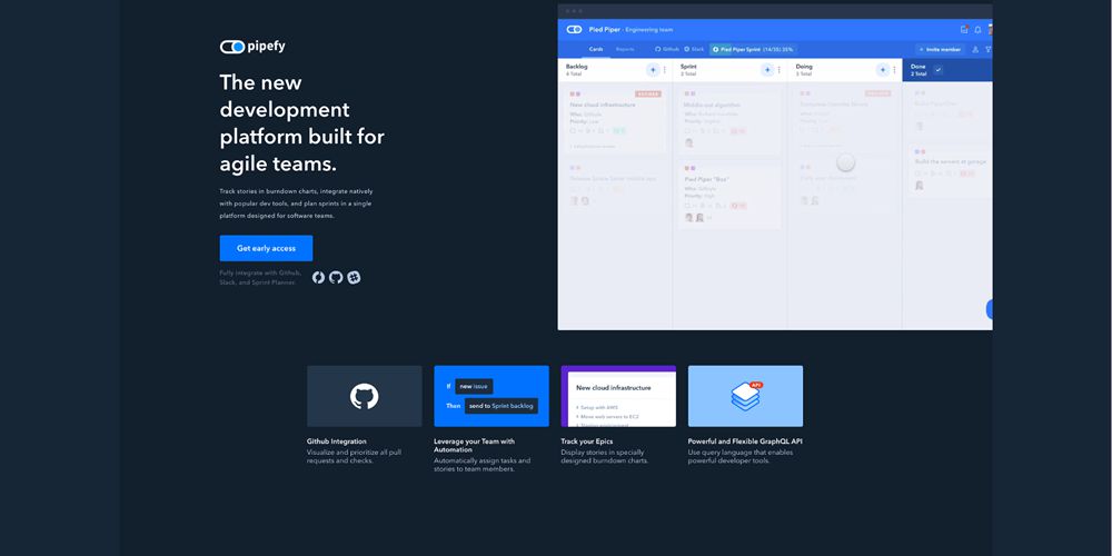
Pipefy uses motion design in the hero section of its website. It displays a user interface demo of their product with a hypothetical user interacting with and showcasing the platform.
Figma
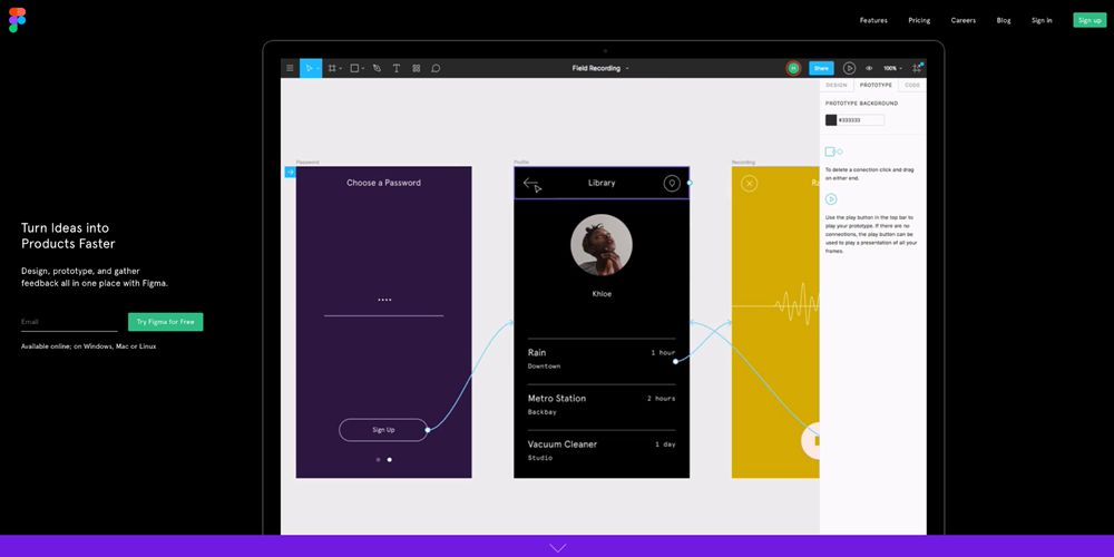
Figma’s main selling point is design collaboration. As such, it demos this using effective screen capture video footage in the hero section.
ZenDesk
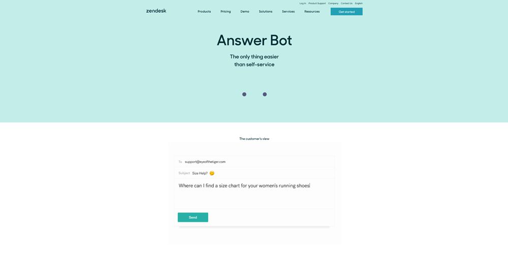
ZenDesk’s Answer Bot is demoed on their website using a minimal and simple example of motion design.
Museum of Science + Industry
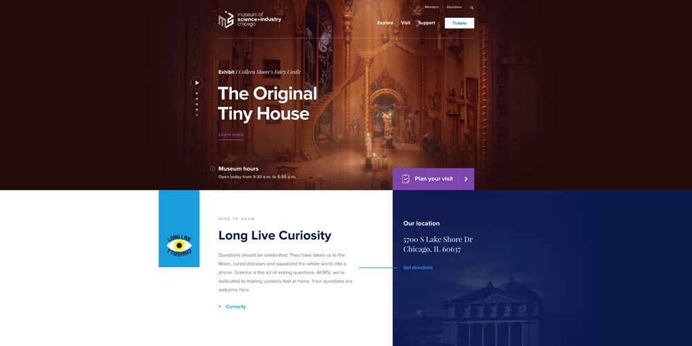
The Museum of Science + Industry uses motion graphics and video in the hero section of their website to illustrate each active exhibition. It adds a great deal of visual interest and effect.
Adidas
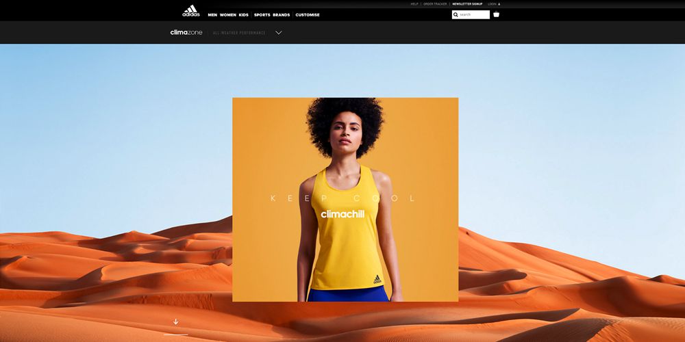
Adidas Climazone’s landing page uses motion design via user scrolling as the trigger. As the the user makes their way down the page the graphics and images morph and change.
Stripe Sigma
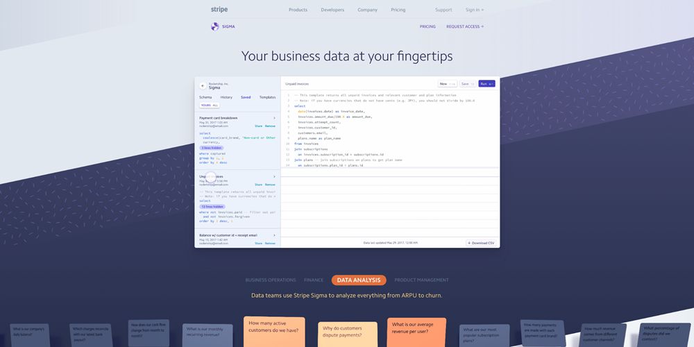
In possibly the most impressive example of all, Stripe uses motion design in multiple instances. The hero section uses a video to illustrate the product in action, while below a scrolling ticker of FAQ cards makes its way from right to left, changing color over time.
Snappd
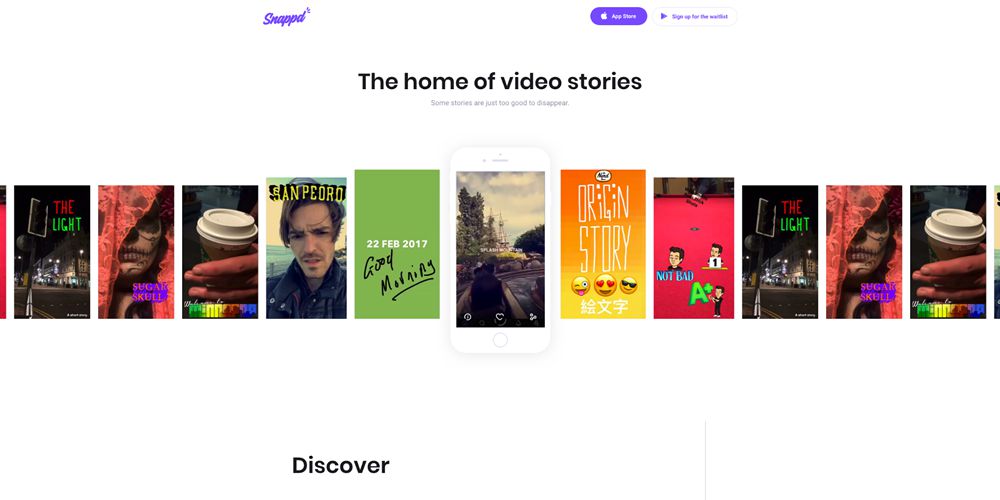
Snappd’s homepage scrolls through a selection of video stories. When one lines up with the iPhone mockup, it triggers the video to play.
ZKIPSTER
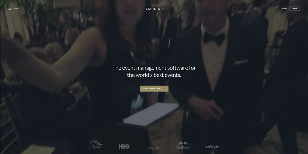
ZKIPSTER uses one of the more traditional implementations of motion design: a full size background video. It does so with great effect, applying a filter on top for greater contrast and subtlety.
Shopify
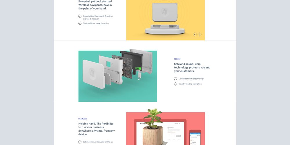
Shopify uses motion through its product imagery. In this instance, the user’s scroll location is used as a trigger to expand the product mockup and reveal its complexity within the simple design.
An Interesting Day
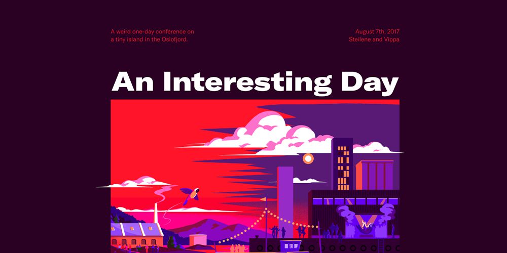
The ‘An interesting Day’ website applies motion by implementing a parallax effect which tracks the point of the user’s cursor to produce a depth effect. It’s subtle but highly effective and satisfying to experience.

Leave a Reply
Want to join the discussion?Feel free to contribute!