UX And HTML5: Let’s Help Users Fill In Your Mobile Form (Part 2)
Original Source: https://www.smashingmagazine.com/2018/08/ux-html5-mobile-form-part-2/
UX And HTML5: Let’s Help Users Fill In Your Mobile Form (Part 2)
UX And HTML5: Let’s Help Users Fill In Your Mobile Form (Part 2)
Stéphanie Walter
2018-08-27T14:00:31+02:00
2018-08-28T18:17:33+00:00
In this second part, I want to focus more on mobile-specific capabilities. HTML5, for instance, has brought us a lot of really cool features to help users fill in mobile forms and format their data. We will see in detail how HTML5 attributes can help you with that. Then, we will go beyond “classic” form elements and see how to use mobile capabilities such as the camera, geolocation and fingerprint scanners to really take your mobile form experience to the next level on websites and in native applications.
Helping The User Format Content With HTML5
In the first part of this series, we saw some general advice on how to display fields. Now it’s time to go a bit deeper and look at how a few well-crafted lines of HTML5 code can improve your mobile forms.
HTML5 Mobile-Optimized Goodness
HTML5 opens a whole world of possibilities for optimizing forms for mobile and touch devices. A lot of interesting new input types can trigger different keyboards to help users. We can also do some interesting things with capturing media directly in the browser.
Entering Numerical Data
input type= number
The HTML5 <input type=number> attribute restricts an input field to numbers. It has a built-in validation system that rejects anything that is not a number.
In some desktop browsers, this input is presented with little arrows on the right that the user can click to increment the number. On mobile, it opens a keyboard with numbers, which decreases typos and form-validation errors. The input’s look and feel depend on the operating system.
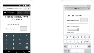
On the left, Android’s keyboard, and on the right, the iOS keyboard with numbers. (Large preview)
The input should allow for decimals and negative numbers (but few keyboards respect that). As explained in the W3C’s specifications, “a simple way of determining whether to use type=number is to consider whether it would make sense for the input control to have a spinbox interface (e.g. with ‘up’ and ‘down’ arrows)”. This means that the input is not supposed to be used for credit cards or area codes.
With so much happening on the web, what should we really pay attention to? At SmashingConf New York 2018 ?? we’ll explore everything from PWAs, font loading best practices, web performance and eCommerce UX optimization, to refactoring CSS, design workflows and convincing your clients. With Sarah Drasner, Dan Mall, Sara Soueidan, Jason Grigsby, and many other speakers. Oct 23–24.
Check the speakers →

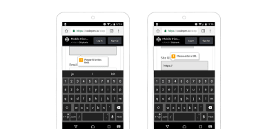
The pattern And inputmode Attributes
To add some restrictions to your number inputs, you could use the pattern attribute to specify a regular expression against which you want to control values.
This is what it looks like:
<input type=”number” id=”quantity” name=”quantity” pattern=”[0-9]*” inputmode=”numeric” />
You can use this pattern to bring up the big-button numeric keyboard on the iPhone (but not the iPad). This keyboard does not have the minus sign or comma, so users lose the ability to use negative numbers and decimals. Also, they can’t switch back to another keyboard here, so be careful when using this.
Also, note that patterns can be applied to any other type of inputs.
Using only this pattern won’t work on most Android phones. You’ll still need a combination of input type=number and the attribute to make this work.
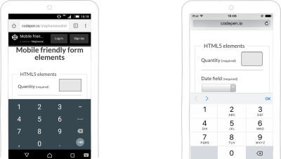
Android and iOS demo with input type=number, pattern and inputmode. (Large preview)
inputmode
If you only want to trigger the mobile numeric keyboard but don’t want to deal with the type=number and pattern mess, you could use a text input and apply the inputmode=numeric attribute. It would look like this:
<input type=”text” id=”quantity” name=”quantity” inputmode=”numeric” />
Unfortunately (at the time of writing), only Chrome 67 mobile supports this, but it should be arriving in Chrome desktop 66 without a flag.
To learn more about how to enter numbers in a form, read “I Wanted to Type a Number”.
input type=tel
If you want users to enter a phone number, you can use the input type=tel. As you can see in the screenshot below, it triggers the same digits on iOS’ keyboard as the pattern attribute described above. Due to the complexity of phone numbers across the world, there is no automatic validation with this input type.
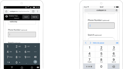
input type=tel on Android and iOS (Large preview)
Entering Dates
Even if they are technically numerical data, dates deserve their own section. There are a few HTML5 input types for entering dates. The most used is input type=date. It will trigger a date-picker in supported browsers. The appearance of the date-picker depends on the browser and OS. To learn more on how browsers render input type="date", I recommend you read “Making input type=date complicated.”
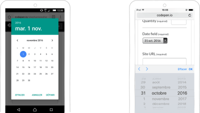
A date-picker based on input type=date on Android and iOS (Large preview)
There’s also type=week to pick a week, type=time to enter a time (up to the hour and minute), and type=datetime-local to pick a date and a time (using the user’s local time). So many choices!
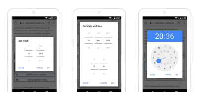
Example of date-picker with more options on Android (week, date and time, etc.) (Large preview)
input type=date works well for booking interfaces, for example. You might have some needs that require you to build your own date-picker, though (as we’ve already seen in the section on sensible defaults). But input type=date is always a nice option if you need a date-picker and don’t want to bring a whole JavaScript library into the website for the job.
Yet, sometimes not using type=date for dates is better. Let’s take the example of a birth date. If I was born in 1960 (I’m not — this is just an example), it would take me many taps to pick my birth date if I was starting from 2018. On Android, I discovered recently that if I press on the year in the picker, I get a sort of dropdown wheel with all of the years. A bit better, but it still requires a fair amount of scrolling.
A user told me on Twitter:
“I’m born in 1977 and can confirm the annoyance. The more time it takes to scroll, the older you feel :-(”
So, maybe birth dates are not the best candidate for date-pickers.
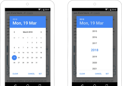
With Android’s date-picker, even though you can press and hold the year to get a year-picker, picking a birth date is still tedious. (Large preview)
URL, Email, Tel And Search
Mobile phones hide some other keyboard and input-optimization goodness that enhance the user’s experience when filling in a form. The devil is in the details, as they say.
Using the input type=url field will bring up an optimized keyboard on mobile, with / (the slash key) directly accessible. Depending on the OS, you can also give quick access to commons top-level domains, like the .fr in the screenshot below. If you long-press this button, shortcuts to other top-level domains will appear. This also comes with automatic browser validation that checks that the URL’s format is valid.

input type=url keyboard on Android and iOS (Large preview)
The input type=emailfield brings up an email-optimized keyboard giving quick access to the @ symbol. This input requires the presence of @ somewhere in the field in order to be valid. That’s the only verification it does.
input type=email keyboard on Android and iOS (Large preview)
The input type=search field brings up a search-optimized keyboard. The user can directly launch the search from a button on the keyboard. There’s also a little cross to clear the field and type a new query.
input type=search keyboard on Android and iOS (Large preview)
Range And Color
The last two input types we looked at are not particularly optimized for mobile, but by using them, we can avoid having to load heavy custom JavaScript libraries, which is a good idea for mobile users.
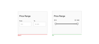
input type=range provides a visual UI slider to input a number. The UI for this control is browser-dependent.
input type=color provides an easy way for the user to enter a color value. In many browser implementations, this comes with a color-picker.
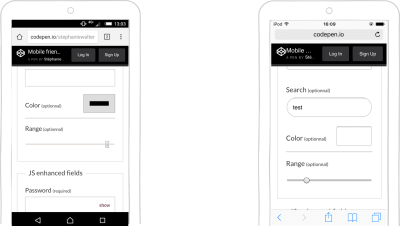
input type=range and input type=color on Android and iOS (Large preview)
HTML Media Capture: Taking And Uploading Pictures And Recording Sound
I remember the time of the iPhone 3, when Apple would not even allow a simple input type=file to be used on a website, for security reasons. Those times are long gone. With the HTML media capture API, it’s now possible to access different sensors of a device. We can capture photos and videos, and we can even record voice directly in the browser.
The accept attribute lets you specify what kind of media to accept in the input: audio, image, video. The user can give the browser direct access to their camera, for example.
The code looks like this:
<input type=”file” id=”take-picture” accept=”image/*”>
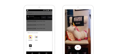
The accept attribute is set to image. The browser asks whether I want to access the camera directly or the files on the device. (Large preview)
The capture attribute lets you specify the preferred mode of capture. If you add the capture attribute on top of the accept attribute, you can make the browser open the camera or voice recorder directly.
<input type=”file” accept=”image/*” capture> // opens the camera>
<input type=”file” accept=”video/*” capture> // opens the camera in video mode
<input type=”file” accept=”audio/*” capture> // opens the voice recorder

The mobile browser directly opens the capture mechanism: on the left, the camera, on the right, the video recorder. (Large preview)
For more details on how to use media directly in the browser, read the section “Accessing and Handling Images, Video and Audio Directly in the Browser” in my article on the secret powers of mobile browsers.
HTML5 Autos: Autocorrect, Autocomplete, Autofill, Autocapitalize And Autofocus
HTML5 comes with a slew of automatic attributes. To enhance the mobile experience, you will want to be smart about what can be automated and what can’t. Here are some general rules of thumb:
Disable autocorrect on things for which the dictionary is weak: email addresses, numbers, names, addresses, cities, regions, area codes, credit card numbers.
Disable autocapitalize for email fields and other fields where appropriate (for example, website URLs). Note that type=email does the job for you in recents version of iOS and Android, but disable it anyway for older versions or if type=email is not supported.
You can set the autocapitalize attribute to words to automatically uppercase the first letter of each word the user types. This can be useful for names, places and the like, but, again, be careful with it, and test it.
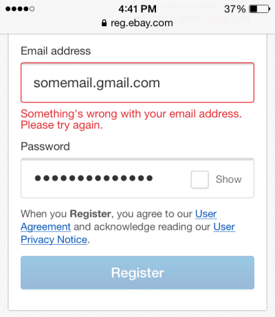
Use input type=email for email addresses. If you don’t, at least deactivate auto-capitalization. No email address starts with a capital letter. (Large preview)
For input type=tel, set autocomplete="tel".
You could use autofocus to give the focus to a control element when the user loads the page. But just because the user opens the “contact” page, it does not mean they are ready to jump right to the first field of your form. So, again, use it wisely.
In this example, we could use autofocus to take the user directly to the first field once they’ve clicked on the button. (Large preview)
If you want more autocomplete options, a whole list is on the WhatWG Wiki. Just make sure you use the right ones. Implement, test, and test again.
HTML5 Form Validation
I won’t get into the technical details here, but you should know that HTML5 has a built-in form-validation API for many fields. It’s nice if you don’t want to use a JavaScript library to display inline validation messages. Here are the main things you need to know as a UX designer about HTML5 form validation:
The validation message is a browser control. You can’t style it in CSS, and it’s different for every browser.
You can change the text of the message in JavaScript using setCustomValidity.
CSS3 provides :invalid, :valid and :required and other pseudo-classes for HTML form validation. These get triggered on blur, so are pretty much useless for now.
HTML native form validation in an Android browser (Large preview)
In “Native Form Validation, Part 1,” Peter-Paul Koch goes into detail on why HTML and CSS form validation doesn’t really make forms better at this time.
Offline Support To Save User Data
A lot of things can go wrong, especially on mobile. Mistakes happen. A user could mistap the back button in the browser and lose all of their data.
If the user comes back to the page, it would be nice to display their data again. The same goes for if the browser crashes or the user closes the tab. You can store the user’s data in local or session storage to ensure nothing gets lost if something goes wrong. Geoffrey Crofte has written a JavaScript library to help you with that.
If the connection is lost as the user is submitting the form, they might also lose the data. To avoid this, you could use a combination of the** HTML5 offline API** and the Service Workers API to:
store the data in the cache,
try to automatically send it again when the connection comes back.
To learn how to code this, check out the article on “Offline-Friendly Forms”.
Mobile Device Capabilities Can Take the Experience To The Next Level
In part 1, we stuck to the basic common HTML form elements and attributes for enhancing mobile forms. But mobile devices capabilities now go far beyond displaying HTML, CSS and JavaScript web pages. Those little devices come equipped with a lot of sensors. And we will be able to use many of those in native apps and on the web to make our users’ lives so much easier.
Detecting The User’s Location
In the previous section, I wrote about pre-filling information for places and addresses. That’s a good start. We can go one step further. Instead of asking users to type a location, we can detect it. Meet the geolocation API for the web. There are also native iOS, Android and Windows Phone geolocation APIs.
Citymapper is a website and an app that helps users plan their travels. When the user goes into the first field, they see the “Use current location” option. If they select it, they are asked to allow the browser to access their geolocation data. This is the geolocation API. The browser then autocompletes the location it found and, the user can proceed to the destination field. The native app works pretty much the same way.
Citymapper proposes the user’s current location as the starting point for the journey.
Be Smart When Asking For The User’s Permission
You might have noticed in the previous video that I had to agree to give access to my position to the Citymapper website. In the browser, the user handles permissions website by website, API by API.
You also need to be careful how you ask for permission. The user might refuse access to the geolocation, notification or other API if you ask too soon. They also might refuse if they don’t understand why you need the permission. You get one chance; use it wisely. After that, it will be almost impossible to recover. I’m an Android power user, and even I have to search around for the options in my browser when I want to reset the permissions I’ve given to a website. Imagine the trouble your users will have.
Here is some general advice on asking for permissions on the web:
Don’t be the creepy geolocation or notification stalker: Don’t ask for permission as soon as the user arrives on your website. They might not know about you or your service yet.
Let the user discover your website and service. Then, ask for permission in context. If you want to access their location, ask them only when you need it (Citymapper is a good example).
Explain why you need permission and what you will do with it.
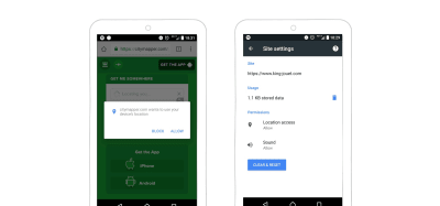
Citymapper asks for access to the user’s location only when it needs it. Clearing permissions after the user refuses it can get really complicated because the user will need to search through their settings for that website. (Large preview)
If you want to go further, Luke Wroblewski (yes, him again) has created a nice video to help you with the permission-asking process.
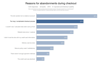
A Better Checkout Experience
A big area of improvement for forms is the whole checkout payment experience. Here again, sensors on the device can make this an almost painless experience. The only pain will be the amount of money the user spends.
iOS Credit Card Scanner
In the previous section, I wrote about autodetection of credit cards and autocompletion features based on the user’s previous input. This still means that the user has to type their credit card data at least once.
Apple has taken this to the next level with its credit card scanner. Since iOS 8 in Safari, users can use their camera to scan and autocomplete their credit card information. To perform this magic, you will need to add the autocomplete cc-number attribute and some name to identify this as a credit card field. Apple doesn’t have much official information on it, but some people did some testing and put the results on StackOverflow.
Safari also has autofill options that users can use to add their credit card, allowing them reuse it on multiple websites.
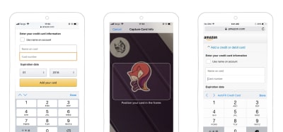
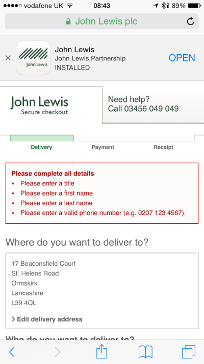
The credit card scanning option appears when Safari detects a field that matches the credit card format. If the user already has a card registered on the phone, they can use the autofill option. (Large preview)
Take Checkout One Step Further With Google Pay API
Google launched something similar: the Google Pay API. When implemented on a website, the API eliminates the need to manually enter payment information. It goes one step further: It can store billing and shipping addresses as well.
The user gets a dialog in Chrome that displays the various payment information they’ve stored. They can choose which one to use and can pay directly through the dialog.
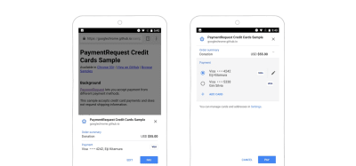
The Google Pay API pop-up triggered on an e-commerce website (Source) (Large preview)
A standardized version of the Payment Request API is currently a W3C candidate recommendation. If this gets implemented in browsers, it would allow users to check out with a single button, which would request the API. Every step thereafter would be handled by native browser dialogs.
Making Authentication Easier
Mobile phones are, in most cases, personal devices that people don’t usually share with others. This opens up some interesting opportunities for authentication.
Magic Link
I use a password manager. I don’t know 99% of my passwords. They are all randomly generated. In order to log into a new Slack workspace, I must:
open my password manager,
enter my master password,
search for the workspace,
copy and paste the password into the Slack app.
It’s a tedious process, but Slack was smart enough to provide a better option.
Many users have they mail synchronized on their phone. Slack understood that. When you add a new Slack workspace in the app, you can either log in using the password or ask for the “magic link” option. If you opt for the latter, Slack sends a magic link to your mailbox. Open the mail, click on the big green button, and — ta-da! — you’re logged in.
Behind the scenes, this magic link contains an authentication token. The Slack app catches this and authenticates you without requiring the password.

When using the magic link option, Slack sends you an email with a link that lets you connect to your slack without having to enter your password. (Large preview)
Fingerprint For Smart Identification
I do almost all of my banking on my mobile device. And when it comes to logging into my bank accounts, there’s a world of difference between my French Societe General bank app and the German N26 app.
With Société Générale, I have a login string and a passphrase. I can ask the app to remember the login string, which is 10 random digits. I’m not able to remember that one; I use a password manager for it. I must still remember and enter the six-digit passphrase on a custom-built keypad. Of course, the numbers’ positions change every time I log in. Security — yeah, I know. Also, I must change this passphrase every three months. The last time I was forced to change the passphrase, I did what most people do: choose almost the same passphrase, because I don’t want to have to remember yet another six-digit number. And of course, I was damn sure I would remember it, so I did not enter it in my password manager. Rookie mistake. Two weeks later, I tried to log in. Of course, I forgot it. I made three failed attempts, and then my account was blocked. Fortunately, I only use this account for savings. In the app, you can ask for a new passcode. It took almost one week for the bank to send me a new six-digit passphrase by paper mail to my home address in Luxembourg. Yeah.
N26, on the other hand, uses my email address as the login string. I can remember that without a password manager. When I want to log in, I put my finger on the start button of my Xperia phone, and that’s it. In the background, my phone scans my fingerprint and authenticates me. If that does not work, I can fall back to a password.
Same device, two apps, two totally different experiences.
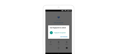
Dropbox has another example of fingerprint authentication. (Large preview)
More and more apps on both Android and iOS now offer user the possibility to authenticate with a fingerprint. No more passwords — it’s an interesting and elegant solution.
Of course, people have expressed some security concerns about this. For the National Institute of Standards and Technology (NIST), biometrics is not considered secure enough. It advises combining biometrics with a second factor of authentication.
Fingerprint sensors can also be tricked — yes, like in spy movies. Did you hear about the plane that was forced to land because a woman learned of her husband’s infidelity after using his thumb to unlock his phone while he was sleeping?
Facial Recognition And Face ID
In 2018, Apple launched the iPhone X with the brand new face ID. Users can unlock their iPhone X using their face. Of course, some other Android phones and Windows tablets and computers had proposed this feature earlier. But when Apple launches something, it tends to become “a thing”. For the moment, this technology is mostly used as authentication to unlock phones and computer.
There are some pretty big challenges with facial-recognition technology. First, some algorithms can be fooled by a picture of the person, which is easily hackable. Another bigger concern is diversity. Facial-recognition algorithms tend to have difficulty recognizing people of color. For instance, a black researcher had to wear a white mask to test her own project. The researcher is Joy Buolamwini, and she gave a TED talk about the issue.
Some facial-recognition software is also used by some customs services to speed up border processing. It is used in New Zealand and will be used in Canada.
Most of us have seen enough science fiction to see the potential problems and consequences of systems that use facial recognition at scale. This kind of technology used outside of the private space of unlocking phones can get controversial and scary.
Google: One-Tap Sign-Up
If a user has a Google account, they can benefit from Google’s one-tap sign-up. When visiting a website and prompted to create an account in an inline dialog, the user doesn’t need to enter a password. Google provides a secure token-based password-less account, linked to the user’s Google account. When the user returns, they are automatically signed in. If they store their passwords in the Smart Lock, they get automatically signed in on other devices as well.
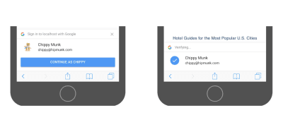
Google’s one-tap sign-up dialog (Source) (Large preview)
Note: This is an interesting password-less solution. Of course, by using it, users are linked to Google, which not everyone will feel comfortable with.
Conclusion
You can do a lot of really cool things when you start using mobile capabilities to help users fill in forms. We need a mobile-first mindset when building forms; otherwise, we’ll get stuck on the desktop capabilities we are familiar with.
Again, be careful with the device’s capabilities: always have a fallback solution in case a sensor fails or the user refuses access. Avoid making those capabilities the only options for those functions (unless you are building a map app that relies on geolocation).
This is the end of a series of two really long articles in which I’ve given you some general UX and usability advice and best practices. In the end, what matter are your form and your users. Some things described here might not even work specifically for your users — who knows? So, whatever you do, don’t take my (or Luke’s) word for it. Test it, with real users, on real devices. Measure it. And test again. Do some user research and usability testing. User experience is not only about best practices and magic recipes that you copy and paste. You need to adapt the recipe to make it work for you.
So, in short: Test it. Test it on real devices. Test it with real users.
![]()
(lf, ra, al, il)
 Masked input for a phone number. (Image: Josh Morony)
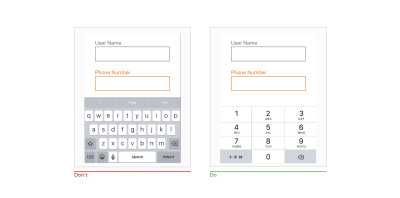
 This form suggests the email host and saves users from typing a complete address. (Image: GitHub)
 Address prefill. Image: Google
 Address lookup using Google Places API. (Image: Chromatic HQ) (Large preview)
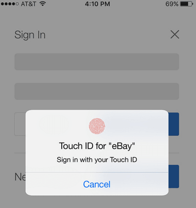
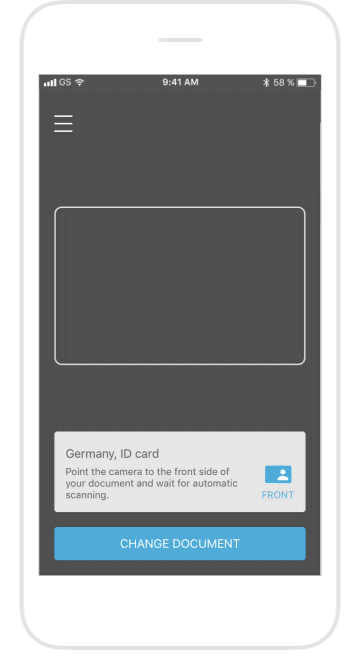 Let users scan their identity card, instead of having to fill out their credit card information manually. (Image: blinkid)
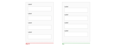
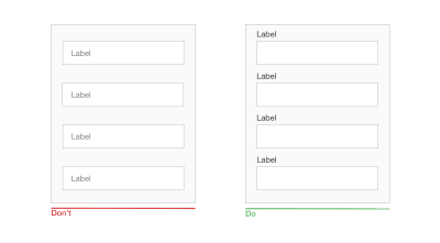
 Floating labels assure the user that they’ve filled out the fields correctly. (Image: Matt D. Smith)


 Using progressive disclosure to reduce cognitive load and keep the user focused on a task. (Image: Ramotion)
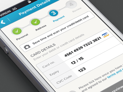


 This form disables the button after submission. (Image: Michaël Villar)
 Example of success state. (Image: João Oliveira Simões)
 Reward early, punish late is a solid validation approach. (Image: Mihael Konjević)
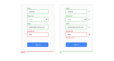


 What it actually looks like


 Look at that camera by Hasselblad