Original Source: https://www.smashingmagazine.com/2020/03/monthly-roundup-03-2020/
Stay Calm And Read Smashing
Stay Calm And Read Smashing
Iris Lješnjanin
2020-03-13T12:30:00+00:00
2020-03-13T22:08:58+00:00
For all the times we asked folks about Smashing, most still seem to believe that we’re some sort of large publishing company situated somewhere in the United States — both of which are wrong. It all started in Freiburg, Germany, and the team consists of folks scattered all over the world — with most of us not working fulltime for Smashing.
That’s right, working remotely is quite familiar to us, and so with the current situation going on with COVID-19 that is making everyone uneasy, we’d like to make the best of things and help our friends who are having to work or lead teams remotely for the first time. Our editor-in-chief, Rachel Andrew, has prepared a nice post to help you stay connected and keep learning while we go through this together.
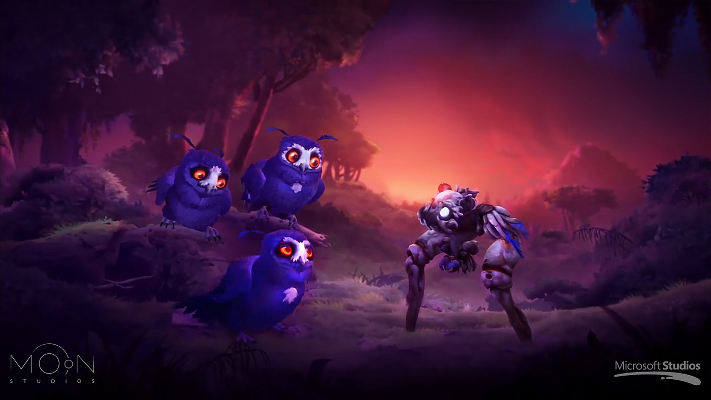
You may have already heard that SmashingConf SF has been postponed to November due to the unfortunate travel restrictions and many other reasons. It was truly a difficult decision for the team to make, but we believe it is the best way forward — safety and health always come first.
Without further ado, here’s a short update of things going on at Smashing and some super creative work shared from and to the community!
Happy reading — from my computer to yours!
Designing With Ethics In Mind
 After months of hard work, the “The Ethical Design Handbook” is finally here — and it’s shipping! The response has already been overwhelmingly positive, and we’re excited to share reviews with you soon. There is still quite a bit of work to do on the web, but our hope is that with this book, you will be equipped with enough tooling to slowly move a company towards a more sustainable and healthy digital footprint!
Of course, you can jump to the table of contents right away, or download a free PDF excerpt to get a first impression of the book — we’re sure you won’t be disappointed! Read our official release post with all the details →
Always Learning New Things From One Another
 We all have busy schedules, but there’s always time to pop in those earplugs and listen to some music or podcasts that make you happy! We’re moving on to our 12th episode of the Smashing Podcast — with folks from different backgrounds and so much to share! You’re always welcome to tune in and share your questions and thoughts with us anytime!
Previous Smashing Podcast episodes (including transcripts)
Follow @SmashingPod on Twitter
Apart from the heart-breaking news about our postponed SmashingConf SF, our SmashingConfs are known to be friendly, inclusive events where front-end developers and designers come together to attend live sessions and hands-on workshops. From live designing to live debugging, all of our speakers like to go into detail and show useful examples from their own projects on the big screen.
Here are some talks you may like to watch and learn from:
Talk Title
Speaker’s Name
Thinking With Grids
Jen Simmons
Building Accessible Interfaces: Patterns And Techniques
Sara Soueidan
Dynamic CSS
Miriam Suzanne
Dynamic Web Typography
Jason Pamental
Making A Difference With Differential Serving
Jeremy Wagner
Slam Dunk Your Javascript Fundamentals
Wes Bos
Think Like An Email Geek
Rémi Parmentier
Effortless Performance Debugging
Anna Migas
Move Fast & Don’t Break Things
Scott Jehl
Designer vs Developer!
Dan Mall, Brad Frost and Ian Frost
The first SmashingConf took place in Freiburg back in 2012, so there are so many more talks you can watch. See all SmashingConf videos →
Shining The Spotlight On React, Redux And Electron
 Mark your calendars! Next week on March 19, we’ll be hosting a Smashing TV webinar with Cassidy Williams who’ll be explaining how to organize a modern React application and build an Electron application (with React). Join us at 17:00 London time — we’d love to hear your thoughts and experiences you’ve had with React in your projects!
Smashing TV is a series of webinars and live streams packed with practical tips for designers and developers. They’re not just talks, but more like conversations and “here-is-how-I-work”-sessions. Smashing Members can download recordings, and also receive discounts and lots of goodies to make their membership worthwhile. Tell me more →
Trending Topics On SmashingMag
We publish a new article every day on various topics that are current in the web industry. Here are some that our readers seemed to enjoy the most and have recommended further:
“Why Are We Talking About CSS4?”
by Rachel Andrew
Around the web and within the CSS Working Group, there has been some discussion about whether we should specify a version of CSS — perhaps naming it CSS4. In this article, Rachel Andrew rounds up some of the pros and cons of doing so, and asks for your feedback on the suggestion.
“Setting Height And Width On Images Is Important Again”
by Barry Pollard
Thanks to some recent changes in browsers, it’s now well worth setting width and height attributes on your images to prevent layout shifts and improve the experience of your site visitors.
“Setting Up Tailwind CSS In A React Project”
by Blessing Krofegha
This article introduces Tailwind CSS, a CSS library that gives you all of the building blocks you need to build bespoke designs without opinionated styles. You’ll also learn how to seamlessly set up Tailwind CSS in a React project.
“Introducing Alpine.js: A Tiny JavaScript Framework”
by Phil Smith
Ever built a website and reached for jQuery, Bootstrap, Vue.js or React to acheive some basic user interaction? Alpine.js is a fraction of the size of these frameworks because it involves no build steps and provides all of the tools you need to build a basic user interface.
“How To Design Mobile Apps For One-Hand Usage”
by Maitrik Kataria
90% of the smartphones sold today have >5-inch displays. Bigger screen real estate presents newer challenges and opportunities for app makers and designers. Let’s look at how designing apps for one-handed usage can solve those challenges.
Best Picks From Our Newsletter
We’ll be honest: Every second week, we struggle with keeping the Smashing Newsletter issues at a moderate length — there are just so many talented folks out there working on brilliant projects! So, without wanting to make this monthly update too long either, we’re shining the spotlight on the following projects:
P.S.: A huge thank you to Cosima Mielke for writing and preparing these posts!
Find And Fix Errors In Your Designs
We all know those moments when we are so immersed in a project that we lose the distance we need to be able to catch little inconsistencies: an incorrect border-radius around an image or missing styles or text, for example. If you’re designing in Figma, the free and open-source plugin Design Lint makes finding and fixing errors like these easy so that no bug makes it into production.
 A free and open-source plugin for Figma built to help you find and fix errors in your designs.: Design Lint.
Design Lint checks for missing text, fill, stroke, and effects styles, and catches incorrect border-radius values on all your layers. To not interrupt your workflow, the plugin automatically updates as you fix errors. The repo is available on GitHub, so feel free to write specific rules to tailor the plugin to your needs.
Learn CSS Positioning With… Cats!
Could there be a better way to learn CSS positioning as with a bunch of friendly cats? That’s probably what Ahmad Shadeed thought, too, when he created his interactive guide to how CSS positioning works.
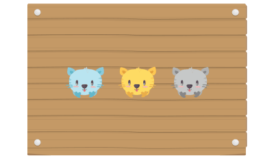
Meow! Ahmad Shadeed has prepared a great guide for you to learn everything about CSS positioning!
The guide teaches you to use CSS to position three cartoon cats and their blanket inside a box, and once you’ve grasped the concept, you can start tinkering with the interactive demo that visualizes how the result changes as you edit the values. Now who said learning can’t be fun?
Intimacy, An Interactive Short Poem
An inspiring experiment comes from the French graphic and interaction design student Thibaud Giffon: “Intimacy”. The interactive short poem uses abstract images, sound, and text to explore intimacy from different angles.
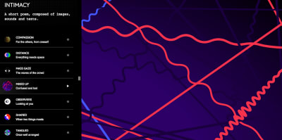
The “Mixed Up” musical poem is brought to life (sound ON) by just moving your cursor across the cords. Try it out!
Compassion, distance, confusion, touch — these are four of the eight chapters that make up the poem; and each one of them reflects the topic in its own, unique way: with warm and harmonious waves or circles that melt into each other but also with dissonant strings or colorful bubbles that burst as they make space for themselves. Beautiful!
All Your SVG Icons In One Place
Having one central place to organize all your assets is always a good thing, not only for teams — to keep track of what you have and to quickly find what you’re looking for. The free cross-platform app Iconset is such a place: it helps you collect, customize, share, and manage all your SVG icon sets.
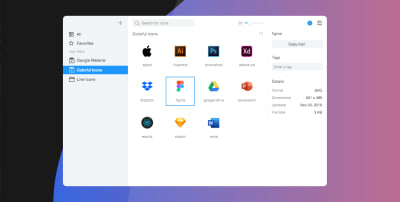
Organizing SVG icons all in one place with Iconset.
To make it easier to find the icon you’re looking for, you can organize your icons in sets or with tags, and, once you’ve found the icon you need, you can drag it directly into your favorite tool. A real timesaver. Iconset supports cloud services like Dropbox or OneDrive so that all your icons are always in sync between team members. The app is available for Mac and Windows.
An Ancient Hero’s WebGL Adventure
A reluctant hero on a quest he never asked for — that’s the story behind the browser-based adventure video game Heraclos. Set in ancient Greece, the young Heraclos stumbles across an amphora that belongs to one of the gods. He is declared to be the chosen one and gets sent off to climb the secret mountain and return the amphora to his owner.
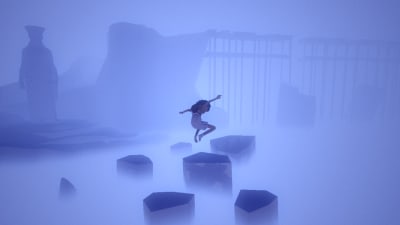
Heraclos, an adventure video game made in WebGL.
What makes the game so noteworthy is the fun twist in the interaction between the hero and the god (a parody of common heroic stories) but also the technical background: Heraclos was designed in only three months by a group of students at the Gobelins school of images in Paris — with WebGL and Cannon.js. A great example of what’s possible on the web.
An Open-Source Screen Recorder Built With Web Technology
Have you heard of Kap, yet? The open-source screen recorder is one that is definitely worth checking out if you’re frequently doing screen recordings.
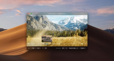
Kap, an open-source screen recorder built with web technology.
Built with web technologies, Kap produces high-quality recordings in GIF, MP4, WebM, or APNG formats. You can include audio (even from your microphone), highlight clicks, and trim the recordings. As a bonus goodie, there are also options to share your recorded GIFs on Giphy, deploy them with ZEIT now, or upload them to Streamable. Perfect for technical demos.
Open Peeps, A Free Hand-Drawn Illustration Library
584,688 possible combinations. That’s the number of different characters you could create with Pablo Stanley’s hand-drawn illustration library Open Peeps.

“Open Peeps,” a hand-drawn illustration library created by Pablo Stanley.
Open Peeps lets you mix and match different vector elements to create diverse personalities: combine clothing and hairstyles, change emotion with facial expressions, set the scene with different poses — the possibilities are sheer endless. And if you’re in a hurry, Pablo also prepared some ready-to-download Peeps that you can use right away. Open Peeps is released under a CC0 license, so you are free to use the illustrations in both personal and commercial projects. A great way to add a handmade touch to your design.
How To Make Inputs More Accessible
In 2019, WebAim analyzed the accessibility of the top one million websites, with a shocking conclusion: the percentage of error-free pages was estimated to be under one percent. To make our sites inclusive and usable for people who rely on assistive technology, we need to get the basics of semantic HTML right. With its credo of starting small, sharing, and working together, Oscar Braunert’s article on inclusive inputs is a great starting point to do so.
Starting off with the basics of WAI, ARIA, and WCAG, the article explores how to make inputs more accessible. The tips can be implemented without changing the user interface, and, as Oscar puts it: “If in doubt, just do it. Nobody will notice. Except some of your users. And they will thank you for it.”
An Open-Source Font For Developers
High readability, quick text scanning, no distraction — these are just some of the demands developers have on a typeface. Well, the free and open-source typeface JetBrains Mono meets all of them beautifully.
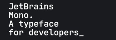
JetBrains Mono’s typeface forms are simple and free from unnecessary details. Rendered in small sizes, the text looks crisper.
To do so, Jet Brains Mono takes advantage of some small but mighty details: Compared to other monospace fonts, the height of JetBrains Mono is increased while the characters remain standard in width to keep code lines to the length developers expect. To improve readability even further, 138 code-specific ligatures reduce noise so that your eyes need to process less and whitespace becomes more balanced. Clever! JetBrains Mono comes in four weights and supports 145 languages.
The Ultimate Guide To iframes
With a lot of articles advising against them, iframes don’t have the best reputation. JavaScript developer Nada Rifki sees things differently: She suggests not to let their reputation prevent you from relying on iframes. After all, they have many legitimate use cases.
The ultimate guide to iframes written by Nada Rifki.
To help you form your own opinion on this controversial element, Nada wrote an ultimate guide to iframes which explores iframe features and how to use them; tricky situations where iframes might come in handy; last but not least, how you can secure your iframe against potential vulnerabilities. A great opportunity to see things from a different perspective.
A Guide To Console Commands
The capabilities of the developer’s debugging console have evolved significantly in the past years — from a means to report errors to automatically logging information like network requests and security errors or warnings. There’s also a way for a website’s JavaScript to trigger various commands that output to the console for debugging purposes. And while these features are mostly consistent between browsers, there are also some functional differences.
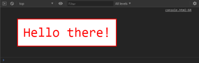
“A Guide to Console Commands” by Travis Almand
If you’re looking for an overview of what console commands are capable of, Travis Almand put together a helpful guide. It covers Firefox and Chrome and examines various commands that can be used in the browser’s console output or with JavaScript. A handy summary.

Smashing Newsletter
Upgrade your inbox and get our editors’ picks 2× a month — delivered right into your inbox. Earlier issues.
Your (smashing) email
Subscribe →
Useful tips for web designers. Sent 2× a month.
You can unsubscribe any time — obviously.

(cm, vf, ra, il)