Original Source: https://ecommerce-platforms.com/advertising/serp-gap-analyzer-review
I’ve been working in ecommerce and marketing for over ten years. That’s long enough to watch the ground shift under my feet multiple times. I remember when SEO was basically about stuffing keywords into blog posts and hoping Google would take the bait.
Then came the push for quality content, the rise of EEAT, and the slow march toward mobile-first everything. Every time we adjusted, Google adjusted again.
Now the biggest shift isn’t even happening on Google anymore. It’s happening in AI search.
More and more, customers are turning to ChatGPT, Gemini, or a host of other AI tools for guidance. Those AI models are pulling answers from somewhere. If your brand doesn’t show up, you’re invisible, no matter how much effort you’ve poured into SEO.
That’s exactly why the SERP Gap Analyzer caught my eye. It was designed to help users make the most of their traditional SEO strategy and boost their AI search visibility.
So is it worthwhile? Here’s what I found out.
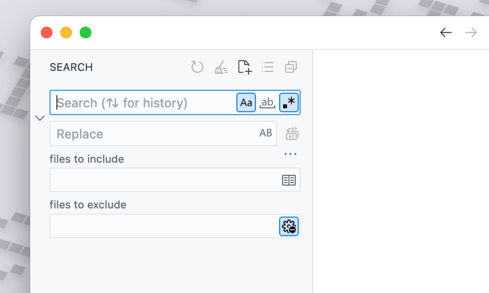
What is SERP Gap Analyzer?
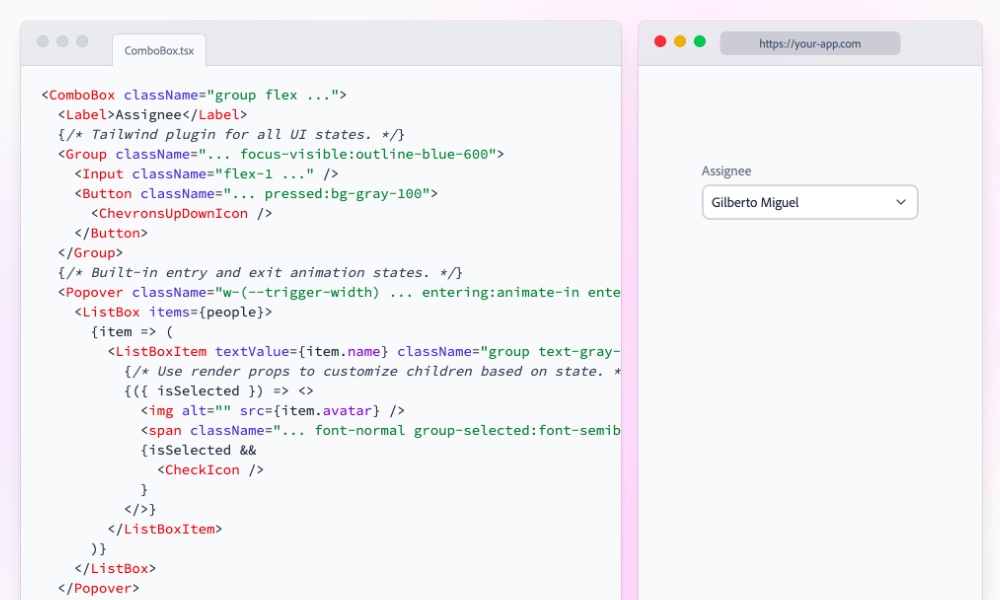
The SERP Gap Analyzer is an app in Semrush’s App Center built to help marketers spot SERP opportunities. You enter a seed topic and your domain, and it spits out data.
But what sets it apart is how it connects two worlds that usually feel separate: old-school Google SEO and this new wave of AI-driven search engines like ChatGPT, Claude, Gemini, and DeepSeek.
When you run a report, the tool doesn’t just show you the top ten results for your keyword. It digs into why those pages are ranking, and more importantly, where they’re weak.
Then there’s the AI side. SERP Gap Analyzer checks if your brand shows up when people ask AI models questions in your niche. It even rolls all that visibility into a single AI Search Score (0 to 100), weighted by which models actually matter.
Is it perfect? No. Reports take a few minutes to generate, and if you’re just dabbling in SEO, the $99/month entry point is steep. But if you’ve been around the block in marketing, you’ll see the time savings and the future-proofing angle right away.
Pros
Surfaces competitor weaknesses you’d miss manually
Tracks your visibility across AI search engines (ChatGPT, Claude, Gemini, etc.)
AI Search Score gives you a clear benchmark for brand presence in AI answers
Actionable: flags outdated content, slow pages, weak titles, poor readability
Built-in GPT-4 writing tools for quick optimizations
Cons
Reports take a few minutes to run – not instant
Free trial is limited; real use requires $99/month minimum
Can feel like overkill for beginners or very small sites
Pricing: How Much Does It Cost and Is It Worth It?
Most of the apps you’ll find in Semrush’s App Center will cost you something, and SERP Gap Analyzer is no exception. You do get a 7-day free trial where you can test things out. After that, there’s just one paid plan (which keeps things nice and simple). It costs $99 a month and gives you:
Analytics for up to 3 domains
6 suggested keywords per report
20 exports (to XLS, or PDF)
10 analysis reports each month
You can also splash out on extras in the app. For instance, for another $50 per month, you can upgrade to unlimited domains, 12 suggested keywords for each report, and 30 analysis reports, plus endless exports.
It isn’t cheap, but that doesn’t mean it’s not worth it. If you think about the hours you spend manually searching for competitor data, checking keyword volumes, and cross-referencing weaknesses, you’ll see how it adds up.
For me, one or two well-placed content wins in a month would cover the cost.
Plus, you need to think about ROI beyond Google. That AI Search Score alone feels like the kind of metric that agencies will be charging clients to monitor in six months. In that sense, the tool could be actually future-proofing your visibility.
Diving into the Features of the SERP Gap Analyzer
The SERP Gap Analyzer doesn’t overwhelm you with features. What you get is a tool that helps you track visibility across AI search, and discover fast-ranking opportunities in the Google SERPs.
But there are some bonuses too. You get actionable tips you can use to fight content decay, tools you can use to analyze competitor weaknesses, and even AI content generation in some places.
Here’s a closer look at the tools I used most often, and what they’re great for.
Competitor Analysis: Finding Weaknesses
The first thing I do when I’m creating any kind of content plan is check out what a company’s competitors are doing. That can be a tedious process when it’s done manually.
You need to open a dozen tabs, check site speed, run audits, all that stuff.
The SERP Gap Analyzer makes this whole thing a lot easier. You drop in your seed topic and domain, wait a few minutes, and suddenly you’ve got a table filled with data. You’ll see:
Pages that haven’t been updated in half a year or more.
Titles missing important keywords.
Load times dragging past the three-second mark.
Thin word counts – anything under about a thousand words gets flagged.
Readability that’s either too dense or too simplistic.
When I ran my first report, I spotted a top-ranking competitor with a page that hadn’t been touched in almost a year. Authority score was decent, but the content was thin and the readability was awful.
That’s the kind of weakness you can step right into if you’re willing to publish something fresher and more thorough.
What I liked most here was the clarity. Instead of me juggling six different tools, the Analyzer basically circled the spots on the map and said, “attack here.” It shaved hours off my usual research routine.
Analyzing Content: How to Run an Analysis
Running your first analysis with the SERP Gap Analyzer is pretty straightforward, though I’ll admit the waiting period caught me off guard the first time.
You pick whether you want to create new content or optimize what you already have. I started with the “create” option, just to see what kind of gaps I could find in my niche.
You enter your root domain, add a seed topic (in my case, “sustainable packaging”), pick your language and country, then hit the magnifying glass.
Then you wait up to 15 minutes. I flipped over to email and forgot about it until the notification popped up saying the report was ready.
When the results come in, you get a table that looks deceptively simple:
Website address
Seed topic
Language
Date of analysis
Status
Click “View Report” and the real magic starts. Now you’re staring at an overview that shows your domain, authority score, and the seed topic you tested.
Underneath, you get suggested keywords tied to that topic, plus search volumes and competitor weaknesses laid out in a way that’s actually digestible.
The part I liked most was that you don’t just see “Keyword Difficulty: Medium.” You see why – which sites are ranking, how strong they are, and where they’re falling short. I
Diving Into the Data: Accessing Your Detailed Report
Clicking into a detailed report really shows you what this tool is all about.
At the top, you get a neat little overview with the domain, authority score, seed topic, language, and country. All the basics lined up so you know exactly what you’re looking at. Further down, the tables open up and you can start poking around in the details.
Here’s what I found most useful:
Suggested keywords: Each comes with global search volume, how tough it’ll be to rank, and what kind of authority you’d need to realistically compete.
Competitor weaknesses: Those little icons again – missing keywords in the title, slow load times, thin content, outdated pages, bad readability.
Side-by-side comparisons: You’re not just seeing your domain in isolation. You’re stacked right next to the competition, line by line.
AI writing assistance: This included AI feature whips up content briefs and full outlines in seconds with help from GPT-4. It can also give you a head start on creating effective titles, meta descriptions, and even rank-ready blog posts.
If you’re interested in a keyword, you can also click on that and see who else might be ranking for it. Plus, you’ll get actionable tips on where you can improve that content to make your version rank higher.
If something’s off, the Analyzer doesn’t bury it in jargon. It highlights the issue in red. Hover over the red text and it tells you straight up what’s wrong. Too few words. Outdated by six months. Slow on mobile. It’s blunt, but honestly that’s refreshing.
When I ran my first report, one competitor’s page looked fine at a glance. But the Analyzer flagged it for a low readability score and a word count under 700.
Those aren’t fatal flaws on their own, but together they make for an easy target. I would’ve scrolled past that page in a manual check, here, it was handed to me with a red warning.
AI Writing Tools
I’ll start by briefly talking about the AI writing tools built into this app.
Honestly, I’m usually pretty skeptical of AI writing tools. I’ve tried a lot, and many of them seem to produce the same generic text, with all the standard obvious AI flags you might be aware of (like endless emdashes).
SERP Gap Analyzer, though, is surprisingly useful for writing tasks, because it focuses on helping you use AI as a launching pad.
You can generate post titles from a single keyword or topic, which is great if you’re struggling for inspiration, and create SEO-friendly meta descriptions in seconds.
I also love the fact that you can create content briefs for actual human writers to follow. I tested that feature, and found the brief was remarkably useful.
It outlines all the key sections and topics to cover, gives inspiration every step of the way, and provides resources so a creative mind can dive into creating something worth reading without hours of prep.
If you need even more guidance, the Article Genie can throw together an impressively well-written first draft of your article or guide in just a couple of minutes.
I wouldn’t recommend publishing those articles “as-is” – they still need tweaking. But they do give you a skeleton to flesh out, build on, humanize, and infuse with your brand voice.
When I’m limited in creative juices, this tool makes sure I can start writing quickly without running into a brick wall.
Content Optimization: Fighting Decay
If there’s one battle every ecommerce brand eventually fights, it’s content decay. You put hours (sometimes days) into an article, it climbs up the rankings, traffic rolls in.
Then, six months later, it’s quietly sliding down the page. The clicks dry up, impressions look fine, but conversions tank.
This is where the SERP Gap Analyzer’s Optimize Content feature helps. Unlike the competitor analysis side (which is outward-looking), this part points the spotlight back at your own house.
Here’s how it works:
You head to the “Optimize Content” tab.
Connect your Google Search Console (yes, you’ll need to authenticate).
The Analyzer pulls in your data, usually under a minute.
Then it starts flagging pages that need help.
The criteria are smart, not random. It highlights pages that:
Rank in the top 20 positions but are losing ground.
Get high impressions but shockingly low click-through rates.
Haven’t been updated in too long.
Show the classic signs of slipping relevance.
When I ran this, one of my blog posts stood out like a sore thumb. It was ranking decently (position 14 on average) and had a ton of impressions, but almost nobody was clicking. The Analyzer flagged the meta title and description as weak.
A few tweaks later and the click-through started climbing. Same content, same rankings, but more traffic. That’s the kind of low-effort, high-reward win that makes this feature addictive.
The reports use color coding, too, which keeps things simple. Green means you’re fine. Red means fix it. If you see a hammer icon, that’s a bigger issue (like thin content or a seriously outdated page).
I’ve used plenty of optimization tools before, but what I liked here was the focus. Instead of drowning you in “optimize everything,” it zeroes in on pages that actually have upside.
That prioritization makes all the difference when you’re managing a busy ecommerce site with a hundred other things competing for your time.
Generating Seed Topic Ideas
I’ll admit that half the battle in content marketing isn’t writing, it’s figuring out what to write about. You can spend hours in keyword tools, second-guessing yourself, only to realize later you picked a topic that was way too competitive or just not aligned with your site.
That’s why I was curious about the Seed Topic Suggestions feature in the SERP Gap Analyzer.
Instead of you pulling random ideas out of a hat, the tool crawls your site using NLP (natural language processing) and basically says: “Here’s what you actually talk about the most – and here’s where you could go deeper.”
When I ran it on one of my ecommerce sites, it surfaced a handful of topic clusters that made me stop and think, “Why haven’t I written about that yet?”
These weren’t vague ideas either, they were tightly connected to my existing content, which made them feel natural to expand on.
The process is simple:
Enter your domain.
Wait about 10–15 minutes for the crawl.
Get back a list of suggested seed topics.
Click one, and boom, a new analysis starts.
What I liked most was how it took guesswork off my plate. Instead of me asking, “What if people care about X?”, I had data pointing to actual themes already tied to my site.
Other Features Worth Mentioning
The big three: competitor analysis, content optimization, and seed topic ideas, are the headline acts. But once you spend time in the SERP Gap Analyzer, you notice there are several “bonus” features tucked inside that round out the toolkit. Some I expected, some genuinely surprised me.
AI Search Score
I mentioned this earlier, but it deserves its own spotlight. The AI Search Score boils down how visible your brand is across ChatGPT, Gemini, Claude, DeepSeek, Llama, Mistral, and others.
One number. Zero to a hundred. For me, this was the moment the tool stopped being “just another SEO toy.” AI visibility is the future, and being able to track it now feels like a head start.
Prompt-Testing Engine
Here, you can enter your brand or product, and the Analyzer automatically runs prompts across AI platforms to see if (and how) you show up in the answers.
I tested it with one of my ecommerce brands and found ChatGPT barely mentioned us. Gemini? Not at all. My competitor, though? Front and center. That turned into an action plan – I now had a clear sense of which models were ignoring me and where to focus.
Actionable AI Insights
The tool doesn’t just tell you you’re invisible. It gives you hints on how to fix it. Things like:
“Your content overlaps too much with the Google Knowledge Graph.”
“Add original insights.”
“Refresh outdated content.”
It sounds obvious, but seeing it tied to my actual brand presence in AI search made it actionable in a way that generic SEO advice never does.
Exporting and Sharing
Nothing fancy here, but important. Reports export cleanly to PDF or XLS. You can archive old ones so your dashboard doesn’t get cluttered. And filters make it easy to slice by date or status.
For agencies, I can see this being really helpful. A client-friendly PDF that says, “Here’s where you rank in Google, and here’s where you’re showing up in AI” – that’s the kind of deliverable that justifies a retainer.
Final Verdict: Who I’d Recommend This To
So, would I recommend the SERP Gap Analyzer? Yes, but with caveats.
If you’re an agency managing multiple domains, this is an easy investment. The Premium plan pays for itself in one or two client wins, and the ability to export slick reports with both Google and AI visibility metrics is exactly the kind of thing clients love to see.
If you’re running an ecommerce brand that’s been publishing content for a while, it’s worth it too.
The content decay checks alone will save you from losing traffic you already earned, and the competitor analysis can highlight weak spots your rivals probably don’t even know they have.
Where I see it being less useful is for:
Beginners just dipping their toes into SEO. Honestly, the tool would overwhelm you before it helped you.
Small local businesses that don’t rely heavily on content or AI search visibility. If most of your leads come from word of mouth or paid ads, this might not be your tool.
For me personally, the Analyzer earned a spot in my workflow. Not because it does something I couldn’t technically do myself, but because it does it faster, cleaner, and with fewer blind spots.
The post SERP Gap Analyzer Review: How I Used It to Spot AI Search Opportunities appeared first on Ecommerce-Platforms.com.