1Password Review: Everything You Need to Know About This Password Management Software
Original Source: https://ecommerce-platforms.com/password-management/1password-review
Password security is a major talking topic for both individuals and businesses. As more and more of our daily lives become digitized, the amount of sensitive information to be found online also increases. Although passwords are supposed to protect us from hackers, it’s challenging to manage and remember all our login details for all our online accounts.
As a result, security often falls to the wayside in favor of convenience. Consequently, many of us are underprepared to securely handle our logins. For example, 53% of people rely on memory alone to manage their passwords, and more than 60% of workers use the same password for their professional and personal apps.
But, password security shouldn’t be taken lightly- two out of five people have had their passwords compromised or identities hacked.
The solution?
Password management software
This enables you, your family, and/or employees to quickly log into their most-used services while keeping passwords secure and helping everyone establish safer online habits.
1Password is one such solution, which we’ll take a close look at below. More specifically, we’ll discuss 1Password’s password management features, how much it costs, and who it’s best suited for.
Table of contents
Toggle
About 1Password
1Password Review – Key Features
1Password Review – Pricing
1Password Review – Customer Support and Resources
1Password Review – Security
1Password Review – Pros and Cons
1Password FAQs
1Password Review – Our Final Thoughts
That’s a lot to cover, so let’s dive in.
About 1Password
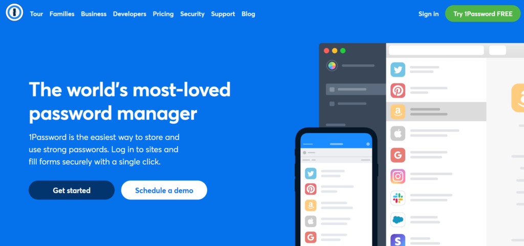
1Password is password management software explicitly designed to meet the needs of two key audience groups:
Families looking to remain secure onlineBusinesses looking to stay safe online
More than 100,000 companies already use 1Password to secure their passwords and sensitive data, including IBM, PagerDuty, Intercom, and Shopify. On top of that, 1Password has also achieved several credentials from G2. These include the ‘Most Implementable for Small Businesses’ in Summer 2021 and ‘Momentum Leader’ in summer 2021.
1Password has been around since 2005 and is continually adapting to meet new security requirements. Its features suit all kinds of organizations – even enterprise-level companies can benefit from advanced protection, password and username generators, security features, and more.
1Password also offers courses about the frequently changing landscape of online security to help ensure you remain up to date on the best cybersecurity practices.
Finally, it comes with developer tools that allow you to simplify and secure your workflows using Git.
Go to the top
1Password Review – Key Features
1Password offers a wide range of password and account security features. With that said, here are some of its most noteworthy tools:
Username and Password Generator
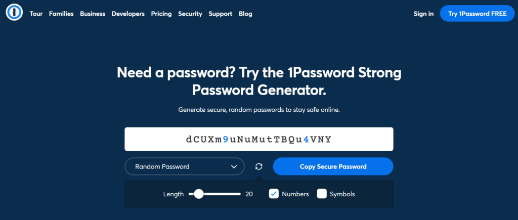
Using 1Password’s password and username generator, forging strong and secure passwords for all your accounts is easy.
You decide on the password length and whether to include numbers and symbols. The generated password is entirely randomized and unique, making it much harder for hackers to guess. Alternatively, you can develop a random but memorable password using four random words strung together.
Store Your Details
Store logins, secure notes, SSH keys, and sensitive documents in one centralized place and be able to access everything you’ve stored, regardless of your device (desktop or mobile devices) or web browser (Windows, macOS, Linux, iOS, and Android are all supported)
This makes it easy to manage, review, and organize your passwords from the convenience of a single interface. You can also grant your coworkers, and family members access to sensitive items using secure ‘vaults.’
Dashboard

Get an overview of your company’s cybersecurity health from one simple dashboard. Here, you’ll also find actionable insights and reporting features.
More specifically, you’ll be informed of potential breaches, password health, team usage, and more. You can also set user permissions at scale or customize access per individual user. This enables you to quickly and safely delegate responsibility to trusted team members to help you manage your 1Password account.
Single Sign-On (SSO)
Single-Sign-On enables you to sign into one account to verify your identity. Once this is done, you can then sign into a whole range of your accounts without re-entering your login details every time.
1Password works with SSO to save and encrypt one main password to add more security to your single-sign-on applications. This is especially handy if your business uses single-sign-on to give employees access to multiple pieces of software simultaneously, and you want to boost the security of this process.
Alerts
You’ll automatically be notified if an account is compromised, so you can update passwords immediately. 1Password also identifies weak passwords, duplicate passwords, and reused passwords, and websites that permit you to turn on two-factor authentication for tighter security.
The 1Password Browser Extension and Mobile Apps
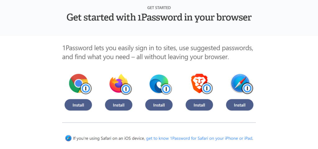
1Password is available as a browser extension. This enables you to manage your browser passwords, create new, stronger passwords as you go, and autofill details like usernames and passwords.
Firewall Rules
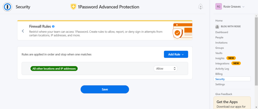
Create your own custom rules that automatically allow, report, or deny sign-in attempts from specific locations, IP addresses, and more. You’ll be notified of sign-in attempts from any recently reported or blocked addresses.
Go to the top
1Password Review – Pricing
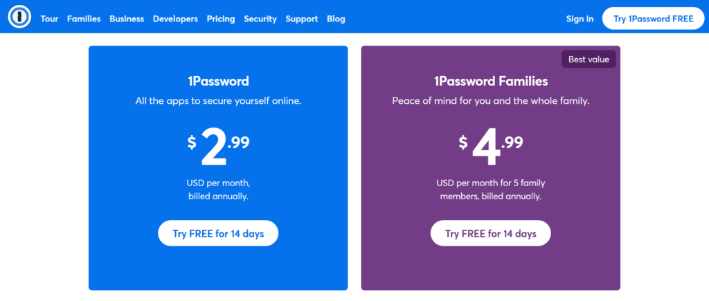
As 1Password is suitable for any number of people, it comes with a wide range of pricing options to suit different use cases. Each plan is billed annually, and a 14-day trial is available.
All accounts include:
1Password Watchtower, from which alerts you if your accounts/passwords are compromisedA digital wallet to store debit and credit card information securelyOne-on-one supportTravel mode – this allows you to remove sensitive data from your devices when you cross borders and restore them upon your returnAccess to 1Password on unlimited devicesAdvanced encryptionTotal privacy – only you have access to your data
The Personal Plan
This is suitable for a single individual and is available at $2.99 per month. With this plan, you can create, autosave, and autofill passwords and sensitive information, share secure details, unlock two-factor authentication and restore recently deleted or previous versions of products. You’ll also have access to 24/7 email support.
The Family Plan
Here, five family members can access 1Password for limited sharing at $4.99 per month. However, you can invite more family members to join for just one additional dollar each. You’ll also benefit from account recovery for locked-out family members, and you can manage what members can see and do.
Teams Starter Pack
This includes ten member accounts for a flat monthly price of $19.95. This also comes with admin controls where you can view and manage user permissions, unlimited shared 1Password vaults, and item storage. You’ll have 1GB of document storage as well. This plan additionally features 24/7 email support and duo integration for business-wide multi-factor authentication.
The Business Plan
This will set you back $7.99 per user per month. In addition, you can create up to 20 guest accounts for limited sharing. You also benefit from custom role design, custom security controls, and fine-grained access control for each vault.
It also features an activity log for tracking changes to vaults and items, plus usage reports for creating an audit trail. Each team member also gets a free family account to help them, and their family members stay secure online.
The Enterprise Plan
An Enterprise plan unlocks a dedicated account manager, onboarding, and tailor-made setup training. This is available for a custom quote, so you’ll need to get in touch with 1Password to learn more.
Go to the top
1Password Review – Customer Support and Resources
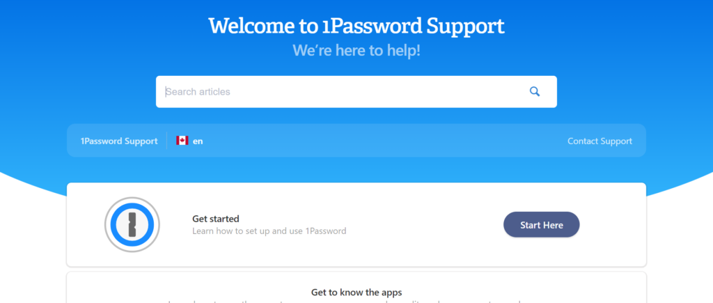
1Password offers support to its customers via email on a 24/7 basis. This is available not only in English but also in German, Spanish, French, Italian, and Japanese. But thanks to its thorough self-help documentation, you might never have to get in touch. There’s plenty of access to multi-lingual articles containing tips, migration instructions, helpful videos, and more.
Or, if you need support but don’t want to jump straight into the team’s email inbox, you can also turn to the 1Password community. This is a moderated forum where peers discuss online security, various 1Password features, and troubleshoot problems. The team is active on the forum, so chances are you’ll receive help this way while aiding others by asking important questions – win-win!
The password and username generator is also available on its website.
Go to the top
1Password Review – Security
When it comes to security, 1Password has you covered. For starters, you’re the sole owner and accessor of any information you store on the platform, so no one at 1Password can see, share, or sell your data. On top of that, 1Password’s security starts with AES 256-bit encryption. Still, it also uses several other technologies to keep your data secure.
Your 34-character secret access key to 1Password is created locally on your devices. You don’t have to remember this key to access your account, but you should print it out and save it in your emergency kit for recovery.
The master key is combined with a master password to authenticate that you are who you say you are with the server; only then will you get access to your data. Your account also uses SRP to establish your credentials without sending them over the web.
The software only works on verified internet browsers and only autofill passwords and login details when you want it to.
1Password’s entire security protocol can be reviewed in this document if you want a more in-depth look at how they protect their users.
Go to the top
1Password Review – Pros and Cons
Lastly, before we bring this 1Password review to a close, here are its key advantages and disadvantages:
Pros 👍
Cons 👎
Pros 👍
The app works with various operating systems, including Windows, macOS, Linux, Android, and iOS.
1Password makes it easy to manage and organize all your passwords.
You benefit from secure and yet simple authentication to add new devices.
It supports multi-factor authentication.
Ease of use is a priority.
Businesses get 1GB of encrypted file storage.
You can save virtual payment cards.
1Password’s customer support is reportedly excellent, as are its online self-help resources.
This software is very affordable for individuals, families, and small teams. We also like that business accounts get a lot of great value, including free family accounts.
Cons 👎
There are limited import options for importing existing passwords into 1Password.
No password inheritance features are available that allow account members to hand off their passwords to new users. For example, when a new employee takes over a role.
One-click password updates aren’t available.
There isn’t a free version, which makes 1Password a bit of an outlier amongst the best password managers. However, limitations on free plans with other providers make this gap less significant. On top of that, 1Password offers a 14-day free trial, and its Personal plans are very affordable.
No phone support is available.
The mobile apps aren’t as full-featured as the desktop apps.
Go to the top
1Password FAQs
Last but not least, let’s answer some of the most frequently asked questions we hear about 1Password:
Is it safe to store all my passwords in the cloud?
Having all your passwords in one place might seem like a risk. In a way, you’re putting all your eggs in one basket, right? However, every time you use 1Password, your data is encrypted before it leaves your device. So only you have the keys to access your passwords and details. No one at 1Password can review or use them, and you’re protected similarly from anyone else who might try to access them.
What is a Secret Key?
A secret key ensures that if anyone obtained data from 1Password, they would still be unable to do anything with it. This is a 34-character encryption key that protects your account and ensures that only your authorized devices can make sense of any data linked to your account. That way, data breaches are near-on impossible.
What can I store in 1Password?
Of course, you can use 1Password to store passwords, but the 1GB document storage and the ability to create vaults enable you to store other kinds of data. For example, you can save your bank accounts, social security numbers, mortgage account codes, medical data, or anything else you want within 1Password. This makes it easy to access sensitive information you might need only semi-regularly, so you don’t have to memorize anything.
Go to the top
1Password Review – Our Final Thoughts
It’s hard to imagine that 1Password was, once upon a time, a niche password manager for Apple products. However, since its origins, the company has come a long way to make its services available on all operating systems and devices. On top of this, they offer a wide range of valuable features, including a browser extension, web vaults, and mobile apps.
Although 1Password doesn’t offer a free plan, its pricing is affordable for individuals and families. Businesses also enjoy great value for money. All in all, if you don’t mind paying for the peace of mind and security of a password manager, we think 1Password is a great option – especially for small teams and families that want to take online security more seriously.
If you’re not yet convinced, why not sign up for a free trial, or browse the many online resources to learn more about password security? Or are you considering other password manager apps like LastPass or Dashlane? Then, let us know how you get on the comments box below!
The post 1Password Review: Everything You Need to Know About This Password Management Software appeared first on Ecommerce Platforms.


 Modals, a nifty little feature that allows you to display different messages at the top of your website, have been touted as extremely useful. Some even claim that they are helpful enough to completely replace the banner ads we all hate so much. But are modals in web design a UX disaster?


![<p>[]</p>](https://assets.hongkiat.com/uploads/engagebay-crm/website-forms.jpg)


