Animating HTML Links with CSS Transition
Original Source: https://1stwebdesigner.com/animating-html-links-with-css-transition/
This article was originally posted at https://christinatruong.medium.com/animating-links-on-hover-with-css-transition-e73b955f1e98 and was kindly shared by Christina Truong. Check out more of her work at https://christinatruong.com.
The CSS transition property does what it sounds like; it creates transitions! But more specifically, it controls the animation speed when changing a CSS style from one state to another. For example, changing the text color when hovering over alink. The hover is the state change.
Prefer to watch a video? This article is a companion piece to my Decoded by Christina series on YouTube.
Changing the state of an element usually requires some kind of user interaction like scrolling down the page or clicking on an object. Making changes based on user interactions usually requires JavaScript. But there is a way to create CSS-only interactions using pseudo-classes.
UNLIMITED DOWNLOADS: 1,500,000+ Icons & Design Assets
DOWNLOAD NOW
CSS pseudo-classes
A CSS pseudo-class is a special keyword, added to a selector, to define a specific state of an element. A common example is using :hover to change the style of a link when a user hovers over it with their mouse.
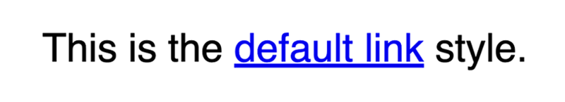
A common style convention for the link/hover interaction is to change the underline and/or the color styles. By default, links are blue and underlined.
But that can be changed with the text-decoration-line and color properties. In the following example, the underline is removed and the default color has been changed.
.link {
text-decoration-line: none;
color: crimson;
}

Then, using the :hover pseudo-class with the .link class, the underline can be added back in by setting text-decoration-line to underline. To add multiple styles, just add another property to the declaration block. For example, we can also change the color of the text, on hover, by using the color property here. Or change the color of the underline with the text-decoration-color property.
.link {
text-decoration-line: none;
color: crimson;
}
.link:hover {
text-decoration-line: underline;
text-decoration-color: green;
color: mediumpurple;
}
Now when you hover over the link, the underline and color changes will be applied instantaneously.

You could also do the reverse and leave the underline as is, then remove it on hover. It’s up to you!
text-decoration shorthand syntax
text-decoration-line and text-decoration-color can also be declared using the shorthand text-decoration property.
/* longhand syntax */
.link {
text-decoration-line: none;
color: crimson;
}
.link:hover {
text-decoration-line: underline;
text-decoration-color: green;
color: mediumpurple;
}
/* shorthand syntax */
.link {
text-decoration: none;
color: crimson;
}
.link:hover {
text-decoration: underline green;
color: mediumpurple;
}
The transition property
These types of hover style are a pretty common way of indicating to the user that this bit of text is a link. For these types of interactions, I like to use the transition property to make the change between the styles a little more subtle.
In the following example, the transition style has been included in the CSS. Now, when you hover over the link, the color of the text will change slowly, as it transitions from the one color to another.
See the Pen
Animating with CSS transition by Christina Truong (@christinatruong)
on CodePen.0
But there is no gradual change showing for the underline style. It displays right away, on hover, just like it did before the transition style was added. That’s because not all CSS properties are affected by the transition property. Let’s dive a little deeper into how this works.
transition is actually shorthand for four sub-properties.
/* shorthand */
transition: color 1s linear 0.5s;
/* longhand */
transition-property: color;
transition-duration: 1s;
transition-timing-function: linear;
transition-delay: 0.5s;
The transition-property and transition-duration must be defined for this style to work. Defining the transition-timing-function and transition-delay are optional.
How to use the transition property
Whether you’re using the longhand or the shorthand syntax, the transition property should be added to the element before the changes start.
In the following example, the hover effect triggers the change. So, the transition property should be added to the .link class, to define the behavior before the changes begin. The styles added to .link:hover are the styles that should be displayed at the end of the transition.
.link {
text-decoration-line: none;
color: crimson;
transition: color 1s linear 0.5s;
}
.link:hover {
text-decoration-line: underline;
text-decoration-color: green;
color: mediumpurple;
}
transition-property
The transition-property determines which CSS style will be applied by specifying the property name (e.g. color or font-size). Only the properties defined here will be animated during the transition.
/* transition will be applied only to ‘color’ */
transition-property: color;
/* transition will be applied only to ‘font-size’ */
transition-property: font-size;
To apply a transition to more than one property, the values can be separated by a comma or use the keyword all to apply the effect to all the properties that can be transitioned.
/* Transition will be applied to ‘color’ and `font-size` */
transition-property: color, font-size;
/* Applied to all properties that can transition */
transition-property: all;
As we saw in the previous example, some properties can’t be transitioned. If the property has no in-between state, transition can’t be used to show a gradual change.
Referring back to the previous Codepen example, text-decoration-line will not be transitioned. Either the line is there or it isn’t. But the color property does have in-between values, that the browser can define, as it’s changing from one color to another. And by default, the color of the underline follows the color of the text. So while the underline shows right away, the color of the line will transition, on hover.
To see a full list of which CSS properties can be transitioned, check out this resource from the Mozilla Developer Network.
There are alternative ways to create a style that looks like the underline is expanding from left to right but that involves using other properties instead of text-decoration. Check out this article for more details.
transition-duration
The next step is to set the length of time to complete the change, using the transition-duration property. Set the value using seconds with the s unit or milliseconds with the ms unit. You can use whole numbers or decimals. The 0 before the decimal point is not required but can be added, if that is your personal preference.
transition-duration: 1s; /* one second */
transition-duration: 1000ms; /* one thousand milliseconds = 1 second */
transition-duration: 0.5s; /* half a second */
transition-duration: 500ms; /* 500 milliseconds = half a second */
transition-timing-function
The transition-timing-function property is used to set an acceleration curve of the transition, by varying the speed over the duration of the change from one style to the other. It can be used with a variety of keyword or function values.
The keyword values are based on Bézier curves, specifically cubic Bézier curves, which uses four points to define the acceleration pattern.
/* Keyword values */
transition-timing-function: linear;
transition-timing-function: ease-in;
The linear keyword will set the acceleration pattern to an even speed for the duration of the animation. The ease-in keyword, which is being used in the previous Codepen example, will set the acceleration to start slowly—easing in. Then, the speed will increase until it’s complete.
You can also create your own acceleration patterns, using this function values instead.
/* Function values */
transition-timing-function: steps(4, jump-end);
transition-timing-function: cubic-bezier(0.1, 0.7, 1.0, 0.1);
Personally, I keep it simple when using this property and generally stick linear or one of the ease keywords. Though, the more advanced options would be useful for creating more advanced animations.
Check out the Mozilla Developer Network for a full list of keyword values, examples and more information about creating your own functions.
transition-delay
The transition-delay property can be used to delay the start of the animation. It is defined with seconds or milliseconds.
A positive value will delay the start of the transition. A negative value will begin the transition immediately but also partway through the animation, as if it had already been running for the length of time defined.
This property is also optional and if it’s not declared, there will be no delay at the start of the animation. You can refer to my YouTube video to see a demo of this effect.
Since transition-delay and transition-duration both use the same type of values, when using the shorthand syntax, the first number value will always be read by the browser as the transition-duration value. So make sure to add the transition-delay value after.
/* shorthand */
transition: color 1s linear 0.5s;
/* longhand */
transition-property: color;
transition-duration: 1s;
transition-timing-function: linear;
transition-delay: 0.5s;
And that’s it! Take some time to experiment with these different values and different properties to find the perfect combination for your transitions.


Leave a Reply
Want to join the discussion?Feel free to contribute!