Privacy UX: Better Notifications And Permission Requests
Original Source: https://www.smashingmagazine.com/2019/04/privacy-better-notifications-ux-permission-requests/
Privacy UX: Better Notifications And Permission Requests
Privacy UX: Better Notifications And Permission Requests
Vitaly Friedman
2019-04-18T17:00:49+02:00
2019-04-18T16:15:47+00:00
Part 1: Privacy Concerns And Privacy In Web Forms
Part 2: Better Cookie Consent Experiences
Part 3: Better Notifications UX And Permission Requests
Part 4: Privacy-Aware Design Framework
Imagine you are late for one of those meetings that you really don’t want to be late to. You hastily put on your shoes and your coat and fetch your door keys and grasp for the door handle — just to head out in time. As you are stepping down the stairs, you reach into your pocket and pull out your mobile phone to check the subway schedule or order a cab.
A brief glance at the screen is enough to have you breaking out in a sweat: you realize you’ve forgotten to charge your phone overnight, and it’s proudly running on its remaining 2% battery charge. As you rush down the street, full of hope and faith, you dim the brightness of the screen and hunt down the right app icon across the home screen. Of course, at that exact moment a slew of notifications cascades down your screen, asking for your undivided attention for new followers, updates, reminders, and messages.
Chances are high that you know way too well what this feels like. How likely are you to act on the cascading stack of notifications in that situation? And how likely are you turn off notifications altogether as another reminder reaches you a few minutes later, just when you missed your connection? That’s one of those situations when notifications are literally getting in a way in the most disruptive way possible, and despite all the thoroughly crafted user flows and polished, precious pixels.
With so many applications and services and people and machines and chatbots fighting for our attention, staying focused is a luxury that needs to be savored and protected, and so no wonder notifications don’t enjoy a decent reputation these days. More than that, often they feel off the point and manipulative, too.
“They often appear at times when they are least relevant, and they create a false sense of urgency, diluting focus and causing frustration.”
— Alex Potrivaev, Intercom
This goes for floating windows on the home screen as much as the almighty unread count in toolbars. This is also true for marketing messages masked as notifications, as well as social updates broken down in many small messages to permanently draw attention to the service.
All of these notifications demand immediate attention and feel incredibly invasive, playing on our desires not to miss out and stay connected with our social groups. In fact, they disrupt privacy in a way that no dark patterns can — by demanding and seizing attention unconditionally, no matter what the user is currently doing.
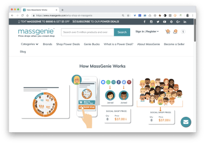
Can you spot anything weird in this particular design? It’s not common to see the notification count ‘0’, as it’s done on MassGenie in the top-right corner. (Large preview)
However, it’s not the fault of notifications that they feel invasive; it’s that we design them such that they often get in the way. Users don’t want to miss important notifications and miss out on timely messages or limited sales, but they don’t want to feel pestered by a never-ending tide of noisy updates either. If the latter happens too frequently, users turn off notifications altogether, often with a bitter aftertaste towards the app and brand due to its “desperate begging for attention”, as one user put it. A single culprit can ruin it for everybody else, and that despite the fact that no notification is like another.
The Many Faces Of Notifications
Notifications are distractions by nature; they bring a user’s attention to a (potentially) significant event they aren’t aware of or might want to be reminded of. As such, they can be very helpful and relevant, providing assistance, and bringing structure and order to the daily routine. Until they are not.
In general, notifications can be either informational (calendar reminders, delay notifications, election night results) or encourage action (approve payment, install an update, confirm a friend request). They can stream from various sources, and can have various impacts:
UI notifications appear as subtle cards in UIs as users interact with the web interface — as such, they are widely accepted and less invasive than some of their counterparts.
In-browser push notifications are more difficult to dismiss, and draw attention to themselves even if the user isn’t accessing the UI.
In-app notifications live within desktop and mobile apps, and can be as humble as UI notifications, but can take a more central role with messages pushed to the home screen or the notifications center.
OS notifications such as software updates or mobile carrier changes also get in the mix, often appearing together with a wide variety of notes, calendar updates, and everything in between.
Finally, notifications can find their way into email, SMS, and social messaging apps, coming from chatbots, recommendation systems, and actual humans.
You can see how notifications — given all their flavors and sources — could become overwhelming at some point. It’s not that we pay exactly the same amount of attention to every notification we receive, though. For the vast majority of users, it can take weeks until they eventually install a software update prompted by their OS notification, whereas it usually doesn’t take more than a few hours to confirm or decline a new LinkedIn or Facebook request.
Not every notification is equal, and the level of attention users grant them will depend on their nature, or, more specifically, how and when notifications are triggered.
In his article on “Critical Analysis of Notification Systems”, Shankar Balasubramanian has done remarkable research breaking down notification triggers into a few groups:
Event-triggered notifications
News updates, recommendations, state changes
OS-triggered notifications
Low battery, software update, or an emergency alert
Self-triggered notifications
Reminders or alarms
Many-to-one messaging notifications
Group messages from Slack or WhatsApp
One-to-one messaging notifications
Personal email from a friend or a relative
We can’t deduce that one group of triggers is always more effective than another, but some notifications from every group tend to be much better at capturing attention than others:
People care more about new messages from close friends and relatives, notifications from selected colleagues during working hours, bank transactions and important alerts, calendar notifications, scheduled events, alarms, and any actionable and awaited confirmations or releases.
People care less about news updates, social feed updates, announcements, new features, crash reports, web notifications, informational and automated messages in general.
Unsurprisingly, users tend to attend to low battery notifications or payment confirmations immediately; also, calendar reminders, progress updates (e.g. package delivery ETA) and one-to-one messages matter more than other notifications. In fact, in every single conversation we’ve had with users, a message from another human being was valued much higher than any automated notification. The priorities might change slightly, of course, if a user is impatiently awaiting a notification, but only few people would ever leave everything behind in a desperate rush to check the 77th like on their photo.
So notifications can be different, and different notifications are perceived differently; however, the more personal, relevant, and timely notifications are, the higher engagement we should expect. But what does it all mean for the design of notifications, and how can we make them less intrusive and more efficient?
Don’t Rely On Generic Defaults: Set Up Notification Modes
There is usually a good reason why customers have chosen to sign up for a service. Not many people wake up in the morning hoping to create a new account that day. In fact, they might feel like your service might help them in their daily tasks, or could improve their workflow. Hopefully they don’t need notifications to understand how a service works, but they might need to receive notifications to understand the value the service provides.
Perhaps they’ve received an important message from a potential employer, or perhaps there is a dating profile match that’s worth looking at. They might not want to miss these messages just because they’ve forgotten to check into the service for a while. As designers, we need to sprinkle just the right pinch of notifications into the mix to keep the customer motivated, while delivering only relevant and actionable pointers to them.
Unfortunately, with most services it’s not uncommon to sign up, only to realize a few moments later that the inbox is filling up with all kinds of messages (mostly purely informational), often sent immediately after another, and rarely actionable. Email notifications especially are often switched on by default, with the user’s consent implied by agreeing to lengthy and unmanageable terms and conditions. Nobody loves being bombarded with a stream of unsolicited messages, and that holds true for spam emails as much as for unwanted notifications.
Instead of setting up a default notification frequency for all customers by default, we could start sending just a few curated notifications very infrequently. As the customer keeps using the interface, we could ask them to decide on the kind of notifications they’d prefer and their frequency. The same goes for cookie consent prompts: we could provide predefined recommended options with a “calm mode” (low frequency), a “regular mode” (medium frequency), and a “power-user mode” (high frequency).
We could be more granular even than this, though. Basecamp, for example, has introduced “Always On” and “Work Can Wait” options as a part of their onboarding experience, so new customers can select if they wish to receive notifications as they occur (at any time), or choose specific time ranges and days when notifications can be sent. Or, the other way around, we could ask users when they don’t want to be disturbed, and suspend notifications at that time. Not every customer wants to receive work-related notifications outside of business hours or on the weekend, even if their colleagues might be working extra hours on Saturday night on the other side of the planet.
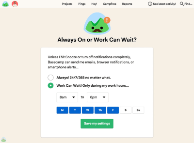
On Basecamp, new customers can select if they wish to receive notifications as they occur, or choose specific time ranges and days when notifications can be sent. (Large preview)
As time passes, the format of notifications might need adjustments as well. Rather than having notifications sent one by one as events occur, users could choose a “summary mode,” with all notifications grouped into a single standalone message delivered at a particular time each day or every week.
That’s one of the settings that Slack provides when it comes to notifications; in fact, the system adapts the frequency of notifications over time, too. Initially, as Slack channels can be quite silent, the system sends notifications for every posted message. As activities become more frequent, Slack recommends reducing the notification level so the user will be notified only when they are actually mentioned.
Another feature Slack offers is allowing users to highlight a selection of words so that the users only get notified when a topic they care about has been mentioned:
 With this feature, it’s still important to remain selective about your choice of highlighted words in order to avoid getting too many notifications. (Image source: Slack) (Large preview)
It might sound like the frequency of notifications is receiving too much attention at this point, but when asked about common pain points with notifications, the most common issue was, by far, their high frequency, even if the messages were relevant or actionable.
The bottom line is: start sending notifications slowly but steadily; set up notification modes, and provide granular options such as a choice of triggers and the format of notifications. Better send too little than too much: you might not get another chance should the customer wish to opt out from numerous notifications that are getting on their nerves at just the wrong time.
Pick Timing Carefully
We might not like to admit it, but for many of us, the day doesn’t start with a peaceful, mindful greeting of the rising sun; instead, it starts with a tedious, reflexive glance at the glowing screen of our mobile phones. More specifically, the first thing we see every morning isn’t even the current time or our loved ones, but the stack of notifications that piled up tirelessly while we slept.
That state of mind isn’t necessarily the best opportunity to remind users of an updated privacy policy, shiny new features, or outstanding expenses that need finalizing. Personal notifications like new social shares and reactions from social circles might be way more relevant, though, just like upcoming appointments and to-dos for the day.
Timing matters, and so do timely notifications. You probably don’t want to disturb your customers in the middle of the night as they arrive at a remote destination with heavy jet lag. Therefore, it’s a good idea to track the change of time zones and local time, and adjust the delivery of notifications accordingly. On the other side, customers won’t be particularly happy about an important notification appearing when it’s no longer relevant, so if they are tracking an important event or announcement, you’ll have to decide if the event is critical enough to disturb them at an uncomfortable time.
Your analytics will tell you when your users are likely to act on your notifications, so it’s a good idea to study and track responses based on time, and trigger the dispatch of notifications around that time. For example, if a customer is most receptive to sharing a message in the mornings, hold off notifications until just the right moment at the local morning time.
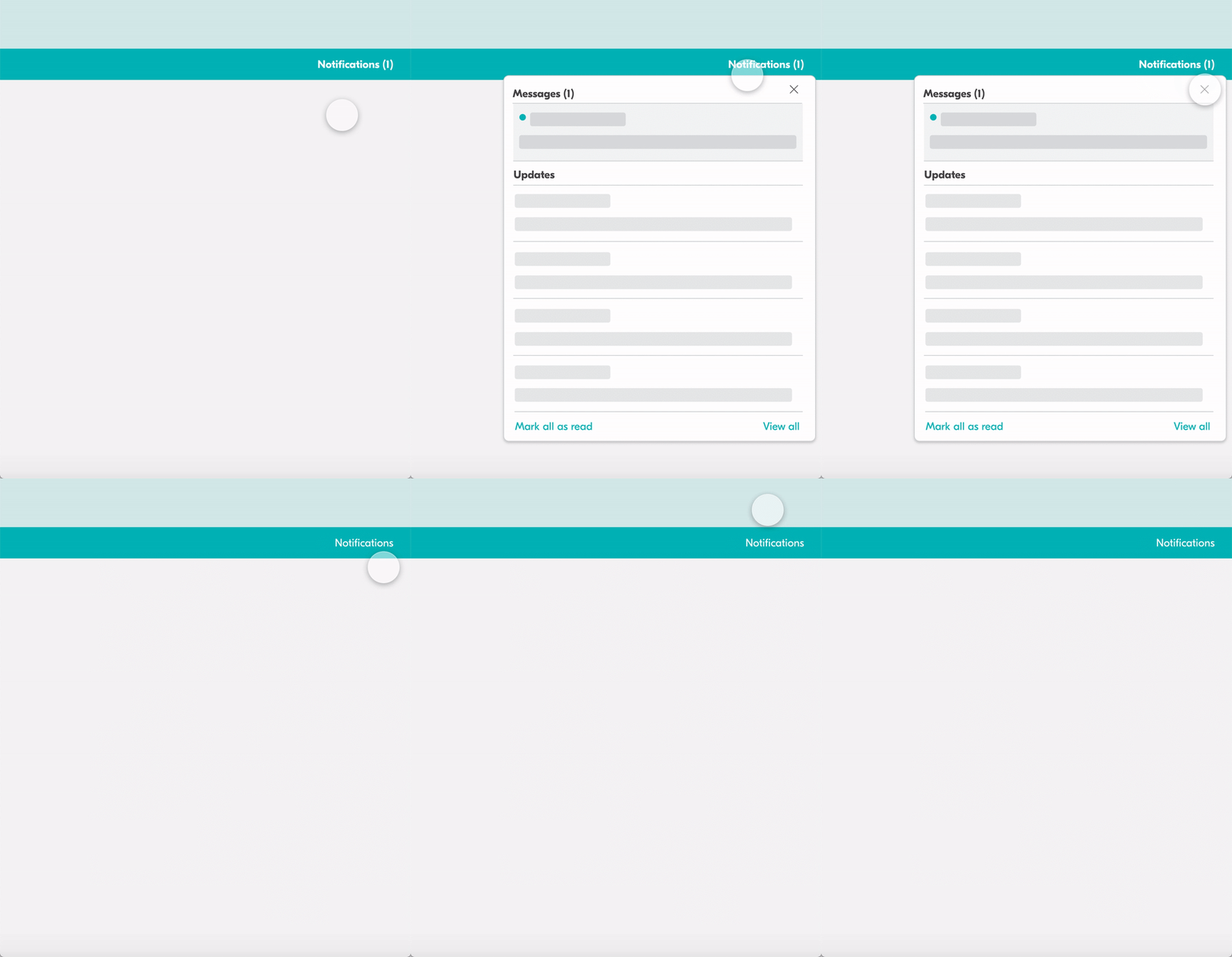 There are many ways to present a notification. Most common notifications are displayed within a designated area, usually in the right top corner of the screen. It is the format we are used to from apps such as Facebook, Airbnb or Dropbox. (Image source) (Large preview)
Avoid Stressful Situations By Design
With notifications, timing is not the only important attribute to consider. Remember the poor character hoping to catch their connection from the beginning of this section? Unleashing a deck of notifications at a critically low battery level isn’t a good idea, and it’s just as counterproductive when the user is struggling with connectivity or is focused on a task like driving a car. If you can assess the battery level and the quality of connection, it’s a good idea to avoid sending notifications when a user’s conditions are suboptimal. Of course, notifications also have to be relevant, so if you can assess user’s location too, avoid sending location-dependent notifications that are not applicable at all.
Sometimes it’s difficult to hold notifications as they might be critical for the user’s current activity. If the user is driving a car, following directions in a navigator app, you might need to provide a more persistent and humble notification about the recommended change of route due to an accident on the road. In that case, just like other critical notifications, we could display a floating button “New updates available. Refresh.” It’s much less invasive than a notification blocking access to the content, but it’s as effective in indicating that the page or state of the page might be outdated and new information is available.
In fact, instead of sending out notifications at specific default times, even if it’s based on the user’s past behavior, you could explore the other side of the coin and tap into happy and successful moments instead. A money transfer service, TransferWise, displays notifications when the customer receives a payment — and isn’t that wonderful timing to ask for an app review on App Store? We could track important milestones and notify users about advanced features as they are reached, just-in-time, as Luke Wroblewski calls them.
Reduce Frequency By Grouping Notifications
There is no golden rule for just the right amount of notifications on a given day. Just like every notification differs, so do the preferences and motivations of every customer. To keep a user’s engagement, you might need to gradually release blocks of notifications depending on the customer’s reach or preferences. That’s where gradual grouping comes into place, as explained in the article “Designing Smart Notifications” by Alex Potrivaev, product designer at Intercom.
The idea is simple. If you know your customers get less than five reactions per post on average, it might be a good idea to provide a unique notification for each of them. You might also trigger a notification if a message is coming from important events, such as a message from close friends, family, or influential people. Besides, as we know that notifications triggered by an action from another human being are valued more than automated notifications, prioritize and focus primarily on personal ones, for that particular customer.
Once the volume of notifications has increased, we can start grouping them and provide compact summaries at an appropriate time. For example, Facebook summarizes notifications in non-intrusive blocks, with every line highlighting exactly one type of event, such as reactions to a particular message (“Stoyan Stefanov and 48 other people reacted to your post…”). LinkedIn, on the other hand, seems to trigger almost every single event one by one (“Stoyan Stefanov commented on your post”), hence polluting the stream of notifications and making them difficult to scan and use.
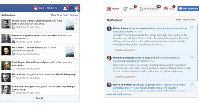
The quality of notifications matters. While Facebook provides a compact summary view of notifications, on Quora they are lengthy and verbose, making scanning difficult. (Image source: Designing Smart Notifications) (Large preview)
Of course, based on a user’s history, we could customize more than just grouping of notifications. Once we know how a user reacts to new photo likes, whether they briefly glance at them or dive deep into each and every notification, we can provide better notifications next time. As Alex concludes:
“Based on the way you usually interact with content, better wording and structure choices could be offered, and depending on the default behavior you may see notifications structured differently.”
This, of course, also requires continuous feedback loops.
Allow Users To Snooze Or Pause Notifications
Hardly any company will dismiss the value of data about their customers. In fact, we can gain valuable long-term insights by introducing feedback loops; that is, continuously offering customers options to “See more” or “See fewer” notifications of a particular kind. But just like we tend to perceive disability as an on/off condition (you either have a disability or don’t), we often feel that we can accurately predict the user’s behavior based on their past behavior alone.
The reality, however, is rarely black and white. Our users might be temporarily hindered while holding a baby in one arm, or because of a recent unfortunate accident, and the conditions in which they find themselves can fluctuate in the same way. Quick actions such as snoozing in response to an incoming notification can help alleviate the issue, albeit temporarily.
The user’s context changes continuously. If you notice an unusual drop in engagement rate, or if you’re anticipating an unusually high volume of notifications coming up (a birthday, wedding anniversary, or election night, perhaps), consider providing an option to mute, snooze, or pause notifications, perhaps for the next 24 hours.
This might go very much against our intuition, as we might want to re-engage the customer if they’ve gone silent all of a sudden, or we might want to maximize their engagement when important events are happening. However, pressing on with the frequency of notifications is just too dangerous most of the time. It’s easy to reach a point when a seemingly harmless notification will steer a customer away, potentially even in the long term. There might be good reasons why the user hasn’t been or doesn’t want to be active for a while, and more often than not, it has nothing to do with the service at all.
Another option would be to suggest a change of medium used to consume notifications. Users tend to associate different levels of urgency with different channels of communication. In-app notifications, push notifications, and text messages are considered to be much more intrusive than good ol’ email, so when frequency exceeds a certain threshold, you might want to nudge users towards a switch from push notifications to daily email summaries.
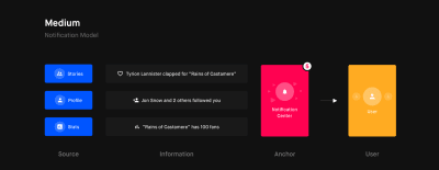
In the article “Designing Notifications For Apps”, Shashank Sahay explores different notification models and when to use which, e.g. notification center, with a few guidelines and recommendations along the way. (Large preview)
Set Thresholds And Build Up A Notifications Decision Tree
The thresholds aren’t easy to set properly, though. Important events should trigger immediate notifications to be received in time. Less important events could wait, but it might be useful to draw the customer’s attention to the service. Potentially irrelevant notifications have to be filtered out relentlessly to leave time and space for important notifications to be cherished and valued.
In general, shorter notifications, such as messages from friends and colleagues, are best suited as UI notifications if they aren’t urgent, or push notifications if they are. Lengthier notifications are better off as emails — whether they’re urgent or not. This rule of thumb would vary from service to service, so you could build up a notifications decision tree to track which medium works best for particular kinds of notification based on their urgency, length, and frequency. Additionally, you could define thresholds and trigger a prompt for snoozing or adjusting the settings if a threshold is reached.
Make Opting In And Opting Out Obvious
These days it’s almost expected for a service to go to extremes in making it ridiculously difficult for a customer to opt out from almighty notifications. Obscure wording and obscure labels skillfully hidden in remote corners of the interface are not uncommon. Few other design considerations can be more harmful and damaging for a brand. When users can’t adjust settings easily, they apply heavy artillery, marking email notifications as spam, or blocking notifications in OS settings or browser settings. For a website or an app, there is no easy way to recover from that, except begging for subscriptions yet again.
A much simpler way out is to provide very granular control over notifications, including their content, format, frequency, and do-not-disturb times. We could provide an option to reply to a recent notification with “Fewer emails” or “Stop” to change the frequency, bypassing website log-ins or app sign-ins (Notion.so does that). For apps, provide notification preferences integrated into the app rather than relying on OS native settings. There, you could also explain what the user can expect from every kind of notification, perhaps even with examples of how they would look.
In practice, many users will search for notification settings in both places if they really need to, but the longer it takes them to find that nebulous setting, the less patient they’ll be. In reality, most users seek a way of turning off notifications at the moment when they are actually frustrated or annoyed by recent notifications. That’s not a pleasant state of mind to be in, and as a service, you probably don’t want to unnecessarily extend that state of mind at the expense of feeling nagged and confused by your paying customers.
Don’t forget to explore the other side of the coin as well, though. Identify parts of the user journey when a user is more likely to subscribe to notifications; for example, once an order in an online shop has been successfully placed, or a flight booking has been confirmed. In both cases, notifications can help customers track delays or retrieve boarding passes in time. That’s also a good time to suggest real-time push notifications, which also means first asking the customer’s permission to send those reminders. And that topic deserves a separate conversation.
Asking For Permission, The Humble Way
Some websites are quite a character, aren’t they? Self-indulgent, impolite at heart, and genuinely unlikeable too. How often do you stumble on a seemingly modest, unpretentious page just to be greeted with a wondrous permissions prompt begging to send you notifications? You haven’t read a single word yet, but there it is, already asking for a long-term commitment — and frankly, quite an invasive one.
In terms of user experience, displaying a permission prompt on load is probably the best way to make a poor first impression, and in most cases an irreversible mistake. Starting from January 2019, Chrome has changed the options displayed when a native prompt is triggered. While users might be able to dismiss a notification to react to it later, now they have to choose whether they’d like to either “Accept” or “Block” notifications. The latter results in web notifications being permanently blocked for the entire site, unless the user finds their way through the wilderness of browser settings to grant access after all. No wonder the vast majority of users block such prompts right away, without reading their contents at all.
Strategically, it’s better to ask permission only when there is a high chance a user would actually accept. For that to happen, we need to explain to the customer why we actually need their permission, and what value we can provide them in return. In practice, this strategy is often implemented in form of the ‘double request pattern.’ Instead of asking for permission immediately, we wait for a certain amount of engagement first: perhaps a couple of page visits, a few interactions, a certain amount of time spent on the site. Eventually, we can highlight the fact that a user could subscribe to notifications and how they might be valuable, or that we need their permission for more accurate, location-aware search results. Sometimes the context of the page is enough, like when an interface would like to ask for geolocation when the user visits the store locator page.
In all of these cases, a prominent call-to-action button would wait for the moment when a user is most receptive to act on it. If the user chooses to tap on the button, we can assume they are likely to proceed with the action. So, once clicked, the button would prompt an actual native permission request.
Essentially, we are breaking down the permission prompt into two requests:
A request built into the UI,
A native request at the browser level.
As Adam Lynch notes, should the user still revoke permission, perhaps due to a mis-tap or mis-click in the native browser prompt, we need to display a fallback page that explains how to manually enable the permission via their browser settings (or link to an explanation). Obviously, it doesn’t make sense to display a request for notifications if the user has already granted permission. We can use the Permissions API to query the status of any permission through a single asynchronous interface and adjust the UI accordingly.
The same strategy could be applied to any kind of permission request, such as access to geolocation, camera, microphone, Bluetooth, MIDI, WebUSB, and so on. The wording and appearance of UI notification prompts is of critical importance here, though, so it’s a good idea to track engagement and acceptance ratios for each permission or feature, and act on them accordingly. And that brings us to the king of them all — tracking major metrics for your notifications.
Track Metrics For Notifications
Usually notifications aren’t sent for the sheer purpose of informing customers about an occurring or upcoming event. Good notifications are useful and actionable, helping both customers and businesses achieve their goals. For that, relevant metrics have first to be discovered and defined.
As a bare minimum, we might need to know if the notifications we send are relevant in the first place.
Do the wording, format, and frequency of notifications drive the desired action that we aim to achieve (be it social shares, time spent on the site, or purchases)?
What kind of notifications matter more than others?
Do the notifications actually bring users back to the application?
How much time passes between sending the notification and the user’s return to the site or app?
How much time is spent on average between the clickthrough notification and the user leaving the site?
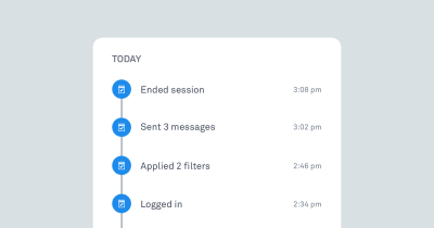
Track whether notifications actually work by exploring if they prompt a desired action, and if yes, when. (Image source: Designing Smart Notifications) (Large preview)
Experiment with wording, length, dispatch times, and grouping and frequency of notifications for different levels of user involvement — beginner, regular user, and power user. For example, users tend to be more receptive to conversational messages that feel more casual and less like system notifications. Mentioning the names of actual human beings whose actions triggered a notification might be useful as well.
It’s never a bad idea to start sending notifications slowly to track their potential negative impact as well — be it opt-outs or app uninstalls. By sending a group of notifications to a small group first, you still have a chance to “adjust or cancel any detrimental notification campaigns before it’s too late,” as Nick Babich remarks in “What Makes A Good Notification”.
All these efforts have the same goal in mind: avoiding significant disruption and preventing notifications fatigue for our customers, while informing them about what they want to know at about the time they need to know it. However, if cookie prompts are just annoying, and frequent notifications are merely a disturbance, when it comes to the security of personal data and how it’s managed, customers tend to have much more pressing concerns.
It’s worth noting that there are significant differences in how notifications are requested, grouped, and displayed on Android and iOS, so if you are designing a native or a hybrid app, you’ll need to examine them in detail. For example, on iOS, users don’t set up app notifications until onboarding or a later usage of the app, while Android users can opt-out from notifications during installation, with the default behavior being opt-in. Push notifications sent by a PWA will behave like native notifications on a respective OS.

Admittedly, these issues will not be raised immediately, but as customers keep using an interface and contribute more and more personal data, doubts and concerns start appearing more frequently, especially if more people from their social circles are involved. Some of these issues are easy refinements, but others are substantial and often underestimated blockers.
In the final article of the series, we’ll be looking into notifications UX and permission requests, and how we can design the experience around them better, with the user’s privacy in mind.
Part 1: Privacy Concerns And Privacy In Web Forms
Part 2: Better Cookie Consent Experiences
Part 3: Better Notifications UX And Permission Requests
Part 4: Privacy-Aware Design Framework
Useful Resources And References
“Designing Notifications For Apps,” Shashank Sahay
“Different Types Of Notifications: Websites, Apps And Beyond,” Joanna Martin
“It’s Time For Notifications To Get Smart,” Alex Potrivaev
“Improving User Experience With Real-Time Features,” Lauren Plews

(yk, il)

Leave a Reply
Want to join the discussion?Feel free to contribute!